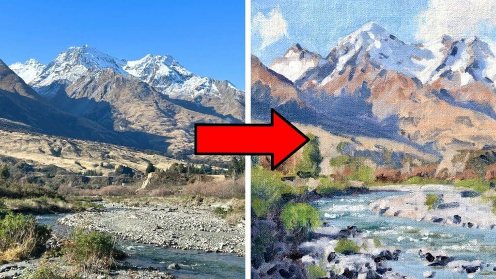
As an artist, there’s something truly magical about capturing the raw beauty of mountain landscapes on canvas. The majestic peaks, the play of light and shadow, and the ever-changing atmosphere create a scene that’s both challenging and rewarding to paint. I’ve spent countless hours perfecting my technique for painting mountains from life, and I’m excited to share my insights with you.
Have you ever found yourself gazing at a breathtaking mountain vista, wishing you could immortalize it with your brush, but feeling unsure where to begin? You’re not alone. Many artists struggle with the complexities of outdoor landscape painting also known as painting ‘en plein air‘, especially when it comes to capturing the grandeur of mountains.
In this comprehensive guide, I’ll walk you through eight essential tips for painting mountain landscapes outdoors. Whether you’re a beginner looking to start your plein air journey or an experienced artist aiming to refine your mountain painting skills, these techniques will help you create beautiful, dynamic scenes that truly capture the essence of the mountains.
From selecting the perfect subject to adding those final, crucial details, we’ll cover everything you need to know to elevate your mountain landscape paintings.
1. Carefully Choose Your Subject: The Foundation of Your Mountain Masterpiece
When painting mountains from life, I’ve learned that choosing the right subject is crucial. It’s not just about finding any mountain, it’s about discovering a scene that speaks to you and offers the elements needed for a compelling composition.
Seek Out Dramatic Shadows
In my experience, the most captivating mountain paintings often feature dramatic interplays of light and shadow. I always look for mountains with interesting shadow patterns cast by their peaks and ridges. These shadows not only add depth to your painting but also create a sense of dimension that can truly bring your landscape to life.
Incorporate Varied Elements
While the mountain itself is the star of the show, I’ve found that including diverse elements in your composition can elevate your painting from good to extraordinary. Here’s what I look for:
- Rivers or streams: These add a sense of movement and can lead the viewer’s eye through the painting.
- Tree lines: They provide texture and can create interesting patterns on the mountain slopes.
- Meadows or valleys: These offer a contrast to the rugged mountain terrain and can add a splash of color.
- Weather elements: Clouds, mist, or even a distant rainstorm can add drama and atmosphere to your scene.
Consider the Time of Day
The time of day can dramatically affect the mood and lighting of your mountain scene. I often prefer early morning or late afternoon light, as it creates longer shadows and more vibrant colors. However, don’t discount the stark beauty of midday light or the subtle hues of twilight, each offers unique opportunities for capturing the mountain’s character.
Composition is Key
As you scout for your perfect subject, keep composition in mind. Look for natural framing elements, interesting foregrounds, or compelling focal points. I often use the rule of thirds as a starting point, placing key elements at the intersections of imaginary grid lines.
Pro Tip: Sketch Before You Commit
Before setting up your easel, consider the shadows in your landscape. For example when I paint a mountain, I will paint it more in shadow or more in light, but never half in shadow and half in light as this will be displeasing in your painting.
You may want to do a quick thumbnail sketch of potential composition before you start painting. This helps you visualize how different elements will work together and can save you time and frustration later.
Choosing your subject is more than just picking a pretty view, it’s about finding a scene that offers the right elements to create a dynamic, engaging painting. Take your time with this step; it’s the foundation upon which your entire artwork will be built.
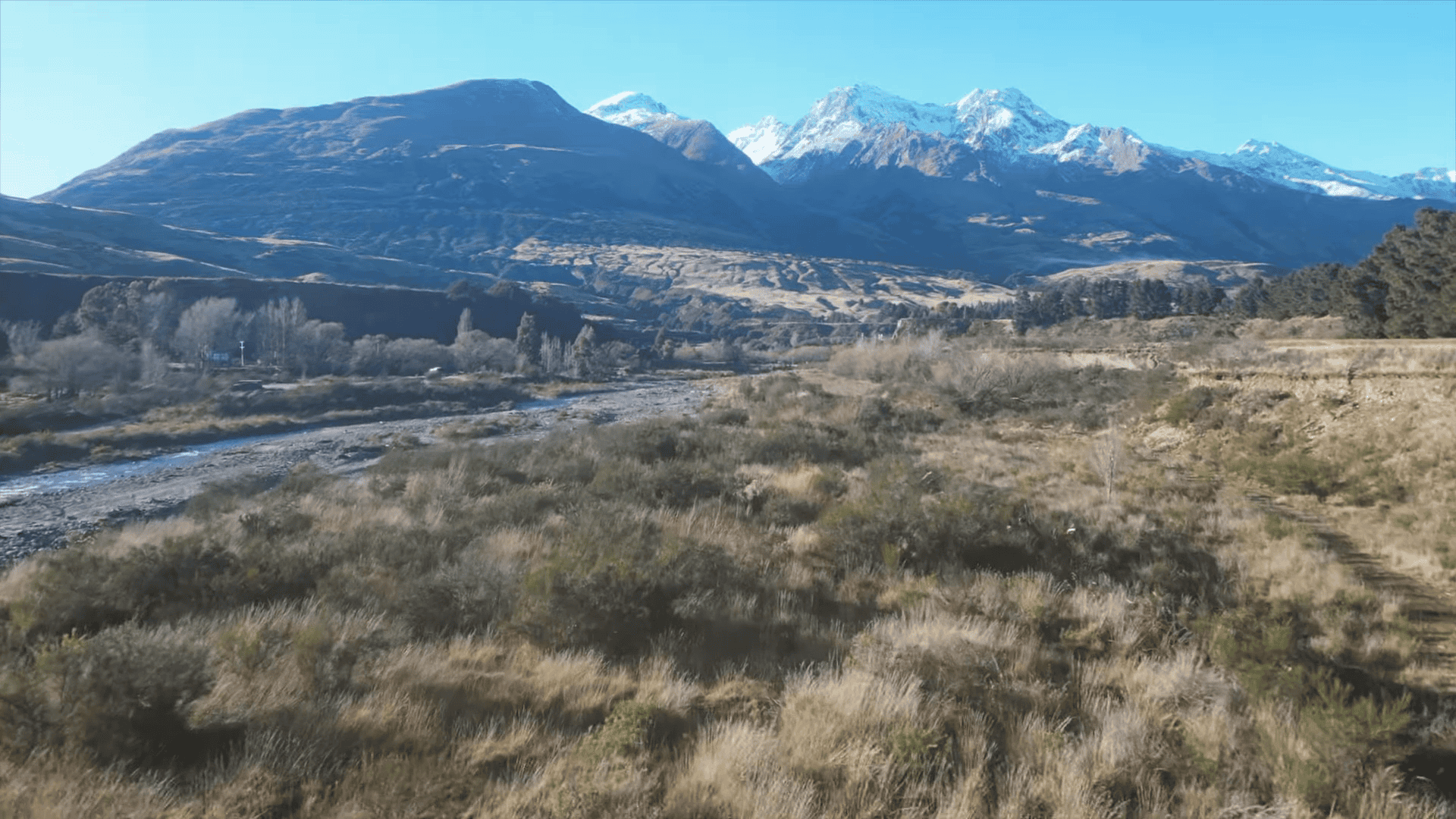
A well-chosen mountain landscape with rich shadows and a dynamic foreground.
2. Sketching Your Composition on the Canvas
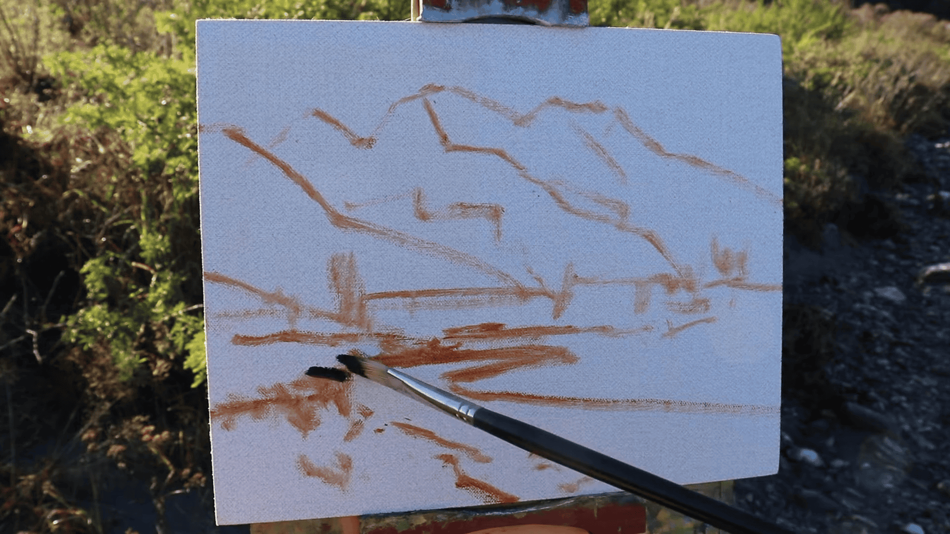
Once I’ve chosen my subject, I always sketch out my composition using burnt sienna mixed with a bit of medium. The medium I usually use for painting outdoors is Liquin Original which is known for its fast drying time.
Choosing the Right Medium for Sketching Your Composition
While many artists use pencils to outline their composition, I’ve found that using oil paint for this step offers several advantages:
- It allows for easy adjustments without leaving residue on the canvas.
- The sketch becomes an integral part of the painting, contributing to its overall texture and depth.
- It helps me start thinking in terms of color and value right from the beginning.
Materials I Use
For this sketching phase of the painting, I rely on:
- Blue Ridge Oil Paints: I find their quality and consistency perfect for both sketching and painting.
- Burnt Sienna Paint: This warm, earthy tone is ideal for sketching as it provides a nice contrast to the cooler tones often found in mountain landscapes.
- Liquin Original: This medium helps thin the paint to a consistency that’s perfect for sketching.
3. Start with Dark Values and Shadows: Building the Foundation of Your Mountain Scene
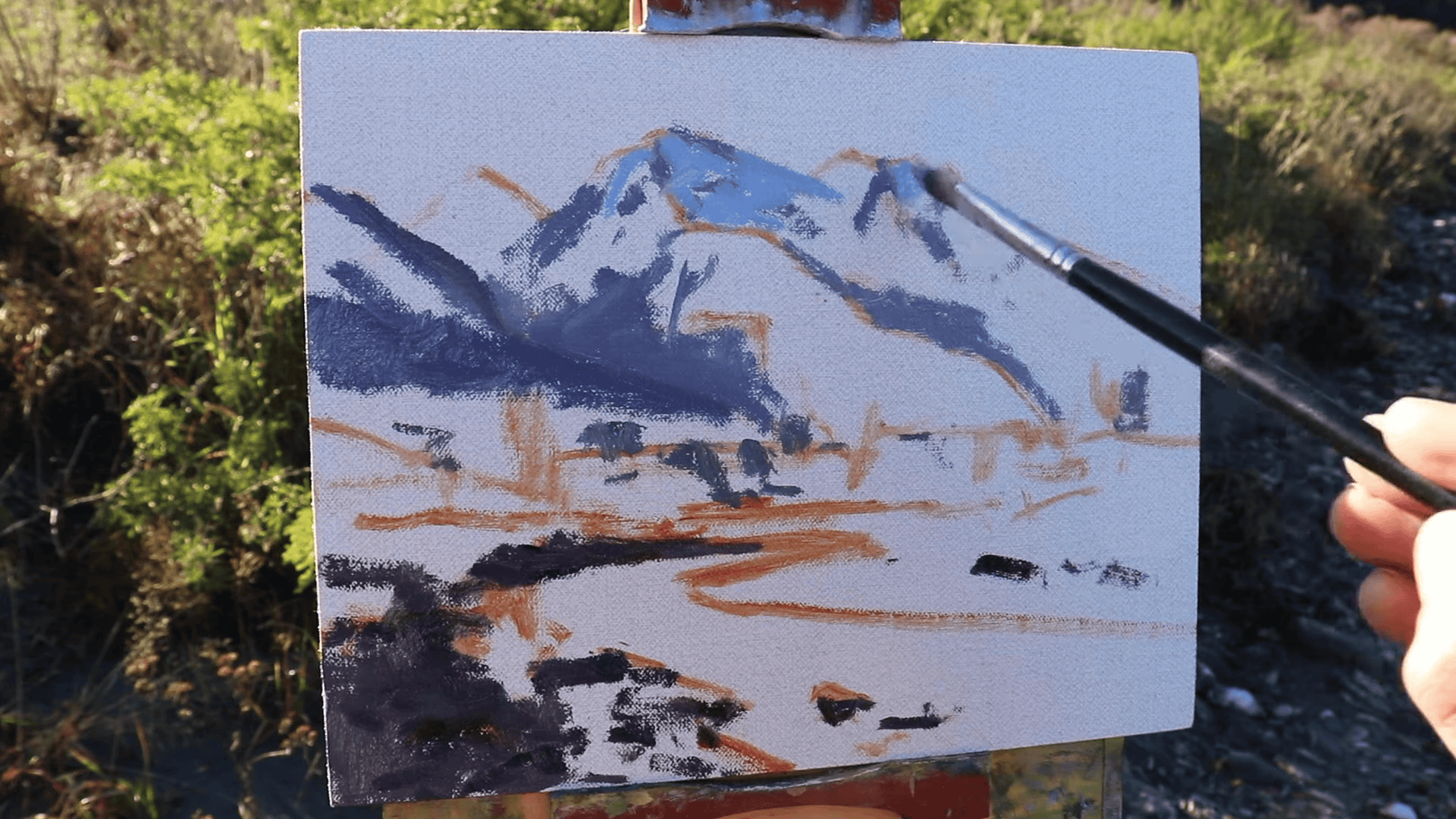
When I’m painting mountains from life, one of the most crucial techniques I’ve learned is to begin with the darkest values and shadows. This approach has saved my paintings countless times, especially when dealing with the ever-changing light conditions of outdoor painting.
Why Dark Values Come First
There’s a good reason for this strategy:
- Establishing Structure: Dark values and shadows define the mountain’s form and create the underlying structure of your painting.
- Adapting to Changing Light: When you’re painting outdoors, the light can shift dramatically in a matter of minutes. By laying down your darkest tones first, you anchor your composition. Even if the lighting changes, you’ll have a solid foundation to work from.
- Creating Contrast: Starting dark allows you to build up to your lighter tones, creating depth and dimensionality in your painting.
My Technique for Blocking in Darks
Here’s how I approach this crucial step:
- I mix my darkest shadow color using Ultramarine Blue and Burnt Sienna. This combination creates a rich, deep tone that’s perfect for mountain shadows.
- Using a large flat brush, I block in the main shadow areas on the mountain, paying attention to the shapes created by ridges and valleys.
- I then add shadows in the foreground, remembering that the darkest darks are often found here.
- As I work, I constantly step back to assess the overall balance of dark values in the composition.
The Palette I Use
For this stage of the painting, I rely on a limited palette:
- Ultramarine Blue: Essential for creating cool shadows and deep sky tones.
- Burnt Sienna: Adds warmth to the shadows and helps create natural-looking earth tones.
- Titanium White: Used sparingly at this stage, mainly for mixing and adjusting values.
- Alizarin Crimson: Useful for adding subtle warmth to shadows or creating distant atmospheric effects.
The Importance of Value in Landscape Painting
I always remind myself of this crucial principle:
“The general rule with painting landscapes is that our darkest darks and lightest lights are typically found in the foreground.”
This guideline helps create depth in your painting. By placing your most extreme values in the foreground, you create a sense of atmospheric perspective, making the mountains appear more distant and majestic.
Pro Tip: Squint to See Values
When I’m unsure about the relative darkness of different areas in my scene, I use a simple trick: I squint my eyes. This blurs the details and allows me to see the basic value structure more clearly. It’s an invaluable technique for ensuring your dark values are placed correctly.
Building Up to Light
Remember, starting with dark values doesn’t mean your painting will end up gloomy. These deep tones counter the lighter values you’ll add later, creating the contrast that brings a mountain scene to life. In the next stages, we’ll build upon this foundation, gradually adding mid-tones and highlights to capture the full majesty of the mountains.
By mastering the technique of starting with dark values and shadows, you’ll set yourself up for a successful painting that captures both the structure and the mood of your mountain landscape.
4. Paint the Areas in Light: Bringing Your Mountain Scene to Life
After establishing the dark values and shadows, I always find it exciting to move on to painting the areas in light. This is where your mountain landscape really starts to come alive as you capture the play of sunlight across the rugged terrain.
The Importance of Light in Mountain Paintings
Light is what gives mountains their drama and grandeur. It highlights textures, defines forms, and creates the atmospheric effects that make mountain scenes so captivating. When painting light areas, I focus on:
- Contrast: The interplay between light and shadow areas creates depth and dimensionality.
- Temperature: Sunlit areas are often warmer in tone compared to shadows.
- Atmospheric perspective: Light areas in the distance typically appear cooler and less saturated due to atmospheric haze.
My Technique for Painting Light Areas
Here’s how I approach this crucial stage:
- I start from the background and work my way forward. This helps me maintain a consistent light direction and intensity across the entire composition.
- For distant sunlit areas, I use a mix of Ultramarine Blue, Titanium White, and a touch of Yellow Ochre to create a cool, slightly warm light that suggests atmospheric haze.
- As I move to middle-ground and foreground areas, I increase the intensity of the light by adding more Yellow Ochre and reducing the amount of Ultramarine Blue.
- For the brightest highlights, I use a mix of Titanium White and Yellow Ochre, sometimes with a tiny touch of Alizarin Crimson for warmth.
Colors I Use for Light Areas
My palette for painting light areas consists of:
- Yellow Ochre: This is my go-to color for warm sunlight. It’s earthy enough to look natural on mountain slopes.
- Titanium White: Essential for creating highlights and adjusting the value of other colors.
- Ultramarine Blue: I use this to cool down mixtures, especially for distant light areas.
- Alizarin Crimson: A small amount can add a beautiful warmth to sunlit areas, especially during “golden hour” lighting.
Pro Tip: Observe Color Temperature Shifts
One key aspect I always pay attention to is the subtle shift in color temperature as light moves across the mountain. Areas in full sunlight are warmest, while areas transitioning into shadow have a cooler tone. Capturing these temperature shifts adds a lot of realism and depth to your painting.
Maintaining Color Harmony
As I paint the light areas, I constantly refer back to the shadow areas to ensure I’m maintaining overall color harmony. I might add touches of my light colors into the shadow mixtures, and vice versa, to create a cohesive feel across the entire painting.
The Importance of Edges
Where light meets shadow is where the magic happens in mountain painting. I pay close attention to these edges:
- Hard edges for sharp ridges and rocky outcrops
- Soft edges for gentler slopes and areas of atmospheric haze
Varying your edge quality adds interest and realism to your mountain scene.
Painting light is not just about making areas brighter. It’s about capturing the way sunlight interacts with the landscape, creating form, depth, and atmosphere. By carefully observing and recreating these light effects, you’ll bring your mountain painting to life, allowing viewers to feel as if they’re standing right there in the scene with you.
5. Use Big Brushes First: Creating Bold, Expressive Mountain Landscapes
One of the most valuable lessons I’ve learned in my years of painting mountains from life is the power of starting with big brushes. This approach has transformed the way I tackle outdoor painting, allowing me to capture the essence of a scene quickly and expressively.
The Advantages of Large Brushes
When I’m standing before a majestic mountain vista, ready to paint, I always reach for my largest brushes first. Here’s why:
- Speed: Large brushes cover more area quickly, crucial when racing against changing light conditions.
- Expressiveness: Bigger brushes naturally create more gestural, dynamic strokes that can capture the energy of a landscape.
- Simplification: They force you to focus on large shapes and overall composition rather than getting lost in details too early.
- Texture: Large brushes can create interesting textures that add depth and character to your mountain surfaces.
My Large Brush Technique
Here’s how I approach the initial stages of my mountain paintings using large brushes:
- I start with the biggest brush I can reasonably use for the size of my canvas.
- Using broad, confident strokes, I block in the major shapes of the mountains, sky, and foreground.
- I focus on capturing the overall light and shadow patterns, not worrying about fine details.
- I vary the pressure and angle of the brush to create different effects – from bold, defined edges to softer, more blended areas.
Choosing the Right Brushes
For this stage, I typically use:
- Large flat brushes (1-2 inches wide) for broad areas of sky and mountain slopes
- Big filbert brushes for more rounded shapes and blending
- Large fan brushes for creating texture in foliage or rugged mountain surfaces
Pro Tip: Embrace Imperfection
When using large brushes, I remind myself to embrace imperfection. The goal isn’t photorealistic detail, but to capture the mood and essence of the scene. Those seemingly random brush marks often add character and energy to the final painting.
Transitioning to Smaller Brushes
As the painting progresses, I gradually move to smaller brushes. But I always keep in mind the bold shapes and strokes established with the large brushes. This helps maintain a sense of cohesion and prevents me from getting too caught up in minor details.
The Psychological Benefit
There’s also a psychological benefit to starting with big brushes. It helps overcome the intimidation of a blank canvas and gets you into the flow of painting more quickly. By making bold moves early on, you set a confident tone for the rest of your painting session.
When you’re painting mountains from life, you’re not just recreating what you see, you’re interpreting it. Large brushes help you tap into that interpretive, expressive side of landscape painting. They allow you to capture not just the physical reality of the mountains, but the feeling of awe and grandeur they inspire.
So next time you’re out there, ready to capture a mountain scene, don’t be afraid to go big with your brushes. You might be surprised at how this approach can invigorate your painting process and lead to more dynamic, expressive mountain landscapes.
6. Maintain Color Harmony: Creating a Cohesive Mountain Landscape
In my years of painting mountains from life, I’ve found that achieving color harmony is one of the most crucial elements in creating a compelling landscape. It turns a collection of individual elements into a unified, breathtaking scene that captures the essence of the mountains.
The Importance of Color Harmony in Mountain Painting
Color harmony is more than just making colors look good together. It’s about creating a visual rhythm and balance that guides the viewer’s eye through your painting. In mountain landscapes, it helps to:
- Unify diverse elements (sky, mountains, foreground)
- Create a sense of atmosphere and depth
- Evoke the mood and time of day
- Enhance the overall visual appeal of your painting
My Approach to Color Harmony
Here’s how I ensure color harmony in my mountain paintings:
- Limited Palette TechniqueI stick to a small set of carefully chosen colors. This naturally creates harmony as all mixed colors share common parents. My go-to palette includes:
- Ultramarine Blue: For skies, shadows, and cool tones
- Titanium White: For mixing and highlights
- Burnt Sienna: For warm earth tones and mixing with blue for rich darks
- Alizarin Crimson: For adding warmth to shadows and creating atmospheric purples
- Yellow Ochre: For sunlit areas and mixing with blue for greens
- Cobalt Teal: For adding vibrancy to skies and water features
- Color Temperature Balance I always ensure a balance between warm and cool colors. If my shadows are cool (bluish), I make sure my light areas have some warmth (yellows and reds). This creates a pleasing contrast and vibrance.
- Atmospheric Perspective I use color to create a sense of depth. Distant mountains are cooler and less saturated, while foreground elements are warmer and more vibrant.
- Unifying Color I often choose one color to weave throughout the entire painting. For example, if I’m painting a sunset scene, I might add touches of warm orange to all parts of the painting, even the shadows.
Adapting to Changing Light
When painting mountains from life, the light can change rapidly. I’ve learned to anticipate these changes and adjust my palette accordingly. If the light becomes warmer as the sun sets, I’ll gradually introduce more warm tones into my mixtures.
The Role of Observation
Achieving color harmony starts with careful observation. I spend time studying the scene before I start painting, noting how colors interact and change across different parts of the landscape. This mental preparation helps me maintain harmony as I paint.
Color harmony doesn’t mean your painting should be monotonous. It’s about creating a cohesive color story that enhances the beauty and mood of your mountain scene. By mastering color harmony, you’ll be able to create mountain landscapes that look beautiful and evoke the emotions and atmosphere of the scene you’re capturing.
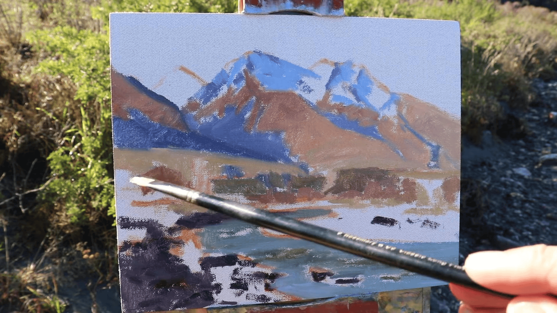
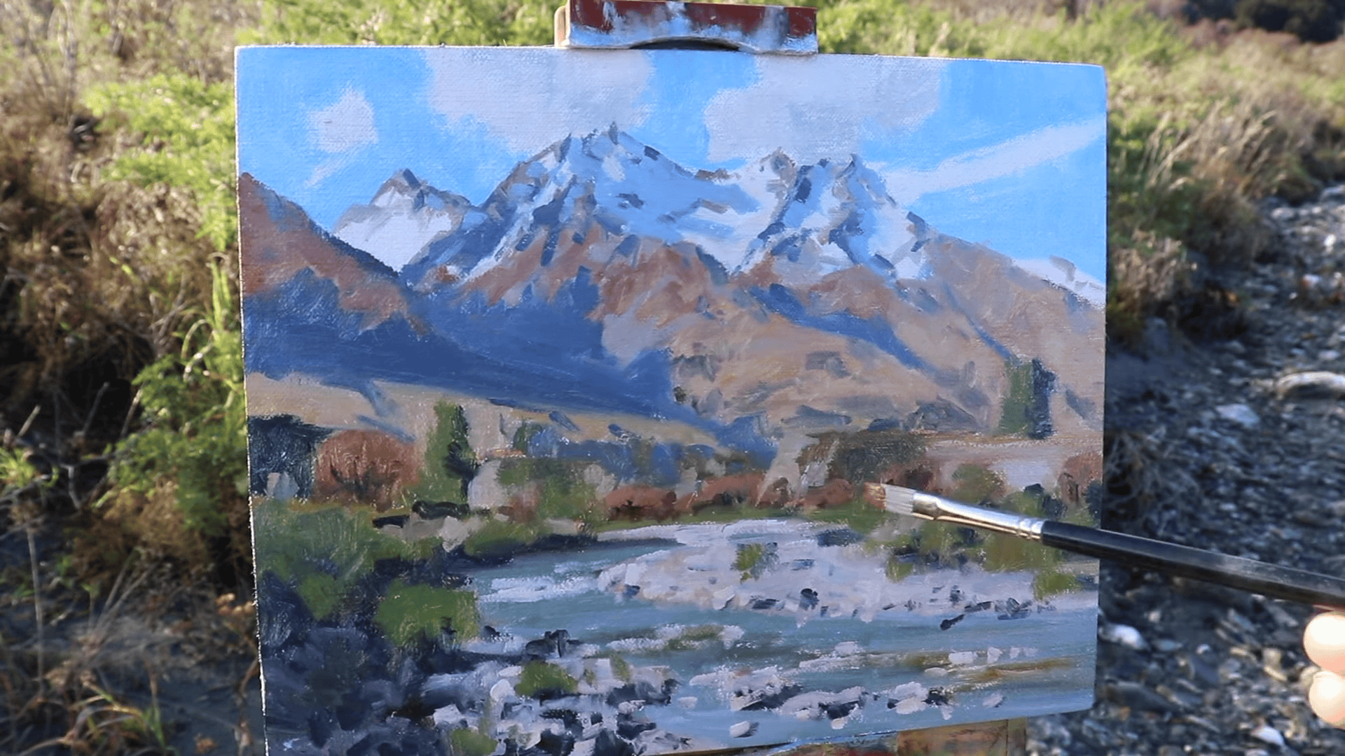
7. Add Details and Restate Dark Values: Bringing Your Mountain Landscape to Life
As I near the completion of a mountain landscape, I always find myself getting excited about this crucial stage: adding details and restating dark values. This is where the painting truly comes to life, gaining depth, dimension, and a sense of realism that can transport the viewer right into the scene.
The Importance of Details and Dark Values
Adding details and restating dark values serves several important purposes in a mountain painting:
- It enhances the sense of depth and dimensionality.
- It draws the viewer’s eye to key focal points in the composition.
- It adds a level of realism and specificity to the scene.
- It helps to reestablish the tonal range that may have been lost during the painting process.
My Approach to Adding Details
Here’s how I tackle this stage of the painting process:
- Assess the Painting I step back and look at the painting as a whole, identifying areas that need more definition or contrast.
- Focus on Key Areas I typically concentrate on adding details to:
- Mountain ridges and peaks
- Rock formations in the foreground
- Trees or vegetation
- Water features like streams or lakes
- Use a Smaller Brush For this stage, I switch to a smaller brush. My go-to is a Number 3 Synthetic Flat Brush. Its size allows for precision, while its flat shape can still create varied marks.
- Restate Dark Values I carefully reapply dark values, especially in shadow areas and crevices. This helps to reestablish the full range of values in the painting.
- Add Highlights I add small touches of light to create sparkle and focus. This might be sunlight catching the edge of a rock or glinting off a distant snow-capped peak.
Techniques for Effective Detailing
- Dry Brush Technique I often use a dry brush technique for adding texture to rocky surfaces or vegetation. This involves using a brush with very little paint to create scratchy, textured marks.
- Palette Knife for Rock Formations For bold, angular rock formations, I sometimes switch to a palette knife. This can create sharp, geometric shapes that perfectly capture the rugged nature of mountain geology.
- Glazing for Subtle Details To add subtle details or adjust colors, I use thin glazes of transparent paint. This allows me to build up detail without obscuring the underlying layers.
Pro Tip: Less is More
While it’s tempting to add lots of fine details, I always remind myself that less is often more. The goal is to suggest detail rather than render every single element. This allows the viewer’s imagination to engage with the painting.
Restating Dark Values
Restating dark values is crucial for maintaining the painting’s depth and drama. Here’s how I approach it:
- I mix my darkest value again, usually a combination of Ultramarine Blue and Burnt Sienna.
- I carefully apply this to the deepest shadow areas, paying attention to the forms of the mountains.
- I use this dark value to sharpen edges where needed, like the silhouette of a mountain against the sky.
Balancing Act
Adding details and restating darks is a balancing act. The key is to enhance the painting without overworking it. I constantly step back to assess the overall effect, ensuring that the details are serving the composition as a whole.
The goal of this stage is not to radically change your painting, but to refine and enhance what’s already there. By carefully adding details and restating dark values, you can take your mountain landscape from good to great, creating a painting that truly captures the majesty and drama of the mountains.
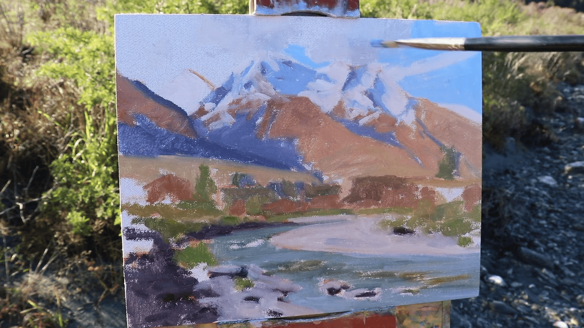
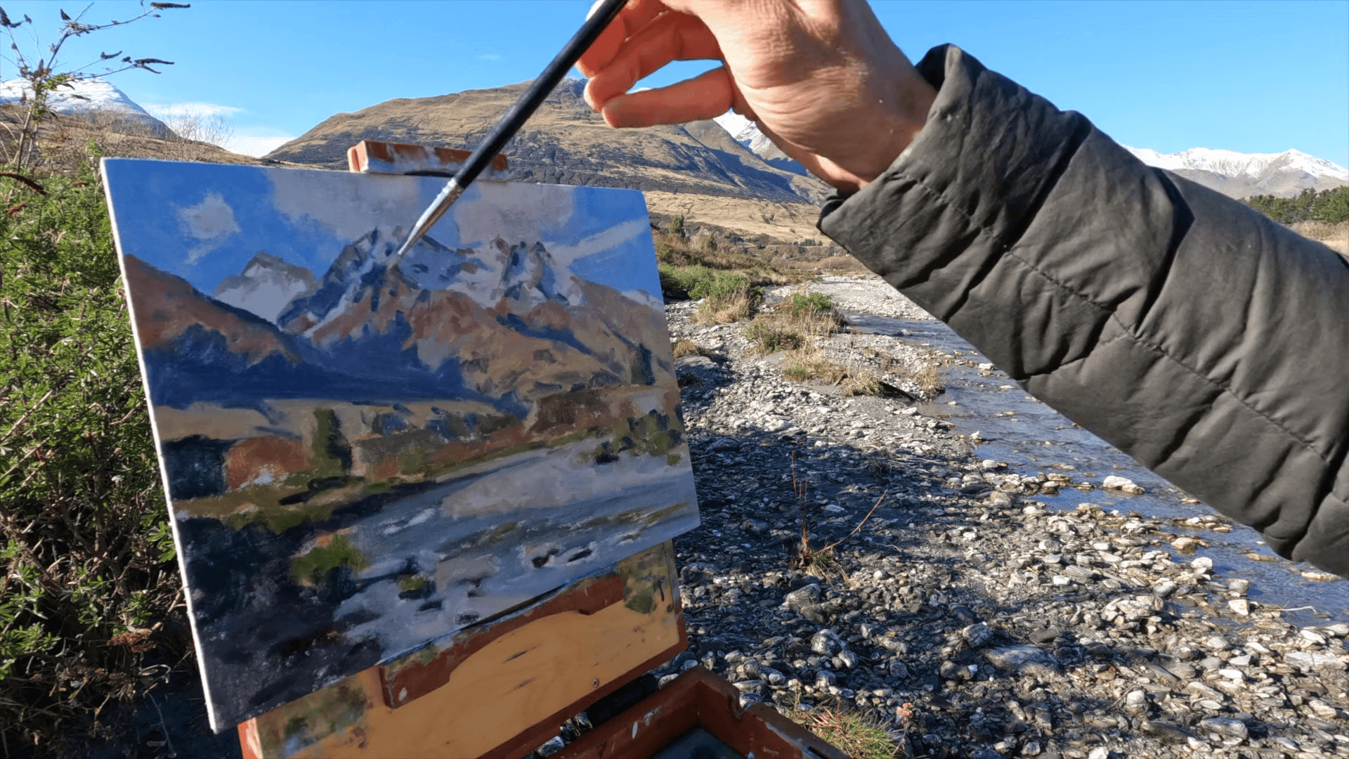
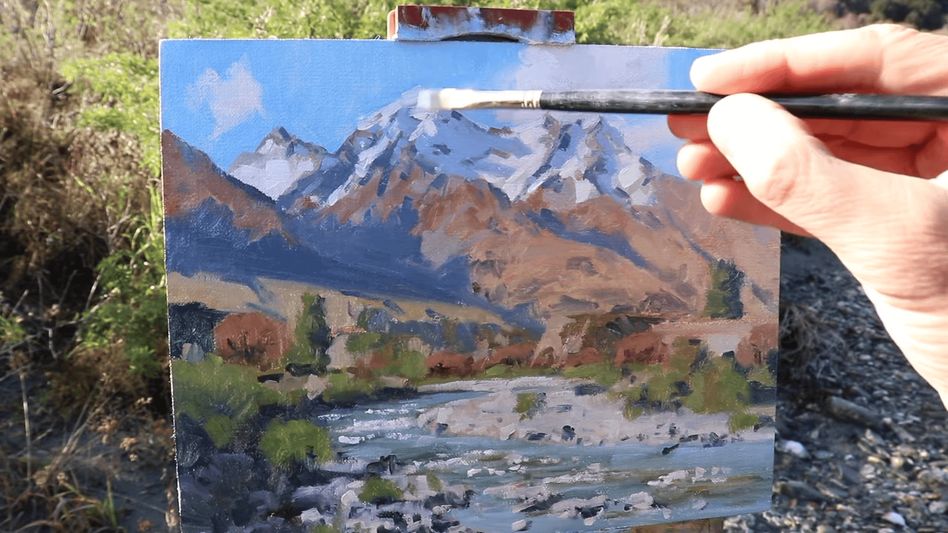
8. Save Your Lightest Lights for Last: The Final Touch of Mountain Magic
In my years of painting mountains from life, I’ve learned that timing is everything when it comes to adding the lightest lights. Saving these brilliant highlights for the very end of your painting process can truly make your mountain landscape come alive with a sense of luminosity and depth.
The Power of Lightest Lights
The lightest areas in a painting serve several crucial purposes:
- They create focal points that draw the viewer’s eye.
- They enhance the sense of three-dimensionality and form.
- They contribute to the overall mood and atmosphere of the scene.
- They can suggest specific lighting conditions, like the glare of midday sun or the soft glow of dawn.
My Approach to Adding the Lightest Lights
Here’s how I tackle this final, exciting stage of the painting process:
Identify Key Areas. I carefully consider where the lightest lights should go. In mountain scenes, this often includes:
- Snow-capped peaks
- Sunlit ridges
- Reflections on water surfaces
- Bright elements in the foreground, like a sunlit riverbank
Mix the Perfect Light Tone. My go-to mixture for the lightest lights is:
- Titanium White: For its opacity and brightness
- Yellow Ochre: To add a touch of warmth, mimicking sunlight The ratio depends on the specific lighting conditions I’m trying to capture. For a cool, bright light, I use more white; for a warmer glow, I increase the yellow ochre.
Apply with Precision. I use a small brush and apply these highlights with careful, deliberate strokes. Less is often more, a few well-placed dabs of light can be more effective than broad areas of bright paint.
Techniques for Effective Highlights
- Broken Color: I often use a broken color technique instead of solid highlight areas. This involves applying small strokes of pure light color next to strokes of a slightly darker tone. From a distance, this creates a vibrant, shimmering effect.
- Scumbling For softer highlights, like the glow on distant snow-capped peaks, I use a scumbling technique. This involves lightly dragging a nearly-dry brush loaded with light paint over a darker, dry underlayer.
Pro Tip: Squint to Assess
Before adding highlights, I always take a moment to squint at my painting. This helps me see where the lightest lights truly belong in relation to the overall value structure of the piece.
The Importance of Restraint
While it’s tempting to add lots of bright highlights, I’ve learned that restraint is key. Too many light areas can diminish the impact of each one. I always remind myself that the power of the lightest lights comes from their contrast with the darker areas of the painting.
Adapting to the Scene
Every mountain scene is unique, and the placement and intensity of the lightest lights will vary depending on the specific conditions you’re painting. In my example, the riverbank and mountain snow were the key light areas. In other scenes, it might be a sunlit meadow in the foreground or the brilliant edge of a cloud above the peaks.
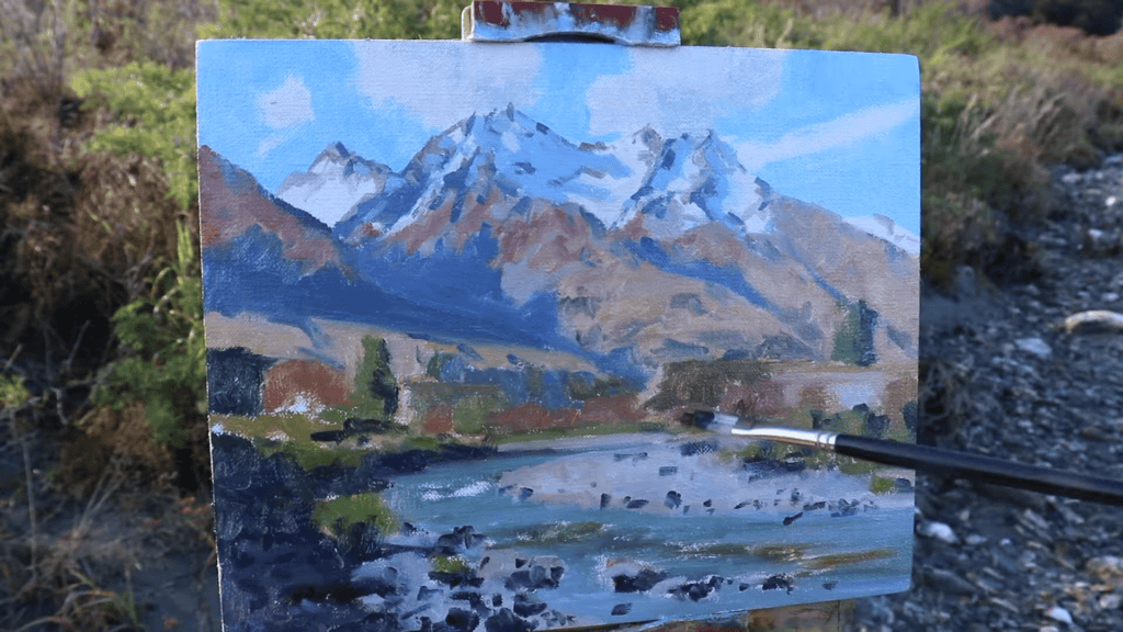
A Final Check
After adding the lightest lights, I always take a step back and assess the painting as a whole. Does it capture the mood and atmosphere I was aiming for? Do the highlights enhance the sense of depth and dimensionality? If needed, I make small adjustments until everything feels just right.
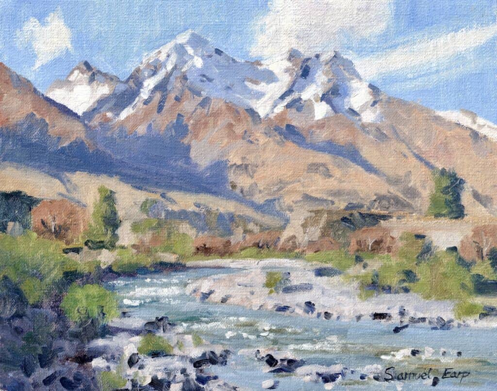
Adding these final touches of light is like adding the sparkle to your mountain scene. It’s these bright points that often make viewers pause and say, “Wow, it feels like I’m really there!” By mastering the art of placing your lightest lights, you can create mountain landscapes that truly capture the awe-inspiring luminosity of these majestic natural scenes.
Conclusion: Mastering the Art of Painting Mountains from Life
As we wrap up this journey through the essential tips for painting mountains from life, I can’t help but reflect on the incredible experiences I’ve had standing before majestic peaks, brush in hand. Painting outdoors, or “en plein air” as it’s often called, is truly a unique and rewarding experience. It challenges you, inspires you, and connects you with nature profoundly.
The Rewards of Outdoor Mountain Painting
Painting mountains from life offers rewards that go beyond the finished artwork:
- It sharpens your observational skills, training your eye to notice subtle color shifts and value changes.
- It encourages quick decision-making and spontaneity as you race against changing light conditions.
- It deepens your appreciation for the natural world and the grand scale of mountain landscapes.
- It produces paintings with a freshness and authenticity that’s hard to achieve in the studio.
Overcoming the Challenges
Of course, painting outdoors comes with its unique set of challenges. Changing weather, shifting light, and the physical demands of painting on location can all be daunting. But by following the eight essential tips we’ve discussed, you’ll be well-equipped to handle these challenges:
- Carefully choose your subject
- Sketch your composition
- Start with dark values and shadows
- Paint the areas in light
- Use big brushes first
- Maintain color harmony
- Add details and restate dark values
- Save your lightest lights for last
Each of these steps builds on the others, creating a logical process that helps you navigate the complexities of mountain landscapes.
The Journey of Improvement
Mastering the art of painting mountains from life is a journey, not a destination. Each painting is an opportunity to learn and improve. Don’t be discouraged if your first attempts don’t match your vision – that’s all part of the process. With practice, you’ll find yourself creating more dynamic, expressive mountain landscapes that truly capture the essence of the scenes before you.
Final Thoughts
As you embark on your mountain painting adventures, keep in mind that while the technique is important, it’s your unique vision and emotional response to the landscape that will make your paintings truly special. Let the grandeur of the mountains inspire you, and don’t be afraid to let that inspiration shine through in your work.
Remember to choose your subject carefully, embracing the interplay of light and shadow. Start with your dark values to establish a strong foundation, and build up to those brightest highlights that will make your painting sing. Maintain color harmony throughout, and don’t shy away from using those big brushes to capture the bold, sweeping forms of the mountains.
Most importantly, enjoy the process. There’s something magical about capturing the beauty of mountains on canvas, translating that three-dimensional majesty into a two-dimensional work of art. It’s a challenge, certainly, but one that offers rich rewards.
Bonus Tips & Resources
Struggling with Depth, Composition, colours and values?
Many artists struggle to create depth, achieve correct tonal values, and handle composition intricacies.
If you’re facing these challenges, don’t worry, there’s help available! I’m offering a free landscape painting blueprint to aid you.
Sign up using the link below and join our free art community with tutorials and tips.
Are you Struggling with Depth, Composition, colors, and values?
Many artists struggle to create depth, achieve correct tonal values, and handle composition intricacies.
If you’re facing these challenges, don’t worry; there’s help available!
I’m offering a free landscape painting blueprint to aid you.
Sign up using the link below and join our free art community with tutorials and tips.
