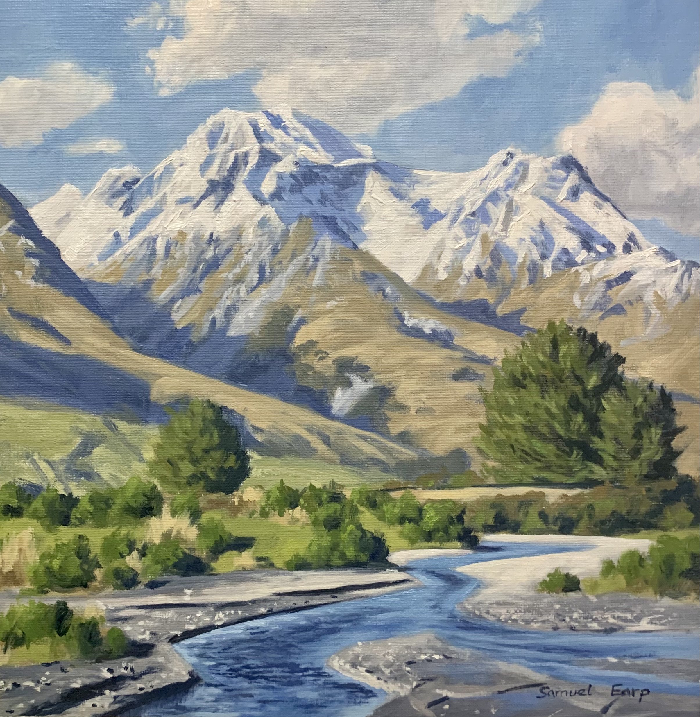
In this blog post I will show you how to paint this mountain landscape and I’ll give you tips on painting the mountains in a manner that they look like they are in the distance.
This mountain landscape painting is inspired by the Glenorchy area of southern New Zealand.
Suitable for oils and acrylics.
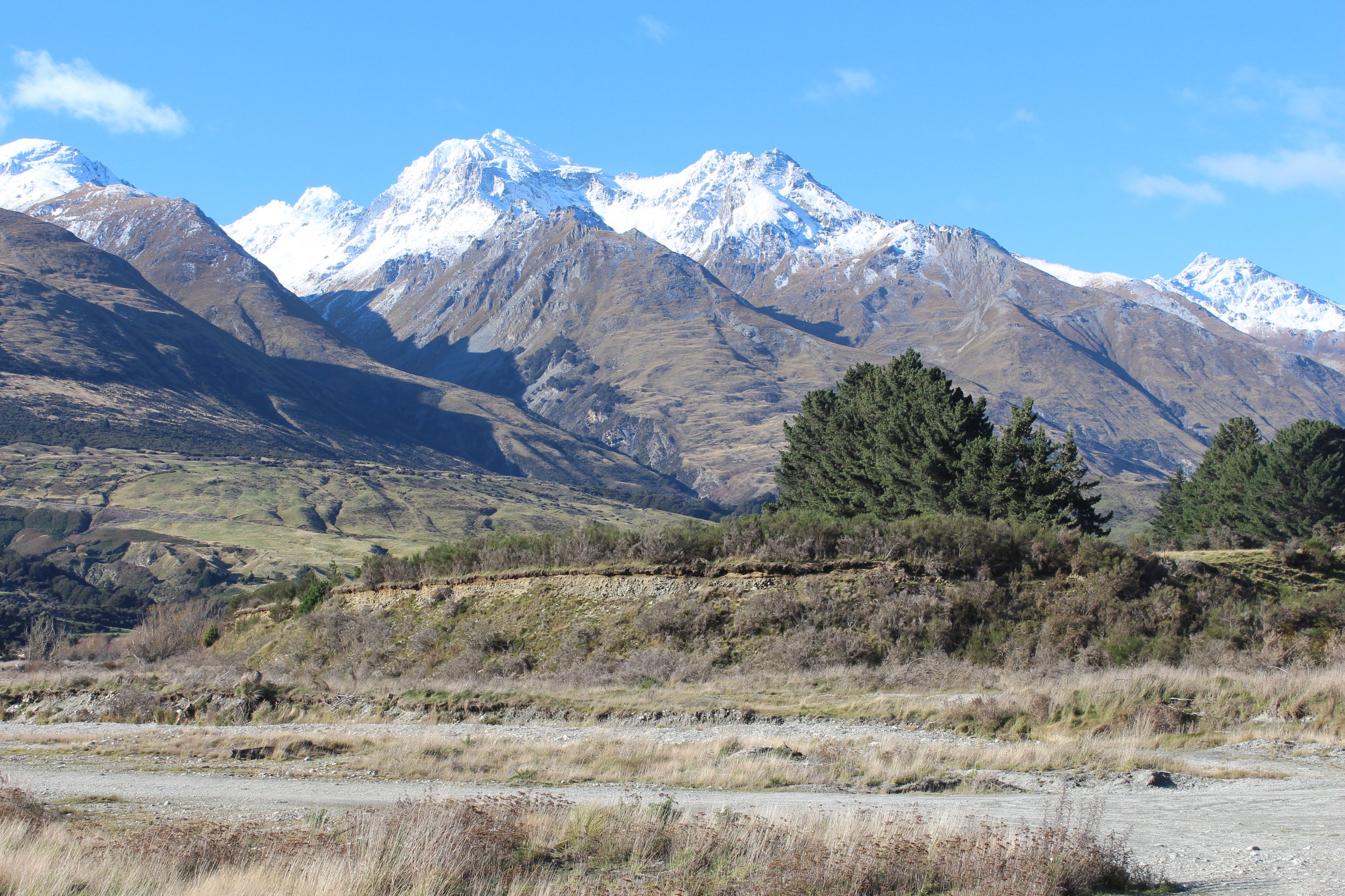
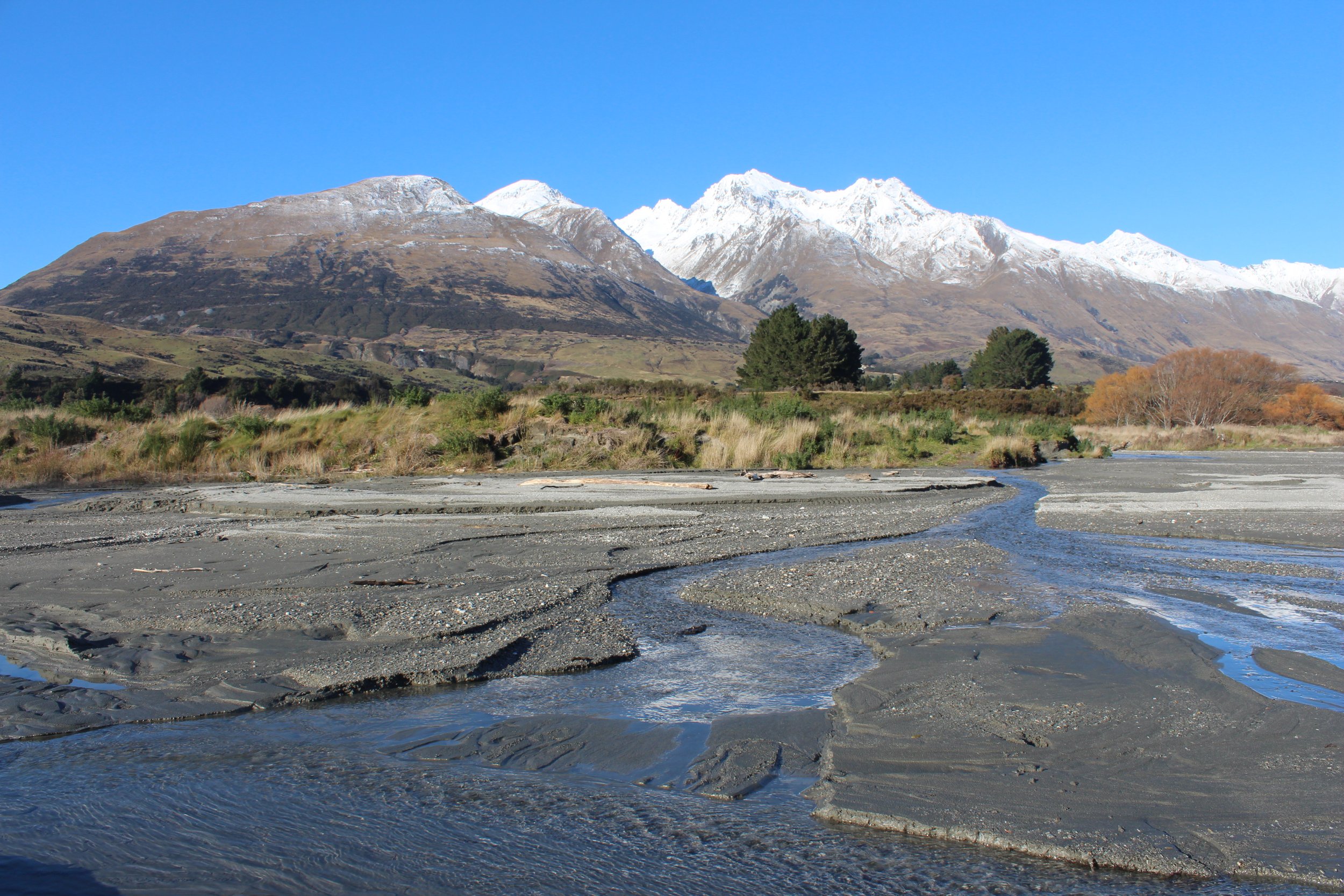
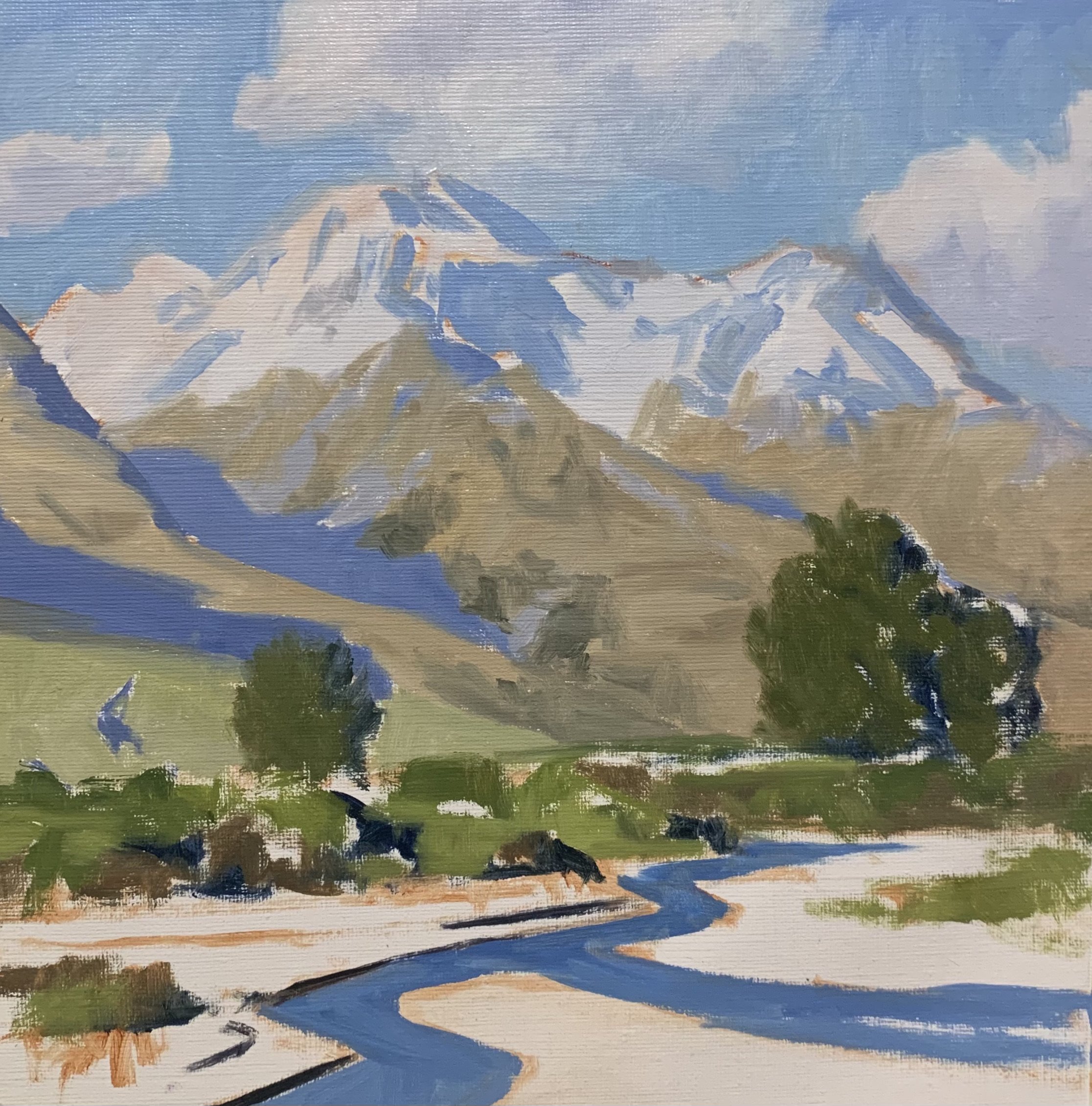
Reference Photos
Here are a couple of reference photos I took and used for this painting. Please feel free to use or copy these photos if you would like to have a go at painting this art work.
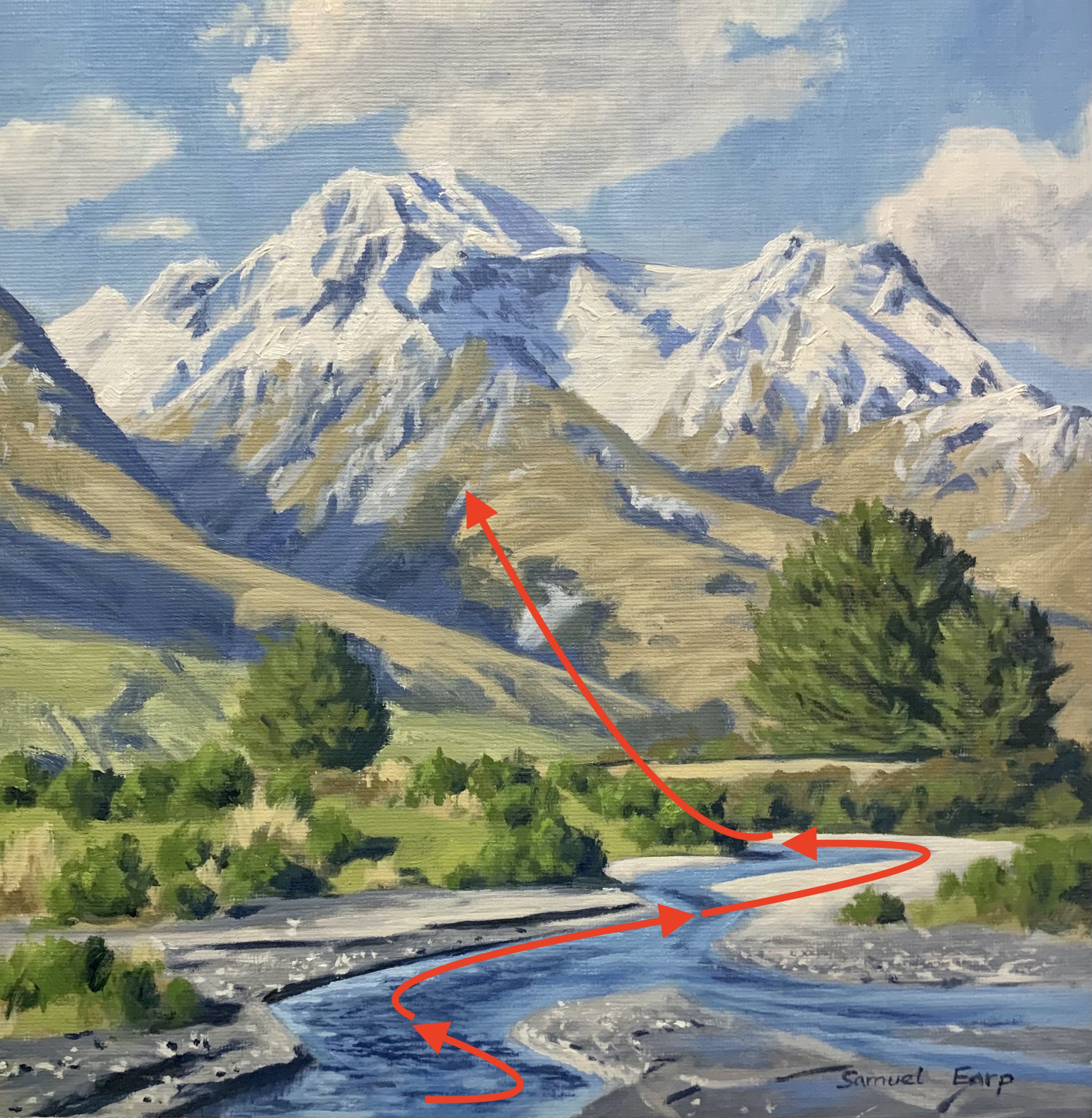
Composition
The composition in this painting follows an ‘S’ composition where the stream is leading the eye towards the mountains in the background. The ‘S’ composition implies rhythm in the painting.
In creating this composition I used several photos to come up with a design for this painting.
Art Tip
Painting the mountain summits nearer the top of the canvas communicates great height.
Colours
I painted this artwork using oil paint and the colours I used in this painting are as follows:
- Titanium white
- Burnt sienna
- Yellow ochre
- Cadmium yellow
- Cadmium red light
- Alizarin crimson
- Ultramarine blue
- Phthalo green
Brushes
Here is a list of the brushes I used in this painting:
- No.6 flat
No.5 flat
- No.3 flat
- No.2 flat
- No.3 filbert
- No.1 round
- No.0 round
Painting Demonstration
Stage 1 – Blocking-In The Painting
I am painting on a 12” x 12” loose linen canvas. The linen is an oil primed medium weave linen and I taped it onto a board whilst I was painting this art work. When the painting was finished I peeled off the tape to reveal the finished painting.
I sketch the composition using a No.1 round brush with burnt sienna mixed with Liquin Original (Liquin). I am using Liquin as a medium to thin the paint and it also has the advantage of speeding up the drying time.
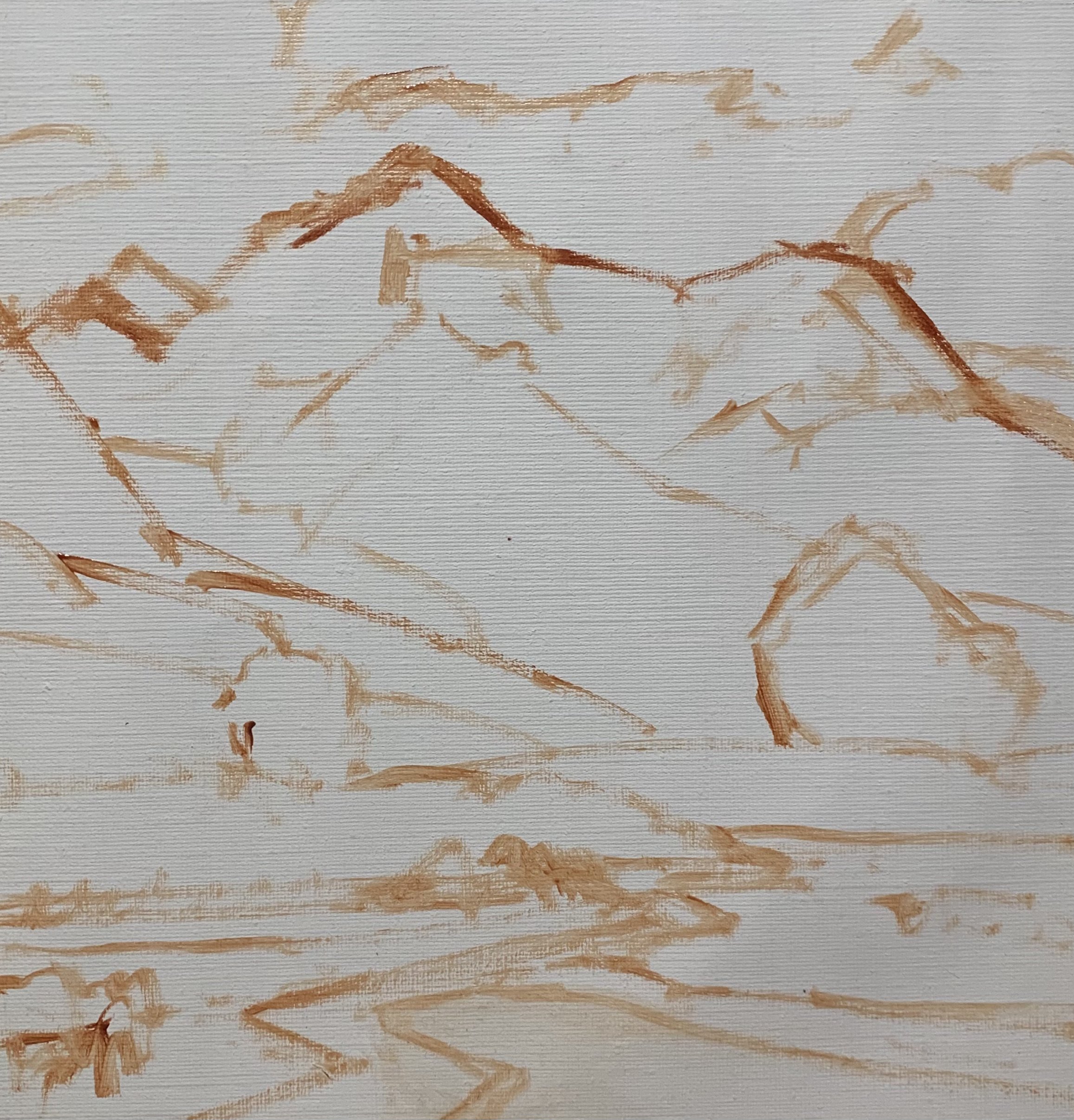
Paint Your Dark Values and Shadows First
Whenever I start a painting I always identify where the dark values and shadows are first in the scene I am painting. Value refers to how light or dark a subject is and by painting in the dark values first I personally find it is much easier to create atmospheric perspective my paintings. It also makes it easier to add the areas in light and to get the saturation of your colours correct once you have painted your dark values.
When painting distant mountains it is important to pay attention to the values we are using so that the mountains look like they are in the distant. The means the values cannot be too dark. The darkest darks in the mountains will be lighter than the darkest darks in the foreground.
I paint the cloud shadows using a mix ultramarine blue, burnt sienna, titanium white and a little alizarin crimson. I use the same colour combination for the mountain shadows but with less titanium white in the mix so the value is darker.
The darkest shadows are in the foreground. I paint the shadows at the banks of the stream using ultramarine blue and burnt sienna.
For the tree shadows in the mid ground I use a mix of ultramarine blue and a little yellow ochre.
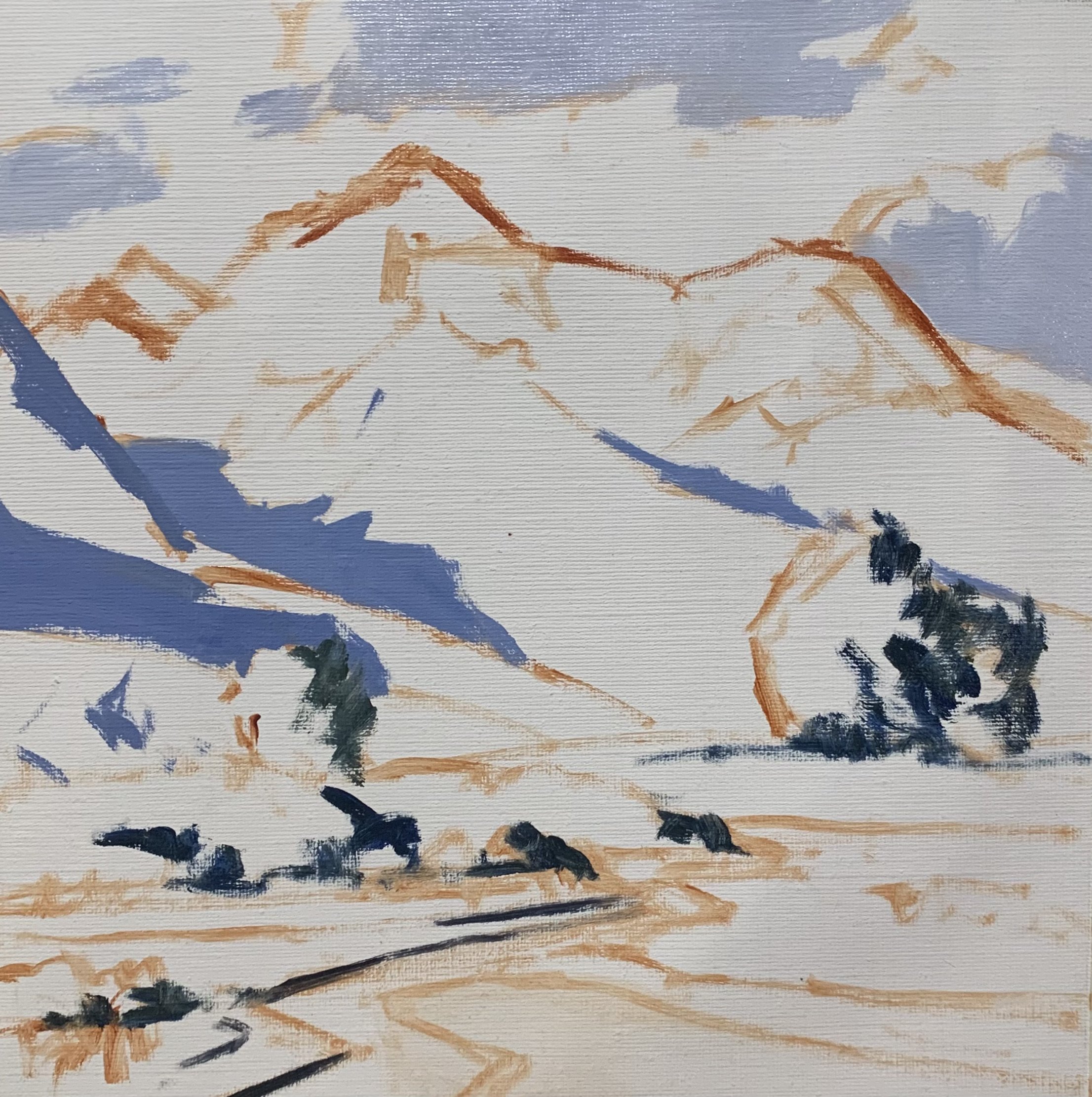
I paint the cloud highlights with a mix of titanium white and burnt sienna and I allow the shadows to mix into the highlights as I blend the clouds. I also use the highlight mix to paint the snow on the mountains.
The sky is a mix of ultramarine blue, titanium white and a little phthalo green.
The snow shadows on the mountain is mainly a mix of ultramarine blue and titanium white with a dash of burnt sienna and alizarin crimson. I have used the same colours for the exposed rock faces in the full sunlight however I have used more burnt sienna in my mix.
Art Tip:
By using similar colours throughout the painting, you are much more likely to create colour harmony in your painting. This means the painting will read well. I have used similar colour combinations for the clouds and mountains.
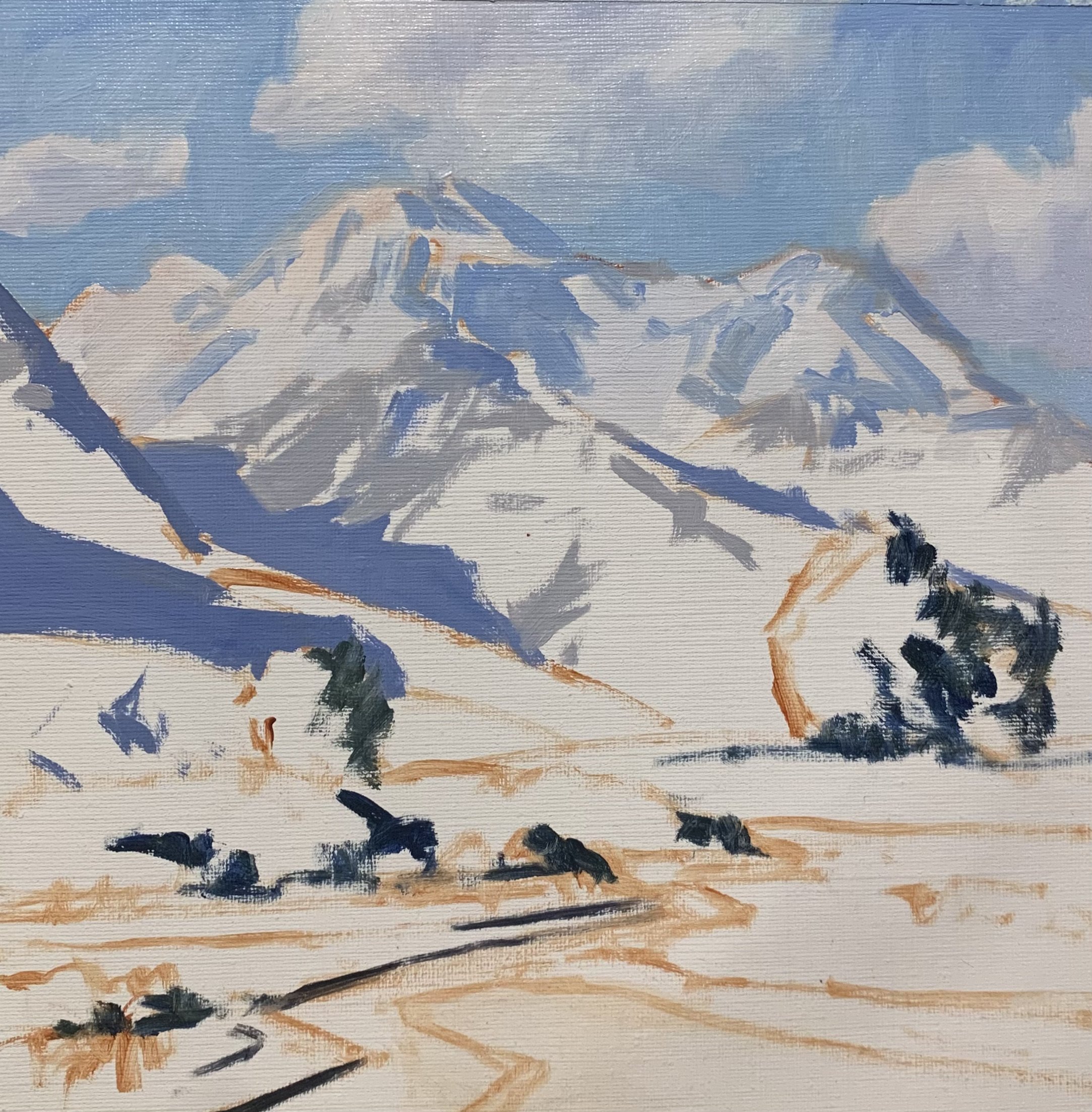
The lower section of the mountains have tussock grass growing on them which is a pale rusty yellow colour. This is a low chroma colour and it can’t be too saturated otherwise the mountain will leap forward in the painting.
I mix the colour for the mountain grass using yellow oxide, titanium white, burnt sienna and a small amount of ultramarine blue.
I paint the distant grass on the lower mountain using a mix of yellow oxide, ultramarine blue, titanium white and little alizarin crimson and a dash of phthalo green.
For the trees and mid ground vegetation I use much more saturated greens. The pine trees are a mix of yellow ochre, cadmium yellow, a little cadmium red light and titanium white. I use the same colours for the grass and bushes in the in the mid ground and I vary the colours in the mix. I have also added a little phthalo green to increase the saturation and create some emerald tones.
I paint the metallic colour of the stones and silt in the flood plain using a mix of ultramarine blue, burnt sienna, titanium white and a little alizarin crimson. As I have used these colours in the clouds and the mountains it’s going to tie these zones together and make the painting look more harmonious.
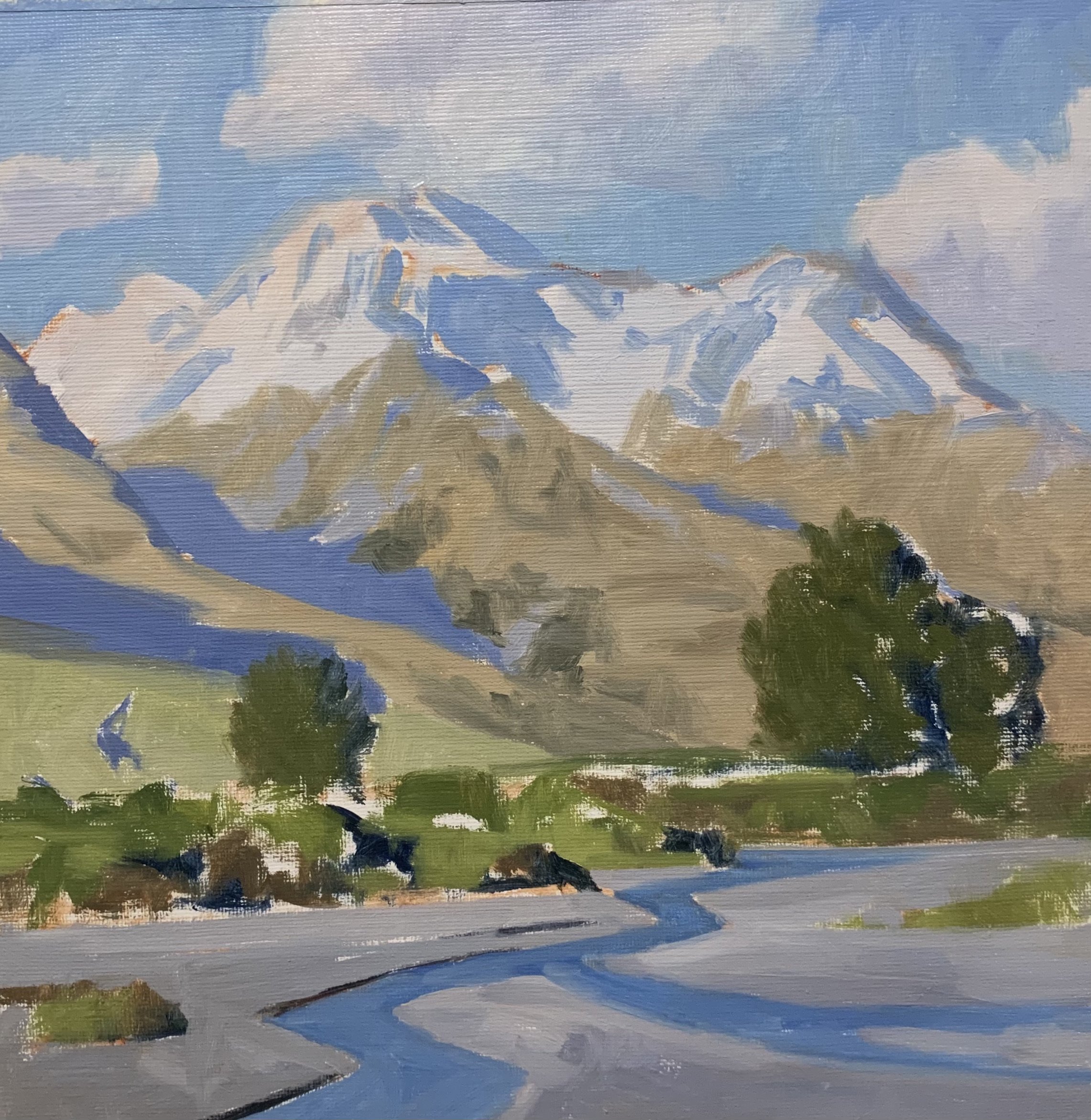
I complete the first stage of the painting by restating the dark values in the shadows of the mountains, trees and vegetation in the mid ground. I also paint the suggestions of exposed rock faces within the mountains.
At this point I let the painting dry so I can start adding details to it.
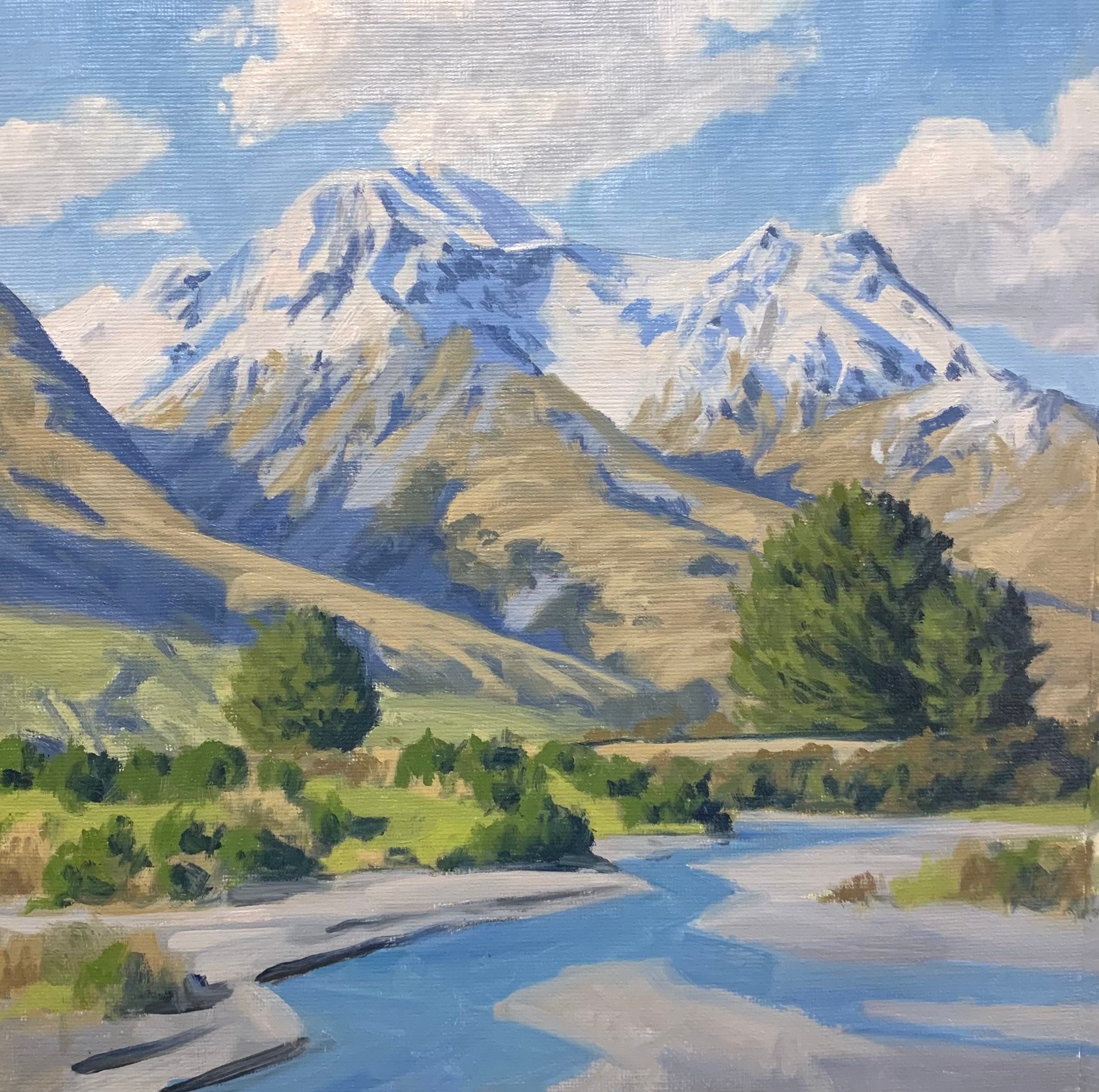
Stage 2 – Adding Details, Modelling and Refining the Painting
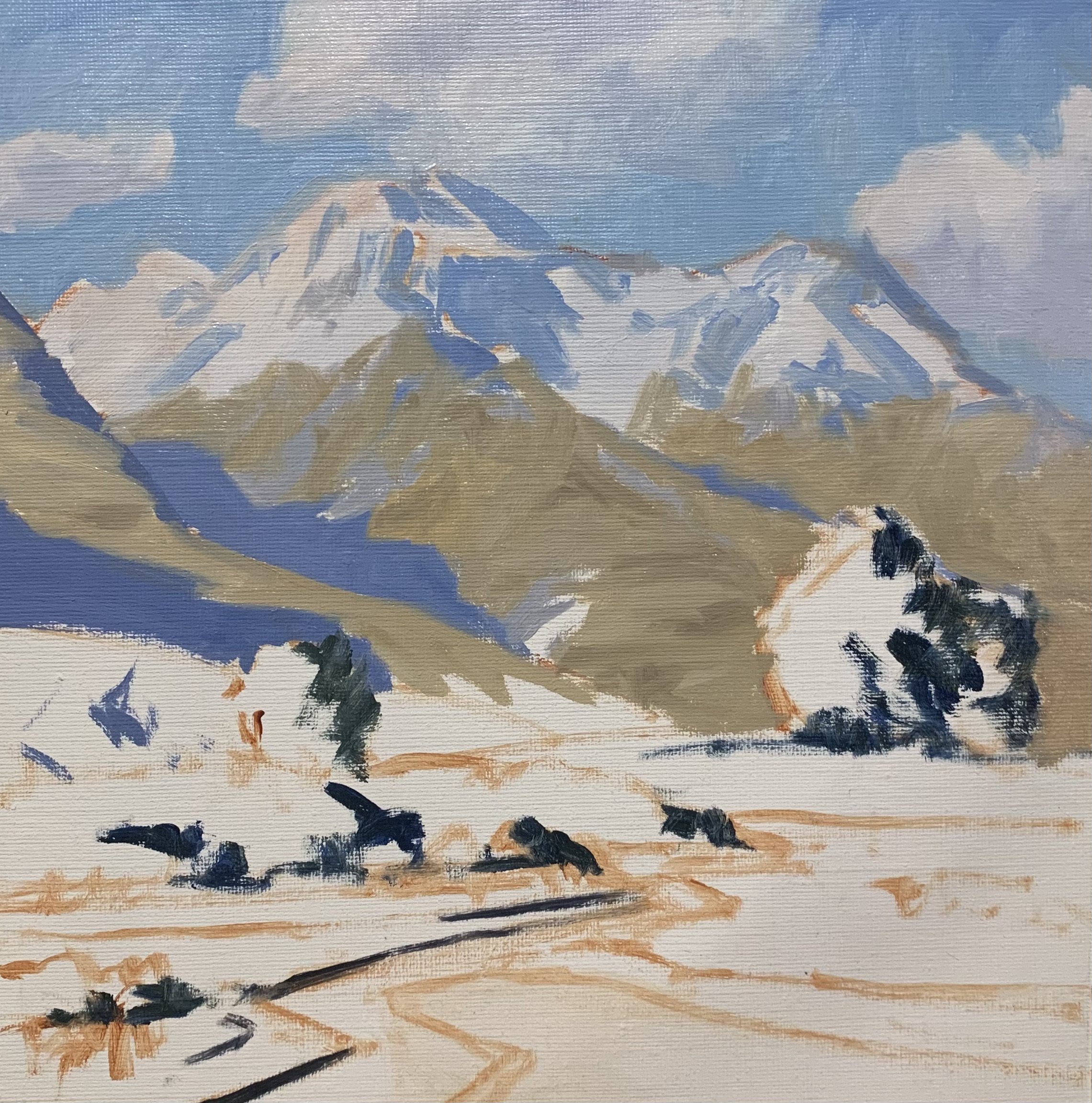
Once the painting was dry I began adding details to it which included refining the clouds and sky and building up the details in the mountains.
I added some more layers of snow to the mountains but I keep the value of the paint a little darker so I have room to add my lightest values when I come to finish the painting. This will make the mountain look more three dimensional. By using titanium white and adding a small amount of ultramarine blue and burnt sienna this will make the value of the snow a little darker.
As I work through the rest of the painting I am essentially using the same colour mixes but making sure that many of the values are lighter than those initial layers during the ‘blocking-in’ stage so as to communicate three dimensional forms.
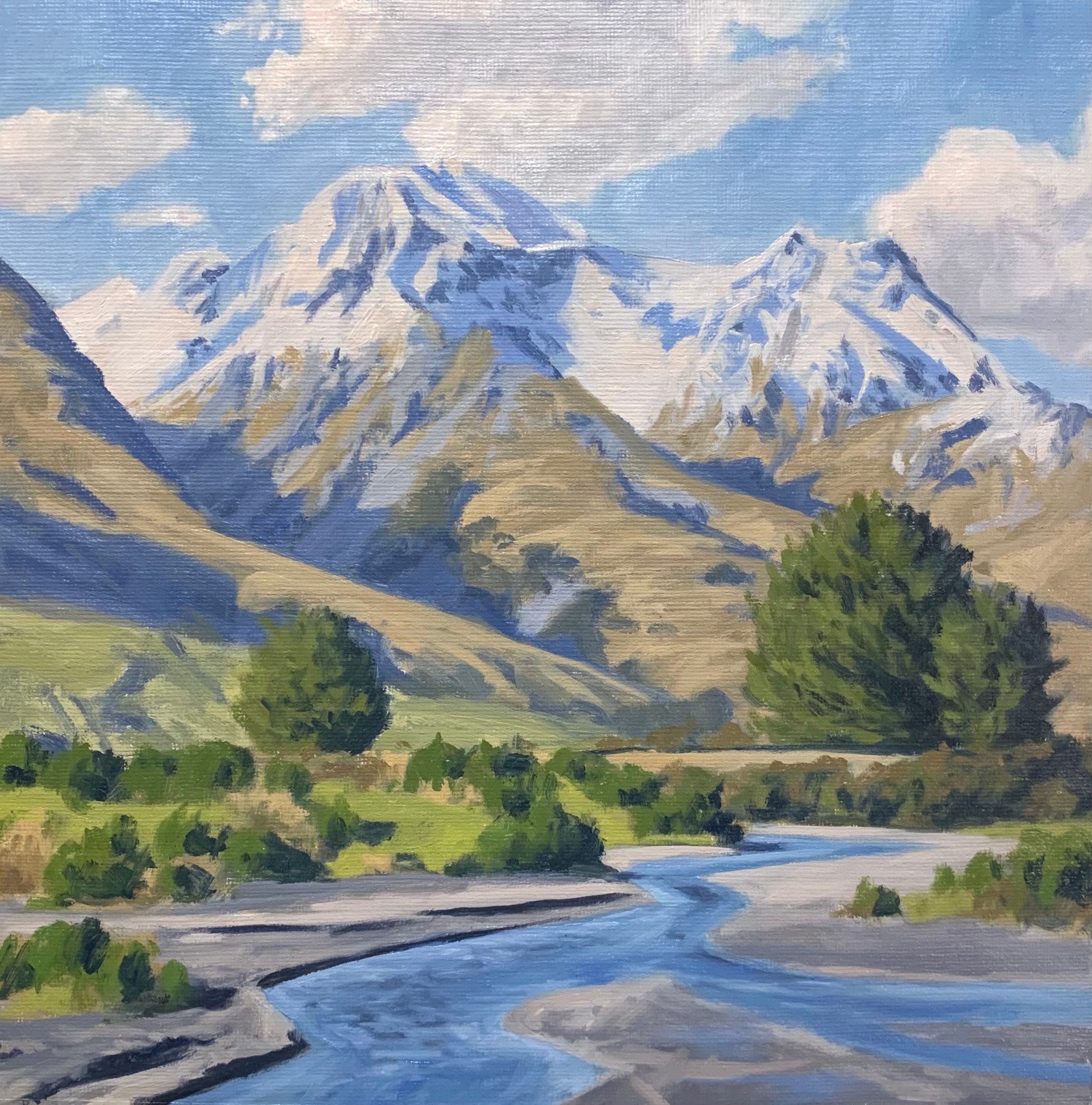
Stage 3 – Final Details
After spending time building up the details in the painting I let it dry so I could add the last details and final highlights which I always save until last.
I add the final layers to the snow using my lightest value colour which I saved until the end. This is a mix of titanium white and a little yellow ochre. There are also subtle highlights I add to the exposed rock faces in the mountains.
I paint some lighter value colour in the pine tree foliage, using the same colours I used in the blocking-in stage (yellow ochre, cadmium yellow, ultramarine blue, cadmium red light and titanium white) but I use more titanium white in my mix.
I add my final details to the water and flood plain in the foreground by painting the suggestion of stones and pebbles and also ripples within the water.
Thanks for reading 😊
