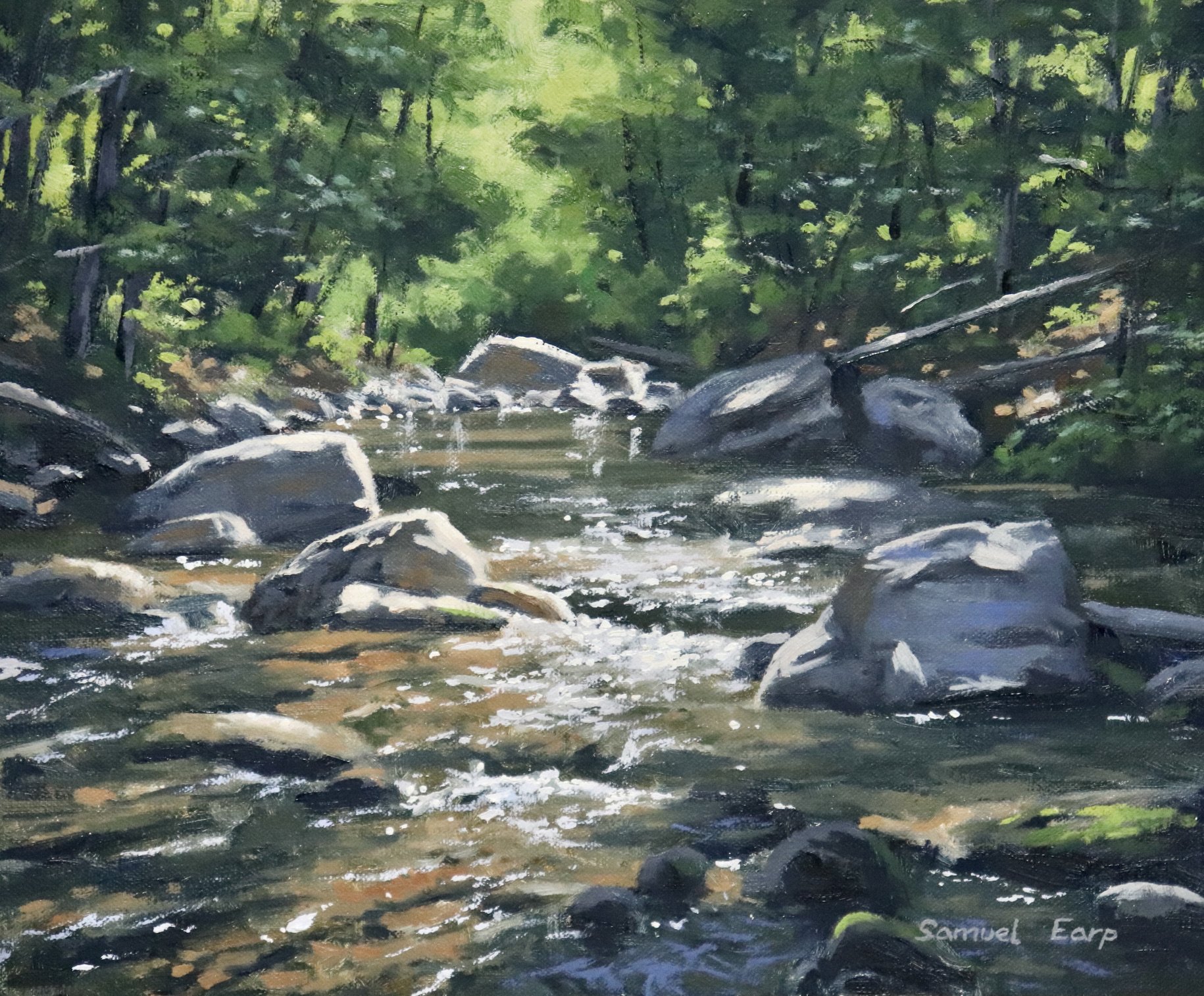
In this blog post I will show you how to paint this forest, river landscape painting that features a woodland with a sunlit stream running through it. This painting is inspired by one of the many beach tree forests in the south island of New Zealand. I loved the tranquil atmosphere of the trees with stream running through it.
Suitable for oils and acrylics.
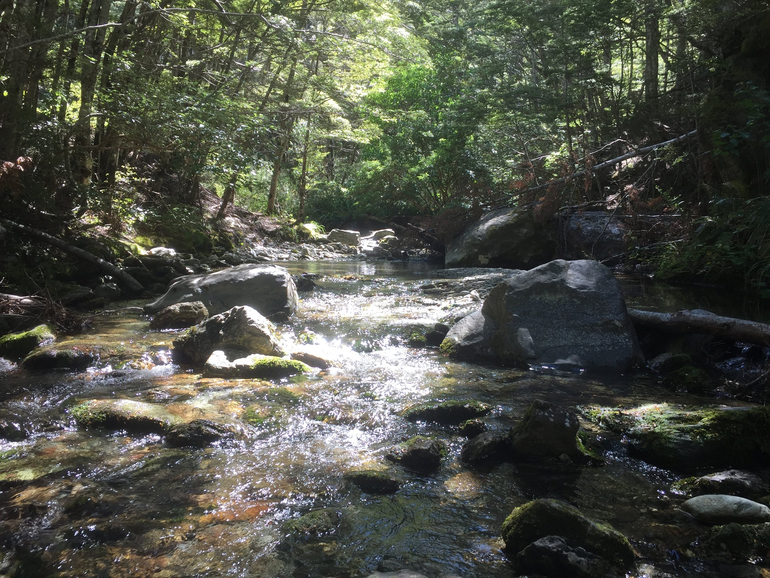
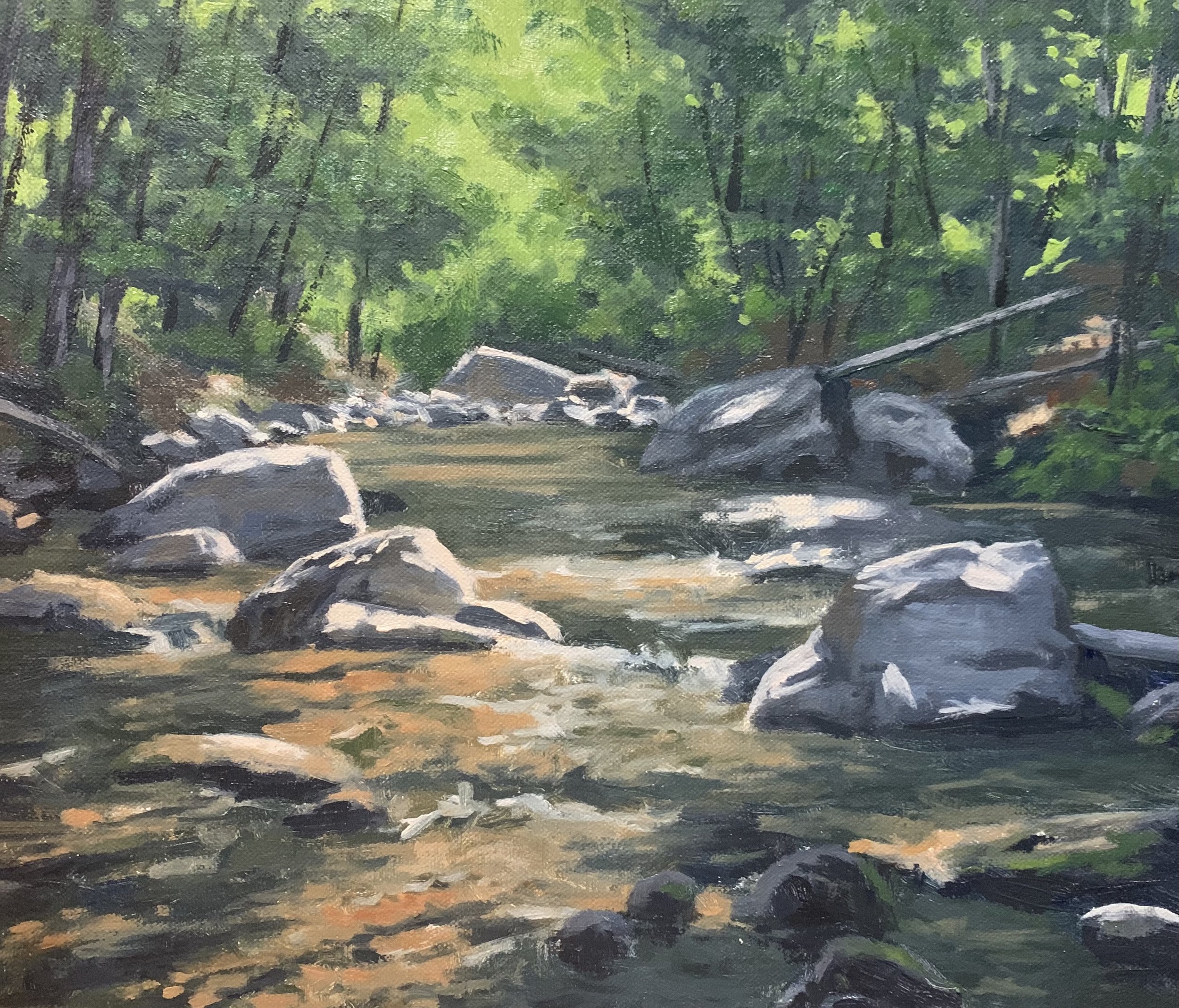
Reference Photo
Here is the reference photo I took and used in this painting. Please feel free to use or copy this photo if you would like to have a go at painting this art work.
Composition
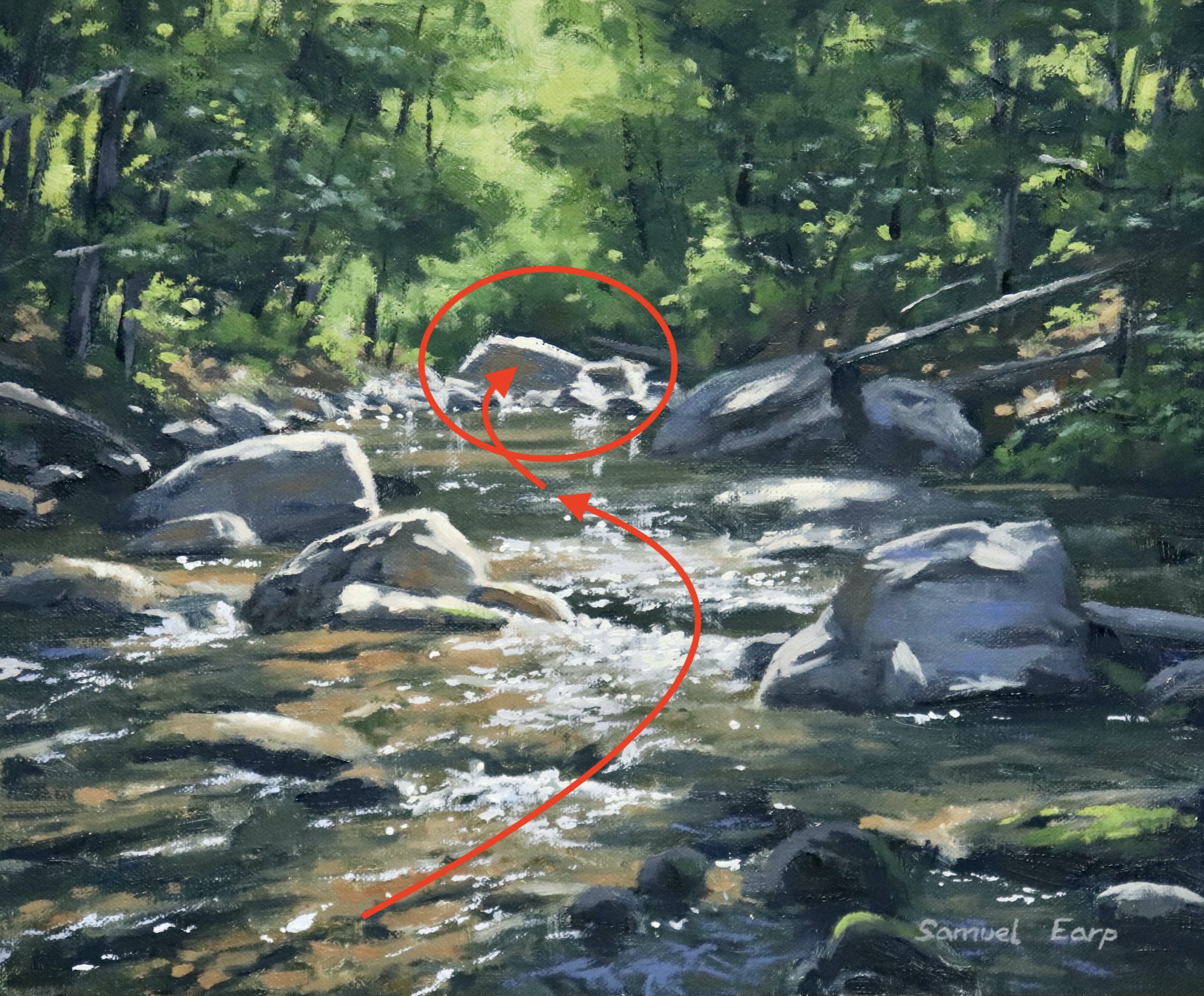
The composition in this painting follows and ‘S’ composition where the stream is leading the eye towards the rocks in the mid ground and then to the green glow of the vegetation in the background. The ‘S’ composition implies rhythm in the painting.
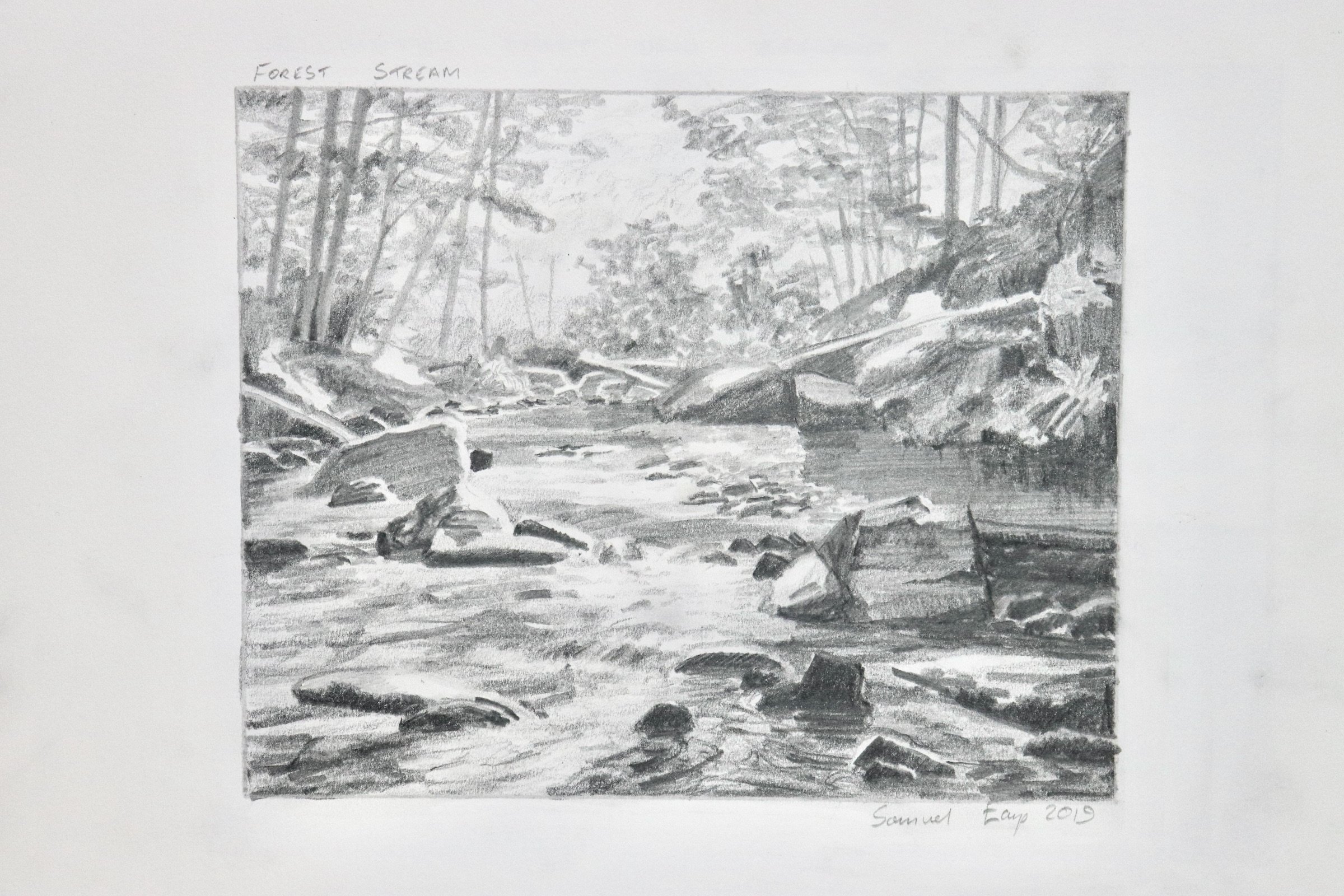
Pencil Sketch
Before I begin a studio painting I always plan the composition first by sketching some composition designs. This usually begins with some quick two minute thumbnail sketches and then once I have a good idea for a composition I create a final sketch.
My pencil sketch will not only provide a solid composition for me to copy onto my canvas but also it will give me an idea of the values and tonality of the scene I am going to paint. Value refers to how light or dark a subject is and getting your values correct goes a long way to creating a solid painting.
Below is the sketch I created for this painting. I used a range of pencils from 4H to 6B.
Colours
I painted this artwork using oil paint and the colours I used in this painting are as follows:
- Titanium white
- Burnt sienna
- Yellow ochre
- Cadmium yellow
- Cadmium orange
- Alizarin crimson
- Ultramarine blue
- Phthalo green
Brushes
Here is a list of the brushes I used in this painting:
- No.5 flat
- No.3 flat
- No.2 flat
- No.3 filbert
- No.1 round
- No.0 round
Painting Demonstration
Stage 1 – Blocking-In The Painting
I am painting on a 10” x 12” linen panel. The linen panel is pre made and is an oil primed medium weave linen that is mounted to Baltic birch. These panels are perfect for creating small to medium sized art works, studies and they are also great to use for painting en plein air.
I sketch the composition using a No.1 round brush with burnt sienna mixed with Liquin Original (Liquin). I am using Liquin as a medium to thin the paint and it also has the advantage of speeding up the drying time.
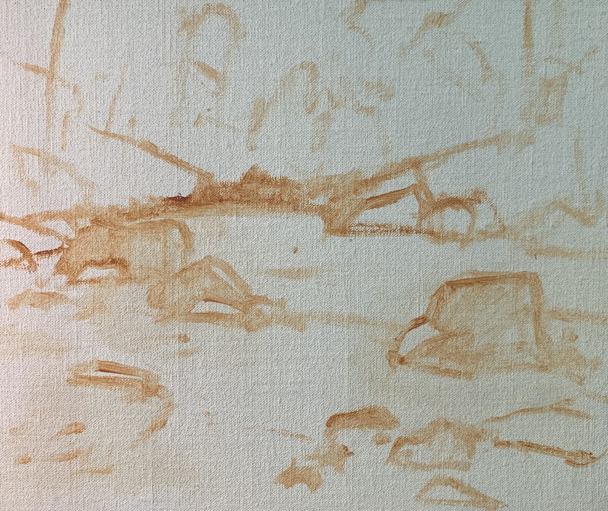
Paint Your Dark Values and Shadows First
Whenever I start a painting I always identify where the dark values and shadows are first in the scene I am painting. Value refers to how light or dark a subject is and by painting in the dark values first I personally find it is much easier to create atmospheric perspective my paintings. It also makes it easier to add the areas in light and to get the saturation of your colours correct once you have painted your dark values.
Most of this landscape is in the foreground and there aren’t any far distant elements such as hills to paint. Much of the forest is is shadow so there are some dark values in this painting.
I paint the shadows in the rocks using varying amounts of ultramarine blue, burnt sienna and titanium white. I also use a little alizarin crimson to give the mix a violet tint. For the darker areas of the rocks such as the occlusion shadows i have used a lot less if any titanium white in my mix.
Much of the tree foliage is in shadow and the values are also dark. I mix ultramarine blue with a little yellow ochre so the mix is dark but also has a green cast to it.
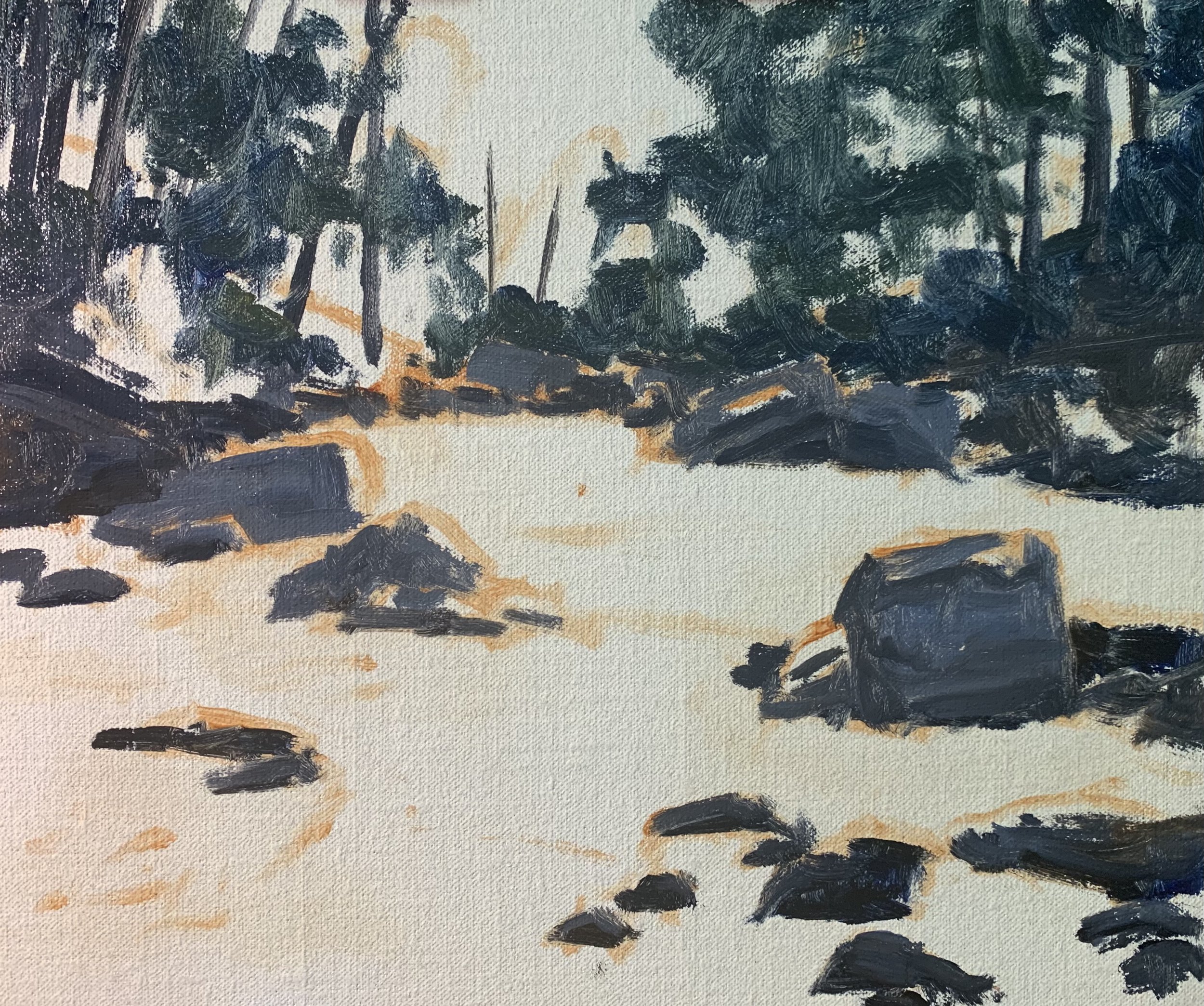
Once my dark values are established I start from the back of the painting and I work forward. I paint the green glow in the background as well as the half tones in the leaves using a varying mix of yellow ochre, cadmium yellow, ultramarine blue and titanium white. I round off the mix with some cadmium orange which helps to take some of the saturation out of the green and make it look more natural. I can also increase the saturation of my green and create some emerald tones by mixing in some phthalo green.
The water has many areas in shadow but also sunlight areas which are illuminating the submerged rocks beneath. I have kept the colour mix simple here using a mix of yellow ochre, burnt sienna, ultramarine blue and if I need to create light value colours such as the sunlit areas of the water I have mixed in some titanium white.
I have used more yellow ochre, burnt sienna and titanium white for the areas of the water and submerged rocks in the full sunlight. Keep in mind that titanium white will have a desaturating effect on your colours.
I am painting the water with a No.5 flat brush and applying my brush marks in the general flow of the water.
I add highlights to the rocks using a mix of titanium white with burnt sienna and a little yellow ochre. I also mark in the highlights on the water with a mix of titanium white with a little burnt sienna and ultramarine blue. This is to darken the value so that when I add my final highlights to the water, the sparkles on it will really pop. I save my lightest values until the end of the painting.
I finish the blocking-in stage by restating the dark values in the painting and then I left it to dry for a couple of day so I could begin adding details.
Stage 2 – Adding Details, Modelling and Refining the Painting
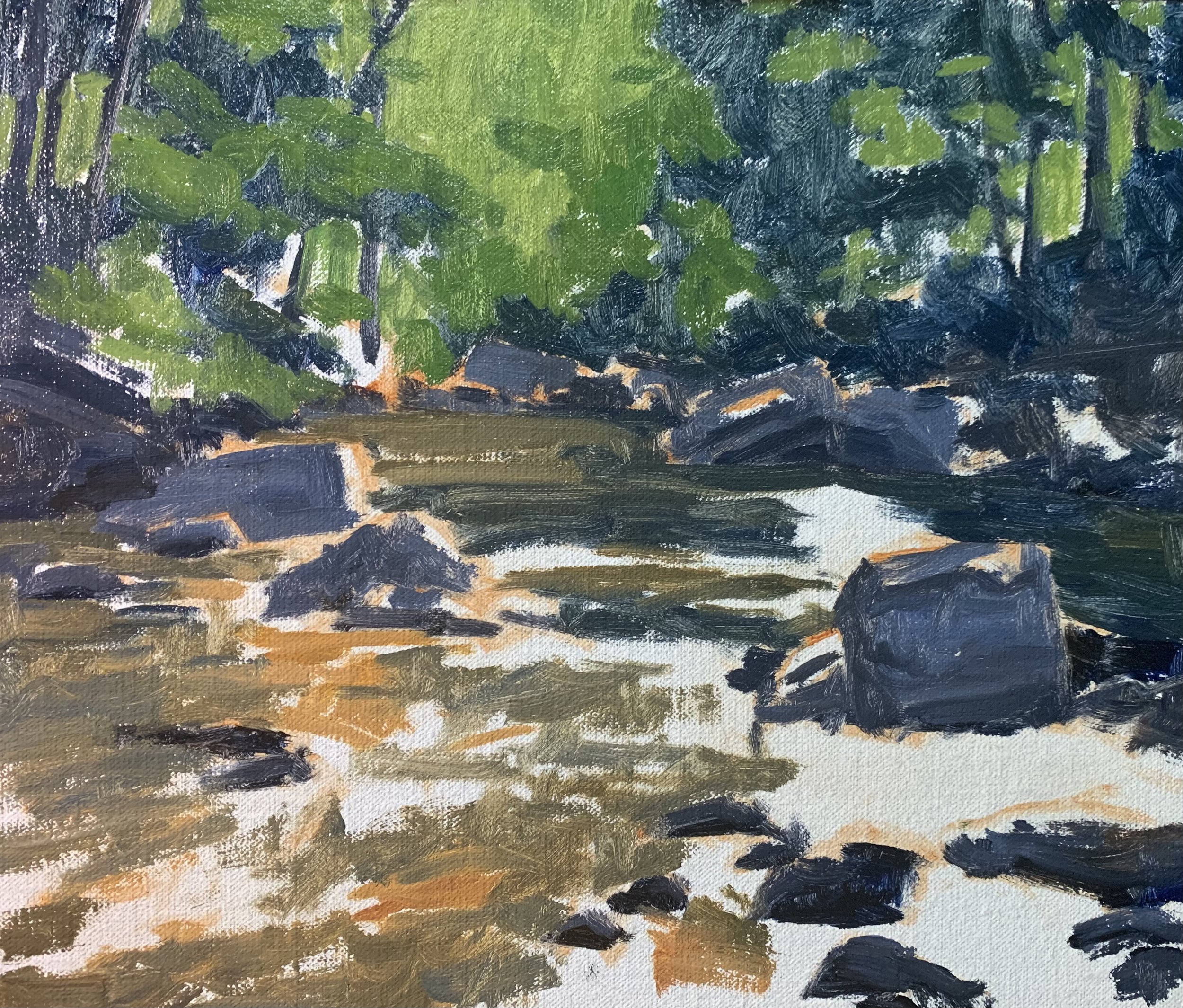
It is during this stage that i build up the details within this woodland landscape and model the paint so I can define the elements within the scene such as the trees, rocks and the water. I am essentially using the same colour mixes but I am layering on lighter colours to build up the form of the various masses.
I add much more details within the trees including the foliage and the tree stems. I use the background green glow to paint gaps within the tree canopies where the light is passing through. This helps to communicate the form of the trees.
I begin adding and refining the areas in the water especially the rocks, boulders and submerged rocks beneath the water. I emphasise the shadows in the submerged rocks.
For the rocks and boulders above the water I refine their shapes and again I am essentially using the same colours that I was using during the blocking-in stage, a varying mix of ultramarine blue, burnt sienna, alizarin crimson and titanium white.
I paint reflected light in some of the rocks which creates warmth using a mix of a little titanium white, burnt sienna, yellow ochre and a small amount of ultramarine blue.
Stage 3 – Final Details
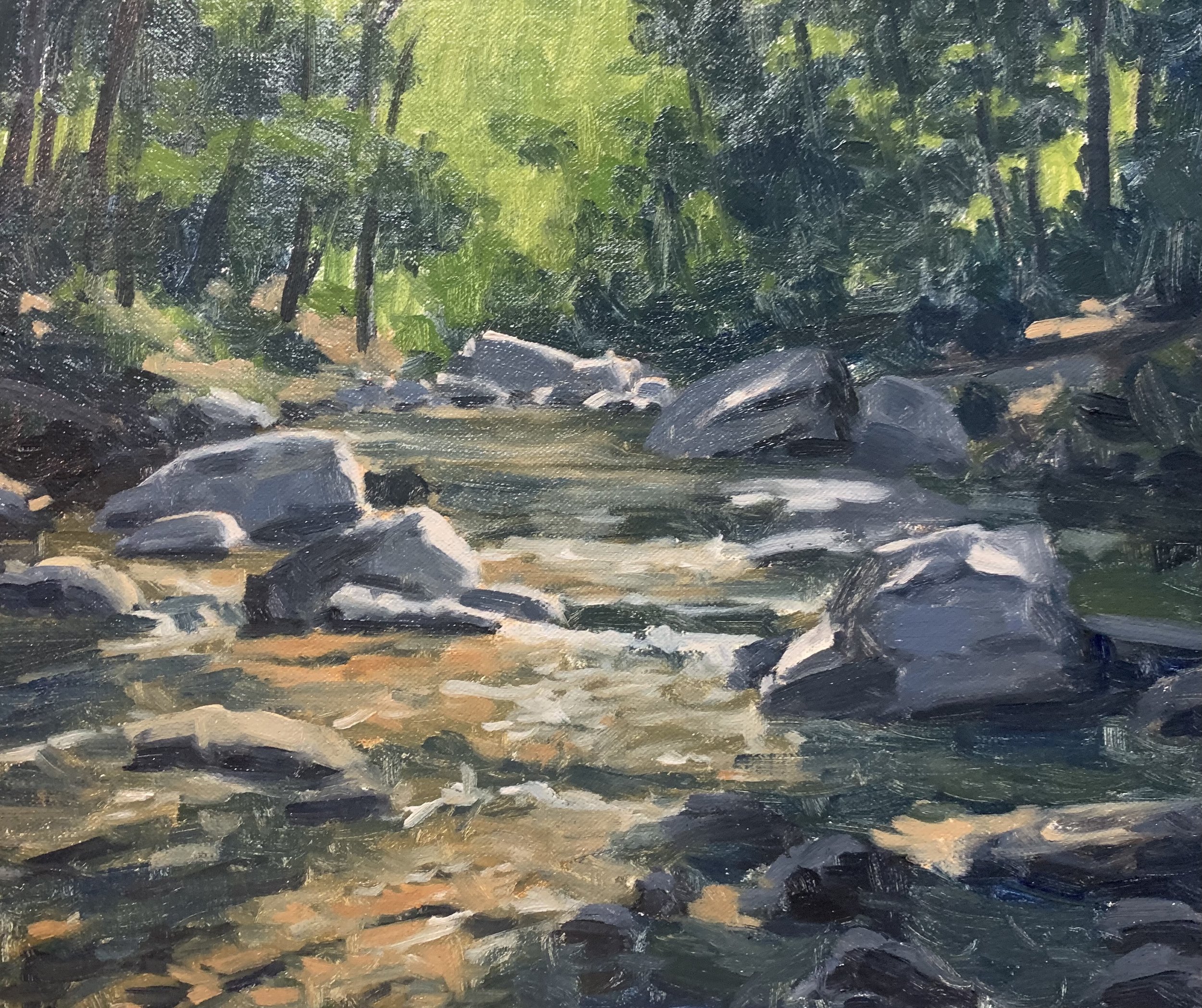
After spending time building up the details in the painting I let it dry so I could add the last details and final highlights which I always save until last.
I added more details to the trees, painting the suggestion of leaves using a No.3 filbert brush.
I painted more highlights on the rocks again using a mix of titanium white, yellow ochre and burnt sienna but I also made sure the layer was lighter than the previous layer. I was able to use the same mix for painting a few reflections in the water.
I paint the sparkles in the shimmering water using a mix of titanium white with just a dash of yellow ochre. This is where I have saved my lightest values.
Throughout the painting I have tried to create colour harmony by using common colours throughout. For example the trees contain ultramarine blue and yellow ochre which I used in the water and for the rock highlights. For the shadow areas of the rocks I mainly used ultramarine blue and burnt sienna and titanium white again which I used in the water.
By using common colours throughout your painting it ties all the zones together and it will make the painting read well to the viewer.
Thanks for reading 😊
