This article may contain affiliate links, please read my affiliate disclosure for more information
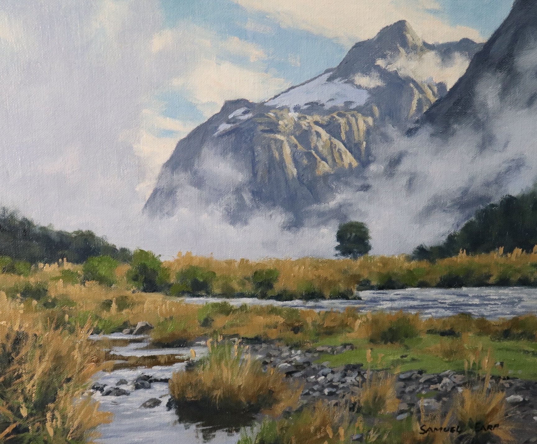
In this painting demonstration, I show you how to paint a misty mountain landscape. This painting is inspired by the mountains in the Fiordland area of southern New Zealand.
Suitable for oils and acrylics.
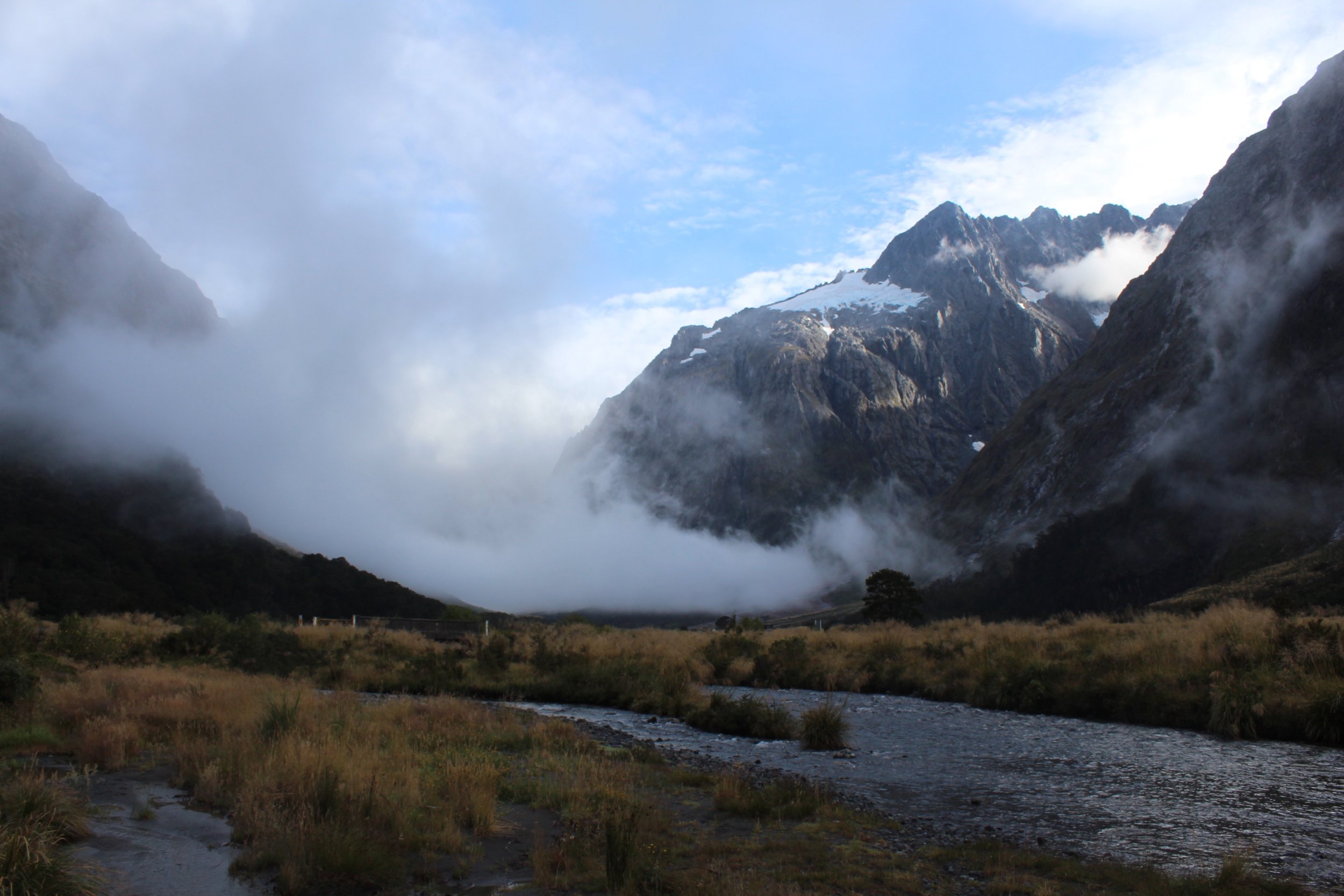
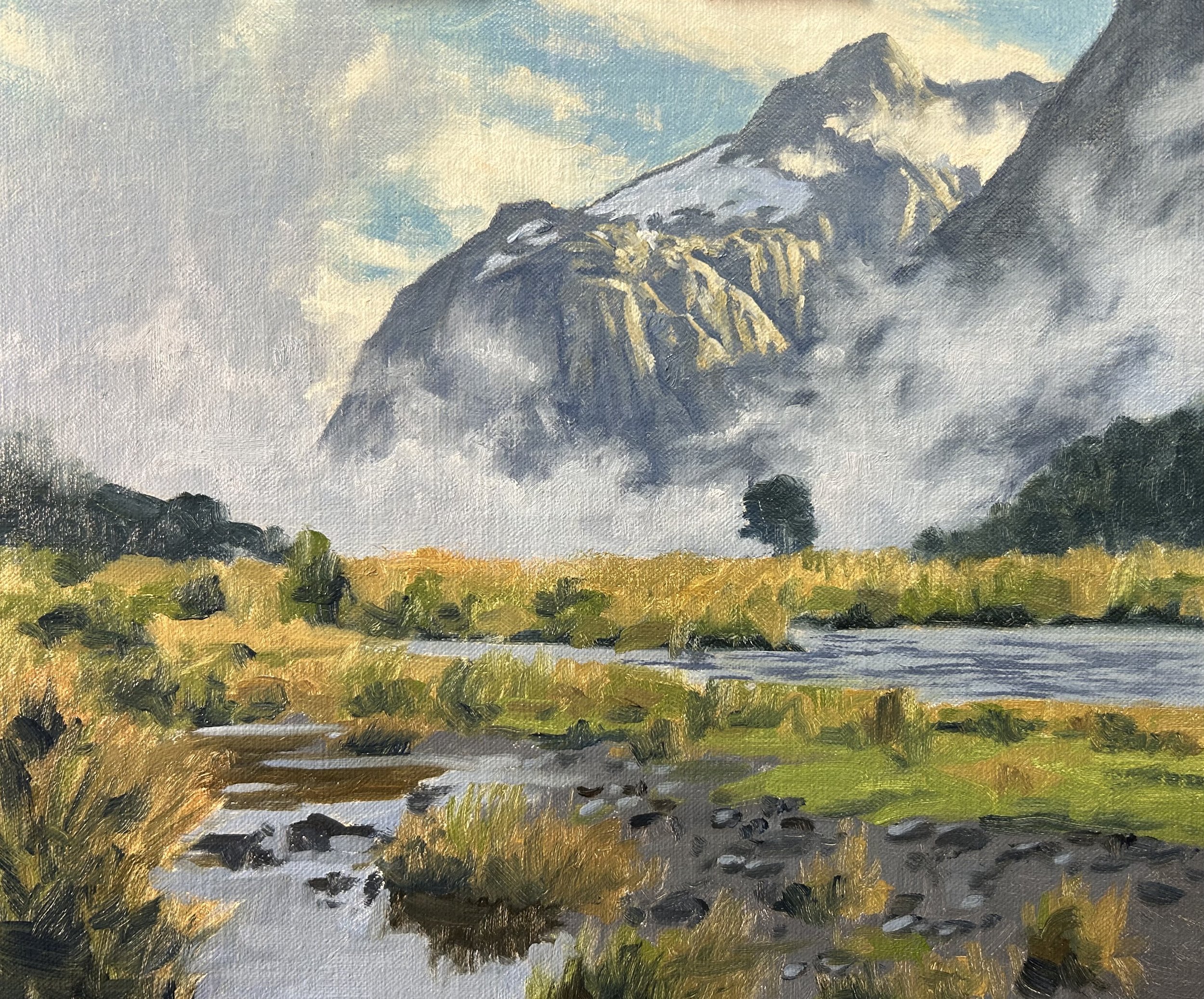
Reference Photo
Please feel free to use or copy this photo if you would like to have a go at painting this art work.
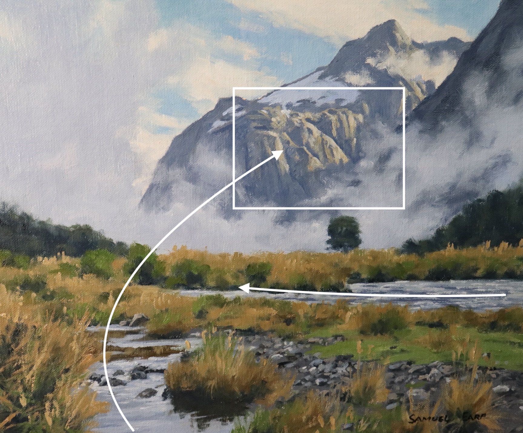
Composition
This composition loosely incorporates an ‘S’ or ‘compound curve’ composition where the river and small stream are leading the eye towards the illuminated area on the side of the mountain. This composition features a lower horizon so as to incorporate more of the mountains.
Art Tips:
- Never have your horizon line in the middle where it divides the canvas into two equal parts as this will cause disharmony in the composition. Either have a low or high horizon line in the composition.
- Placing the summit of your mountains near the top of your composition helps to communicate great height. Make sure to leave some space for the sky and don’t have your mountain summit touching the top of the canvas as this can spoil the composition.

Colours
I painted this art work using oil paint and the colours I used in this painting are as follows:
- Titanium white
- Burnt sienna
- Yellow ochre
- Cadmium yellow
- Cadmium red
- Alizarin crimson
- Ultramarine blue
- Phthalo green
Brushes
Here is a list of the brushes I used in this painting:
- No.5 flat
- No.3 flat
- No.2 flat
- No.3 filbert
- No.1 round
- No.0 round
Painting Demonstration
I painted this artwork on oil-primed, medium-weave Belgian linen that is mounted to a panel. The painting itself measures 10” x 12”.
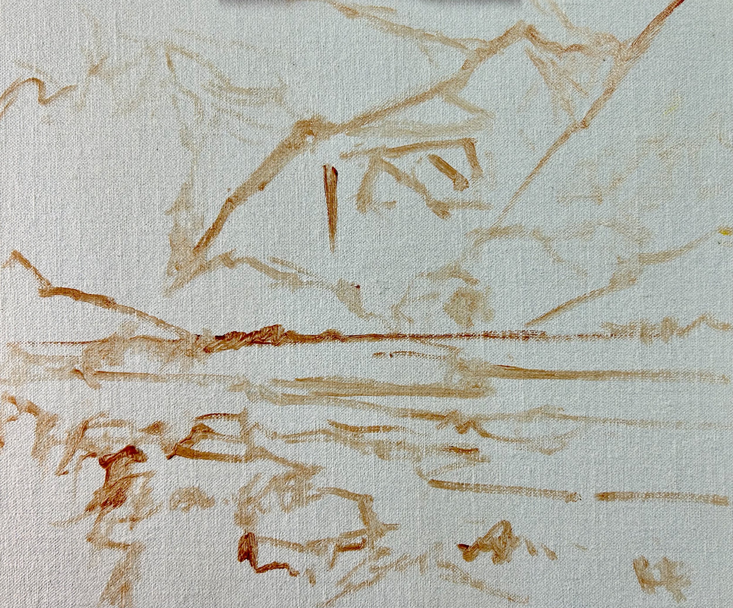
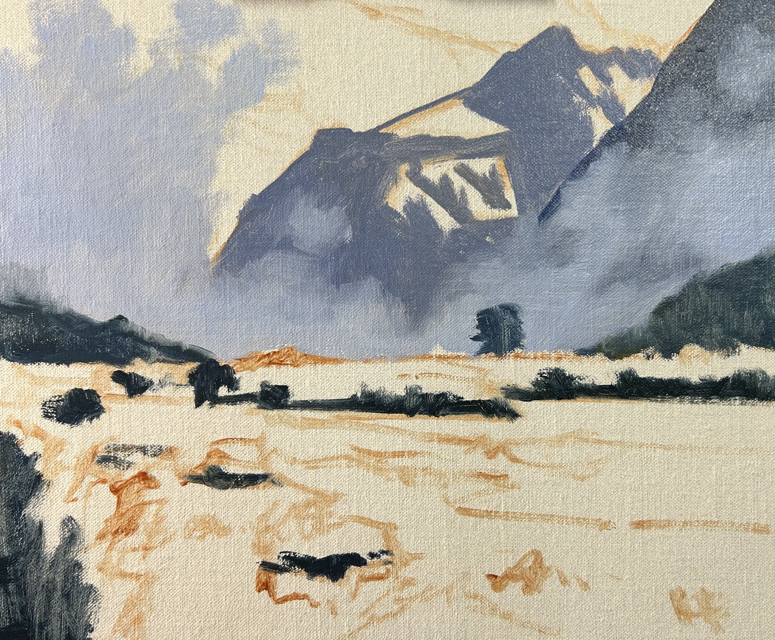
I sketched the composition using a No.1 round brush with burnt sienna mixed with Liquin Original (Liquin). I am using Liquin as a medium to thin the paint and it also has the advantage of speeding up the drying time.
I begin by painting the major shadows in the scene which are mainly in the mountain slopes, the low cloud and some areas of vegetation in the foreground. I use a combination of ultramarine blue, burnt sienna, titanium white and a little alizarin crimson for the low cloud and I use the same colours for the mountains only with a lot less titanium white in the mix to make the value darker.
For the trees and vegetation in the foreground, I use combinations of ultramarine blue, yellow ochre and titanium white. Not much titanium white is needed as we are dealing with darker values here, however, it is just to make the value of the colour a little lighter, especially for the mid-ground trees.
Art Tip: Paint Your Dark Values and Shadows First
Whenever I start a painting, I always identify where the dark values and shadows are first in the scene I am painting. Value refers to how light or dark a subject is and by painting in the dark values first I personally find it is much easier to create atmospheric perspective in my paintings. It also makes it easier to add the areas in light and to get the saturation of your colours correct once you have painted your dark values.
Once my main areas of dark values and shadows have been established I turn my attention to the sky and clouds and the illuminated area on the side of the mountain.
The sky is a mix of ultramarine blue, a little phthalo green and titanium white and for the high clouds I used a mix of titanium white and a little burnt sienna.
For the illuminated area on the side of the mountain, it is important to make sure the colours are of a low chroma so they sit back in the landscape. In a scene such as this one we want to communicate soft light so it is important that the colours are not too saturated I used a mix of yellow ochre, burnt sienna, ultramarine blue and titanium white.
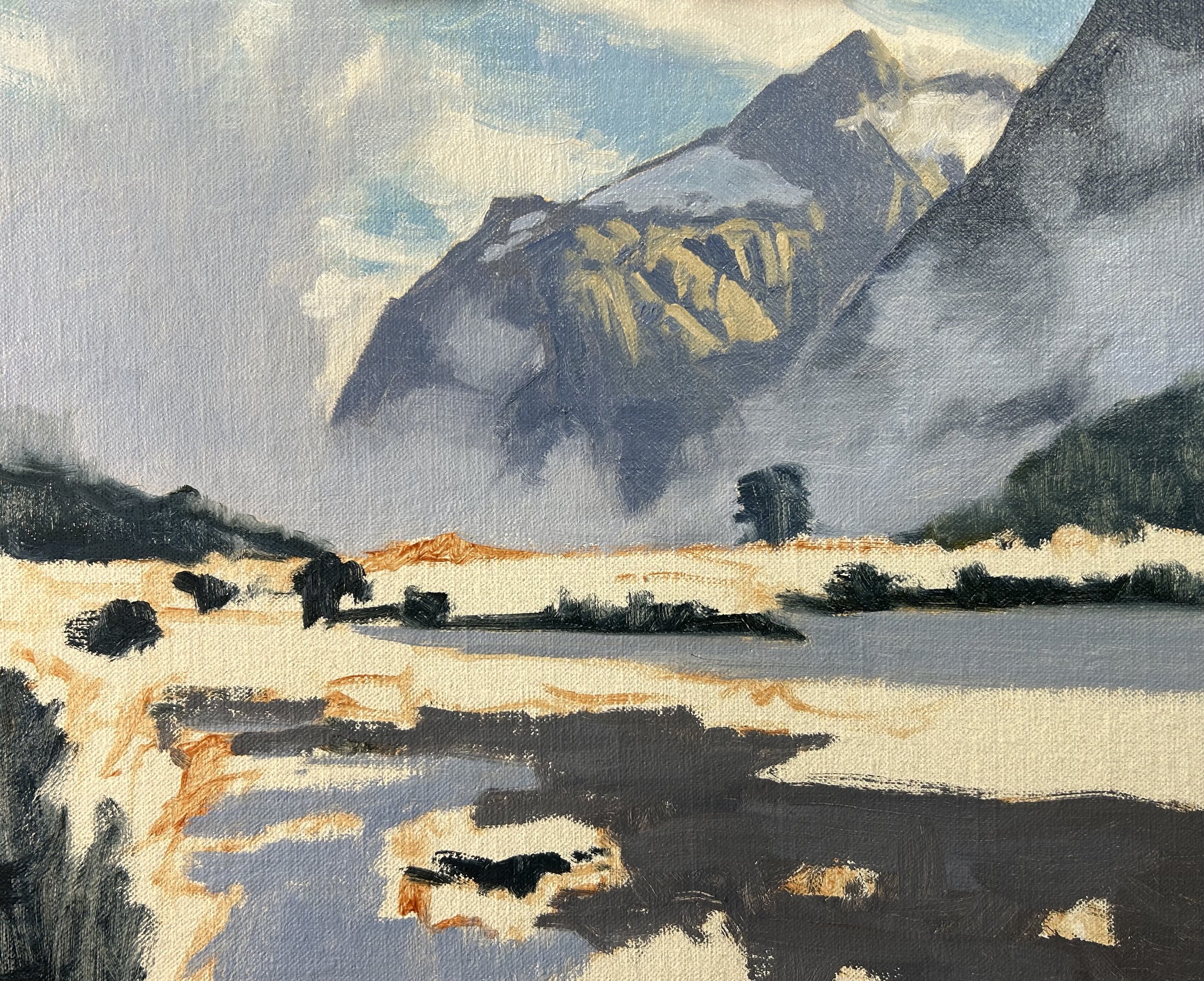
Next, I work on the foreground. The water is mostly reflecting the sky and low clouds so I am able to use the same cloud colour mix for the water.
The vegetation is a mix of straw-coloured grass and reeds as well as green grass. I have tried to keep the colour mixtures simple using mainly yellow ochre, burnt sienna, ultramarine blue and titanium white for the straw-coloured grass. to paint the green grass I can add to this colour mix by mixing in cadmium yellow, phthalo green and a little cadmium red. I vary these colour mixtures to create different hues and tones.
Here I complete the first session on this painting, the ‘blocking-in’ stage. Mostly I am tidying up the painting, filling in gaps and restating the dark values in the scene. It is very important to make sure your colours and values look good and it is advisable to keep your colours a little darker at this stage so you have plenty of room to add lighter value colour as you work through the painting. Most of the time I save adding my lightest values until last.
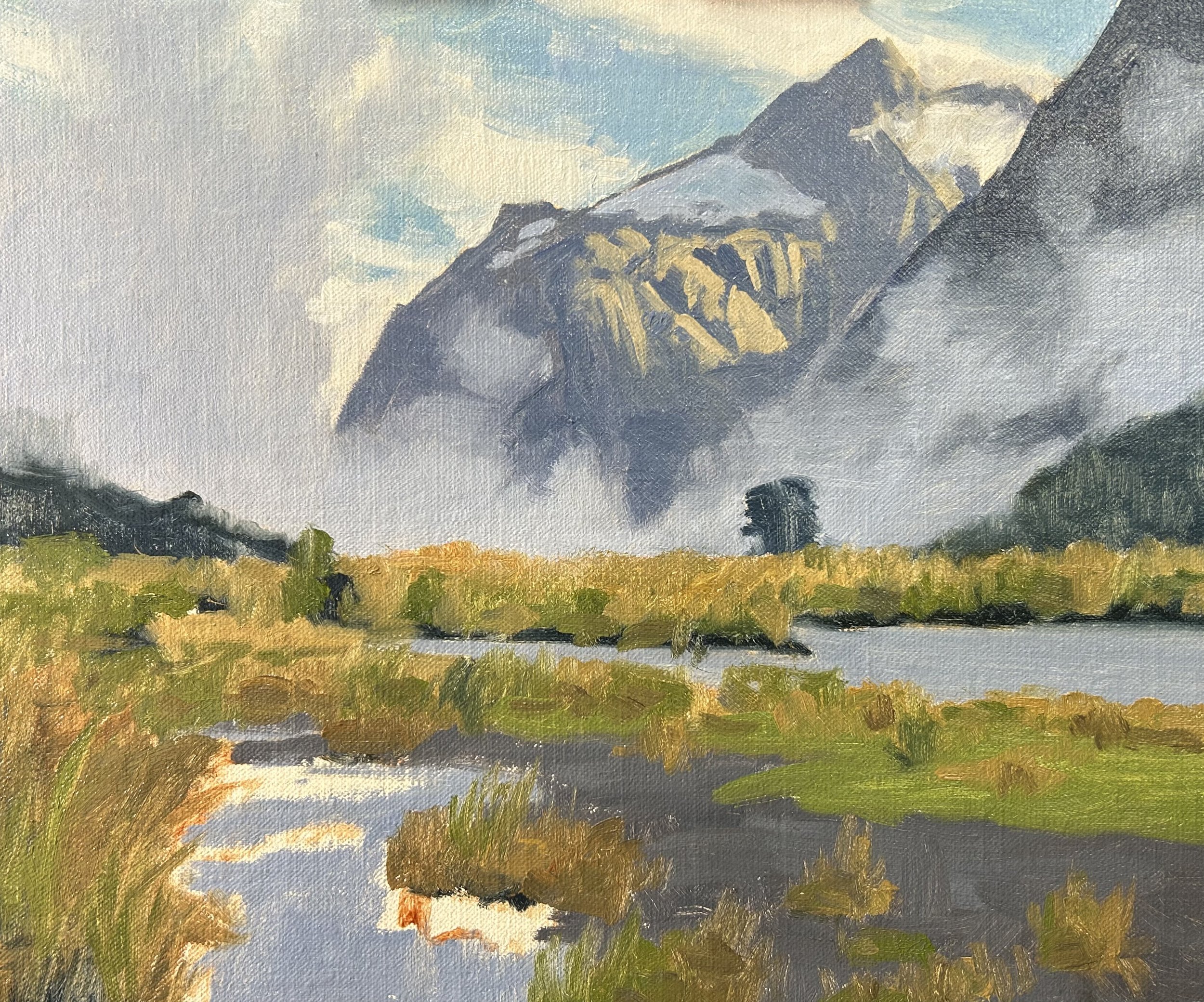
I paint the suggestion of a few stones and pebbles with a mix of ultramarine blue, burnt sienna, alizarin crimson and titanium white.
Now that the painting is dry I begin adding details to the sky, clouds and mountains. Essentially I am using the same colours I was using during the blocking-in stage but I am adding details and lighter value colours which helps to create a three-dimensional effect.
I add my lightest value colour to the light on the side of the mountain using a mix of yellow ochre, burnt sienna, and a tiny amount of ultramarine blue and titanium white. This is where I am also adding my highlights.
I added some lighter value colour to the mist and low clouds to bulk them out a little.
Adding Details and Finishing The Painting
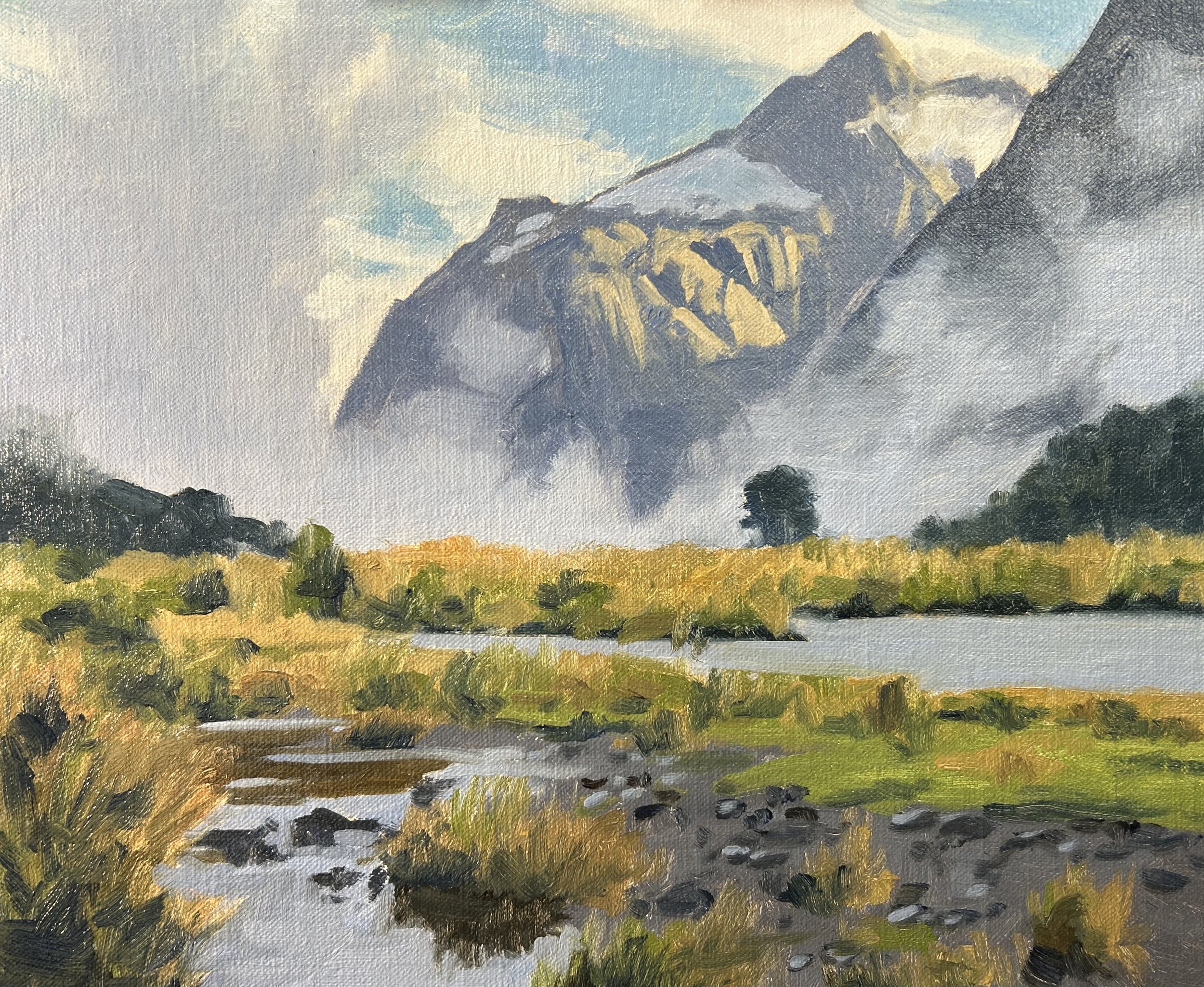
I finish the painting by adding details to the foreground, mainly to the grass, vegetation and water. Again I am using the same colours that I used during the ‘blocking-in’ stage however using lighter value colours to build out the three-dimensional forms.
To paint the grass I used No.3 flat brushes and 1/4” bristle dagger brushes as these are perfect for creating feathered effects to communicate clumps of grass. I also used a No.0 synthetic round brush to paint a few individual blades of grass, stalks and stems.
I add lighter tones to the water as well as more detail to the stones and pebbles where I used varying mixes of ultramarine blue, burnt sienna, titanium white and alizarin crimson.

Final Note
I hope you enjoyed this written painting demonstration, however, I have only scratched the surface as there is way more to this painting. Check out the painting tutorial video where I show you how to paint this scene, available on my Patreon channel.
