Do you want to create paintings on canvas like the great landscape artist Edgar Payne? If you’ve always dreamed of becoming a master landscape painter, then this blog post is for you. From brush techniques to mixing the colors, this blog post will provide some tips and advice you need to paint like Edgar Payne.
When learning to paint there is no shame in copying other artist’s works, especially the great masters as it is an excellent way to improve your painting skills. In this blog post, I show you how I recreate one of Edgar Payne’s paintings from a book called ‘Edgar Payne, The Scenic Journey’, which is a book depicting many of his artworks. I love to get inspiration from Edgar Payne and I hope this blog post inspires you too.
Suitable for oils and acrylics.
A Look at Edgar Payne’s Painting Process
Edgar Payne was a master painter who travelled to many locations in the American South West as well as Europe in order to paint subjects such as mountains, rural landscapes, desert scenes, seascapes and boats among others.
Edgar Payne would often paint from direct observation in the field, known as painting ‘en plein air’. His paintings are characterized by bold, loose, and gestural brush marks. He clearly mastered his subject and had a good eye for colors and values in his painted landscapes.
I often refer to Edgar Payne’s artworks for inspiration and his loose brushwork style of painting are visual instructions on how to mix the colors he used in his paintings.
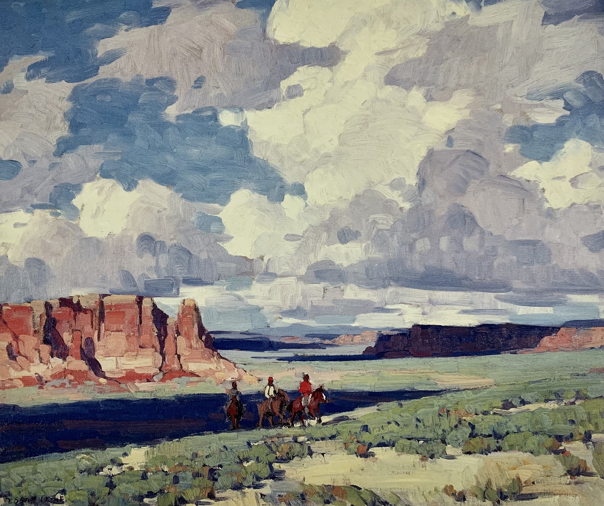
Image of the Original Painting
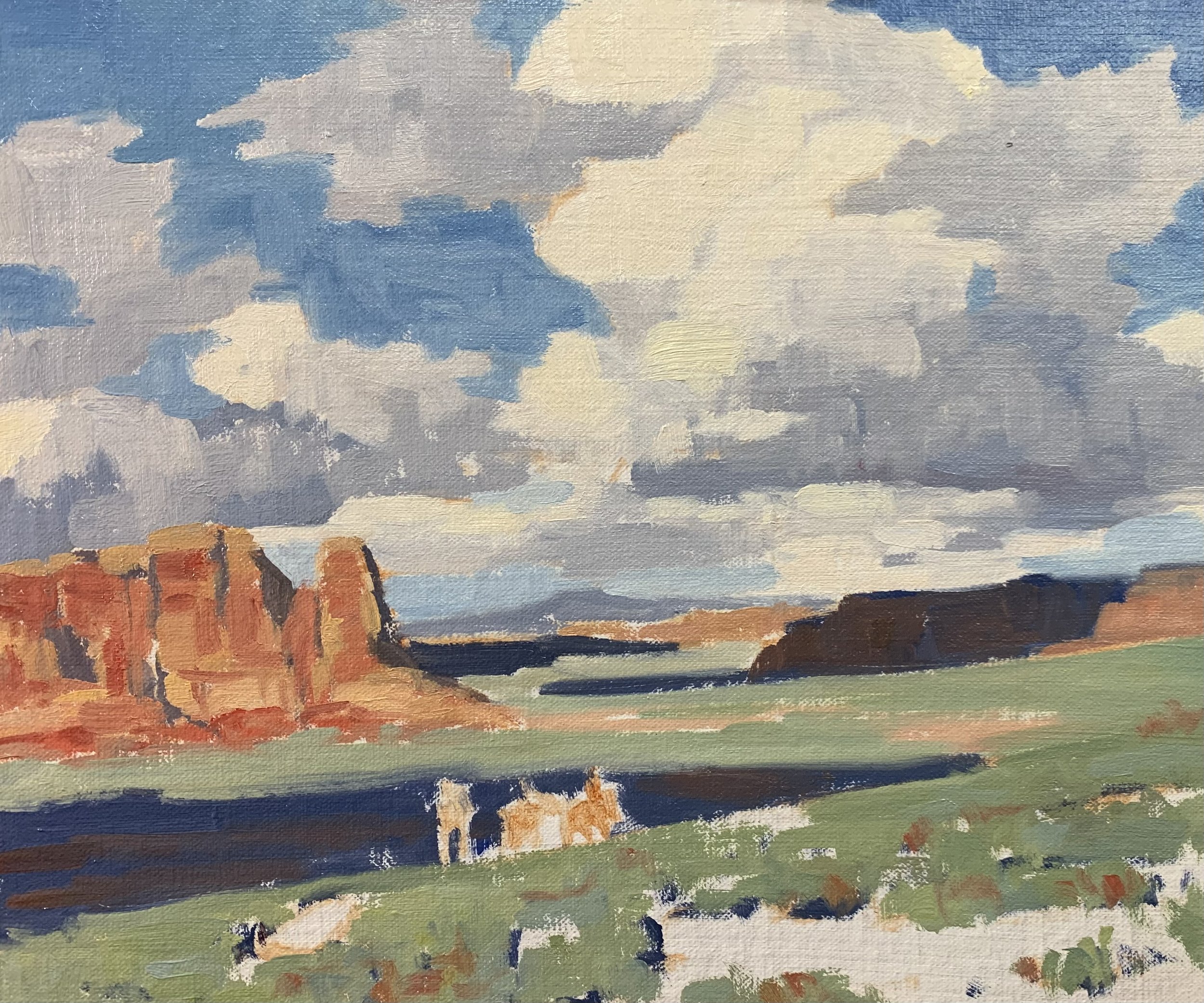
Below is an image of the Edgar Payne painting that I replicated. The original painting is called ‘Arizona Clouds’.
Composition
Upon examination of Edgar Payne’s painting, the riders on horseback are the obvious focal area within the composition. However, it is apparent that the sky and dramatic clouds are also a main feature of the painting as well as the dark shadows in the landscape that are being cast by those heavy clouds. Edgar Payne clearly made a feature of the clouds by opting for a lower horizon in his composition.
Art Tip:
- Never have your horizon line in the middle where it divides the canvas into two equal parts as this will cause disharmony in the composition. Either have a low or high horizon line in the composition.
Choosing the Right Brushes and Colors
Colors Used
I painted this still life artwork using oil paint and the colors I used in this particular painting are as follows:
- Titanium white
- Burnt sienna
- Yellow ochre
- Cadmium yellow
- Cadmium red
- Alizarin crimson
- Ultramarine blue
- Thalo green
Brushes
Here is a list of the brushes I used in this painting:
- No.5 flat
- No.3 flat
- No.2 flat
- No.3 filbert
- No.1 round
- No.0 round
ARE YOU STRUGGLING WITH YOUR PAINTING?
JOIN MY ONLINE ART SCHOOL AND UNLEASH YOUR INNER ARTIST.
- Step-by-Step Painting Tutorials
- Helpful Tips and Techniques
- In-depth lesson notes
- Inspiring reference photos
- Instant access to all content, including videos, lesson notes, reference photos and more.
- A vibrant and friendly community, meet other members, ask questions, and share your art.
- Zoom meetings for Q&A’s, painting critiques and painting livestreams.
- Ideal for beginners and experienced painters.
- Lots of inspiration, help and support to take your painting skills to the next level.
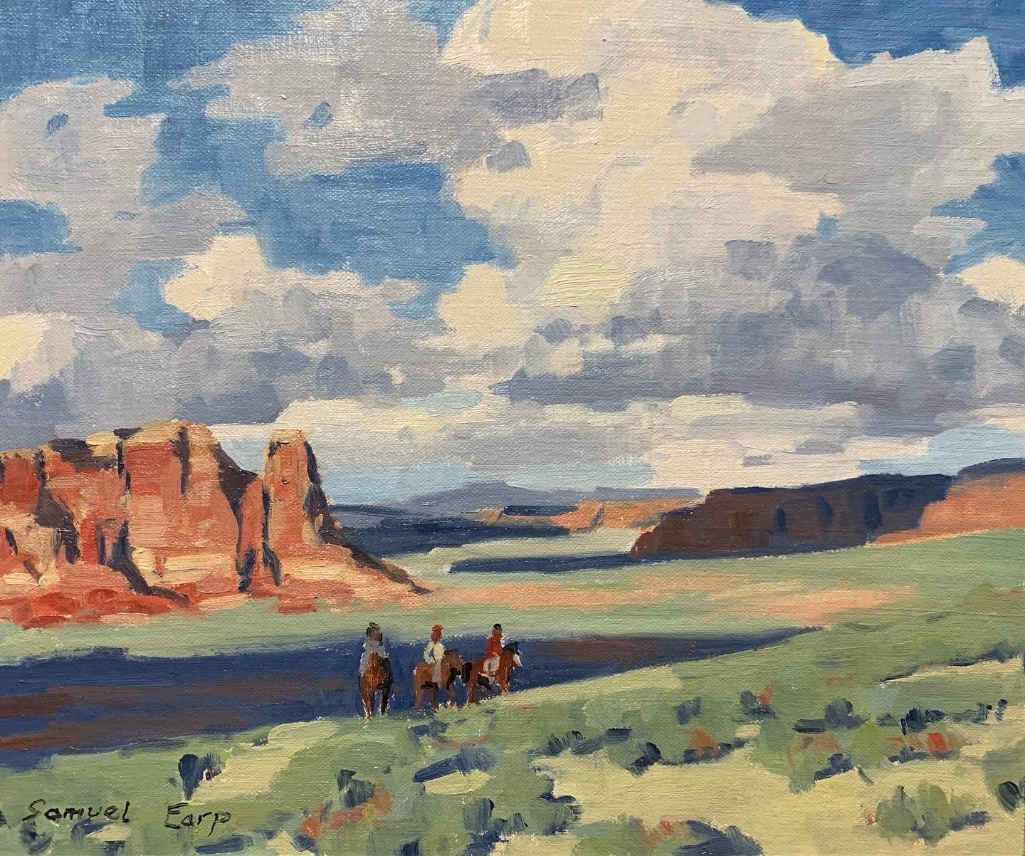
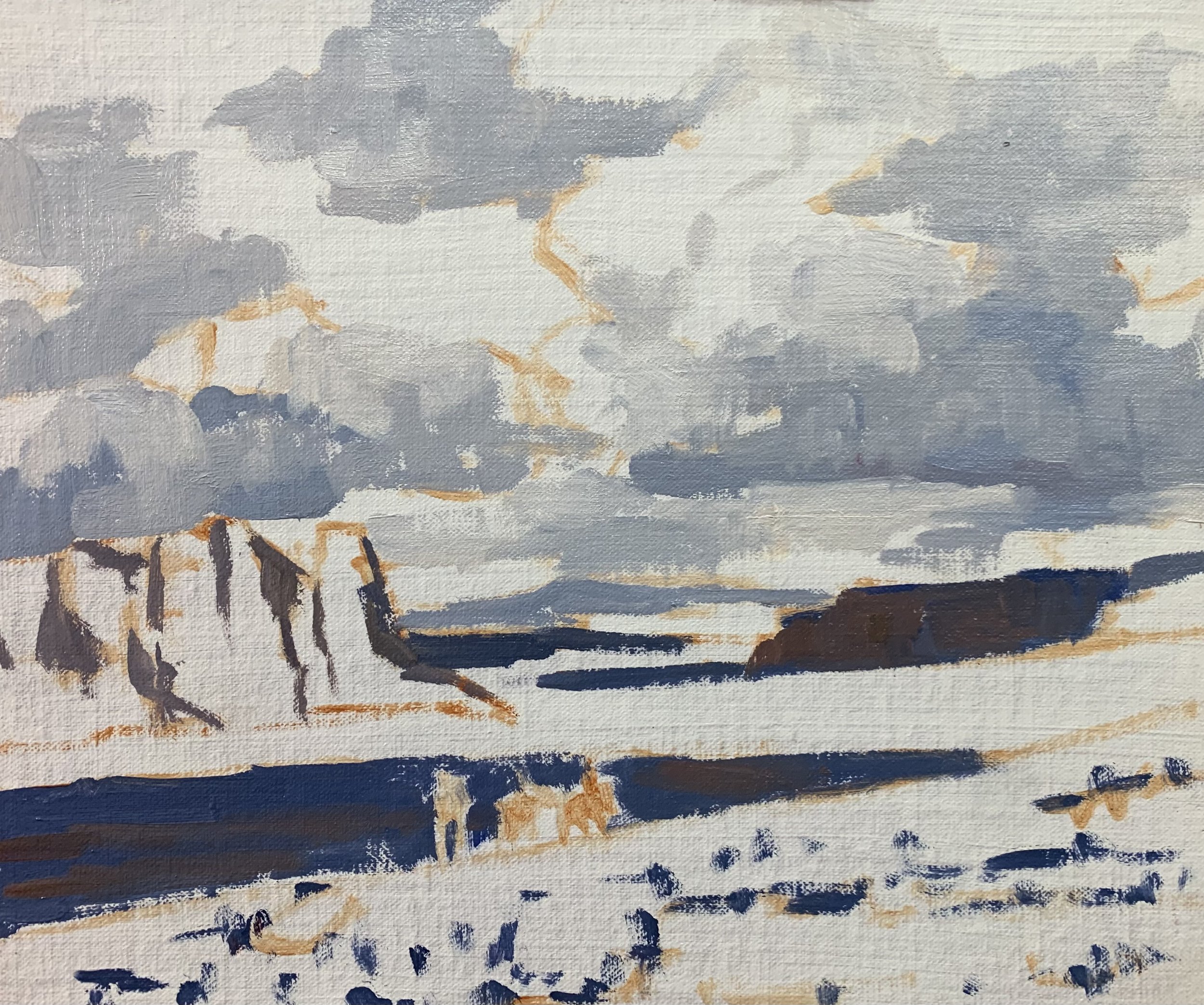
Painting Demonstration
I painted this artwork on oil-primed, medium-weave Belgian linen that is mounted to a panel. The painting itself measures 10” x 12”. Now the original painting here was about 28” by 34” which is quite big but I’ve made it a much more miniature painting. I’ve squished down the sky a little bit so it’s not entirely accurate compared with the original but definitely close enough.
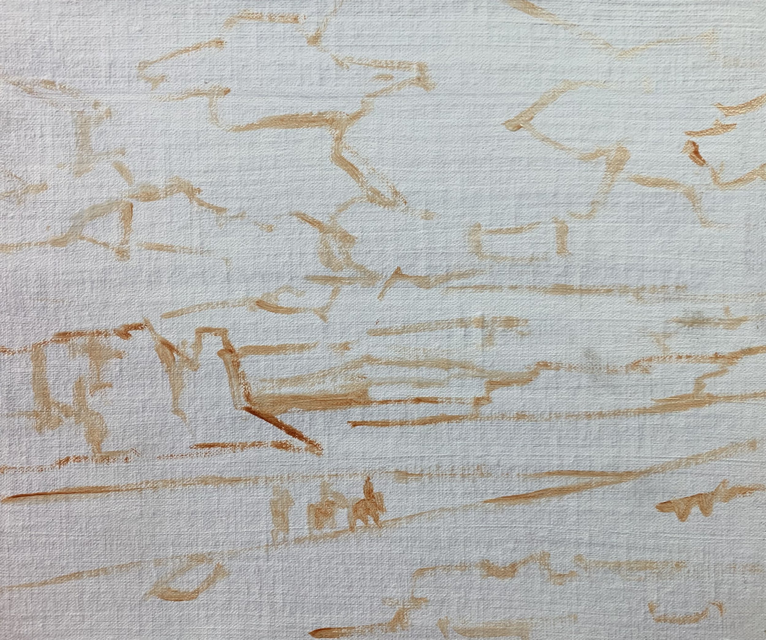
I sketched the composition using a No.1 round brush with burnt sienna mixed with Liquin Original (Liquin). I am using Liquin as a medium to thin the paint and it also has the advantage of speeding up the drying time.
Capturing Light and Shadows in Your Paintings
Once I have sketched out the composition I start off by painting the cloud shadows because I find it easiest to paint my dark values first and value is how light or dark a subject is. The reason I paint the dark values first is that I find it much easier to then paint the areas in light afterwards.
For the cloud color mix, I’m using ultramarine blue with some burnt sienna which helps to desaturate the blue, titanium white and a dash of alizarin crimson. I am mainly using No.5 flat brushes in this artwork and the cool thing about this painting is it really lends itself to using large flat brushes. I can then create loose gestural brush marks which is what made Edgar Payne’s paintings so recognisable.
I painted some of the dark shadows in the distant landforms and these are dark from the clouds casting shadows over them. I used the same colors I used for the clouds but with only a little titanium white in the mix so the value is darker. I use the same color combination for the reflected light in the rock formations but with burnt sienna as the dominant color.
Paint Your Dark Values and Shadows First
Whenever I start a painting I always identify where the dark values and shadows are first in the scene I am painting. Value refers to how light or dark a subject is and by painting in the dark values first I personally find it is much easier to create atmospheric perspective in my paintings. It also makes it easier to add the areas in light and to get the saturation of your colors correct once you have painted your dark values.
I paint the sky and clouds starting with the cloud highlights and using a mix of titanium white a little bit of burnt sienna. I also used just a dash of cadmium yellow. Upon close inspection of the clouds in the original painting, it looks like it has a kind of very pale yellow in it but more pure than a yellow ochre, so I mixed in a little cadmium yellow.
For the sky, I used a mix of ultramarine blue with some titanium white and a dash of phthalo green. As I was painting the sky I felt it needed a little bit of cadmium yellow added to it to create a nice rich blue sky.
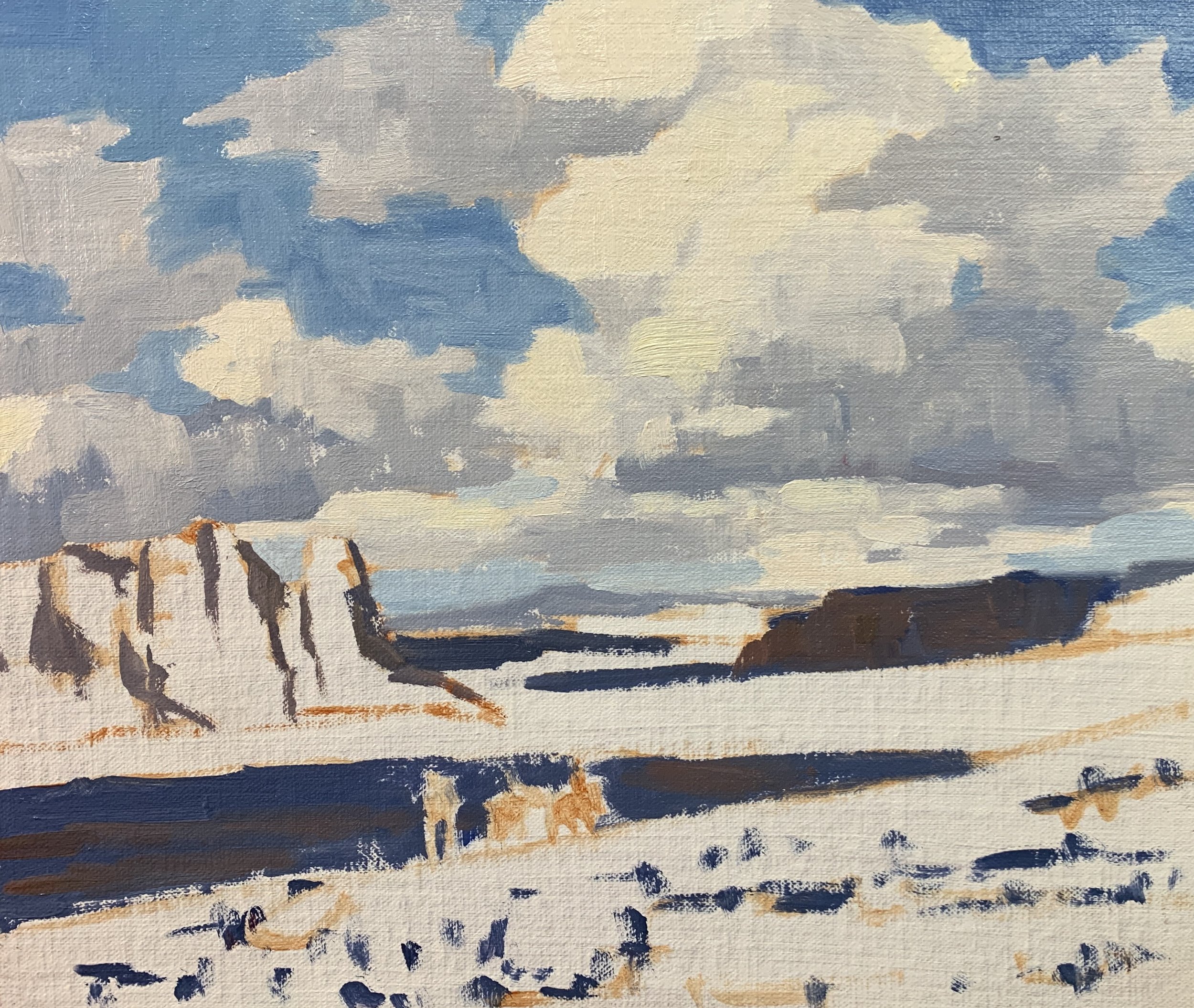
So now, moving on to the rock formations in the landscape and here, a few colors would be required in my mixes. The colors in the rocks are not overly saturated but there are a few higher chroma colors, especially the reds.
I start mixing the colors for these rocks with a base of burnt sienna, titanium white and yellow ochre. I then increased the saturation by mixing in some cadmium red and cadmium yellow and following this I was varying up those mixes. There are a few different textures in these rock faces with higher chroma tones near the base of the rock structures.
To paint the rocks I used a No.3 filbert brush to create loose gestural marks to build up some nice textures within the rocks.
The colors in the distant landforms are more desaturated, so I edged my existing color mix much more on the burnt sienna side, also if I needed to I could also use a little ultramarine blue to desaturate the color. There is also a lot of titanium white in the mix as well which helps to make the value of the color lighter as well as desaturate it.
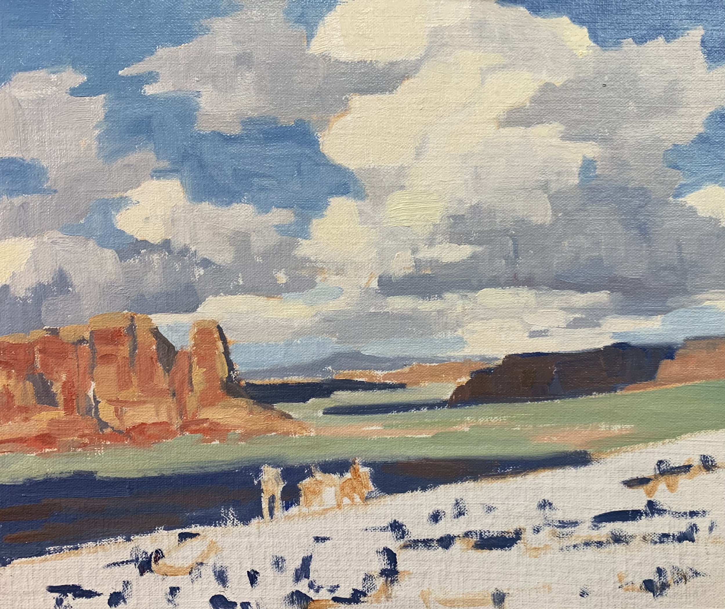
I paint the vegetation using a mixture of yellow ochre with a little ultramarine blue, titanium white and a tiny amount of phthalo green to shift the hue a little bit. As I work my way forward in the painting I increased the saturation by mixing in some cadmium yellow.
To paint the vegetation I used a No.5 flat brush with downwards vertical marks but also some sweeping horizontal marks in order to create texture and communicate clumps of plants.
I balance out my green mixes by adding a little cadmium red as red is opposite to green on the color wheel so it is going to complement the green.
Finishing The Painting
I finished this artwork by painting the horses and adding some details to them. I started off by painting the horse shadows using a mix of burnt sienna with a little ultramarine blue. These two colors combine well to make a near black and this is because burnt sienna is actually a dark orange and orange is opposite to blue on the color wheel.
For the areas of the horses that are in light I used a lot more burnt sienna in the mix and a little titanium white. I paint the horses with much smaller brushes, mostly using No.0 synthetic round brushes for more accurate marks.
Once I had finished painting the horses, I completed this artwork by tidying up areas in the various zones of the painting and restating the dark values in the clouds, shadows and rock formations.
Final Thoughts
Painting like Edgar Payne doesn’t have to be difficult at all, in fact, it will help you immensely to develop your painting skills. With a few colors and a little practice, you can apply these techniques to create your own beautiful landscape paintings inspired by the masters such as the great Edgar Payne.
I hope you enjoyed this written painting demonstration; however, I have only scratched the surface as there is way more to this painting. Check out my painting tutorial videos and other content available on my Patreon channel.
Watch the Youtube video
Painting tutorial videos
-
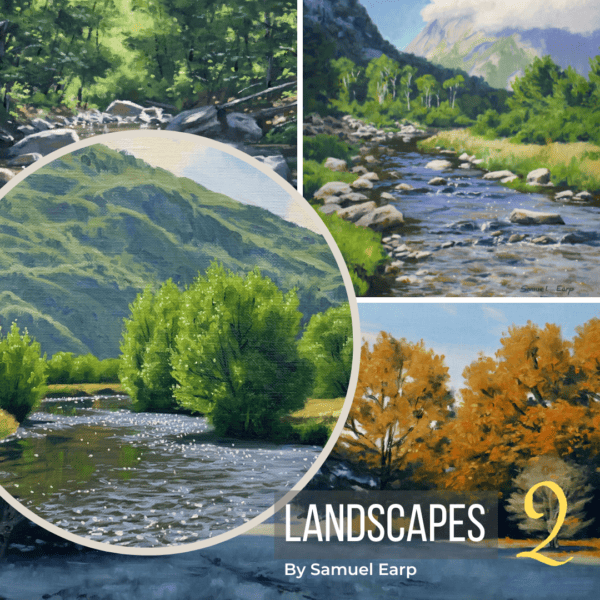
LANDSCAPES #2 – PAINTING TUTORIALS – 6 Videos, Over 7 Hours of Content
$27.00 -
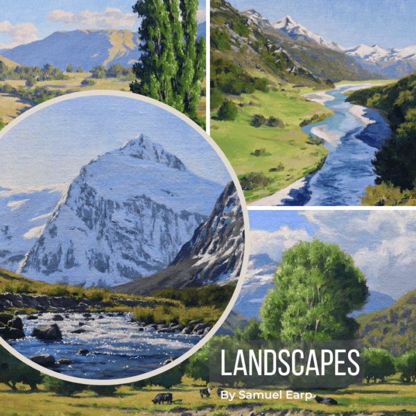
LANDSCAPES, PAINTING TUTORIALS – 4 Videos, Over 4 Hours of Content
$19.00 -
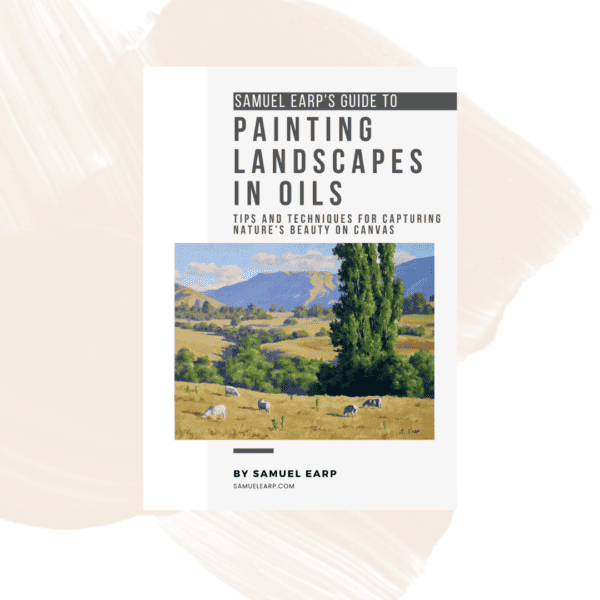
Painting Landscapes in Oils – eBook
$9.00 -
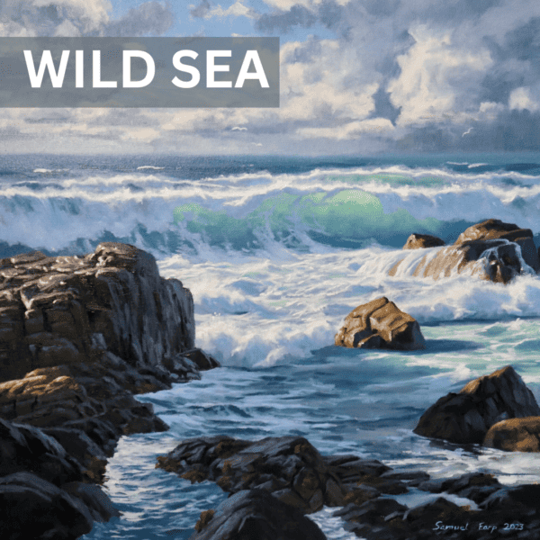
Painting Tutorial Video Download – Wild Sea
$11.00 -
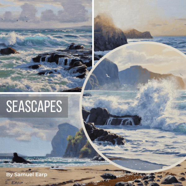
Seascapes – Painting Tutorials – 6 Videos, Over 6 Hours of Content
$27.00 -
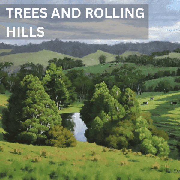
Trees and Rolling Hills – Landscape Painting Tutorial Video
$11.00
