Are you tired of struggling with mixing colors? Do you want to create beautiful artwork without frustration? Then this article on color mixing made easy: a beginner’s guide is for you.
Color theory can seem daunting and a bit dry, but it doesn’t need to be. Learning a few basic principles of color theory and values can help you set an easy-to-remember structure in your head that can make a difference to your painting.
In this article, I will take you through the basics of the color wheel and the fundamentals of color mixing based on my own experience as a landscape artist. You’ll learn how to create tints, shades, and values and master the art of color harmony.
History of Color Theory
Color theory has been around for centuries and has evolved with the contributions of many artists and scientists. In ancient times, color was associated with various religious and cultural beliefs. It wasn’t until the 17th century that the first scientific study of color was conducted by Sir Isaac Newton, who discovered that white light could be broken down into a spectrum of colors.
Later, in the 18th century, Swiss artist Johannes Itten developed the first modern color wheel based on the primary colors of red, yellow, and blue. This color wheel became the foundation for color theory as we know it today.
In the 19th century, French chemist Michel Eugène Chevreul conducted studies on the perception of color and introduced the concept of simultaneous contrast. This concept refers to how the appearance of a color is influenced by the colors surrounding it.
Throughout the 20th century, the color theory continued to evolve with the contributions of artists such as Josef Albers and his book “Interaction of Colour,” which explored the relationship between colors.
Today, color theory is essential to art and design, and understanding the basics can help you create beautiful artwork. By learning about the history of modern color theory here, you can appreciate the evolution of this field and gain a deeper understanding of the principles that guide color mixing and harmony.
Understanding the Basics: The Color Wheel
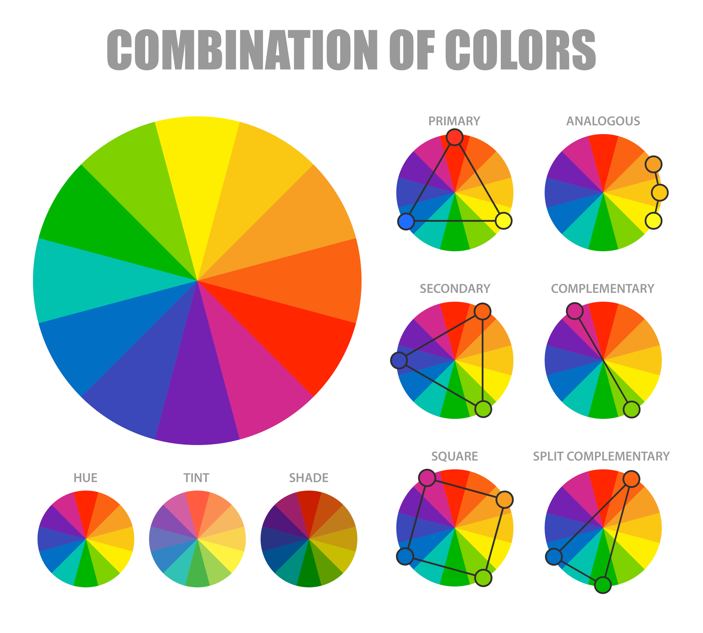
The color wheel visualizes the relationships between colors and is an essential tool in color theory. It consists of primary colors (red, blue, and yellow), secondary colors (green, orange, and violet), and tertiary colors (yellow-green, blue-green, blue-violet, red-violet, red-orange, and yellow-orange).
Complementary Colors
Complementary colors, opposite each other on the wheel, create a striking visual contrast when used together. Mixing complementary colors are essential to desaturate your paint mixes.
When these colors are arranged on the color wheel, a primary color is always opposite a secondary color, known as compliments or complementary opposites.
- Blue is the opposite of orange
- Red is the opposite to green
- Yellow is opposite to violet
So why is this important?
If you want to desaturate a color, you can mix a neutral color with its complementary opposite as the two colors will cancel each other out. In this manner, you can create some neutral greys and browns, especially when combined with white.
Complimentary colors also look good next to each other in a painting; for example, greens often look more harmonious in a landscape if there are some reds amongst the mix or colors that contain red. Looking closely at nature, you’ll see naturally occurring complementary opposites everywhere.
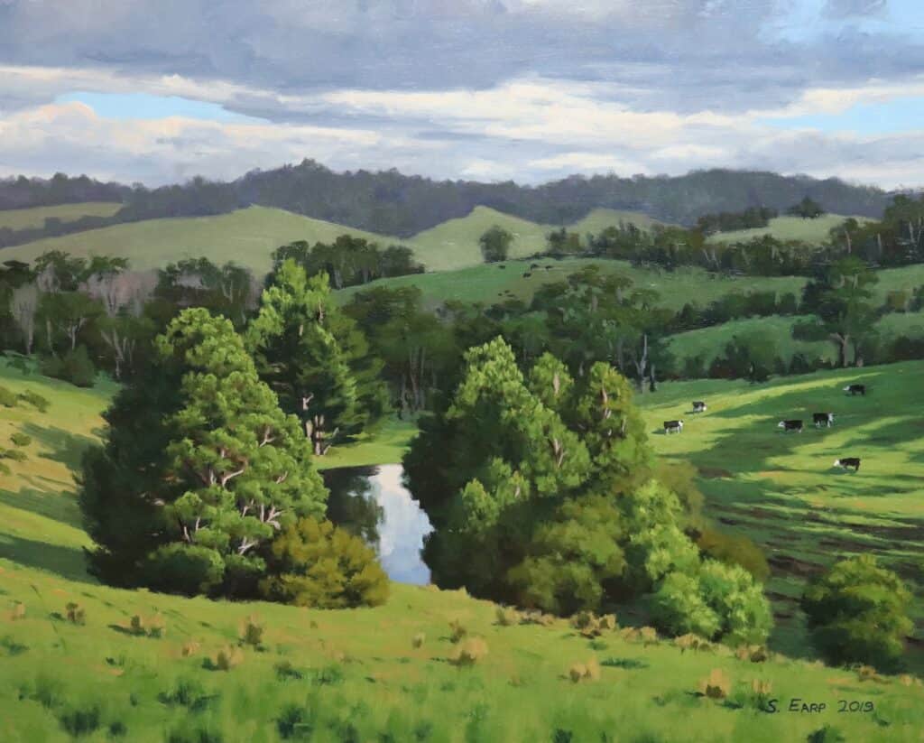
In the painting below, you’ll see that I added some colors that contain red in the grass. This adds interest and texture to the grass and helps harmonize the green by having its complementary color opposite.
PAINTING LANDSCAPES IN OILS – EBOOK
$17.00
This ebook contains information on oil paints, brushes, colors and values, composition, color mixing, planning your painting and there are 11 painting demonstrations. All this and so much more.
- File Type: PDF
- 102-Pages
Analogous Colors
Analogous colors, which are adjacent, create a harmonious and soothing effect. Analogous colors are colors adjacent or adjacent to each other on the wheel. These colors share a similar hue and have a balanced relationship when used together.
Typically, an analogous color scheme consists of three colors: a dominant color and two supporting colors. For example, if we take the color wheel and select a dominant yellow, the analogous colors would be yellow-orange and yellow-green. Using these analogous color schemes of colors in design or art can create a sense of unity and balance, as they naturally blend well and create a smooth transition from one color to another.
By understanding the basics of the color wheel, you can begin experimenting with various color schemes and color combinations that complement and enhance each other. This knowledge is crucial for color mixing, allowing you to create the desired shades and tones.
Split Complementary Colors
Split complementary colors, in reference to the color wheel, are a variation of the complementary color scheme. In this scheme, instead of using a single complementary color, two colors adjacent to its complement are chosen.
The split-complementary color scheme consists of a base color and two other colors, each side of the complement’s opposite. For instance, if we select blue as the base color, the split-complementary colors would be yellow-orange and red-orange.
This scheme allows for a broader range of colors while maintaining a pleasing balance. It offers a vibrant and dynamic visual effect, with the base color complemented by two colors that provide contrast and harmony simultaneously.
Split-complementary colors can be effectively used in various artistic and design applications to create visual interest and excitement.
ARE YOU STRUGGLING WITH YOUR PAINTING?
JOIN MY ONLINE ART SCHOOL AND UNLEASH YOUR INNER ARTIST.
- Step-by-Step Painting Tutorials
- Helpful Tips and Techniques
- In-depth lesson notes
- Inspiring reference photos
- Instant access to all content, including videos, lesson notes, reference photos and more.
- A vibrant and friendly community, meet other members, ask questions, and share your art.
- Zoom meetings for Q&A’s, painting critiques and painting livestreams.
- Ideal for beginners and experienced painters.
- Lots of inspiration, help and support to take your painting skills to the next level.
The Fundamentals of Color Mixing: Hue, Saturation, and Chroma
With a basic understanding of the color wheel, you can move on to the fundamentals of color mixing: hue, saturation, and chroma.
To truly master the art of color mixing, it’s essential to understand the fundamentals of hue, saturation, and chroma.
Hue refers to the basic color family, such as red, blue, or yellow. Saturation determines the brightness or dullness of a hue, while chroma refers to the purity or intensity of a color. Hue refers to the pure color itself, while saturation refers to the intensity or purity of that color. Chroma, conversely, is the vividness or brightness of a color.
By manipulating these three variables, artists and designers can create an endless range of colors and tones to convey specific moods and emotions in their work. Whether you’re looking to create a bold and vibrant piece or a soft and calming composition, understanding the basics of color mixing is essential.
An Example of Color Saturation in a Landscape Painting
Color saturation is another essential element and value to get right in your painting. If your colors are too saturated, they likely won’t recede well so you could end up with a flat-looking painting.
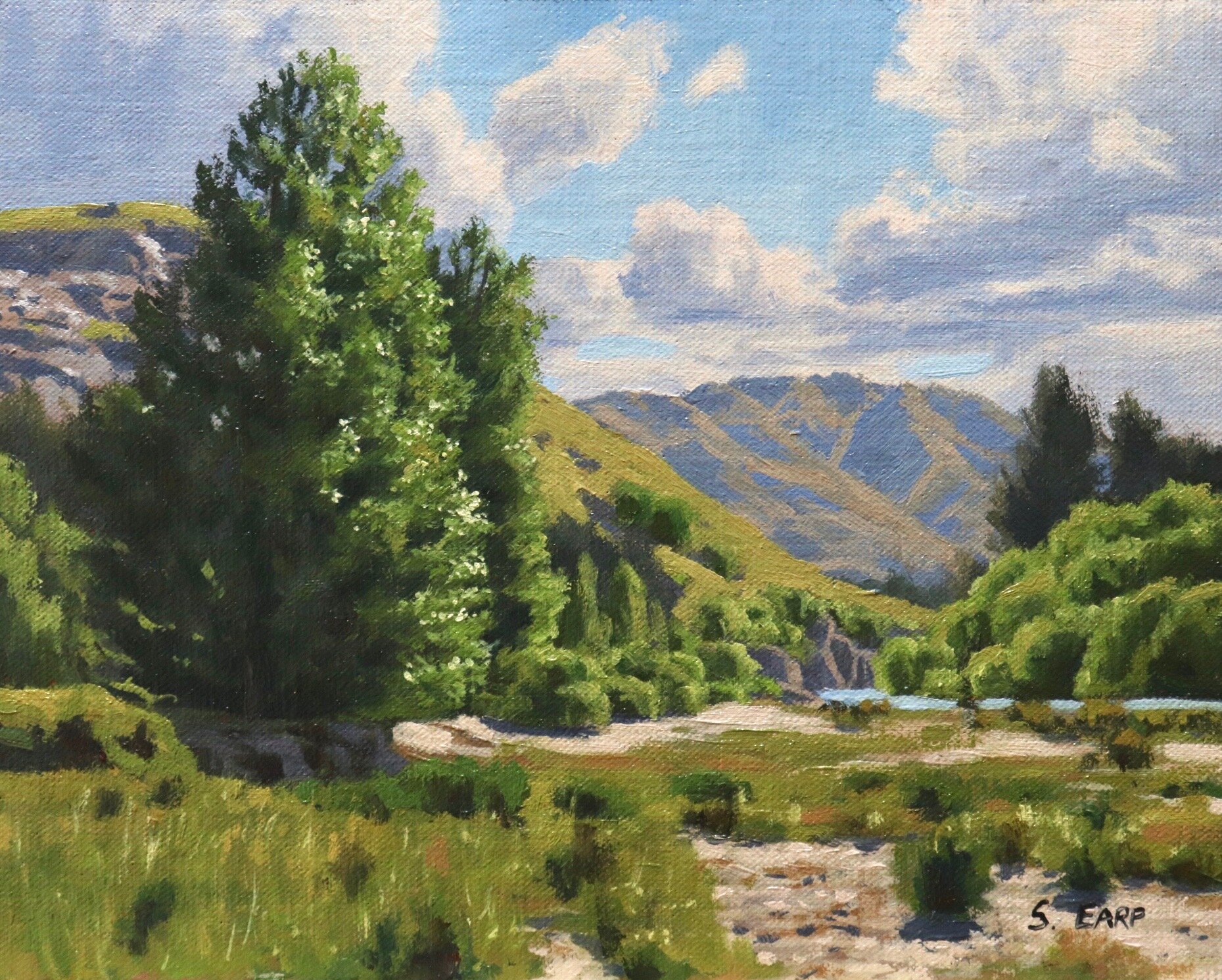
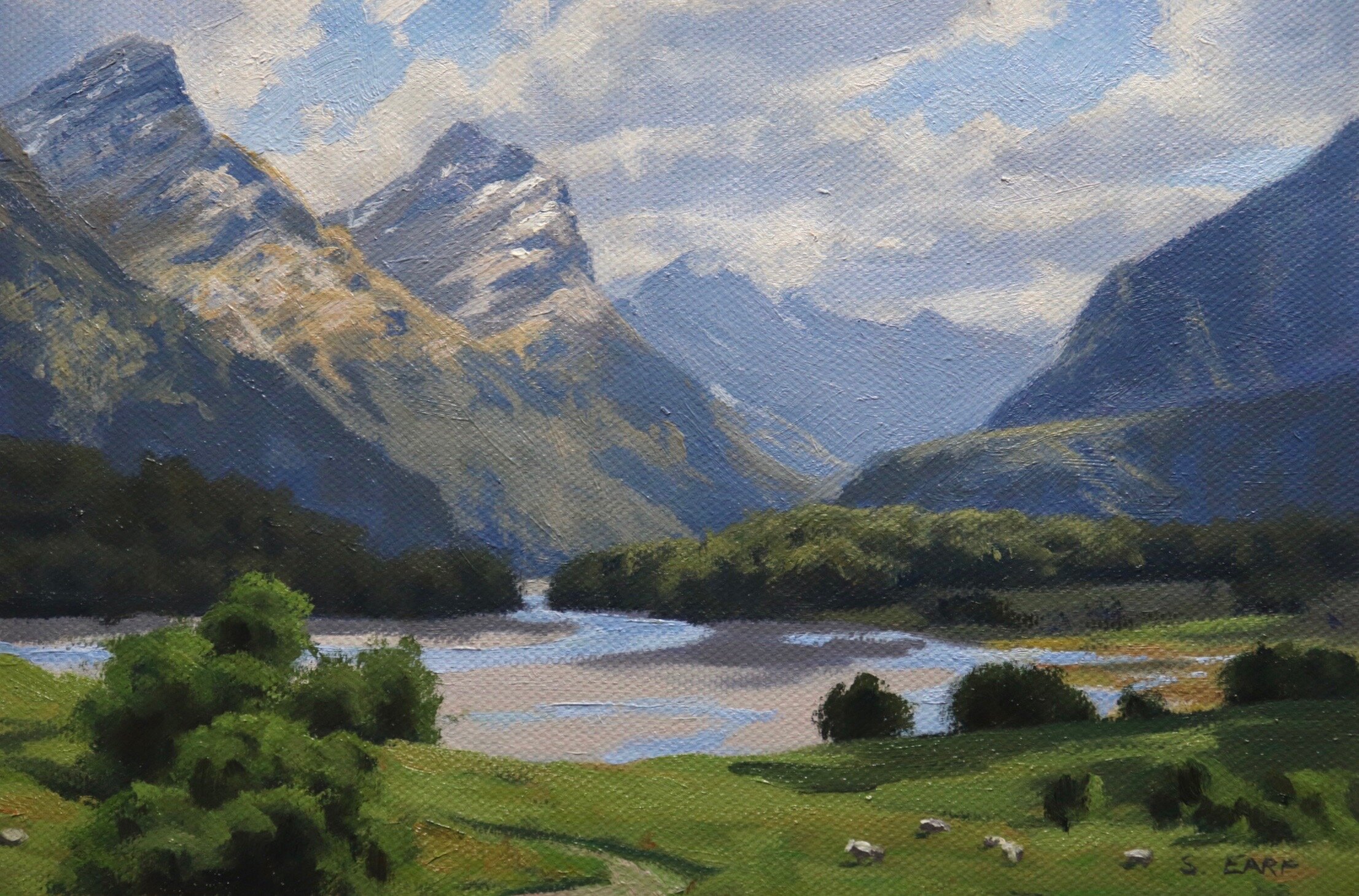
In landscape painting, and as with values, you’ll find your lightest and darkest values in the foreground. You are also more likely to find saturated color in the foreground of a landscape, and as landforms recede into the distance, the colors become desaturated.
For example, I used a saturated green for the grass in the foreground of this painting. You’ll notice the green on the distant mountains is desaturated. If the saturation of the green were the same as the grass in the foreground, it would come forward in the painting, and the illusion of depth would be lost.
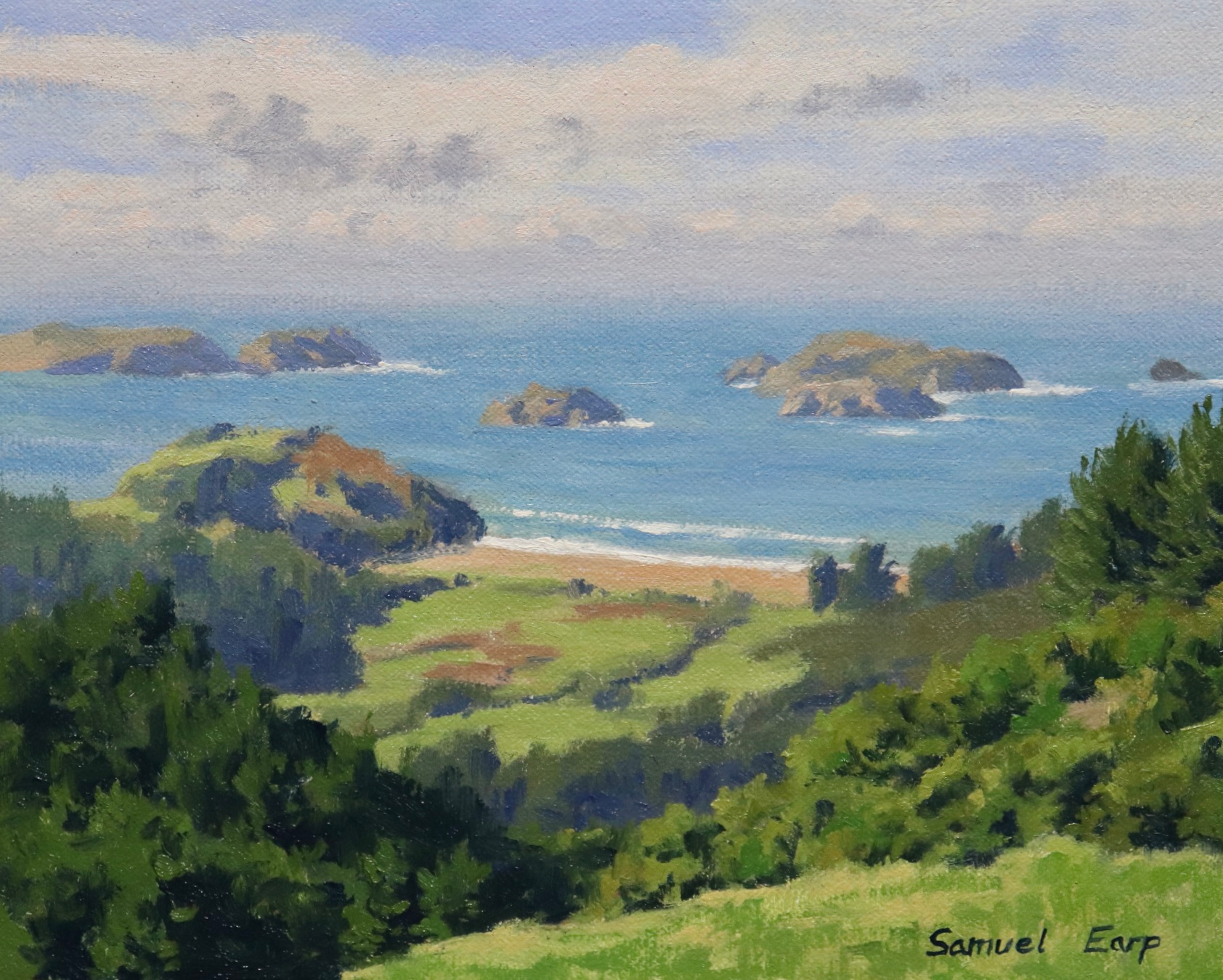
While you will find your most saturated colors in the foreground of a painting, many elements that you would find in a landscape naturally exhibit low chroma colors, for example, dead straw-colored grass or rocks and stones.
Example: In the painting below, the grass in this salt marsh painting naturally displays low chroma color, so this must be considered when painting. You’ll see that the darkest values are in the foreground shadows. The distant landform is lighter in value precisely because it is far away.

Creating Tints, Shades, and Values
By manipulating the intensity of color with either white or black, artists and designers can create variations known as tints and shades, respectively.
Tints are created by adding white to a color, lightening it, and creating a softer, more delicate hue. Shades are created by adding black to a color, darkening it, and creating a richer, deeper hue.
Values, on the other hand, refer to the lightness or darkness of a color, regardless of whether it has been mixed with white or black. Getting the values in your painting correct is more important than the colors you have created in my opinion.
Understanding the differences between tints, shades, and values is crucial for creating a sense of depth in your paintings, especially when conveying atmospheric perspective. Using these principles, you can effectively communicate the different shades, emotions, and moods in your artwork.
Color Theory Terms Quick Reference
Hue
This refers to the main attributes of the color spectrum and depends on its dominant wavelength, irrespective of how light or dark the color is. For example, the color is discernable as blue or red, etc.
Saturation or Chroma
This refers to the purity or intensity of a color. You can reduce the saturation of a color by adding a neutral grey or an opposite color on the color wheel.
Value
This is how light or dark a color is. Getting your values correct is one of the keys to the success of a painting.
Tone
This is a broad term for describing a color that is not a pure hue or black or white. It is a widely misunderstood term.
Tint
A color plus white
Shade
a color plus black
Mastering the Art of Color Harmony: Primary and Secondary Colors, and Complimentary Opposites
Understanding the differences between tints, shades, and values is the first step to mastering color theory. To create a harmonious color scheme, you must also understand the relationships between primary and secondary colors and complementary opposites.
Primary colors are the building blocks of all other colors. They include red, blue, and yellow. When you mix two primary colors, you get a secondary color. For example, when you mix blue and yellow together, you get green. The other two secondary colors are orange (made by mixing red and yellow) and violet (made by mixing blue and red).
Complementary opposites are colors that are opposite each other on the color wheel. When used together effectively, they create a strong contrast that can make your artwork pop.
Understanding Tonal Values
Value is how light or dark a color is and is one of the most essential concepts in painting. The success of a painting rests on the relationship between the values in the painting. If they are not working and not in harmony, then the whole painting can lack any depth.
The Value Scale
Values in the artwork are represented on a scale with the highest value being white and the lowest value being black. The greys in between are known as mid or half-tones.
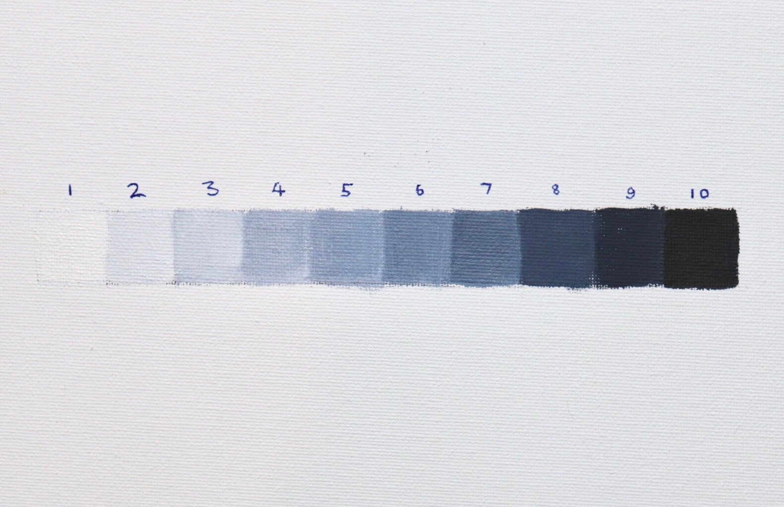
In general, you will find your darkest darks and lightest lights in the foreground of a landscape. However, as landforms recede into the distance, darks are not quite dark, and lights are not quite light as the tonal scale narrows.
If you are unsure of where your light and dark values are in the scene you are painting, switch the reference photo to black and white, and you’ll be able to see where your light and dark values are.
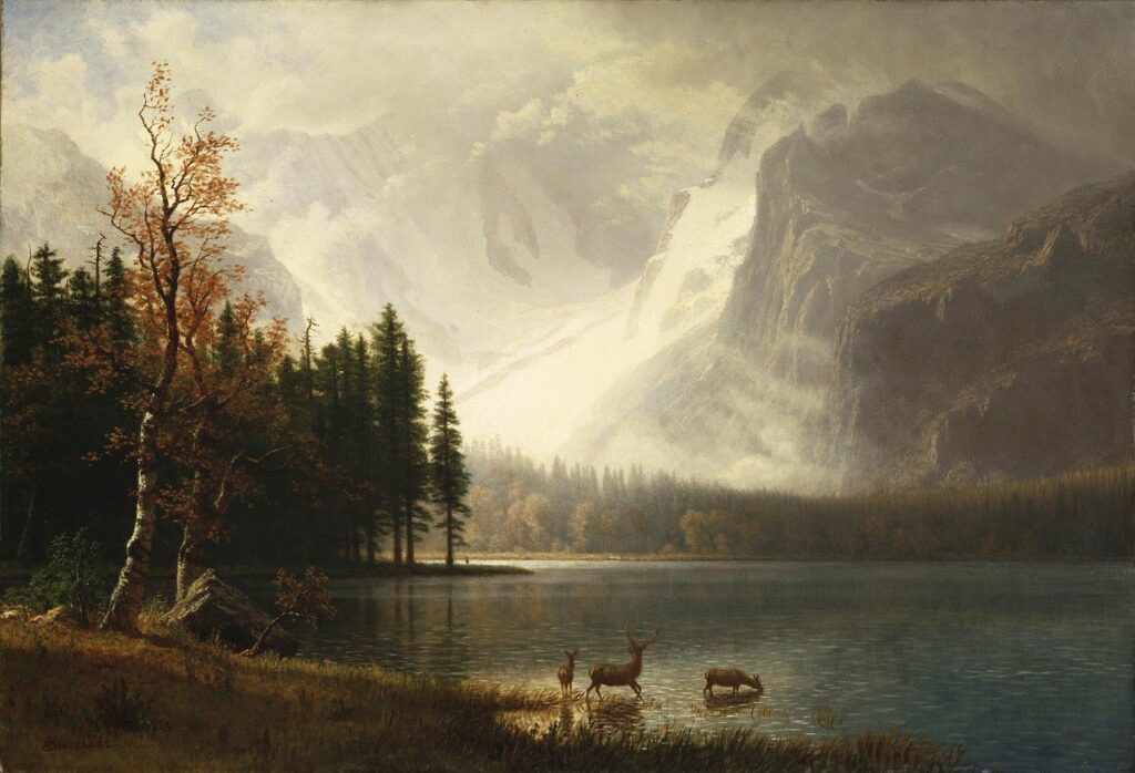
For example
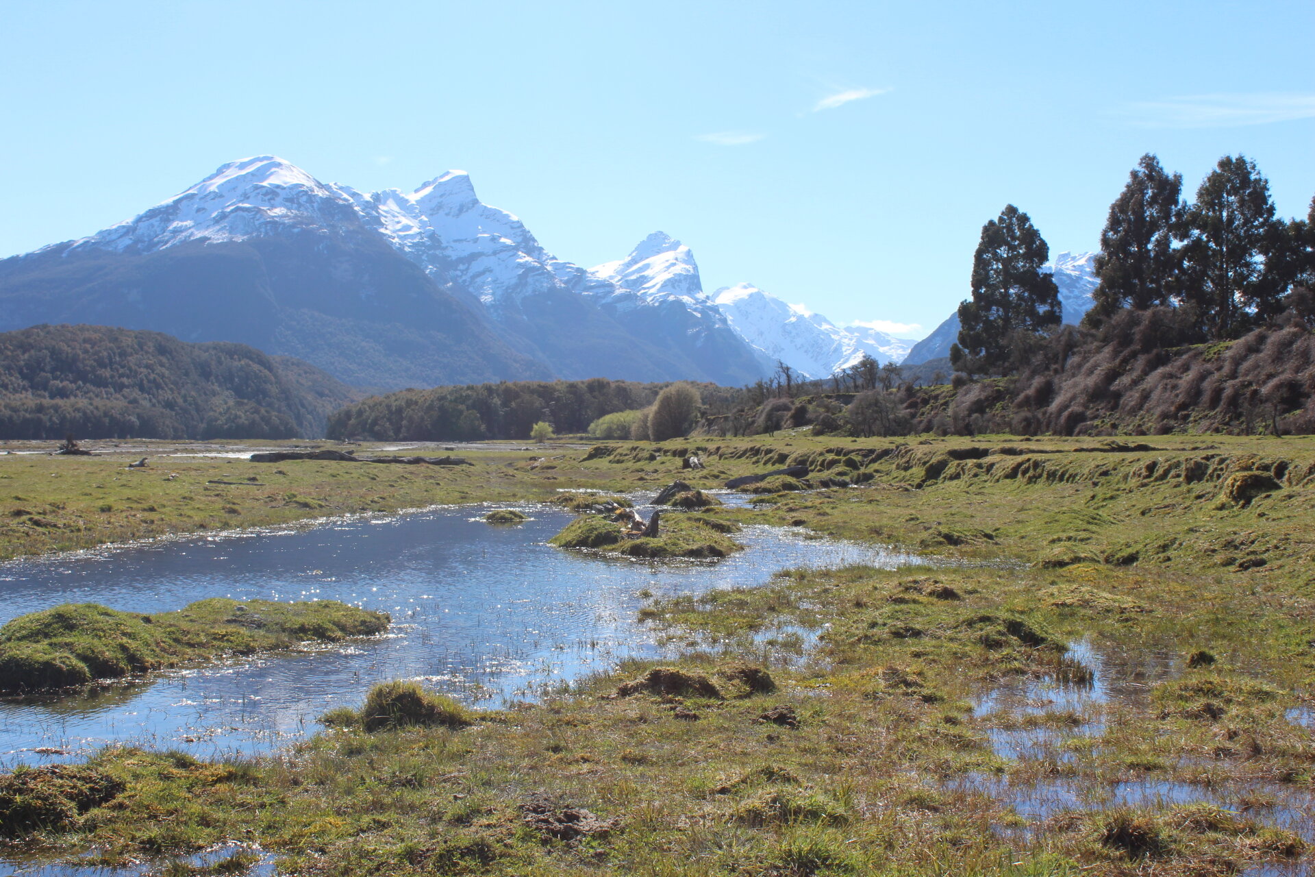
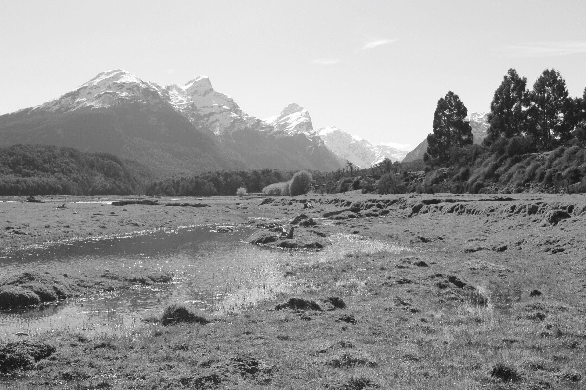
In the black and white photo, you can see the darkest values in the trees and the shadows in the foreground. The lightest values are in the sky on mountain snow.
In general, you’ll find that the sky is often one of the lightest values in the landscape. The grass is also generally lighter in value. Rocks and mountain faces are darker in value and often occupy the mid-tone range of the value scale. Trees are usually some of the darkest values in the landscape.
Getting the values correct in your painting is the most important thing, perhaps more important than getting the right hue.
Using a Limited Palette
I think using a more limited palette is best when you are learning to mix colors or are new to painting. This will help you in many ways.
When using a limited, you will better understand color mixing and increase the likelihood of creating color harmony in your painting. When you use fewer colors, you are likelier to use all the colors on your palette throughout your painting.
Using a limited palette is less confusing and can be overwhelming if you have too many colors.
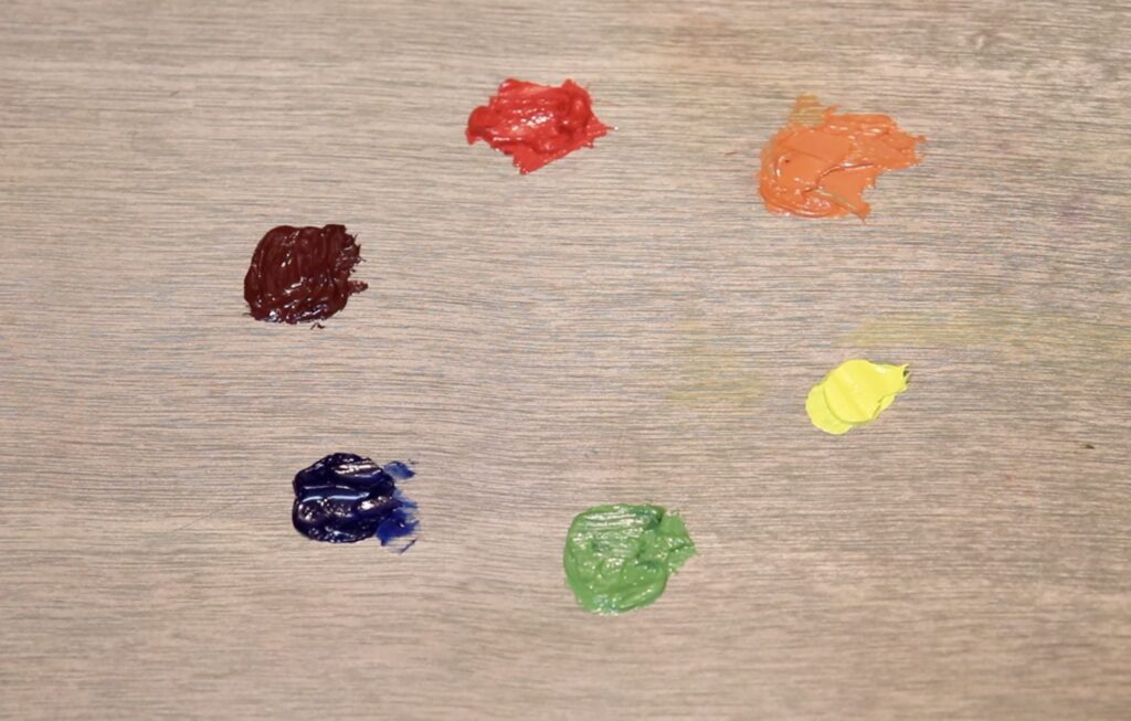
The Colors on My Palette
I am a traditional realism artist who especially loves to paint landscapes. The following list of colors is the ones I have been using for many years. I mainly use oil paint, and I believe you can paint anything with these basic colors used.
- Titanium white
- Burnt sienna
- Yellow ochre
- Cadmium yellow
- Cadmium red light
- Alizarin crimson
- Ultramarine blue
- Thalo green
Recommended Colors
Having shared my basic color palette with you, the following is a brief explanation of each color combination I use and recommend.
Titanium white
This is a strong white that does not lose its intensity with time. It is suitable for all types of painting and mixing with other colors.
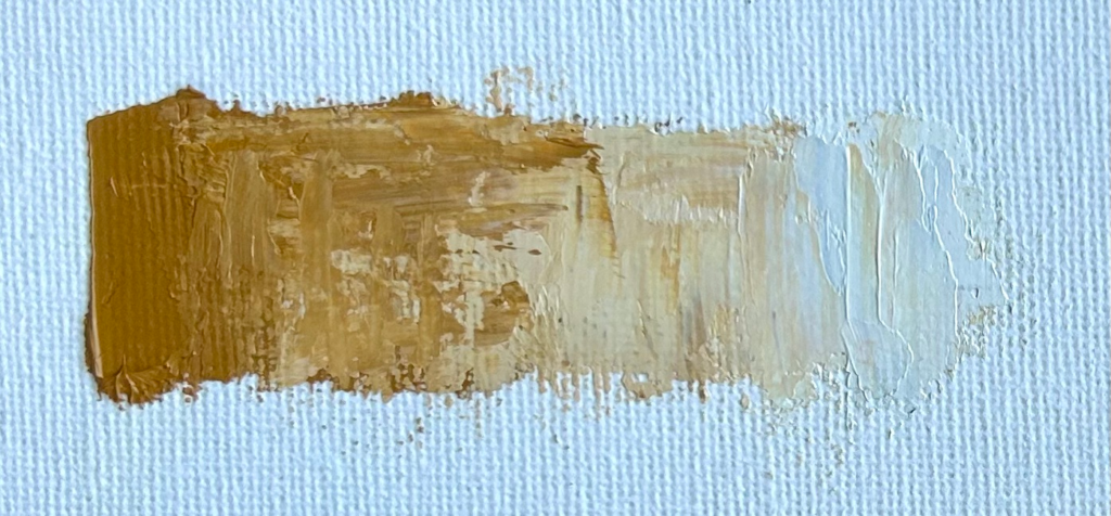
Burnt Sienna
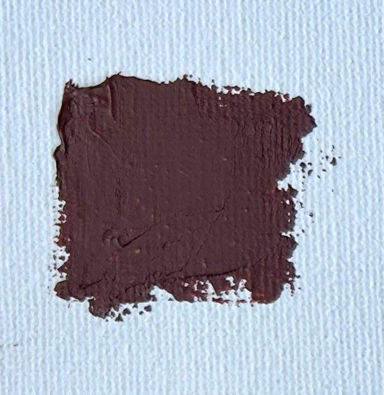
Burnt sienna is an earth color and one of the essential colors I have on my palette. Burnt sienna is actually a dark orange, and it combines well with ultramarine blue, where you can create some dark tones and natural greys when mixed with titanium white.
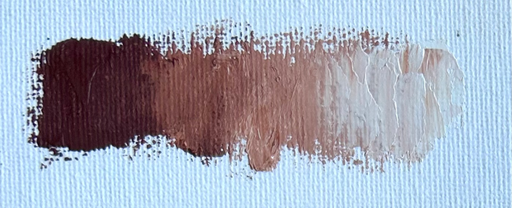
Burnt sienna tinted with titanium white
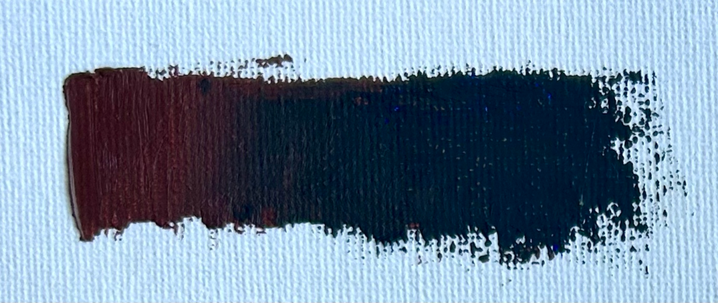
Burnt sienna combined with ultramarine blue
Yellow Ochre
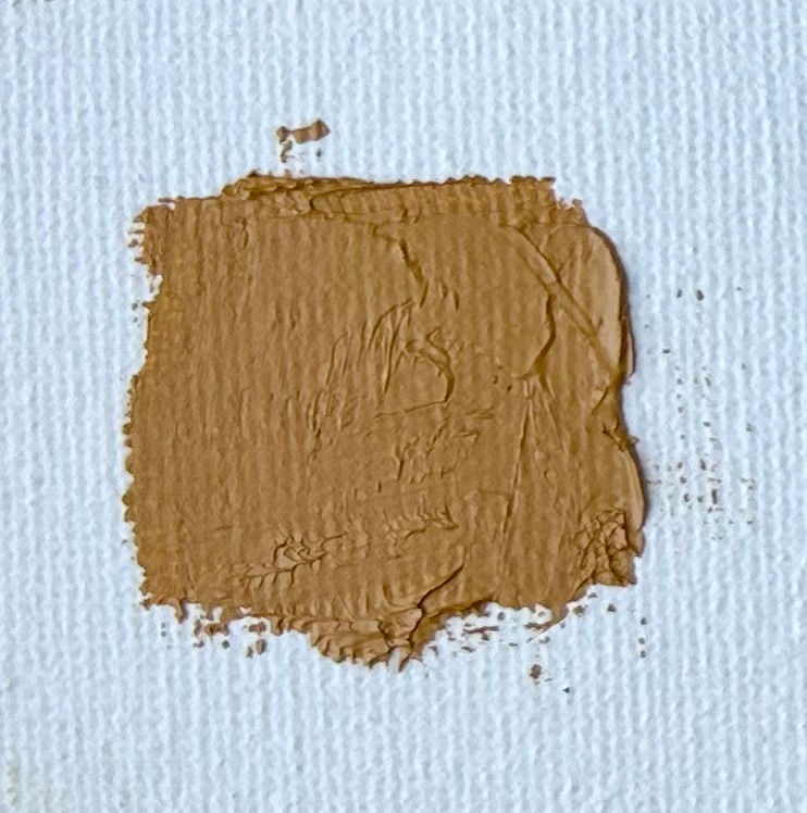
Yellow ochre is another earth color with a medium to light tone and is ideal for mixing greens and warm colors in light areas. It is an excellent color for mixing beach sand and for low-chroma straw-colored grass.
This color combines well with burnt sienna and ultramarine blue.
Yellow ochre tinted with titanium white.
Yellow ochre tinted with burnt sienna and ultramarine blue.
Cadmium Yellow
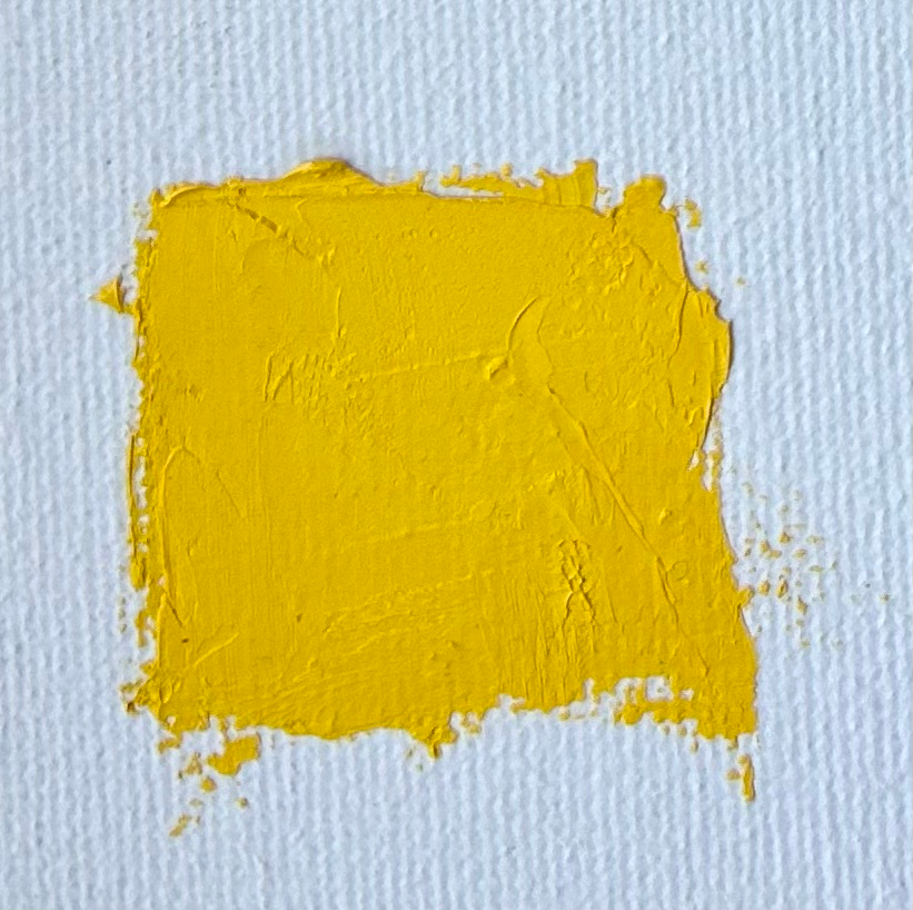
Cadmium yellow is very versatile because its hue is close to primary yellow. This is an excellent color for color mixing with greens, especially for grass, trees, and other foliage that you would find in the foreground of a landscape.
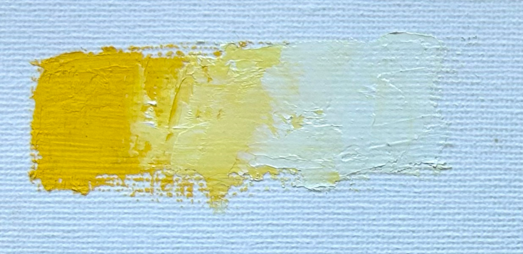
Cadmium yellow tinted with titanium white.
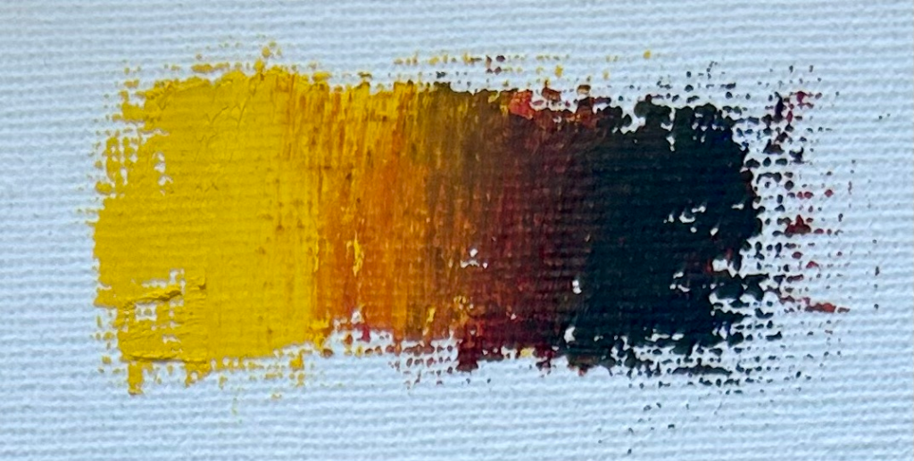
Cadmium yellow combined with alizarin crimson and ultramarine blue
Cadmium Red Light
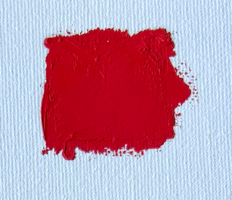
This color is a bright orangey red and is another versatile color. Cadmium red light is excellent for harmonizing greens to reduce saturation. It can be used to create flesh tones when mixed with yellow ochre, and you can also make some deep reds when combined with alizarin crimson.
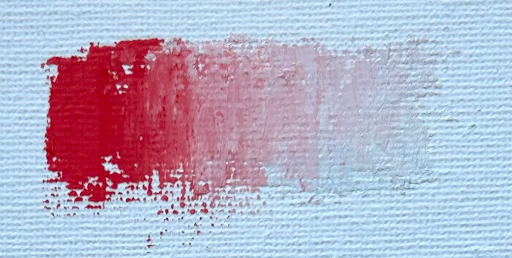
Cadmium red light tinted with titanium white
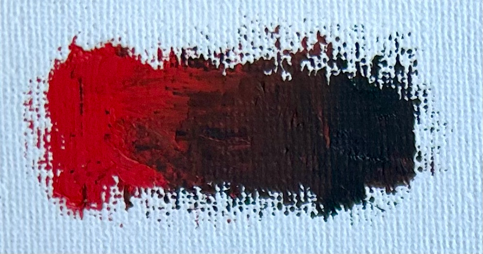
Cadmium red light combined with thalo green
Alizarin Crimson
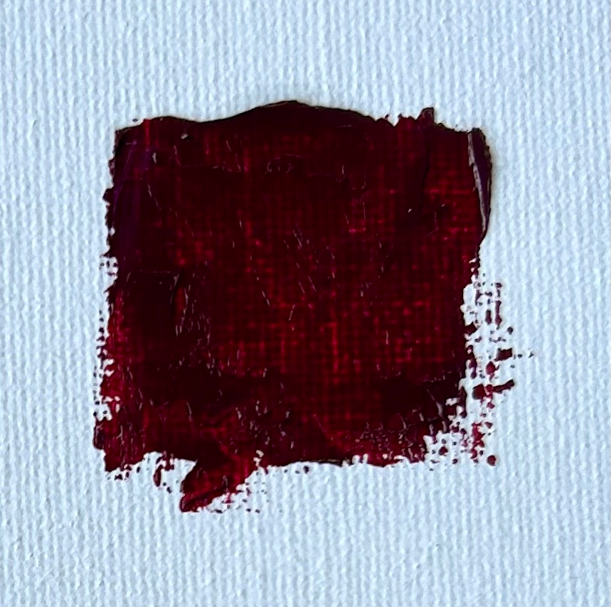
Alizarin crimson is an excellent tinting color to add some violet tones in your painting, great for clouds and shadows. Alizarin crimson is not a red but a violet, which can be seen when tinted with titanium white. Alizarin crimson is a color you must be careful with as it is strong and can quickly overpower your color mixes.
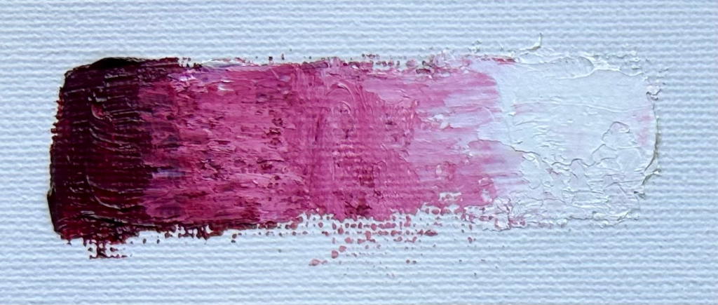
Alizarin crimson tinted with titanium white
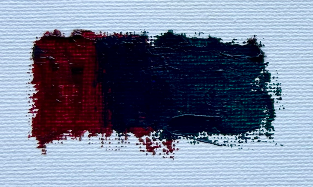
Alizarin crimson combined with thalo green.
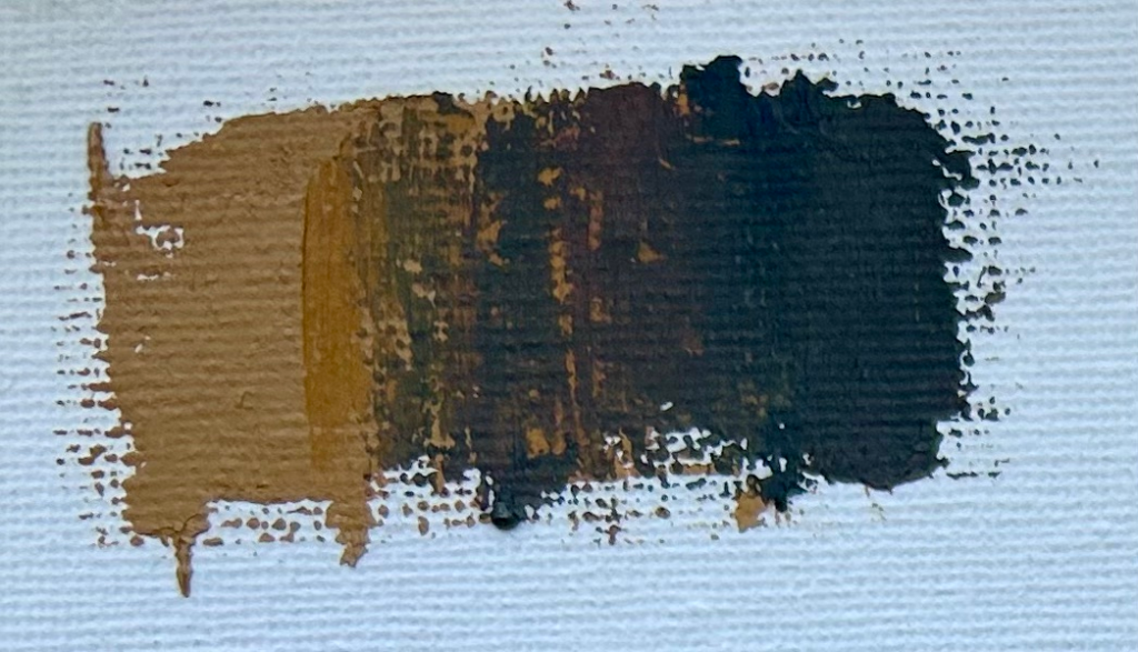
Ultramarine Blue
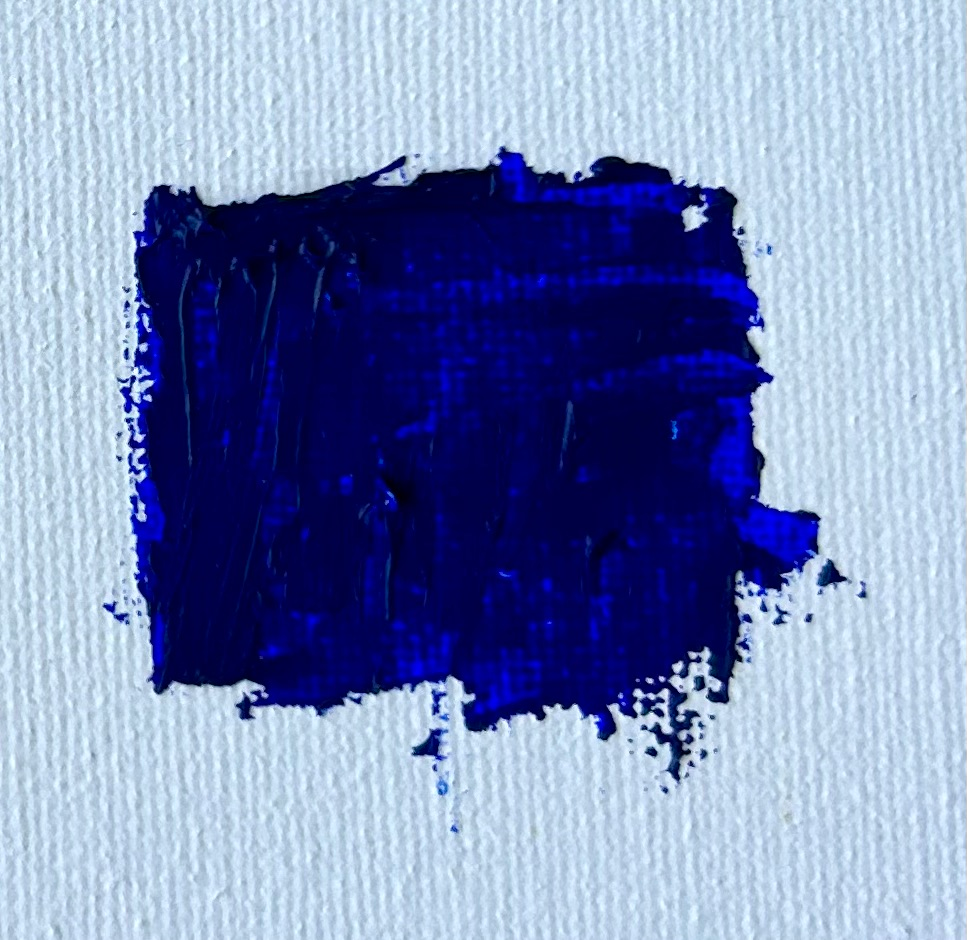
This dark blue is one of the most valuable colors on my palette. Blue is the coldest of colors, so is great for skies, snow, shadows, clouds, rocks, water, and much more.
Ultramarine blue has a subtle red undertone and combines with burnt sienna and titanium white to mix natural greys.
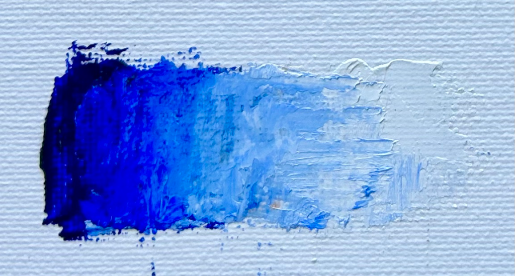
Ultramarine blue tinted with white
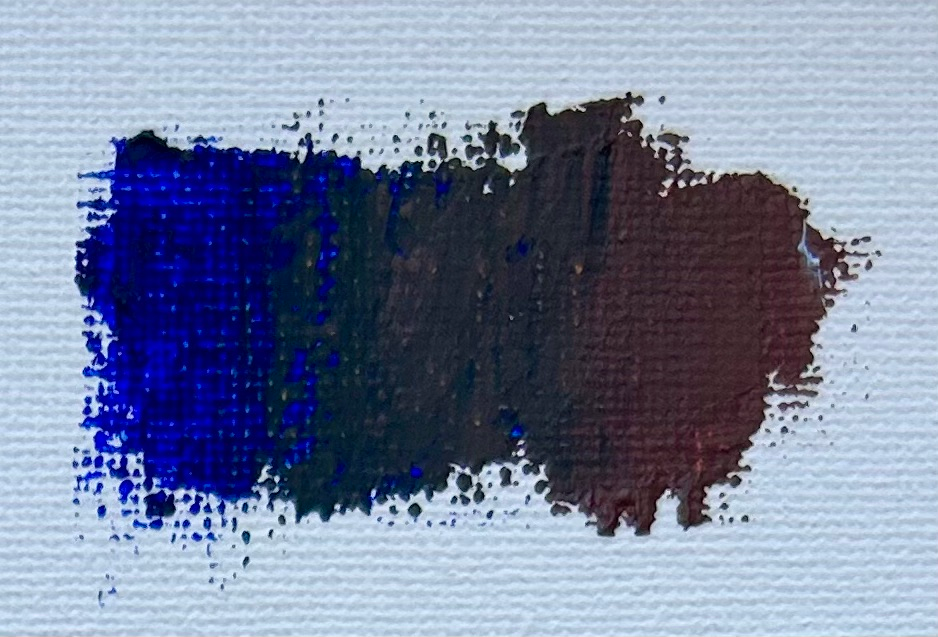
Ultramarine blue combined with burnt sienna
Thalo Green
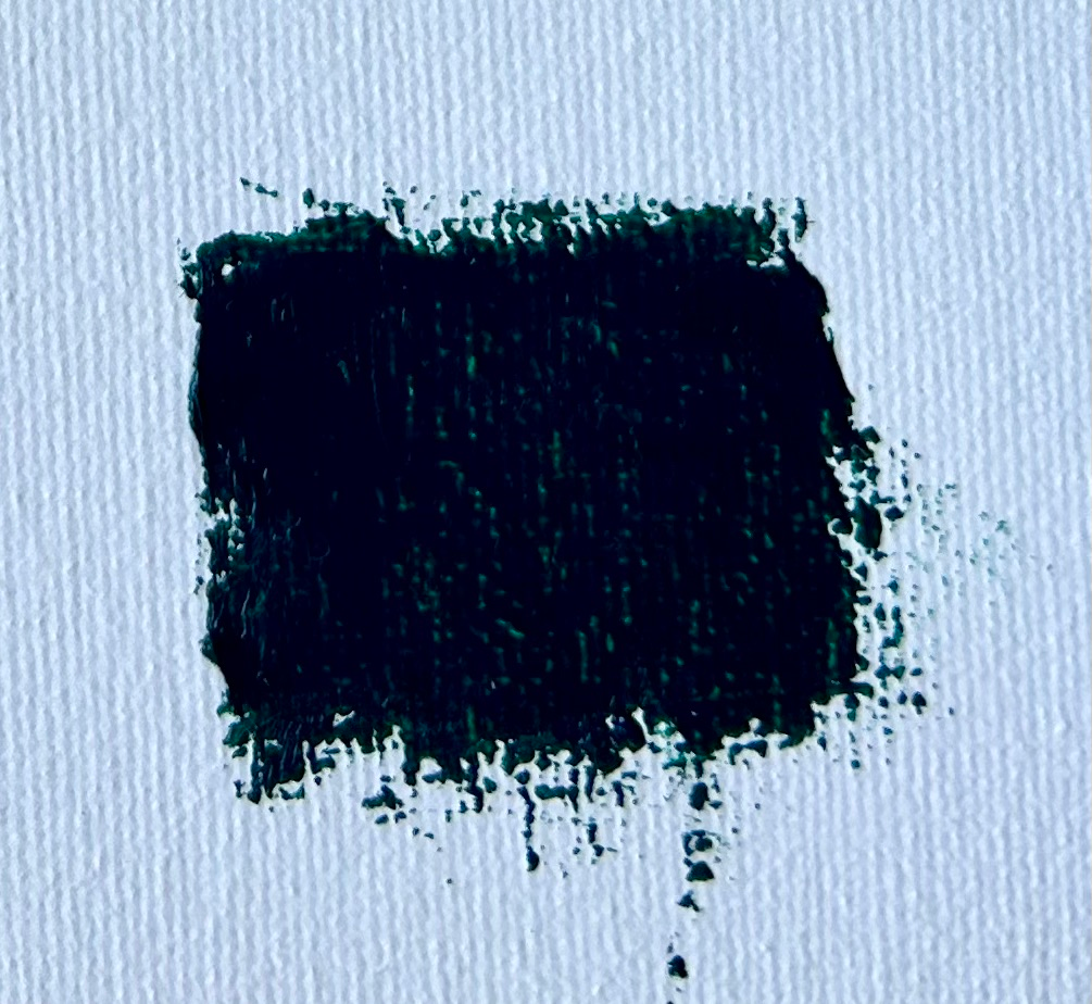
This is a potent color that has a dark tone and is exceptionally useful for increasing the saturation for an existing green that you have made with two primary colors, yellow and blue.
Thalo green produces some beautiful emerald tones but is also a cold green so excellent for painting leaves and foliage in shadow.
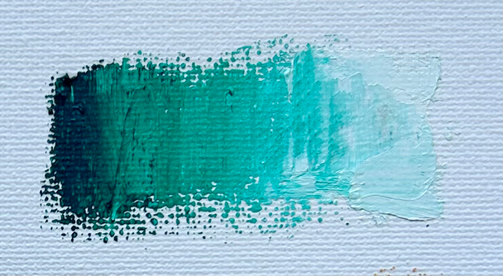
Thalo tinted with titanium white.
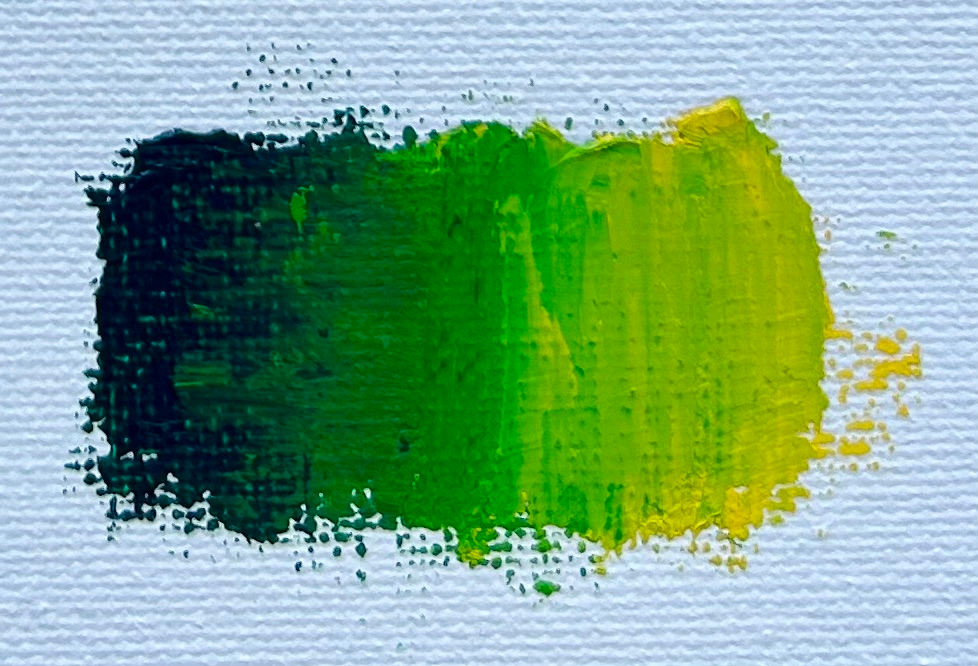
Thalo green combined with cadmium yellow and ultramarine blue
Thank you for reading 😊
