This article may contain affiliate links; please read my affiliate disclosure for more information
In this painting tutorial, I will show you how to mix greens for landscape paintings and some essential go-to greens that are easy to remember and that you can use in your artwork.
One of the trickiest colors to mix in a landscape painting is green, and it causes artists the most problems with many artists. Mix your greens right; they can look unique and vibrant but get wrong and can look acidic, artificial and harsh.
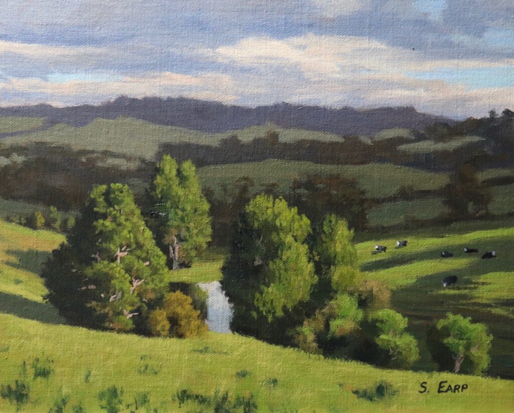
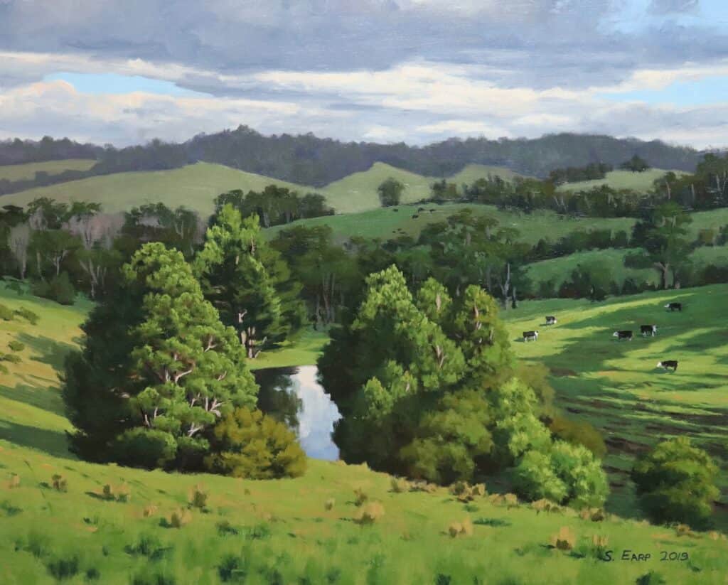
As well as showing you how to mix a few greens I will also demonstrate how to paint the landscape painting above. While this artwork is painted in oils, you can also use acrylic paints.
Why are Greens so Difficult to Get Right?
When you look at greens in the landscape, there are so many different hues but when it comes to getting that information down on the canvas in can be very difficult to get it right. But why is it so difficult to get the right green? Part of the reason is that your eyes can trick you. For example, you may think the green on a distant hill you are seeing is really green when in fact, it’s lost a lot of its chroma and vibrancy.
Greens don’t travel well over long distances, so for example a green on a distant hill will have lost most of its chroma (saturation) by the time it gets to your eye. Distant greens are more desaturated, but without understanding this combined with our eyes tricking us means we can end up mixing a green that is way too saturated on our palette.
Green is a color that is difficult to get right full stop. Too much of the wrong shade of green can be a massive distraction in your composition if you’re not careful, but get them right, and they can look amazing.
Tips for Mixing Green
Mix your own greens
There are many premixed greens available, for example, chromium oxide green, sap green, viridian, thalo green, emerald green, the list goes on. With so many greens, which do you choose from? Personally, I like to mix my own with yellow and blue as this makes the color look more natural and it’s more likely to be harmonious with the other colors on my palette.
Having said that the one premixed green I do use is thalo green as it’s great for increasing that saturation if your green needs a kick and it’s versatile. I never use this color on its own, only to add to an existing green mix.
Keep it simple
Part of the other reason I mix my own greens is that I generally use a limited palette for two reasons. One is that I find it less confusing with fewer colors on my palette as well as it helps me to give me a better understanding of color. The second reason is that with fewer colors on my palette, my color mixtures are more likely to contain common colors which means a more harmonious and cohesive painting.
Get some red in your greens
One last tip I recommend when mixing greens is to round off the mixture by adding a red element to it. As red is the complementary color opposite to green on the color wheel, I found that my green mixtures to look more natural and harmonious when I add a red element into the mix. Very often, I will round off my green mixture with a color that contains red such as cadmium orange, quinacridone crimson and/or burnt sienna.
Some Examples of Greens You Can Mix for Landscape Paintings
In the rest of this blog post, I will show you how to mix some greens that you can use to create inspiring paintings of landscapes but instead of just showing images of greens on a paint palette, I have put it into the context of the landscape painting below which I will show you how to paint in this step by step tutorial.

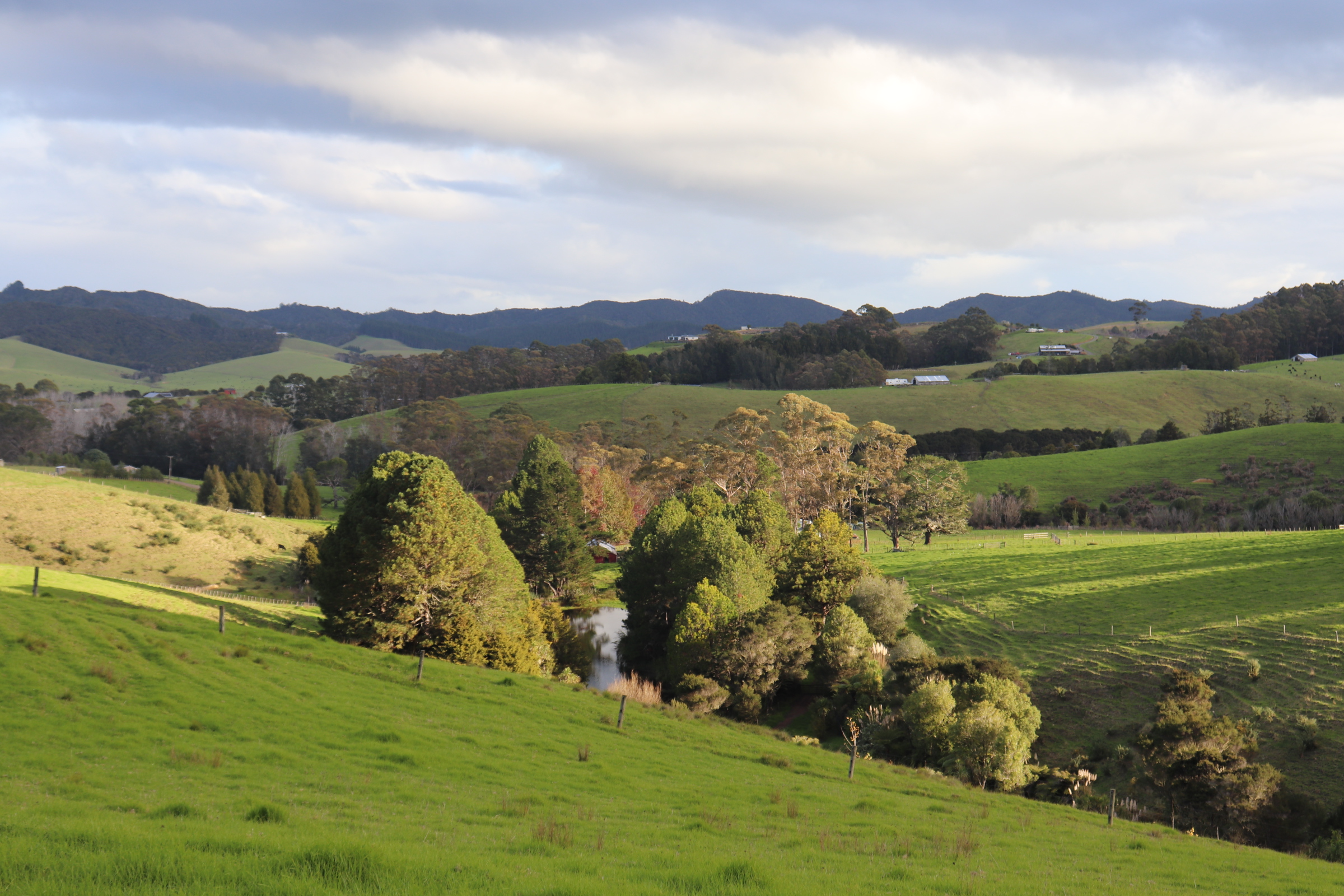
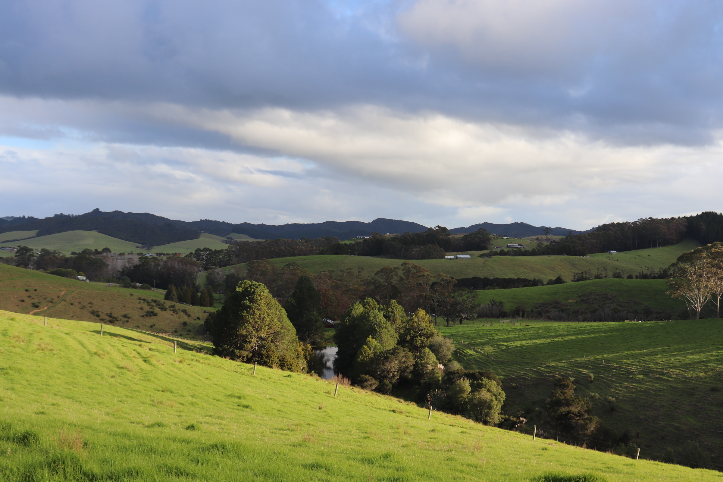
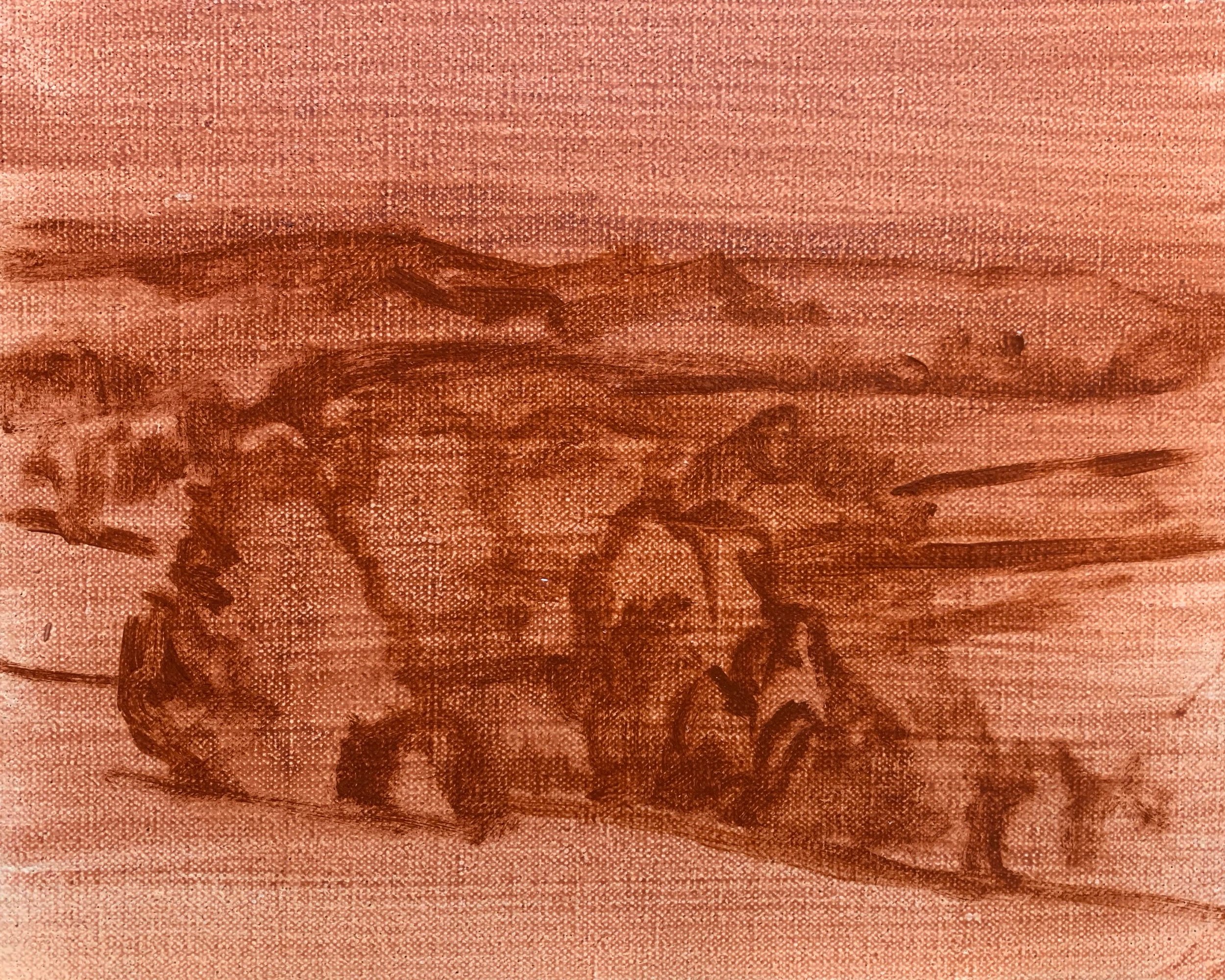
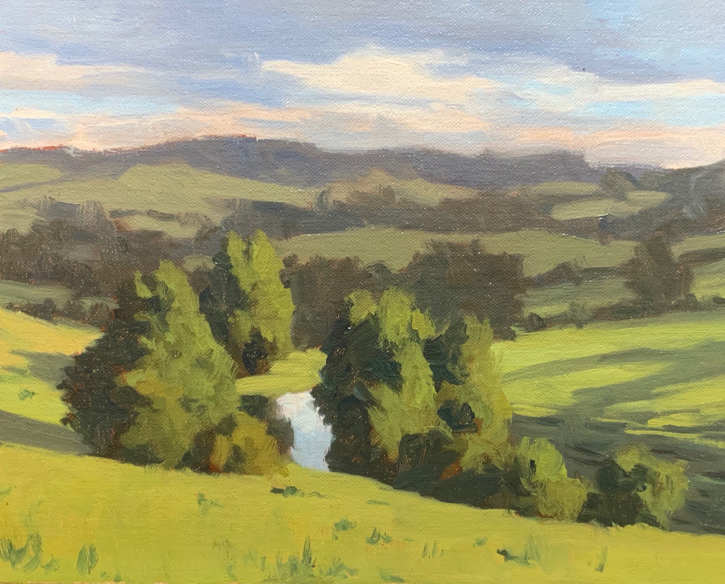
Reference Photos
This is a couple of the reference photos I used. Feel free to use these photos if you would like to have a go at painting this artwork.
WANT TO PAINT LANDSCAPES THAT ACTUALLY LOOK GOOD?
JOIN SAM’S LANDSCAPE PAINTING SCHOOL.
- Weekly live painting classes (current course: Trees)
- “Improve Your Painting in 7 Days” starter course
- My 4-stage framework: thumbnails → sketch → values → colour
- 60+ step-by-step tutorials
- Painting critiques & class replays
Colors
I painted this artwork using oil paint and the colors I used in this painting are as follows:
- Titanium white
- Burnt sienna
- Yellow oxide
- Cadmium yellow
- Cadmium red
- Quinacridone crimson
- Ultramarine blue
- Thalo green
Brushes
Here is a list of the brushes I used in this painting:
- No.6 flat
- No.2 flat
- No.1 round
- No.0 round
- No.00 round
- 3/8 dagger
- 1/4 dagger
Painting Tutorial
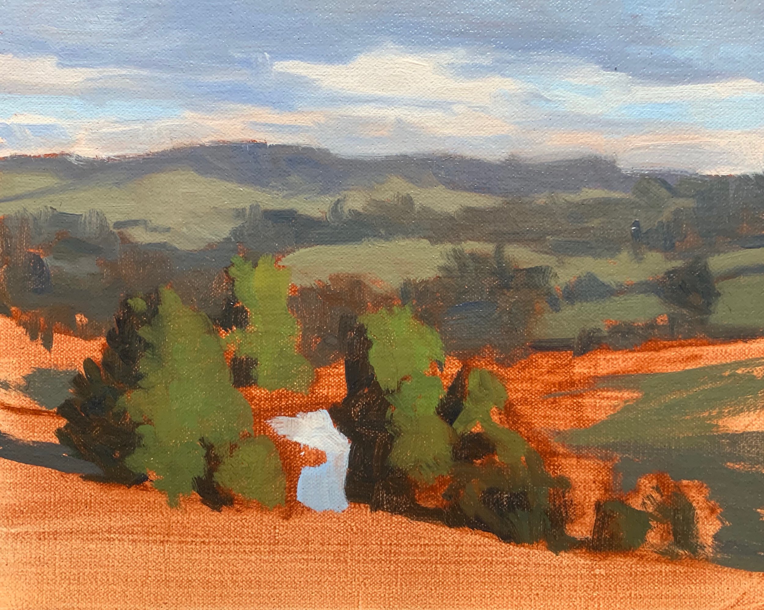
I am painting on an 8” x 10” linen panel that I toned with a layer of burnt sienna. The burnt sienna adds vibrancy to the painting.
I sketch out the composition with a No.1 round brush with burnt sienna. I am using Liquin Original as a medium to thin the paint, it also has the advantage of speeding up the drying time. The group of trees is the main area of interest in the composition.
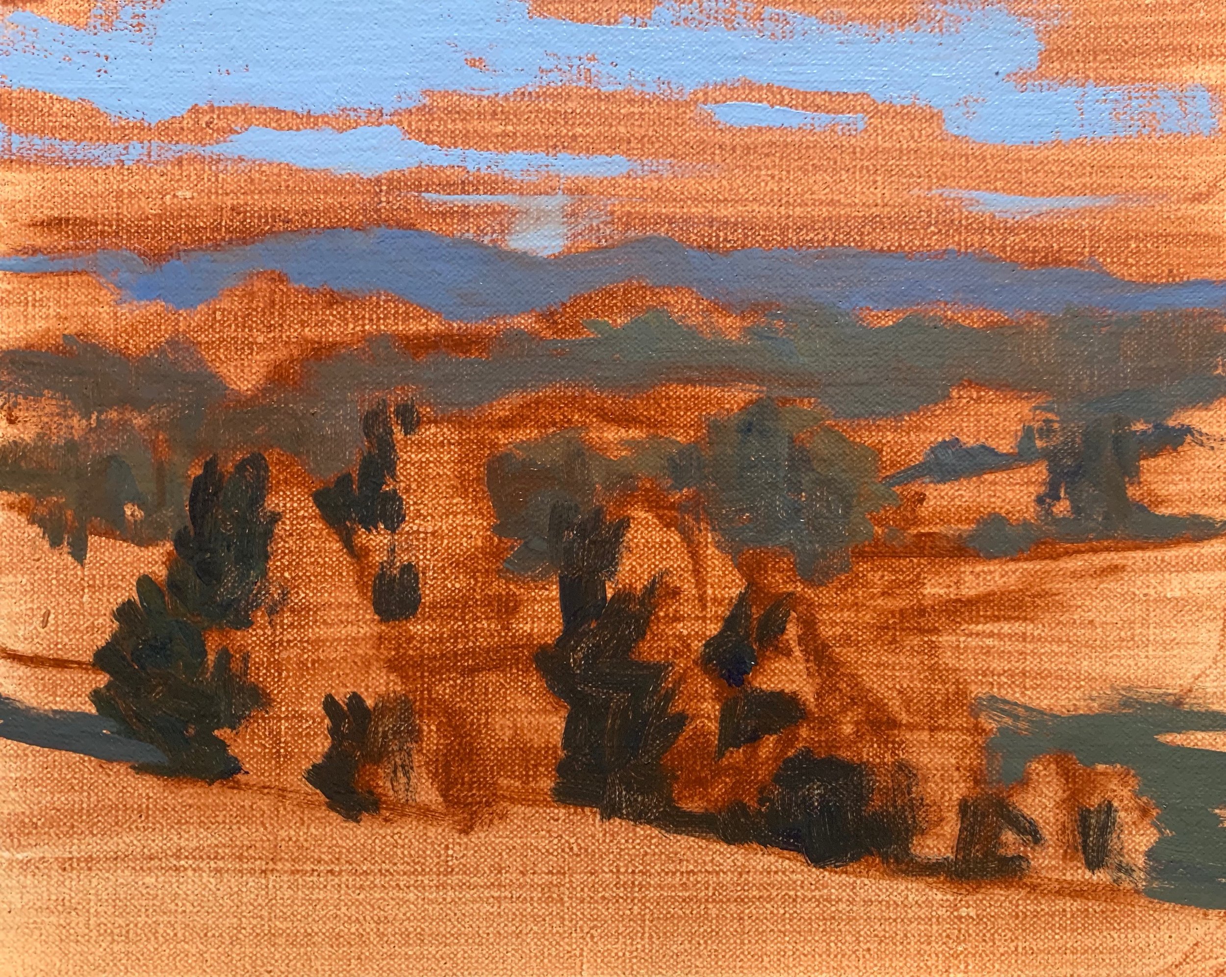
Now that I have sketched my composition it’s time to start blocking-in the painting, but before I mix any greens I paint all my shadows and dark values first. By doing this it’ll be much easier to achieve atmospheric perspective in the painting and get the saturation of my colors correct.
I start by painting the lightest of my shadows first which are in the clouds. For this I mix a combination of ultramarine blue, burnt sienna which takes out some of the saturation in the blue, quinacridone crimson which adds a violet tint and then I lighten the value with titanium white.
I use the same color mixture for the trees on the distant hills, but I darken the value by using less titanium white in my mix.
The color for the mid-ground trees which are also in shadow was mixed with a combination of ultramarine blue, yellow oxide, burnt sienna, quinacridone crimson, and titanium white.
The shadows in the group of trees in the foreground are the darkest value in the painting. I mixed this with a combination of ultramarine blue, yellow oxide and burnt sienna.
Now to start painting some greens.
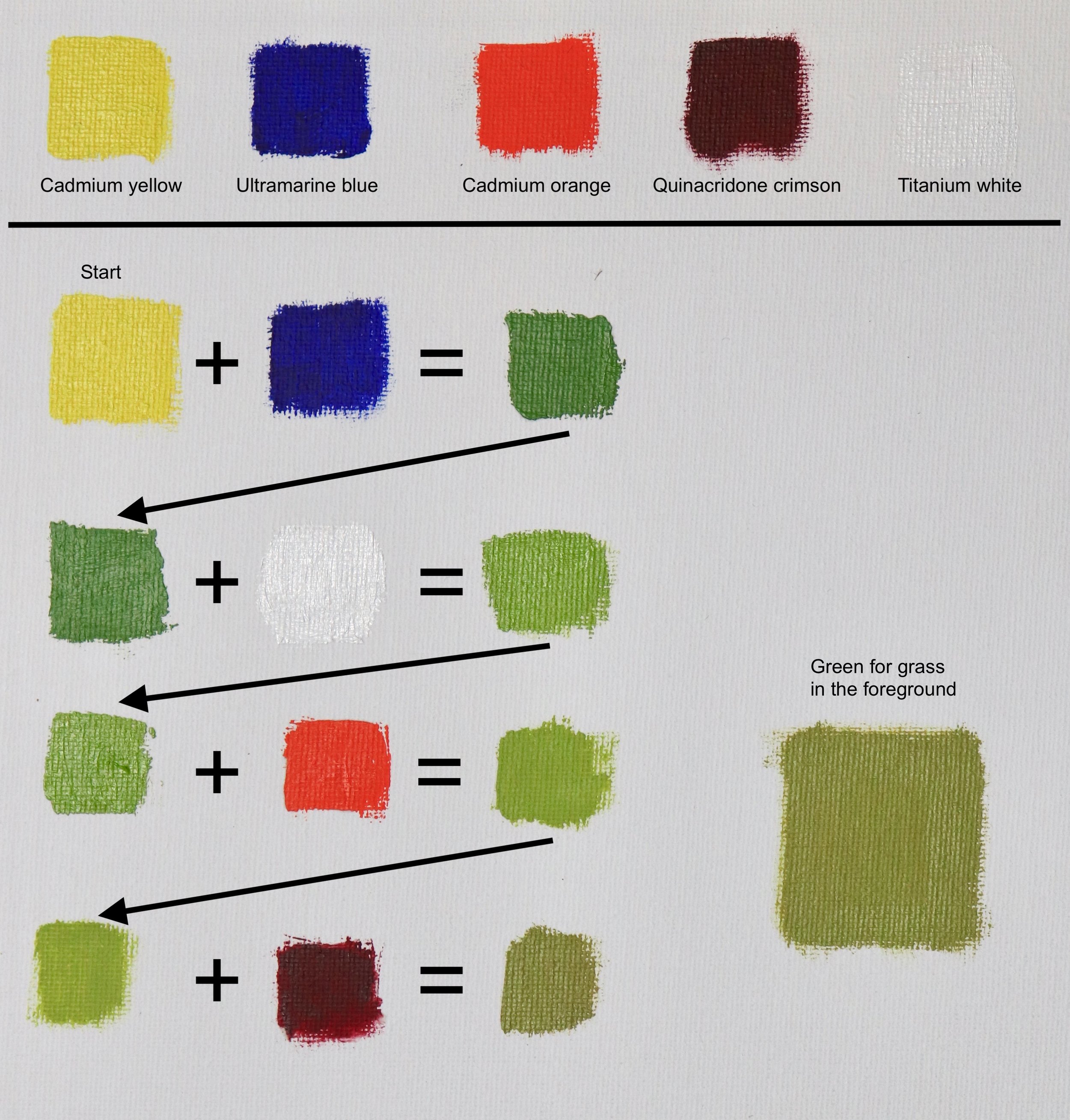
Mixing Green Diagrams
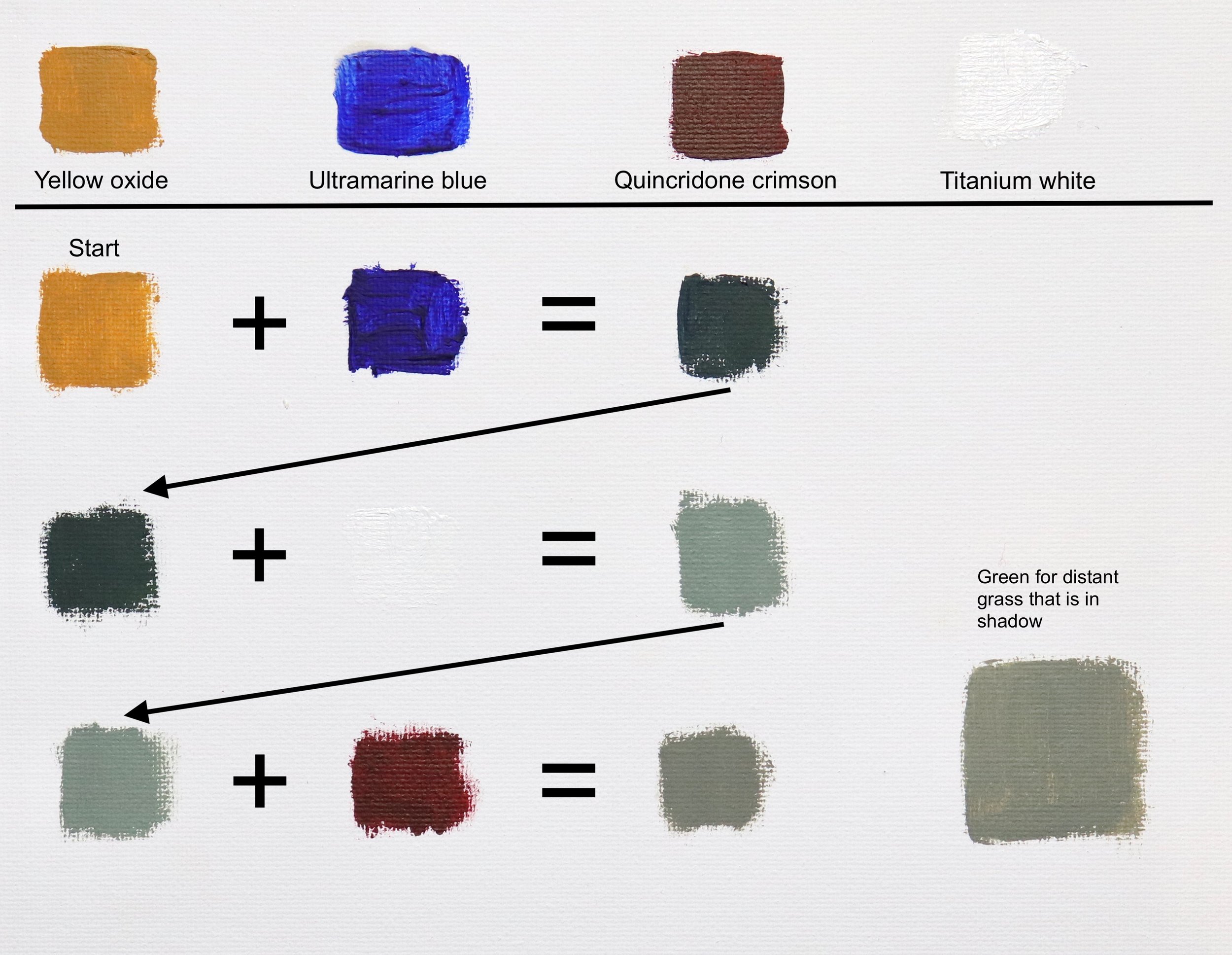
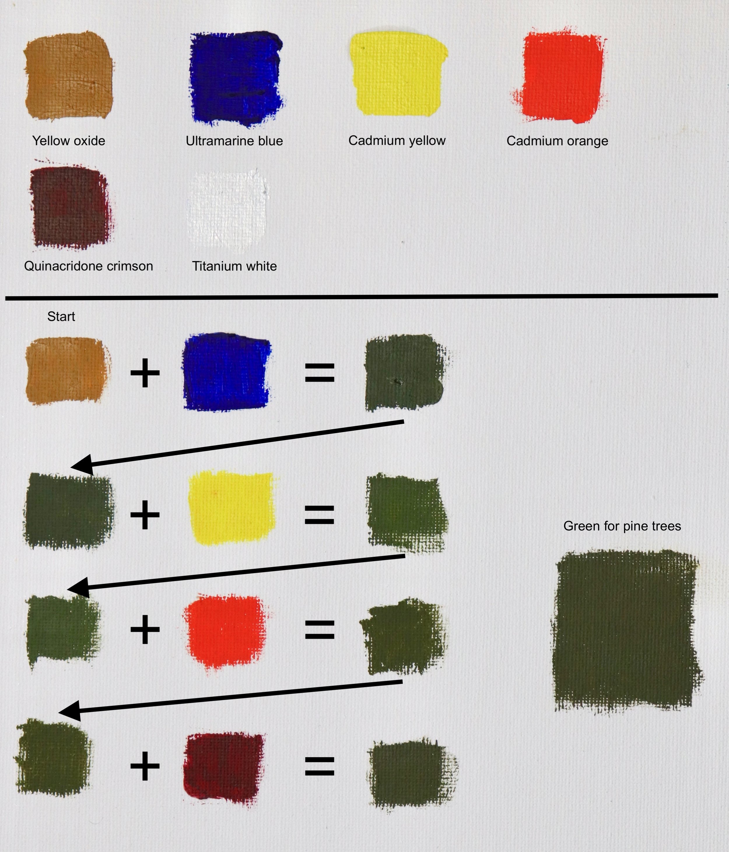
I have included a few visual images of how I have mixed some of these greens. I have done my best to simplify it and put it in the context of the painting. The list of colors required is at the top. Start with the color where is says ‘start’ and follow the steps, the plus signs mean to add the next color and arrows direct you to the next line. I hope this makes sense.
You may have to play around with the mixtures a little but it’s good to experiment with mixing colour.
Paint Stunning Landscapes Step-by-Step

4 x Step-by-Step Painting Tutorial Videos – $19
Mixing the Greens in the Distant Hills
First, I start with the grass in the distant hills which are pale and low in chroma. They are also in shadow. I have the background in shadow to achieve a contrast between the dark background and the trees in the foreground, which are in full sunlight. It also creates more atmosphere in the painting.
The green in the distant hills is desaturated so I need to mix a low chroma green otherwise, it won’t recede in the painting. In general, greens can be desaturated by adding a color opposite and/or using low chroma colors.
To do this I mix ultramarine blue with yellow oxide to start with and then some titanium white. I then round off the mixture with quinacridone crimson to add a red element in the mix.
Mixing the Greens for the Pine Trees
The pine trees in the foreground are darker in value and more saturated. To mix this green, I start with yellow oxide and ultramarine blue. I then increase the saturation by adding cadmium yellow to the mix, which also lightens the value. I round off the color with cadmium orange and quinacridone crimson. I can also vary the hue by adding in a little burnt sienna.
Mixing the Greens for the Grass in the Foreground
The green of the grass in the foreground is light in value and lighter than the pine trees. Trees are often some of the darkest values in the landscape whereas grass is much lighter.
I mix the green of the grass with a combination of ultramarine blue, cadmium yellow, a little cadmium orange and a tiny amount of quinacridone crimson. I then lighten the value by adding titanium white. I can increase the saturation by mixing in a little thalo green.
Once I have finished the blocking in stage I allow the painting to dry before I start adding some detail.
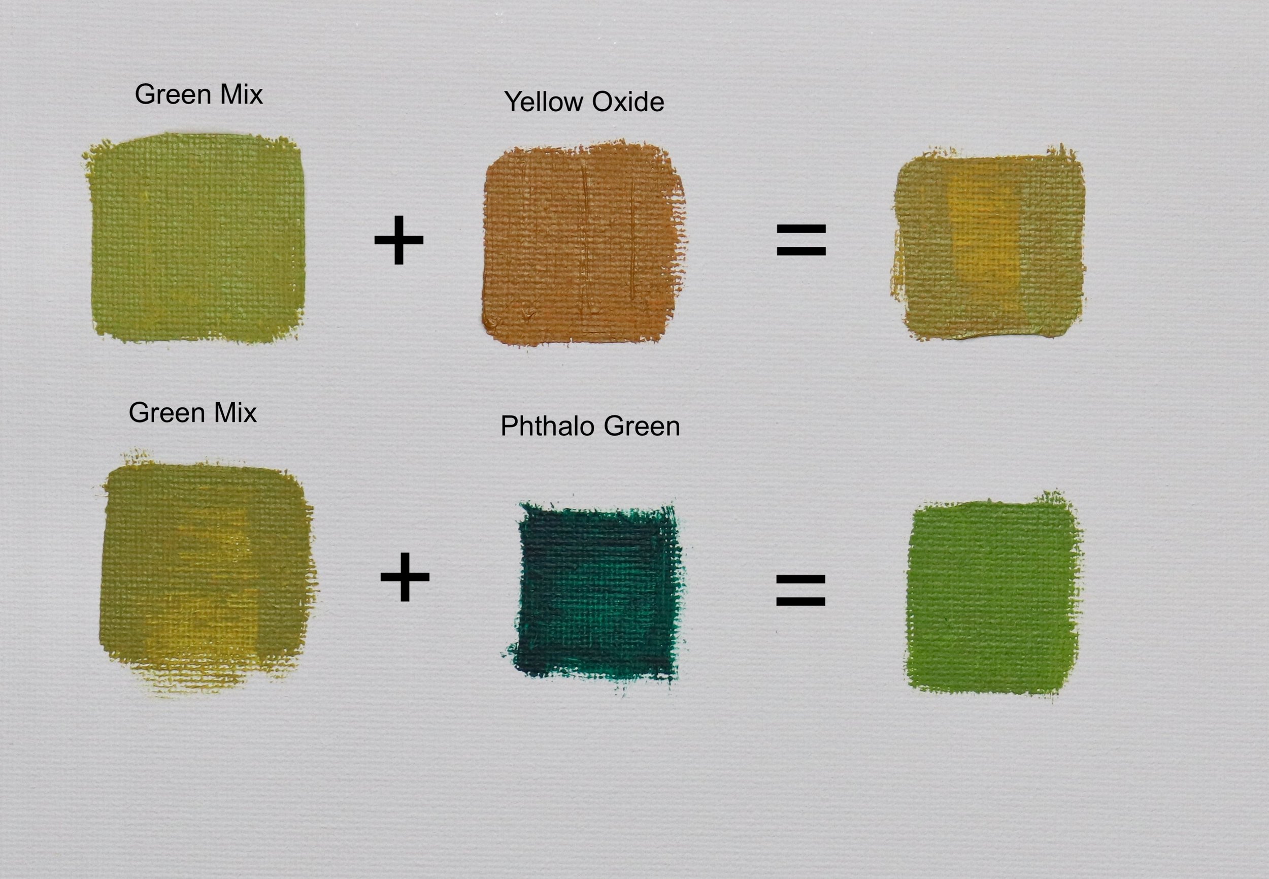
Creating Different Greens
I add more greens into the trees. They are the same color combinations that I used before but I have varied the number of colors I am using in the mix in order to create interest and texture within the trees. For example, if I want to mix olive green I will use more cadmium orange, quinacridone crimson and/or yellow oxide.
If I want to mix a richer more saturated green, I will use more cadmium yellow, ultramarine blue and thalo green.
If my greens are looking too cold I can add more cadmium orange and quinacridone crimson.

I finish up the painting by adding in finer details, such as the clumps on pine needles in the trees. I’m using smaller brushes, including No.0 and 00 round brushes. I am still using the same color combinations in the trees but making the values lighter to create a three-dimensional form within the trees.
I use my dagger brushes for the grass and mix a few greens to add texture to it but essentially, I am using the same colors I used in the block-in stage, but I vary the amounts I am using. I add my lightest greens at this stage as I have saved my lightest tones until the end of the painting.
Watch the YouTube Video
Thanks for reading 😊
