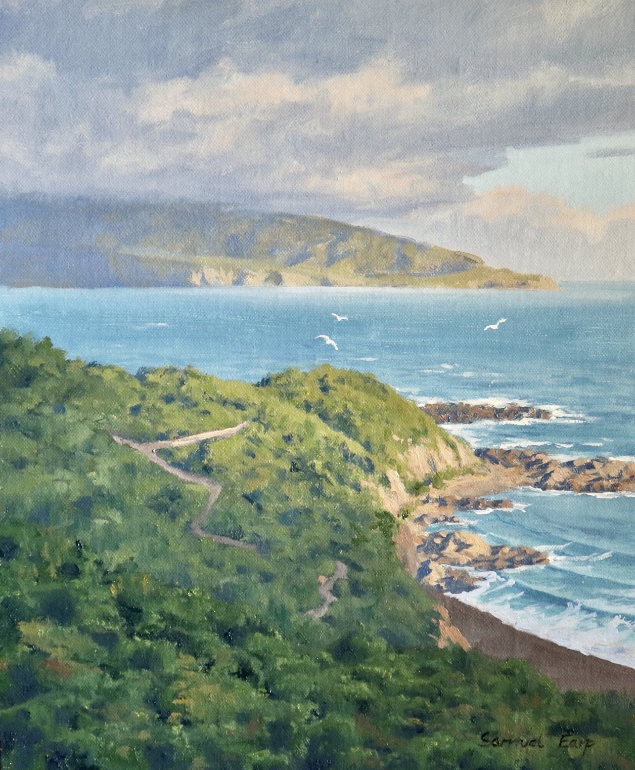
In this painting demonstration, I will show you how to paint a coastal landscape that features spotlighting effects and atmosphere. This painting is inspired by the coast of Wellington in New Zealand.
Suitable for oils and acrylics.
Bookmark this post on Pinterest!
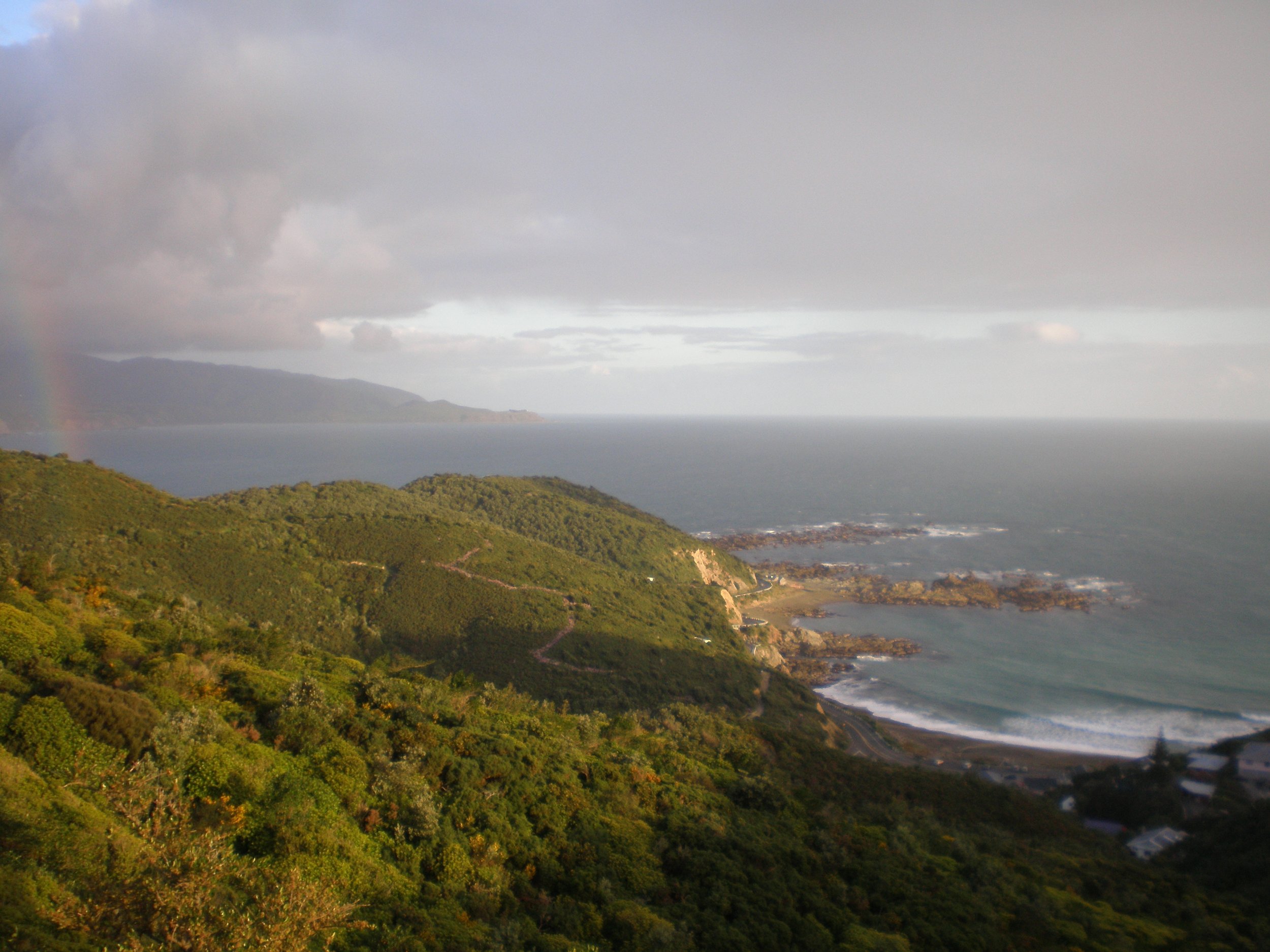
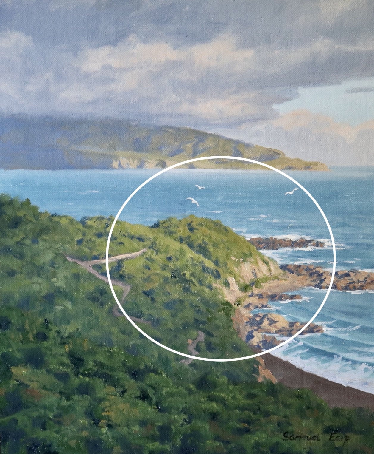
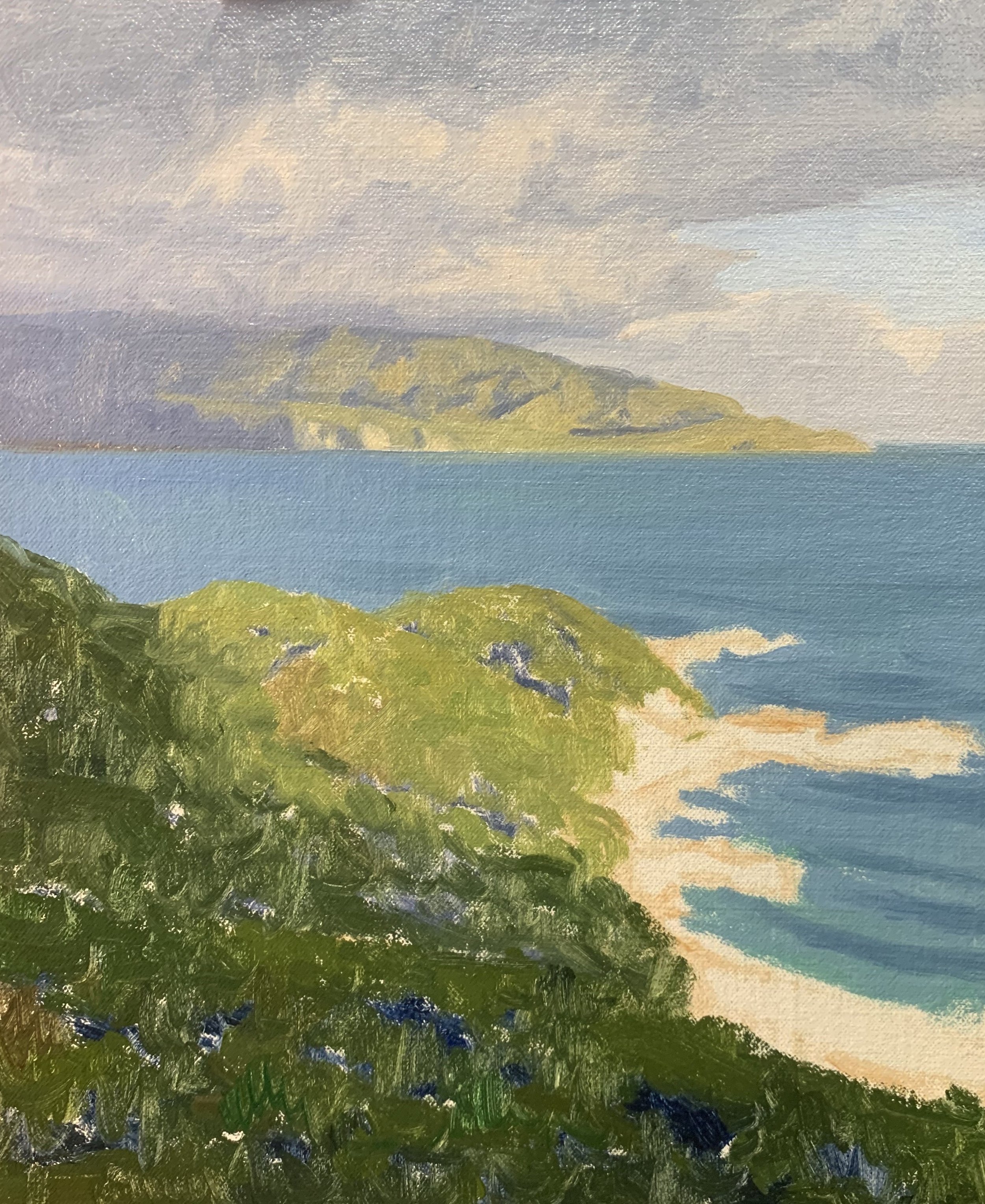
Reference Photos
Here are a couple of reference photos I took and used for this painting. Please feel free to use or copy these photos if you would like to have a go at painting this artwork.
Composition
This composition is all about the atmosphere of this landscape however the main area of interest is the sunlit area of the headland in the mid-ground. The headland in the background is a secondary area of interest along with the seagulls.
This composition features a high horizon line to encompass a decent area for the headland in the foreground.
ART TIP: Never have your horizon line in the middle as it looks displeasing in the composition. Either have a higher or lower horizon line.
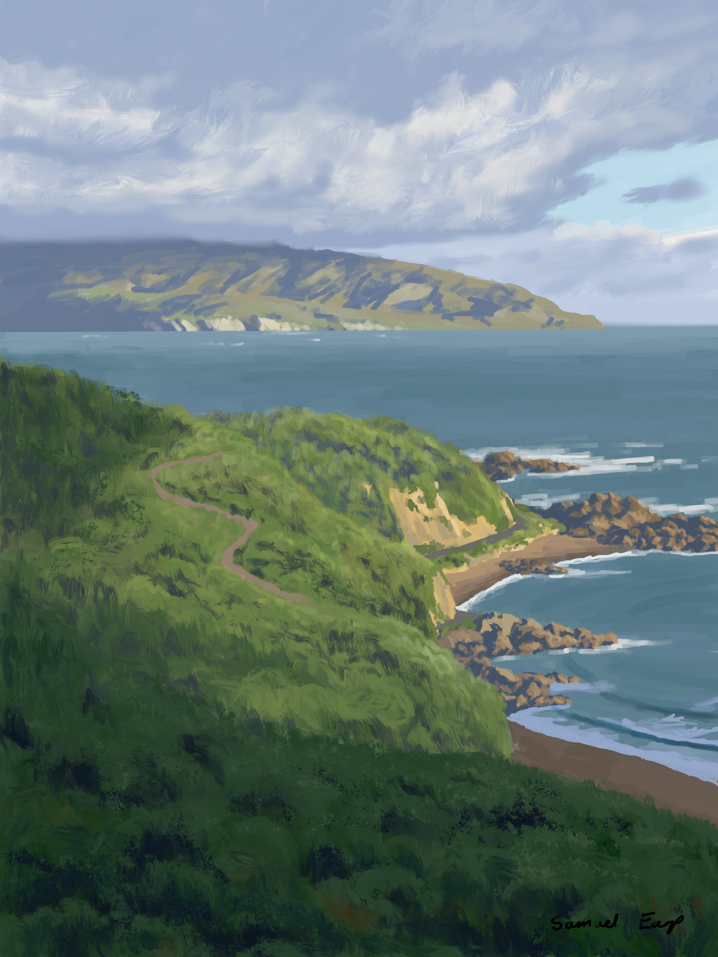
Sketch
Before starting my painting I created a sketch and in this case, it was a digital sketch that I designed using an iPad and Procreate. Whilst I created a digital sketch it is not essential you use this medium, normally I do pencil sketches. Whatever medium you use it is always a good idea to plan your composition before you start your painting.
Colours
I painted this artwork using oil paint and the colours I used in this particular painting are as follows:
- Titanium white
- Burnt sienna
- Yellow ochre
- Cadmium yellow
- Cadmium red light
- Alizarin crimson
- Ultramarine blue
- Phthalo green
Brushes
Here is a list of the brushes I used in this painting:
- No.5 flat
- No.3 flat
- No.2 flat
- No.3 filbert
- 1/4” dagger
- No.1 round
- No.0 round
Painting Demonstration
Stage 1 – Blocking-In The Painting
I am painting on a 10” x 12” linen panel. The linen is an oil-primed medium weave linen that is mounted to Baltic birch.
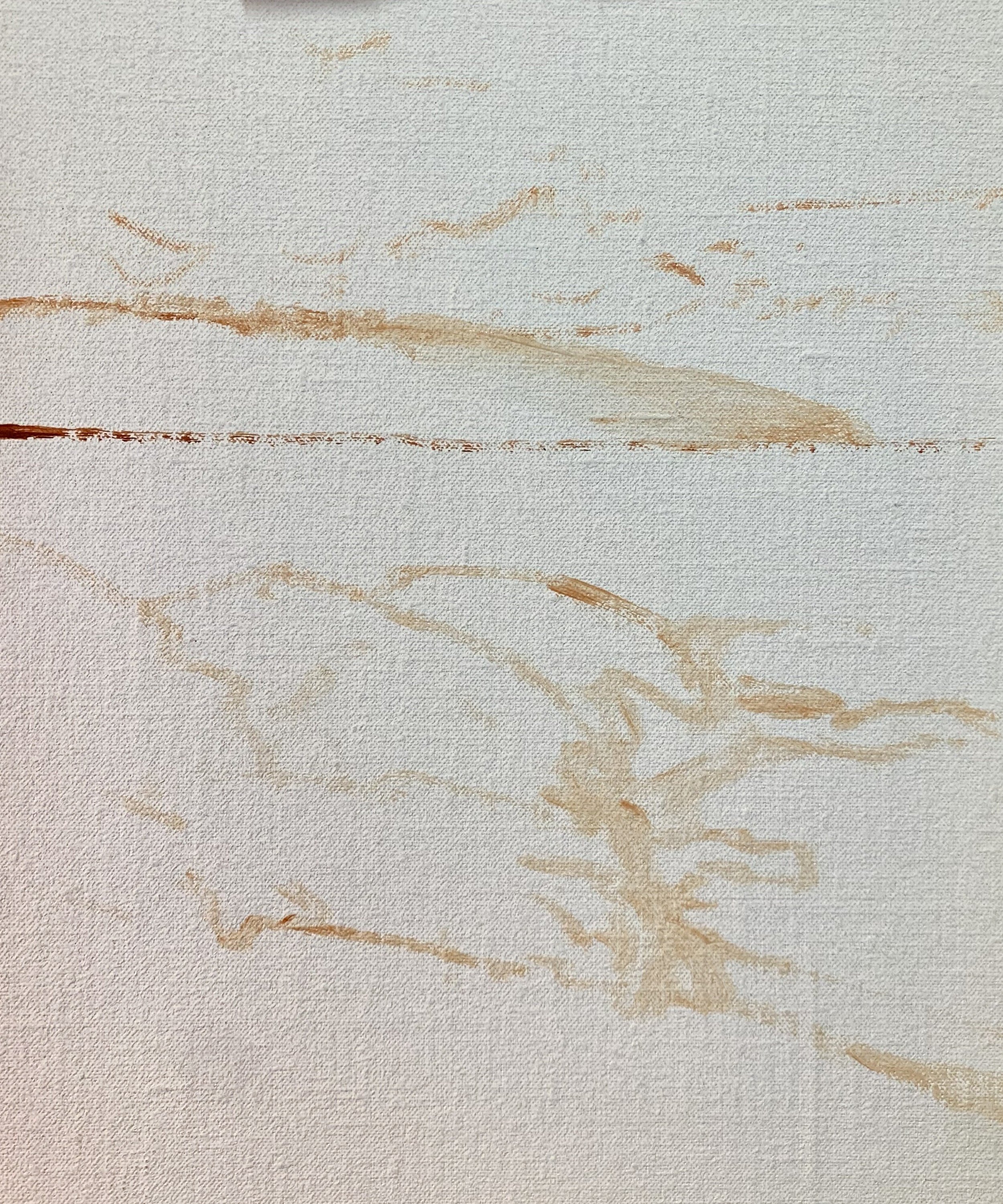
I sketch the composition using a №1 round brush and burnt sienna mixed with Liquin Original (Liquin). I am using Liquin as a medium to thin the paint and it also has the advantage of speeding up the drying time.
Whenever I begin a painting I always identify where all the dark values and shadows are first. Value is how light or dark a subject is and we will find our darkest darks and lightest lights in the foreground, however as landforms recede darks are not as darks and lights are not as light as the value scale narrows.
Painting the dark values and shadows first it then makes it easier to paint the areas in light.
I’ve used a similar colour mix for the clouds, shadows on the distant headland and mid-ground shadows using a mix of ultramarine blue, burnt sienna, a little alizarin crimson and titanium white.
The shadows are getting darker as we come towards the foreground so I use less titanium white in my mix.
For the shadows in the immediate foreground, I use a mix of ultramarine blue and a little yellow ochre so the shadows have a green cast to them. This is where the darkest shadows will be in the landscape.
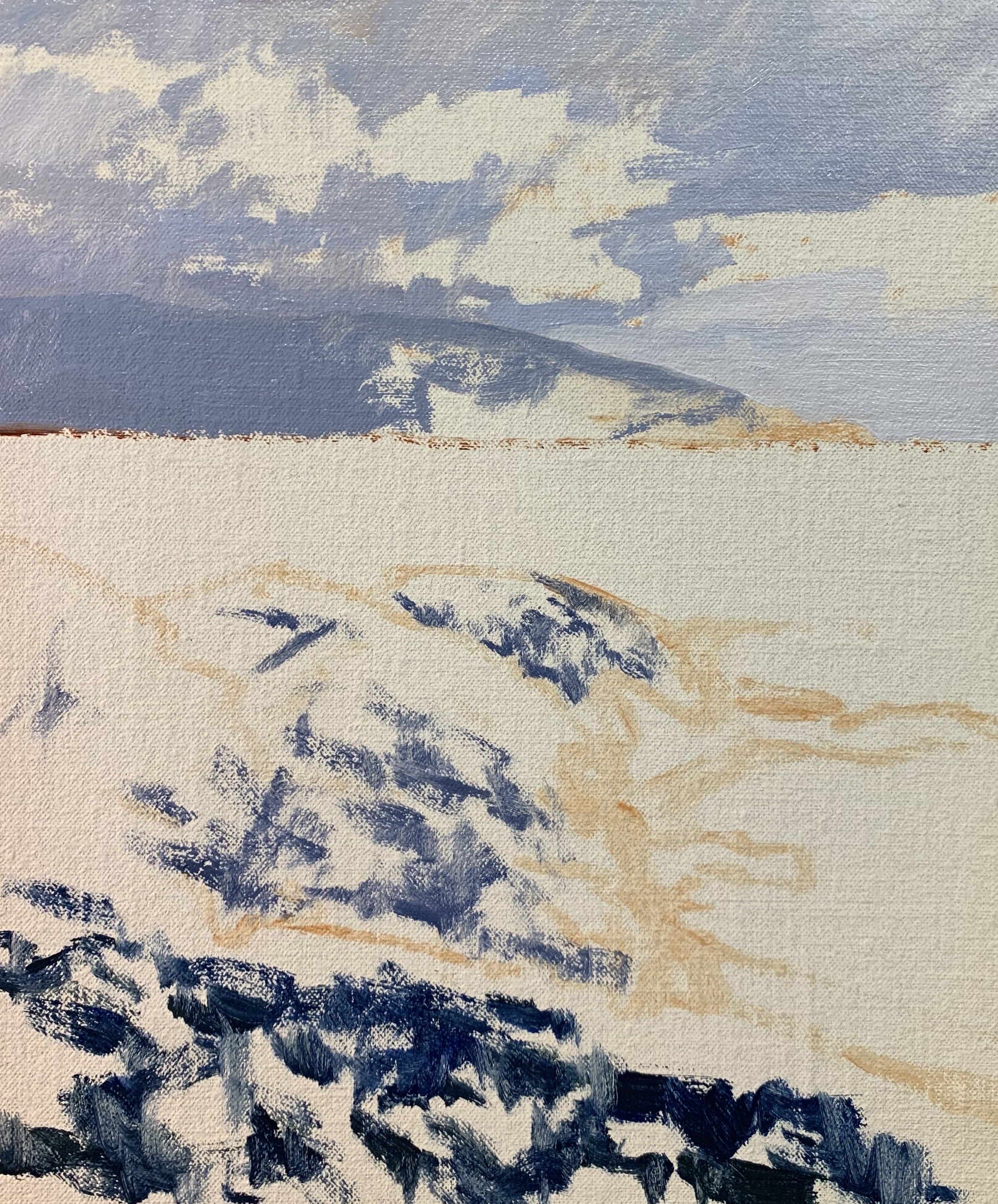
Now that I have established the dark values and shadows I begin painting the areas in light and starting with the clouds and sky and work my way forward in the painting.
I paint some highlights within the clouds using a mix of titanium white and a little burnt sienna. I allow the shadow areas of the clouds to blend in.
The sky is a mix of ultramarine blue, a little phthalo green and titanium white.
For the vegetation in the sunlight on the distant headland, I have used a mix of yellow ochre, ultramarine blue, titanium white and alizarin crimson. It is important to keep the green desaturated and the value quite light.
I paint the sea using a mix of ultramarine blue, yellow ochre, phthalo green and titanium white. As I work my way towards the foreground I add a little more phthalo green into the mix and I use more ultramarine blue to paint the suggestions of some breaking waves.
Next, I paint the main headland and mix up some greens. For the areas of the headland where the vegetation is in the full sunlight I use a mix of yellow ochre, ultramarine blue, cadmium yellow and titanium white, and then I adjust the colour with a little cadmium red and some phthalo green. The cadmium red helps to harmonise the green but only a small amount will be required.
For the areas of the vegetation under the cloud shadow, I use a mix of yellow ochre, ultramarine blue, cadmium yellow, alizarin crimson and in places some phthalo green.
I don’t mix all of the colours together thoroughly so some of the individual hues can be seen in the mixture.
I complete the blocking-in stage by painting the beach, rocks and cliffs. For the cliffs and sandy-coloured rocks, I used a mix of yellow ochre, alizarin crimson, ultramarine blue and titanium white. For the more copper-coloured rocks and the sand, I used a mix of ultramarine blue, burnt sienna, alizarin crimson and titanium white. I also use the same colours for the rock shadows but with less titanium white in the mix.
Lastly, I restate the dark values in the painting and then allow it to dry so I can begin adding details to it.
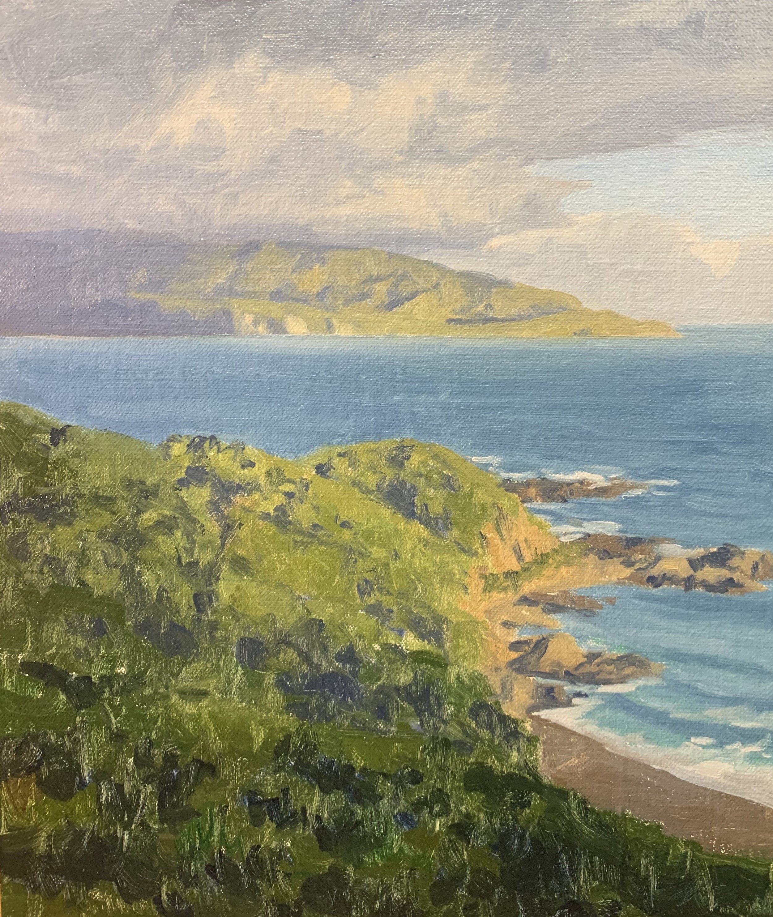
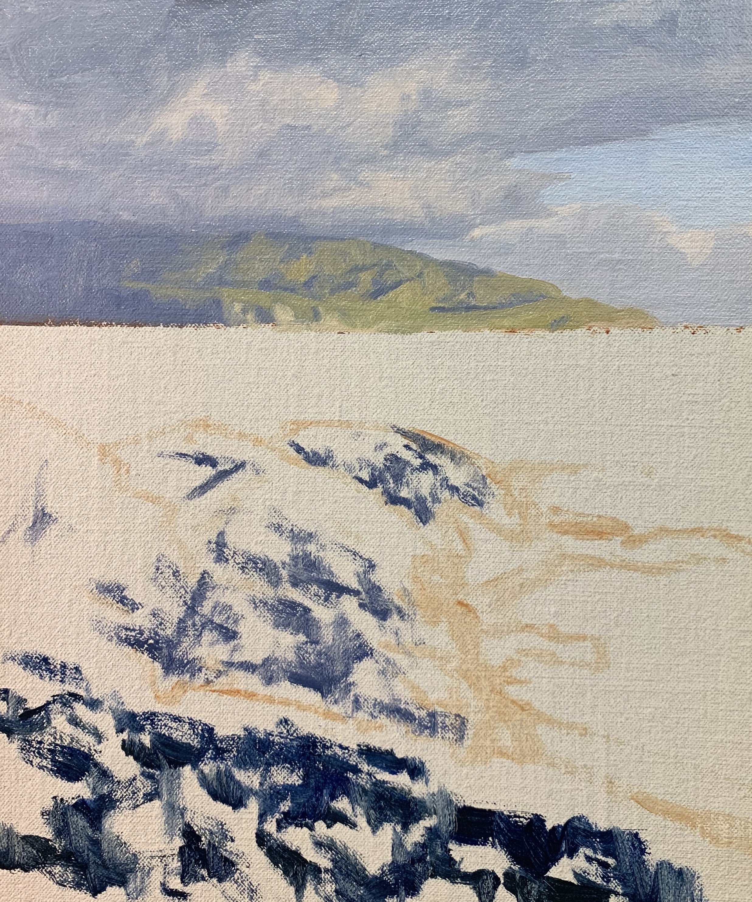
Stage 2 – Adding Details, Modelling and Refining the Painting
Once the painting was dry I began adding details to it which included refining the clouds, sky and ocean then and building up the details in the vegetation on the headland.
For the vegetation, I was essentially using the same colours I used during the blocking-in stage but adding more details and lighter layers of paint. To paint the vegetation I mainly used flat brushes, filberts, dagger brushes and rounds.
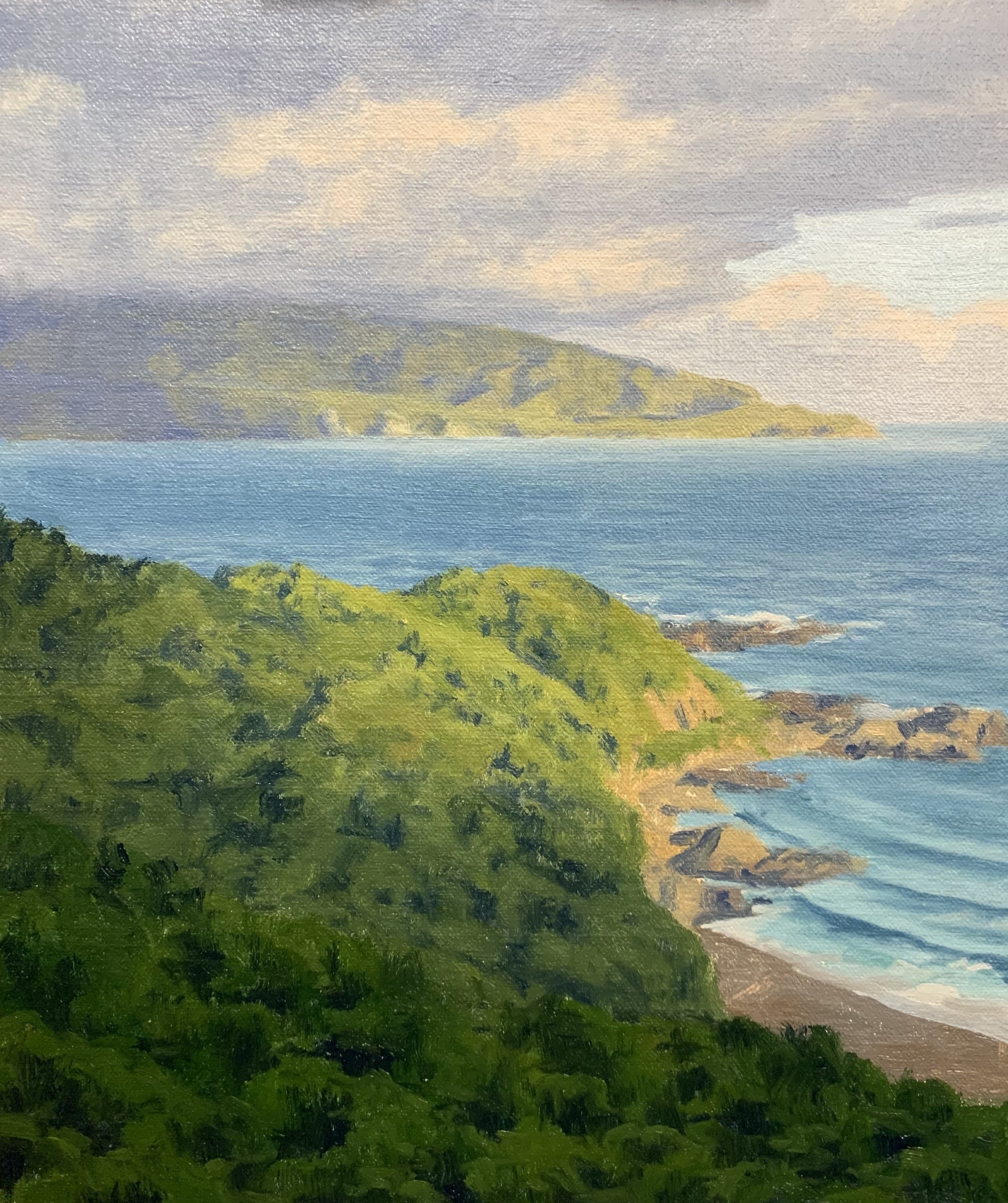
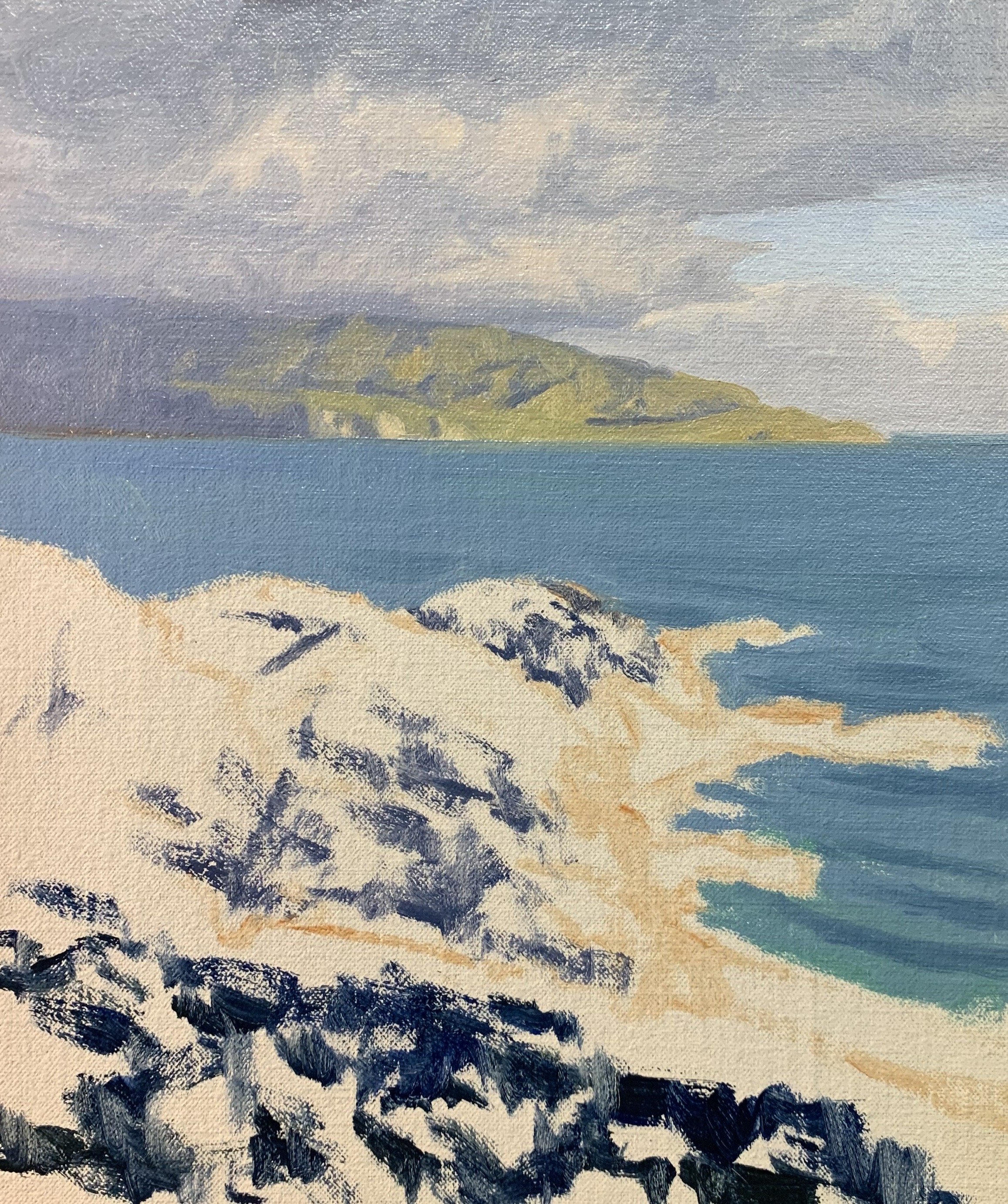
Stage 3 – Final Details
After spending time building up the details in the painting I let it dry so I could add the last details and final highlights which I always save until last.
I added more details to the vegetation including some highlights mostly using a mix of yellow ochre, ultramarine blue, cadmium yellow, alizarin crimson, titanium white and in places some phthalo green.
I add more details to the cliffs and rocks using a dagger brush and I paint in finer details such as the suggestion of a footpath on the cliff.
I paint the white water around the rocks using a mix of titanium white and a little yellow ochre.
I finish up this artwork by painting a few seagulls which adds life to the scene and adds a secondary area of interest.
Thanks for reading.
