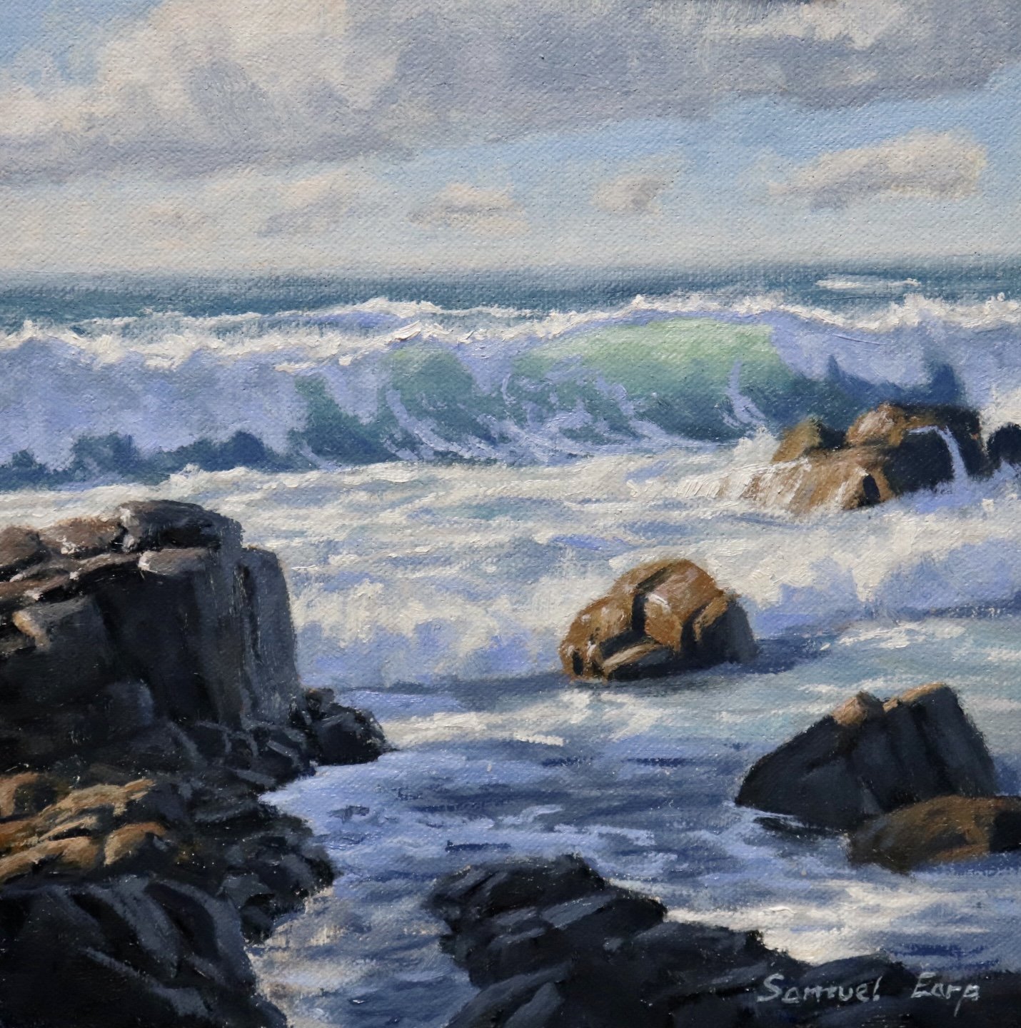
In this article, I will show you how to paint a seascape with a breaking wave, a rocky shore, and dramatic light.
Painting seascapes is a fun subject to paint. Breaking waves, sea spray, surf, light, rocks, and dramatic weather are all great ingredients to create an epic and engaging seascape painting.
I painted this artwork in oils but you could just as easily paint this using acrylics.
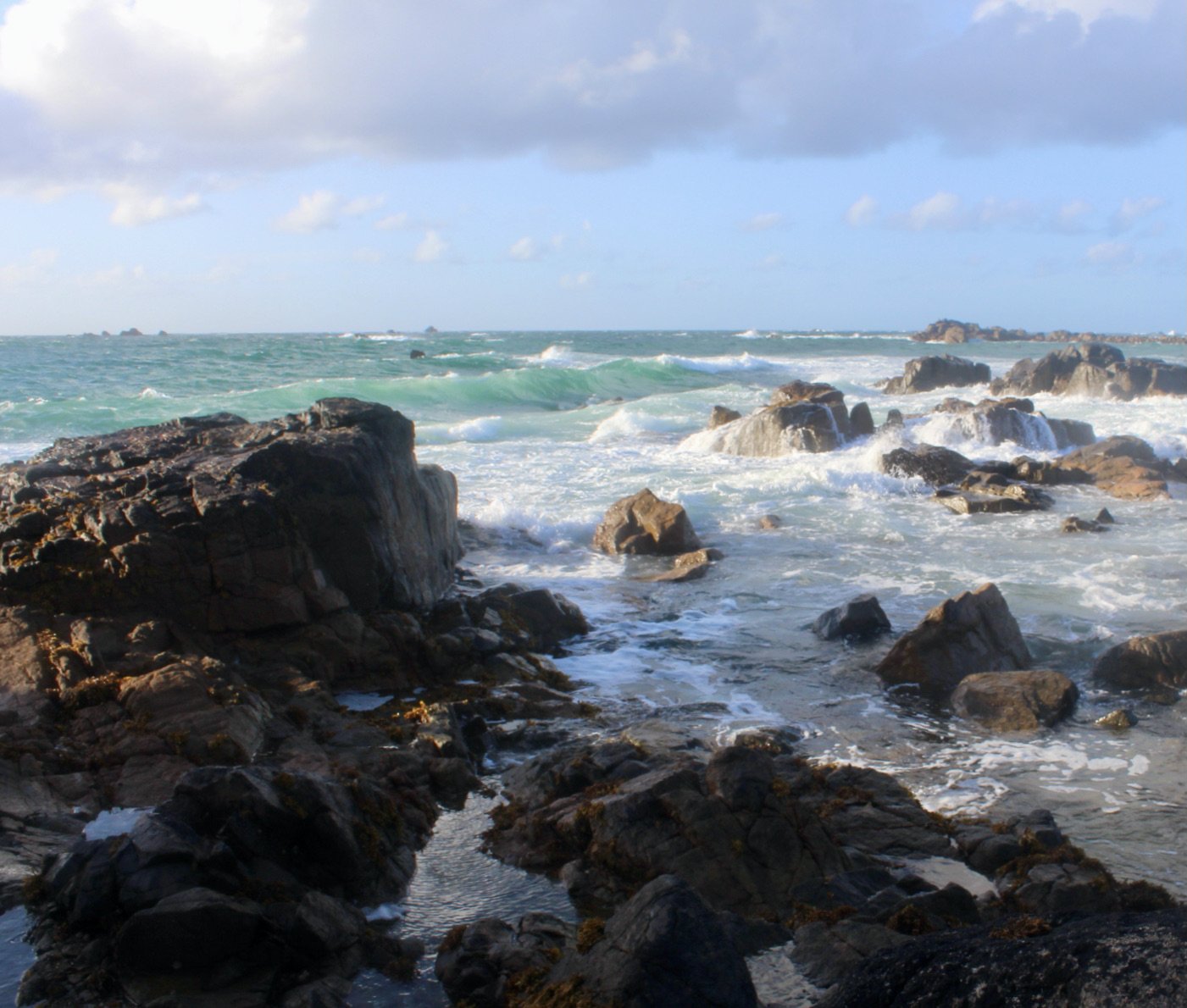
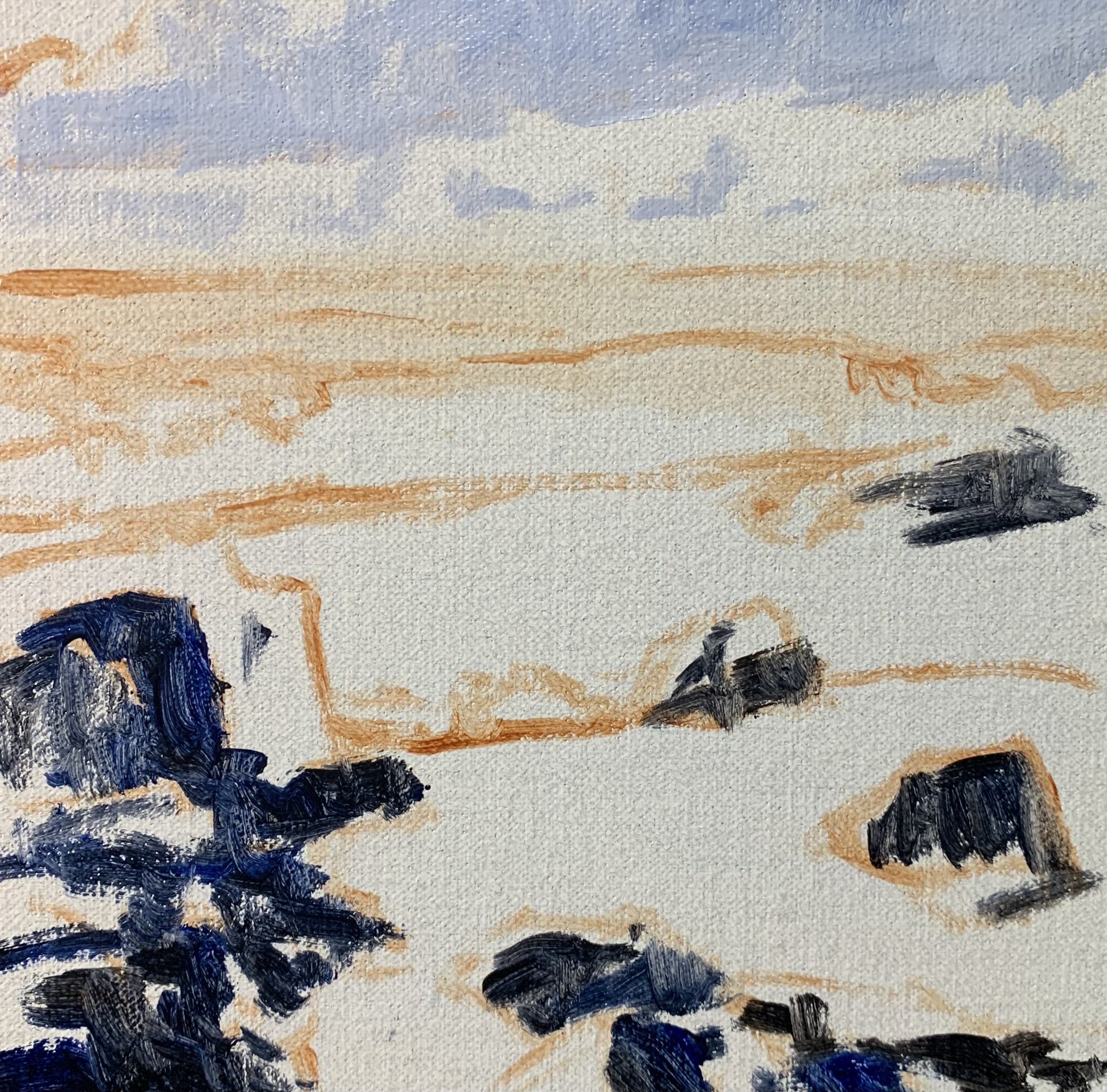
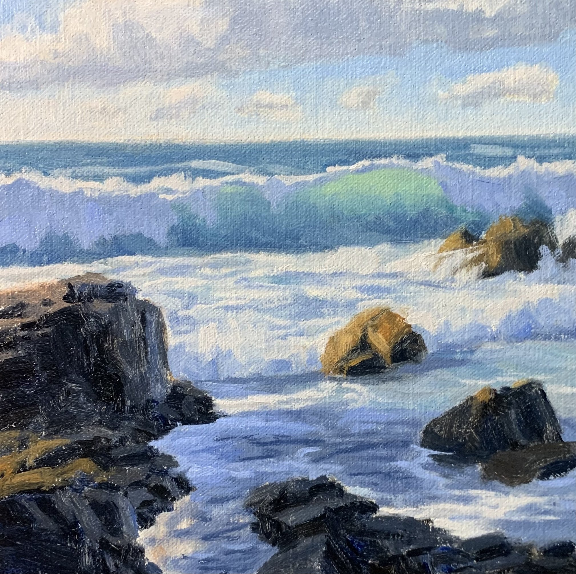
Reference Photo
Here is one of the reference photos I took and used for this painting. Please feel free to use or copy this photo if you would like to paint this artwork.
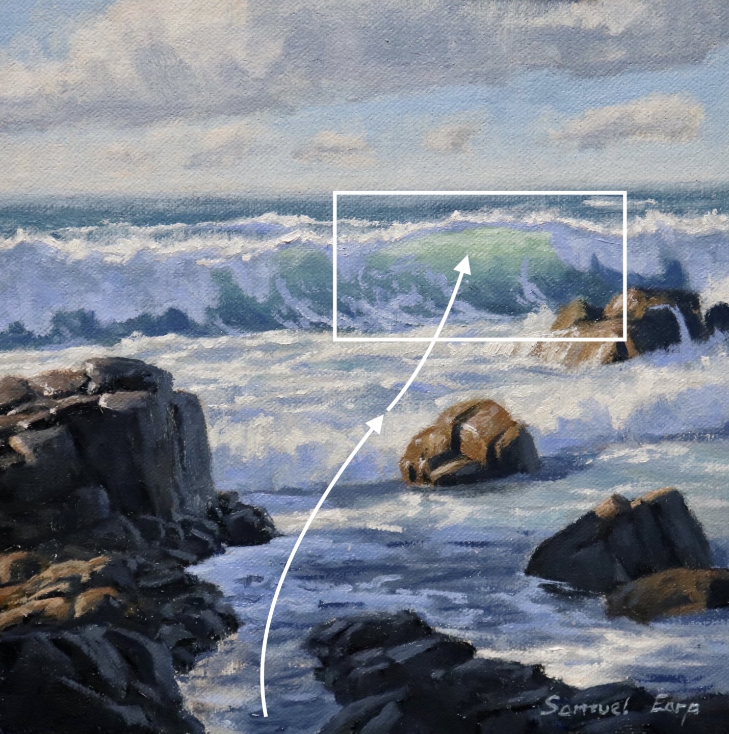
Composition
The composition in this painting follows an ‘S’ composition where the channel between the rocks in the foreground leads the eye towards the translucent breaking wave. The breaking wave is the main area of interest in the painting.
The ‘S’ composition implies rhythm in the painting.
Colors
I painted this artwork using oil paint and the colors I used in this particular painting are as follows:
- Titanium white
- Burnt sienna
- Yellow ochre
- Cadmium yellow
- Cadmium red
- Alizarin crimson
- Ultramarine blue
- Thalo green
Brushes
Here is a list of the brushes I used in this painting:
- No.5 flat
- No.3 flat
- No.2 flat
- No.3 filbert
- No.1 round
- No.0 round
Painting Demonstration: Stage 1 — Blocking-In The Painting
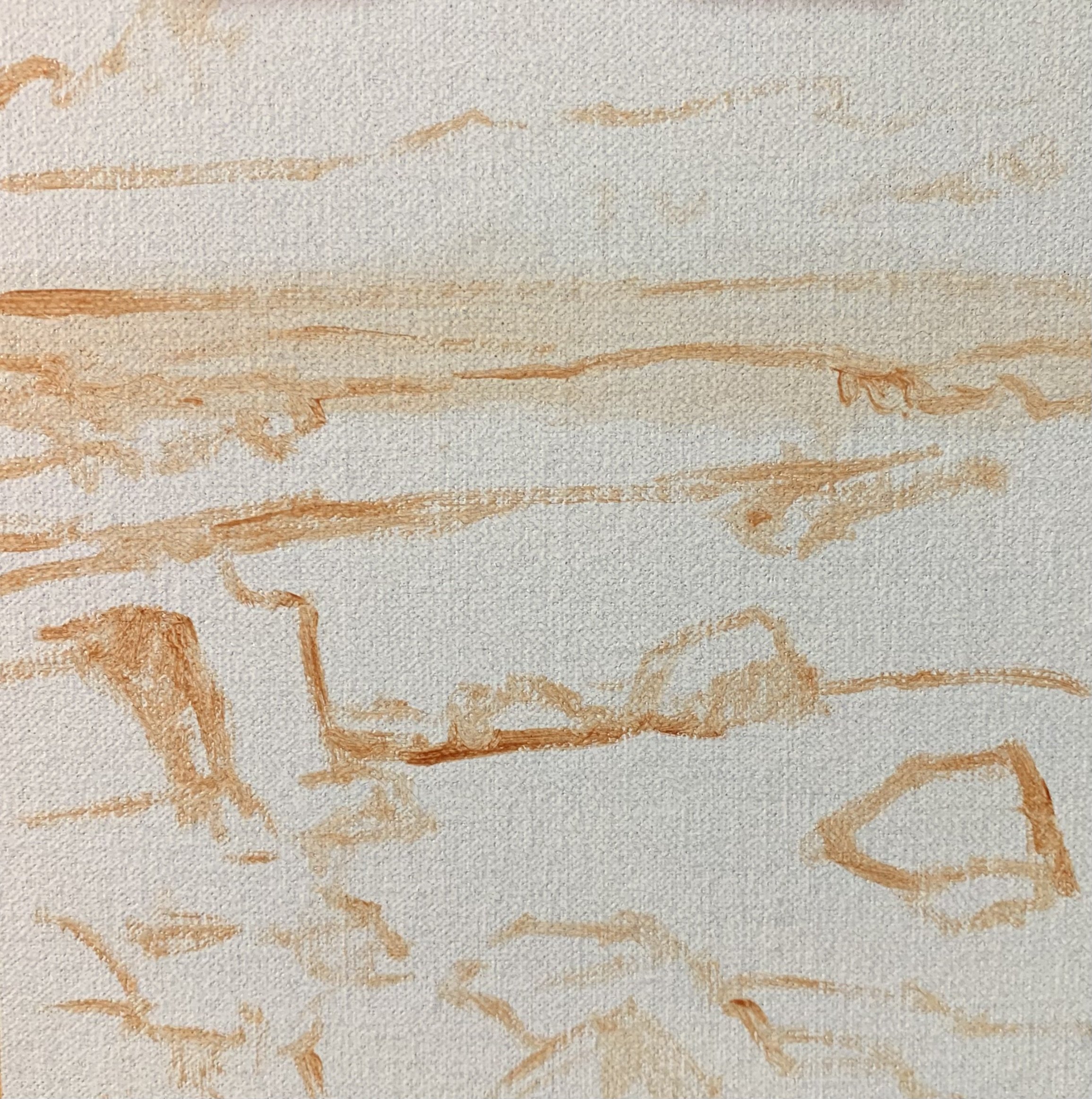
Sketching the Composition
I am painting on an 8” x 8” linen panel. The linen is an oil-primed medium weave that is mounted to Baltic birch.
I sketched the composition using a №1 round brush and burnt sienna mixed with Liquin Original (Liquin). I am using Liquin as a medium to thin the paint and it also has the advantage of speeding up the drying time.
During the blocking-in process I am using loose painterly brush marks and I am mainly using №5 and №3 flat brushes.
Painting the Dark Values
Whenever I begin a painting, I always identify the dark values in the scene I am painting. Value refers to how light or dark a subject is; we will find our darkest darks and lightest lights in the foreground of a landscape. However, as landforms recede into the distance, dark values are not as dark and lights are not as light as the value scale narrows.
By first painting the dark values and shadows, you can quickly create a tonal dynamic, making it easier to paint the areas in light afterward.
I begin by painting the cloud shadows using a mix of ultramarine blue, burnt sienna, titanium white, and a little alizarin crimson.
The shadows in the rocks are the darkest values in this seascape, especially as they are in the foreground. I paint the rock shadows using a mix of ultramarine blue and burnt sienna.
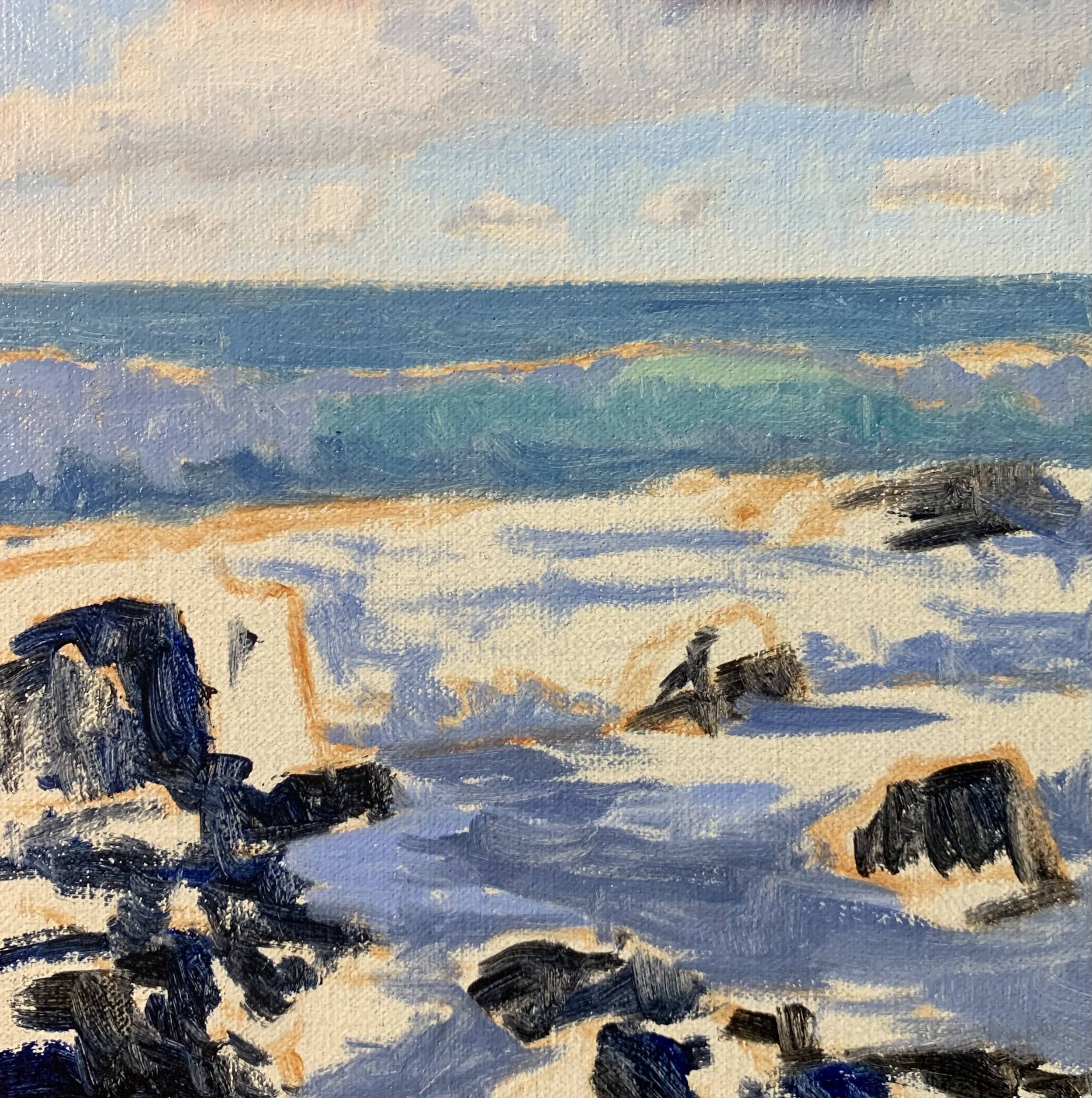
Painting the Sky and Clouds
Now that I have marked in the major areas of shadows, I begin painting the areas in light, starting from the background and working forward.
I paint the clouds with a mix of titanium white and a little burnt sienna.
The sky is a mix of ultramarine blue, titanium white, and a little thalo green.
I paint the sea and waves with varying mixes of ultramarine blue, titanium white, thalo green, and yellow ochre. The translucent area of the wave is a mix of titanium white, thalo green, and yellow ochre.
I have used varying mixes of ultramarine blue, burnt sienna, titanium white, and alizarin crimson for the water and foam areas in shadow.
Painting the Rocks and Ocean
I added more color to the rocks and painted the reflected light on the rock surfaces. The reflected light is coming from the surrounding water, so it has a blue cast to it.
For the rocks, I use a mix of ultramarine blue, burnt sienna, titanium white and alizarin crimson. I have also used these same colors in the foreground water and clouds, which will tie all of these zones together and create color harmony within the painting.
I paint the highlights on the breaking waves and white water with a mix of titanium white and burnt sienna. I’m keeping the value of this color a little darker so that when I add my final highlights at the end of the painting, the waves will pop!
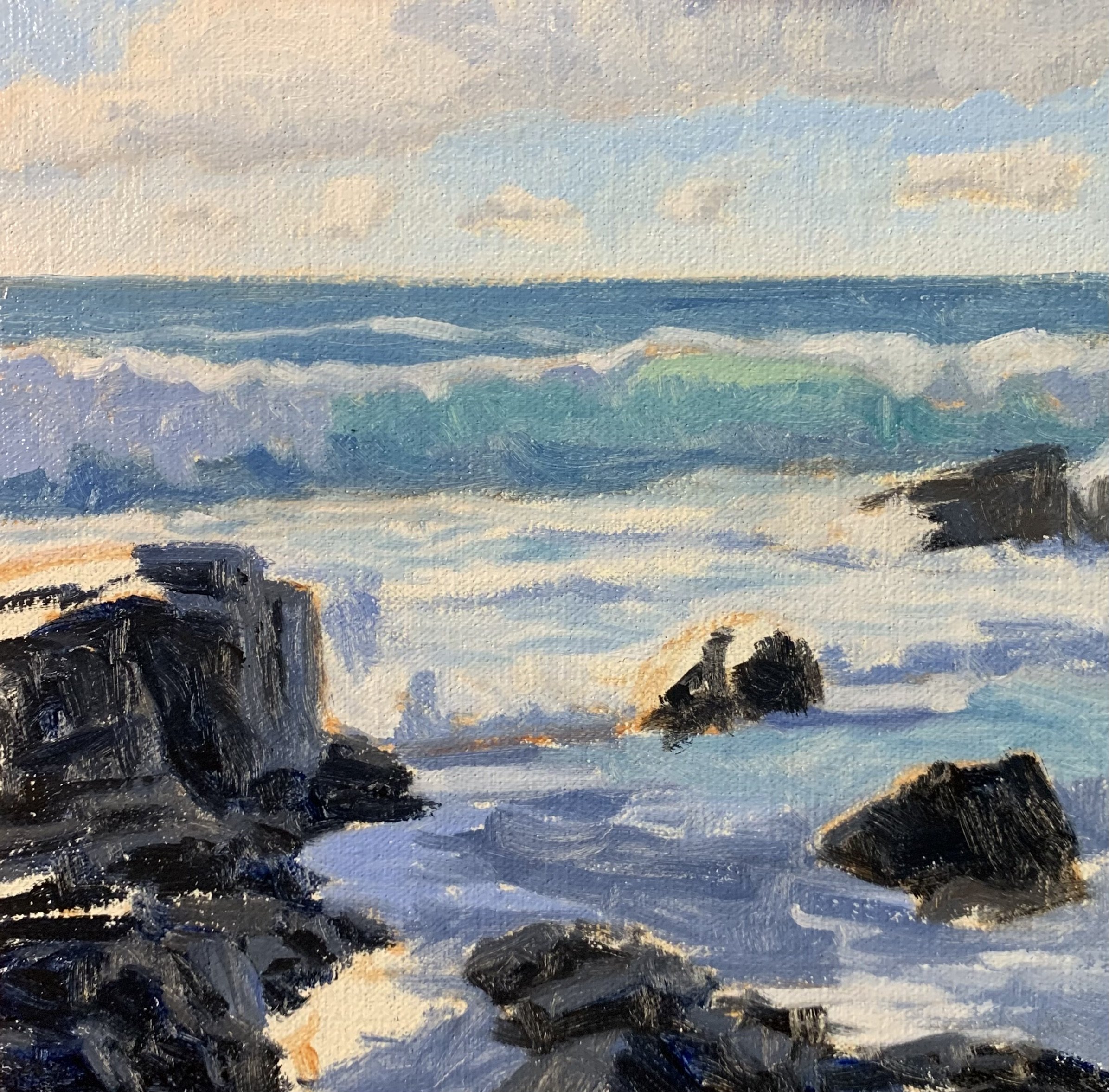
Painting Light On The Rocks
I paint the areas of the rocks that are in full sunlight. For the rocks on the left, I used a mix of burnt sienna, titanium white with a little ultramarine blue and alizarin crimson.
For the other rocks, I have used a mix of burnt sienna, yellow ochre, ultramarine blue and titanium white.
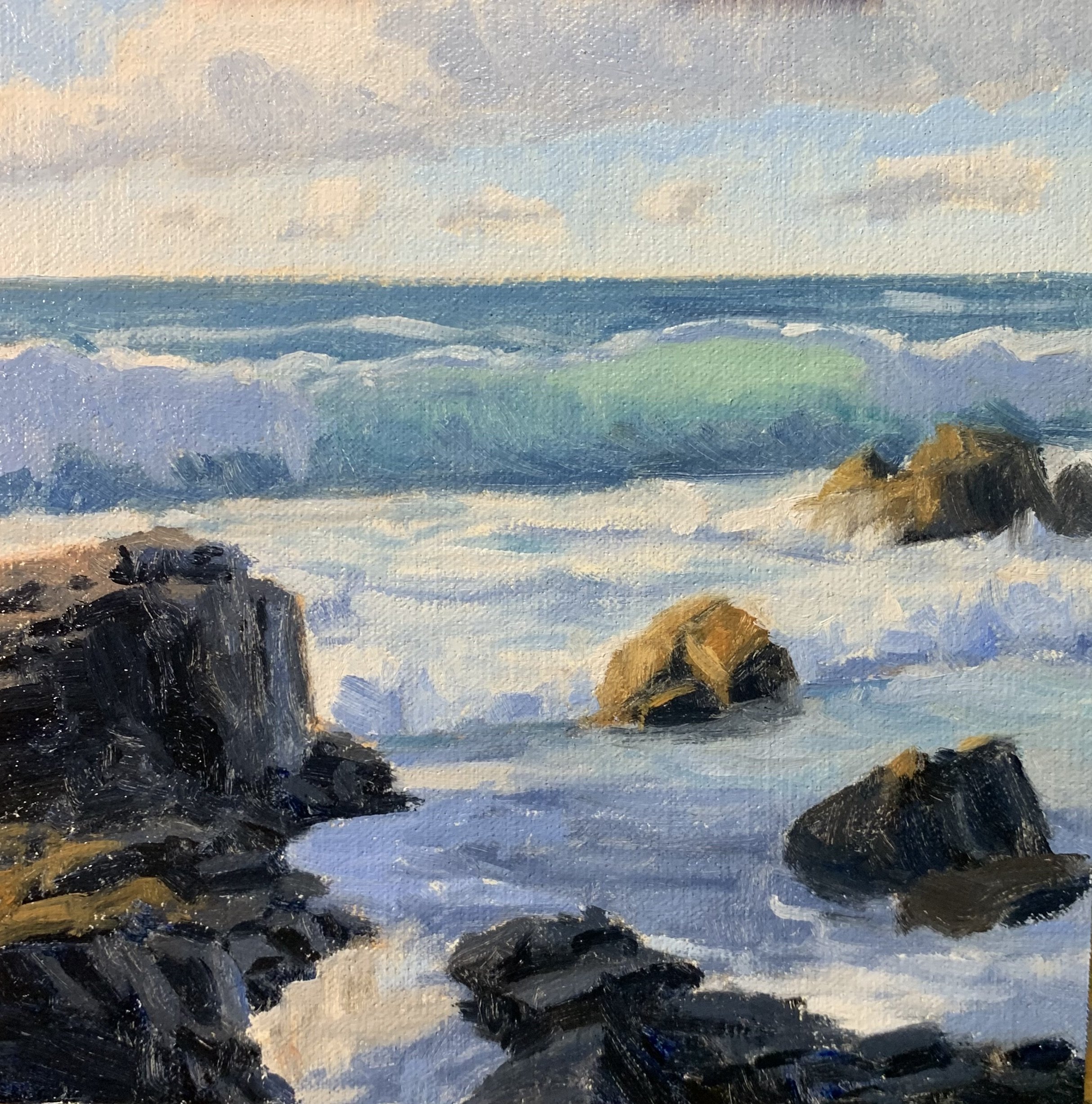
Stage 2 — Adding Details and Refining the Painting
Adding Details
Once the painting was dry I began adding details to it. I’m now using smaller brushes, including №3 flats and filbert brushes.
I add more layers to the clouds, foam, and white water using titanium white with just a tiny amount of burnt sienna, ultramarine blue, and alizarin crimson. I’m keeping the value of the color a little darker, saving my lightest values until the end of the painting.
I paint more details in the water in the foreground, adding ripples and foam patterns.
Modeling
Here is where I’m getting into the modeling stage, where I am building up the various forms within the painting.
I added details and shaped the rocks on the left side of the painting, emphasizing the cracks and painting some highlights on the sunlit rock surfaces.
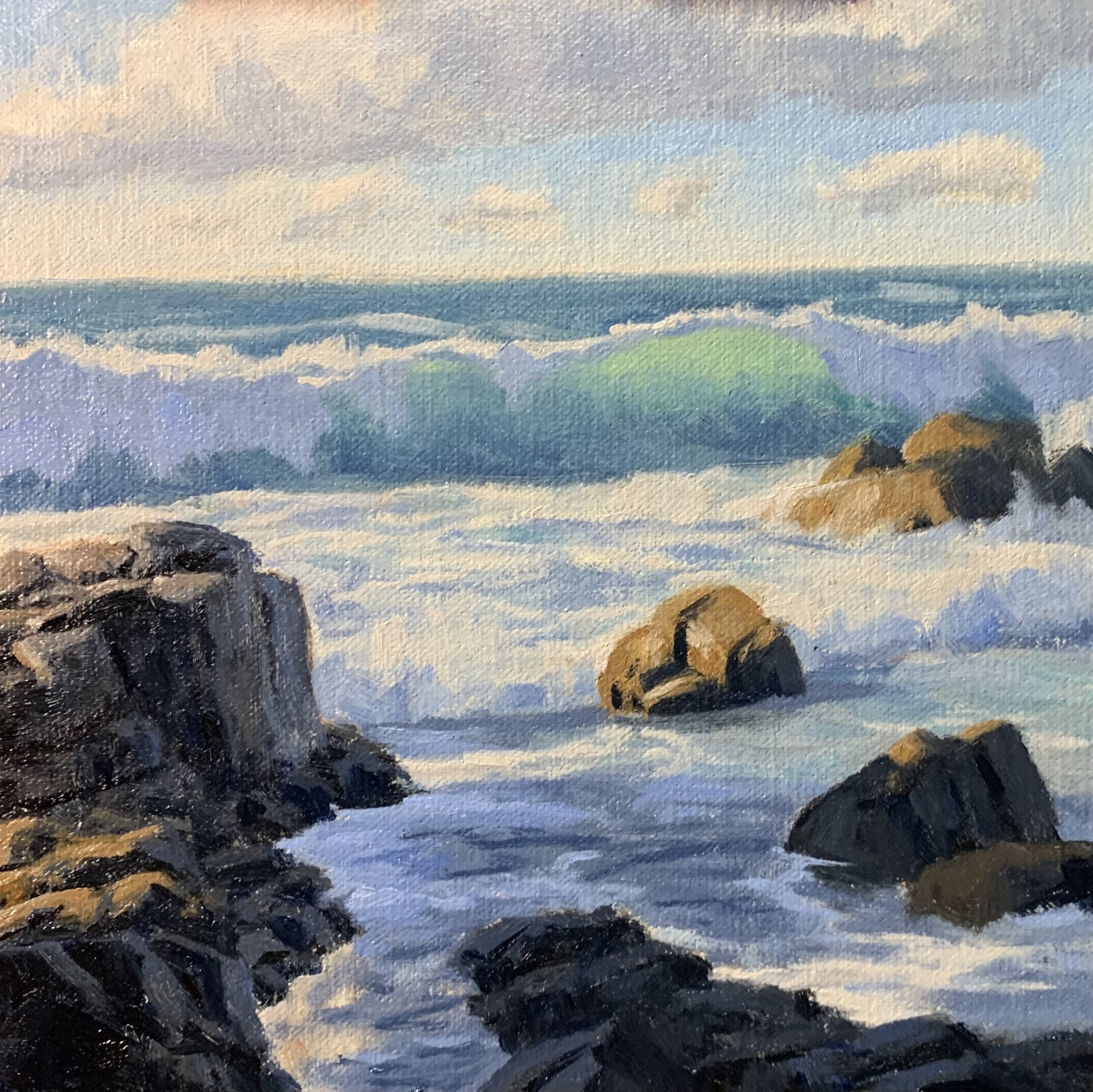
Stage 3 — Final Details
At this point in the painting, I let it dry again to add the final details.
I paint highlights on the breaking waves and white water using a mix of titanium white with a dash of yellow ochre. I sparingly apply the highlights, which really bring the waves to life. I use this same color mix to paint the highlights on the rocks.
I finish up the painting by adding the foam patterns to the waves using a mix of ultramarine blue, titanium white and a little alizarin crimson. I also use the same color mix to paint reflected light in the waves and the spills over the rocks.
Thanks for reading.
