This article may contain affiliate links, please read my affiliate disclosure for more information

In this painting demonstration I will show you how to paint a seascape that features a crashing wave that has created a foam burst.
Suitable for oils and acrylics.
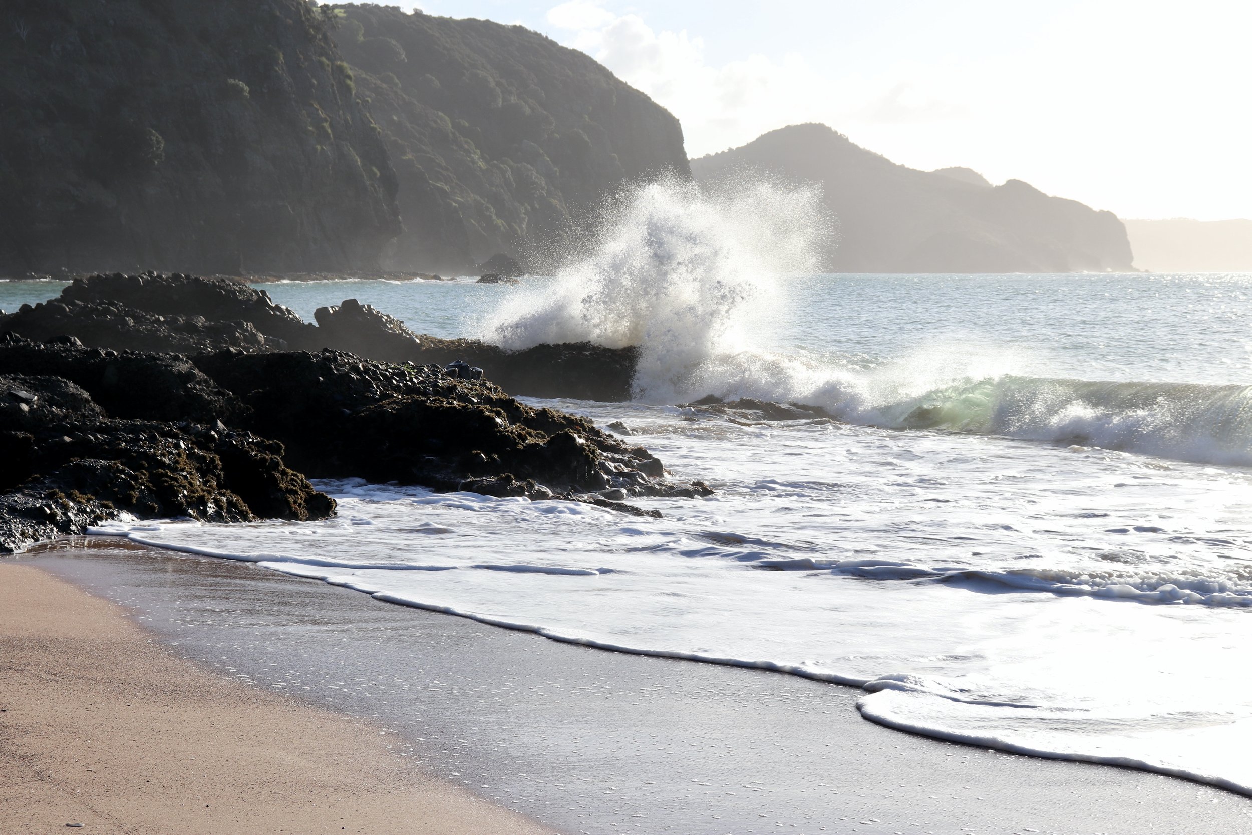
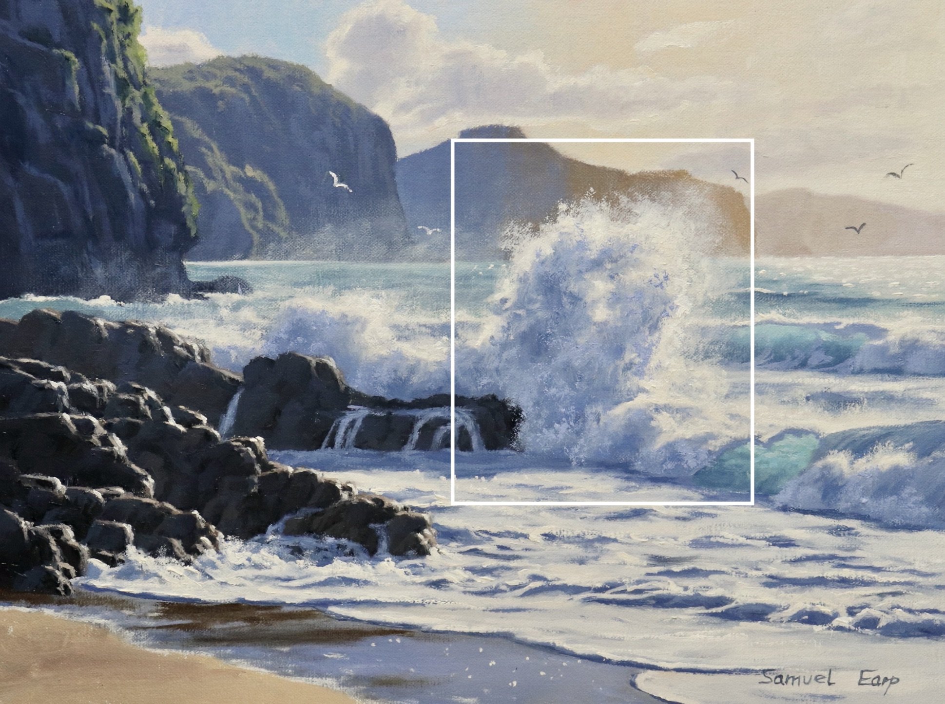
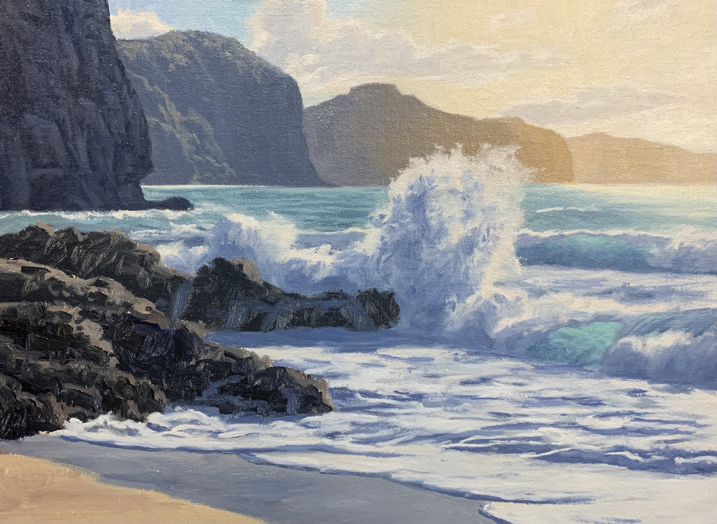
Reference Photos
Here are a couple of reference photos I took and used for this painting. Please feel free to use or copy these photos if you would like to have a go at painting this art work.
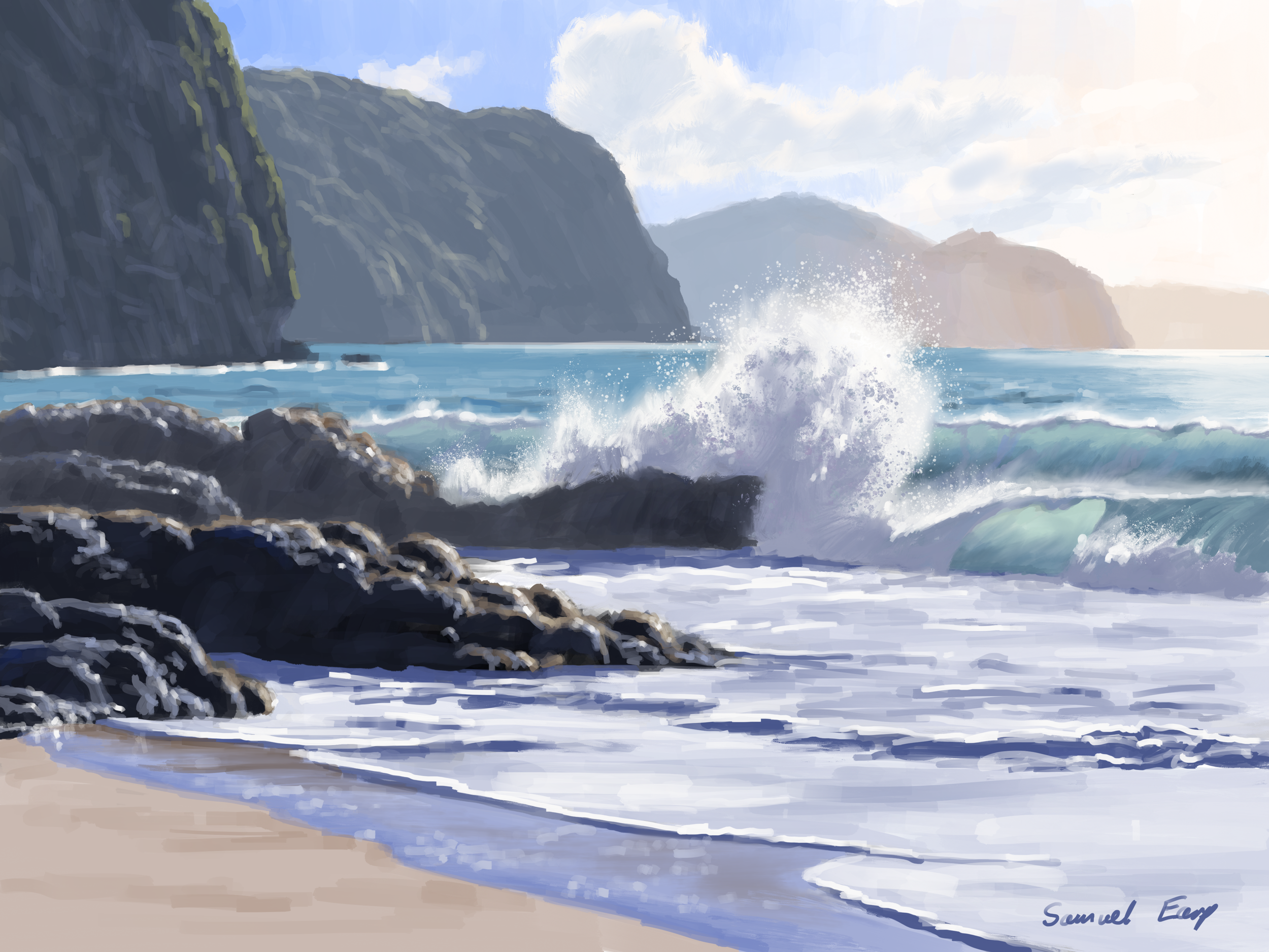
Composition
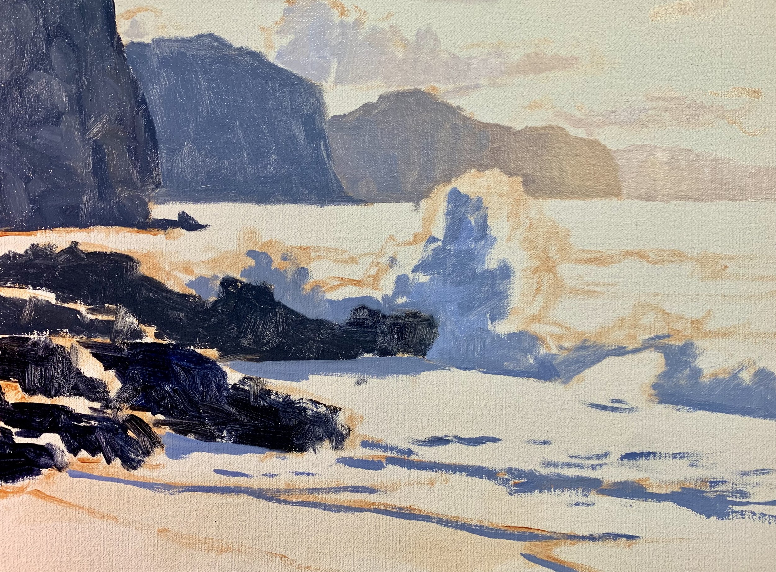
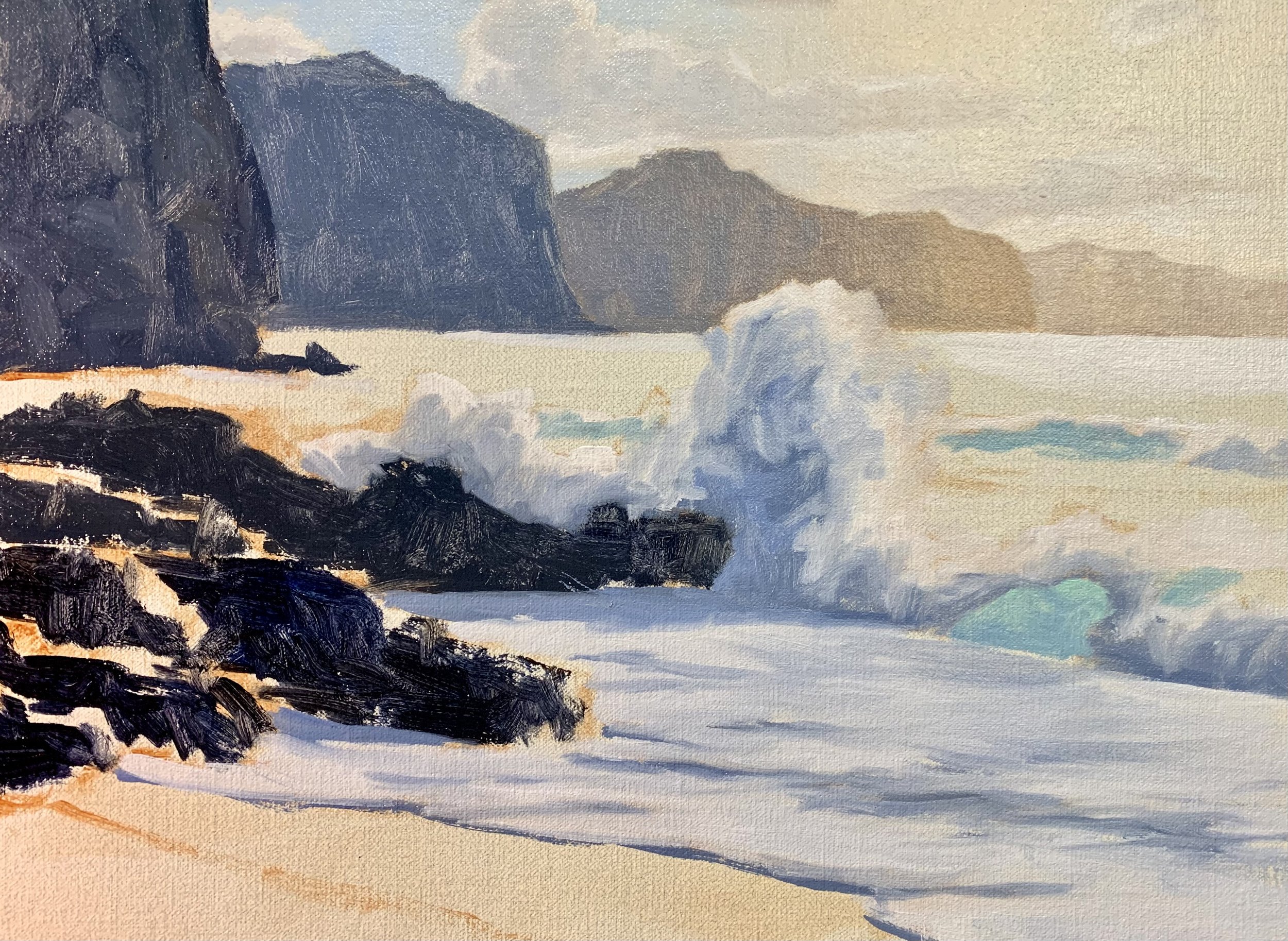
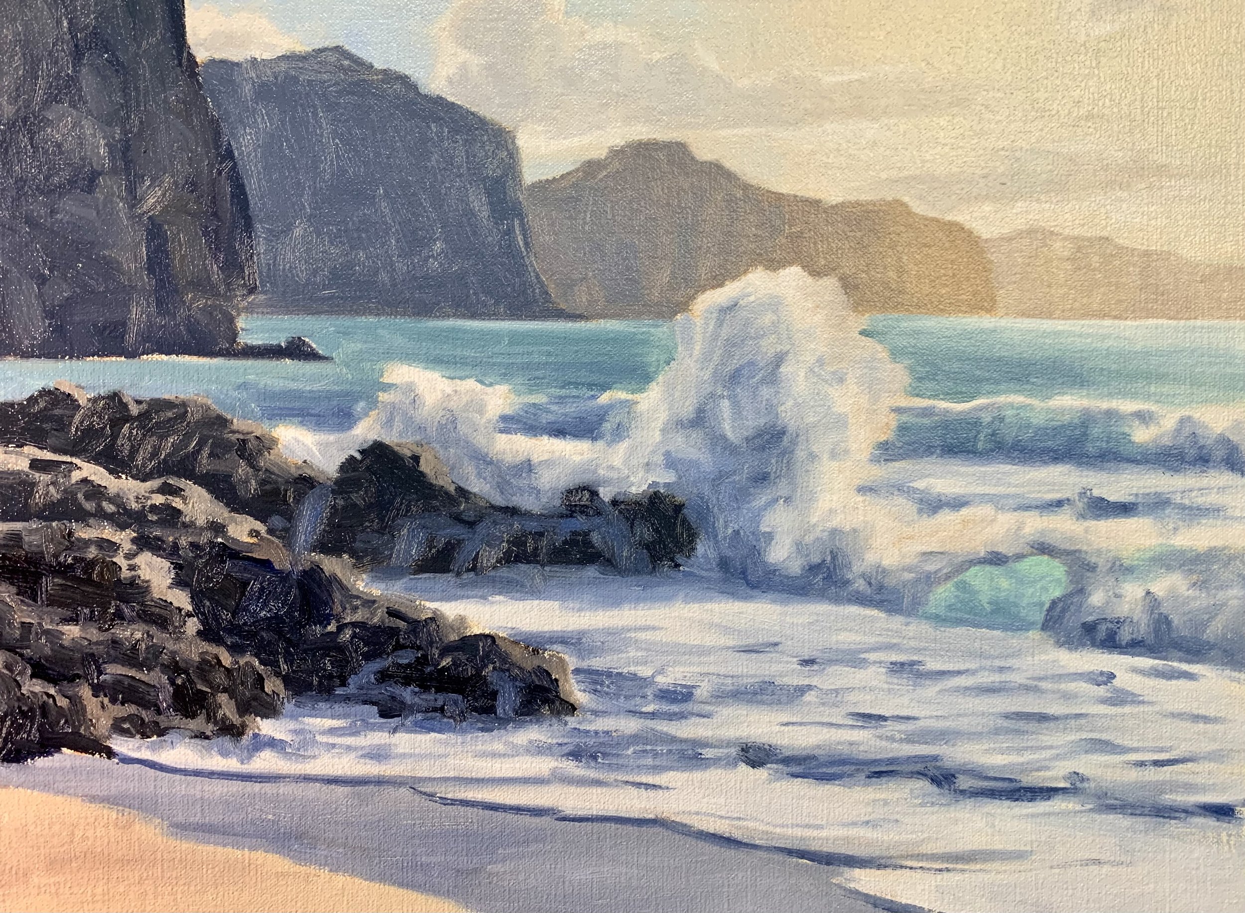
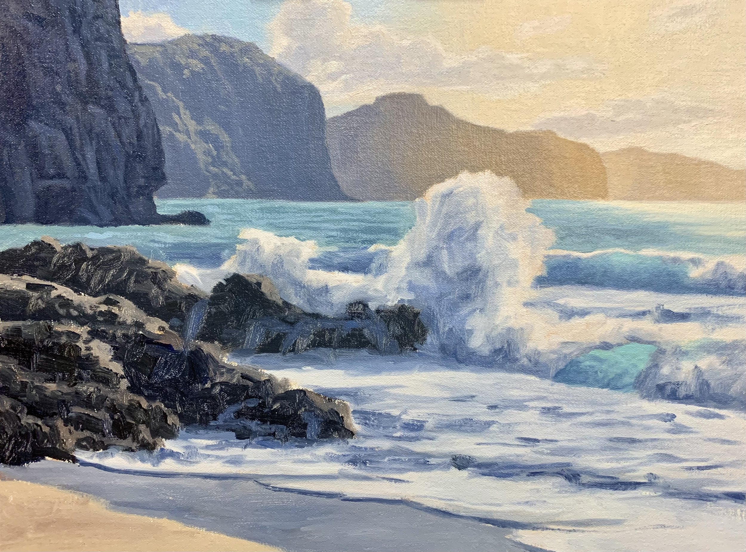
The foam burst is the main area of interest in the painting. I have made sure that the foam burst is not in the middle of the composition as it would cause a distraction and a displeasing static in the painting. Instead the foam burst is to the right of the centre.
This composition features a high horizon line to encompass a decent area of the foreground so there is plenty of room to paint the breaking waves, rocks and seashore.
ART TIP: Never have your horizon line in the middle as it looks displeasing in the composition. Either have a higher or lower horizon line.
Sketch
Before starting my painting I created a sketch and in this case it was a digital sketch that I designed using an iPad and Procreate. Whilst I created a digital sketch it is not essential you use this medium, normally I do pencil sketches. Whatever medium you use it is always a good idea to plan your composition before you start your painting.
Colours
I painted this artwork using oil paint and the colours I used in this particular painting are as follows:
- Titanium white
- Burnt sienna
- Yellow ochre
- Cadmium yellow
- Cadmium red light
- Alizarin crimson
- Ultramarine blue
- Phthalo green
Brushes
Here is a list of the brushes I used in this painting:
- No.5 flat
- No.3 flat
- No.2 flat
- No.3 filbert
- 1/4” dagger
- No.1 round
- No.0 round
Painting Demonstration
Stage 1 – Blocking-In The Painting
I am painting on a 12” x 16” linen panel. The linen is an oil primed medium weave linen that is mounted to Baltic birch.
I sketch the composition using a №1 round brush and burnt sienna mixed with Liquin Original (Liquin). I am using Liquin as a medium to thin the paint and it also has the advantage of speeding up the drying time.
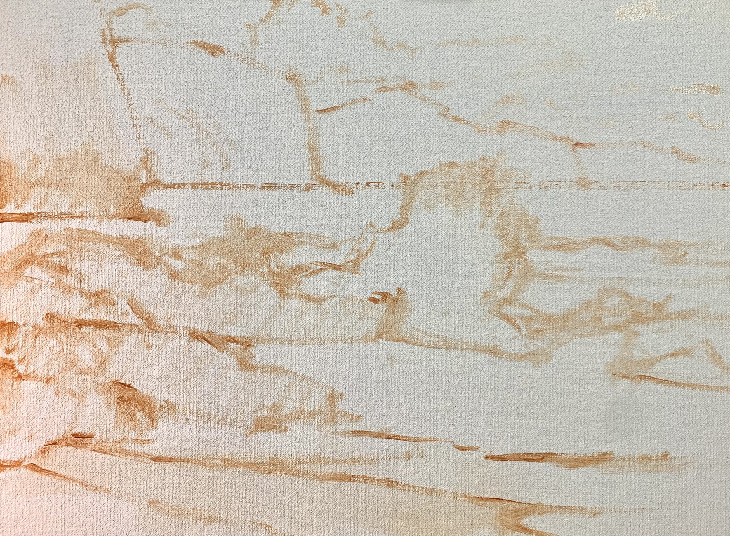
Whenever I begin a painting I always identify where all the dark values and shadows are first. Value is how light or dark a subject is and we will find our darkest darks and lightest lights in the foreground, however as landforms recede darks are not as darks and lights are not as light as the value scale narrows.
By painting the dark values and shadows first it then makes it easier to paint the areas in light and to create atmospheric perspective.
I start by painting the cloud shadows, the lightest of the shadows in this scene. I use a mix of ultramarine blue, burnt sienna, titanium white and a little alizarin crimson. I also use the same colours for the cliff shadows that are not influenced by the bright sun.
As I worked my way towards the right side of the painting where the sunlight is I switched up my colour mix, instead using combinations of ultramarine blue, yellow ochre, alizarin crimson and titanium white. I used these colours for the cliffs and cloud shadows. The yellow ochre in the mix will communicate the warmth of the sun.
For the foam burst I used a mix of ultramarine blue, a little burnt sienna and alizarin crimson and titanium white.
The rock shadows are a mix of ultramarine blue and burnt sienna.
Once I’ve established the main areas of shadows I start from the furthest zone away painting the sky and clouds and then I work forward in the painting.
The cloud highlights are a mix of titanium white with a little burnt sienna and where the sunlit area of the clouds are, I have used yellow ochre in the mix instead of burnt sienna. The yellow area of the sky is a mix of yellow ochre and a lot of titanium white.
The blue area of the sky is a mix of ultramarine blue, phthalo green and titanium white.
I paint the translucent areas of the breaking waves using a mix of ultramarine blue, phthalo green, yellow ochre and titanium white, adding more ultramarine blue in to my mix as I paint the lower sections of the breaking waves.
I paint the illuminated areas of the foam burst and white water in the breaking wave and water in the foreshore. This is a mix of titanium white, ultramarine blue, a little burnt sienna and alizarin crimson. I need to keep the value of the white a little darker at this stage so I can build up lighter layers of paint to create texture within the water. I save my lightest values until the end of the painting.
I continue to paint the ocean using a mix of ultramarine blue, yellow ochre, phthalo green and titanium white.
For the areas of the rocks that are in the full sunlight I use a mix of ultramarine blue, burnt sienna and alizarin crimson and titanium white. The burnt sienna and titanium white are the dominant colours within the mix.
I also begin to start painting some spills on the rocks using the same colour mix that I used for the areas of the water and breaking waves that are in shadow.
Stage 2 – Adding Details, Modelling and Refining the Painting
Once the painting was dry I began adding details to it which included refining the clouds, sky, crashing waves and ocean.
I painted some of the vegetation in the cliffs that is illuminated in the sun using a mix of yellow ochre, ultramarine blue, alizarin crimson and titanium white. It is important to make sure that the colour is desaturated and a light value.
I painted some details in the cliff on the left side of the painting, creating texture and a jagged click face. I used a mix of ultramarine blue, burnt sienna, alizarin crimson and titanium white.
I build up the detail and texture within the water and breaking wave in the foreground using my shadow mix, which included ultramarine blue, burnt sienna, alizarine crimson and titanium white.
I add lighter layers of colour to the illuminated areas of the white water but still keeping the value a little darker.
ART TIP: You can create colour harmony in your painting by using common colours throughout. You may have noticed I have been using varying combinations of ultramarine blue, burnt sienna, titanium white and alizarin crimson. There is no need to over complicate your colour palette and by using common colours it creates more of a cohesiveness in your painting. You painting will also read well to the viewer.
Here I added vegetation to the cliff on the left. As the plants growing on the cliff are closer to the viewer the colours will be more saturated. I used a mix of yellow ochre, cadmium yellow, ultramarine blue, alizarin crimson and titanium white. I can even create some emerald tones by mixing in a little phthalo green.
I added more details to the rocks adding more highlights to the tops of the rock surfaces and reflected light in the shadow ares of the rock. I used varying combinations of ultramarine blue, burnt sienna, alizarin crimson and titanium white.
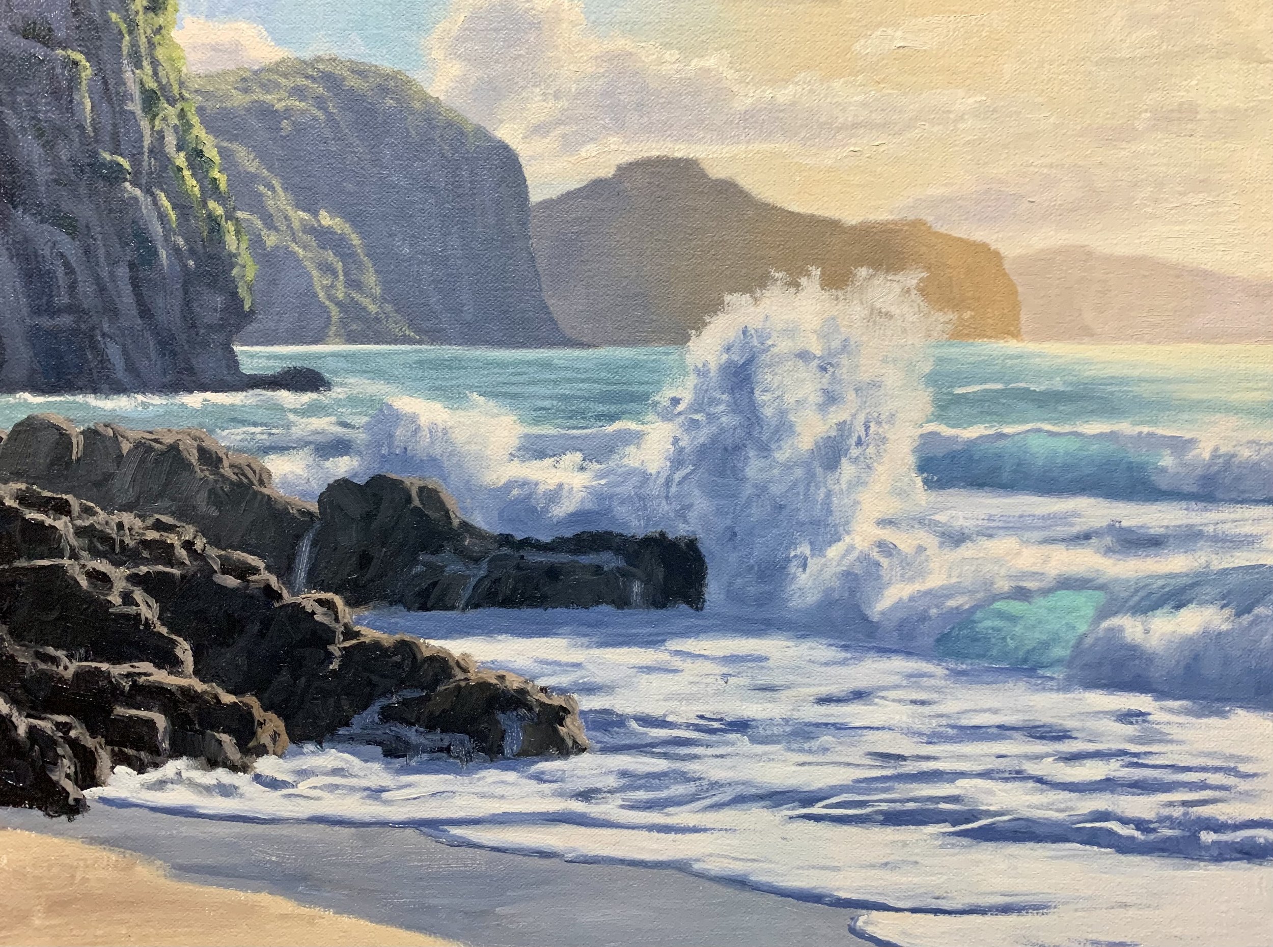
Stage 3 – Final Details
After spending time building up the details in the painting I let it dry so I could add the last details and final highlights which I always save until last.
I added the final highlights to the crashing wave and the whitewater using a mix of titanium white with a dash of yellow ochre. I was also able to use this same colour mix to add some highlights to the rocks.
I finished the painting by adding some seagulls in the distance.

Thanks for reading 😊
