This article may contain affiliate links, please read my affiliate disclosure for more information
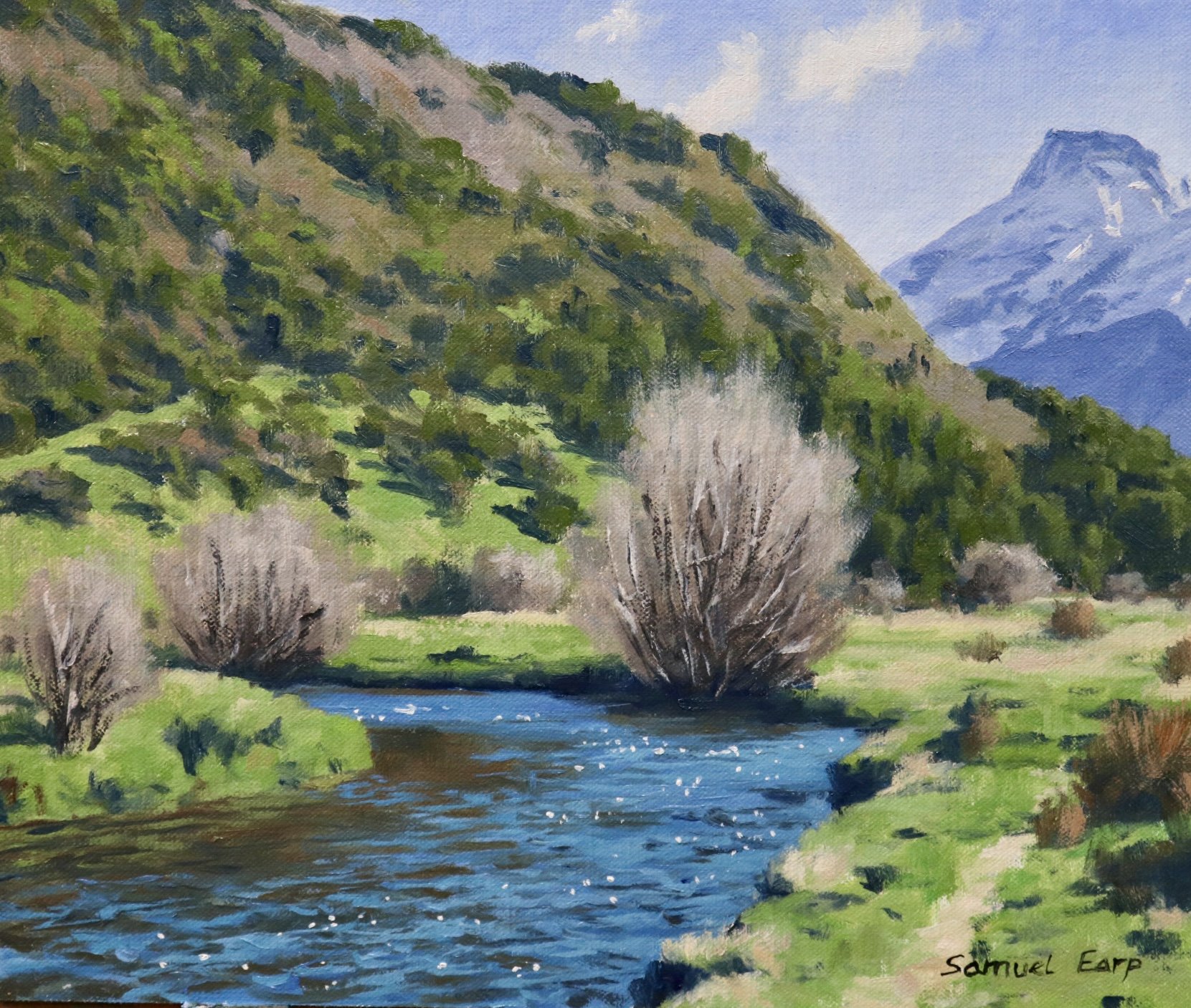
In this painting demonstration, I show you how to paint a landscape that features winter willow trees. This landscape is inspired by the South Island of New Zealand.
Painting deciduous trees can sometimes be a bit tricky because the values of the stems and branches can be lighter than when they are in full leaf, so if you don’t get the values correct they may not stand out in your painting.
Suitable for oils and acrylics.
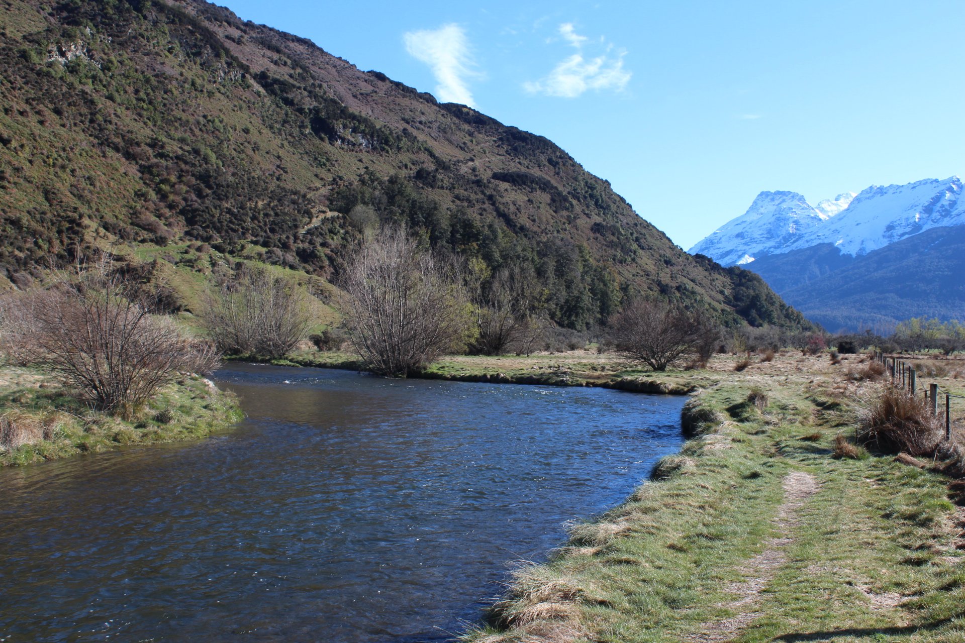
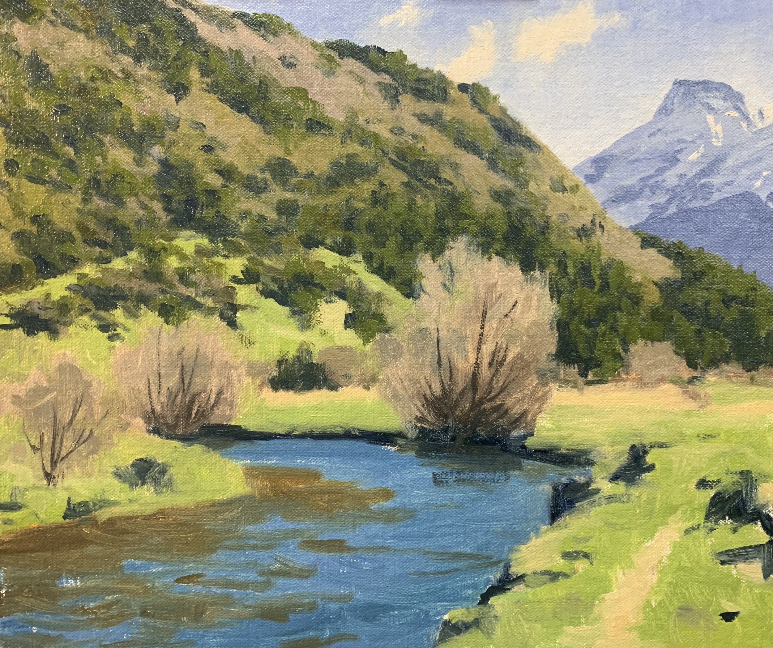
Reference Photo
Here is the reference photo I took and used in this painting. Please feel free to use or copy this photo if you would like to have a go at painting this artwork.
Composition
The willow tree is the main focal area in this painting and the river forms an ‘S’ composition also known as a ‘compound curve’. The river implies rhythm in the composition.
ART TIP
Never have your main focal area in the middle of the painting as it spoils the composition and forms a displeasing static. You will see here the willow tree to the right of the centre.

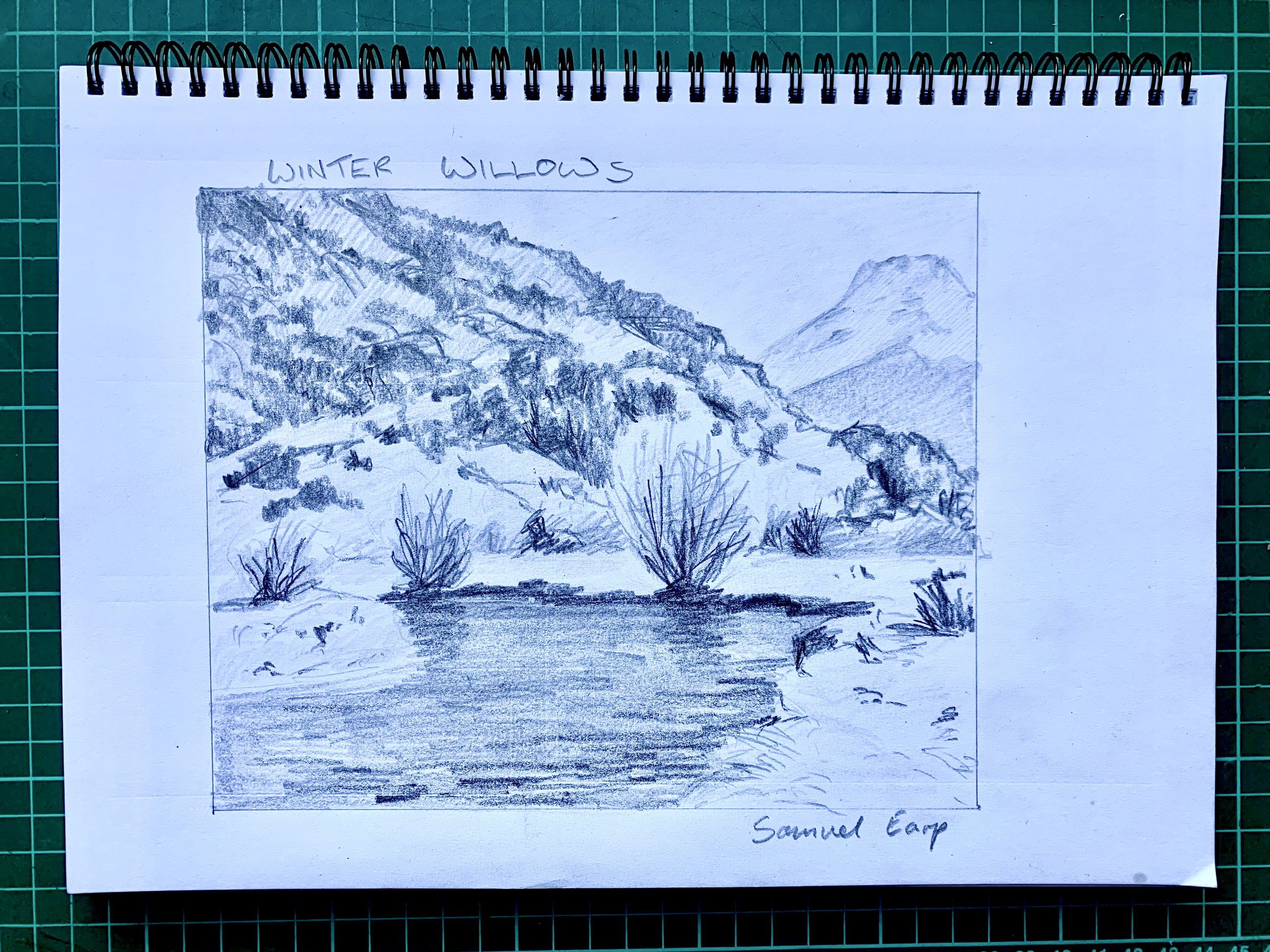
Pencil Sketch
Before I begin a studio painting I always plan the composition first by sketching some composition designs. This usually begins with some quick two-minute thumbnail sketches and then once I have a good idea for a composition I create a final sketch.
My pencil sketch will not only provide a solid composition for me to copy onto my canvas but also it will give me an idea of the values and tonality of the scene I am going to paint. Value refers to how light or dark a subject is and getting your values correct goes a long way to creating a solid painting.
Below is the sketch I created for this painting. I used a range of pencils from 4H to 6B.
Colours
I painted this artwork using oil paint and the colours I used in this particular painting are as follows:
- Titanium white
- Burnt sienna
- Yellow ochre
- Cadmium yellow
- Cadmium red light
- Alizarin crimson
- Ultramarine blue
- Phthalo green
Brushes
Here is a list of the brushes I used in this painting:
- No.5 flat
- No.3 flat
- No.2 flat
- No.3 filbert
- No.1 round
- No.0 round
- 1/4 ivory dagger

Painting Demonstration
Stage 1 – Blocking-In The Painting
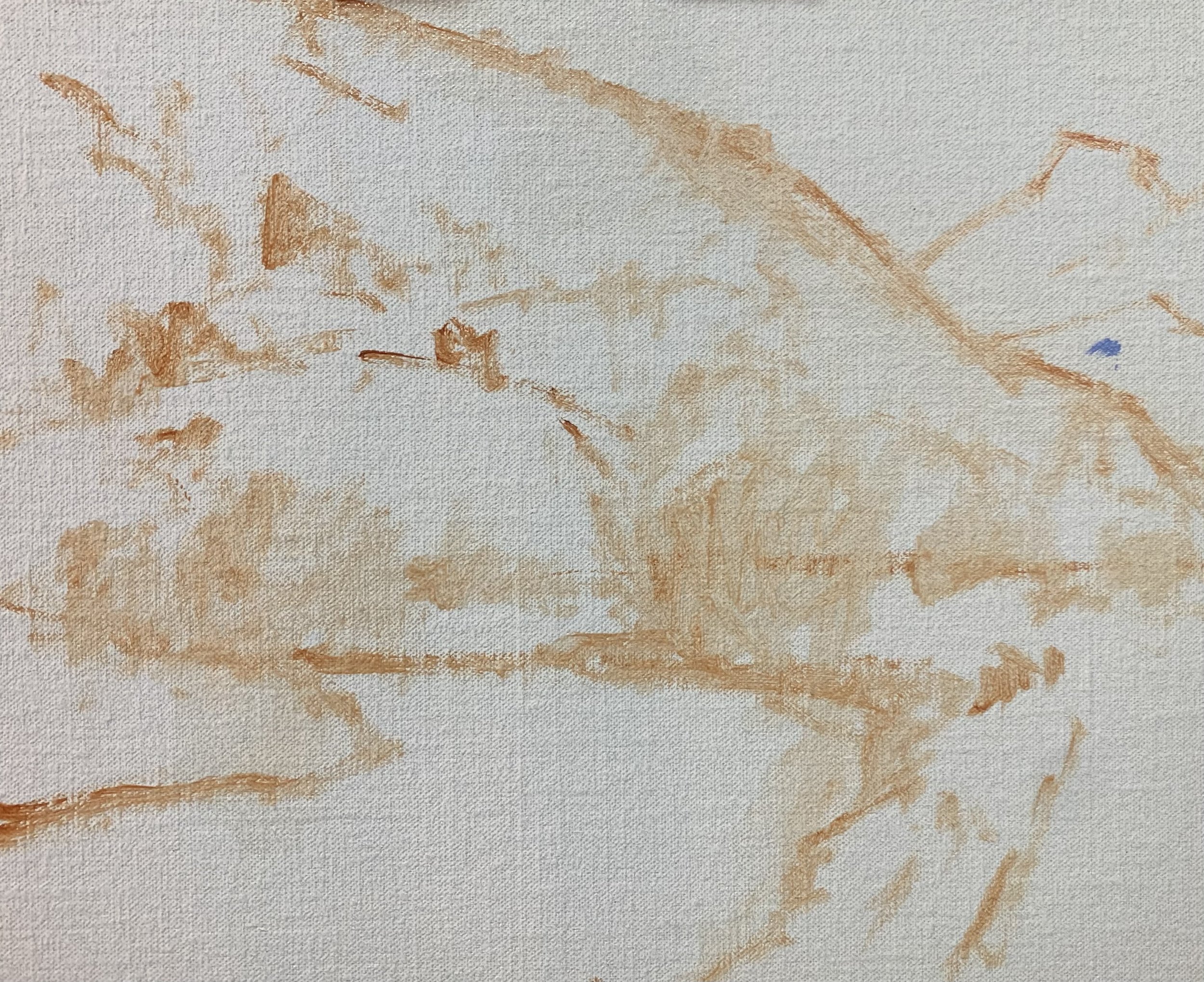
I am painting on a 10” x 12” linen panel. The linen panel is pre-made and is an oil-primed medium weave linen that is mounted to Baltic birch. These panels are perfect for creating small to medium-sized art works and studies and they are also great to use for painting en plein air.
I sketched the composition using a No.1 round brush with burnt sienna mixed with Liquin Original (Liquin). I am using Liquin as a medium to thin the paint and it also has the advantage of speeding up the drying time.
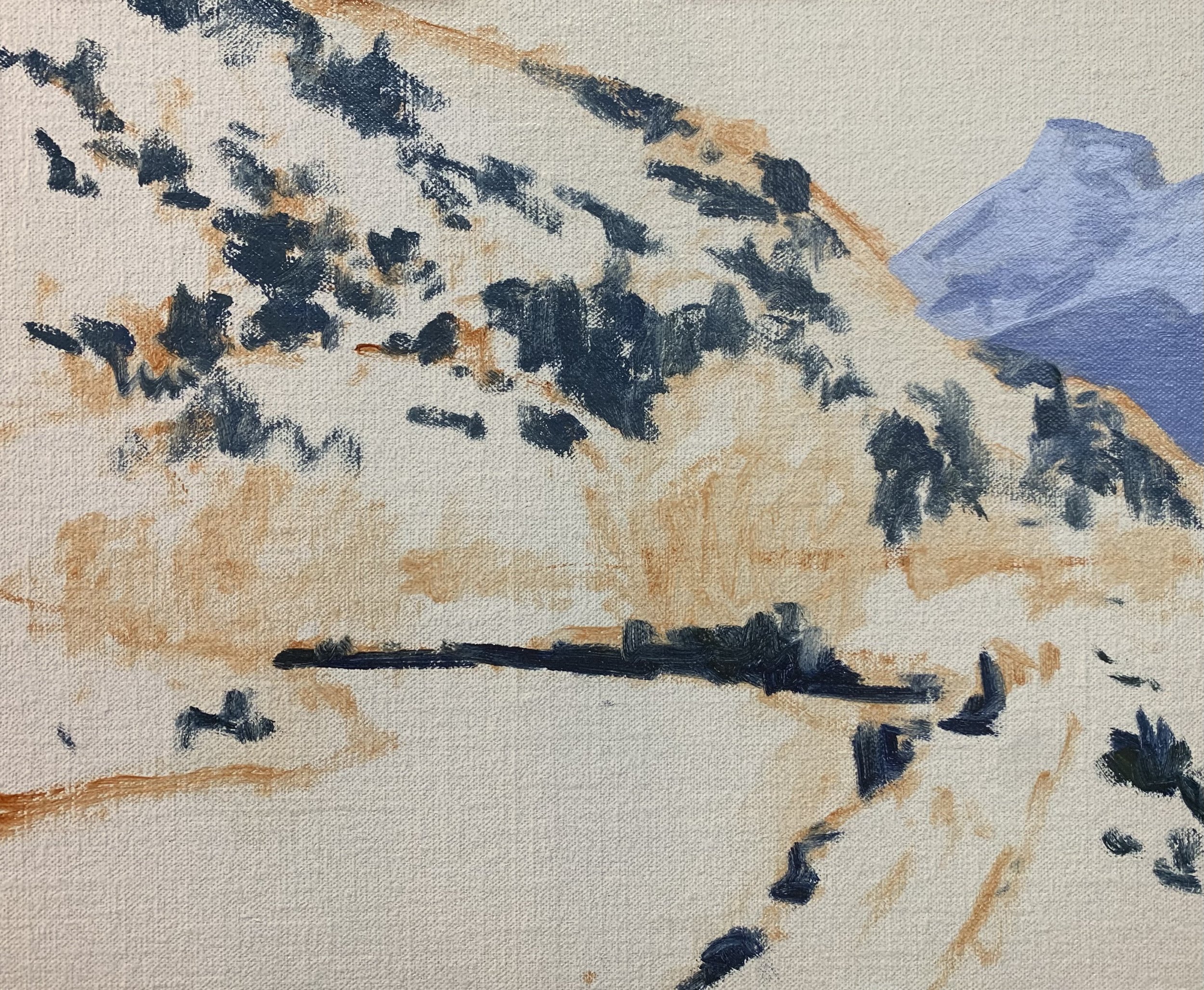
Paint Your Dark Values and Shadows First
Whenever I start a painting I always identify where the dark values and shadows are first in the scene I am painting. Value refers to how light or dark a subject is and by painting in the dark values first I personally find it is much easier to create atmospheric perspective in my paintings. It also makes it easier to add the areas in light and to get the saturation of your colours correct once you have painted your dark values.
In this painting, the darkest values are within the background mountain, the shadows in the vegetation in the mid-ground hill and the shadows along the river bank in the foreground.
The colours I used in the background were a varying mix of ultramarine blue, burnt sienna, alizarin crimson and titanium white.
The shadows in the mid-ground are darker than the mountain shadows and I used a mix of ultramarine blue, yellow ochre and titanium white.
The darkest shadows are in the foreground and for this, I used a mix of ultramarine blue with a little yellow ochre.
Now that all the dark values are established I have a tonal dynamic to work from and I paint the sky and clouds in the background. Skies are some of the lightest values to be found in the landscape.
The clouds are a mix of titanium white with a little burnt sienna. The sky is a mix of ultramarine blue and titanium white making some nice clean colour.


Painting to the Willow Trees
I painted the willow trees using a mix of burnt sienna, ultramarine blue, alizarin crimson and titanium white. The burnt sienna and titanium white are the dominant colours in the mix and the trees overall are a light value low chroma colour.
ART TIP
When blocking in trees I find it easier to treat them as masses and therefore I don’t worry about painting every single leaf or twig. I mark in their shapes and forms and then add details later on.
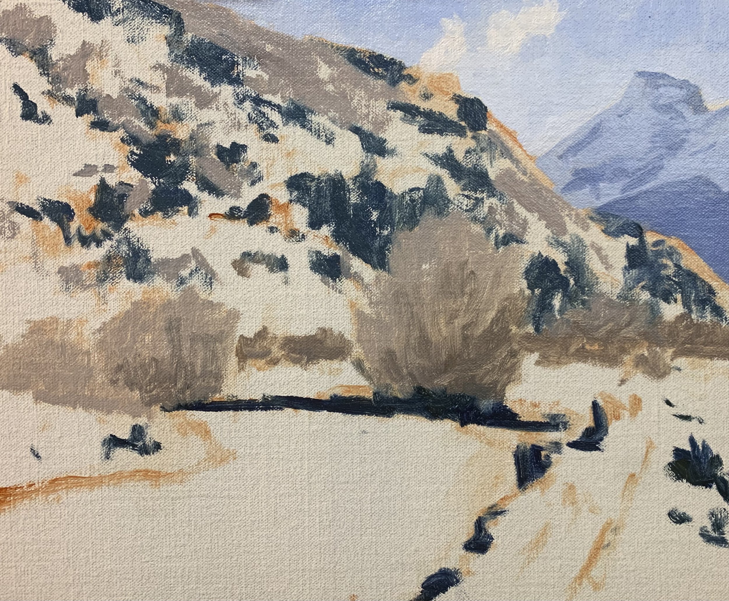
Given the willow trees are a relatively light value colour in order for them to stand out in the painting it is ideal that the background hill contains darker value colours. The vegetation on the hill consists of many trees and shrubs which are naturally dark in value.
The greens I used for the mid-ground hill include varying combinations of yellow ochre, cadmium yellow, ultramarine blue, alizarin crimson and titanium white. For some of the more emerald tones in there, I have also mixed in a little phthalo green. I have used the same colours for the grass however my green mixture contains much more titanium white to make the value lighter as well as some phthalo green in the mix.
The river is reflecting the sky and the background hill. For the blue areas of the river, I have used a mix of ultramarine blue, yellow ochre, phthalo green and titanium white. For the still areas of the water that is reflecting the background hill, I used a mix of yellow ochre, ultramarine blue, burnt sienna and titanium white.
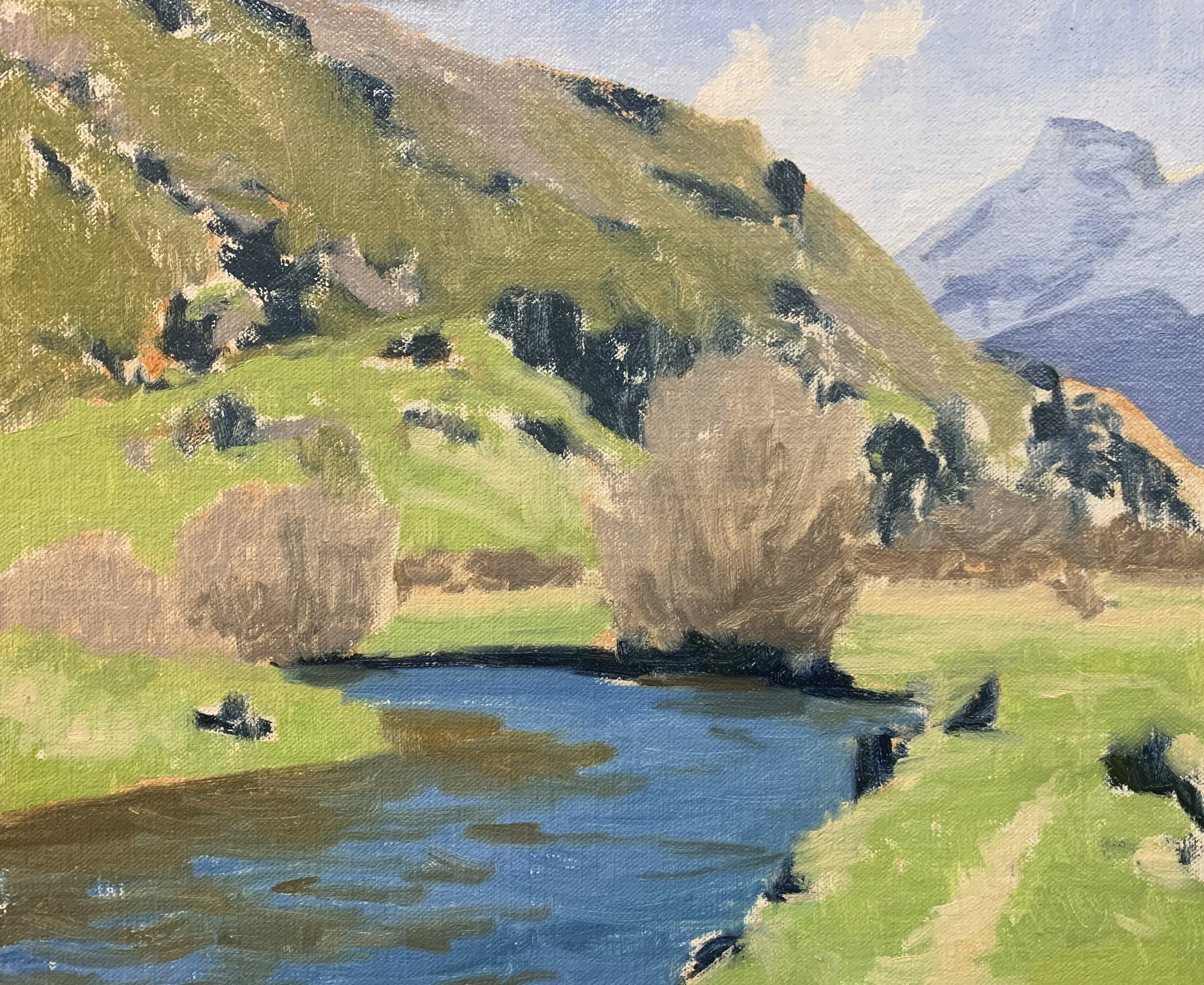
Once I had established the basic colours in this artwork I then went back across the painting and restated the dark values and shadows which helps to add more definition to the forms in the composition. The dark values are mostly in the vegetation on the mid-ground hill.
I complete the blocking in the stage of this painting by marking in the suggestions of a few main stems and branches in the willow trees using a mix of ultramarine blue, burnt sienna, alizarin crimson and a little titanium white. After this, I let the painting dry for a few days so I could begin adding details to it.
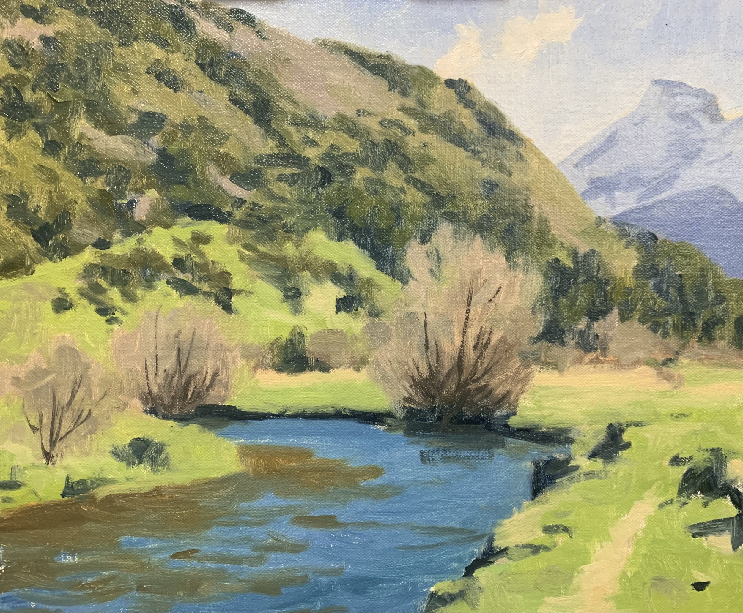
Stage 2 – Adding Details, Modelling and Refining the Painting
Once the painting was dry I was then able to begin the modelling stage where I am adding details to the painting and refined the various forms. Essentially I am still using the same colours for the various zones in the painting but in many cases adding lighter value colours.
I add more layers to the sky, clouds and mountains and then I spent time building up the detail in the vegetation on the mid-ground hill. I mostly used No.3 and No.2 flat brushes and No.3 Filbert brushes to paint the vegetation.
When adding more details to the willow trees I used the same colours I used for the blocking-in stage but this time added some lighter value colours to build up the form of the trees. When painting winter trees I never paint every single twig and branch, instead, I treat the tree canopies as masses and paint the suggestion of a few twigs and branches. I feathered the tops of the canopies with an old brush to soften the edges. I also added some more main stems within the tree canopies using a No.0 round brush.
I added more details to the water using the same colours I used during the blocking-in stage but with lighter value colours. I needed some more detailed marks so I used a 1/4” ivory dagger brush which has synthetic bristles for more accurate marks.
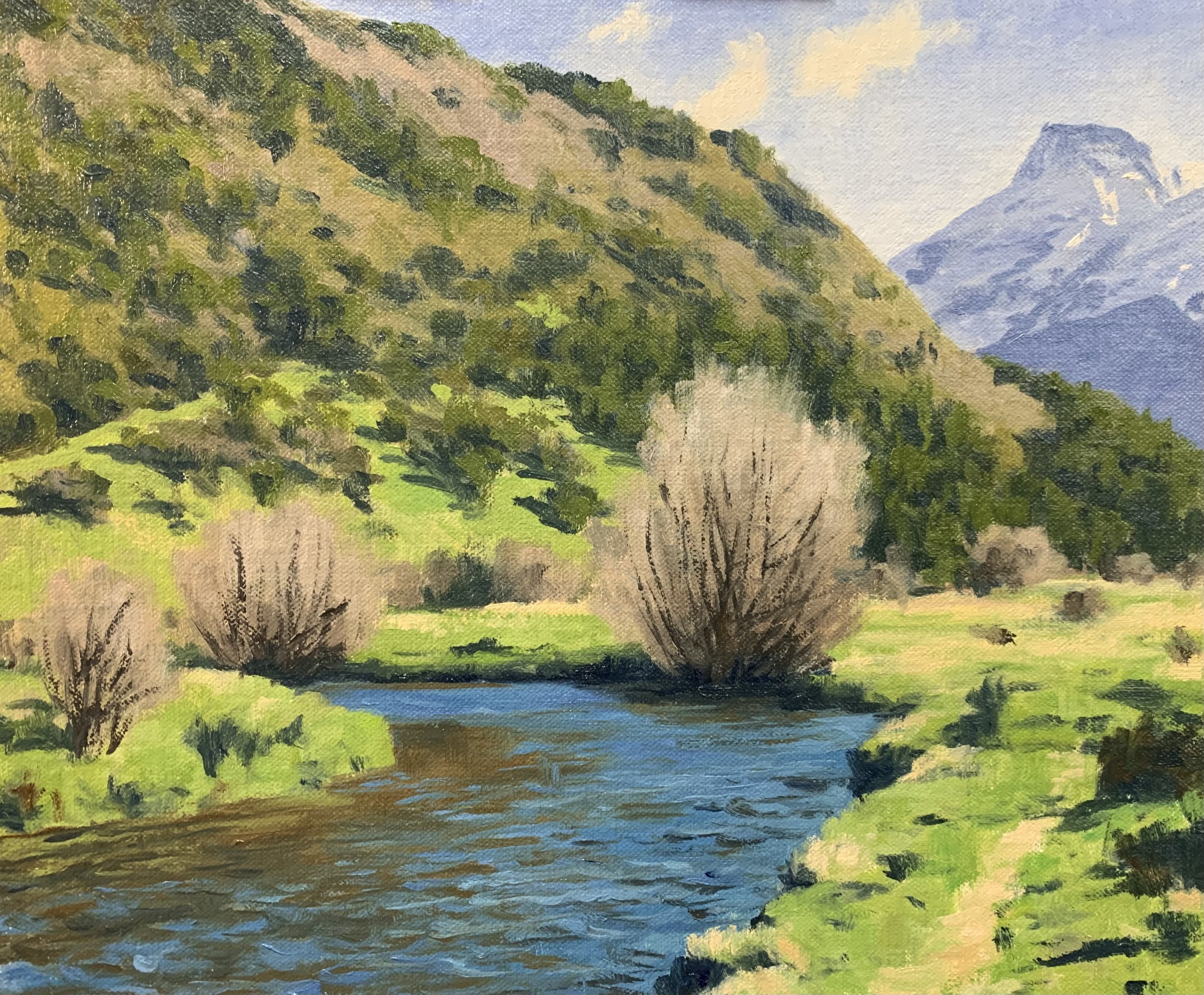
Stage 3 – Final Details
After spending time building up the details in the painting I let it dry so I could add the last details and final highlights which I always save until last.
I added a few highlights to the main stems and branches in the willow trees using a mix of burnt sienna, ultramarine blue and titanium white.
I added some sparkles to the shimmering water using a mix of titanium white and a little yellow ochre and I applied the paint with a No.0 synthetic round brush.
Thanks for reading.
More Blog Posts You Might Like
