Welcome to this blog post guide on how to paint a landscape in acrylic paints. In this article, I demonstrate how to paint a landscape that features a river in a rugged mountain valley inspired by the south island of New Zealand.
I absolutely love landscape painting and find it to be an enriching experience that offers a unique way to connect with nature. It is an opportunity to unleash your creativity and cultivate a sense of tranquility and inner peace.
While painting landscapes may seem daunting to beginners, I hope this step-by-step demonstration will assure you that you can create stunning landscape paintings with the right tools, techniques, and patience.
The medium I will focus on in this article is acrylics, beloved for their versatility, bright colors, and quick drying times.
Whether you’re an aspiring artist or a seasoned professional, this guide will provide step-by-step instructions to help you create your beautiful acrylic landscape painting. So, let’s dive in!
Why Choose Acrylics for Landscape Painting?
Before we begin, it’s essential to understand why acrylic paints are a popular choice for landscape painting.
Firstly, their quick drying time allows you to build up layers and make changes on the canvas without waiting for extended periods. This makes them ideal for beginners as they can quickly correct mistakes or experiment with different techniques.
Secondly, acrylics have an impressive range of colors, including metallic and iridescent options, allowing you to capture a landscape’s natural beauty easily.
Additionally, acrylics are water-soluble, making them easy to clean up and less toxic than other mediums like oil paints. Lastly, their affordability makes them accessible for artists of all levels.
Essential Tools for Acrylic Painting
To create beautiful landscape paintings with acrylics, you’ll need several essential tools:
You should invest in a variety of paintbrushes, including both broad strokes brushes for covering large areas and fine-tip brushes for detailing.
A good quality canvas, preferably primed for acrylic painting, is necessary. Acrylic paints, available in different viscosities and many colors, form the crux of your painting supplies. Remember, a palette for mixing your colors and a palette knife can help create texture.
Consider investing in mediums that allow you to manipulate your acrylics’ texture and drying time.
Whilst not mandatory, an easel can help you achieve the proper perspective, especially for larger canvases.
While good quality materials can enhance your painting experience, creativity and practice remain the key to producing beautiful art.
Colors and Brushes Selection for Acrylic Painting
The world of acrylic paint offers an extensive palette of colors, from vibrant primaries to subtle earth tones.
I prefer to use a simple palette of colors containing primaries, earth colors and tinting colors.
Remember, high-quality paint will provide better pigment and coverage, so consider investing in professional-grade acrylics for impressive results.
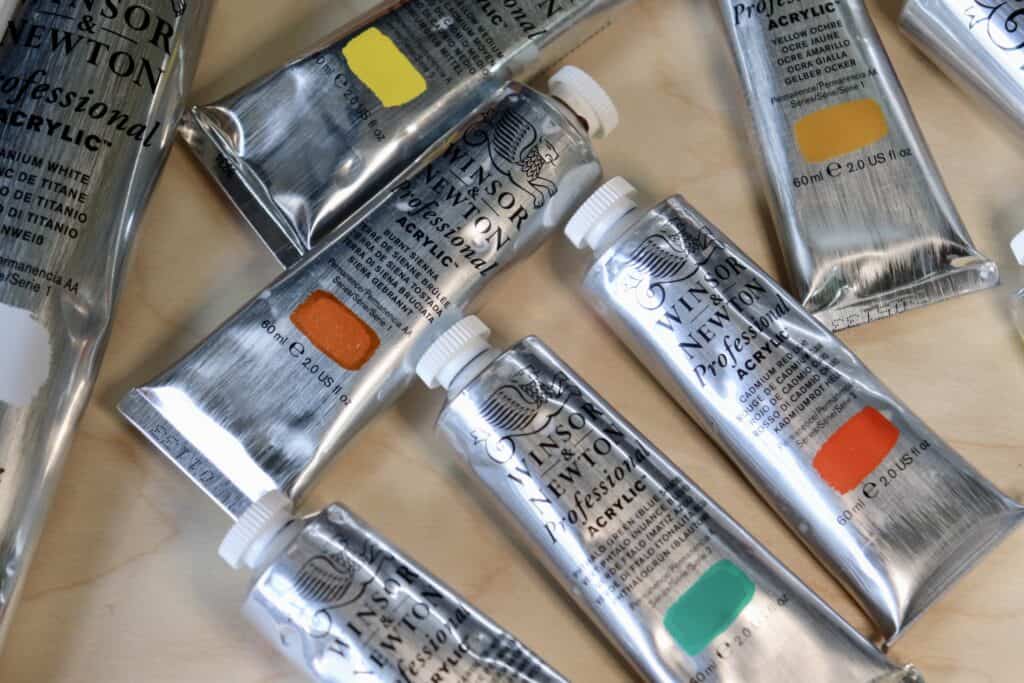
Colors Used For This Painting
For this painting I used Winsor and Newton Professional Acrylic Paints.
Titanium white
Burnt sienna
Yellow ochre
Cadmium yellow
Cadmium red
Alizarin crimson
Ultramarine blue
Phthalo green
Brushes
In terms of brushes, there are many shapes, sizes, and types to select from. Each brush offers different effects and is suited for different painting techniques.
For broad brush strokes and filling large areas, flat brushes are ideal. Round brushes, on the other hand, are perfect for detailed work and lines.
Fan brushes are useful for blending and creating interesting textural effects. As a beginner, consider starting with a basic set of brushes in different sizes and shapes to explore what works best for your style.
Choosing the correct colors and brushes is crucial to the painting process, setting the tone for your work and giving it its unique character. Remember, while the tools are essential, your creativity and vision truly breathe life into your art.
Step-by-step Guide: Painting a Landscape in Acrylics
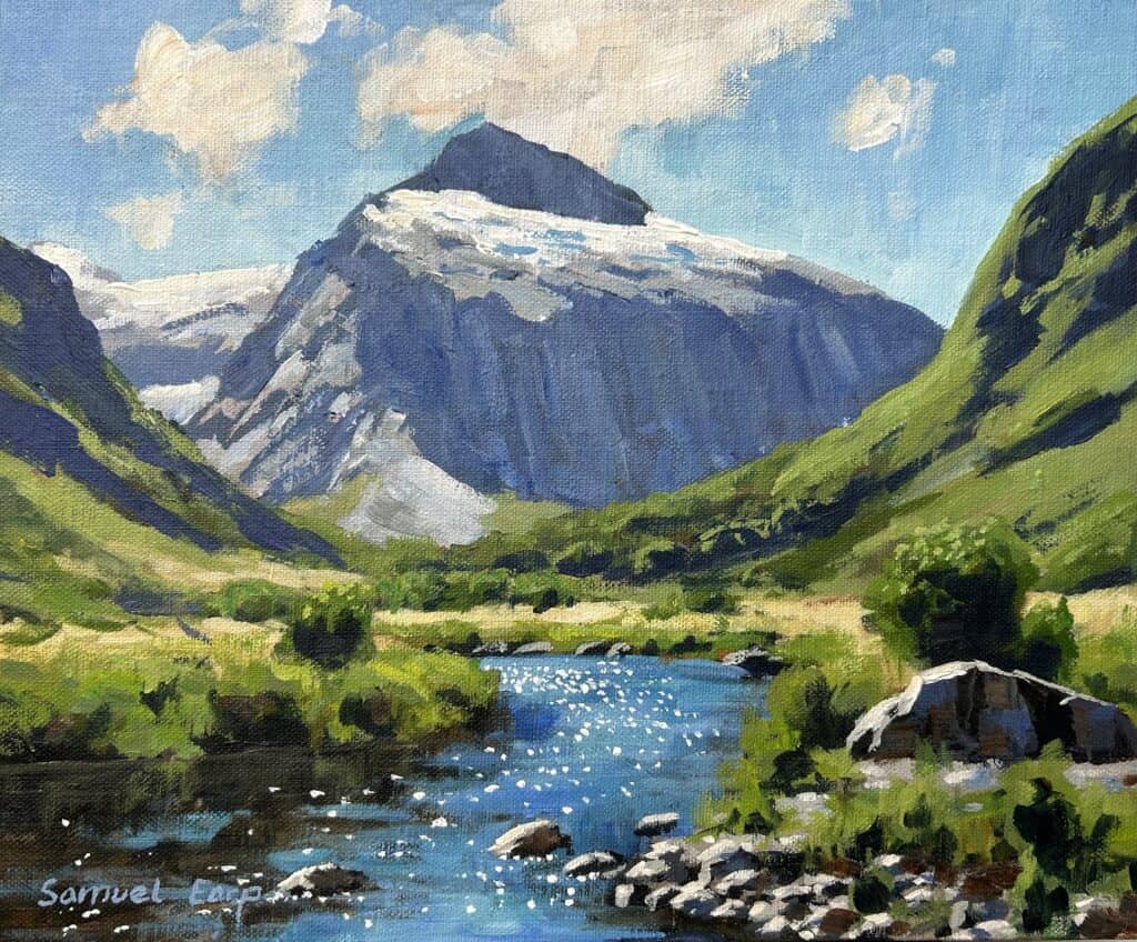
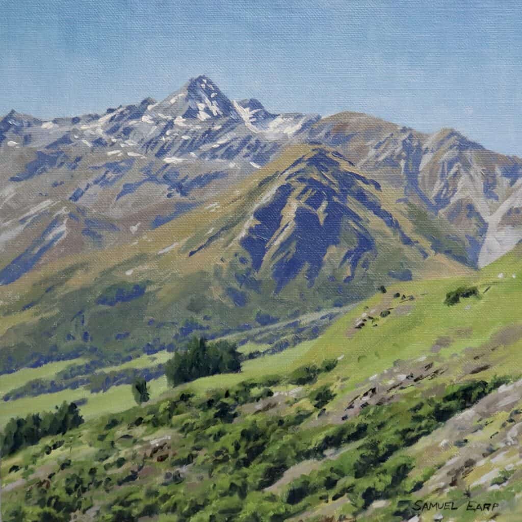
Get ready to bring the vibrant beauty of landscapes to life on your canvas as I show you how to paint a landscape in acrylics that features a mountain and a river. This step-by-step demonstration will walk you through capturing the essence of a mountain landscape in the Fiordland area in New Zealand.
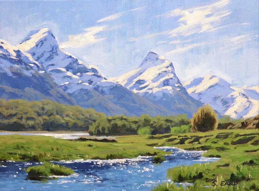
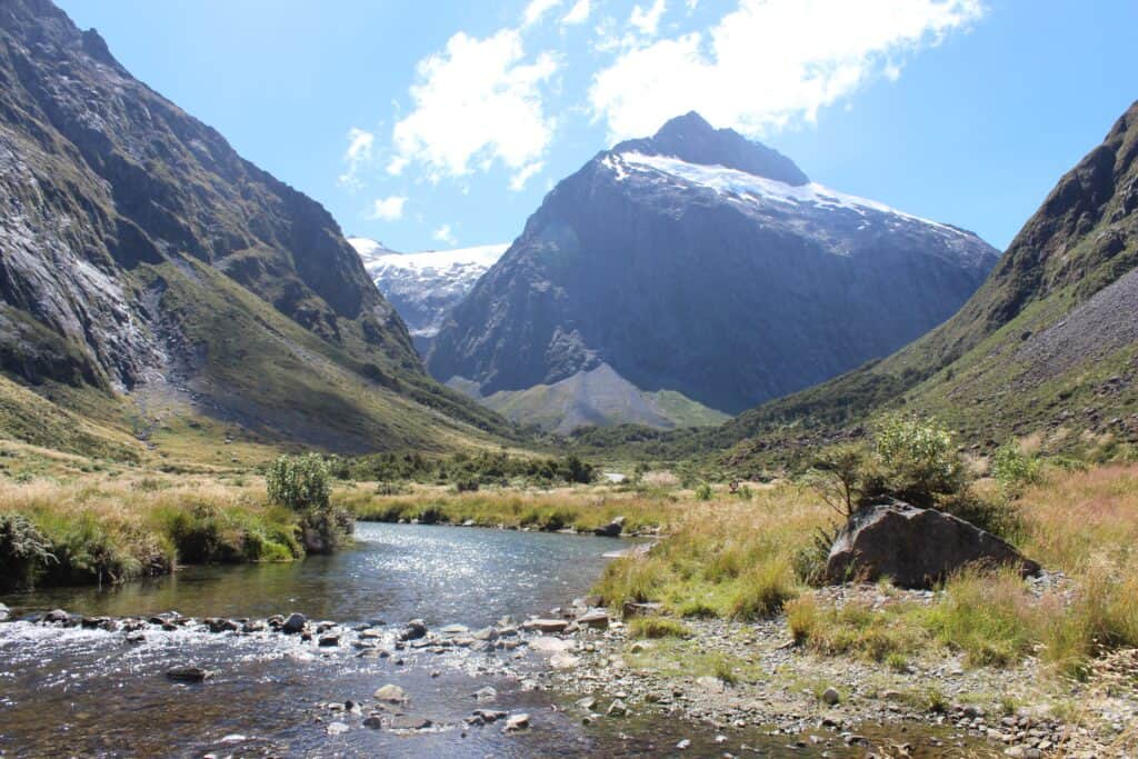
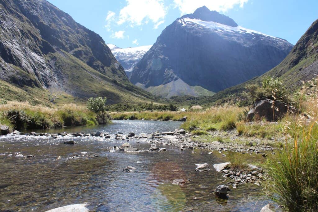
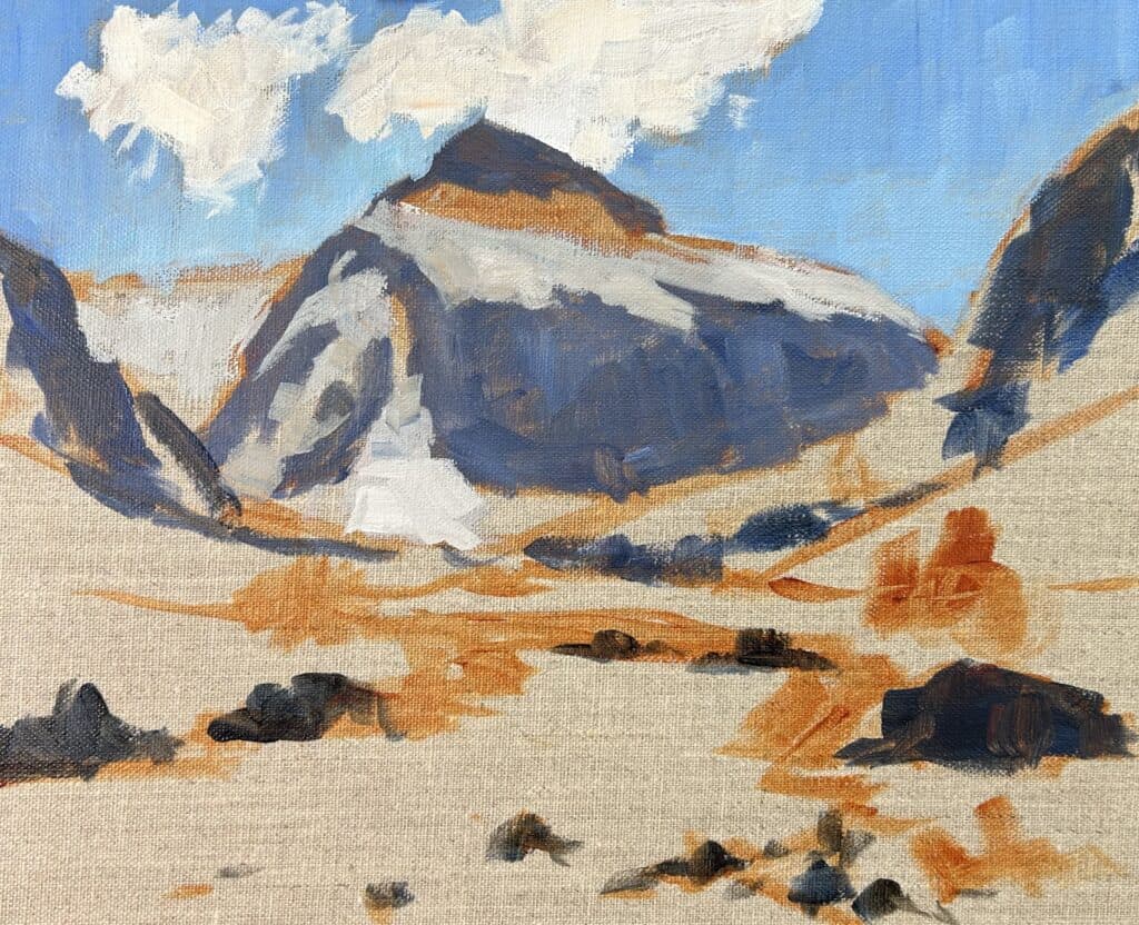
Reference Photos
These are the reference photos I used to paint this landscape painting. These photos are copyright-free, so please use them if you would like to paint this mountain landscape mountain scene yourself.
Outlining the Composition
Before you start painting, it’s essential to think about the key elements of your landscape composition. In this painting, I have created an ‘S’ shape, with the river and mountain taking center stage.
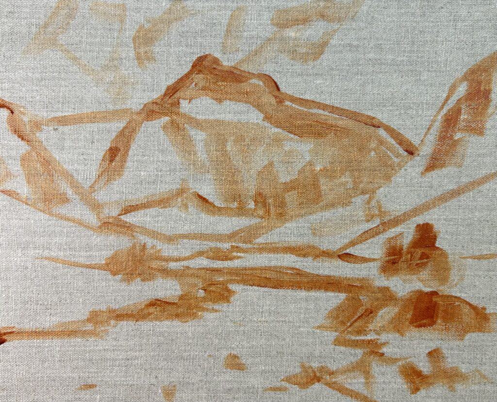
I moved the background mountain towards the center left so the river leads the eye towards it. The background mountain is the main focal point in the painting. Don’t be afraid to move elements around and change what you see; you don’t have to copy your reference photo precisely to the letter; in fact, I would strongly advise against it.
I painted this artwork on an 8″ x 10″ linen canvas panel primed with a clear gesso. I decided not to add layers of gesso as I liked the pale, earthy tone of the linen I was painting.
I outlined the composition with burnt sienna mixed with a bit of water.
Blocking in the Painting
Once I have outlined the composition, I next think about the values in the scene I am painting. Values refer to how light or dark a subject is, and the general rule is that we will find our darkest darks and our lightest lights in the foreground. As land masses recede into the distances, darks become less darks, and lights are not so light.
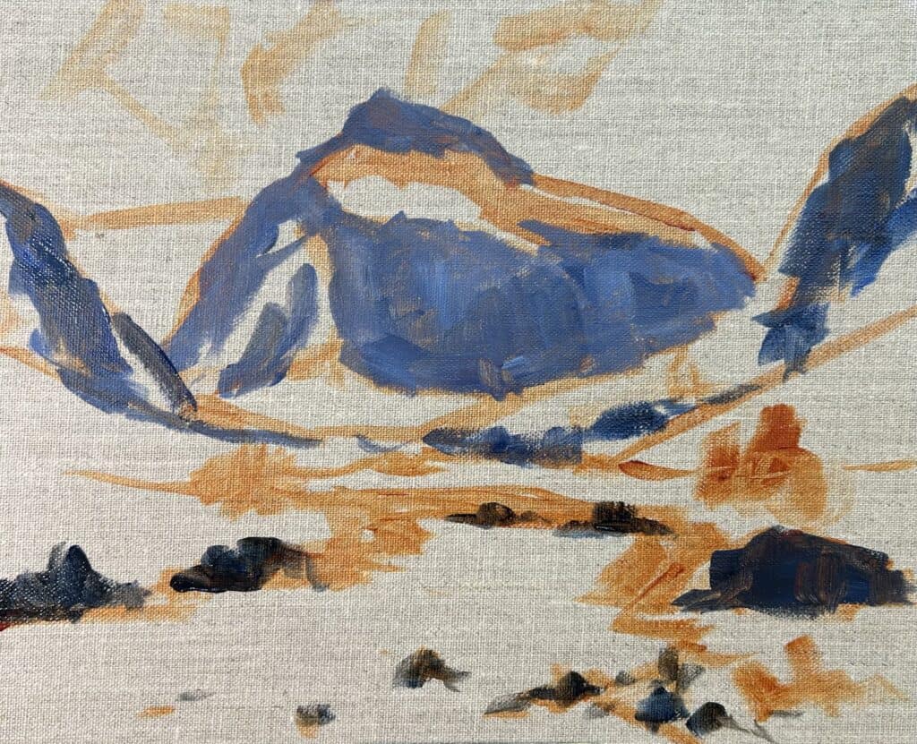
Establish the darkest darks and lightest lights
By roughly painting in the main areas of the shadows first in our acrylic landscape painting techniques, it will make it much easier to paint the areas in light afterward. It also makes mixing the colors for the light areas more effortless and helps create atmospheric depth in your painting.
I paint the shadows in the background mountain using a mix of ultramarine blue, burnt sienna, titanium white and a bit of alizarin crimson. I keep in mind that the shadows in the mountain are lighter in value than the shadows in the foreground.
As I work my way towards the foreground, those shadows are getting darker and so I use less titanium white in my shadow mix. I also edge the paint mixture on the blue side and I create broken color by not thoroughly mixing the colors together to allow some of the individual hues to come through.
Painting the Sky and Clouds
Now that the main areas of the scene and the shadows have been painted, I work back in the painting starting with the sky and clouds‘ furthest zone away. Skies are some of cool colors and the lightest values in the landscape.
I created the sky colors with ultramarine blue, titanium white, and a bit of phthalo green. For the clouds backlit by the sun, I used a mix of titanium white and a little burnt sienna.
I painted the areas of the mountain in light with the same colors I used in the shadows; however, the value of the color mix is a much lighter value. Titanium white and burnt sienna are the dominant colors in the light grey mix.
While painting these zones in the acrylic landscape above, I keep in mind that acrylic paints dry darker, so I allow for that by making my color mixes a little lighter than they need to be.
ARE YOU STRUGGLING WITH YOUR PAINTING?
JOIN MY ONLINE ART SCHOOL AND UNLEASH YOUR INNER ARTIST.
- Step-by-Step Painting Tutorials
- Helpful Tips and Techniques
- In-depth lesson notes
- Inspiring reference photos
- Instant access to all content, including videos, lesson notes, reference photos and more.
- A vibrant and friendly community, meet other members, ask questions, and share your art.
- Zoom meetings for Q&A’s, painting critiques and painting livestreams.
- Ideal for beginners and experienced painters.
- Lots of inspiration, help and support to take your painting skills to the next level.
Painting the Greens in the Mid-Ground
I worked forward in the painting and mixed various greens on my palette to communicate the vegetation in the landscape painting. There is a mix of straw-colored and green grass on the mountain slopes as well as stands of trees. I mix a variety of greens to create various colors and tones.
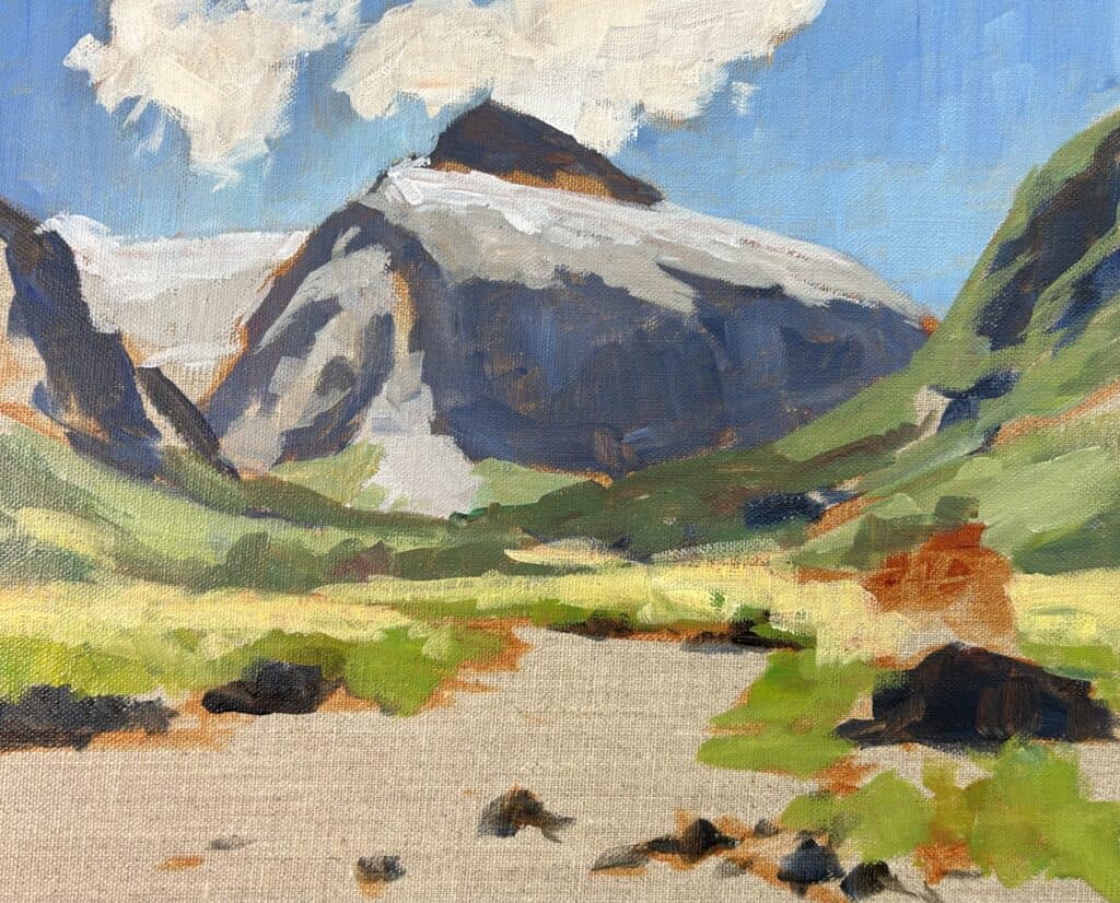
When mixing greens, it is essential to remember that the saturation of the greens drops out the further into the distance you go. So, I begin by mixing a lower chroma green and then increase the saturation of the colors as I gradually work up toward the foreground, where the darkest shades of the most saturated greens are found.
I mixed the various greens using varying combinations of different tones of yellow ochre, cadmium yellow, ultramarine blue and titanium white as my base color. I added more cadmium yellow and a little phthalo green to increase the saturation and I rounded off the greens with either some alizarin crimson or cadmium red light.
Painting the Water
The water is an essential component in the composition as it creates rhythm in the painting and directs the viewer’s eye toward the mountain.
The water mainly reflects the sky, so I used a mix of ultramarine blue, phthalo green, and titanium white. I apply the brush strokes with broad sweeping marks for a more painterly, impressionistic look. However, I used some fine details towards the end of the painting to add depth.
The edges of the river bank reflect into the water and I used a mix of burnt sienna, yellow ochre, ultramarine blue, and titanium white. I discovered that the value of this color was too light, so I darkened it later on as I got into more details.
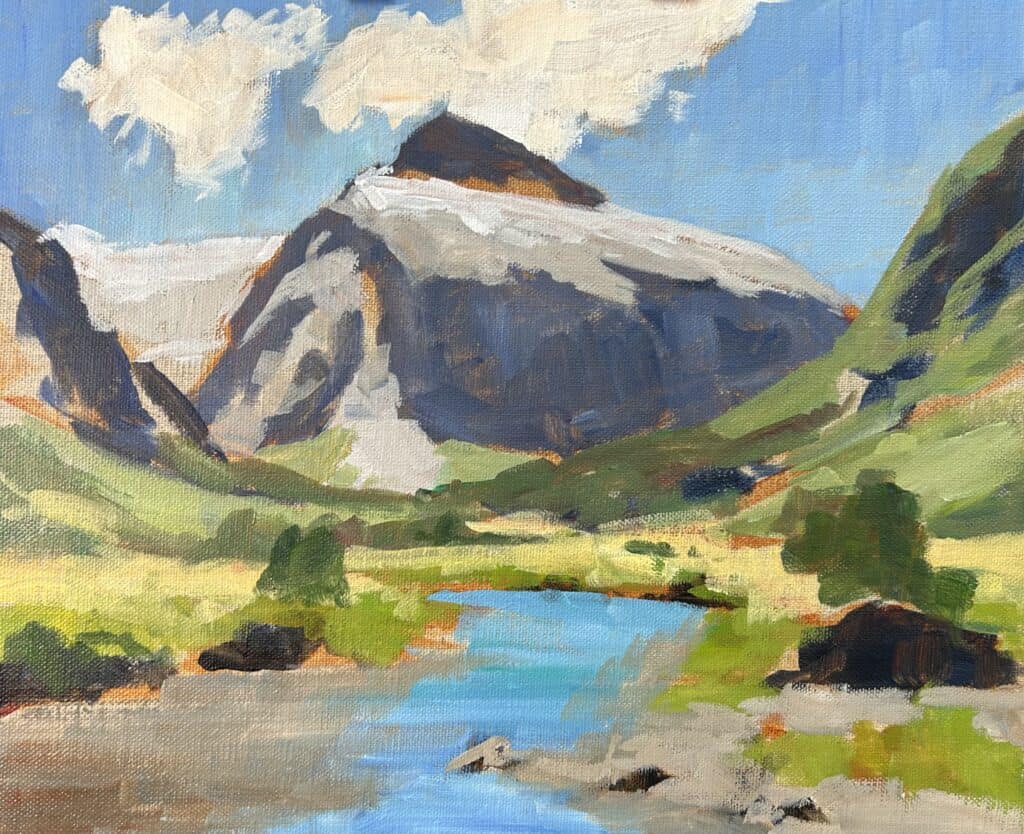
Modeling, Adding Details, and Restating the Dark Values
The fast-drying nature of acrylic paints has its advantages, especially when modeling and adding the details in my mountain landscape painting. It is very easy to start layering on fresh paint over existing layers.
Essentially, I am using similar colors to what I was using when I was blocking in the painting but am adjusting some of the values. For example, the shadows in the background mountain were a little too dark so I added lighter shades and layers of paint.
I added more details to the vegetation in the midground, especially the trees, and then I restated the dark values. The small trees in the foreground have some quite dark occlusion shadows within them and for this, I used a mix of ultramarine blue and yellow ochre, creating a dark, cool tone. In some areas, I also mixed in a little phthalo green and alizarin crimson.
I darken the areas around the banks of the river with a mix of burnt sienna, yellow ochre, and ultramarine blue. If needed, the value can be made lighter by mixing in some titanium white.
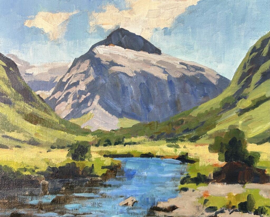
Final Details
With the painting dry, I added final details to the mountain and the vegetation. This is also the time to add my lightest values to this acrylic landscape painting.
The lightest values are in the clouds, snow, and the sparkles in the shimmering water. I added more layers to the clouds with a mix of titanium white with a little burnt sienna and yellow ochre to create a warm tone. I also use this color to add some of the highlights in the snow, which I do sparingly.
I paint the sparkles in the water using titanium white paint with a tiny amount of yellow ochre.
I finished the painting by adding details to other colors in the rocks in the foreground. The colors in the rocks are varying combinations of different tones of ultramarine blue, burnt sienna, titanium white, and alizarin crimson.
Watch the YouTube Video
ARE YOU READY TO UNLEASH YOUR INNER ARTIST? JOIN MY ONLINE ART SCHOOL
- Step-by-Step Painting Tutorials
- Helpful Tips and Techniques
- In-depth lesson notes
- Inspiring reference photos
- Instant access to all of the content.
- A vibrant and friendly community, meet other members, ask questions, and share your art.
- Zoom meetings for Q&A’s, painting critiques, and painting livestreams.
- Ideal for beginners and experienced painters.
- Lots of inspiration, help, and support to take your painting skills to the next level.
Things to Be Mindful of When Using Acrylics
While using acrylic paints can be a joy due to their versatility and ease of use, there are several factors that artists should bear in mind to ensure optimal results.
One of the main considerations is the rapid drying time of acrylic paint. This can be both a blessing for quick project completion and a curse, as it may compromise blending techniques. To circumvent this, keep a spray bottle handy to mist your palette and moisten the paints.
When it comes to paint application, remember that acrylics dry darker than initially applied. This is known as the ‘color shift’; artists must adjust their color mixtures accordingly.
Furthermore, while acrylics can adhere to a wide variety of surfaces, they work best on slightly textured surfaces like canvas, as they need something to grip onto.
Lastly, remember that acrylics are water-soluble but become water-resistant when dry. This means you can layer paints without mixing them, but you must also clean your brushes promptly to prevent damage. By being mindful of these aspects, you can fully harness the potential of acrylics and create stunning artwork.
Landscape Painting Tips
Landscape painting can be a profoundly enjoyable and rewarding activity, allowing you to capture the beauty of the natural world in your unique style. Here are some additional tips that may help you refine your landscape painting skills.
Understand Your Subject: Before you begin painting, take the time to observe and understand your landscape. Note the different elements in your view, how light interacts with the landscape, and the myriad of colors present.
Start with a Sketch: Drafting a quick sketch of your landscape is essential before diving into painting. This sketch will serve as a roadmap for your painting, helping you to understand where each element fits in your composition.
Work from General to Specific: Start with broad strokes to establish the main areas of your painting, then gradually add details. This approach lets you make necessary adjustments to the overall composition before you invest time in the fine details.
Use Photos as a Reference: If you’re painting a scene from memory, using photos as a reference can be helpful. This can help ensure you’re capturing the colors and the light accurately.
Experiment with Textures: Varying brush strokes can add texture and depth to your painting. Don’t be afraid to explore and experiment with adding different mediums to your paints to create varied textures.
Be Mindful of Color Temperature: A color’s temperature can significantly impact your painting’s mood and atmosphere. Warm colors bring energy, while cool colors create a sense of calmness. Be intentional with your color choices to convey the desired feeling in your landscape.
Create Depth by Using Layers: By layering different shades and hues, you can create the illusion of depth in your painting. Start with lighter colors in the background and gradually add darker tones as you move towards the foreground.
Consider Composition: How you arrange elements in your landscape can significantly impact the overall composition of your painting. Use techniques like the rule of thirds or leading lines to guide the viewer’s eye through your painting.
Remember that the beauty of art lies in individual interpretation and expression. So go ahead, unleash your creativity, and happy painting!
