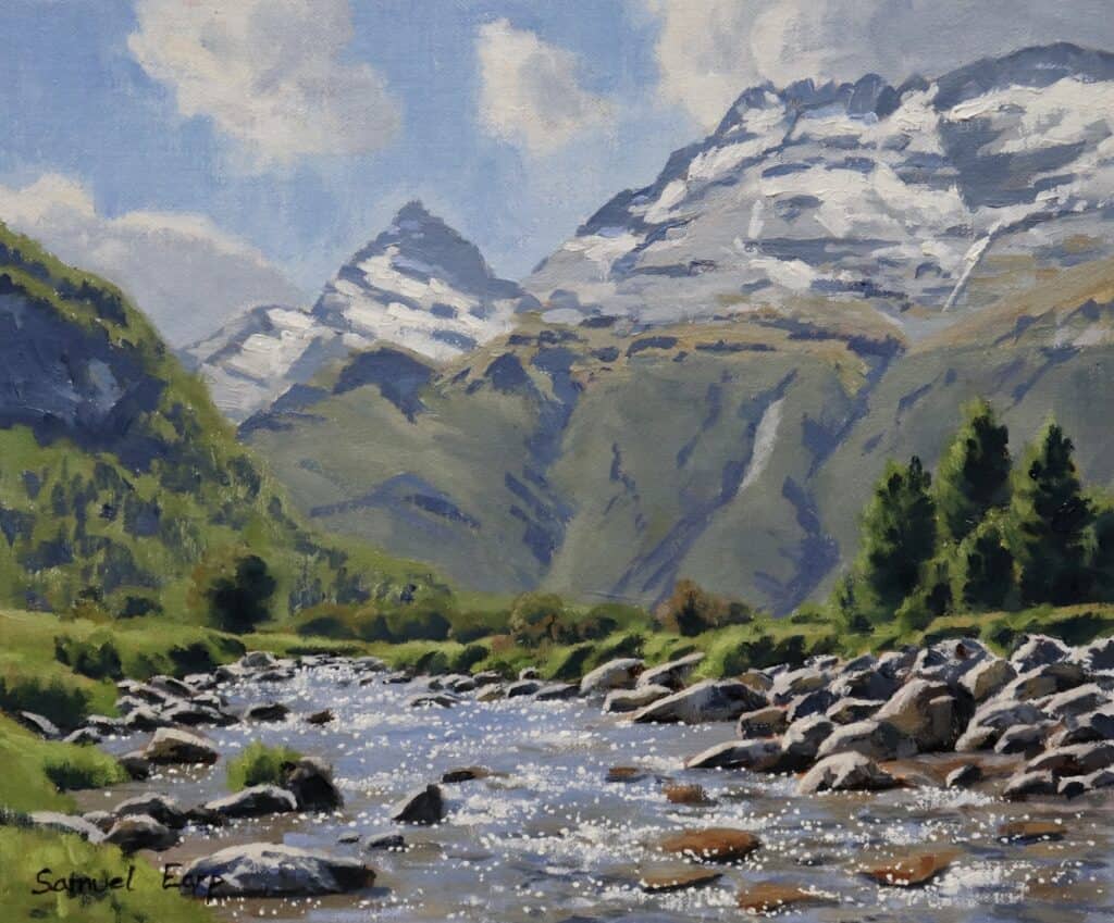
Capturing the mesmerizing sparkle of water in rivers, streams, or lakes can be a challenging yet rewarding aspect of landscape painting. Many artists struggle to convey moving water’s dynamic, light-filled nature, often resulting in flat or unrealistic depictions.
In this article, I will show how to create stunning sparkling water effects in landscape paintings. This comprehensive tutorial aims to demystify the process, guiding you through the intricate steps of painting a captivating river scene with glistening, sparkling water.
In this in-depth guide, we’ll explore:
- Essential composition techniques for water landscapes
- Selecting the ideal materials and tools
- Step-by-step painting methods to achieve realistic water effects
- Advanced tips for enhancing luminosity and movement
Whether you’re a beginner looking to improve your skills or an experienced artist seeking to refine your technique, this tutorial will provide valuable insights to elevate your water paintings to new heights.
Setting Up Your Artistic Toolkit
Before we dive into the painting process, let’s discuss the materials you’ll need:
Canvas
I used a high-quality 10-inch by 12-inch linen panel for this painting. Linen provides an excellent surface for oil paints, offering durability and a fine texture that enhances the overall look of the finished piece.
Paints
I’ll be working with artist-grade oil paints. My palette will consist of the following colors:
- Titanium White
- Burnt Sienna
- Yellow Ochre
- Cadmium Yellow
- Cadmium Red Light
- Alizarin Crimson
- Ultramarine Blue
- Phthalo Green
This carefully selected range of colors will allow us to create a vibrant, realistic water scene with depth and nuance.
By using these high-quality materials and following the techniques outlined in this guide, you’ll be well-equipped to create stunning paintings that capture the allure of sparkling water in nature.
Step-by-step Guide
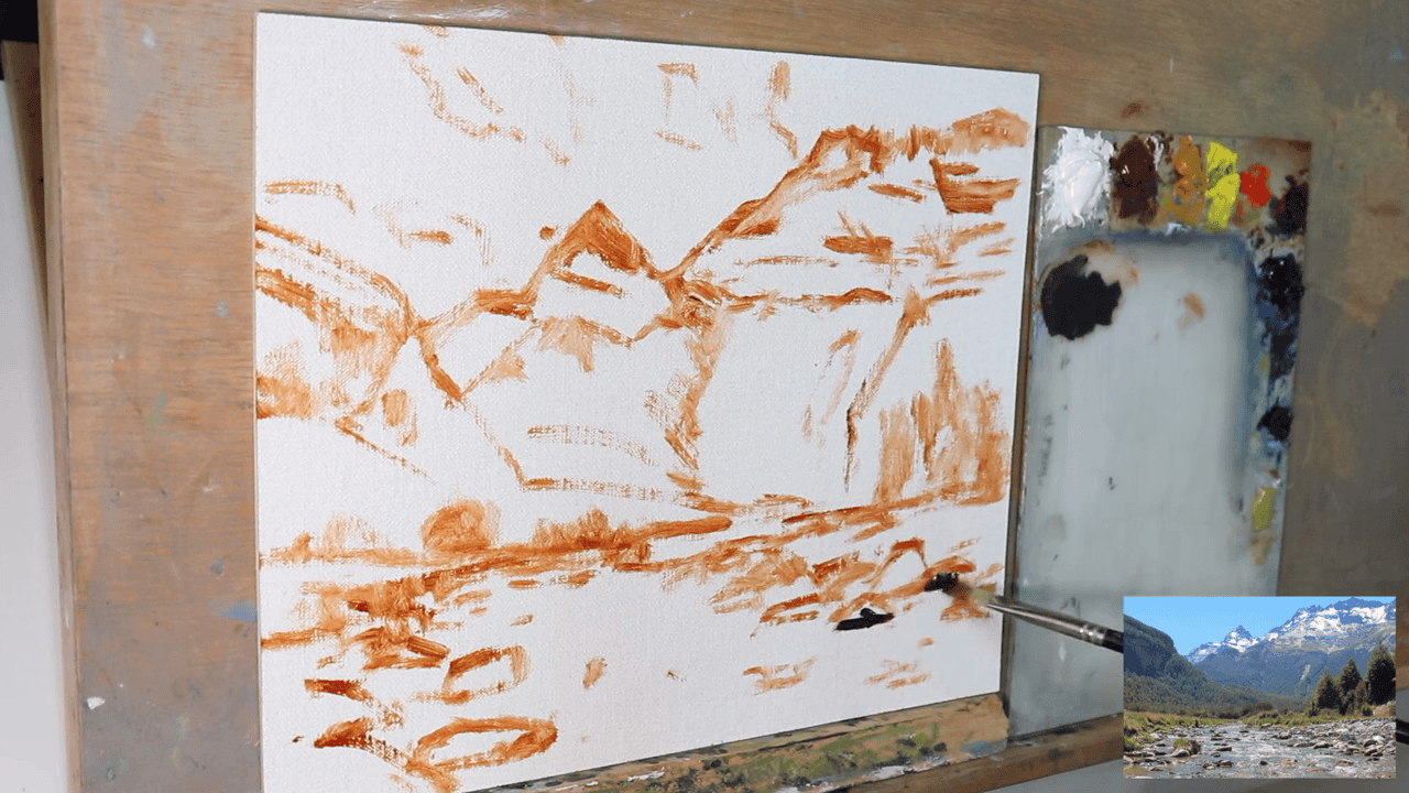
Laying the Groundwork
Before we begin adding color to our canvas, it’s crucial to establish a solid foundation for our painting. This preparatory stage sets the tone for the entire piece and can greatly influence the outcome.
Sketching the Composition
I started this painting by lightly sketching your composition onto the canvas using a burnt sienna with a little pale drying gel, which is the medium I used to thin the paint.
Keep your lines loose and light, as they will serve as a guide rather than definitive borders. This initial sketch helps you visualize the overall layout and ensures a balanced composition.
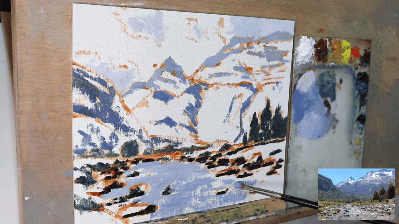
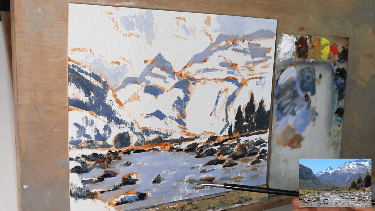
Establishing the Horizon Line
Next, define your horizon line. This crucial element will determine the perspective of your painting and guide the viewer’s eye. In this case, I placed the horizon line in the lower third of my canvas to emphasize the water’s expanse and the height of the mountains.
Establishing Tonal Values: The Key to Depth and Realism
Understanding Value in Landscape Painting
In the world of painting, “value” refers to the lightness or darkness of a color. Mastering value is crucial for creating depth and realism in landscape paintings, especially when depicting water scenes. Let’s explore how to effectively use value to bring your sparkling water painting to life.
The Importance of Contrast
When painting landscapes, a good practice is to begin with the darkest darks. This approach allows you to establish the full range of values in your painting from the outset. Remember:
- The most extreme contrasts (darkest darks and lightest lights) typically appear in the foreground.
- As landscape elements recede into the distance, the contrast diminishes – darks become less dark, and lights less light.
This gradual reduction in contrast is key to creating a sense of depth and atmosphere in your painting.
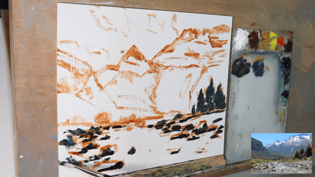
Painting the Darkest Darks
Foreground Shadows
- Start with the occlusion shadows in the rocks and the dark values in the trees on the right side of the painting.
- Create a rich, dark mixture using:
Rock Shadows
- Ultramarine Blue
- Burnt sienna
Tree Shadows
- Ultramarine Blue
- Yellow Ochre
This combination produces a deep, natural-looking shadow color that’s perfect for establishing your darkest values.
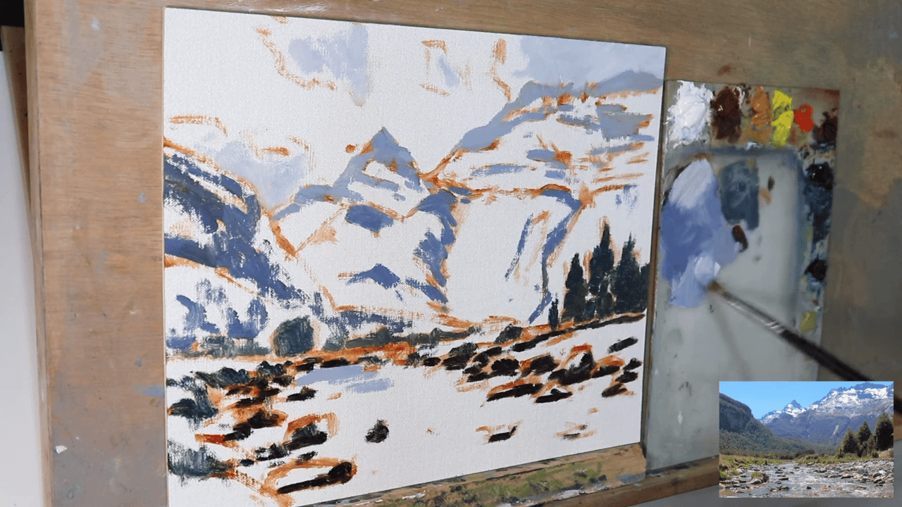
Background Shadows
For shadows in the background:
Mountains
- Use a mixture of Ultramarine Blue, burnt sienna, titanium white and a little alizarin crimson.
- Edge mixture more on the blue side.
Vegetation
- Use the same mixture of Ultramarine Blue and Yellow Ochre.
- Add a small amount of Titanium White to lighten the mix.
This subtle lightening reflects the natural atmospheric perspective, where distant objects appear lighter and less contrasted.
The Purpose of Establishing Dark Values
By laying down these dark values early in the painting process, you accomplish several important goals:
- Value Range: You set the darkest point on your value scale, giving you a reference for all other tones in the painting.
- Depth Creation: The contrast between these dark areas and lighter areas will immediately start to create a sense of depth in your landscape.
- Color Temperature: The mix of cool (Ultramarine Blue) and warm (Yellow Ochre or Burnt Sienna) tones in your shadows adds richness and prevents the darks from appearing flat or lifeless.
Remember, these initial dark values are the foundation upon which you’ll build the rest of your painting. Take your time to get them right, as they’ll guide your color and value choices throughout the rest of the process.
Building Depth with Mid-tones and Shadows
Transitioning from Dark to Mid-tones
After establishing the darkest areas in your painting, the next crucial step is to introduce mid-tones and additional shadows. This stage is vital for creating a sense of depth and dimensional realism in your landscape.
Foreground Shadow Technique
For the dark shadows in the foreground, create a rich, nuanced mixture using:
- Ultramarine Blue
- Burnt Sienna
- A small amount of Alizarin Crimson
This combination produces deep, complex shadows that avoid appearing flat or monotonous. The Burnt Sienna adds warmth, while the Alizarin Crimson introduces a subtle richness to the shadow color.
Application Tips:
- Apply this mixture with varying pressure to create texture and depth within the shadows.
- Use a dry brush technique in some areas to suggest rough textures of rocks or tree bark.
Creating Atmospheric Perspective
Background Elements
For rocks and mountains receding into the distance:
- Start with the foreground shadow mixture.
- Gradually incorporate more Titanium White and Ultramarine Blue as you move towards the background.
This technique achieves two important effects:
- Lighter Shadows: The increased amount of Titanium White lightens the shadow tone, reflecting the natural phenomenon where distant objects appear lighter.
- Blue Cast: The additional Ultramarine Blue creates a cool, atmospheric haze that is characteristic of distant landscape elements.
The Science Behind the Blue:
This blue cast in distant objects is due to Rayleigh scattering, the same phenomenon that makes the sky appear blue. As light travels through more atmosphere to reach distant objects, more of the blue wavelengths are scattered, giving far-off landscape features a bluish tint.
Balancing Color Temperature
While working on your mid-tones and shadows, keep in mind the balance between warm and cool colors:
- Foreground elements typically have warmer tones, achieved by the inclusion of Burnt Sienna and Alizarin Crimson.
- Background elements shift towards cooler tones with the increased use of Ultramarine Blue.
This temperature shift enhances the sense of depth in your painting, as warm colors appear to advance while cool colors recede.
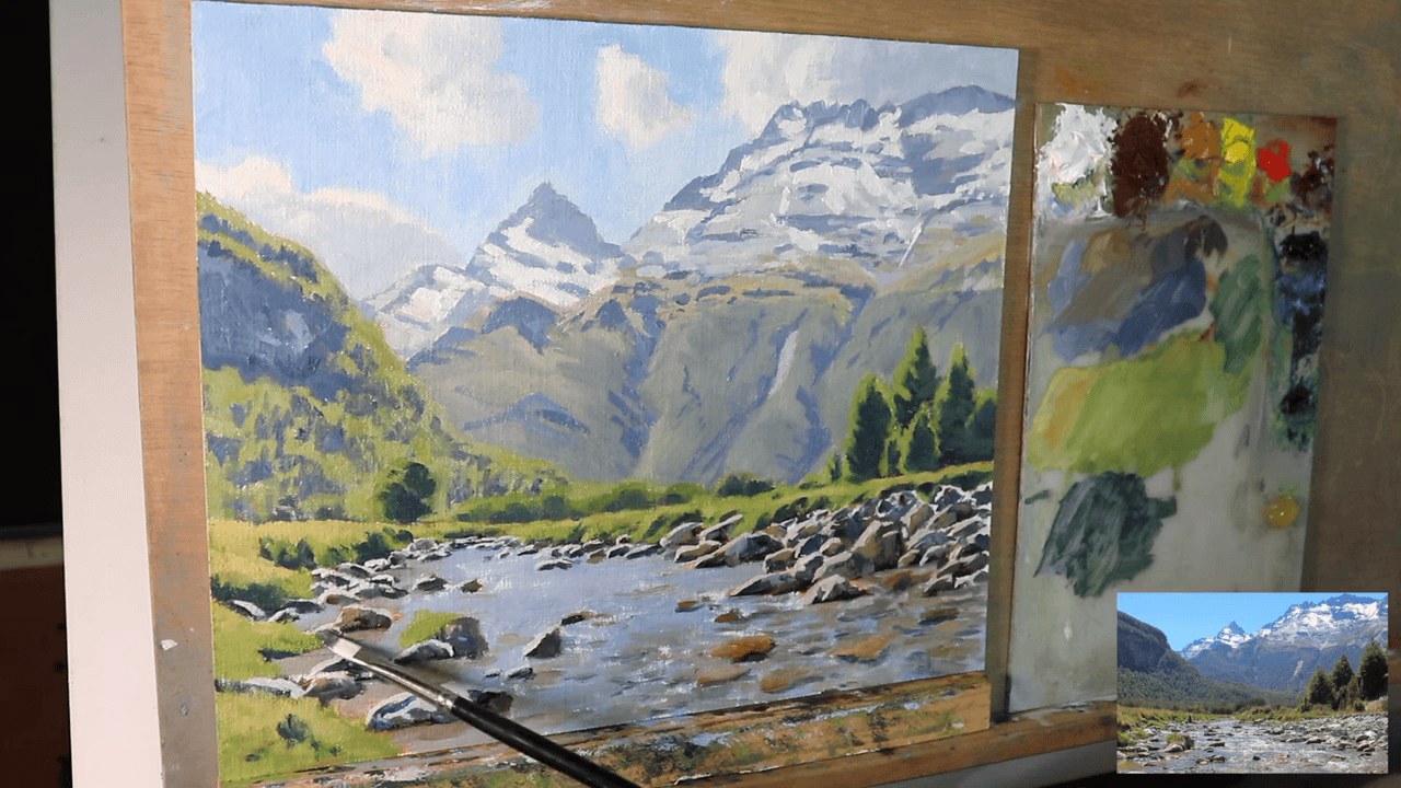
Capturing the Essence of Sparkling Water
Initiating the Water’s Base Layer
Now, we arrive at the heart of our painting – the sparkling water itself. This stage requires a delicate balance of technique and intuition to capture the water’s dynamic nature.
Brush Selection and Technique
For this crucial step, I used a number 5 bristle flat brush. This brush type is ideal because:
- Its stiff bristles allow for expressive, textured strokes
- The flat shape creates both broad swaths and fine lines, perfect for depicting water’s varied surface
Employ loose, gestural brush marks to suggest the water’s movement and flow. These marks should:
- Follow the natural direction of the water’s current
- Vary in pressure and speed to create a sense of depth and motion
Crafting the Perfect Water Color Mixture
To achieve a realistic water color, we’ll use a carefully balanced mixture of:
- Ultramarine Blue
- Burnt Sienna
- Titanium White
- Alizarin Crimson
The Role of Each Color:
- Ultramarine Blue: Provides the base water color
- Burnt Sienna: Desaturates the blue, creating a more natural, less artificial water tone
- Titanium White: Adds opacity and lightens the mixture, simulating light penetration in water
- Alizarin Crimson: Introduces subtle warmth and depth to the water color. It gives the overall mixture a violet tint.
Mixing Technique:
- Start with Ultramarine Blue as your base
- Gradually introduce Burnt Sienna until you achieve a slightly muted blue
- Add Titanium White to lighten and create opacity variations
- Finally, incorporate a small amount of Alizarin Crimson for warmth
Applying the Water Base
Begin applying this mixture to your canvas, focusing on:
- Varied Opacity: Allow some areas to be more transparent, others more opaque
- Directional Strokes: Use your brush strokes to suggest the water’s flow and current
- Color Variations: Subtly adjust the mixture as you paint to create natural color transitions
Submerged Features
Pay special attention to areas where submerged features, like rocks, will be placed. In these areas:
- Use slightly darker tones to suggest depth
- Create subtle color shifts to indicate the water’s interaction with these submerged elements
- Leave some areas lighter to suggest the water’s surface above these features
Building Layers
Remember, this is just the initial layer of the water. We’ll be adding more layers to create the sparkling effect:
- Allow this base layer to dry slightly before proceeding
- Observe how the colors interact with the previously painted shadows and mid-tones
By carefully applying this base water layer, you’re setting the stage for the sparkling highlights and reflections that will bring your water scene to life in the subsequent steps.
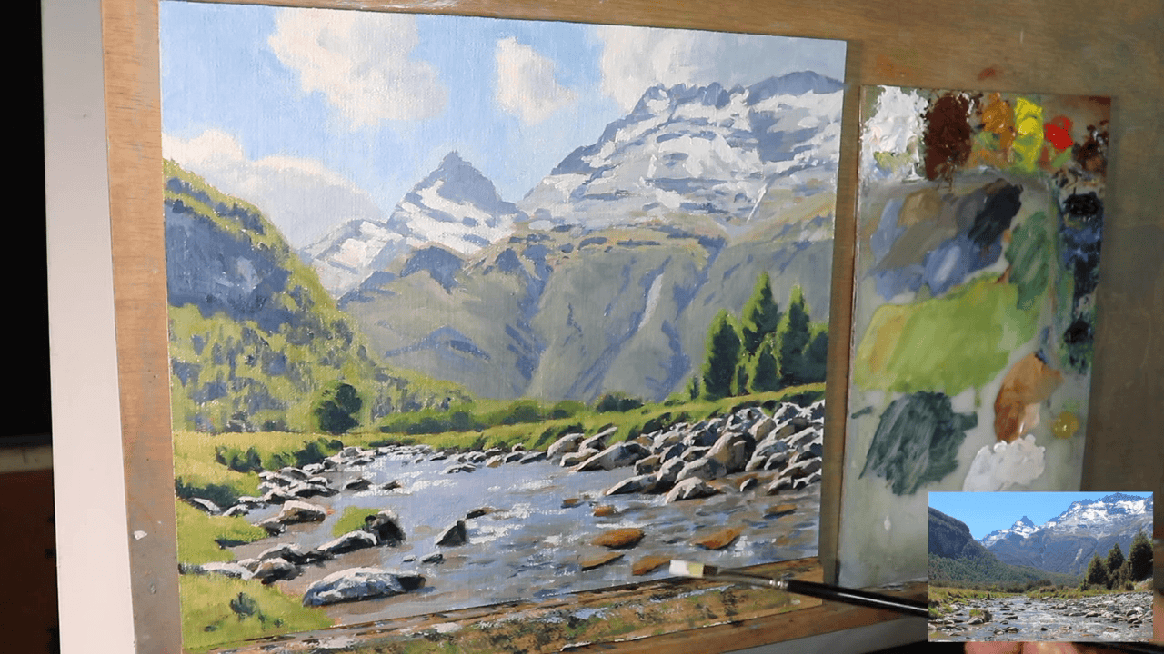
Crafting Realistic Rocks: Adding Texture and Variety to Your Landscape
The Importance of Diversity in Rock Formation
When painting rocks in your landscape, diversity is key. Rocks play a crucial role in adding visual interest and grounding your composition, particularly in a water scene. Let’s explore how to create compelling, varied rock formations that enhance your painting’s overall appeal.
Why Rock Variety Matters
- Visual Interest: Diverse rock shapes and sizes keep the viewer’s eye engaged.
- Realism: Rocks rarely appear uniform in nature, so variation adds authenticity.
- Compositional Balance: Different rock forms can guide the viewer’s gaze through the painting.
Techniques for Painting Diverse Rocks
Varying Shape and Form
- Angular vs. Rounded: Mix sharp, angular rocks with smoother, rounded ones.
- Flat vs. Dimensional: Include both flat, slab-like rocks and more three-dimensional, boulder-type formations.
- Regular vs. Irregular: Combine symmetrical shapes with more organic, irregular forms.
Size Variation
- Include a range of sizes, from small pebbles to larger boulders.
- Use size variation to create depth – larger rocks in the foreground, smaller ones in the background.
Texture Techniques
- Dry Brush: Use a dry brush technique for rough, granular textures.
- Palette Knife: Apply paint with a palette knife for sharp, defined edges and texture.
- Layering: Build up layers of paint to create depth and weathered appearances.
Color and Shadow in Rock Painting
Base Colors
- Use a mix of Burnt Sienna, Yellow Ochre, and Titanium White for warm, sunlit areas.
- Add Ultramarine Blue to your mixture for cooler, shadowed parts.
Adding Depth with Shadows
- Cast Shadows: Paint shadows that the rocks cast on each other and the surrounding area.
- Form Shadows: Use darker tones to indicate the less illuminated sides of the rocks.
Highlighting Techniques
- Add touches of pure Titanium White or a light Yellow Ochre mix for sun-catching edges.
- Use thin, light strokes to suggest mineral streaks or quartz veins in the rocks.
Placing Rocks in Your Composition
- Arrange rocks to create natural-looking groupings.
- Use rocks to frame or direct attention to focal points in your painting.
- Consider partially submerged rocks to create interesting water interactions.
Avoiding Repetitive Patterns
- Resist the urge to create a “perfect” arrangement – nature is inherently random.
- Step back frequently to assess the overall composition and adjust as needed.
- If you notice a pattern forming, intentionally break it with a differently shaped or sized rock.
By focusing on these aspects of rock painting, you’ll create a more dynamic and realistic landscape. Remember, the goal is to make each rock unique while still maintaining a cohesive look that enhances your sparkling water scene.
Bringing Life to the Riverbank: Painting Foliage and Trees
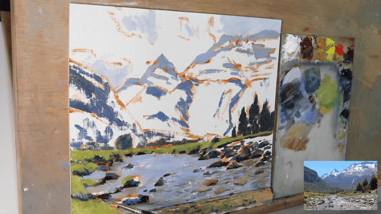
Creating a Lush Landscape Setting
After establishing the rocks and water, it’s time to breathe life into the surrounding landscape. The grassy areas and trees along the riverbank play a crucial role in framing your water scene and adding depth to your composition.
Painting the Grassy Areas
Technique for Realistic Grass
- Base Layer: Start with a mix of Yellow Ochre and Ultramarine blue for a natural grass base.
- Texture: Use a bristle flat brush or a dry brush technique to create the illusion of individual grass blades. You can also use a fan brush for this.
- Highlights: Add touches of Cadmium Yellow mixed with Titanium White for sun-kissed grass tips.
Variations in Grass
- Incorporate darker green patches to suggest shadows or denser growth.
- Add small dabs of earth tones to imply soil or dead grass, enhancing realism.
Crafting Trees on the Riverbank
Near Trees
For trees closer to the viewer:
- Trunk and Branches: Use a mix of Burnt Sienna and Ultramarine Blue for the base.
- Foliage: Create a mix of Ultramarine Blue, Cadmium Yellow, and touches of Burnt Sienna for varied leaf colors.
- Texture: Employ a stippling technique or small, irregular brush strokes to suggest leaves and branches.
The Art of Painting Distant Trees
When depicting trees in the background, it’s crucial to understand how distance affects color and detail:
Color Changes in Distant Foliage
- Lower Chroma Colors: As green shades fade over distance, use more muted tones.
- Color Mixing: Combine your green mixture with more blue, a color that contains red, e.g., Burnt Sienna, and a Titanium White to reduce saturation.
- Atmospheric Perspective: Add a slight blue tint to mimic the effect of atmospheric haze.
Techniques for Distant Trees
- Simplified Shapes: Use broader, less detailed strokes for distant tree masses.
- Softer Edges: Blend the edges of distant trees slightly to suggest atmospheric softening.
- Reduced Contrast: Lessen the contrast between lights and darks in far-off trees.
The Importance of Value in Landscape Painting
As discussed earlier, remember the principle of setting dark values first. This helps capture colors accurately, especially for distant elements.
- Start with the darkest areas of the foliage, using your muted green mixture.
- Gradually build up lighter tones, maintaining a reduced contrast compared to foreground elements.
- Use this value structure to inform your color choices, ensuring a natural progression from foreground to background.
Integrating Trees with the Water Scene
- Allow some tree branches to extend over the water, creating interesting reflections.
- Use the trees to frame the water and direct the viewer’s eye to the focal point of your painting.
By carefully considering color, value, and detail when painting the grassy areas and trees, you’ll create a cohesive landscape that enhances the beauty of your sparkling water scene. This attention to the surrounding environment will elevate the overall impact of your painting.
Crafting the Sky and Snowy Peaks: Adding Atmosphere to Your Landscape
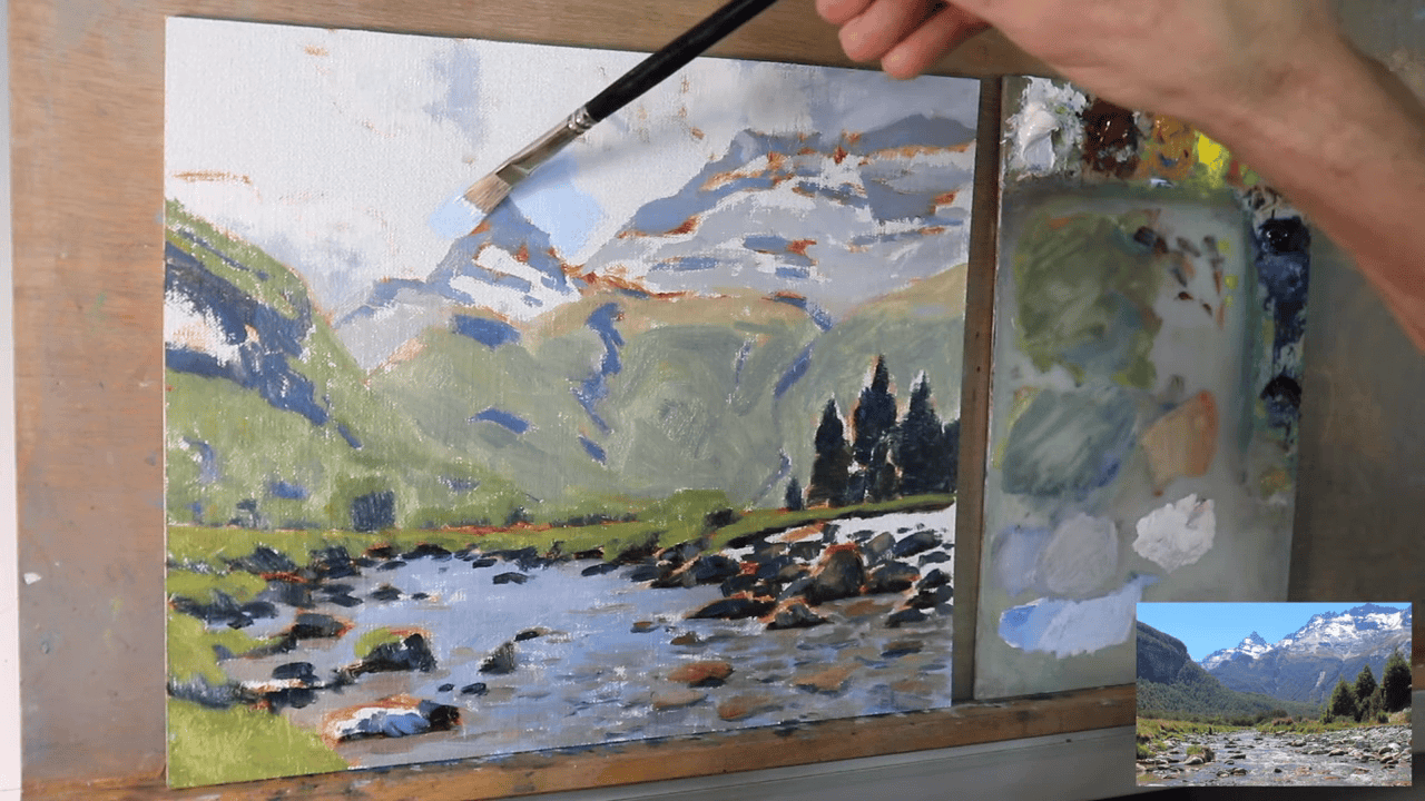
Painting a Dynamic Sky
With the river and surrounding landscape established, it’s time to turn our attention upward. The sky plays a crucial role in setting the mood and providing a backdrop for your sparkling water scene.
Creating the Perfect Sky Color
For a vibrant yet natural-looking sky, we’ll use a carefully crafted mixture:
- Ultramarine Blue: Provides the base sky color
- Phthalo Green: Adds depth and prevents the sky from appearing too purple
- Titanium White: Lightens the mixture and creates cloud effects
Technique for Sky Painting
- Gradient Effect: Apply the color more intensely at the top of the canvas, gradually lightening it as you move towards the horizon.
- Cloud Formations: Use a softer brush to add subtle cloud shapes with a slightly lighter version of your sky mixture.
- Atmospheric Perspective: Lighten the sky color near the horizon to create the illusion of distance.
Adding Snow-Capped Mountains
Snow-covered mountains can add a majestic touch to your landscape, creating a stunning contrast with the sparkling water below.
Base Layer for Snowy Peaks
To begin the snow effect on the mountains:
- Mix Titanium White with a small amount of Ultramarine Blue and a touch of Yellow Ochre.
- This slightly darker mix of white allows room for adding lighter layers later, creating depth in the snow.
Techniques for Realistic Snow
- Varied Application: Use both brush and palette knife to create different snow textures.
- Shadow Areas: Leave some of the underlying mountain color visible in crevices and shadows.
- Light and Shadow: Pay attention to the light source, leaving some areas in shadow for a three-dimensional effect.
Integrating Sky and Mountains
- Ensure the mountains interact naturally with the sky, avoiding hard edges at the peaks.
- Add a slight blue tint to distant snowy areas to enhance atmospheric perspective.
Enhancing Depth and Atmosphere
- Cloud Shadows: Paint subtle shadows cast by clouds onto the mountains and landscape.
- Light Rays: Consider adding faint light rays breaking through clouds for added drama.
- Color Harmony: Ensure the sky colors complement the water and landscape palette.
Final Touches for Sky and Mountains
- Add highlights to the snow using pure Titanium White for sun-catching peaks.
- Create a subtle glow around the sun (if visible) using a mix of Cadmium Yellow and Titanium White.
- Soften edges where the sky meets distant mountains to enhance the sense of atmosphere.
By carefully crafting your sky and snow-capped mountains, you’re adding crucial elements that will elevate your entire composition. These features not only provide a beautiful backdrop for your sparkling water but also contribute to the overall mood and depth of your landscape painting. Remember, the interplay between sky, mountains, and water is key to creating a cohesive and captivating scene.
Mastering Highlights: Bringing Your Landscape to Life
Enhancing Texture and Form
Begin by focusing on the rocks. Use a dry brush technique with a light mixture of Titanium White and Yellow Ochre to enhance texture, applying paint to raised areas to simulate light catching on rough surfaces.
Vary between warm and cool tones; use warmer highlights (add a touch of Cadmium Yellow) for sun-facing surfaces and cooler highlights (mix in a small amount of Ultramarine Blue) for shadowed areas. Add thin lines of pure Titanium White to suggest quartz veins or crystalline structures, adding an extra layer of realism.
For vegetation, mix Cadmium Yellow with Titanium White to create sun-kissed foliage. Apply using a stippling technique for a natural, dappled light effect. When highlighting grass, use a fan brush to add fine lines of lighter green, varying the pressure to create depth. For tree bark, add thin, vertical streaks of light gray (mix Titanium White with a touch of Burnt Sienna) to create texture and form.
Mastering Light Interaction
The key to realistic highlights is understanding how light interacts with different surfaces. Use warm highlights for areas directly facing the light source and cool highlights for areas in partial shadow or receiving reflected light. Blend these in transition areas to create a subtle, natural gradient that enhances the three-dimensional effect.
Layer your highlights gradually. Start with lighter, more subtle highlights and build up to brighter ones in smaller areas. Reserve the brightest highlights for the most prominent features or focal points. Always ensure your highlights are consistent with your chosen light source and vary their intensity based on the object’s position and texture.
Refining the Overall Effect
As you work, consider how light reflects off the water onto nearby objects, adding an extra layer of complexity to your scene. Be cautious not to over-highlight, as this can make a painting look artificial. Step back frequently to assess the overall effect.
Remember, adding highlights is a process that requires patience and a keen eye for detail. Take your time with this crucial step. By carefully blending warm and cool tones and building up layers of highlights, you’ll create a richly textured, three-dimensional landscape that draws viewers into your sparkling water scene. The interplay of light across rocks, vegetation, and water will give your painting the depth and realism that makes it truly captivating.
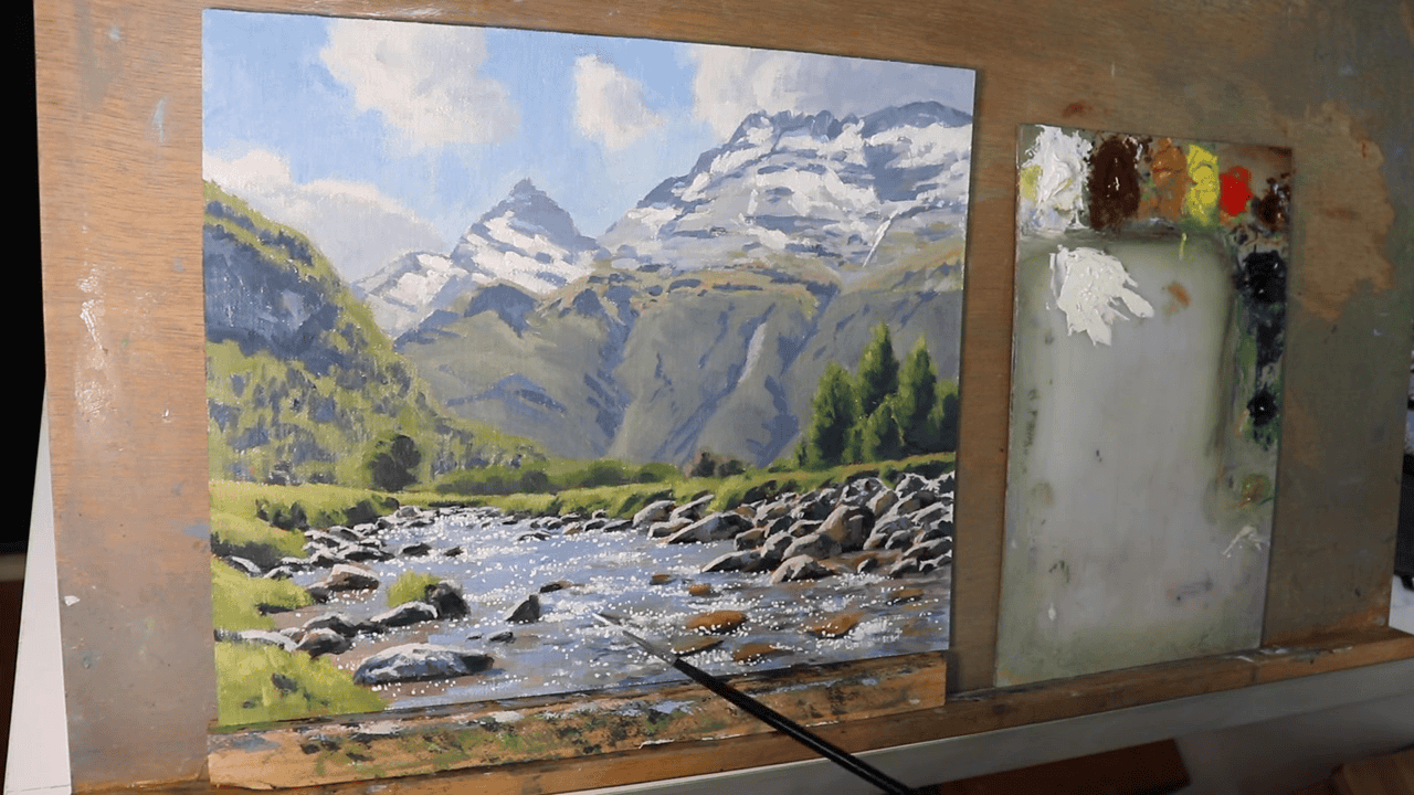
Creating the Magic: Painting Sparkling Water
The Final Touch: Adding Sparkle
Now, we arrive at the most captivating part of our painting process – bringing the water to life with sparkling highlights. This step transforms your river from a static image into a dynamic, shimmering scene that captures the eye and imagination.
Mixing the Perfect Sparkle Color
To achieve the illusion of light dancing on water, create a mixture of:
- Titanium White (primary component)
- A small amount of Cadmium Yellow
This combination produces a warm, bright color that mimics sunlight reflecting off the water’s surface. The touch of yellow adds a subtle warmth that pure white alone can’t achieve.
Technique and Application
Using a number 0 synthetic rigor brush, apply the mixture in small, precise dots across the darker areas of the water. This fine brush allows for detailed work, which is essential for creating realistic sparkles.
Key points to remember:
- Apply the paint thickly for each dot to create texture and catch the light
- Vary the size and density of the dots to simulate natural light patterns
- Focus on areas where light would naturally reflect most intensely, such as wave crests or ripples
Patience and Precision
This technique, while time-consuming, is crucial for achieving a realistic sparkling effect. Take your time and approach this step with patience. The meticulous effort invested here will significantly enhance the overall impact of your painting.
Bringing Your Painting to Life
As you add these sparkling highlights, you’ll see your painting transform. The contrast between the darker water and these bright points of light creates a mesmerizing effect, drawing the viewer’s eye and bringing a sense of movement to your landscape.
“Painting the sparkles in the water is among the most enjoyable parts of the process because it brings the painting to life.”
This quote encapsulates the joy and satisfaction of this final stage. As each sparkle is added, your river scene becomes increasingly vibrant and realistic.
Tips for Natural-Looking Sparkles
- Observe real water surfaces for inspiration on sparkle patterns
- Concentrate sparkles where the light source would naturally reflect most strongly
- Use varying pressure to create sparkles of different intensities
- Step back regularly to assess the overall effect and ensure balance
By carefully applying this technique, you’ll create a water surface that seems to shimmer and move, inviting viewers to lose themselves in the beauty of your painted landscape. This final touch of sparkling highlights is what will make your artwork truly memorable and lifelike.
Finishing Touches: Perfecting Your Masterpiece
The Art of Reflection and Refinement
As I reach the final stage of the painting, it’s crucial to take a step back and assess your work with a critical eye. This phase is all about refining details, ensuring cohesion, and making those final adjustments that will elevate your painting from good to exceptional.
Reviewing Your Work
After completing the sparkling water effect, take time to examine your painting thoroughly:
- Step back several feet from your canvas to get a broader perspective.
- Observe how different elements interact with each other.
- Check the overall balance and composition of your piece.
Making Final Adjustments
Focus on fine-tuning the following aspects:
- Values and Tones:
- Ensure there’s a natural progression of light to dark across the painting.
- Adjust the contrast in key areas to enhance depth and focus.
- Color Harmony:
- Check that your color palette remains consistent and harmonious throughout the piece.
- Make subtle adjustments to unify the overall color scheme if necessary.
- Details and Textures:
- Refine intricate details in focal points.
- Enhance textures in rocks, vegetation, and water surfaces.
- Edge Work:
- Soften or sharpen edges as needed to guide the viewer’s eye and create depth.
The Power of Fresh Perspective
An essential tip for any artist:
“Remember, sometimes it’s best to leave the painting for a few days and revisit it with fresh eyes for any last edits.”
This break allows you to:
- Detach emotionally from your work
- Spot inconsistencies or areas for improvement more easily
- Approach the final edits with renewed creativity and objectivity
Final Considerations
- Signature: Decide on the best place to sign your work without disrupting the composition.
- Varnishing: Consider applying a varnish to protect your painting and enhance colors (after ensuring it’s completely dry).
- Framing: Think about how framing might impact the overall appearance of your piece.
Embracing the Process
As you make these final touches, remember that art is an ongoing journey of growth and discovery. Each painting is a learning experience, contributing to your development as an artist.
Take pride in what you’ve accomplished. Your dedication to capturing the beauty of sparkling water has resulted in a unique piece of art that brings a slice of nature’s wonder to life on canvas.
By carefully reviewing and refining your work, you ensure that your painting of sparkling water not only captures the eye but also resonates with the viewer, inviting them to pause and marvel at the beauty you’ve created.
Essential Tips for Elevating Your Landscape Painting
As we conclude our journey through painting sparkling water, let’s review some key tips that can enhance your overall landscape painting skills:
- Establish Dark Values First: Begin with your darkest darks. This approach makes it easier to paint lighter areas and maintain a dynamic tonal range, crucial for creating depth and contrast in your landscapes.
- Embrace Variety in Brushwork: Experiment with different brush sizes and strokes. This variety adds interest and texture to your painting, creating a more engaging, painterly look.
- Strategic Detail Placement: Concentrate the most intricate details in the foreground. As you move towards the background, use looser brushstrokes. This technique naturally creates depth and draws the viewer’s eye through the painting.
- Plein Air Practice: Take your easel outdoors. Painting directly from nature sharpens your observational skills and deepens your understanding of natural light and color interactions.
- Color Temperature Awareness: Pay attention to the subtle temperature shifts in your scene. Warm and cool color variations can significantly enhance the realism of your landscape.
- Atmospheric Perspective: Remember that distant objects appear less saturated and lighter in value. Incorporate this principle to create a sense of depth and space in your landscapes.
- Edge Control: Vary the sharpness of edges throughout your painting. Softer edges in the distance and sharper ones in the foreground enhance the illusion of depth.
Painting sparkling water in landscapes might initially seem challenging, but you can achieve stunning, realistic water effects by breaking it down into manageable steps and practicing these techniques.
Whether you’re a seasoned artist or just beginning your artistic journey, these methods provide a solid foundation for creating captivating water scenes.
