In this painting tutorial I am going to share some tips for painting beautiful trees and show you the step by step process of how I created the art work pictured above.
Inspiration for This Painting
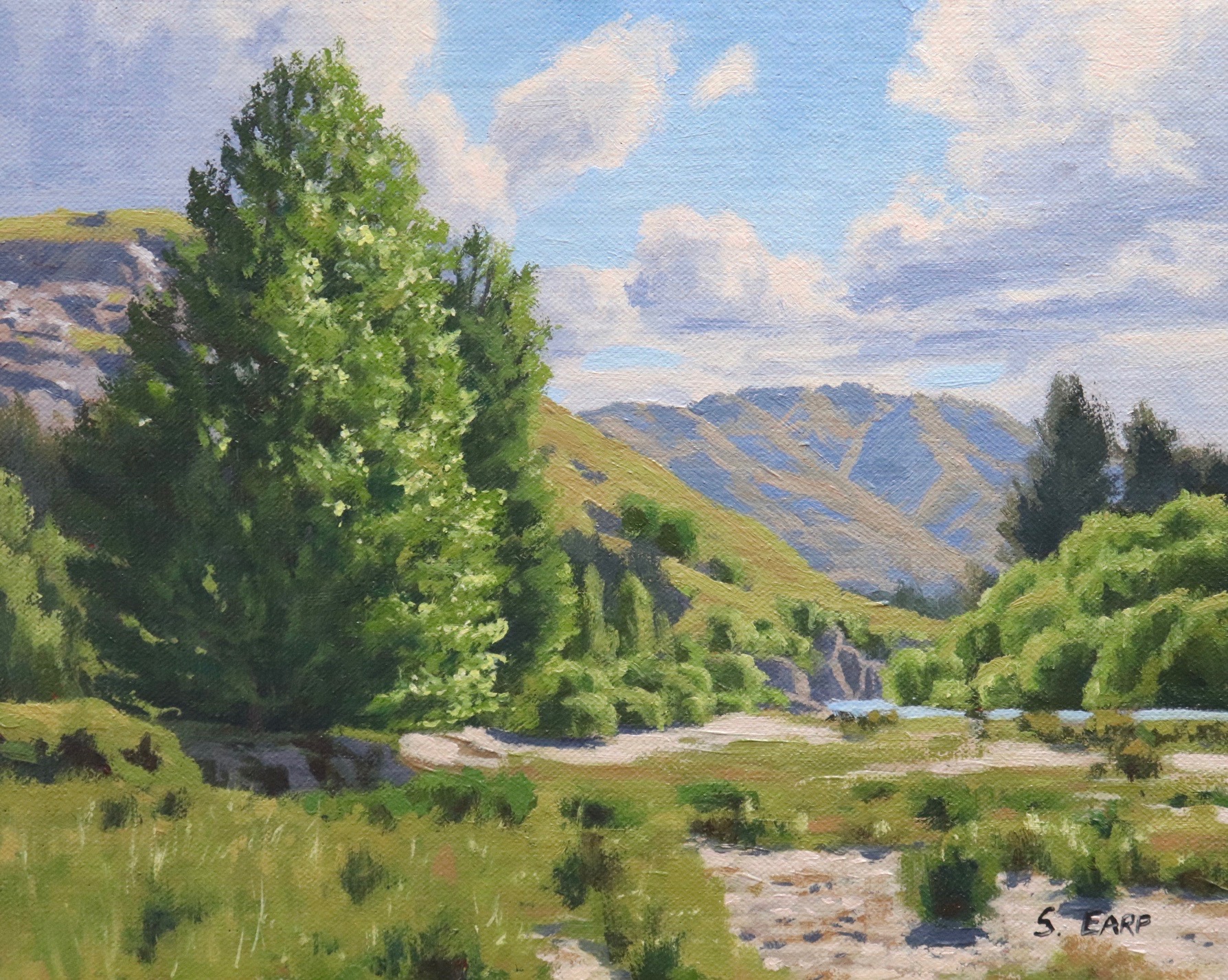
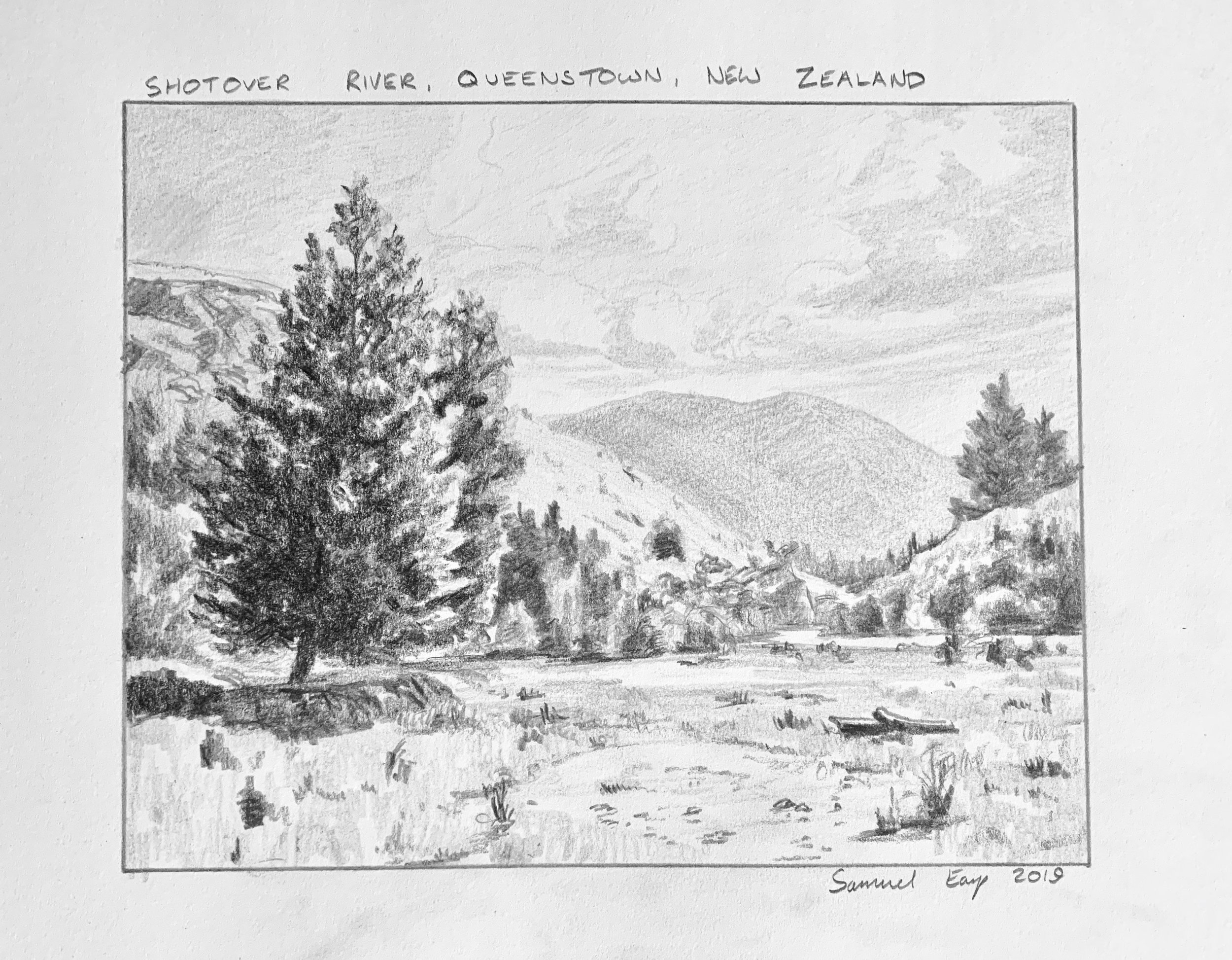
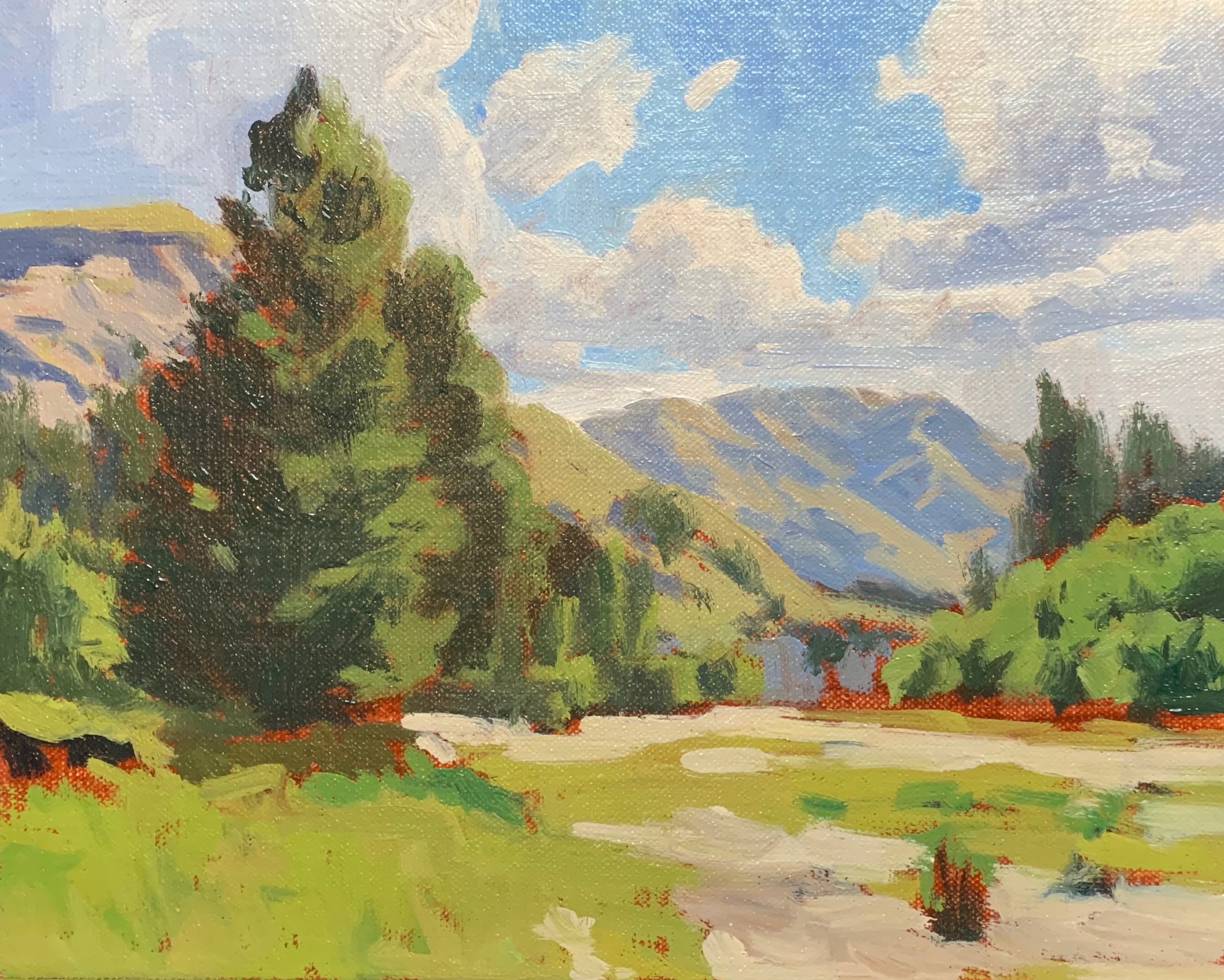
This painting is inspired by a place near Queenstown, New Zealand called Tucker Beach. Tucker Beach is not a beach however but is an area of a flood plain by the Shotover River which is popular with tourists for jet boating.
This beautiful river valley is characterised by lots of European broadleaf trees including, poplars, willows and sycamores. It is a place I have painted outdoors in on many occasions.
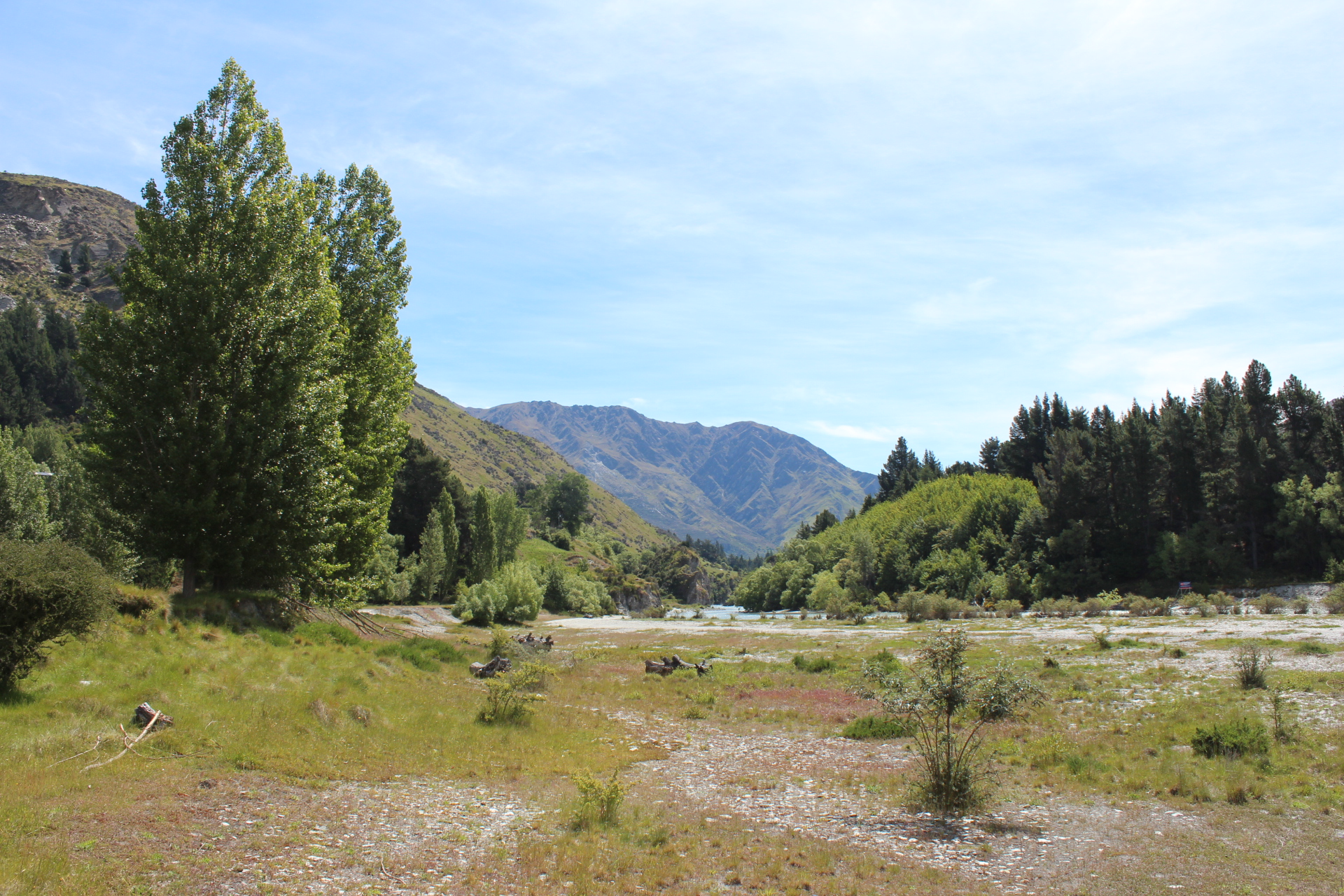
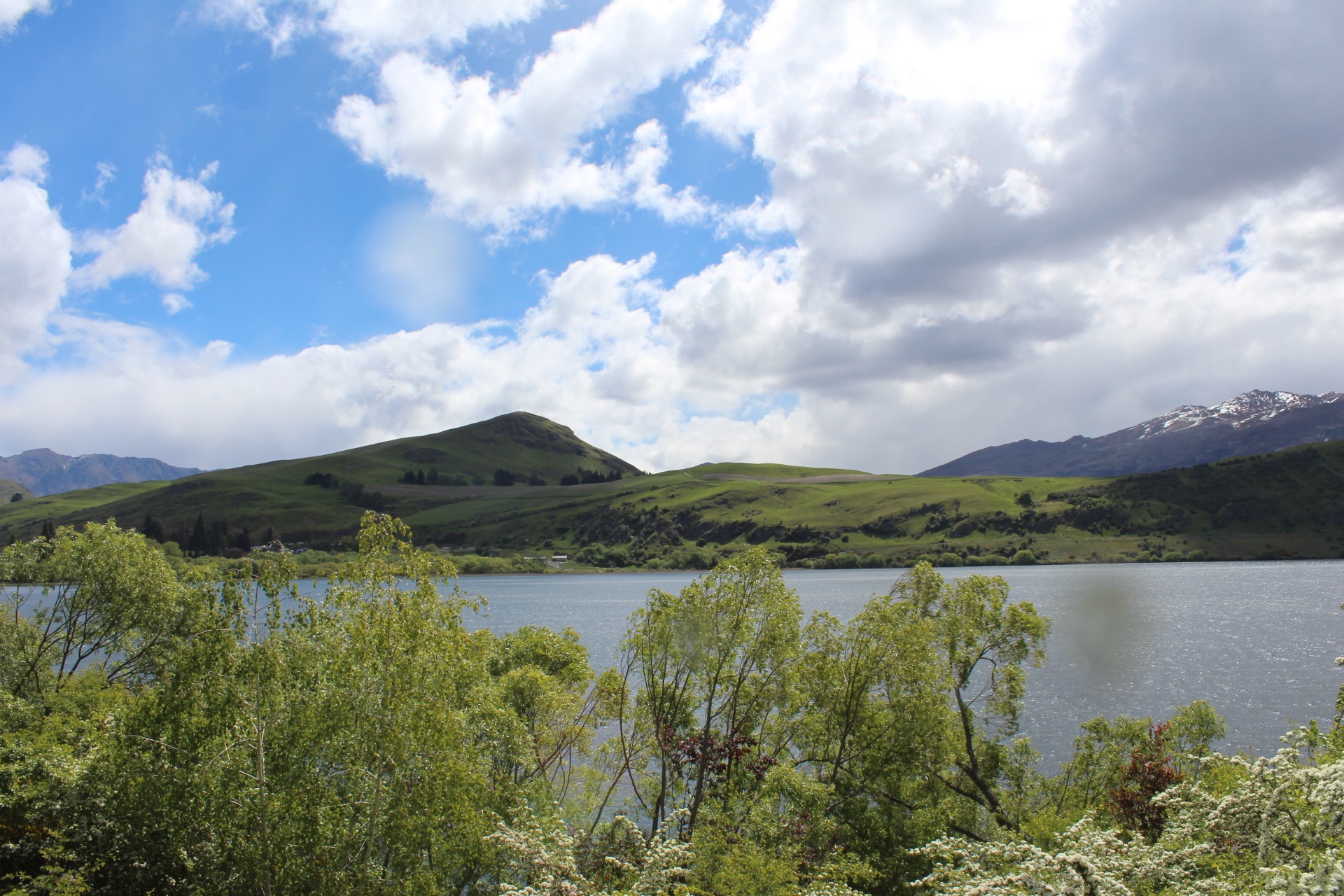
Reference Photos
Here are a couple of reference photos that I used to create this art work. Please feel free to use them or copy them if you would like to have a go at painting this art work.
In this tutorial I will cover the following:
- Colours
- Brushes
- Composition
- Blocking in the painting
- Adding detail
- Final details
- 4 tips for painting trees
Colours
I painted this artwork using oil paint and the colours I used in this painting are as follows:
- Titanium white
- Burnt sienna
- Yellow oxide (you can also use yellow ochre)
- Cadmium yellow
- Cadmium orange
- Quinacridone crimson (you can also use alizarin crimson)
- Ultramarine blue
- Phthalo green
Brushes
Here is a list of the brushes I used in this painting:
- No.6 flat
- No.2 flat
- No.1 round
- No.0 round
- 3/8 dagger
Composition
This painting incorporates a steelyard composition. The steelyard composition is formed of a large mass that is counterbalanced on a theoretical fulcrum by a smaller mass further away from the centre.
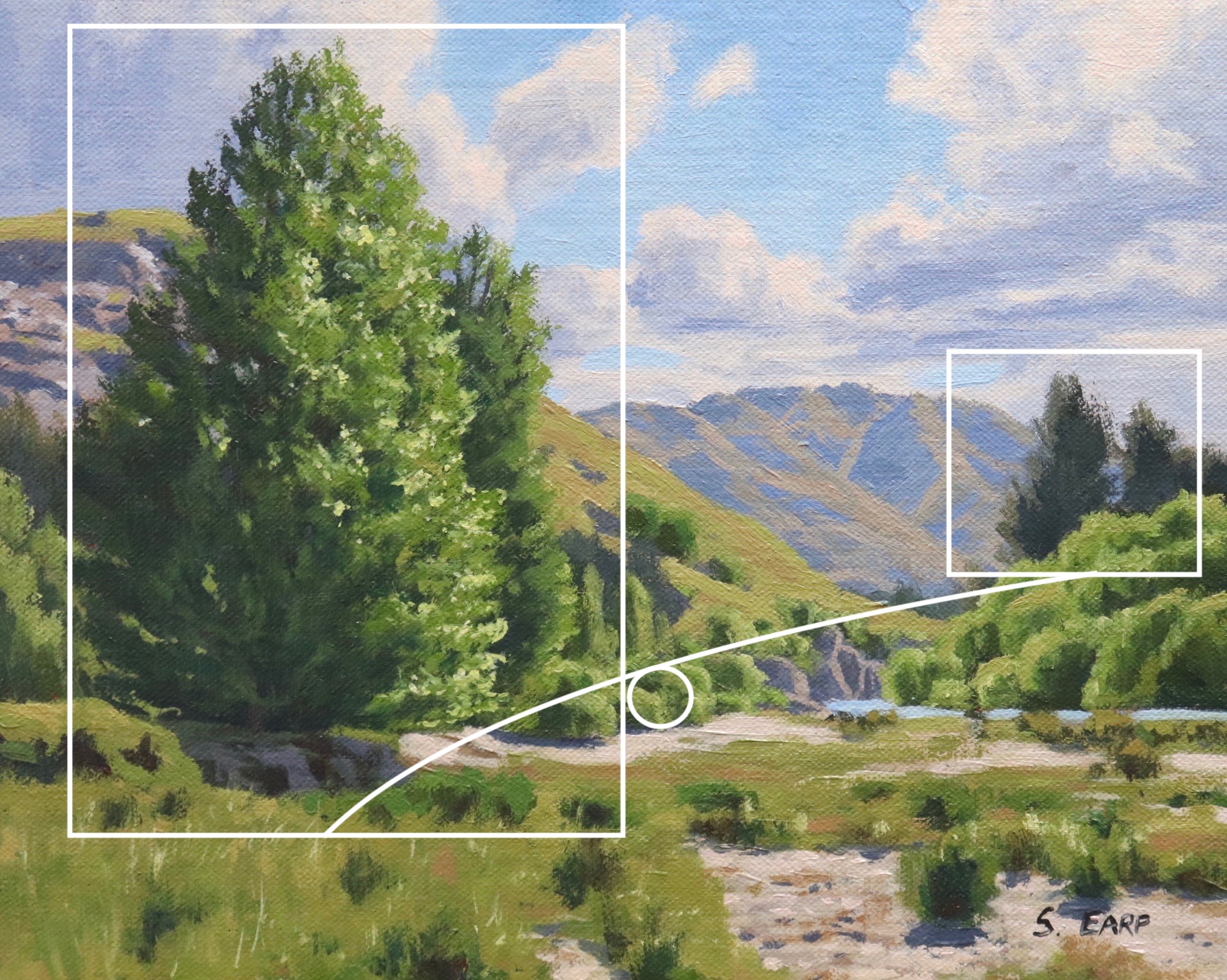
In this case the large poplar trees on the left form the main weight in the painting and is counterbalanced by the smaller conifer trees in the distance on the right. This composition maintains balance in the whole painting.
Pencil Sketch
Before you get into a painting I would always recommend doing some pencil sketches to plan your composition. A painting is much more likely to be a success if it has a solid foundation.
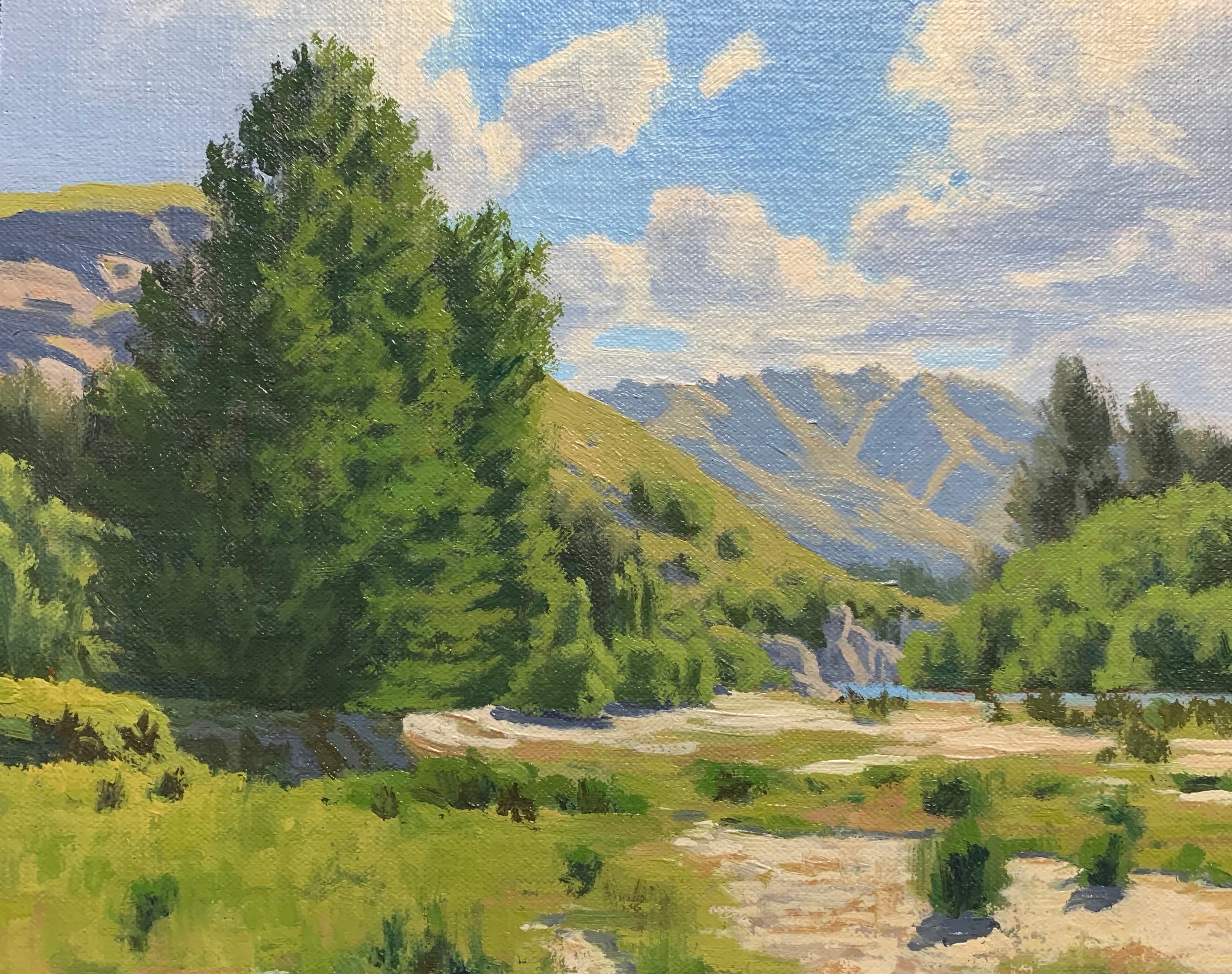
Blocking-In the Painting
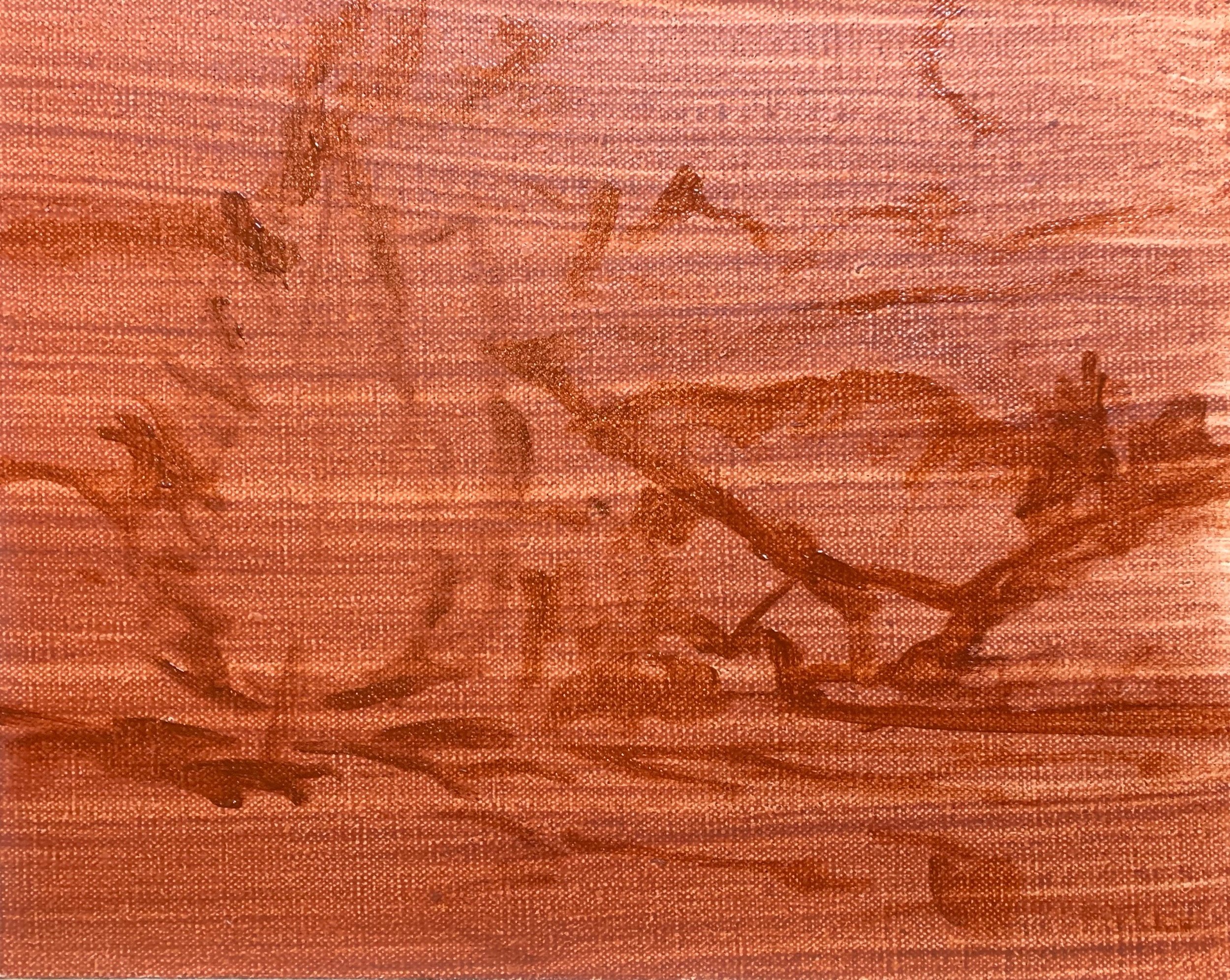
I am painting on a 8” x 10” linen panel which I’ve toned it with a layer of burnt sienna. This really helps with overall colour and tone of the painting and gives the art work a more traditional feel.
I sketch out my composition with a No.1 round brush and burnt sienna. I am using the medium Liquin Original for this painting, which thins out the paint and speeds up the drying time.
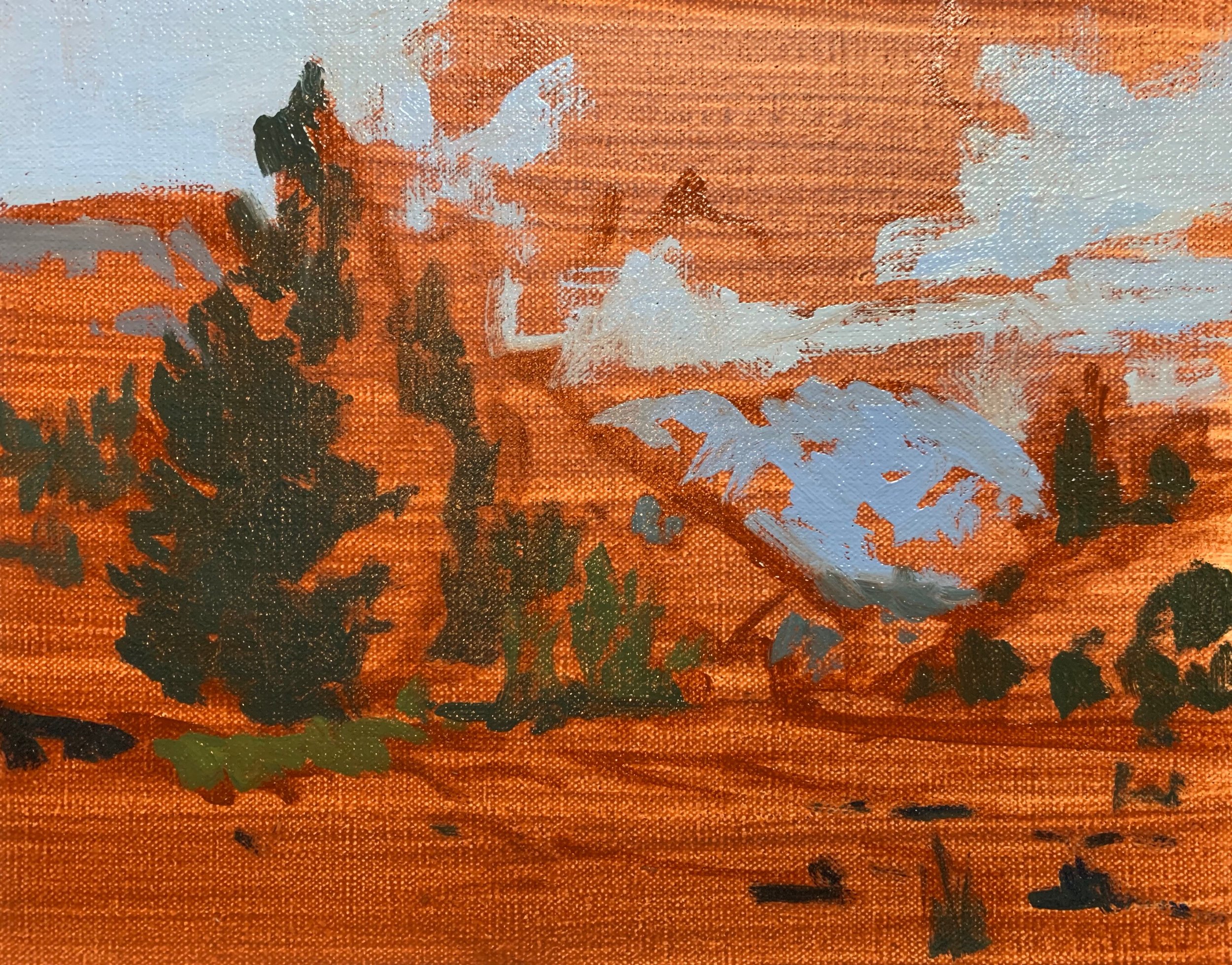
Whenever I begin blocking in a painting I normally start by establishing my dark values and shadows first, that way I can quickly establish the tonal range in the painting. It also then makes it much easier when you come to add the areas in light as well as getting the saturation of your colour correct.
Whilst in the original reference photo there are a few wispy cirrus clouds I felt the painting need some solid clouds in it so I used some cloud reference from a different photo. For the cloud shadows and distant mountain I have used a mixture of ultramarine blue, burnt sienna, quinacridone crimson and titanium white. The burnt sienna being a dark orange desaturates the blue and the quinacridone crimson adds a violet tint. I can make the value lighter by mixing in titanium white.
The shadows in the trees are darker especially as the are in the mid and foreground. For this I use a mixture of Ultramarine blue, yellow oxide and I round of the mixture by adding in some burnt sienna. Again I can make the value lighter by adding titanium white.
My first tip for painting trees is start by painting the shadows in the tree’s crown first.
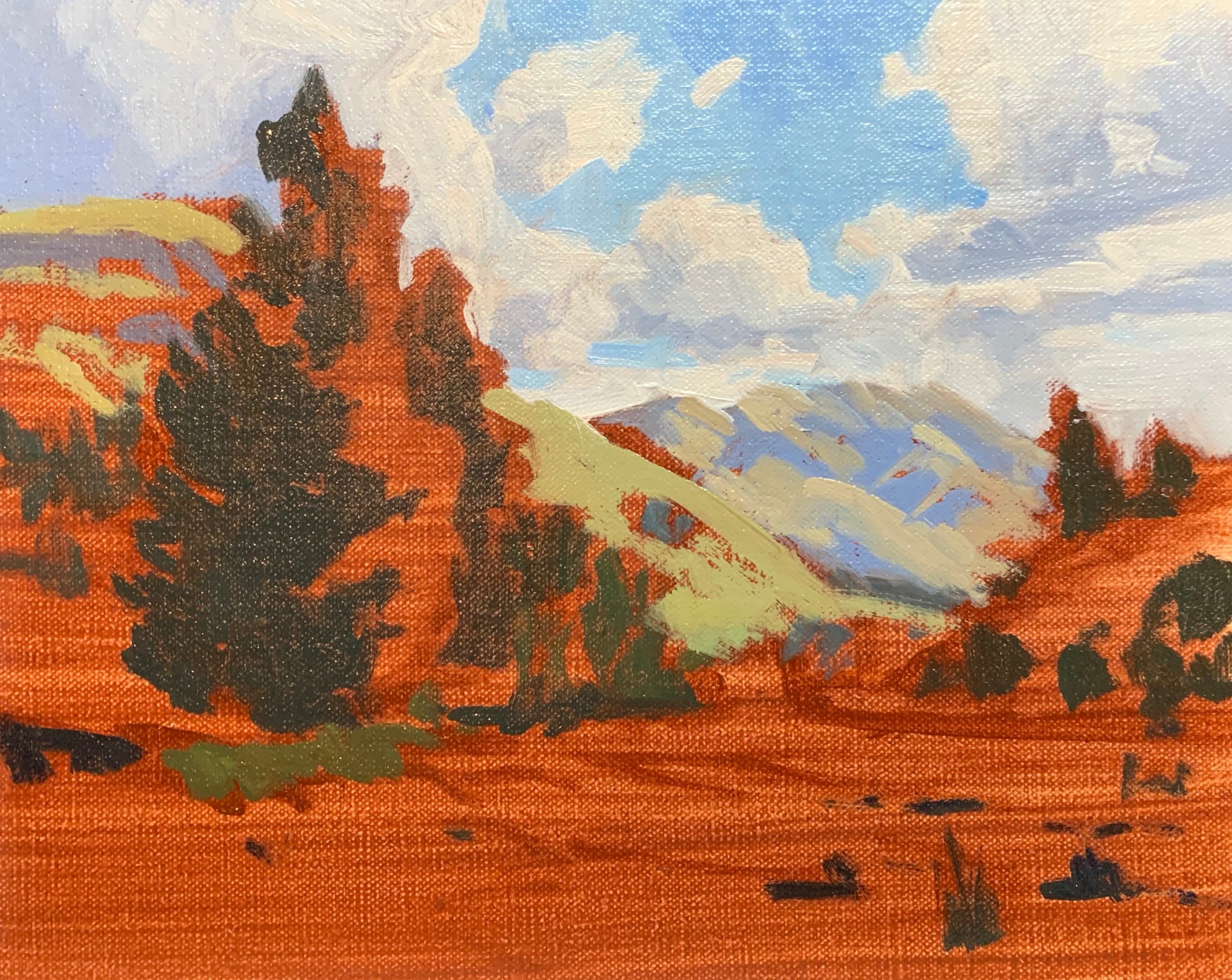
Now I have established my dark values it’s time to start applying some colour to this painting. I start with the background first and work forward.
The sky is the furthest zone away in the painting so I start with this. I paint the highlights of the clouds with a No.6 flat brush using titanium white mixed with a little burnt sienna. I also allow this to mix in with the cloud shadows I have just painted.
I paint the sky with a combination of ultramarine blue, a little phthalo green and titanium white.
For the areas of the mountain that are in light I need to keep in mind that the slopes are naturally light in value and low in chroma due to the tussock grass that is growing on it. These grasses are naturally a golden low-chroma olive green.
For the grass in the mid ground I use a combination of yellow oxide with some ultramarine blue and then I increase the saturation by adding a little cadmium yellow. I round off the mixture by adding cadmium orange and quinacridone crimson. Grass is generally light in value so I also add titanium white to the mix.
Next I start blocking in the foliage of the trees. Tree foliage is generally one of the darker values in the landscape depending on the species. I have found that broadleaf trees can have lighter foliage in spring that gets darker by the summer. In general I would always keep the foliage on the darker side and this is tip number two for painting trees.
I mix the colours for the tree foliage with a combination of yellow oxide and ultramarine blue to start with and then add cadmium yellow. When I am generally happy with the value of the colour I round off the mixture with cadmium orange and quinacridone crimson. I can even mix in a little phthalo green to give the mixture a boost.
I use the same colour combination for the grass but with more titanium white so the value of the grass is lighter than the tree foliage.
The silty sand in the flood plain is a mixture of ultramarine blue, burnt sienna, titanium white and I warm it up with a little yellow oxide.
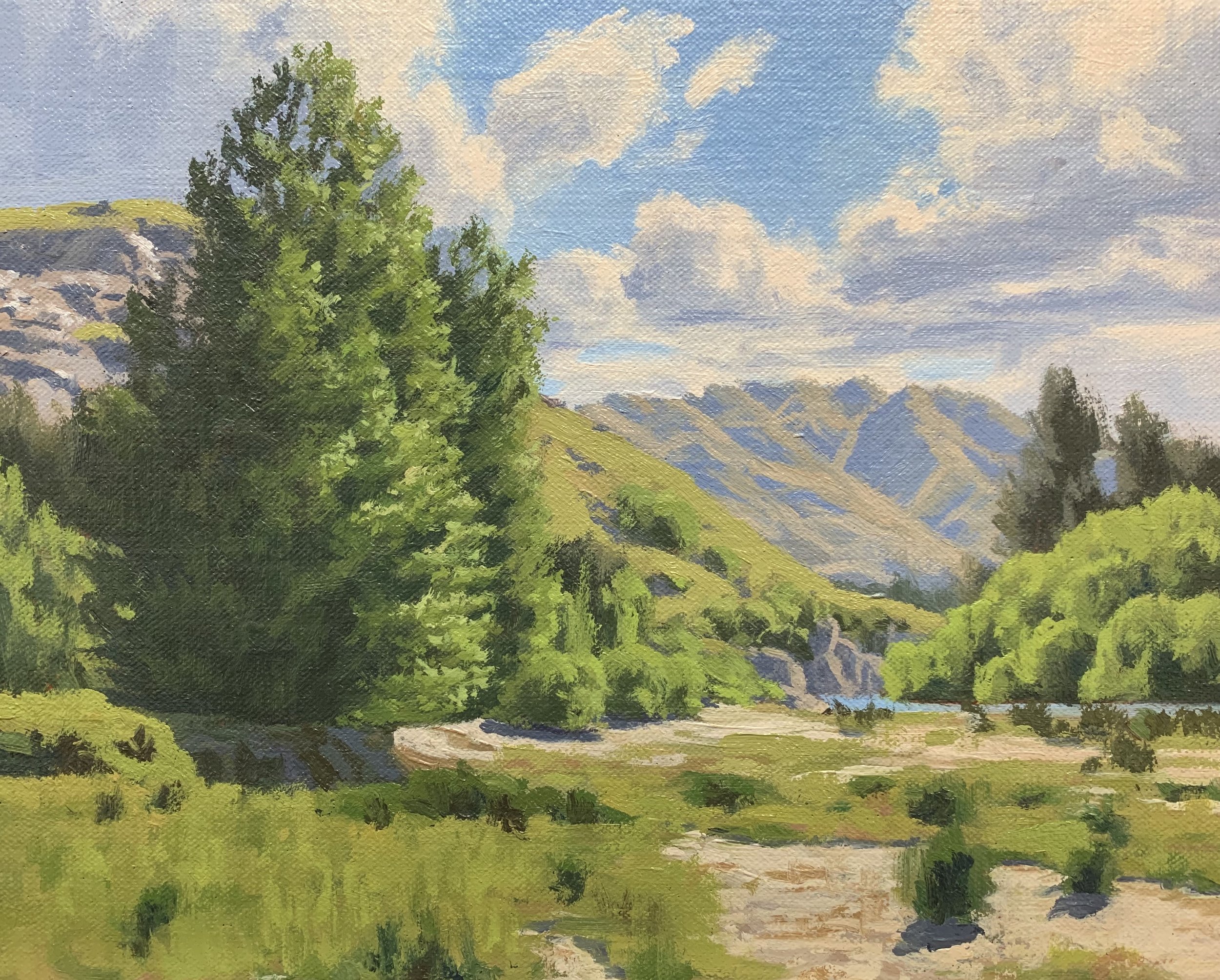
Adding Detail
Once the block-in stage is complete I allow the painting to dry. Now I can start adding details to the painting.
As I apply the details to my painting for the most part the new layers I add are generally a lighter value than the previous layers. We want to build up these layers to create a 3D form and we’ll be saving our lightest values until the end of the painting.
With a No.2 flat brush I go over the sky again and refine the clouds. I am using the same colours that I used in the block-in stage. The cloud highlights are a little lighter.
I start adding detail to the foliage in the trees and for this I use a 3/8 dagger brush. These brushes are brilliant for painting foliage as you can create lots of different marks. You can use the flat end of the brush and use the tip for finer marks and so this is my third tip for painting trees.
I use a No.2 flat brush to create more texture with the grass in the foreground. I still use the same colours from the grass that I used previously but I vary the amounts of colour in the mix to create different tones.
I use a 3/8” dagger brush to paint some reflected light in the shadows of the poplar trees on the left of the painting. For this a mix ultramarine blue, yellow oxide, quinacridone crimson and a little titanium white. I can also mix in a little phthalo green.
I add more details to the foliage of the poplar trees again using my 3/8” dagger brush. The green still consists of the colours I used previously but I’ve made the value lighter, however I have maintained that saturation of the colour by mixing in more cadmium yellow.
Final Details
I have been saving my lightest values for the end of my painting and this is what will bring everything together. In general I am just adding a few final details and finishing touches.
I finish painting the poplar trees on the left by adding some final highlights where those glossy leaves are reflecting the direct sun. This is where I have saved my lightest values which is tip number four for painting trees. For this I mix a combination of titanium white with a little cadmium yellow and a small amount of phthalo green. I apply this with a No.0 round brush.
I paint the negative spaces within the poplar trees which helps to further define their shapes. I also refine the trees by restating some of the shadows if required.
Summary: 4 Tips For Painting Trees
- Paint the tree shadows first to establish the tonal dynamic.
- Remember that trees are some of the darker values in the landscape and they are generally darker than grass depending on the species. In general edge your greens on the darker side.
- Using dagger brushes is ideal for painting realistic tree foliage. You can use the broad side of the brush as well as the tip for finer detail.
- Save your lightest values until the end of the painting. In this case it was the glossy leaves that are reflecting the direct sun.
Thanks for reading 😊
