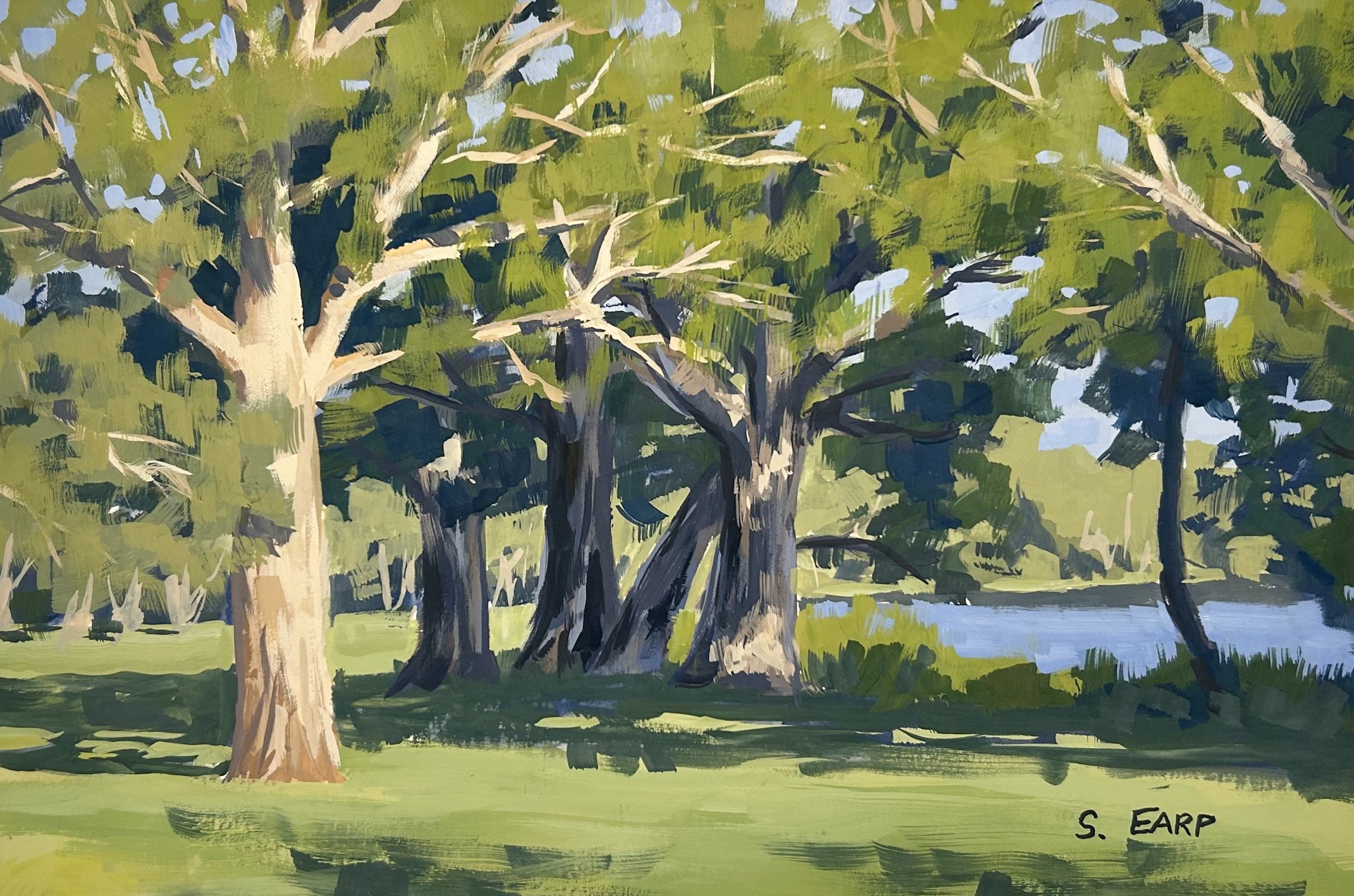
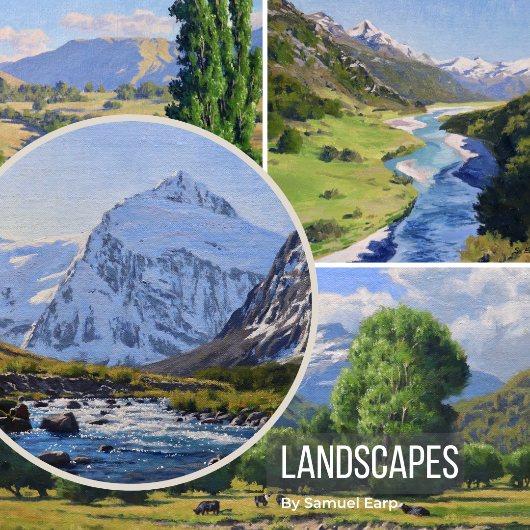
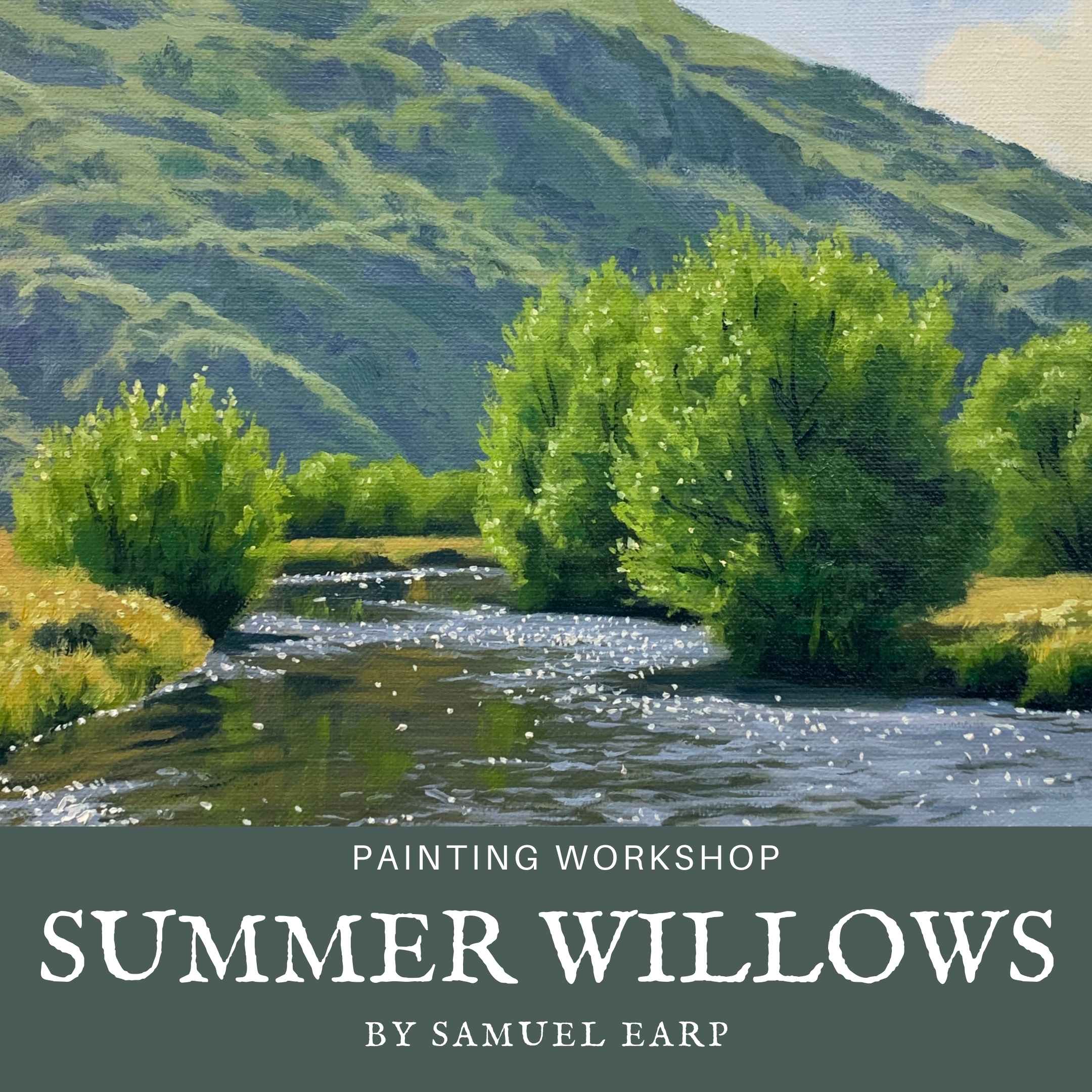
Painting Workshop – Lesson Notes
Pine Trees
By Samuel Earp
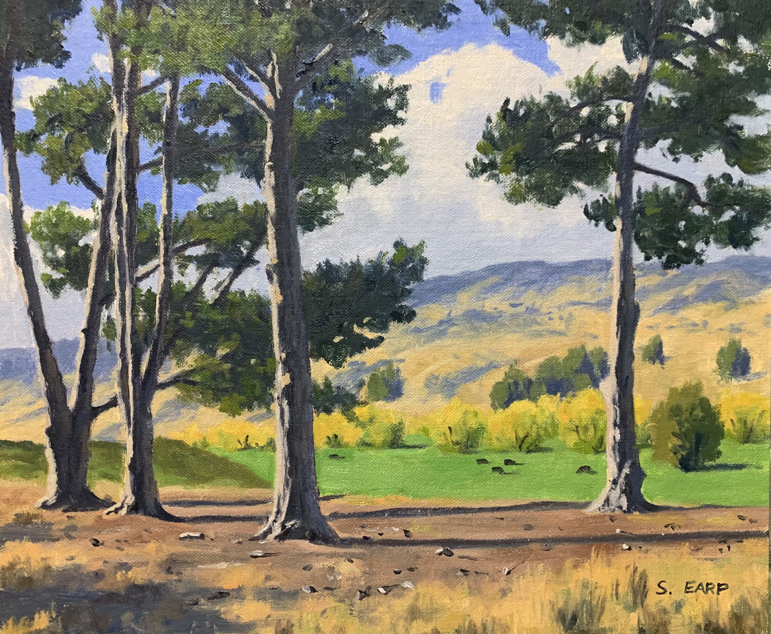
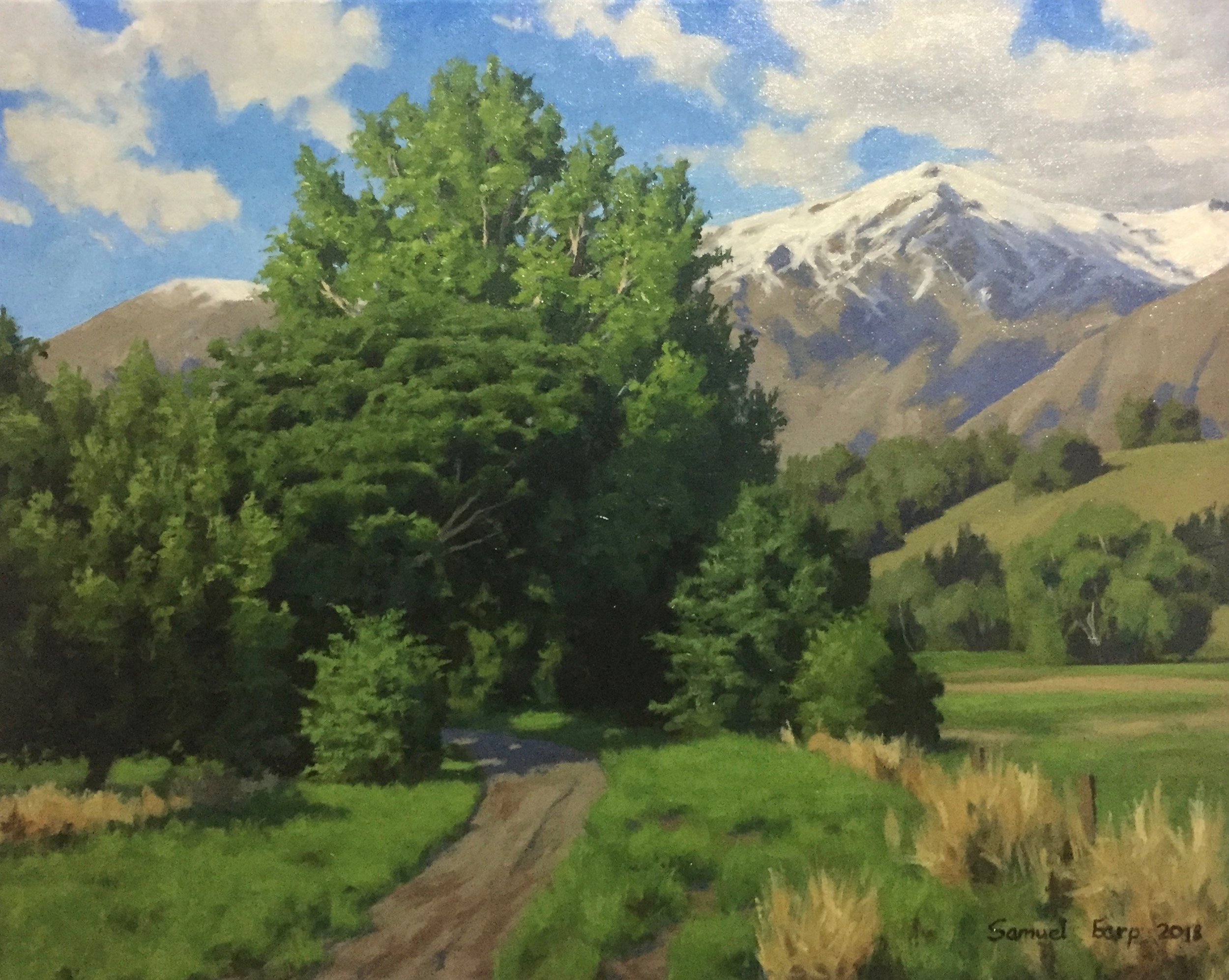
In this written painting tutorial I will show you how to paint this landscape that features a stand of pine trees. This painting is inspired by the Otago region in New Zealand.
I painted this art work in oils but you could use acrylics instead.
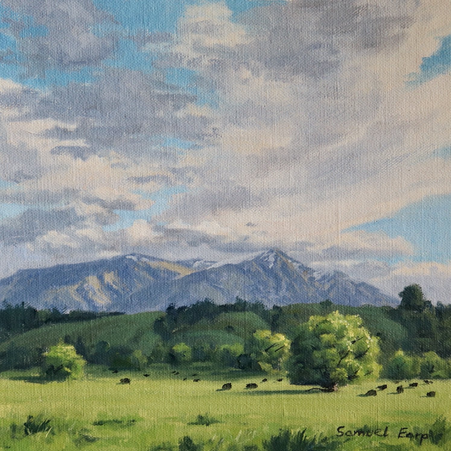
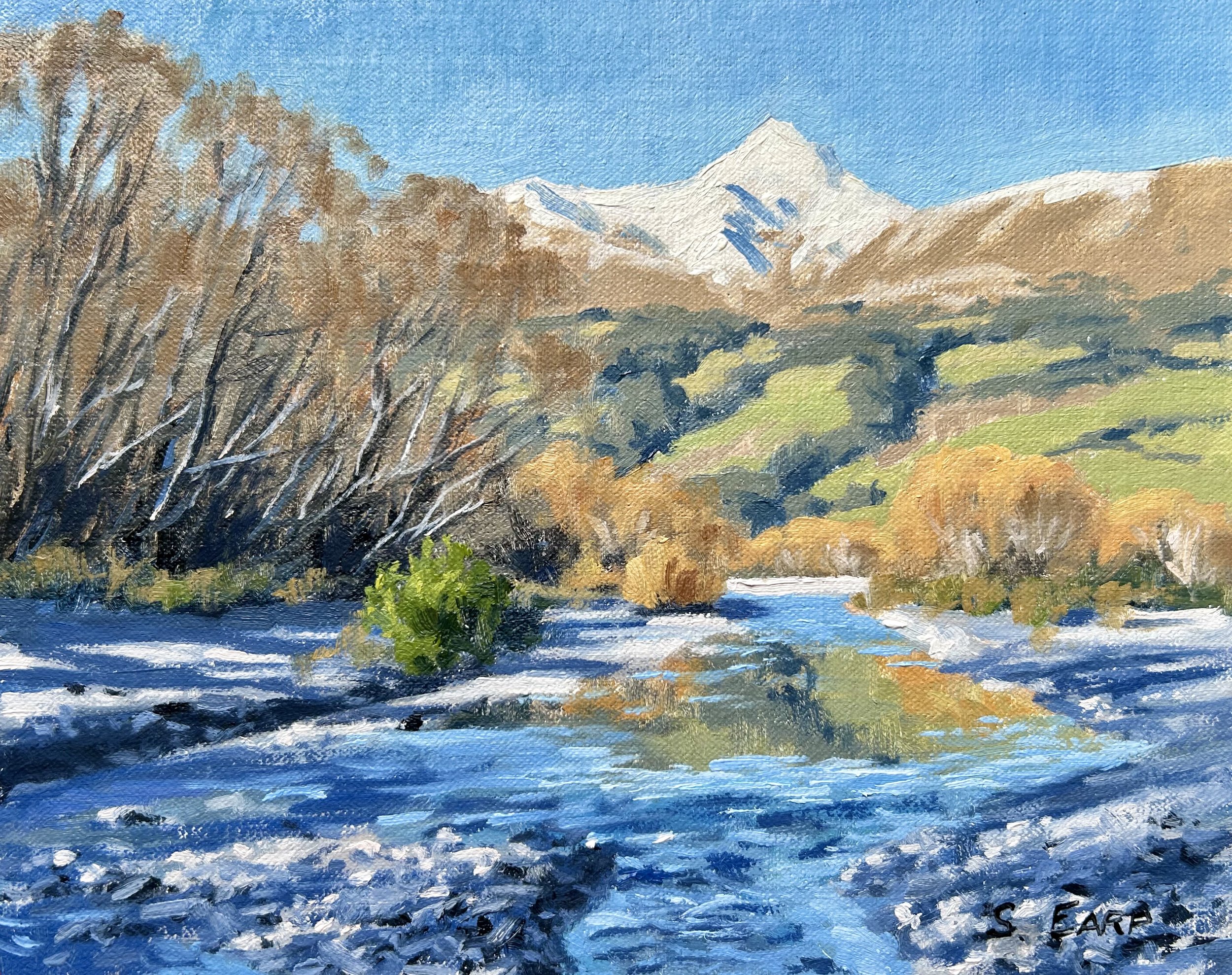
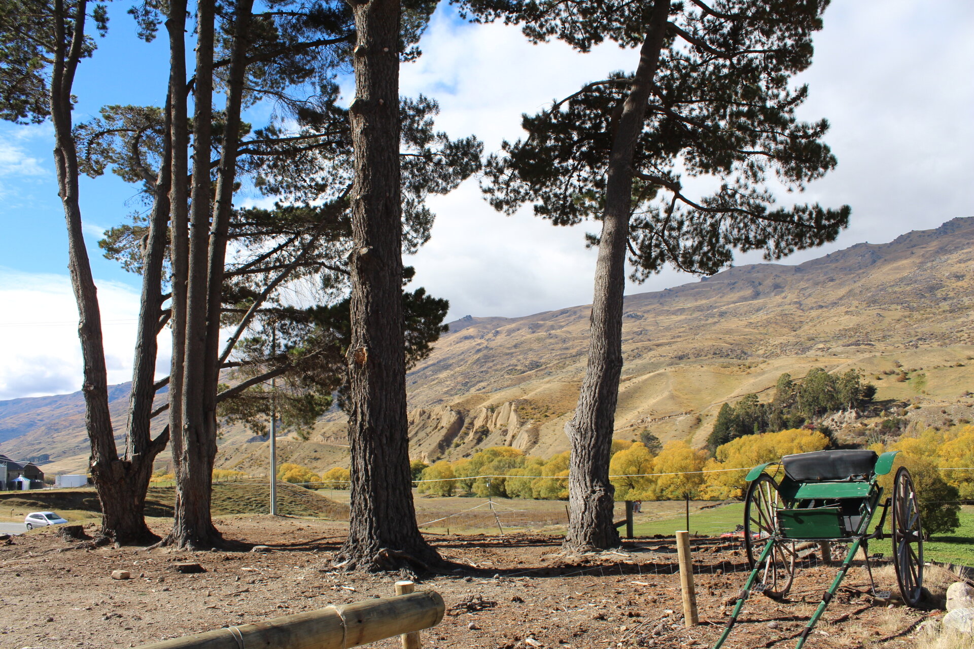
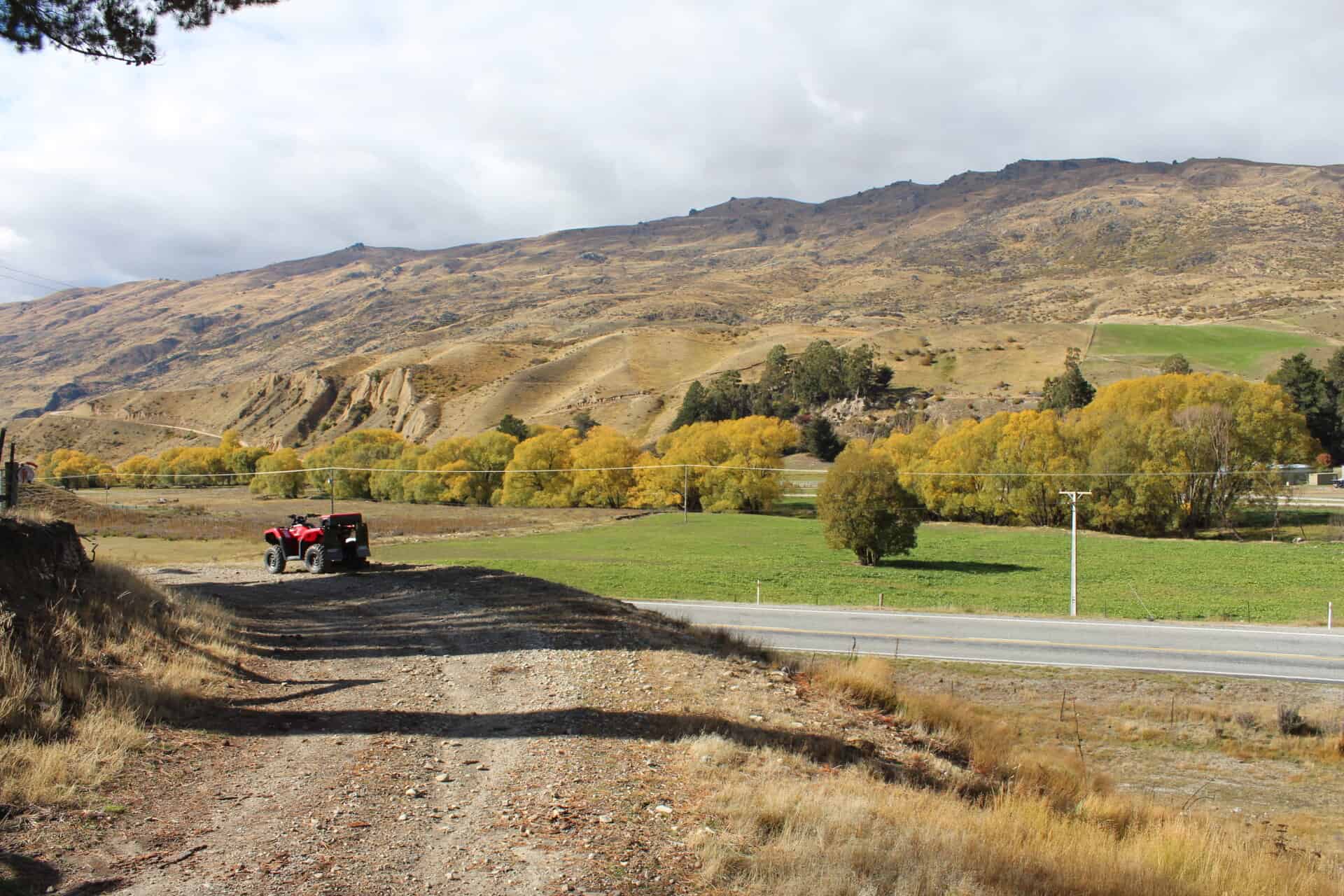
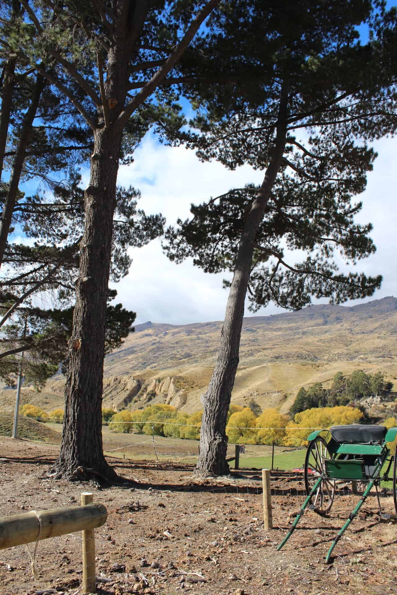
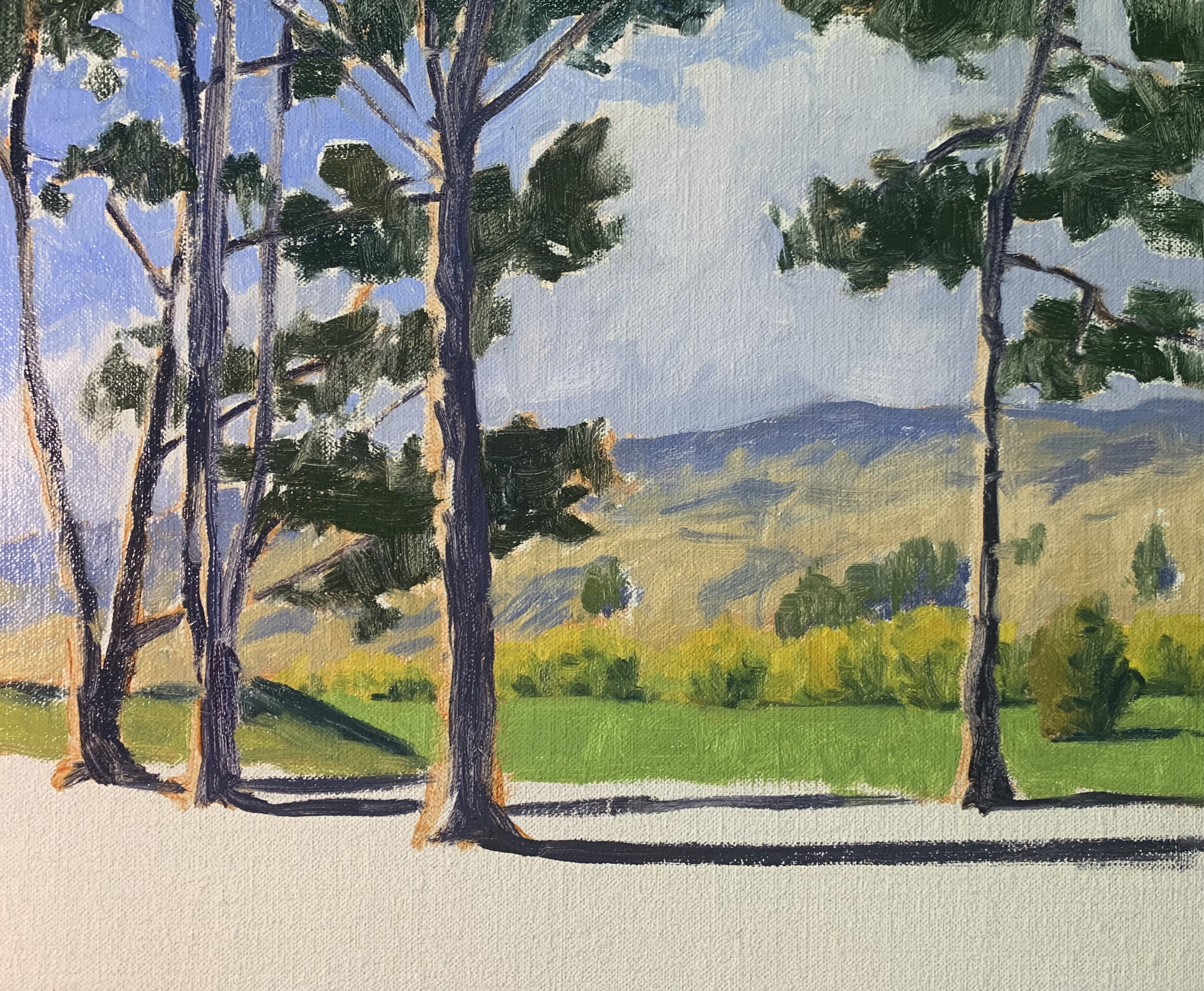
Reference Photos
Here are the reference photos I took and used in this painting. Please feel free to use or copy these photos if you would like to have a go at painting this art work.

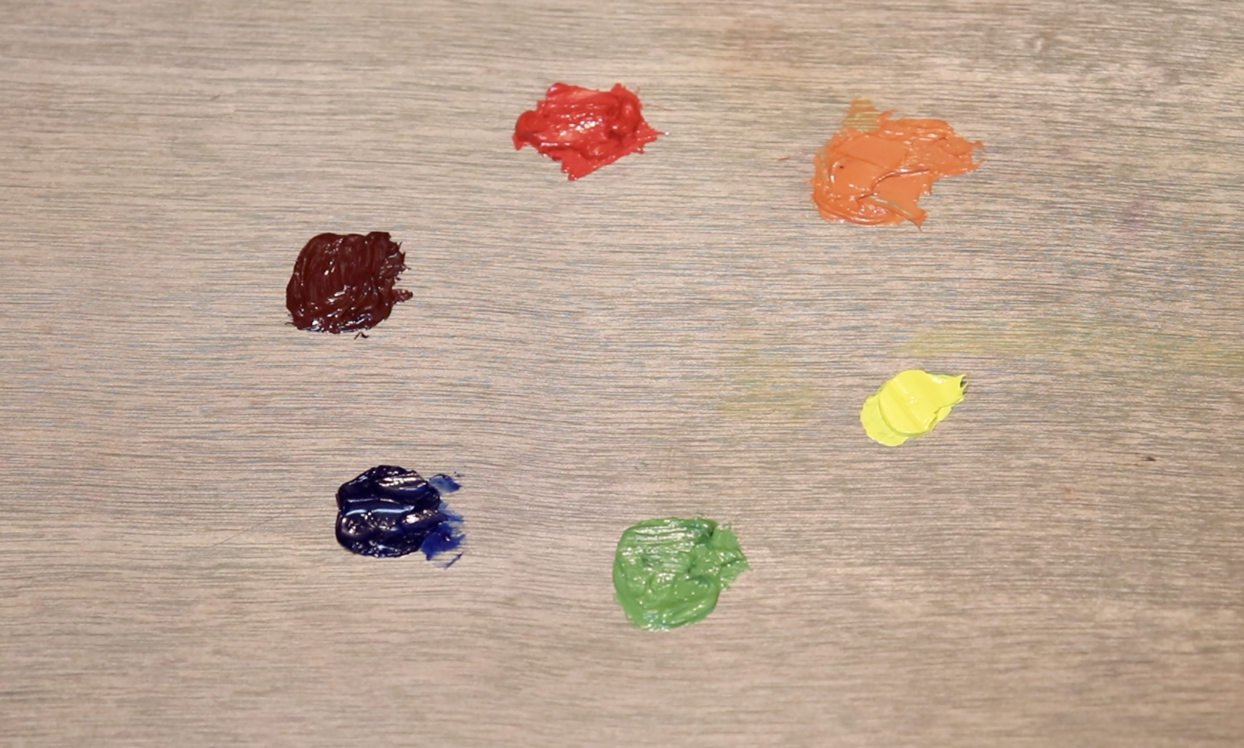
Colours
The colours I used in this painting are as follows:
-
Titanium white
-
Burnt sienna
-
Yellow ochre
-
Cadmium yellow
-
Cadmium orange
-
Alizarin crimson
-
Ultramarine blue
-
Phthalo green
Need Oil Paints?
I personally use Blue Ridge Oil Colors which are available here. If you would like to purchase Blue Ridge oil paints click the link below.
Brushes
Here is a list of the brushes I used in this painting:
-
No.5 flat
-
No.3 flat
-
No.2 flat
-
No.3 filbert
-
No.1 round
-
No.0 round
Need Brushes?
I personally use Rosemary and Co brushes which are available here. If you would like to purchase Rosemary and Co brushes click the link below. (Note: if you purchase Rosemary and Co brushes using the link below I will receive a small commission).
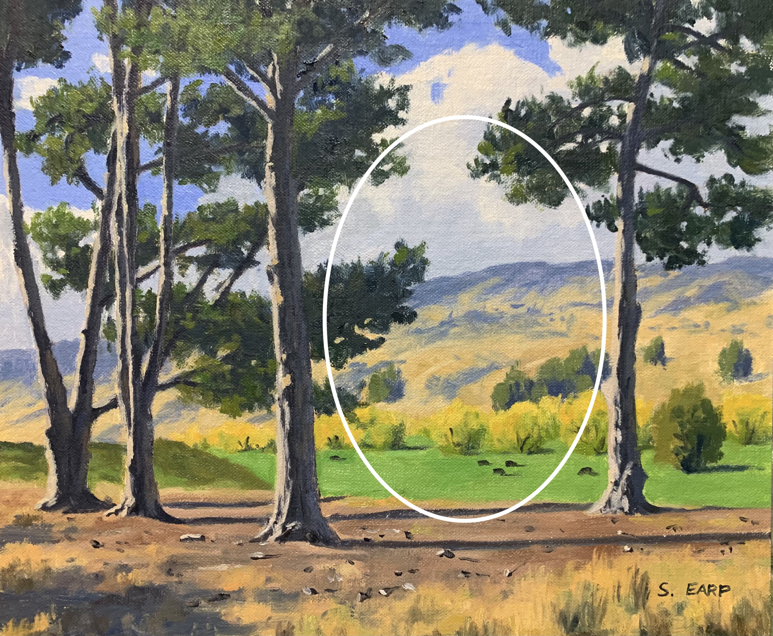
Composition
This art work features a tunnel composition where there is a gap within the stand of trees that leads the eye to the hills in the background. Note how the gap between the trees in not in the middle of the composition but to the right of centre. You should never have your focal area in the middle of your composition as it form a displeasing static within the painting.
I have made the horizon line lower in the composition and just as you should never have centred objects your horizon line should never be in the middle either, so use a low or high horizon line in landscape paintings.
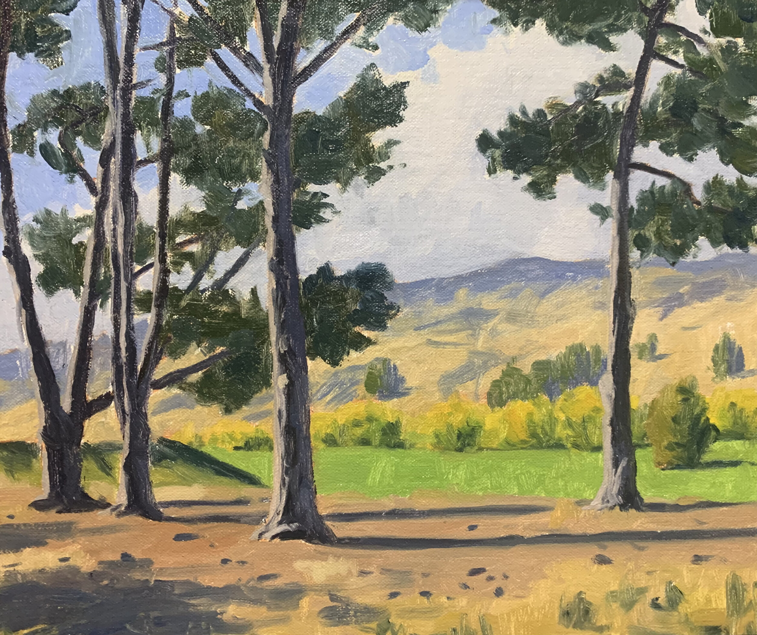
Painting Demonstration
Stage 1 – Blocking in the Painting
I am painting on an 10” x 12” linen panel. The panel is pre made with a medium weave linen that is oil primed.
I sketch the composition using a No.1 round brush with burnt sienna mixed with Liquin Original (Liquin). I am using Liquin as a medium to thin the paint and it also has the advantage of speeding up the drying time.
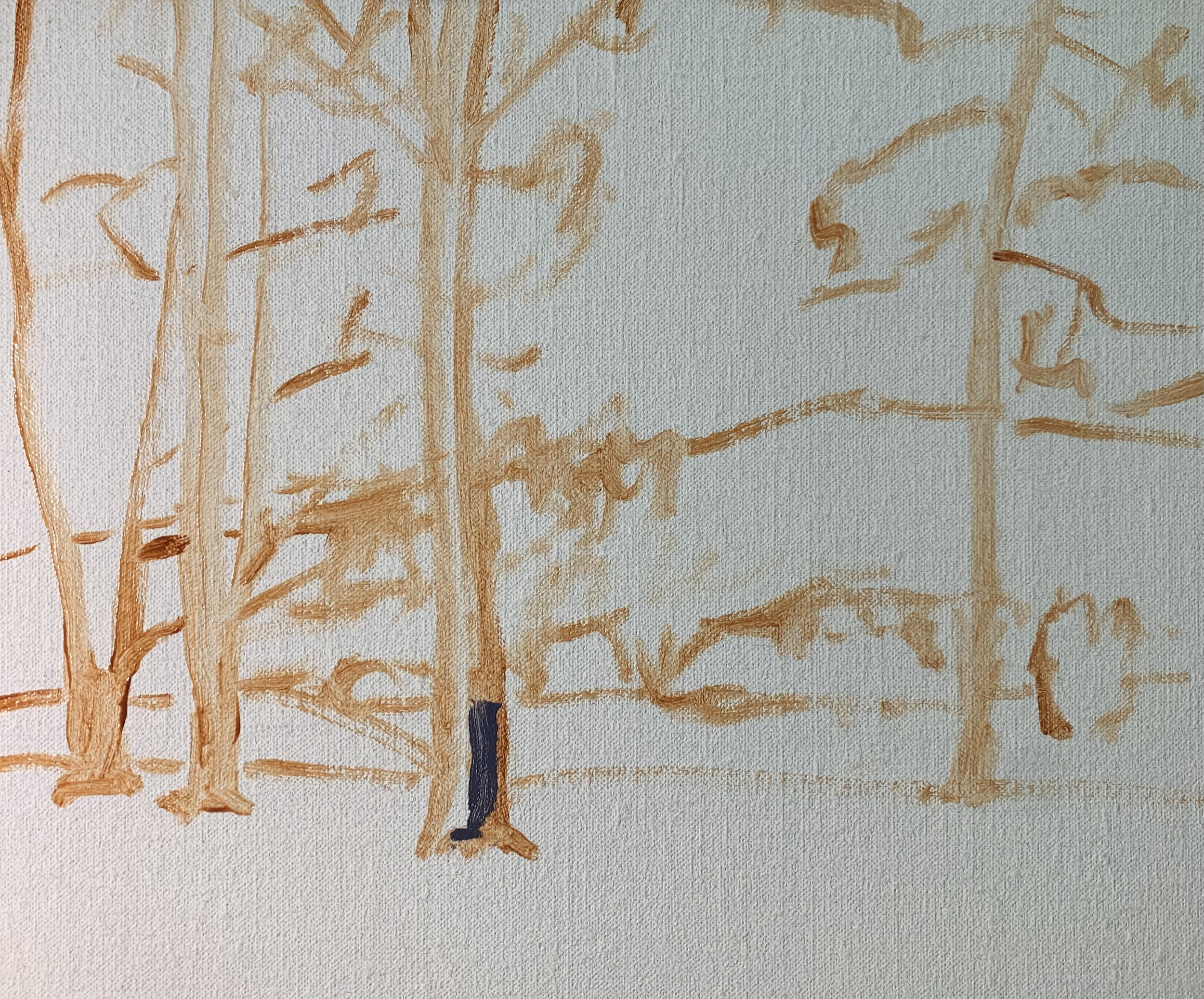
Whenever I begin blocking in a landscape I always start by painting my dark values and shadows first. The darkest values are the trees and trees in general are the darkest values to be found in the landscape.
The shadows in the tree trunks are a mix of ultramarine blue, burnt sienna, titanium white and a little alizarin crimson. I also use this same colour mix for the hills in the background but there is more titanium white to make the value lighter.
The tree foliage is a mix of ultramarine blue and yellow ochre.
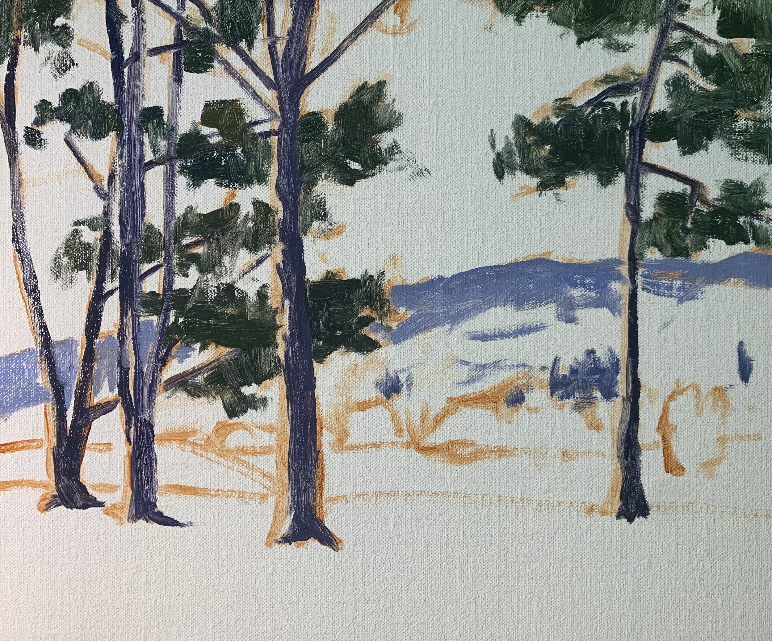
I mark in the cloud shadows with a mix of ultramarine blue, burnt sienna, titanium white and a little alizarin crimson. The value is lighter than the hill shadows but note how I’ve used the same colours in the clouds as I have for the hills and tree stems. By using similar colours throughout your painting you are much more likely to achieve colour harmony and a painting that reads well.
Throughout the blocking-in stage I have mainly used No.5 flat brushes so I can create some gestural painterly brush marks.
I paint the cloud highlights with a mix of titanium white and a little burnt sienna. The sky is a mix of ultramarine blue and titanium white. I am careful to paint around the tree foliage and stems so the green doesn’t accidentally mix into the sky and clouds.
Next I work on the background hills and mid ground. The areas in light on the hills are a mix of yellow ochre, alizarin crimson, titanium white and ultramarine blue. There is mountain grass growing on the side of the hills which is low in chroma and quite pale.
The grass in the mid ground is a mix of ultramarine blue, yellow ochre, cadmium yellow and titanium white. I also mix in a little cadmium orange to balance out the green. I use the same colours in the willow trees and add more yellow ochre, cadmium yellow, cadmium orange and titanium white for the yellow areas of the tree canopies.
The foreground is relatively light in a value and consists of dirt and grass. For this I use a mix of burnt sienna, ultramarine blue, titanium white and a little alizarin crimson. The straw colour grass is a mix of yellow ochre, alizarin crimson, titanium white and ultramarine blue.
I paint the areas of the tree stems that are in the full sunlight with a mix of titanium white, burnt sienna, a little ultramarine blue and alizarin crimson.
I tidy up areas within the painting and then allow it to dry so that I can add details to it.
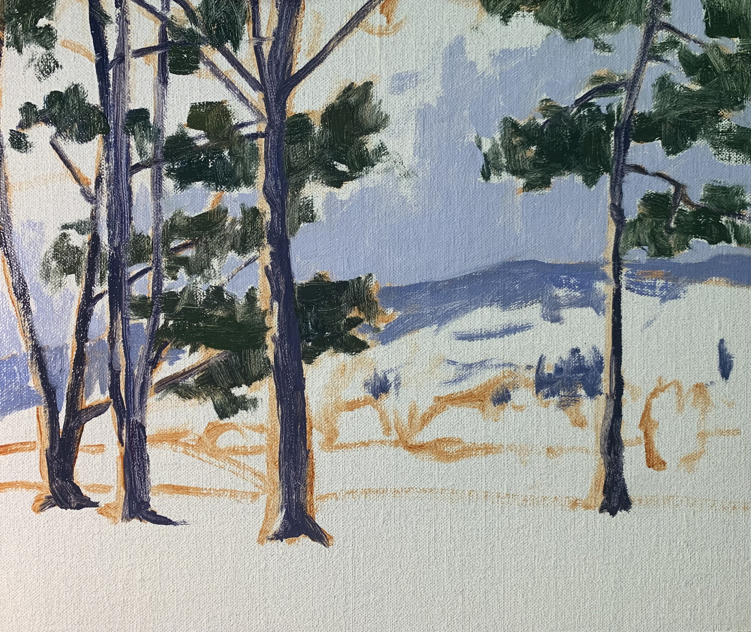
Stage 2 – Adding Details
Now that the painting is dry and I can add details and build up some layers within the painting. I am pretty much using the same colours I used during the blocking-in stage but building up details and lighter layers of paint.
Here I add further details and layers to the sky and clouds.
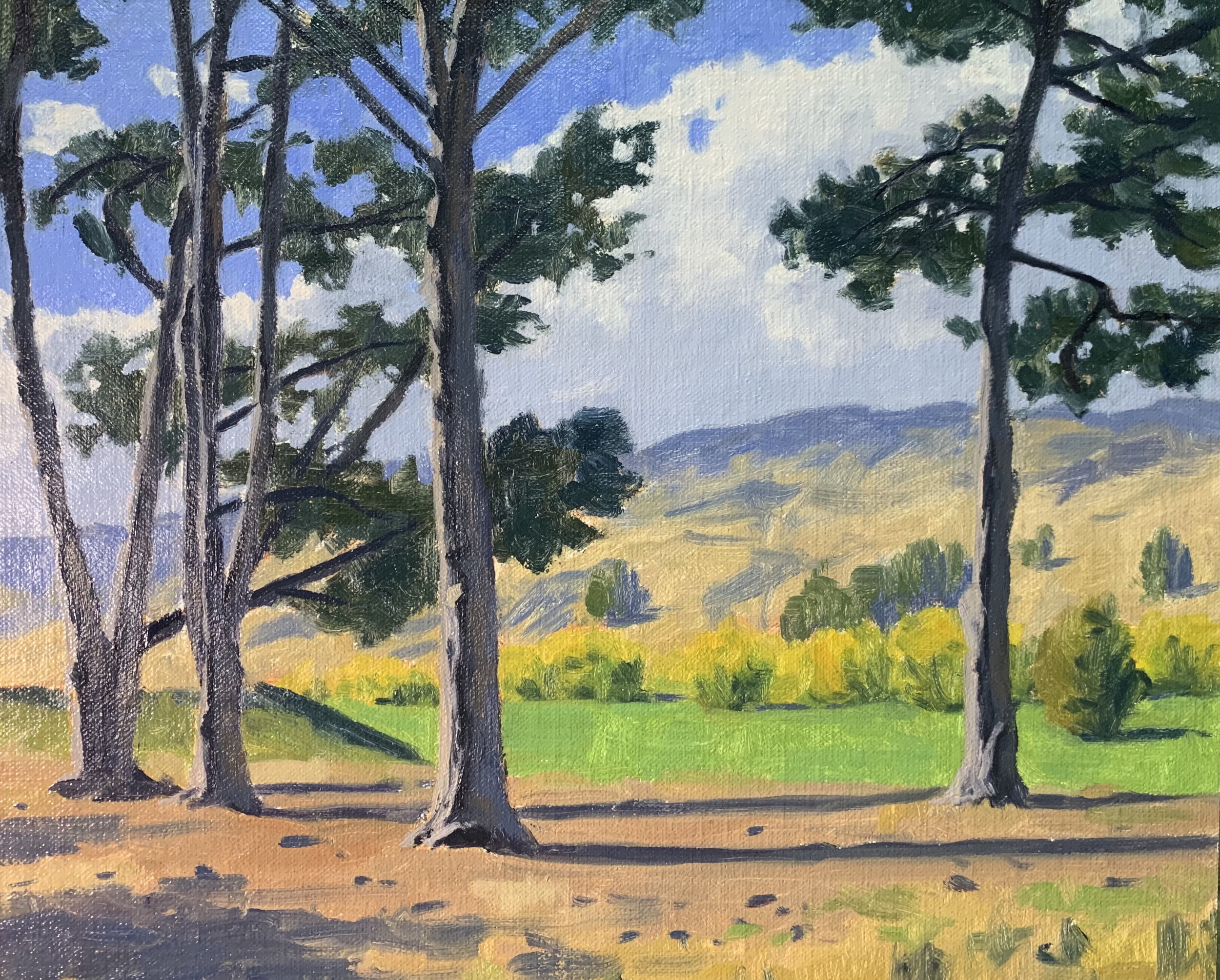
I add details to the trees particularly in the stems. In order to create a three dimensional form within the tree stems I have painted an area of dark shadow immediately next to the area that is in the full sunlight. To the other side of the lines of dark shadows I have painted reflected light on the side of the bark using a mix of ultramarine blue, burnt sienna, titanium white and a little alizarin crimson.
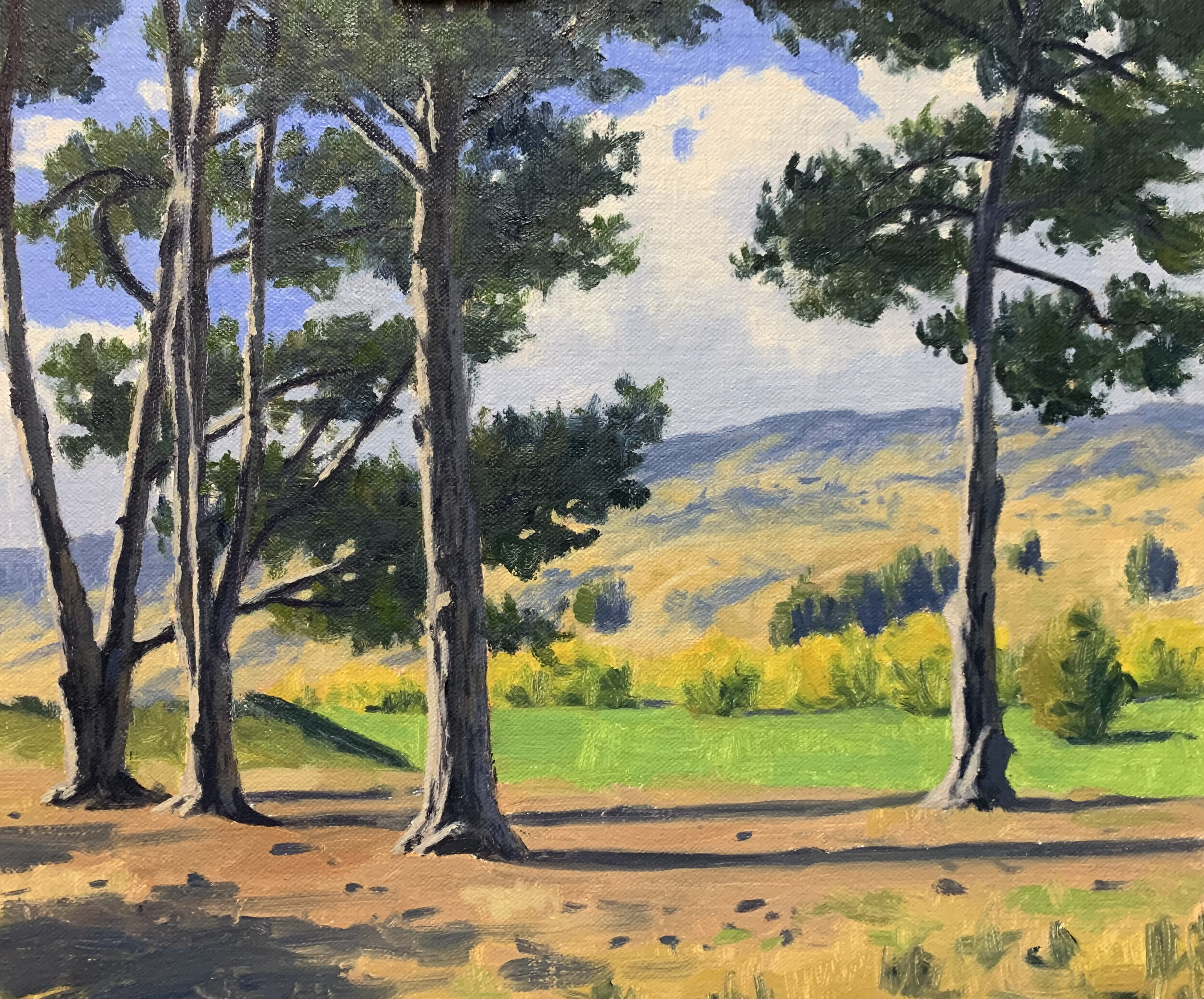
I build up layers in the background hills and mid ground trees and fields again using the same colours I used during the block-in stage.
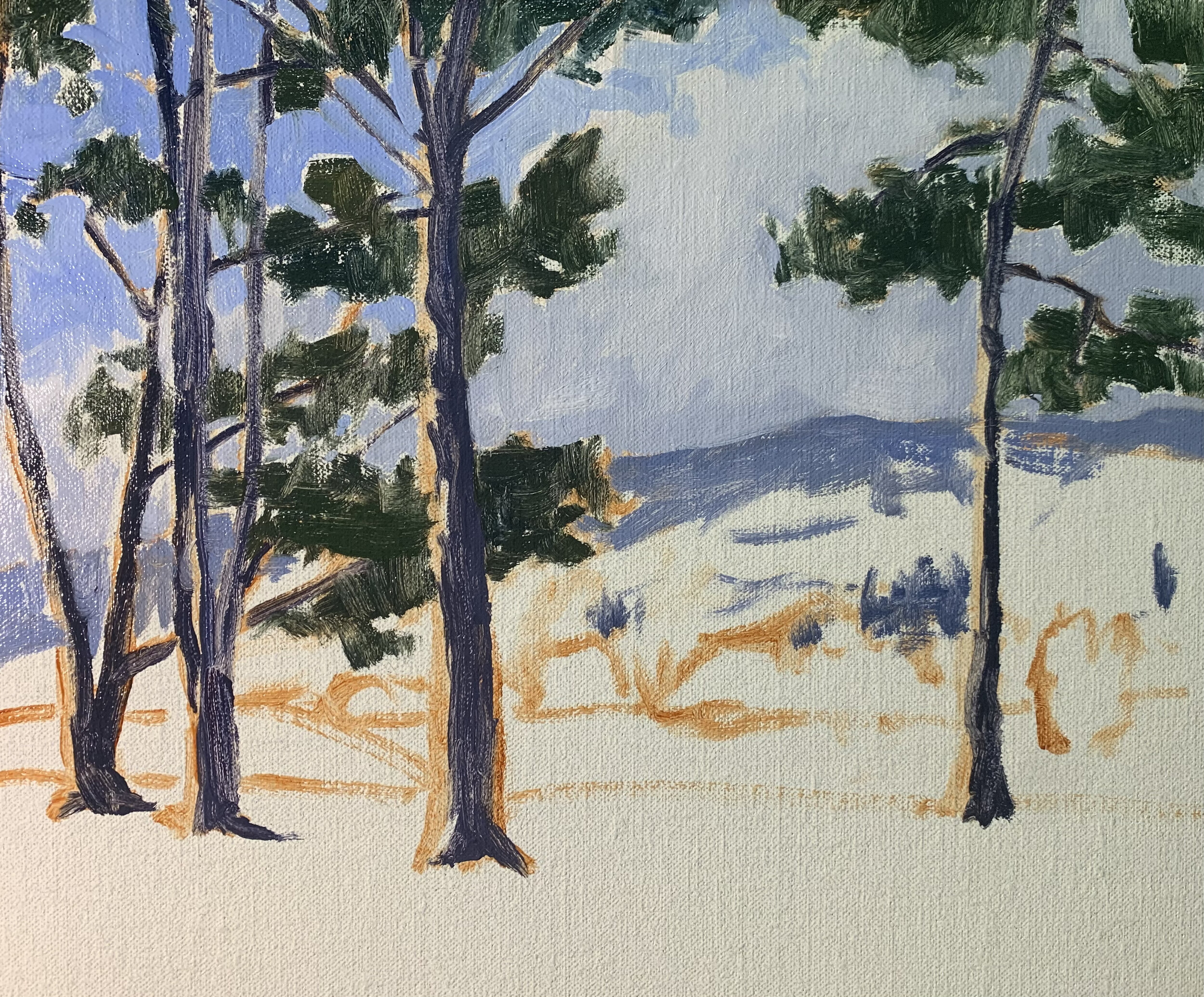
I finish the trees by adding areas of foliage that is in full sunlight with a mix of yellow ochre, ultramarine blue, cadmium yellow and titanium white. If I need to I can knock back the green by mixing in a little burnt sienna.
I add final small details such as the stones in the foreground and the furrows within the bark of the trees.
Colours and Values
Throughout the video you will hear me talk about colours and values. It is important to have a basic understanding of colour theory and values when painting as it will make colour mixing easier for you. Luckily it’s easy to learn the basics and the rest is just brush mileage.
Colours Theory Terms
Below are some terms I use throughout the video and their meanings.
Hue: This refers to the main attributes of a colour and is dependent on its dominant wavelength, irrespective of how light or dark the colour is. For example, the colour is discernible as blue or a red etc.
Saturation or Chroma: This refers to the purity or intensity of a colour. You can reduce the saturation of a colour by adding a neutral grey or an opposite colour on the colour wheel.
Value: This is how light or dark a subject is. Getting your values correct is one of the keys in the success of a painting.
Tone: This is a broad term for describing a colour that is not a pure hue or black or white. It is a widely misunderstood term.
The Colour Wheel
For the benefit of people who are new to painting that are watching this video I will briefly go over the basics of the colour wheel. Knowing how the colour wheel this works can really help you with colour mixing.
Above is a simplified colour wheel. The colour wheel contains three primary colour blue, red and yellow and three secondary colours orange, green and violet.
When these colours are arranged on the colour wheel a primary colour is always opposite a secondary colour and are known as compliments or complimentary opposites. So, blue is opposite to orange, red is opposite to green and yellow is opposite to violet.
So why is this important?
If you want to desaturate a colour you can do this by mixing its complimentary opposite as the two colours will cancel each other out. In this manner you can create some neutral greys and browns especially when combined with white.
Complimentary colours also look good next to each other in a painting, for example greens often look more harmonious in a landscape if there are some reds amongst the mix or colours that contain red. If you look closely in nature, you’ll see naturally occurring complimentary opposites everywhere.
The Value Scale
Value is how light or dark a colour is and is perhaps one of the most important concepts in painting. The success of a painting rests on the relationship between the values in the painting. If they are not working and not in harmony, then the whole painting can lack any kind of depth.
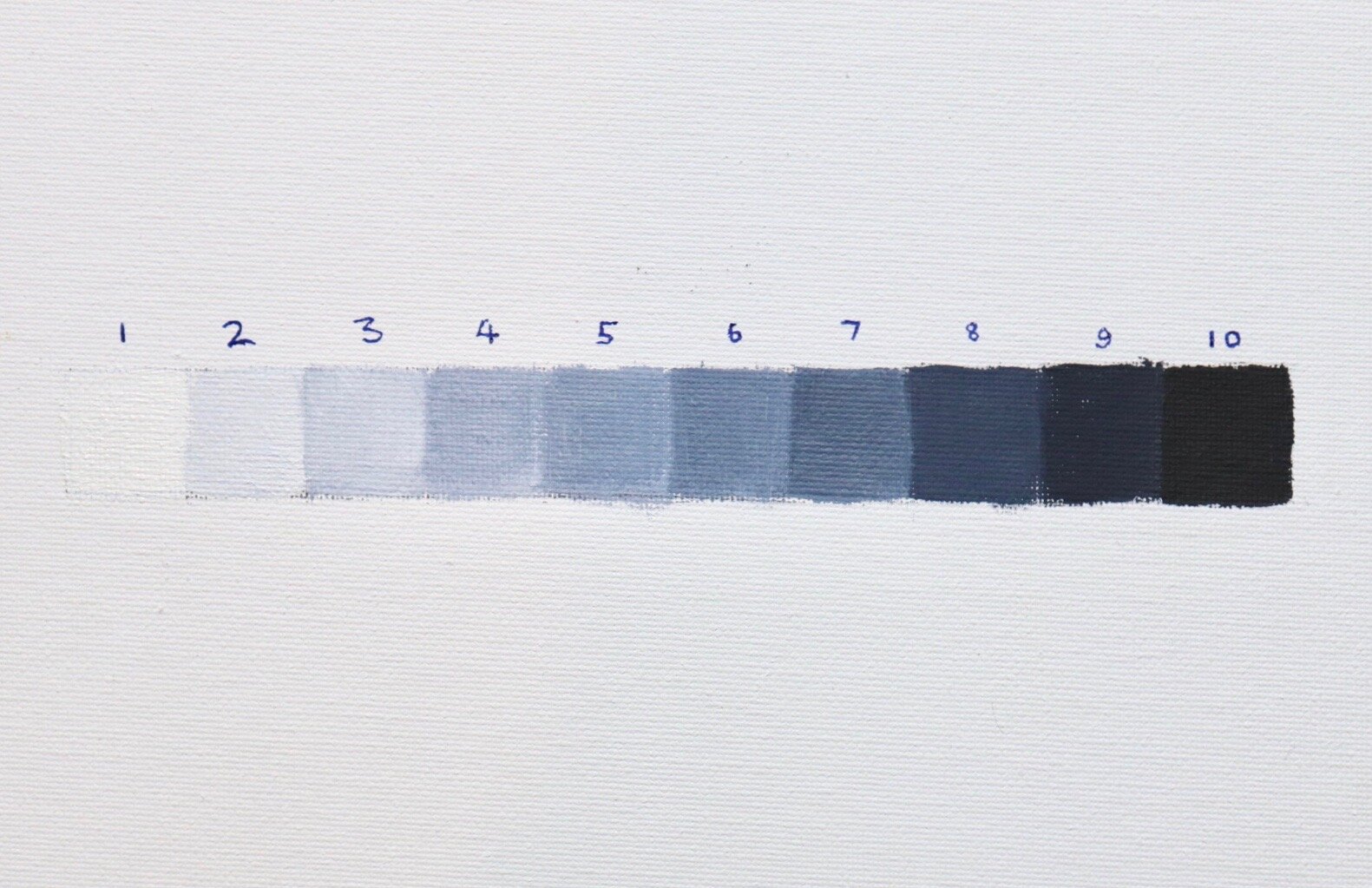
Values in art work are represented on a scale with the highest value being white and the lowest value being black. The greys in between are known as mid or half tones.
In general, you will find your darkest darks and lightest lights in the foreground of a landscape. However, as landforms recede into the distance darks are not quite dark and lights are not quite light as the tonal scale narrows.
If you are unsure of where your light and dark values are in the scene you are painting, switch your reference photo to black and white and you’ll be able to clearly see where your light and dark values are.
In general, you’ll find that the sky is often one of the lightest values in the landscape. Grass is also generally lighter in value. Rocks and mountain faces are darker in value and often occupy the mid-tone range of the value scale. Trees are generally some of the darkest values in the landscape.
New Painting Video Every Month on Patreon
Subscribe to my Patreon channel and get instant access to all of my painting videos and get a new video every month for just $5 per month.
More Painting Tutorial Videos Available
Check Out My Latest Painting Blog Articles
Featured