This article may contain affiliate links, please read my affiliate disclosure for more information
Welcome to my beginner’s guide on landscape painting, where we’ll explore the enchanting location of Milford Sound in New Zealand. Milford Sound is an epic location where the mountains meet the sea. It is a natural fjord.
In this painting demonstration, you will learn valuable techniques to create stunning landscape artwork.
Whether you’re an absolute beginner or looking to improve your skills, this step-by-step tutorial will give you the essential knowledge to paint captivating landscapes. I cover fundamental concepts such as choosing a focal point, utilising cool and warm colours, and working with a limited palette to create harmonious compositions. So, let’s dive into the world of landscape painting!
Suitable for oils and acrylics.
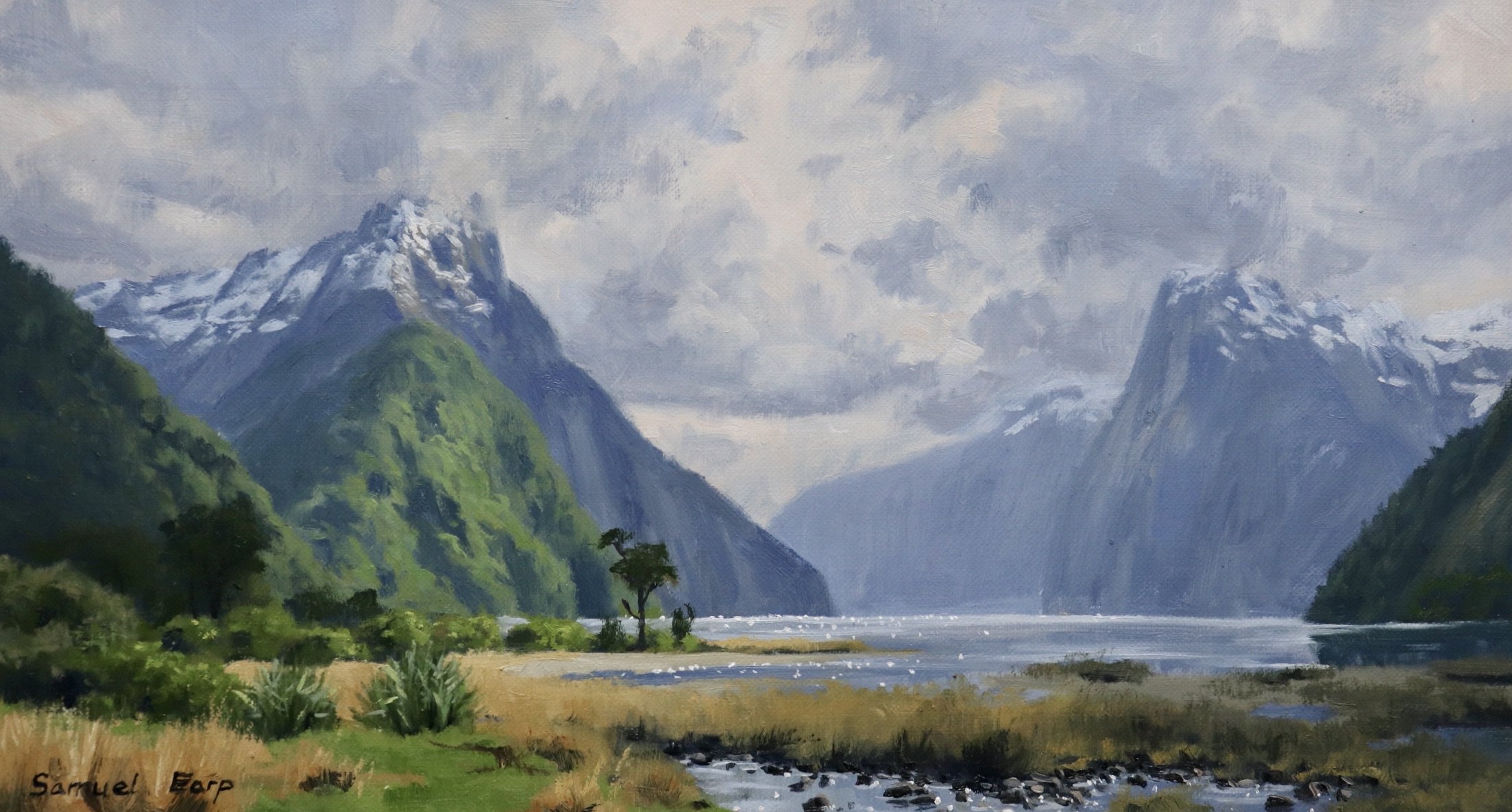
Milford Sound: A Majestic Mountain Scene
When it comes to painting landscapes, few places rival the breathtaking beauty of Milford Sound. Nestled within the dramatic Fiordland National Park in New Zealand, this awe-inspiring location offers a plethora of inspiration for artists. The towering mountains, cascading waterfalls, and serene water create a perfect setting for capturing the essence of a mountain scene.
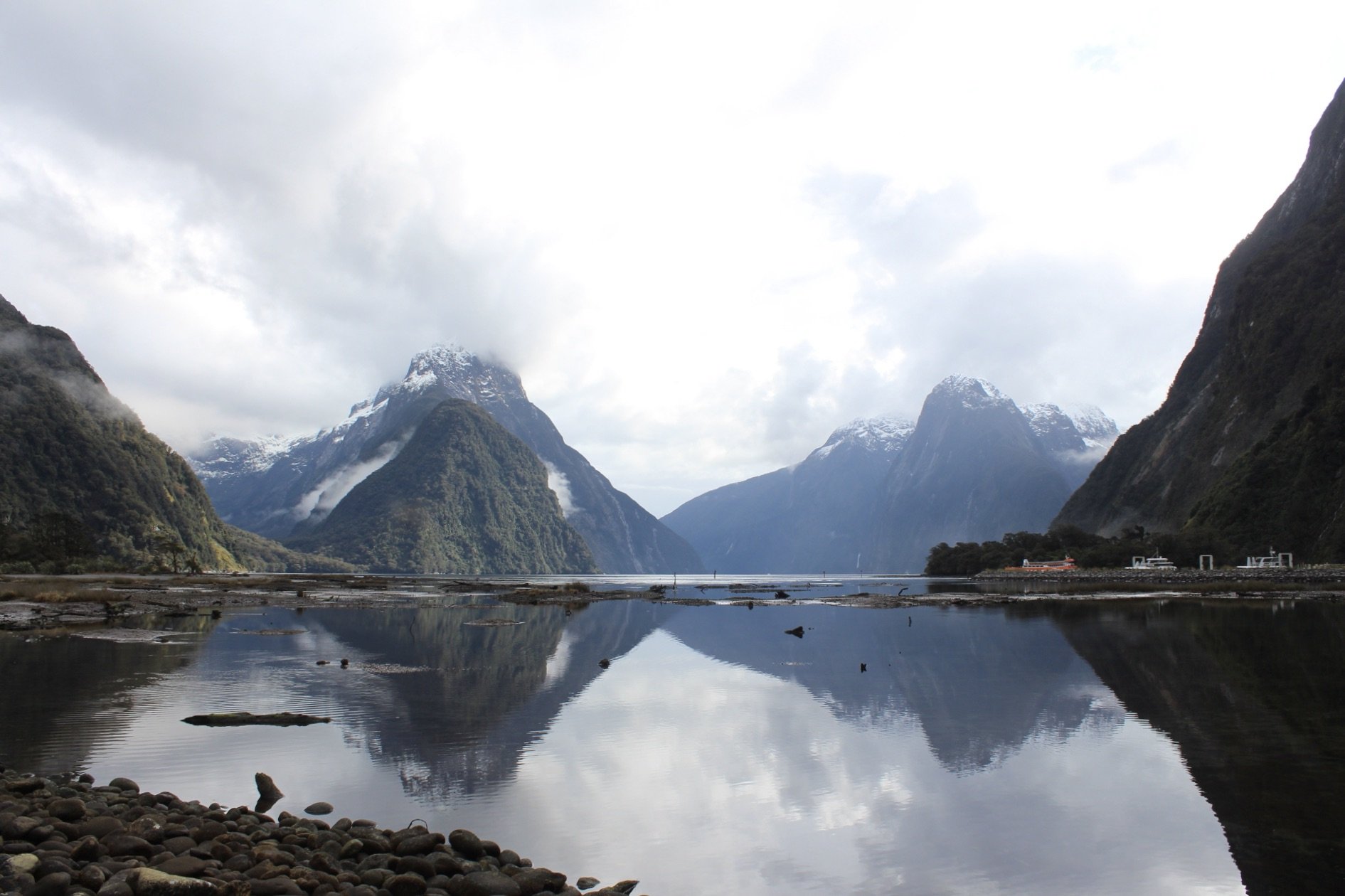
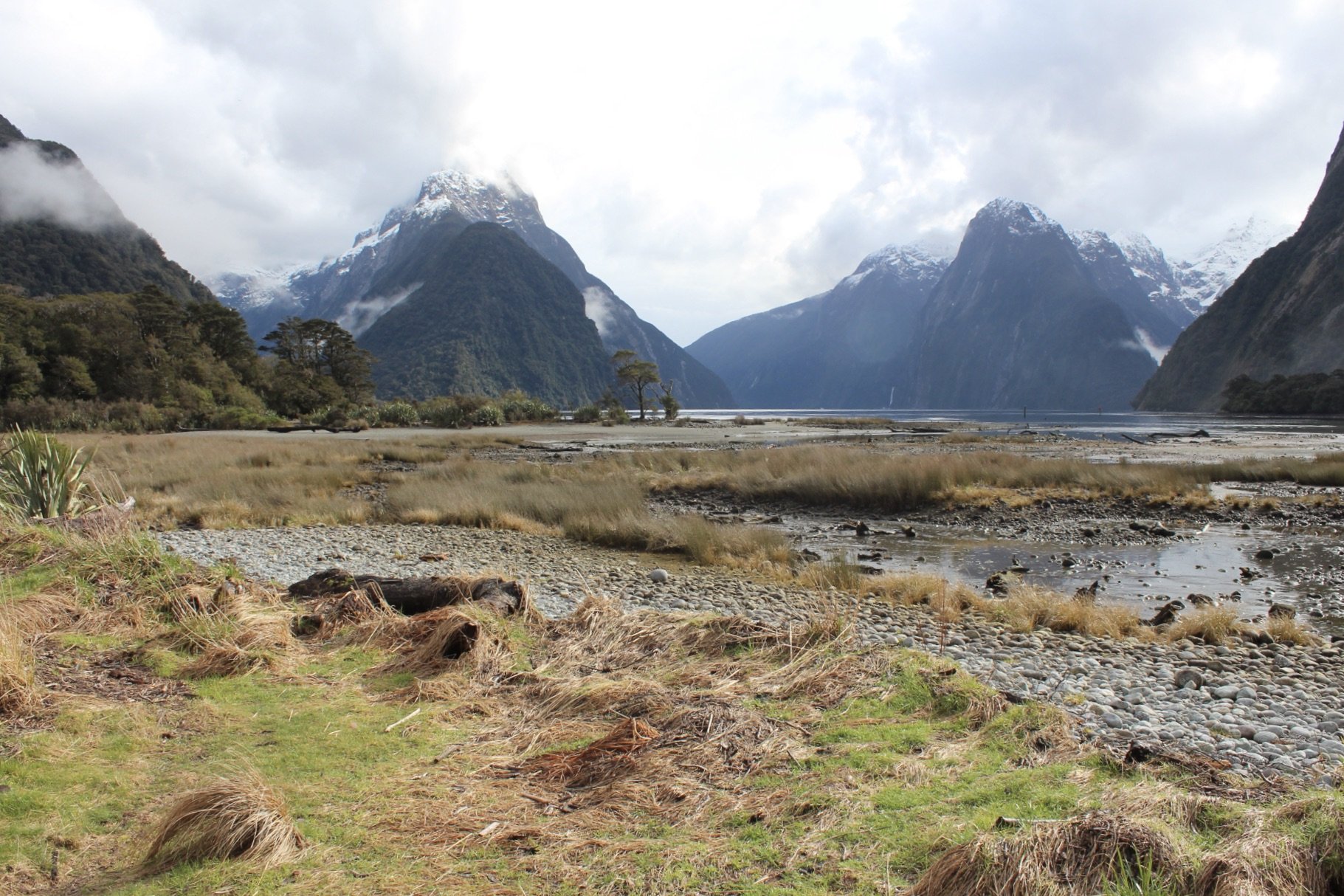
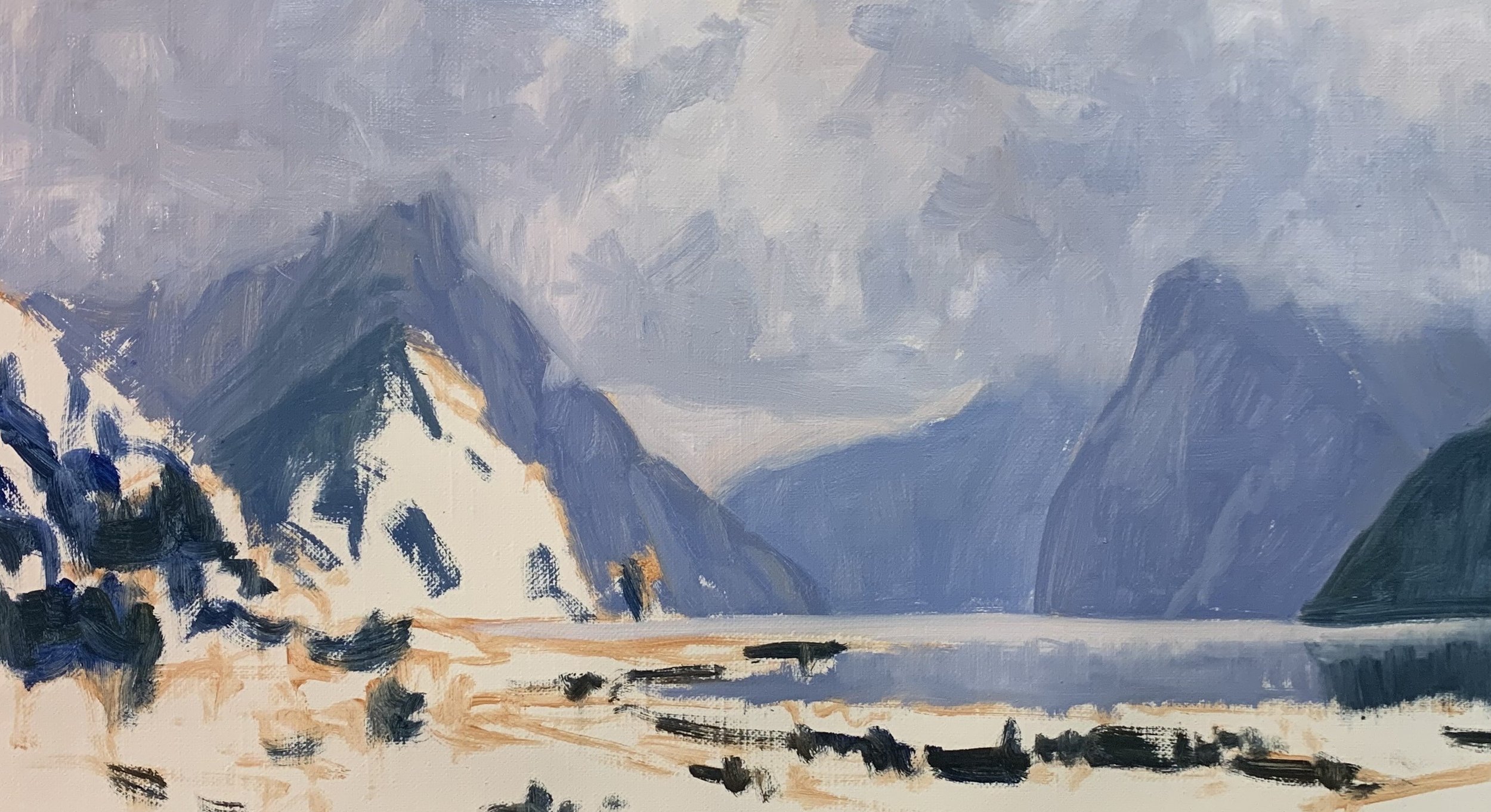
Reference Photos
Please feel free to use or copy these photos if you would like to have a go at painting this artwork. Also, check out the painting tutorial video on my Patreon channel where I demonstrate how to paint this artwork from start to finish.

Composition
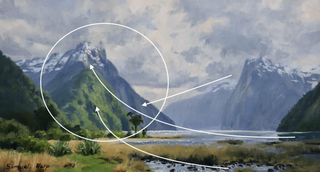
Composition plays a pivotal role in the success of a painting and it is something that I am always learning about. It is the arrangement and organisation of elements within the artwork that determine its visual impact and effectiveness.
A well-composed painting guides the viewer’s eye, creating a sense of order, harmony, and balance. It establishes a focal point, capturing the viewer’s attention and conveying the intended message or story.
A thoughtful composition considers factors such as the placement of objects, the use of negative space, and the overall balance of shapes, colours, and values. It allows the artist to convey a sense of depth, perspective, and movement within the two-dimensional canvas.
Designing a composition for this particular location at Milford Sound is a bit of a tricky one because it is such an iconic and recognisable view, therefor this whole fiord scene really needs to be incorporated into the painting design. With this in mind, I have made Mitre Peak, the mountain on the left the main focal point in the painting.
Things to be Avoided in Composition
- Never place your focal point in the middle of the composition as this will likely cause disharmony in your painting.
- Never place your horizon line in the centre of your painting, so either go for a higher or lower horizon.
- Avoid aberrations, repeating masses, shapes or vectors as this will cause a distraction in your composition
A strong composition not only enhances the overall aesthetics of a painting but also ensures that the artist’s intended narrative or emotional response is effectively communicated to the viewer. Therefore, understanding and mastering the principles of composition is essential for artists seeking to create impactful and visually engaging artworks.
Sketching the Composition
Before embarking on a painting I always do some prior planning to design the composition first. This can be as simple as a couple of quick pencil sketches and it is essential to recognise the significance of sketching as a valuable preliminary step. Sketching serves as a visual roadmap, allowing artists to plan and explore their composition before applying paint to canvas.
It provides an opportunity to experiment with different ideas, perspectives, and arrangements of elements within the painting. Through sketching, artists can refine their composition, determine the placement of focal points, and establish a sense of balance and harmony.
Additionally, sketching will enable you to understand the subject’s structure, proportions, and intricate details. It helps capture the essence and overall mood of the scene, allowing for adjustments and corrections before committing to a final artwork.
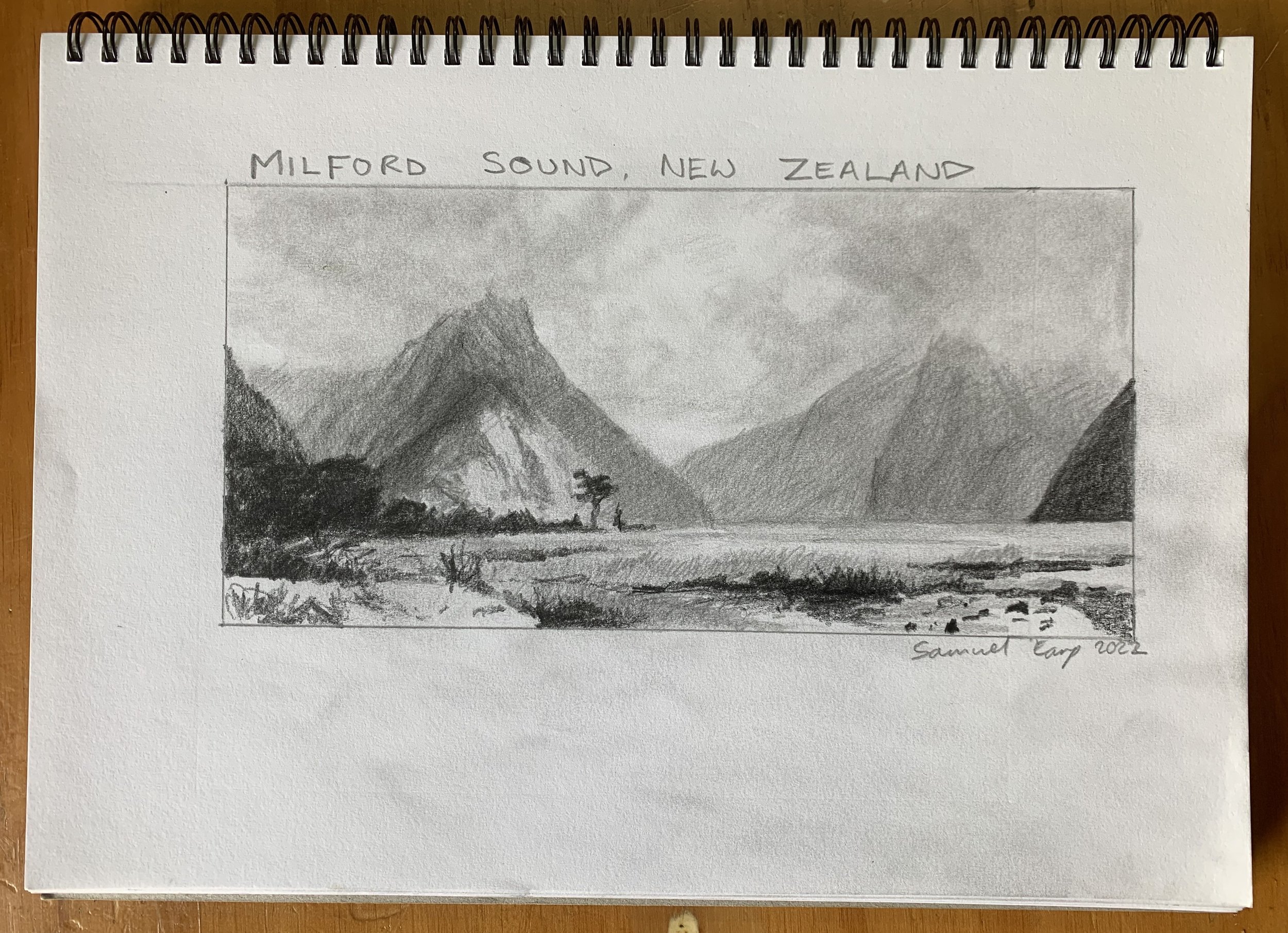
Sketching acts as a foundation, enhancing the artist’s confidence and guiding their creative process, leading to a more successful and compelling painting.
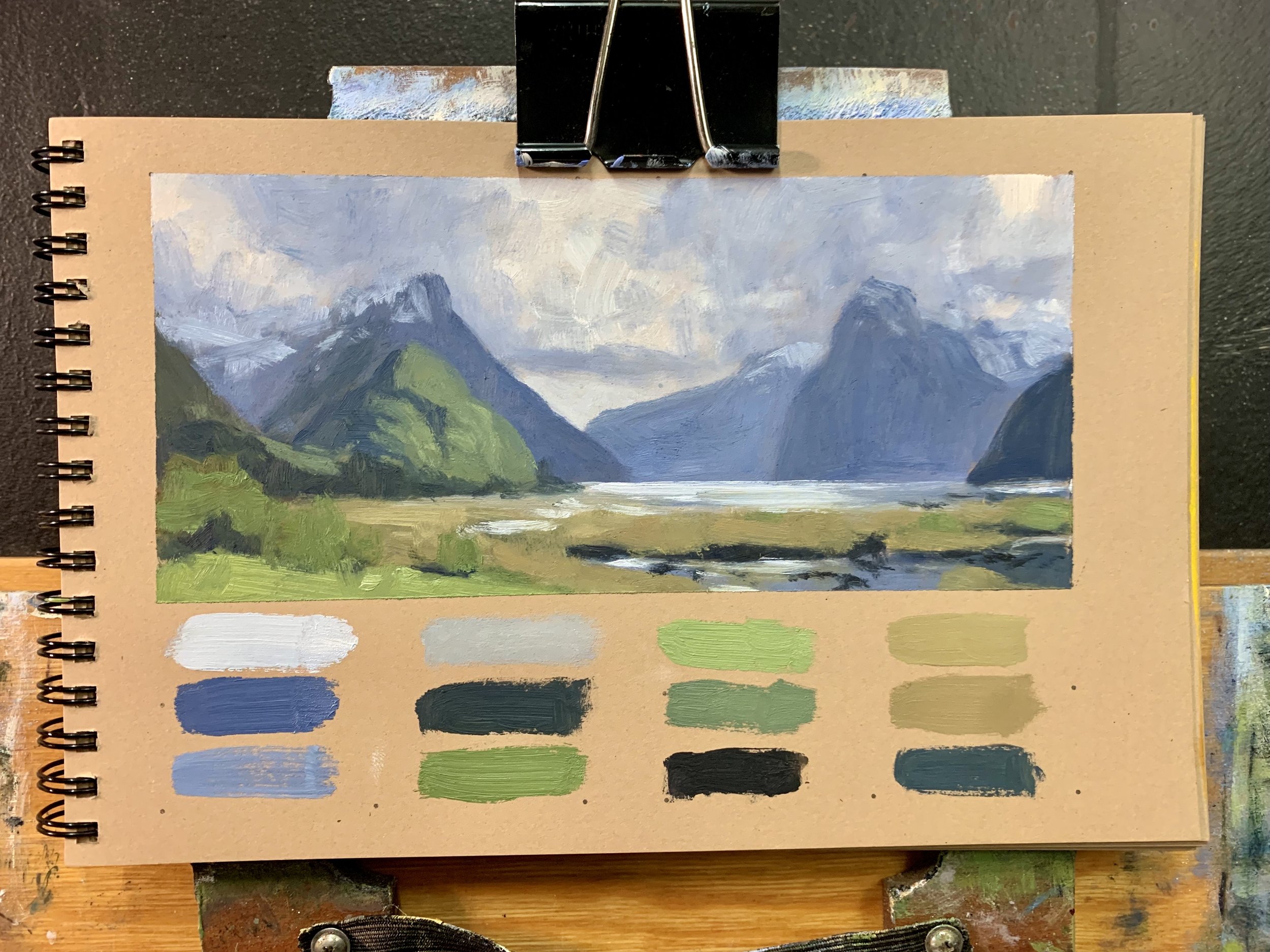
Painting a Colour Study
As I said planning and designing the composition will help you to give you an idea of what your painting might look like and it will reduce the chances of you running into trouble mid-way through a final painting. With this in mind. I always like to paint with hindsight so a colour study is a good way to see quickly if your painting will work
Painting a colour study before diving into a larger artwork is crucial if you want to make sure you create a successful artwork. I’ve created many failed paintings due to bad compositional designs and poor colour harmony that could have been sorted out in the early stages by sketching and painting a colour study.
A colour study allows us artists to explore and experiment with different colour schemes, values, and combinations in a smaller, manageable format. It serves as a testing ground, providing an opportunity to observe how colours interact with each other and how they contribute to the overall mood and atmosphere of the painting.
Colours
I painted this artwork using oil paint the colours I used in this painting are as follows:
- Titanium white
- Burnt sienna
- Yellow ochre
- Cadmium yellow
- Cadmium red light
- Alizarin crimson
- Ultramarine blue
- Phthalo green
Working with a Limited Palette
Whenever I paint landscapes I prefer to use a more limited palette of colours. If you are an absolute beginner, working with a limited palette can be advantageous.
Instead of overwhelming yourself with a wide range of colours, start with a small selection of pigments. This approach helps you focus on colour mixing and tonal values without getting overwhelmed.
Using a limited palette will also greatly increase the likelihood of creating colour harmony in your painting as the colours will look good to the viewer. By using a limited palette you are much more likely to be using common colours throughout your painting which means your painting will read well to the viewer.
For a mountain scene, a limited palette consisting of blues (such as ultramarine blue), greens, and earth tones (such as burnt sienna and yellow ochre) can be a great starting point. With these colours, you can create a wide range of hues to depict the various elements of the landscape.
Brushes
Here is a list of the brushes I used in this painting:
- No.5 flat
- No.3 flat
- No.2 flat
- No.3 filbert
- No.1 round
- No.0 round
- 1/4” ivory dagger


PAINTING DEMONSTRATION: Blocking-In The Painting
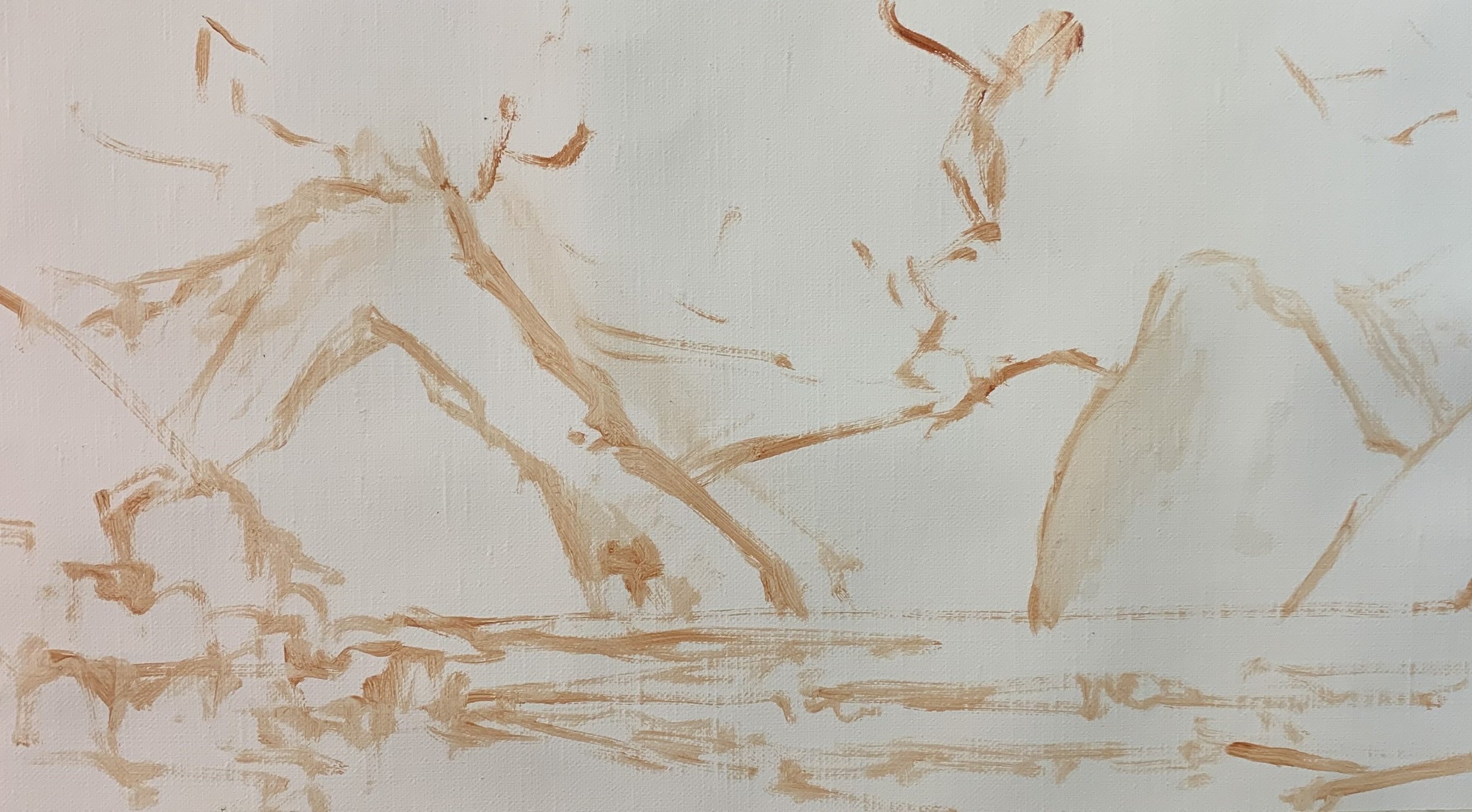
I painted this artwork on oil primed, medium weave Belgian linen and the painting itself measures approximately 22cm x 40cm.
I sketched the composition using a No.1 round brush with burnt sienna mixed with Liquin Original (Liquin). I am using Liquin as a medium to thin the paint and it also has the advantage of speeding up the drying time.
Paint Your Dark Values and Shadows First
Whenever I start a painting I always identify where the dark values and shadows are first in the scene I am painting. Value refers to how light or dark a subject is and by painting in the dark values first I personally find it is much easier to create atmospheric perspective in my paintings.
Painting your dark values first also makes it easier to add the areas in light and to get the saturation of your colours correct once you have painted your shadows.
I painted the cloud shadows and background mountain shadows using a mix of ultramarine blue, burnt sienna, alizarin crimson and titanium white. In order to make the darker values in the mountain shadows I have used less titanium white in the mix.
For the shadows in the foreground and midground, I have used varying combinations of ultramarine blue, yellow ochre and titanium white so the mix has a green cast to it.
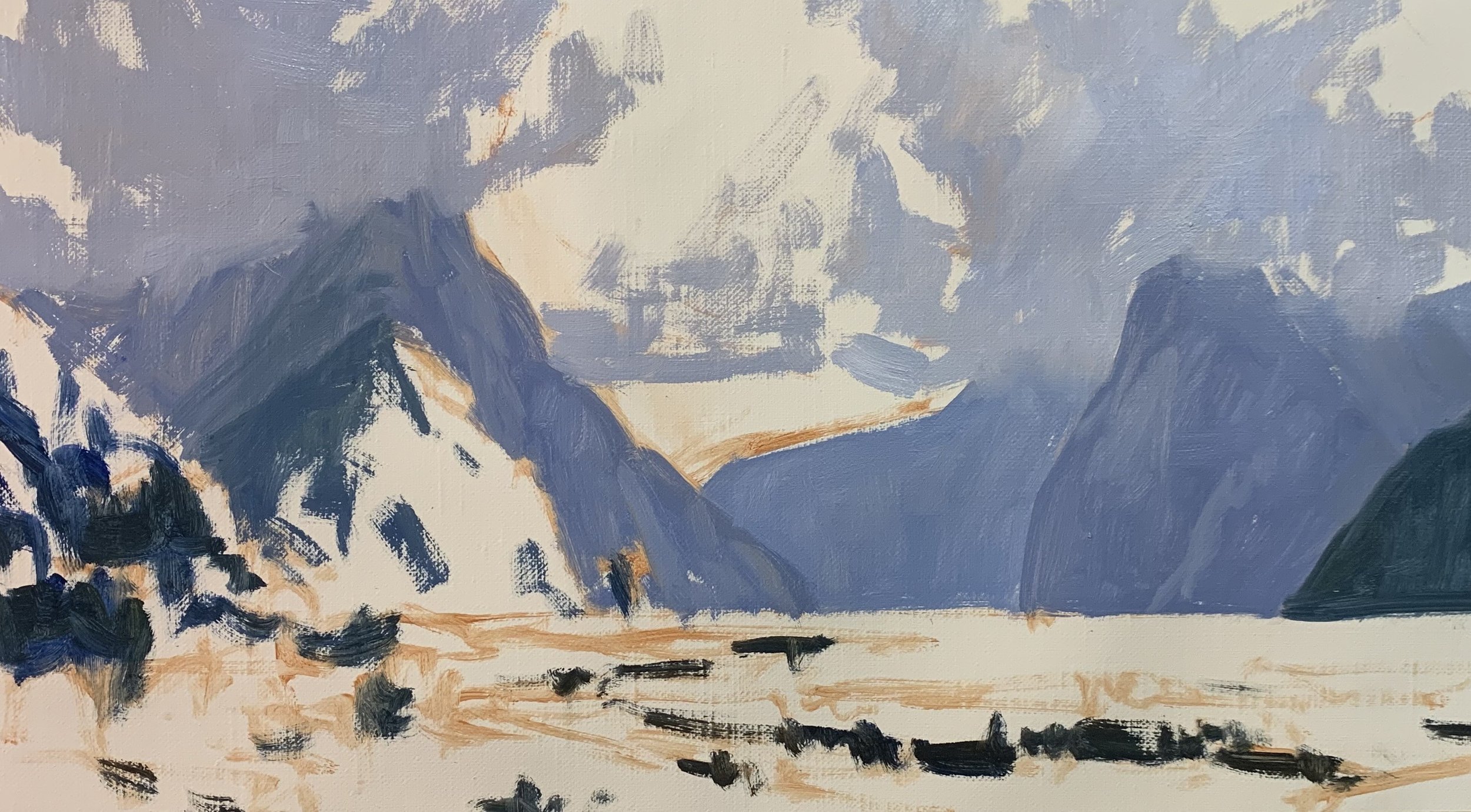

Painting the Clouds
Once the main dark values are established I start painting the areas in light starting with the cloud highlights using a mix of titanium white with a dash of burnt sienna. I allow the highlights to mix in with the cloud shadows.
The water is reflecting the clouds and mountains so I am able to use my cloud and mountain mixes for the water.
We want the mountains and the water to recede into the distance so they look further away but also to create a sense of awe and great height in the mountains. This is where utilising cool colours can help to create this effect in your painting.
Utilising Cool and Warm Colours
Understanding the use of cool and warm colours is essential for creating visually pleasing landscape paintings. Cool colours like blues and greens often recede into the background, creating a sense of distance and tranquillity. Warm colours, on the other hand, like reds and yellows, tend to advance in composition, creating a sense of closeness and vibrancy.
When you are painting your mountain scene, consider using cool colours for the distant peaks and warm colours for the foreground elements. This contrast will enhance the depth and three-dimensionality of your artwork, making it visually captivating.
Painting the Vegetation on the Mountains
I paint the foliage of the dense forest of trees on the mid-ground mountain using a mix of yellow ochre, ultramarine blue, titanium white and a dash of phthalo green. I have also in places used a small amount of cadmium yellow. It is important to make sure the greens in the mid-ground are not saturated otherwise the greens will come forward in the painting and the atmospheric perspective will be lost.
The most saturated greens are in the foreground. I used varying combinations of yellow ochre, cadmium yellow and ultramarine blue which I use as my base then I added titanium white, phthalo green and cadmium red light to create some different hues.
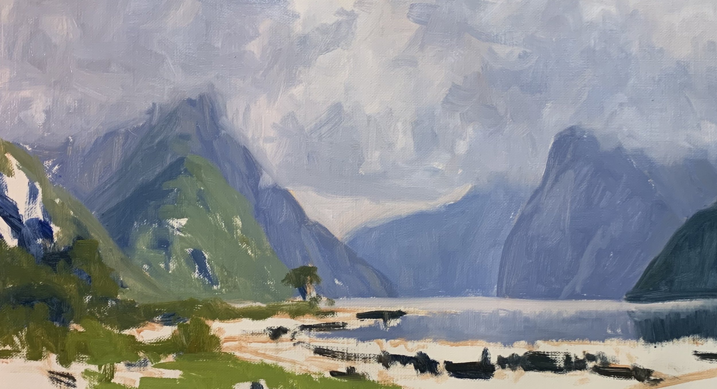
Finishing the Blocking-In Stage
I complete the blocking-in stage by painting the reeds in the foreground using a varying mix of yellow ochre, burnt sienna, ultramarine blue and titanium white. For this area of the painting, I am using warmer tones which will bring these elements forward in the painting, helping to create atmospheric depth.
I used a mix of titanium white with a little ultramarine blue, burnt sienna and alizarin crimson for the snow on the mountains and I completed the blocking-in stage by restating the dark values in the scene. I then let the painting dry for a few days.
Experiment with Colour Temperatures
Experiment with different colour temperatures to achieve the desired effect in your painting. Remember that nature often presents a harmonious blend of warm and cool colours, so observe your surroundings and let them guide your artistic choices.
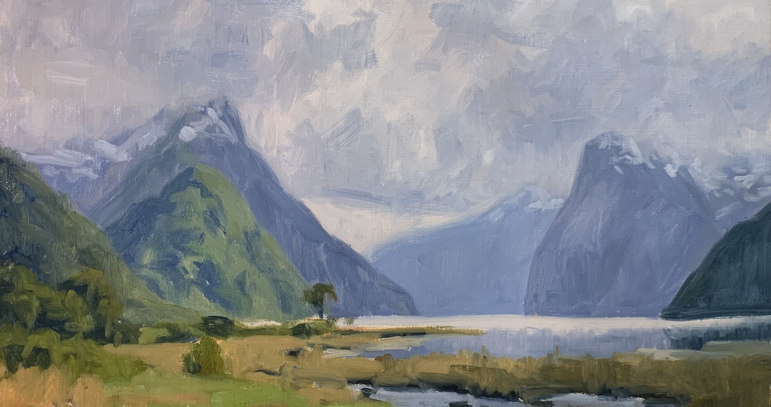
Adding Details, Modelling and Refining the Painting
Once the painting was dry I then spent a few sessions on this painting modelling the paint and building up the details. Essentially I am using the same colours I used during the blocking-in stage in varying amounts.
I worked on adding a small amount of detail and texture in the background mountains being careful not to go overboard with the details. I worked on the foliage in the mid-ground hill by adding lighter values of my green mix to the many trees growing there. Creating this spotlighting effect is going to add more atmosphere to the painting as well as draw the to this area of the painting.
I also worked on building up details in the foliage of the foreground plants and bushes and adding lighter-value colours to build up their forms.
When working on the painting I was using a range of brushes including Nos. 5, 3 and 2 bristle flat brushes, No. 3 Filbert brushes and 1/4″ bristle dagger brushes.
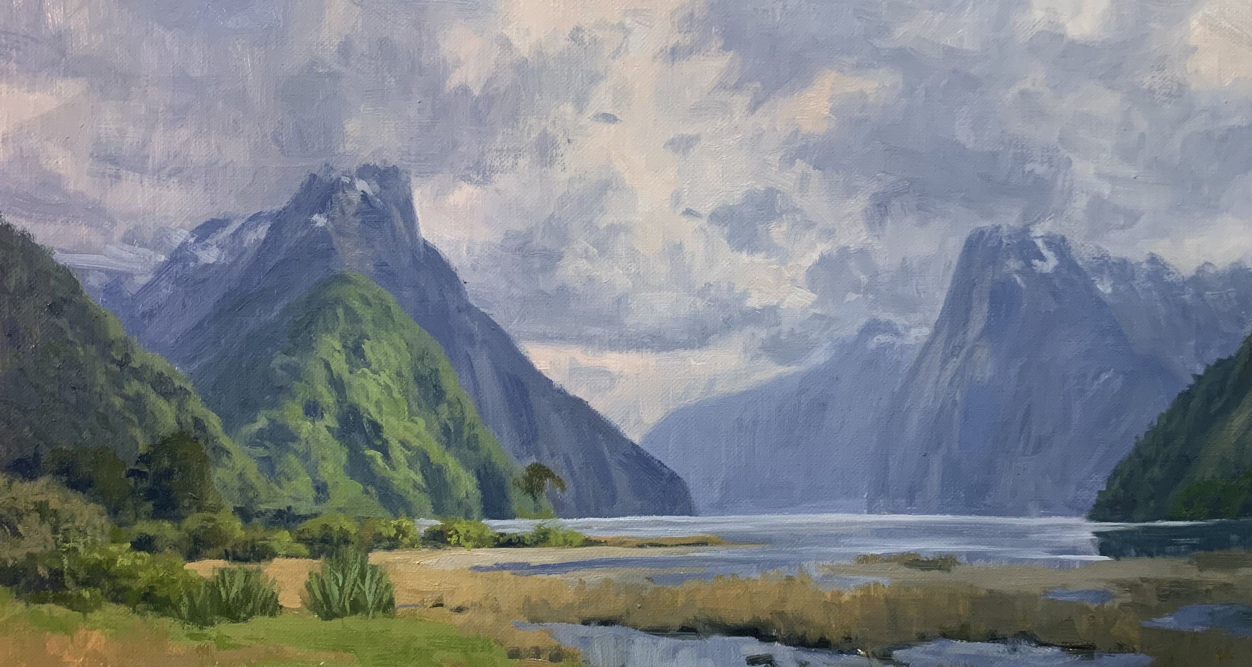
Final Details
Once my painting was dry again I added the last details and this is where I also apply my lightest values such as the sparkles on the water and the snow on Mitre Peak, the mountain on the left side of the composition.
I painted more details in the foreground including the reeds, the water where I added stones and also some final highlights to the plants and bushes. I was using small brushes to paint the last details on this painting including No.0 bristle and synthetic round brushes.
Final Note
I hope you enjoyed this written painting demonstration, however, I have only scratched the surface as there is way more to this painting. Check out the painting tutorial video where I show you how to paint this scene, available on my Patreon channel.