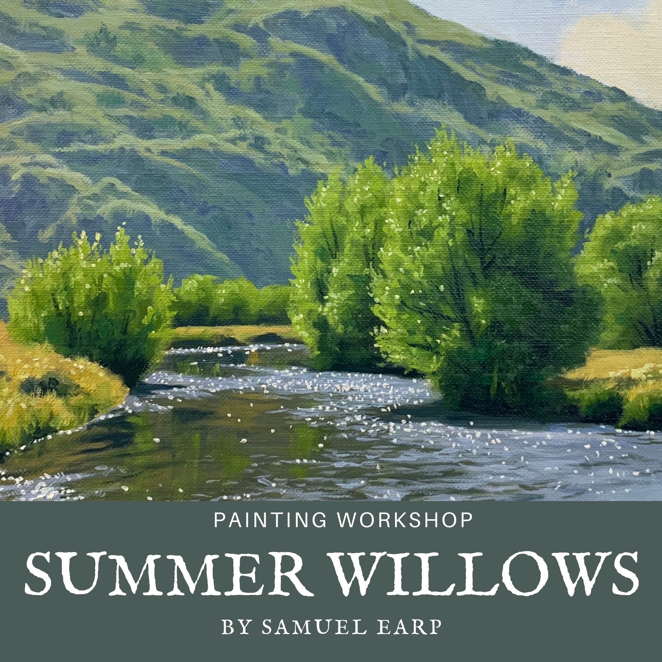
Painting Workshop – Lesson Notes
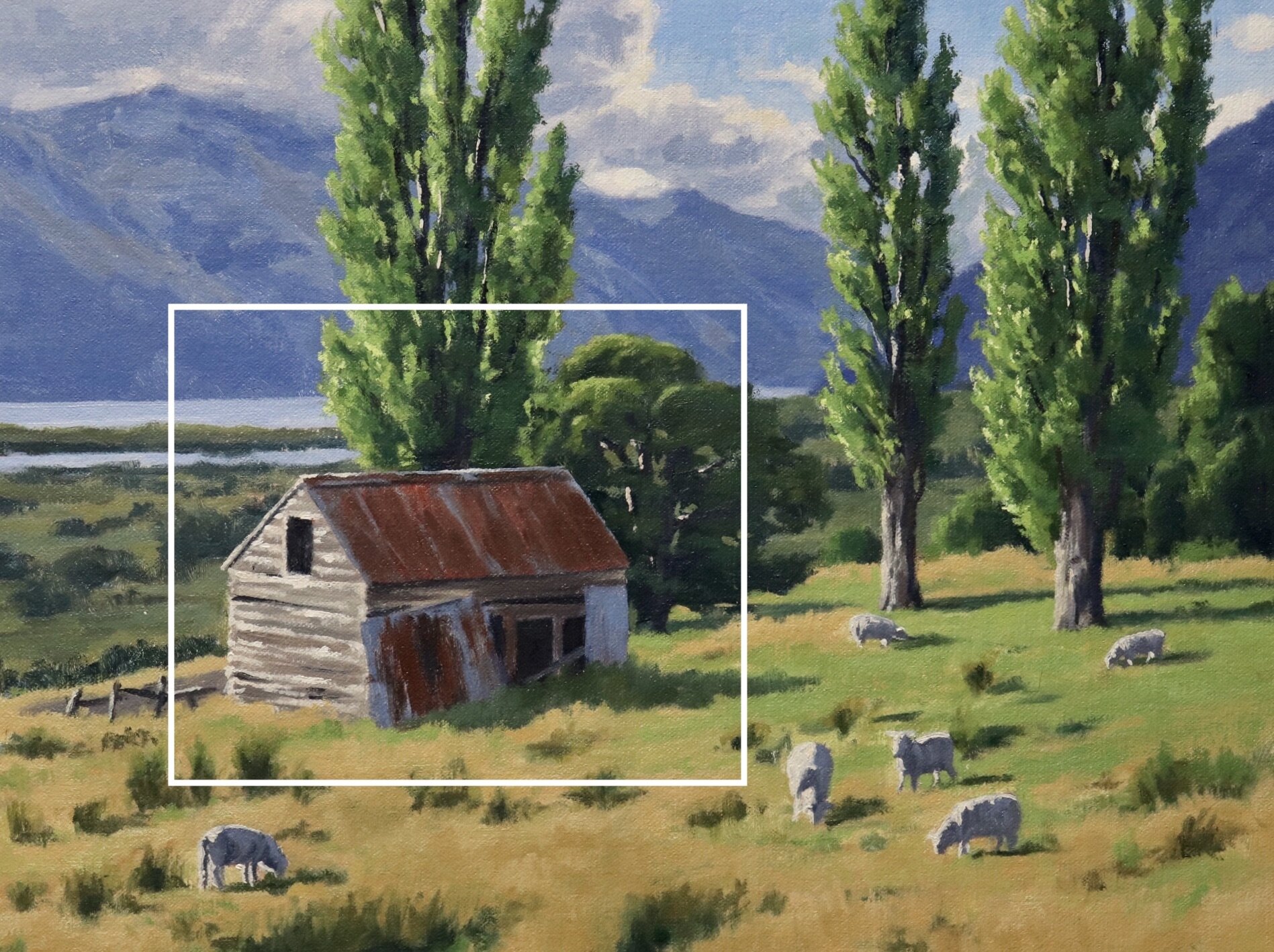
Old Barn
By Samuel Earp

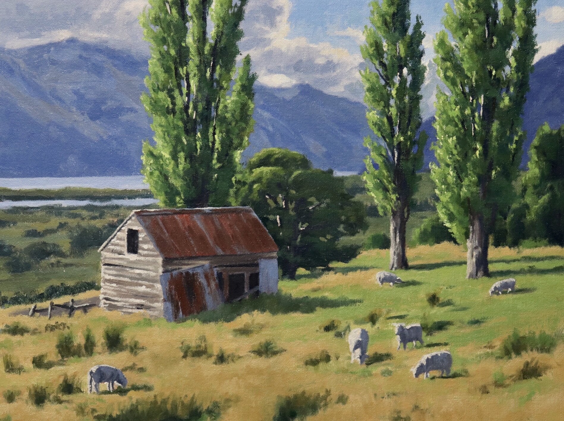
In this painting tutorial I will show you how to paint this countryside scene featuring an old barn. This painting is inspired by the south island of New Zealand.
Suitable for oils and acrylics.
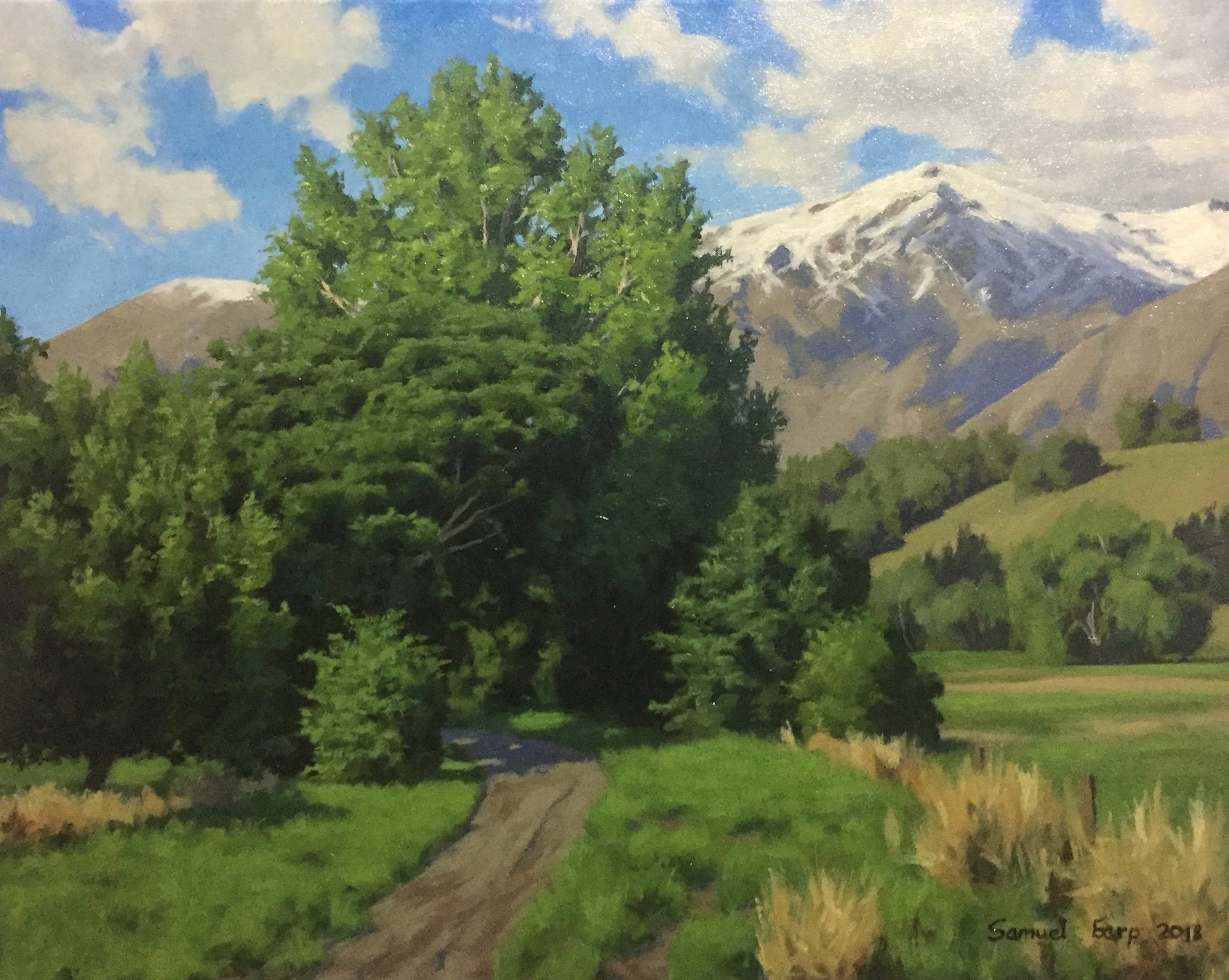
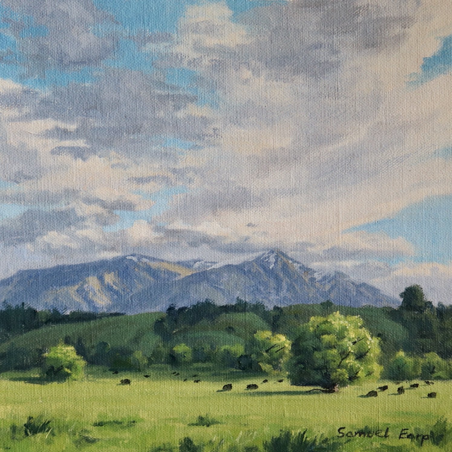
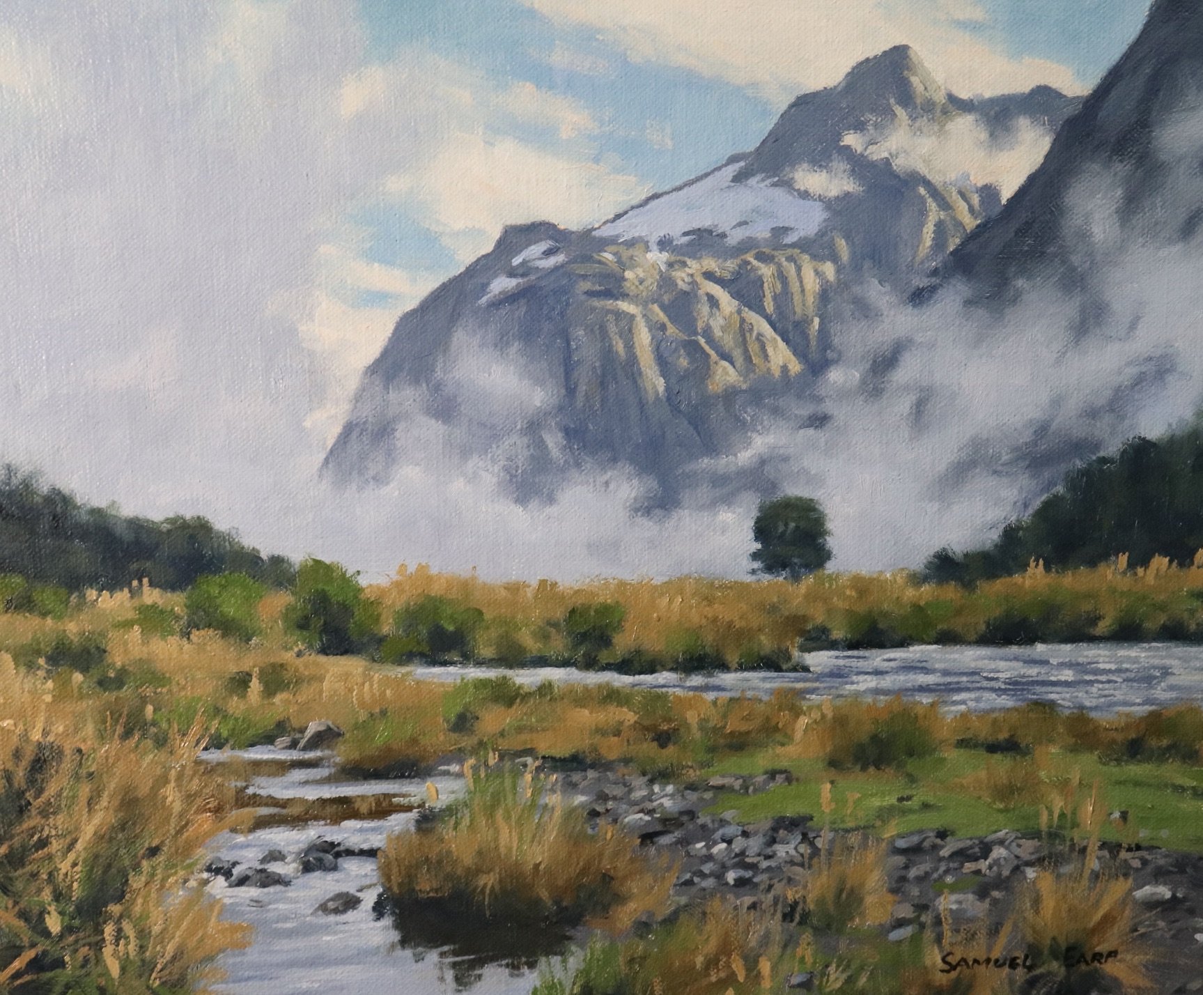
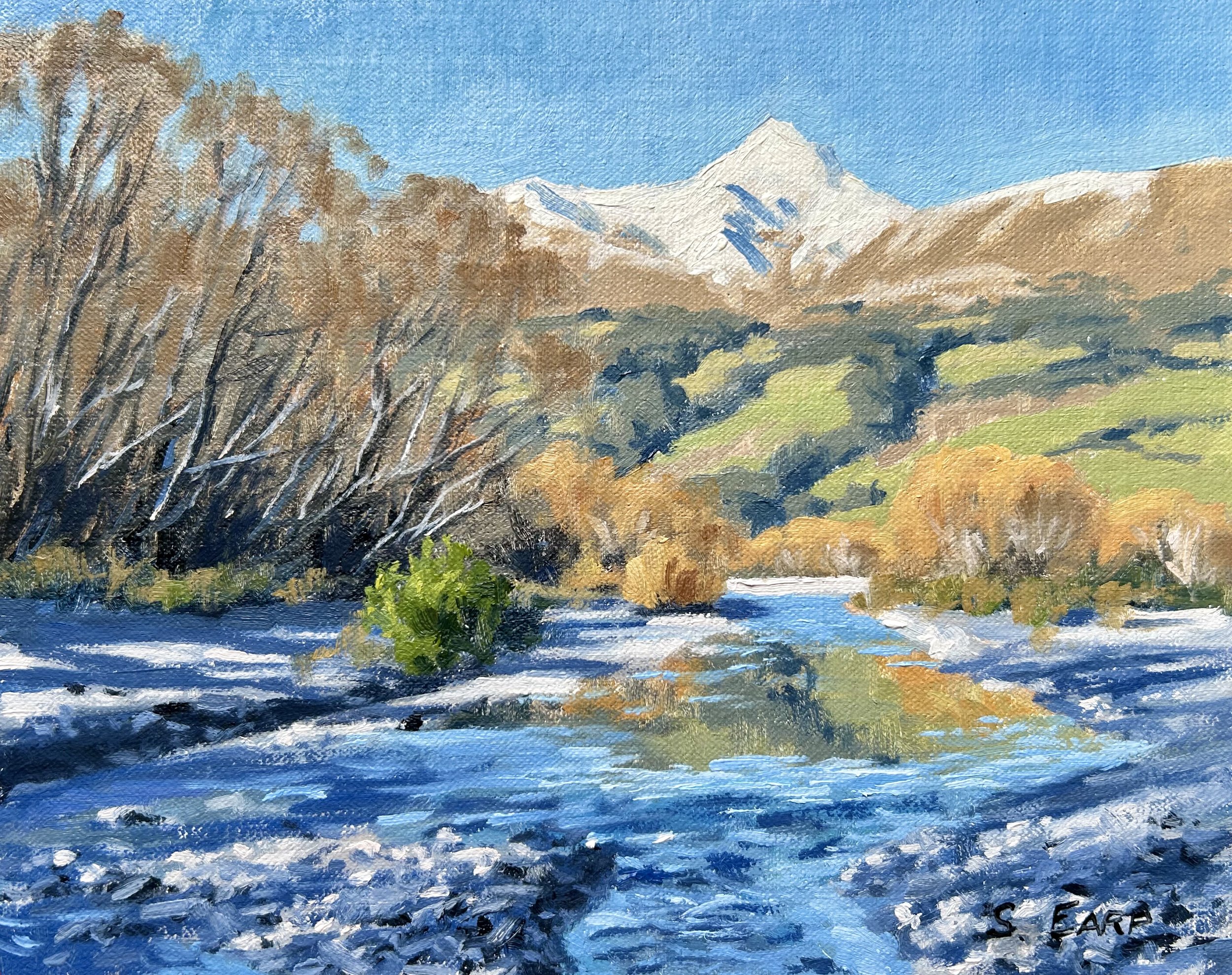
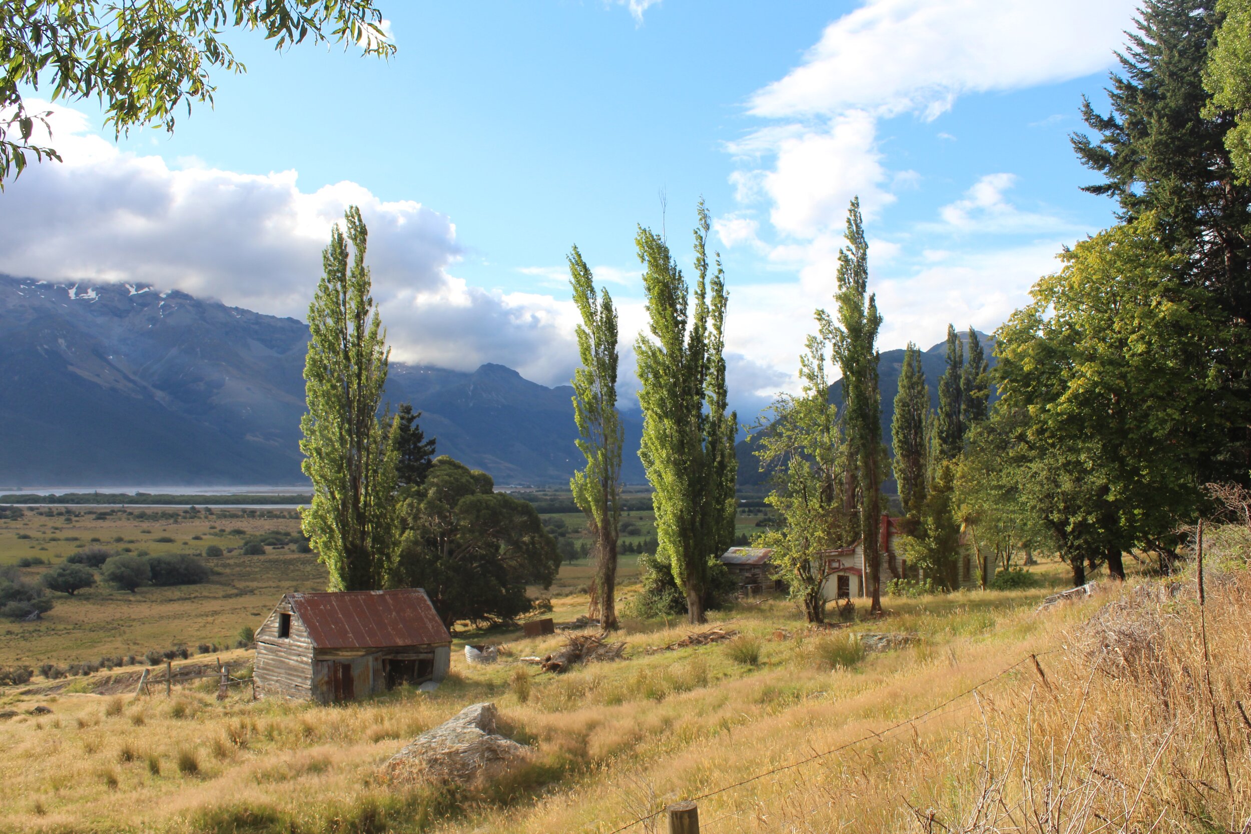
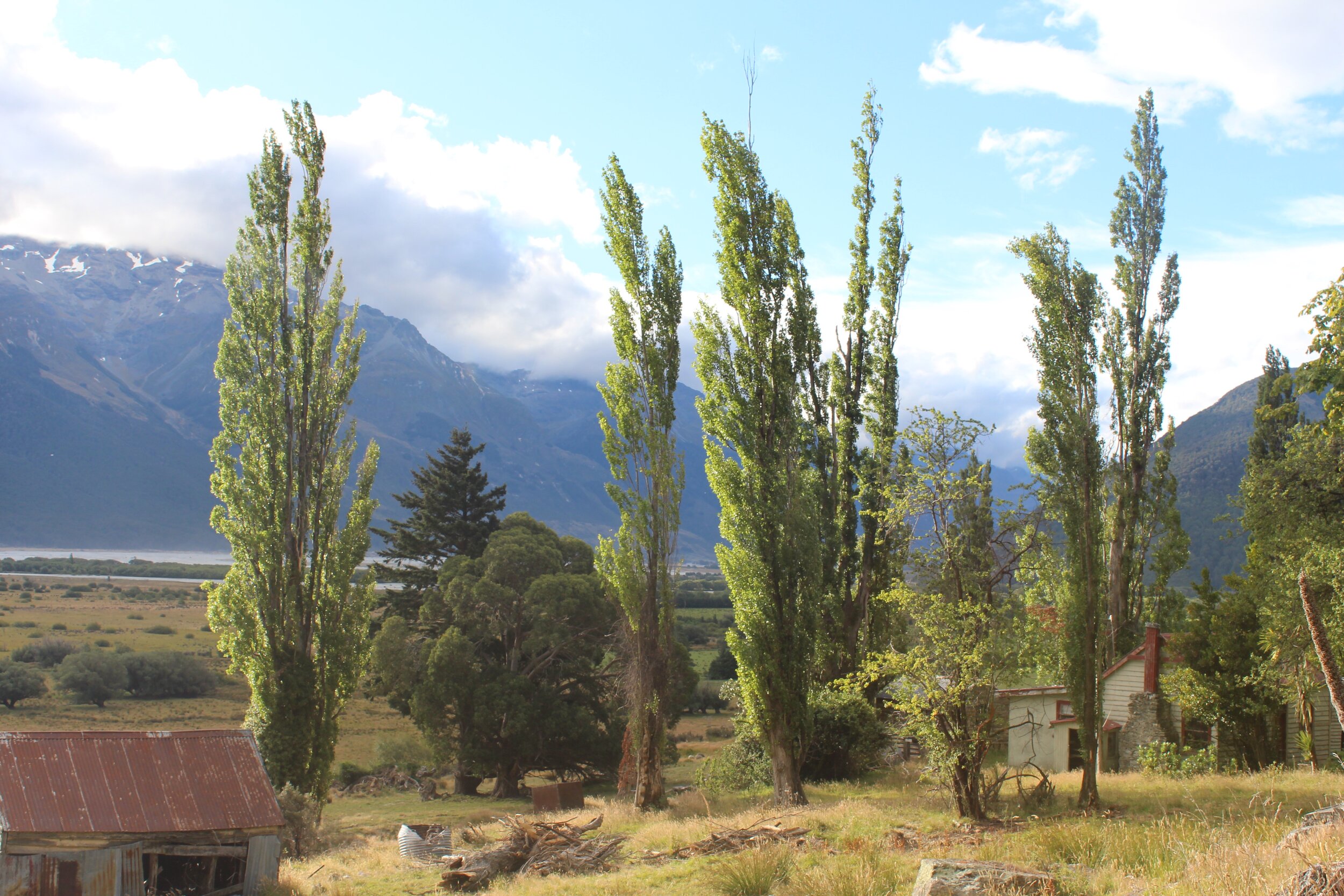
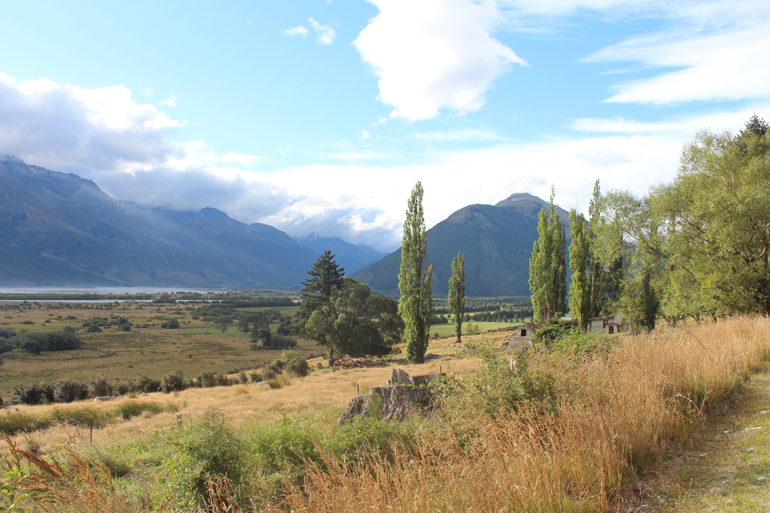
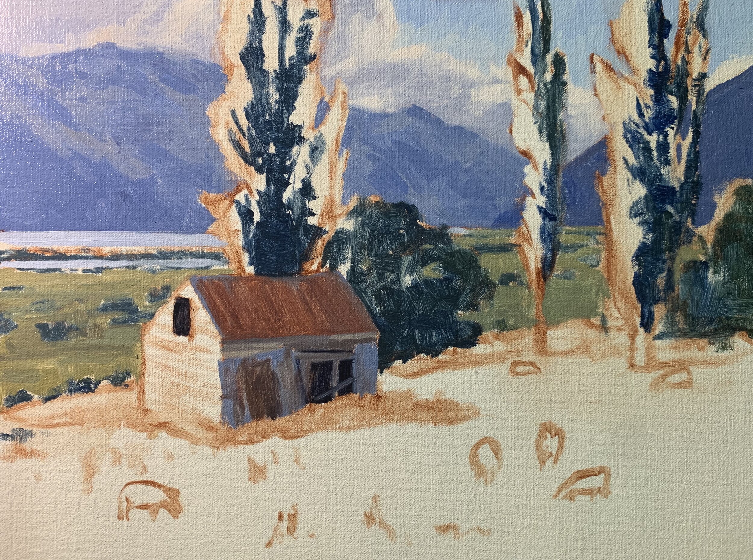
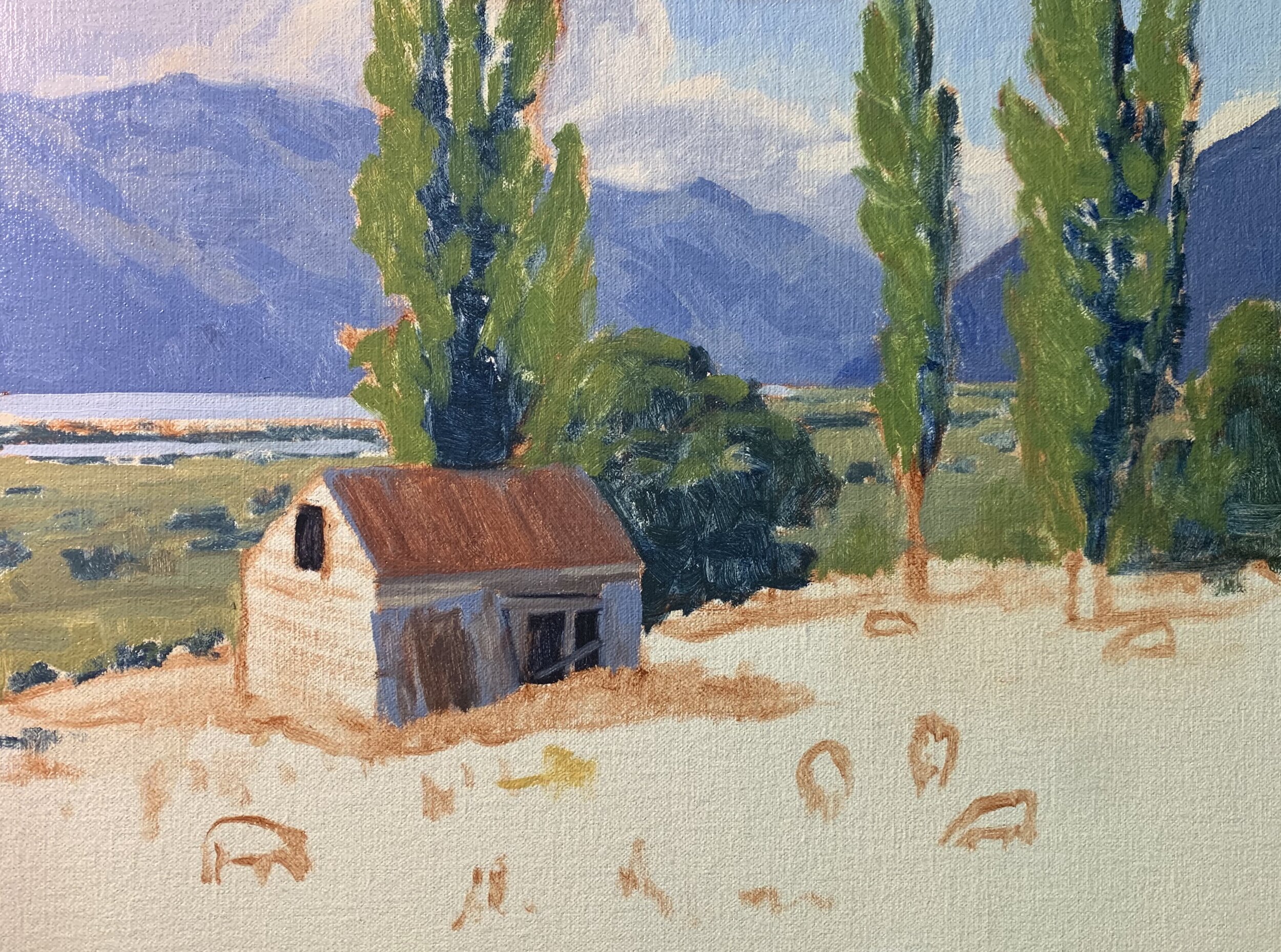
Reference Photos
Here are some reference photos I took which I used in this painting. Please feel free to use or copy the photos if you would like to have a go at painting this art work.
Colours
The colours I used in this painting are as follows:
-
Titanium white
-
Burnt sienna
-
Yellow oxide (you can also use yellow ochre instead)
-
Cadmium yellow
-
Cadmium orange
-
Quinacridone crimson (you can also use alizarin crimson instead)
-
Ultramarine blue
-
Phthalo green
Brushes
Here is a list of the brushes I used in this painting:
-
No.5 flat
-
No.3 flat
-
No.2 flat
-
No.3 filbert
-
No.1 round
-
No.0 round
Need Brushes?
I personally use Rosemary and Co brushes which are available here. If you would like to purchase Rosemary and Co brushes click the link below. (Note: if you purchase Rosemary and Co brushes using the link below I will receive a small commission).
Composition
The painting incorporates a group mass composition where the barn, poplar tree and gum tree is the main area of interest in the painting.
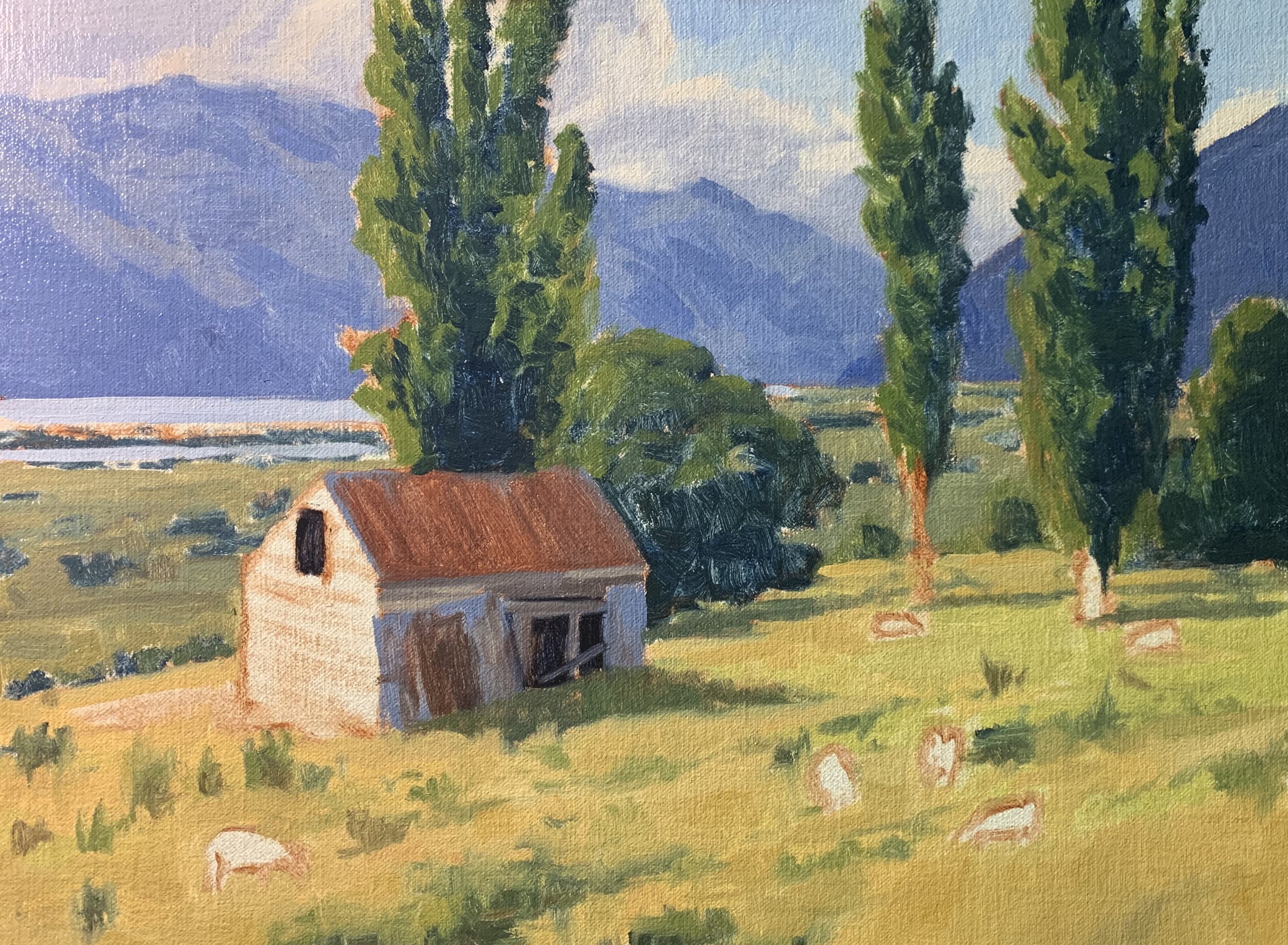
Stage One – Blocking in the Painting
I am painting on a 12” x 16” linen panel. The panel is pre made with a medium weave linen that is oil primed.
I sketch the composition using a No.1 round brush with burnt sienna mixed with Liquin Original (Liquin). I am using Liquin as a medium to thin the paint, it also has the advantage of speeding up the drying time.
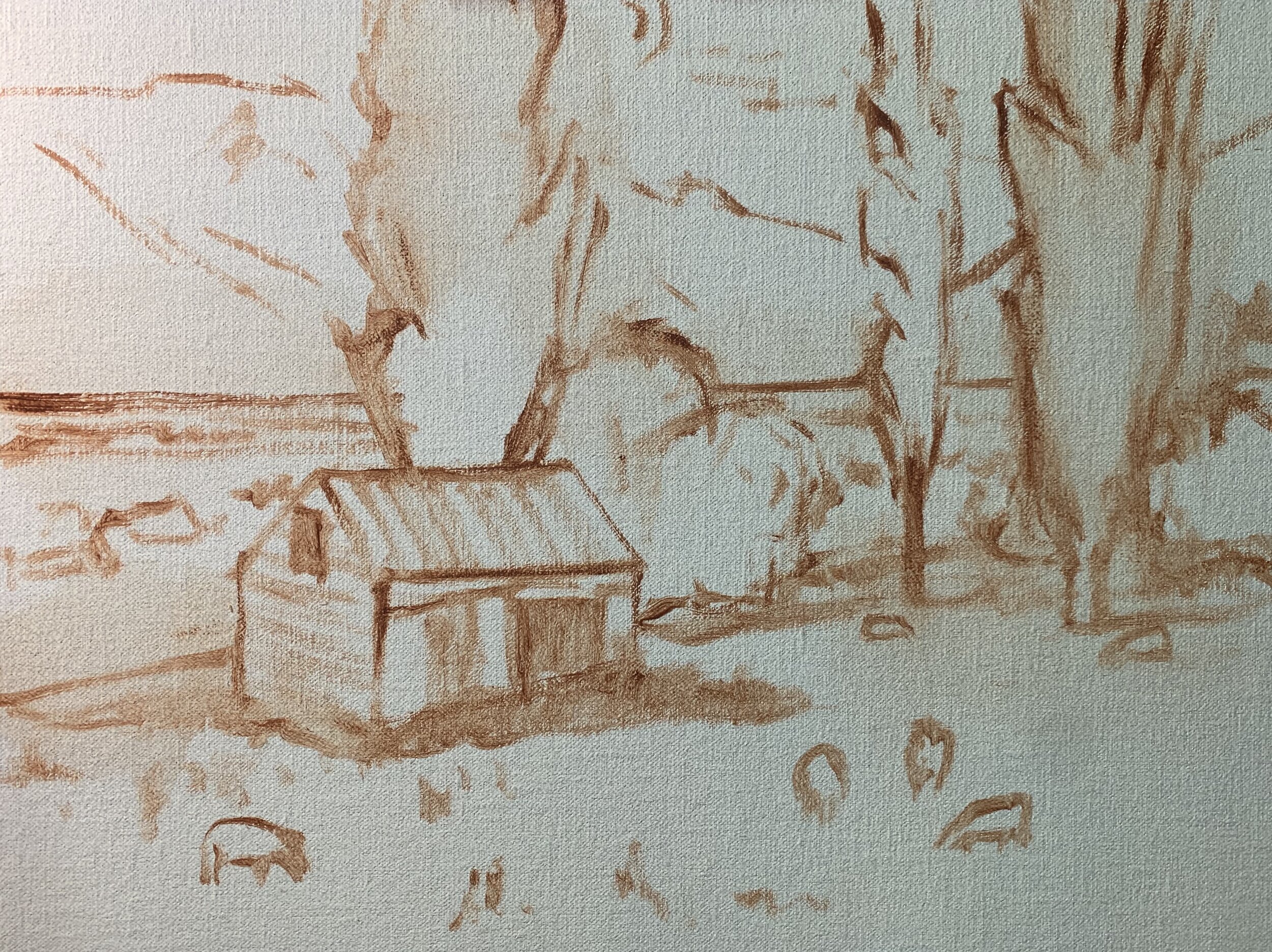
I begin by painting the dark values and shadows first as this will help me to quickly establish a tonal dynamic in the painting. Values are how light or dark a subject is and we will find our darkest values in the foreground of a landscape but as landforms recede into the distance darks are not as dark as the value range narrows.
I paint the clouds with a mix of ultramarine blue, burnt sienna, titanium white and a little quinacridone crimson to give the mix a violet tint.
I use the same colours in the mountains but with much less titanium white to make the value of the colour mix darker. I haven’t mixed the colour thoroughly to allow some of the individual hues to be visible. I have also used the same colour combination for the shadows in the barn but in varying amounts. The barn roof has a lot more burnt sienna in the mix and less ultramarine blue to give the roof a rusty appearance.
The metal walls of the barn have a lot more blue in the mix and are a similar colour to the background mountains. By using the same colours for the clouds, mountains and barn means that I have tied these zones together and so there is more colour harmony in the painting.
The Lombardy poplar trees have the darkest shadows in the painting. Trees are some of the darkest values to be found in the landscape and I have used a simple mix of ultramarine blue and yellow oxide.
I am mainly using No.5 flat brushes.
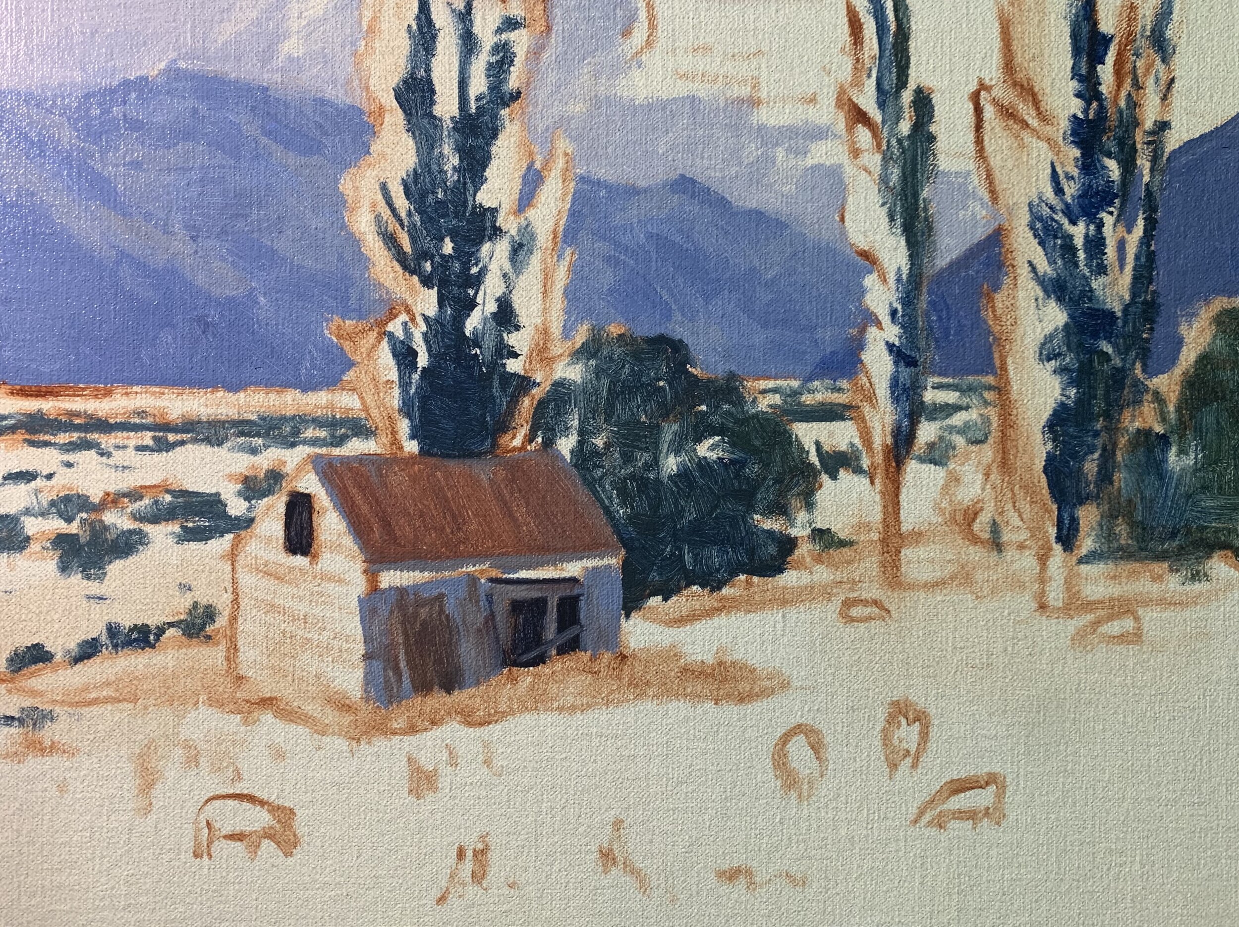
I paint the cloud highlights with a mix of titanium white and burnt sienna. The sky is a mix of Ultramarine blue, titanium white and a little phthalo green.
Overall I am trying to keep my colour mixes simple so I can create cleaner colour and I apply this approach to the mid ground. The mid ground is in shadow and I have used a mix of ultramarine blue, yellow oxide and titanium white in varying amounts to create different textures. I have also rounded off the greens with a little quinacridone crimson.
Moving forward in the painting I begin working on the Lombardy poplar trees in the foreground. I am using a more saturated green and I mix yellow oxide, ultramarine blue to start with and then I increase the saturation by adding some cadmium yellow. I can make the value lighter if I need to by mixing in some titanium white and I also mix in a little cadmium orange to round off the green and make the colour look more organic.
I am keeping the values of the greens in the tree foliage darker at this stage so I have plenty of room to add lighter layers later on in the painting.
Next I start blocking in the grass in the foreground which is a mix of pale green grass and straw coloured grass. The green grass is the same colour mix as the foliage in the Lombardy poplars but with more titanium white in the mix and also a little phthalo green.
The straw coloured grass is a mix of yellow oxide, titanium white and quinacridone crimson. If I need to desaturate the colour I can mix in a little ultramarine blue.
The barn and trees are casting shadows in the grass and it’s very important that we paint these so as to add to the realism of the scene. The grass shadows are a mix of ultramarine blue, yellow oxide, titanium white and quinacridone crimson.
I complete the blocking-in stage by painting the sunlit side of the barn which is a mix of burnt sienna, ultramarine blue, a lot of titanium white and a little yellow oxide. Keep in mind the value of this colour is light.
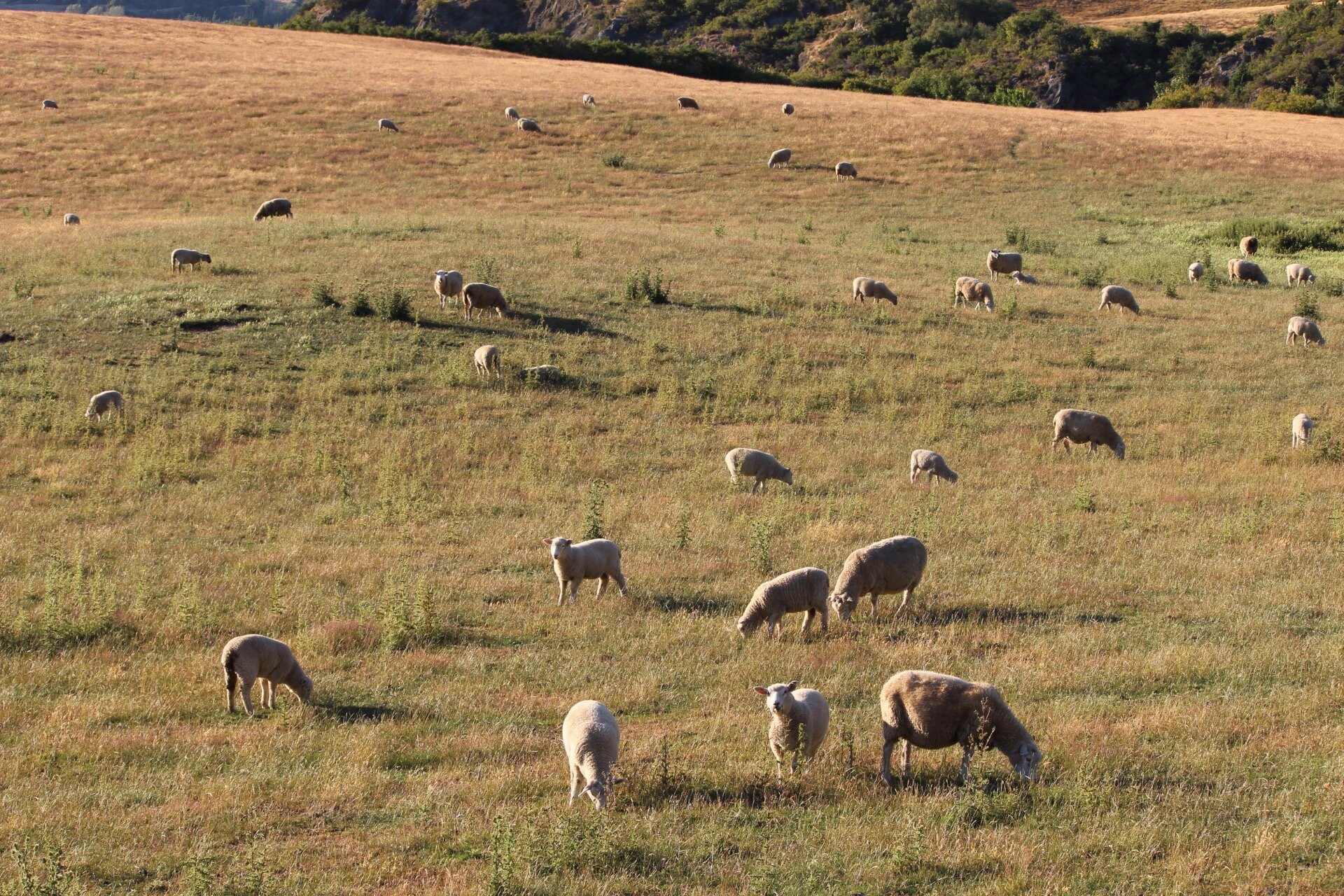
Finally I mark in the basic shapes of the sheep with a mix of ultramarine blue, burnt sienna, quinacridone crimson and titanium white, the same colours I used in the clouds and mountains. For the highlights I used a mix of titanium white with a little burnt sienna.
At this point in the painting I allow it to dry so I can begin adding details to it. During the blocking-in stage I am not at all worried about details as I want the loose brushwork to come through in the painting.
It’s here I want to make sure all of my colours and values are working, then I can move onto the next stage.
Stage Two – Modelling and Adding Details
In this stage of the painting I am adding more details and refining the various zones. I am essentially using the same colours that I used during the blocking-in stage but building up my lighter values to create a three dimensional effect and atmospheric depth in the painting.
I added a few details to the clouds and mountains in the background but not very much. In general I go sparingly with the details so as not to overcomplicate the painting or confuse the eye.
I begin adding details to the barn where I am essentially using the same colours as I did during the blocking-in stage but I am mixing lighter value colours.
I begin modelling the Lombardy poplar trees adjusting the shadows and adding lighter layers of paint to the areas of the tree canopies that are in full sunlight. My green mix is still the same using yellow oxide, ultramarine blue, cadmium yellow but with more titanium white. I also mix in a little cadmium orange and in places phthalo green which increases the saturation.
I add lighter layers to the grass in the foreground and again essentially using the same colours as before. During the modelling stage I am preparing the painting so I can add final details and highlights that will make the painting come alive.

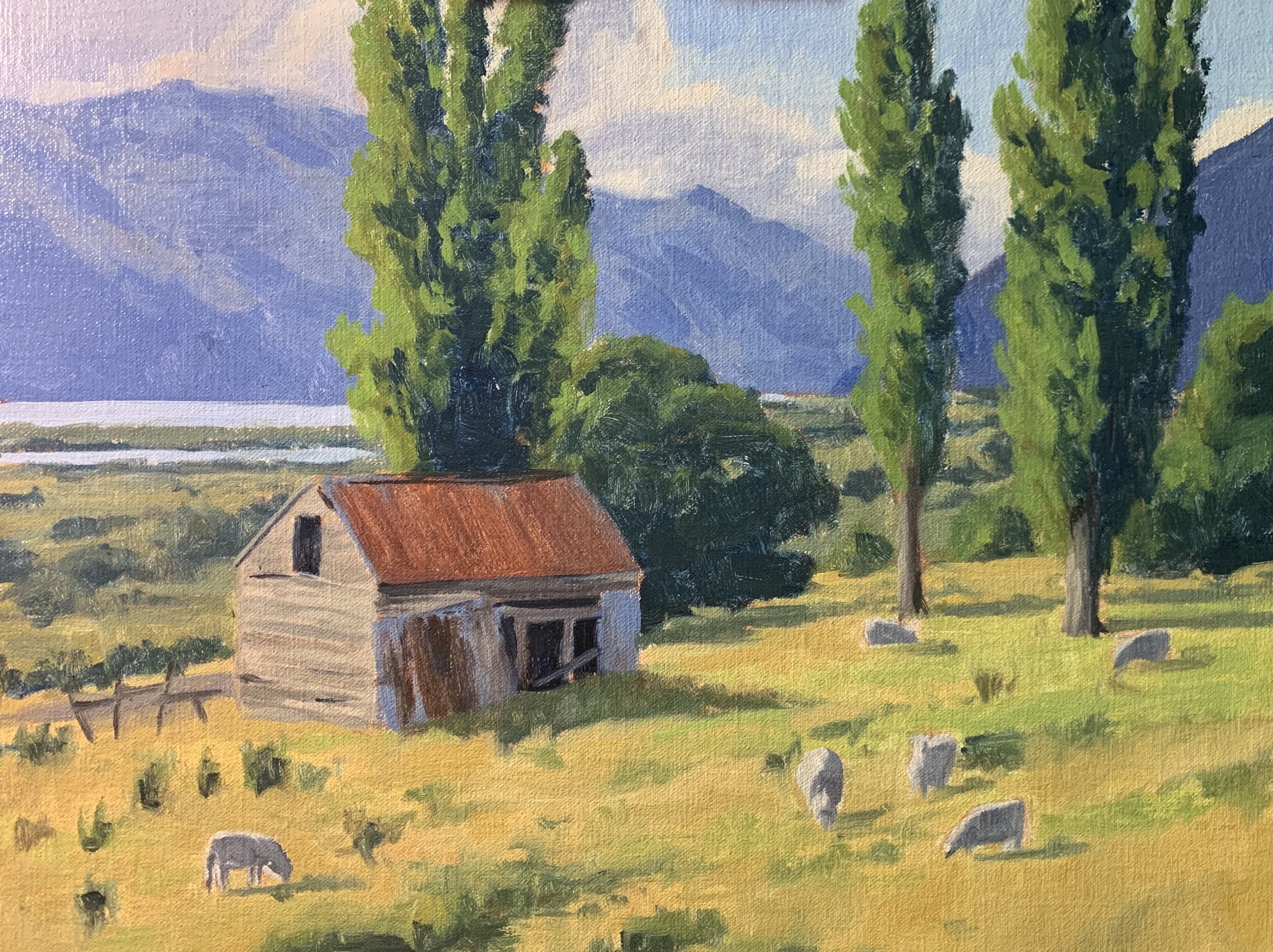
Stage Three – Final Details
I have let my painting dry again and it is here where I add the final details to my art work. This is where I will be using my lightest values as well.
I paint the highlights on the crowns of the Lombardy poplar trees using a mix of titanium white, cadmium yellow and a little phthalo green. I go sparingly with the paint just adding a few highlights here and there.
The stems and branches are a mix of ultramarine blue, burnt sienna and titanium white and I have used these colours for the tree trunks as well. The highlights are a mix of ultramarine blue, burnt sienna, titanium white and a little yellow oxide.
I add highlights to the barn using titanium white mixed with a little yellow oxide and burnt sienna.
Finally I add some details to the sheep, mostly adding highlights which was a mix of titanium white, burnt sienna and a little yellow oxide.
Colours and Values
Throughout the video you will hear me talk about colours and values. It is important to have a basic understanding of colour theory and values when painting as it will make colour mixing easier for you. Luckily it’s easy to learn the basics and the rest is just brush mileage.
Colours Theory Terms
Below are some terms I use throughout the video and their meanings.
Hue: This refers to the main attributes of a colour and is dependent on its dominant wavelength, irrespective of how light or dark the colour is. For example, the colour is discernible as blue or a red etc.
Saturation or Chroma: This refers to the purity or intensity of a colour. You can reduce the saturation of a colour by adding a neutral grey or an opposite colour on the colour wheel.
Value: This is how light or dark a subject is. Getting your values correct is one of the keys in the success of a painting.
Tone: This is a broad term for describing a colour that is not a pure hue or black or white. It is a widely misunderstood term.
The Colour Wheel
For the benefit of people who are new to painting that are watching this video I will briefly go over the basics of the colour wheel. Knowing how the colour wheel this works can really help you with colour mixing.

Above is a simplified colour wheel. The colour wheel contains three primary colour blue, red and yellow and three secondary colours orange, green and violet.
When these colours are arranged on the colour wheel a primary colour is always opposite a secondary colour and are known as compliments or complimentary opposites. So, blue is opposite to orange, red is opposite to green and yellow is opposite to violet.
So why is this important?
If you want to desaturate a colour you can do this by mixing its complimentary opposite as the two colours will cancel each other out. In this manner you can create some neutral greys and browns especially when combined with white.
Complimentary colours also look good next to each other in a painting, for example greens often look more harmonious in a landscape if there are some reds amongst the mix or colours that contain red. If you look closely in nature, you’ll see naturally occurring complimentary opposites everywhere.
The Value Scale
Value is how light or dark a colour is and is perhaps one of the most important concepts in painting. The success of a painting rests on the relationship between the values in the painting. If they are not working and not in harmony, then the whole painting can lack any kind of depth.

Values in art work are represented on a scale with the highest value being white and the lowest value being black. The greys in between are known as mid or half tones.
In general, you will find your darkest darks and lightest lights in the foreground of a landscape. However, as landforms recede into the distance darks are not quite dark and lights are not quite light as the tonal scale narrows.
If you are unsure of where your light and dark values are in the scene you are painting, switch your reference photo to black and white and you’ll be able to clearly see where your light and dark values are.
In general, you’ll find that the sky is often one of the lightest values in the landscape. Grass is also generally lighter in value. Rocks and mountain faces are darker in value and often occupy the mid-tone range of the value scale. Trees are generally some of the darkest values in the landscape.

New Painting Video Every Month on Patreon
Subscribe to my Patreon channel and get instant access to all of my painting videos and get a new video every month for just $5 per month.
More Painting Tutorial Videos Available
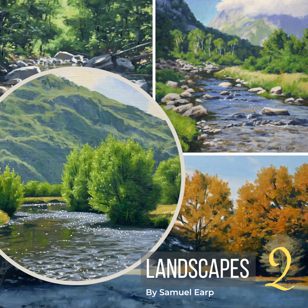
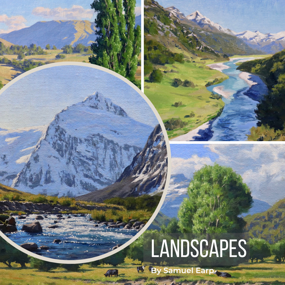
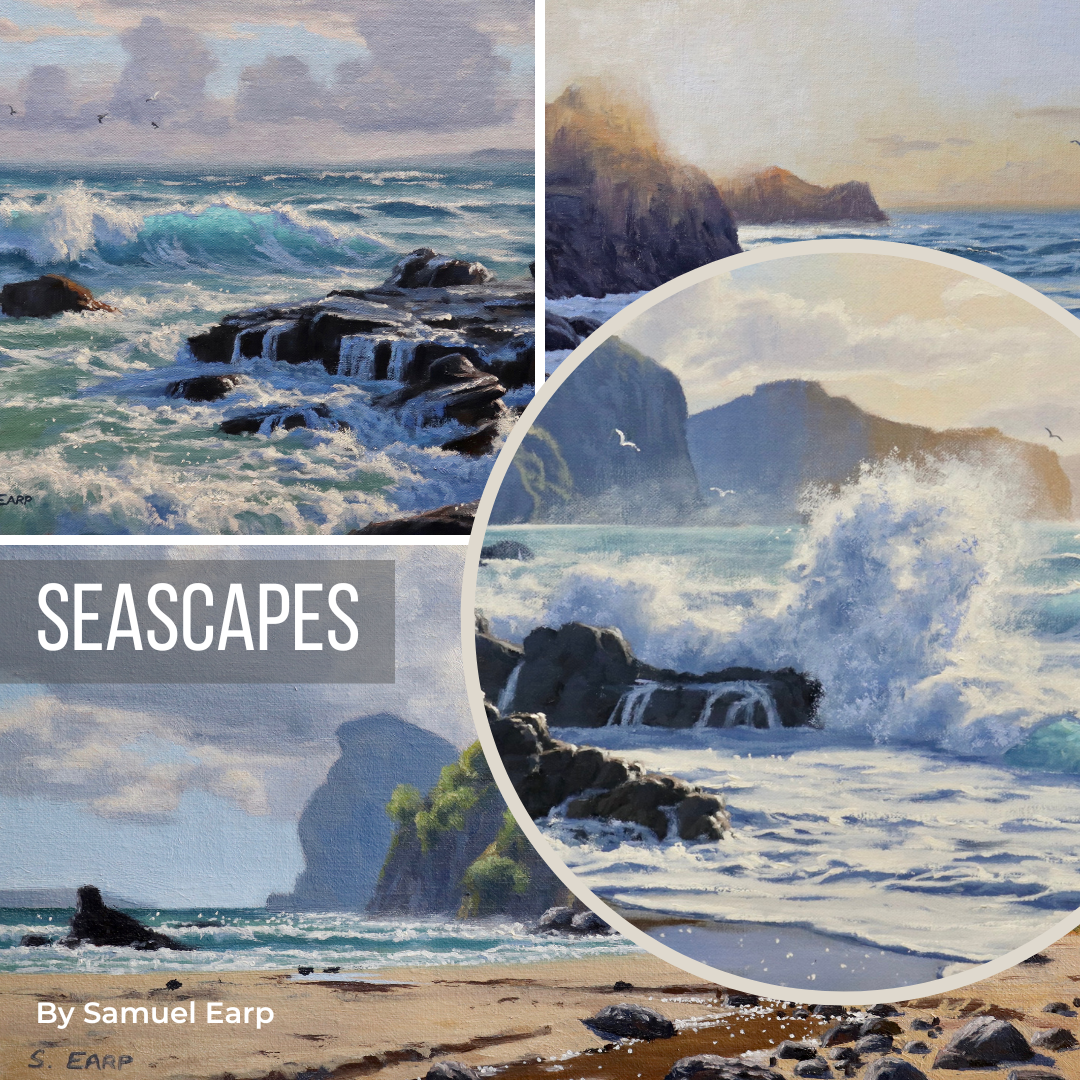
Check Out My Latest Painting Blog Articles
Featured