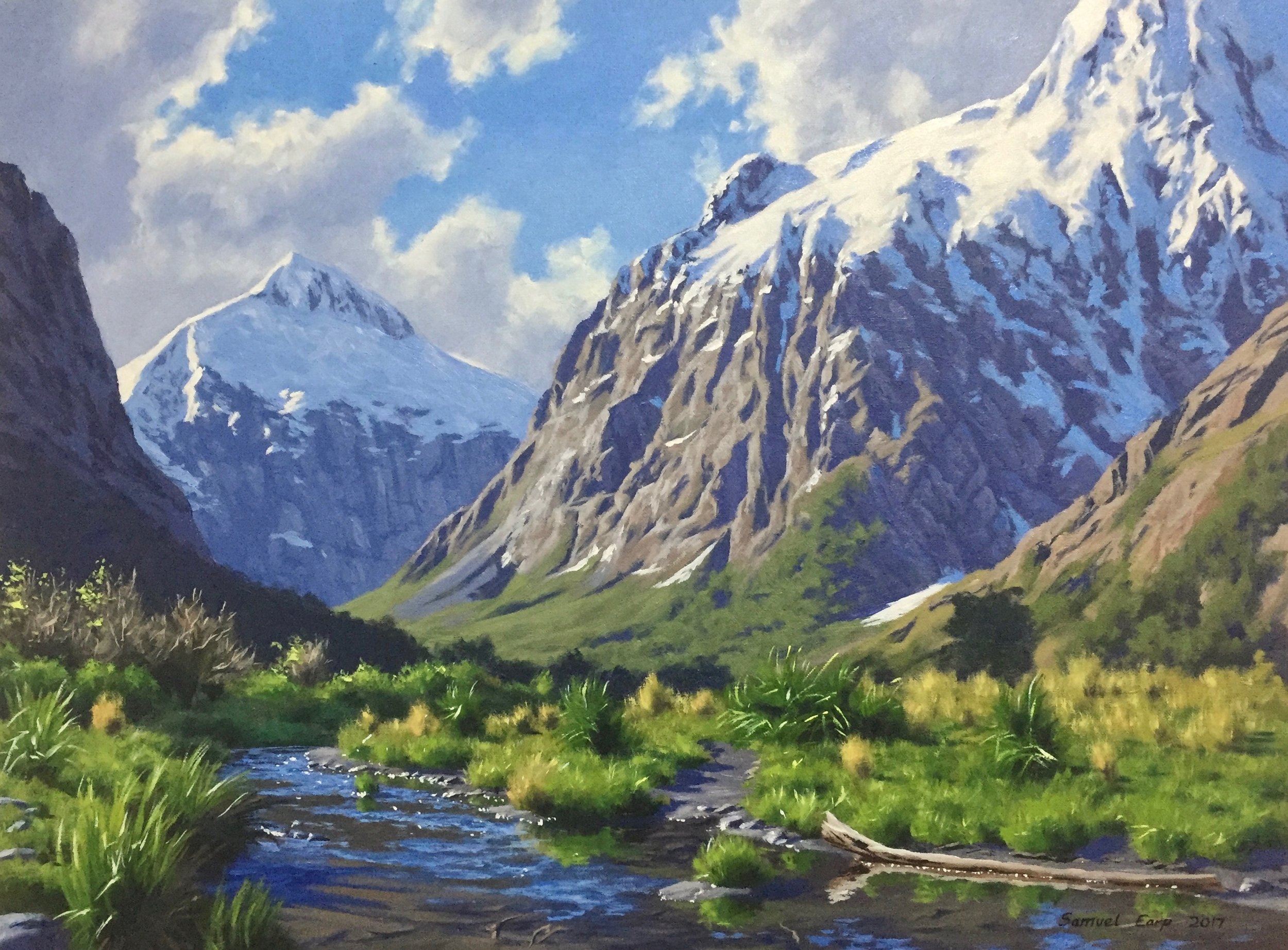
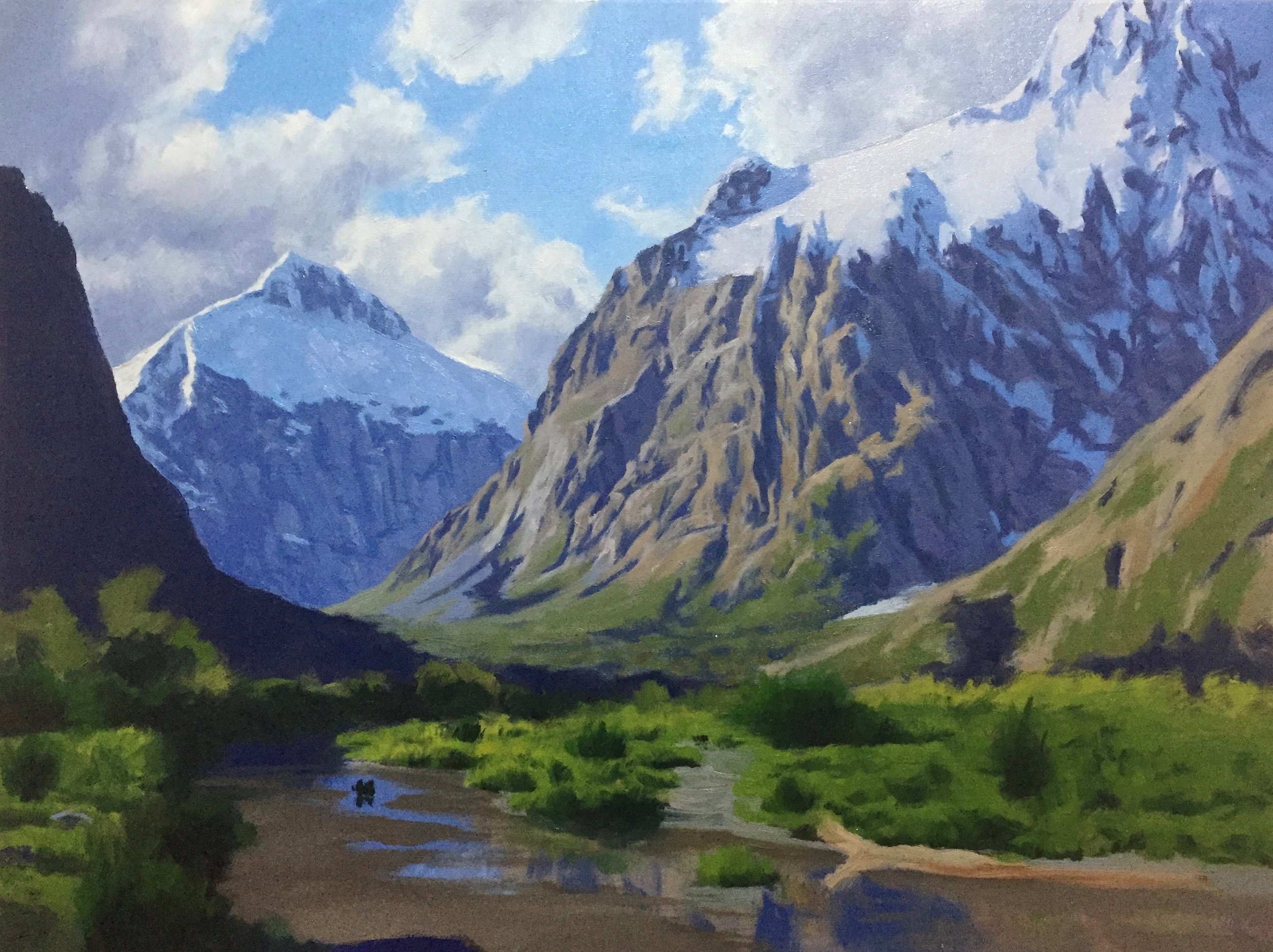
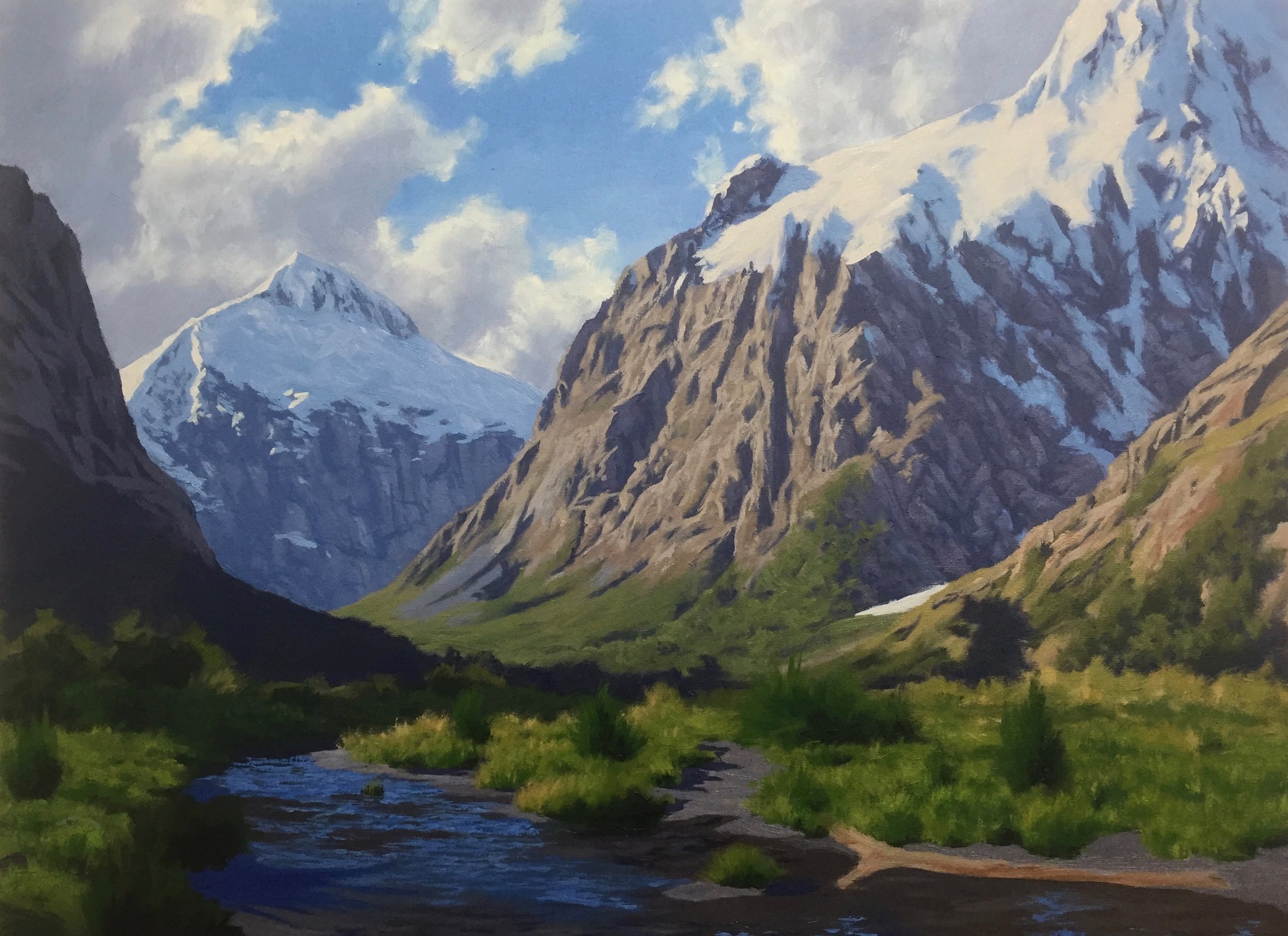
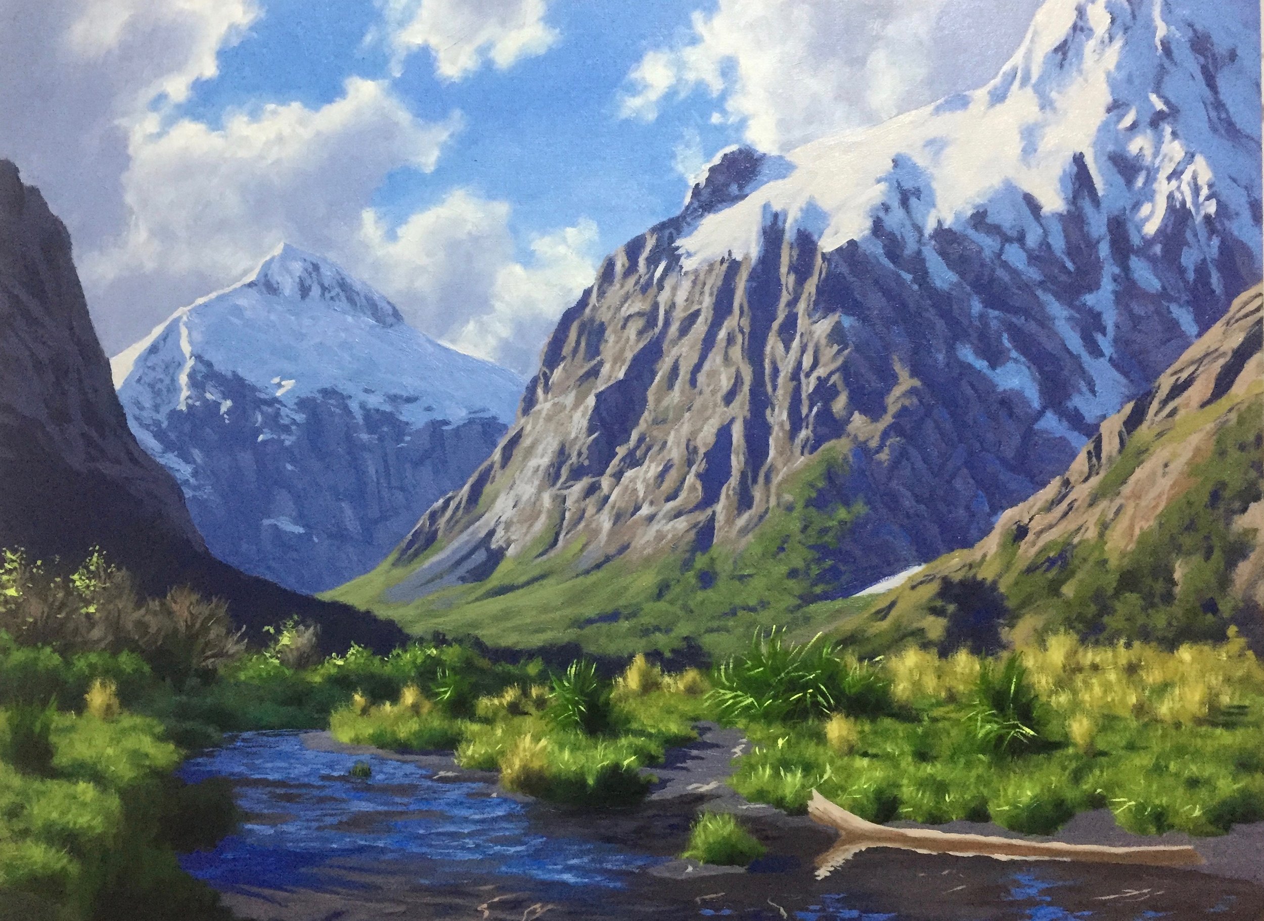
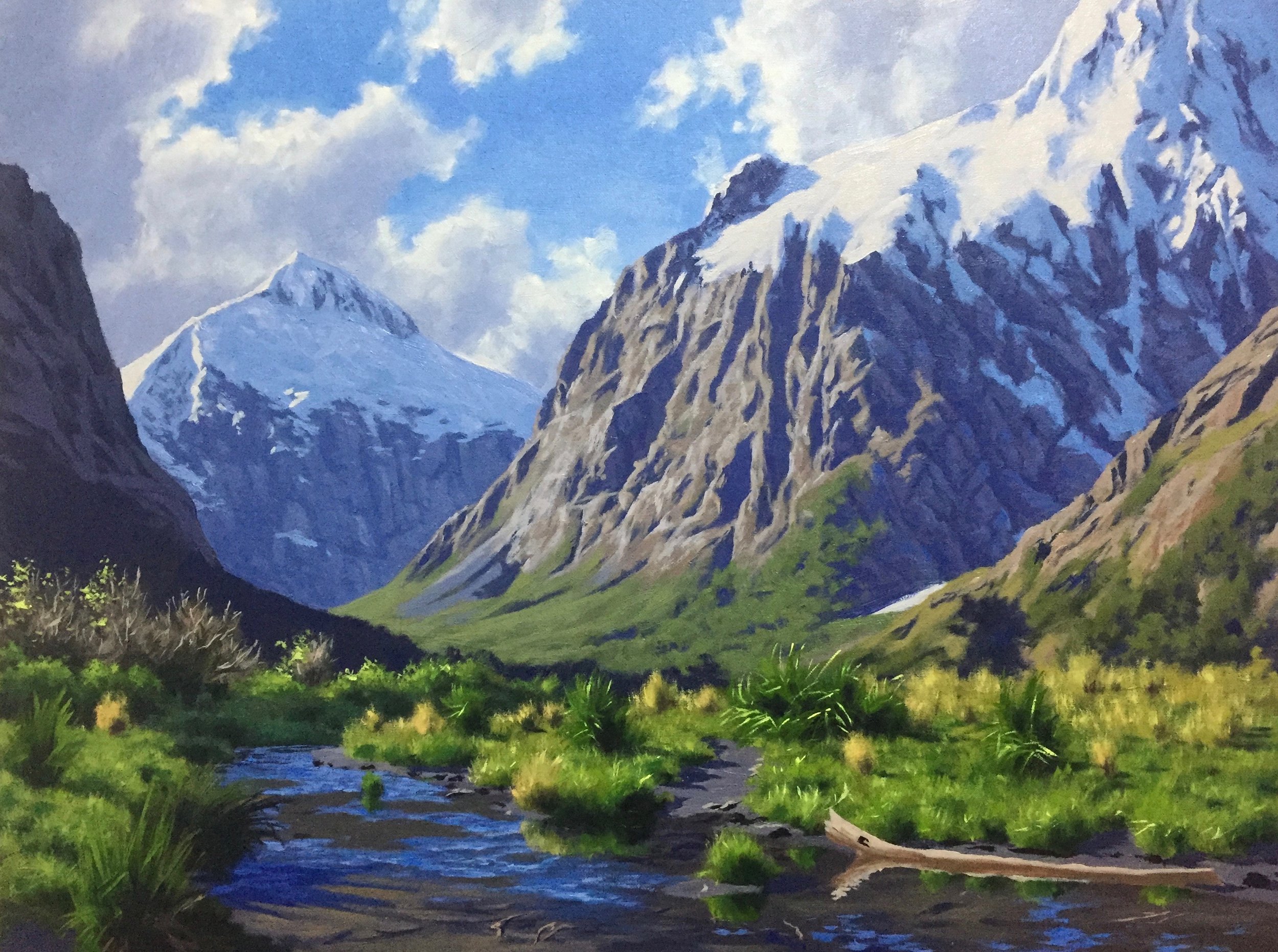
I love painting mountains, and one of the great things about living in New Zealand is plenty of them to paint! One of my favourite mountains to paint in New Zealand are Mt Talbot and Mt Crosscut, located in the Fiordland region of the south island.
In this step-by-step mountain painting tutorial, I will show you how to paint a serene mountain valley. Suitable for oils and acrylics.
Planning the Composition
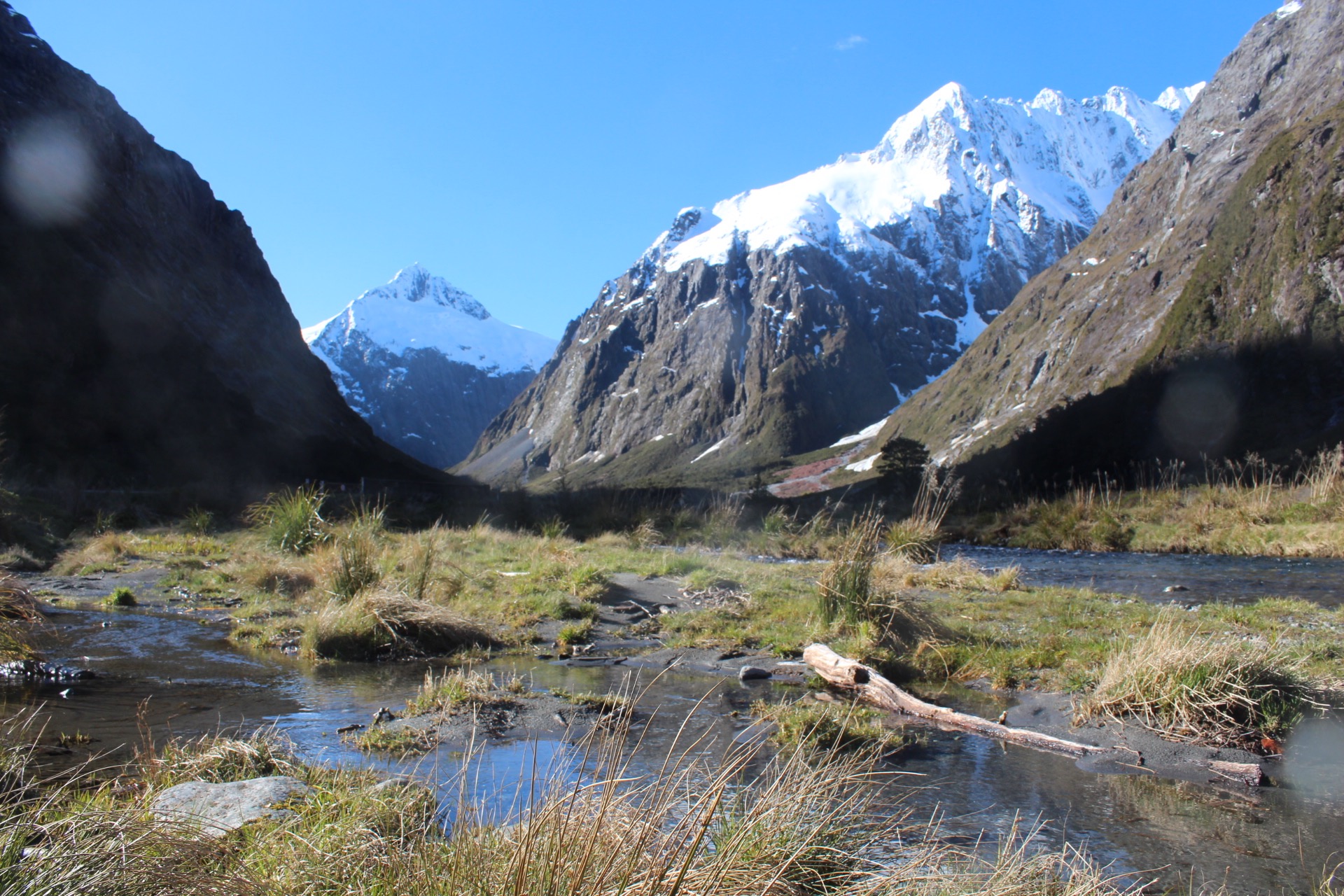
To begin with, I gather my photo reference and decide which photos I will use to plan my composition. Getting a perfect composition from an image is challenging, so it is necessary to start changing the design to create a delicate artwork that will engage the viewer.
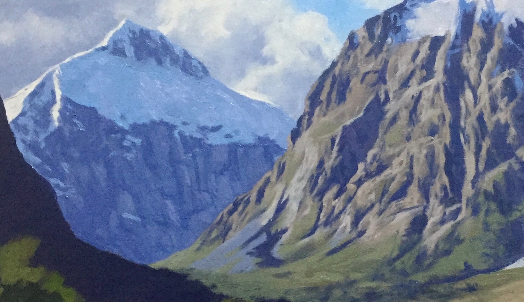
This is one of my photos of Mt Talbot in the distance and Mt Crosscut on the right. The great thing about this location is it already naturally forms a pretty good composition, so when I came to sketching it and creating a composition, I didn’t need to move or alter too many things.
What I like about this photo is that many shadows are perfect for depicting a tonal dynamic in the painting. There are definite tiers of depth for creating atmospheric perspective. This photo has plenty of atmosphere and drama, which is excellent for making an artwork.
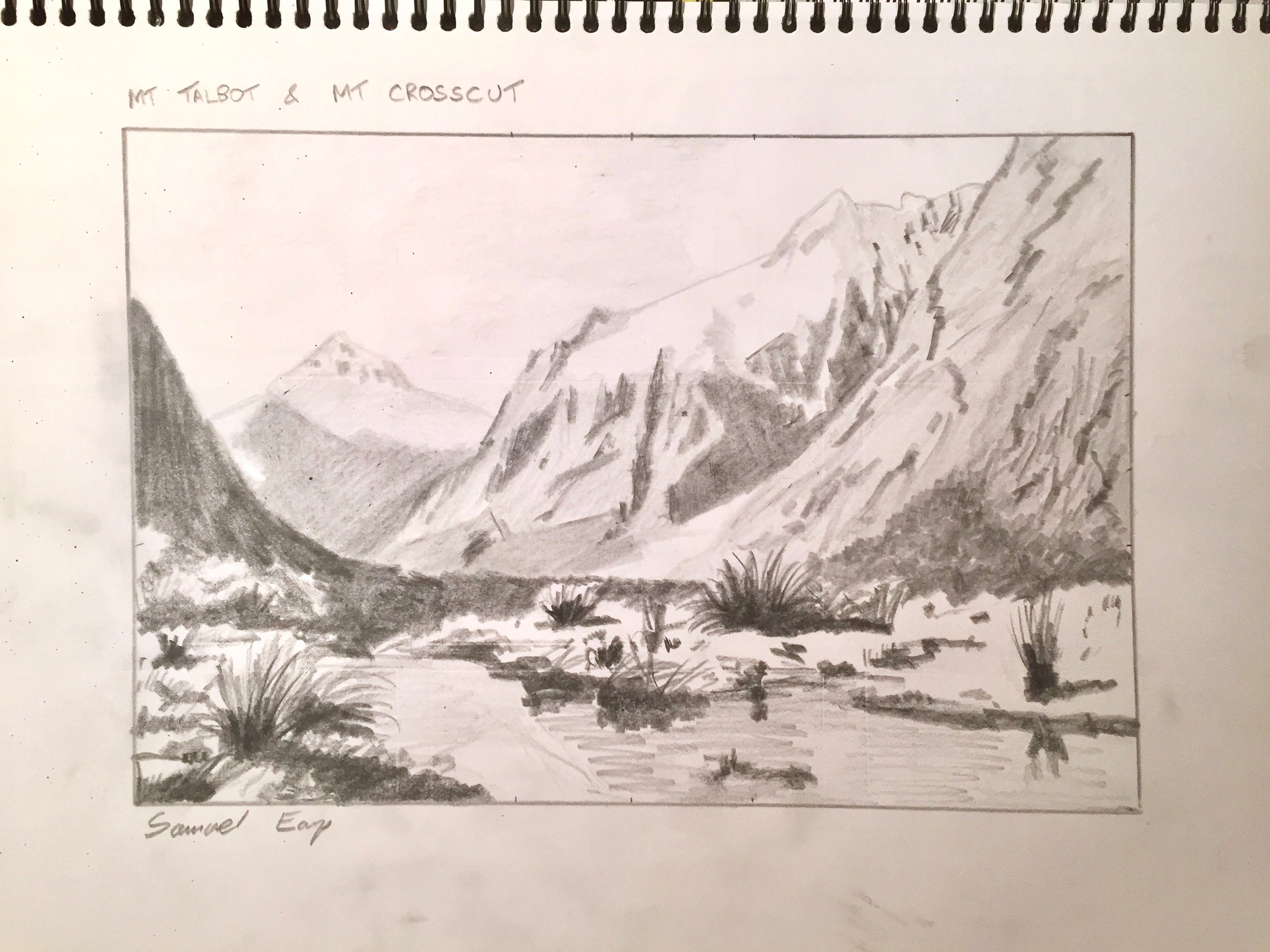
Pencil Sketch
After gathering my photo reference, I sit down with my sketchbook and draw a few quick thumbnail sketches to get an idea for a composition. This will culminate in a final pencil drawing, which I will refer to when I start the colour study.
Sketching is an essential part of the painting process as it helps if you have an idea of where you are going and what the final product will look like. Sketching is not only good fun and practice.
Still, it could save you many hours of frustration in the studio due to a painting not working because your composition did not go to plan. This happened to me a lot in the early days when I just went straight into painting with no prior planning, it was very frustrating, and I have a mountain of failed artworks as a result!
I have Mt Talbot as my focal point in my final sketch, with the small stream leading the eye towards it. I use my pencil sketches to get an idea of the tonality of the scene, and I achieve this by using a range of pencils, including 4H, 2H, HB, 2B and 4B.
Colour Study
After completing my pencil sketches, I work on a colour study, which is a small painting, a miniature version of the final artwork. Painting colour studies are awesome fun; you can quickly correct mistakes. They also make great little paintings which you can sell.
The most important thing about colour studies is that you can use it to determine the colour palette you will use and establish the over tonality and atmosphere of the painting. A colour study will help you to know the road ahead, and they are great to refer to as you are painting your final canvas piece, as you can match the colours.
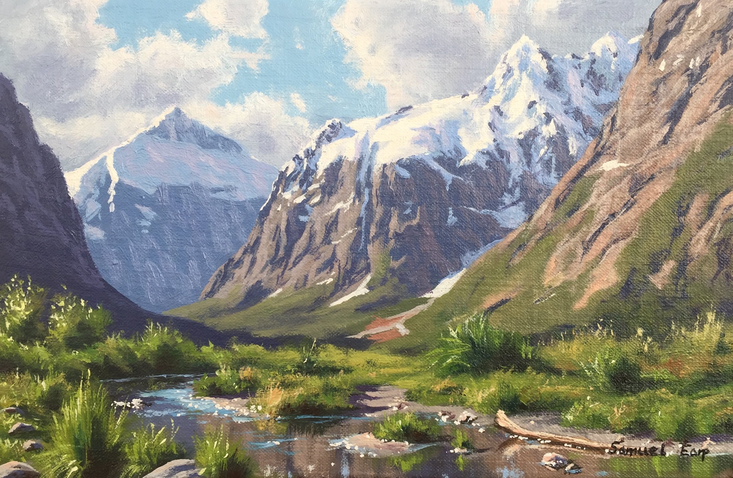
My Colour Pallete
I painted this artwork using oil paint and the colours I used in this painting are as follows:
- Titanium white
- Cadmium yellow
- Cadmium yellow deep
- Yellow oxide
- Burnt sienna
- Burnt umber
- Cadmium red light
- Quinacridone magenta
- Ultramarine blue
- Cobalt blue
- Cobalt teal
- Pthalo green

Starting the Painting
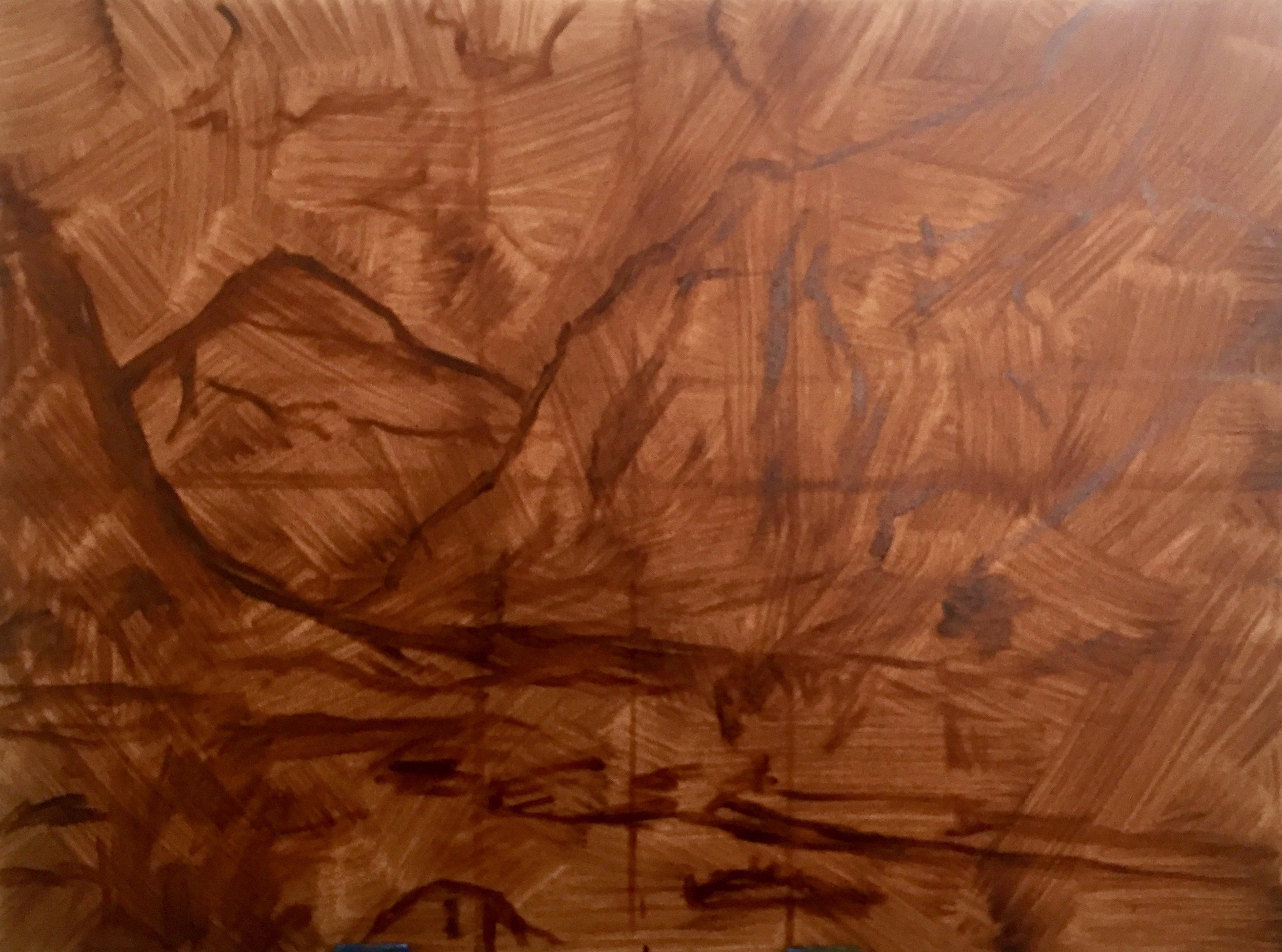
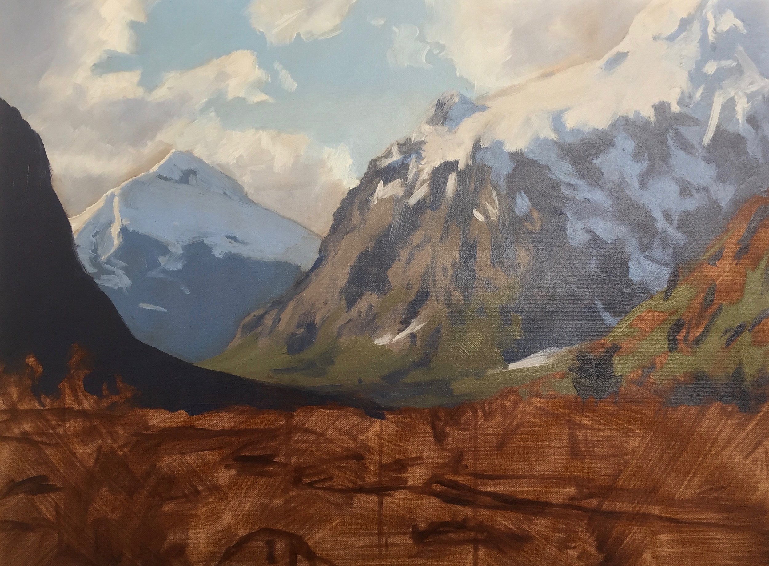
I start my artwork with an underpainting of burnt umber; this gives vibrancy and warmth to the painting as it comes through the paint layers. It also helps establish tone and colour as the white canvas does not distort them. An underpainting of burnt sienna or burnt umber gives the painting a traditional look.
Once the underpainting is dry, I sketch the scene with burnt umber.
Blocking-In
When blocking in the painting, I start by painting the sky, as this helps me gauge the overall tonality. I’m not worried about detail when blocking the painting; for me, it serves as a map that marks out the zones I will work in once the painting is dry.
I mix the sky’s blue with cobalt blue, cobalt teal and titanium white. I combine the clouds with ultramarine blue, burnt umber, which reduces the saturation of the blue, and I add quinacridone magenta to give the clouds a violet tint. I increase the tone of the cloud by adding titanium white.
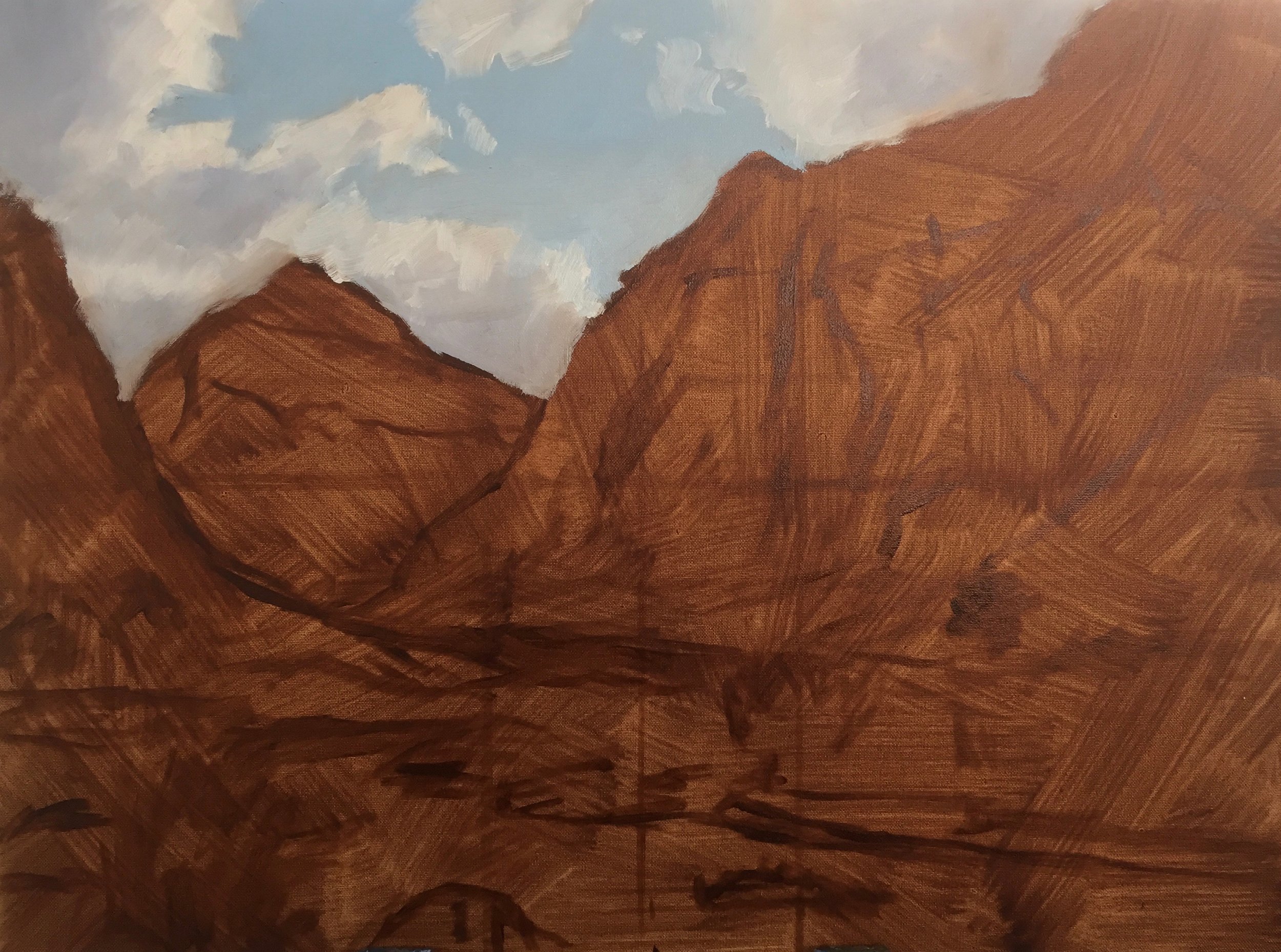
Painting the Background
Next, I start painting Mount Talbot; I am using sizeable flat bristle brushes and the same colour combination that I used in the clouds but with less titanium white. Using these same colours helps to create colour harmony in the painting.
I drop the tone of the shadows of Mount Crosscut, which will bring it forward in the painting and help to create tiers of depth. This is where I am using a darker blue in the mountain shadows.
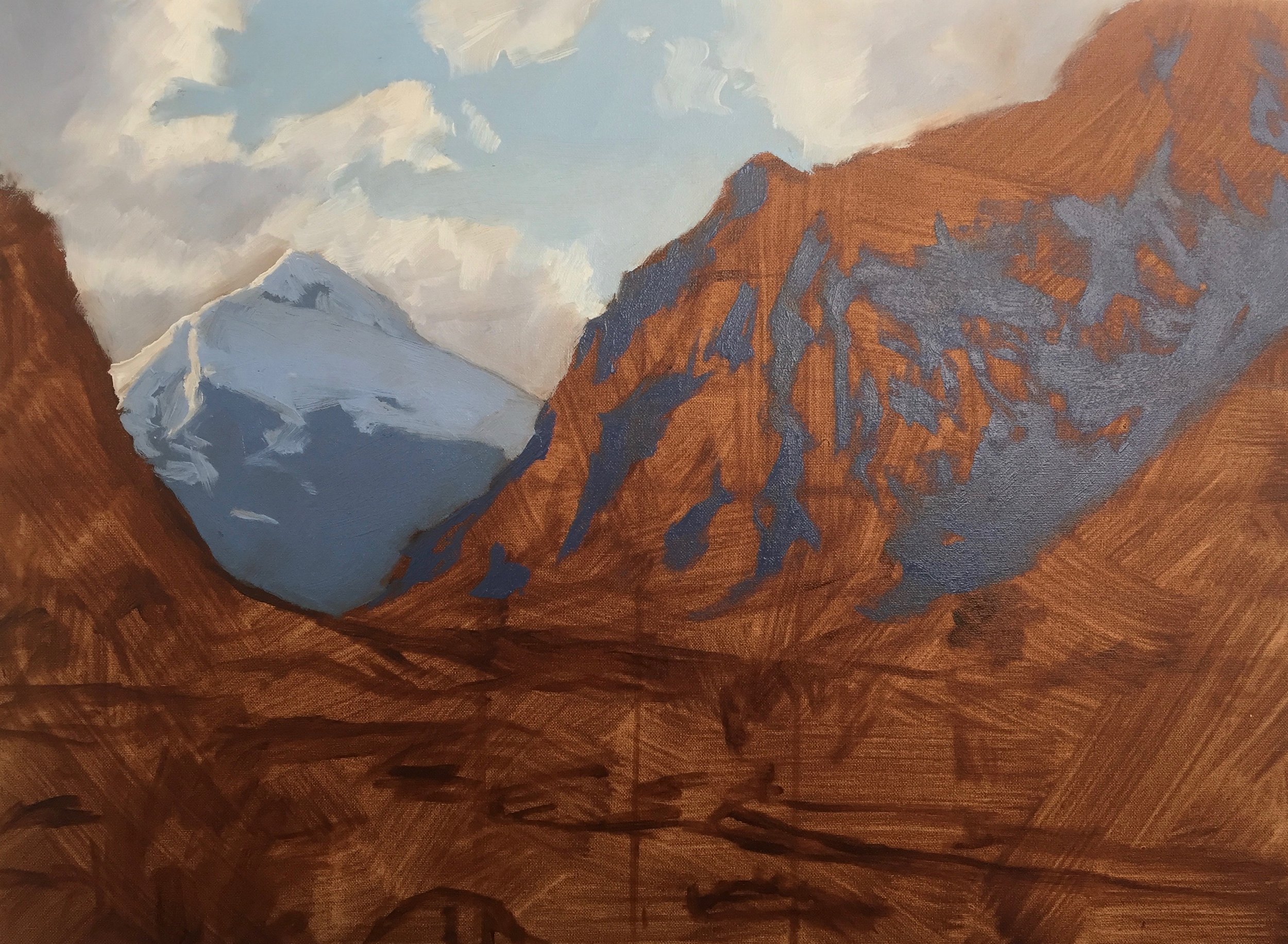


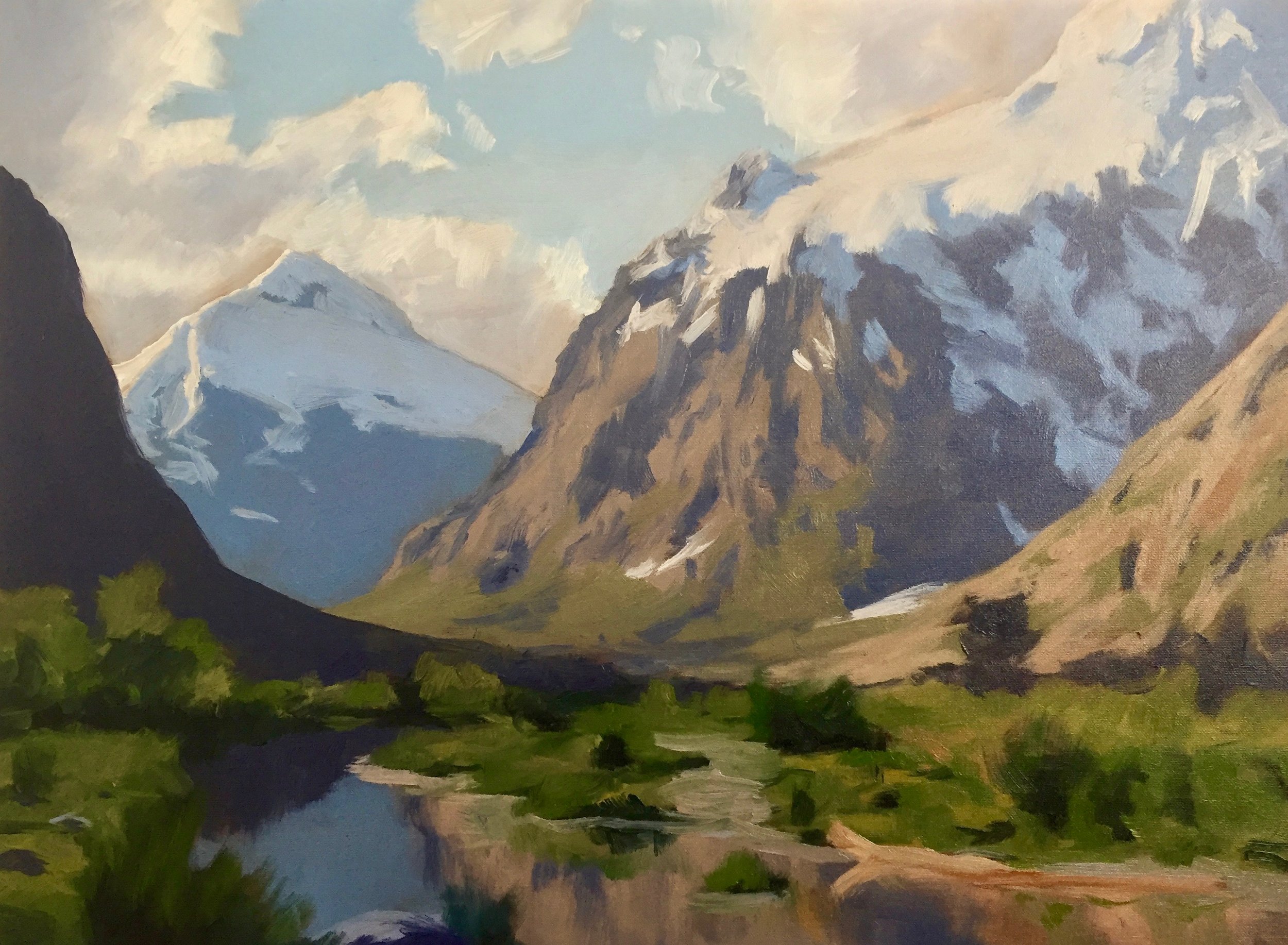
Painting the Mid-Ground
I started adding in the highlights of the mountain face of Mt Crosscut, and again, I am using the same colour combination I used in the clouds but with more burnt umber and titanium white.
I am not at this stage using pure titanium white for the sunlit areas of the snow on the mountains, as this is my lightest tone. Whilst it appears white in the photo, most areas are darker and not white. I was to preserve my lightest tones until the end of the painting, so I mixed the sunlit areas of the snow with the same colours I used in the clouds and plenty of titanium white to make an off-white.
The snow in shadow was mixed using ultramarine blue, cobalt blue, a little burnt umber and titanium white.
Balancing the greens
When mixing colour for the distant grass and foliage, I must remember that green does not travel well over a long distance, so I must mix some desaturated hues. This is achieved by combining yellow oxide, ultramarine blue, titanium white and a little burnt sienna to earth the colour.
It is crucial to make sure that the green is balanced; otherwise, it will come too far forward in the painting, and the illusion of depth will be recovered.
I painted the shadow of the mountainside of the land mass on the left side. As it is closer to the viewer, I use a darker tone as my tonal scale of lights and darks increases as you approach the foreground. Again I used the same colour combination as I used in the clouds.
Painting the Foreground
As I work on the lower half of the painting, I paint the reflections in the water using the same colours and tones I used in the mountains in which the water is reflecting.
I block in the grass, foliage and trees in the foreground, using more saturated green. I mix these greens using cadmium yellow, deep, and ultramarine blue. I increase the saturation by adding a little pthalo green, which really kicks up the mix. I earth these greens by adding either quinacridone magenta or burnt sienna.
I use similar colours for mixing the shadows in the foliage. The red in the quinacridone magenta and burnt sienna is the opposite of green on the colour wheel, neutralising the mixture to create a dark tone and even a near black.
With the blocking in stage complete, I wait for the painting to dry before beginning the modelling phase, which builds up the detail of the painting.

Modelling
So now that I have allowed the painting to dry, I start working on the detail. I start back with the sky and begin defining the clouds. I use ultramarine blue, burnt umber to reduce the saturation, quinacridone magenta to give the clouds a violet tint and titanium white to increase the tone. I use a flat bristle brush and a dagger brush to define the shapes of the clouds.
The highlights of the clouds are white, but not a pure brilliant white; instead, I have dropped the tone by mixing the white with a small quantity of ultramarine blue, burnt umber and quinacridone magenta.
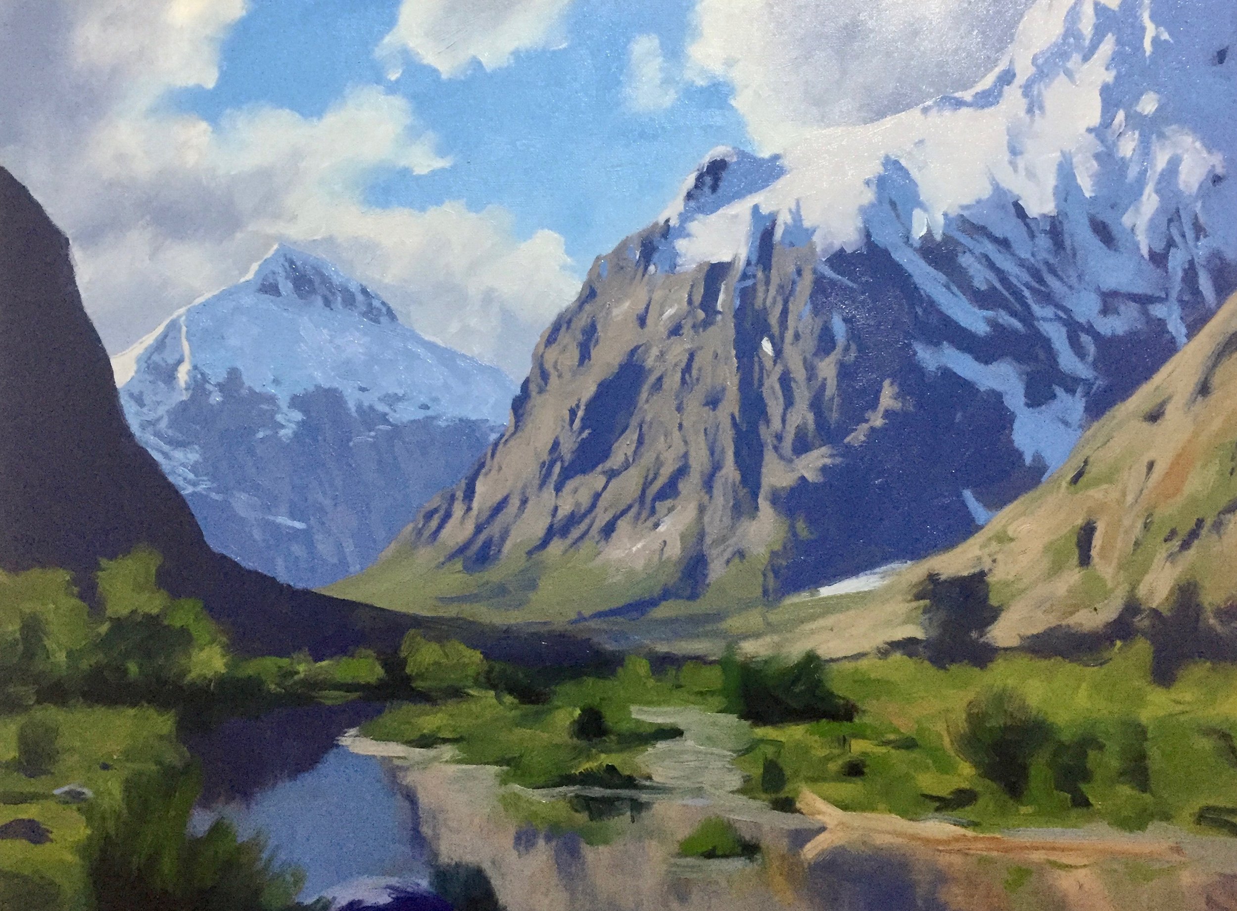
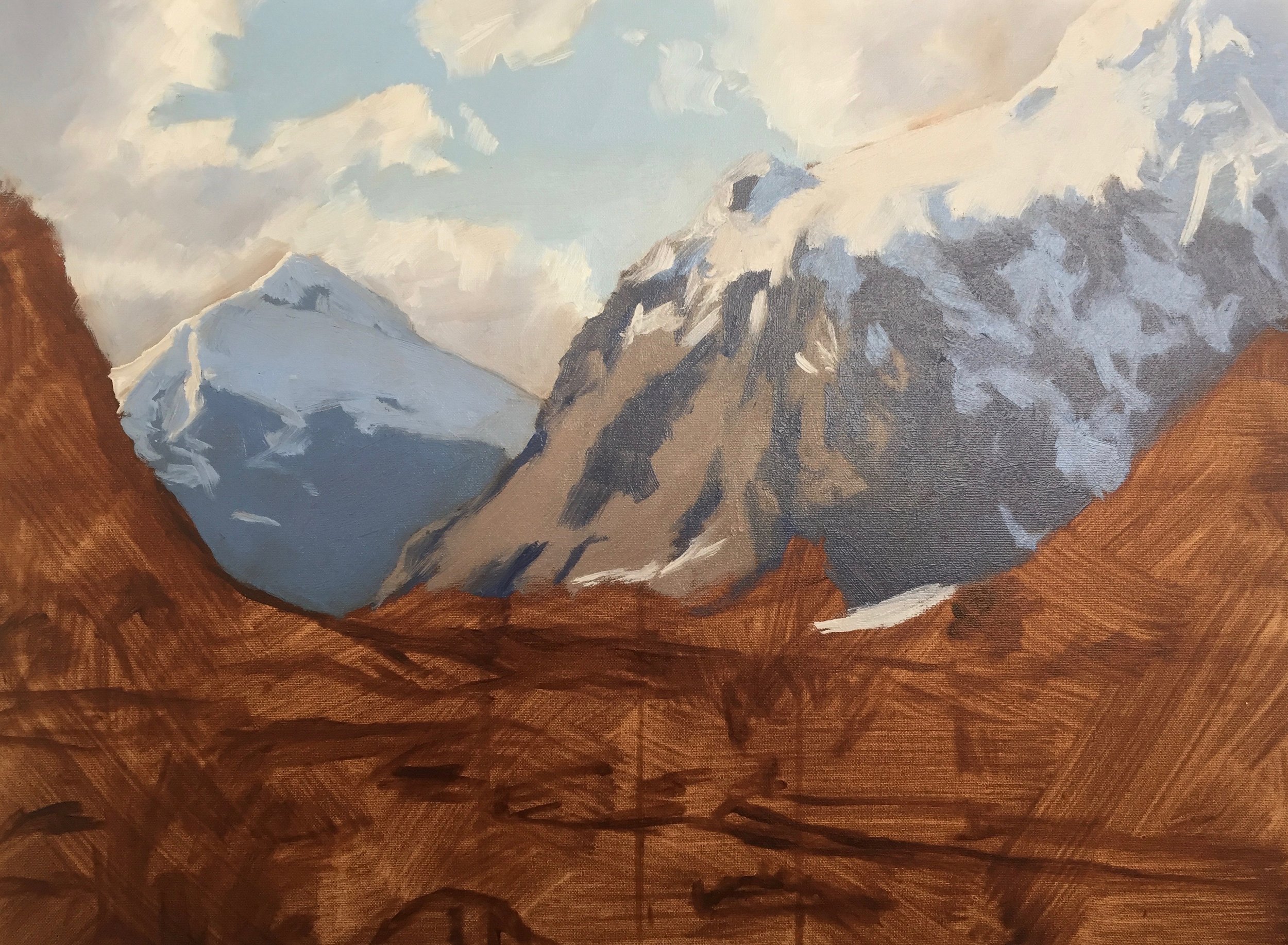
Suggesting Details
Next, I begin working on the highlighted mountain face of Mount Crosscut and Mount Talbot in the distance. I stay moderate with these distant landforms, as too much detail would confuse the eye and could disrupt the composition. Often the suggestion of detail is much better as the human brain fills in the rest of the gaps.
Painting Reflected Light in the Snow
I paint the reflected light in Mount Talbot using ultramarine blue, burnt umber, quinacridone magenta, and titanium white, making the tone slightly lighter than the rest of the mountain shadow. My darks are not dark here at this distance, which in a painting will give the illusion of distance.
I painted the highlights on Mount Crosscut again using the same colours ultramarine blue, burnt umber, quinacridone magenta and titanium white, but using more burnt umber in the mix.
Painting Snow Shadows
As I build up the detail of the snow on top of Mt Crosscut, I am again mindful to have it bright enough at this stage to add further highlights later on in the painting.
I paint the snow’s shadows using ultramarine blue, cobalt blue and titanium white. I added a little quinacridone magenta in some areas to give the appearance of reflected light. If the colour is too saturated, I knock it back with a little burnt umber.
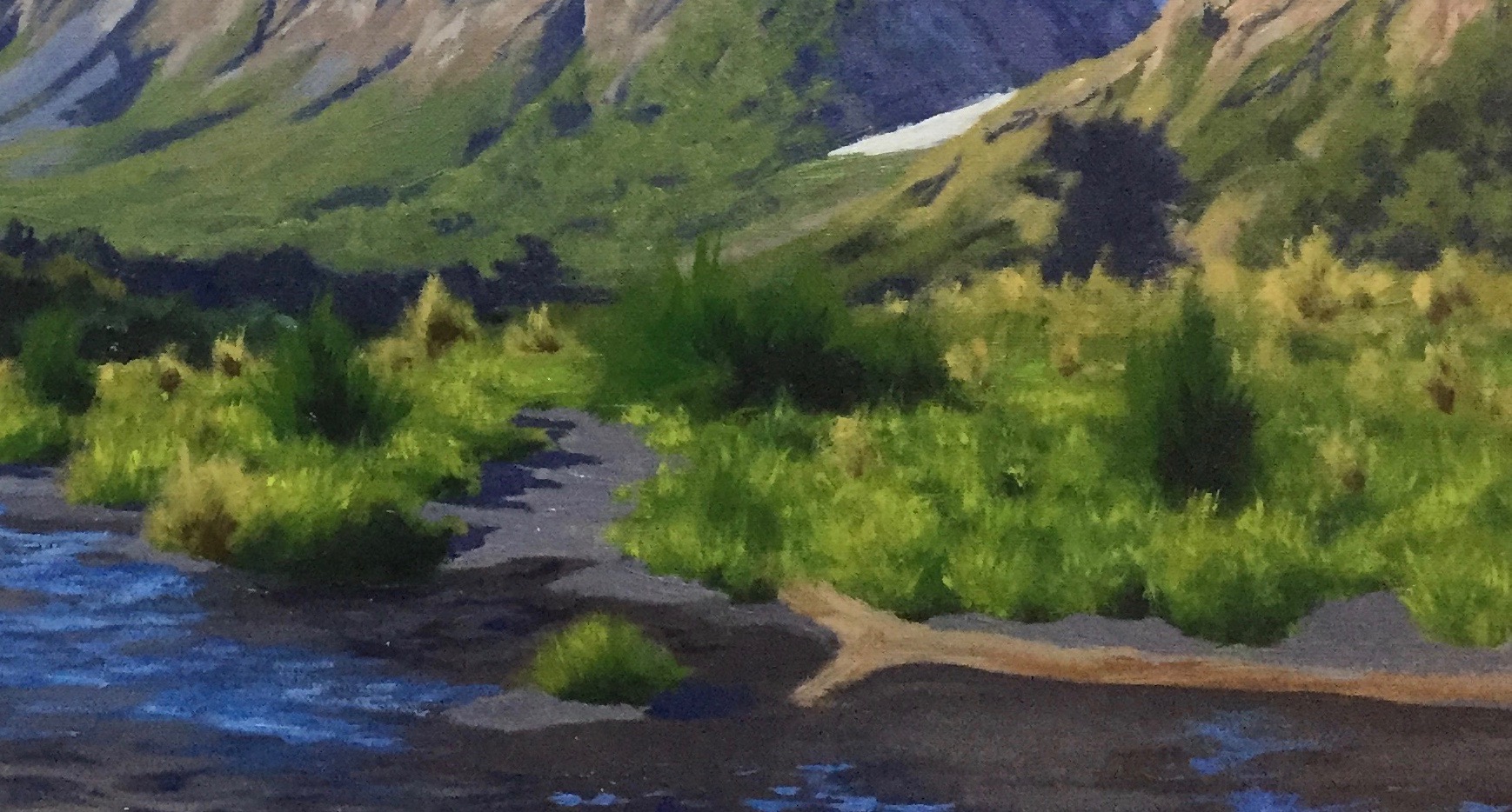
At this stage, I start building up the detail of the foreground, including the grass and foliage, as well as the water. I also work on the painting’s mountain face on the right, which is in full sunlight. Here I increase the saturation of my colour but not too much that it comes too far forward in the painting.

Legal Bundles For Your Website
Legal bundles to help bloggers, freelancers, coaches and entrepreneurs protect their online businesses. Legal bundles range from the basic starter bundle including, privacy policy, disclaimer and terms and conditions to the full VIP bundle. These legal bundles are customisable templates that are easy to use, allowing you to be legally protected within minutes.
Painting the Grass and Foliage
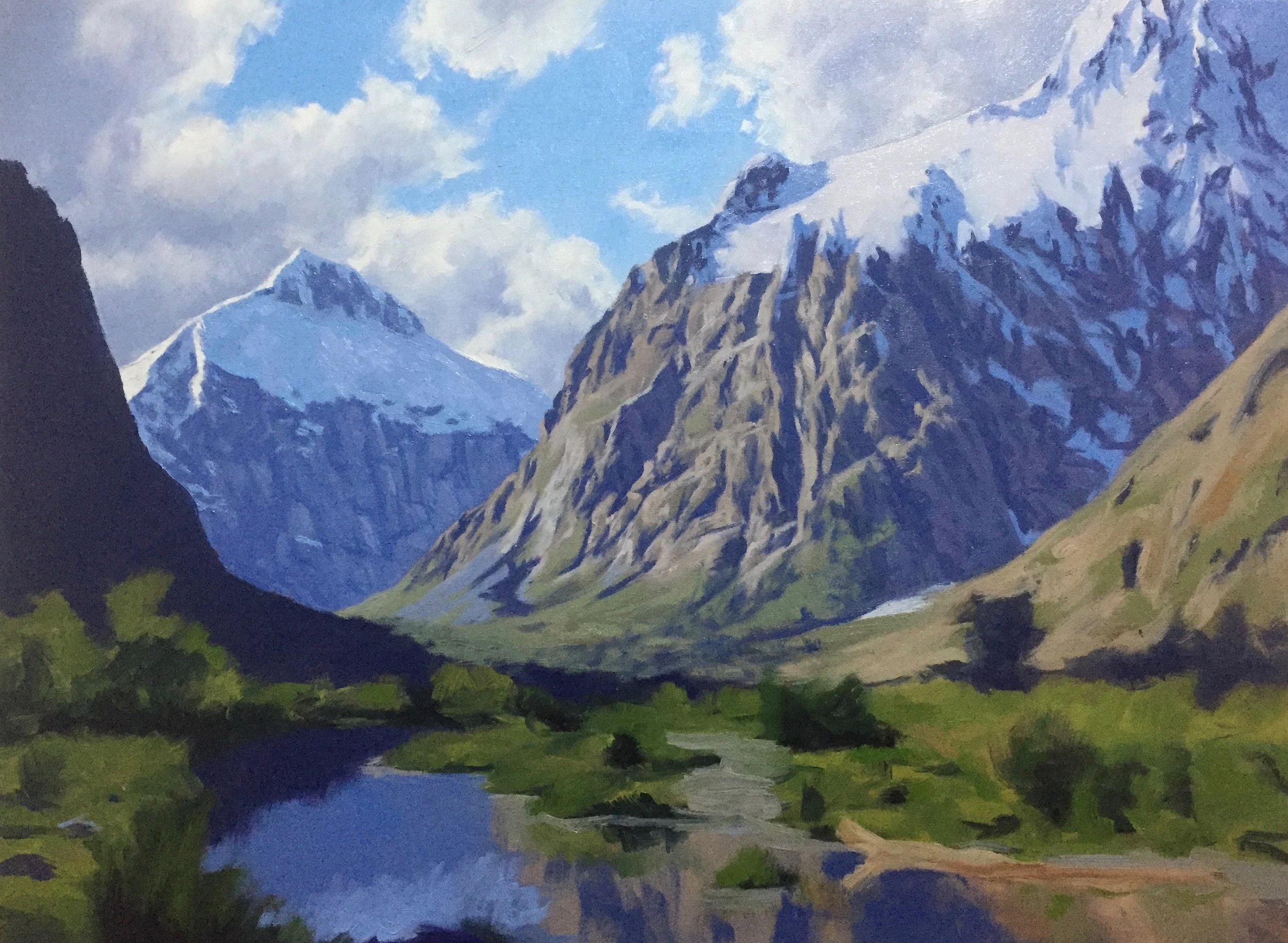
At this stage of the painting, it is well underway; I refine areas of detail such as the shadows in the distance trees and the rock structure on the side of the mountain. I use a variety of smaller brushes but still use mainly flat brushes and dagger brushes.
I focus more on the foreground and begin painting the ripples on the water, considering they reflect the sky. So, I am using plenty of cobalt blue, ultramarine blue and cobalt teal.
I add more highlights and detail to the grass and foliage in the foreground using ultramarine blue, cadmium yellow deep, pthalo green and titanium white. I add either burnt sienna to the mixture or quinacridone magenta to earth the green and make it look more organic.
Adding quinacridone magenta will also reduce the saturation of the green as being the opposite on the colour wheel to the red in the quinacridone magenta cancels each other out.
Adding Dark Shadows to the Vegetation
To bring out the shape of some of these bushes and grasses in the foreground, I paint in some dark shadows using a combination of pthalo green and quinacridone magenta, creating a near black. This colour combination also dissipates nicely into the highlighted green hues.
You can use your most saturated colour when painting masses in the foreground. On a tonal scale, the shadows will be at their darkest and lights at their lightest. Strong dark shadows in the foreground can give your painting a real sense of depth and atmosphere, especially when juxtaposed with the light and mid-tones of the masses in the background.
Introducing Highlights
At this stage of the painting, I am now introducing my highlights and lightest tones to the foreground, which includes the water, grass, foliage, and mountains. Saving my lightest tones until the end of the painting will make it come alive.
Here I am adding in fine detail the reflections in the water, the brilliant foliage of the bushes behind the water and the strong reflected sunlight in the individual leaves on the grasses.
I mix the colour of these bright highlights using mainly cadmium yellow and titanium white.
Adding Fine Details
Here I am getting into the final stages of the painting, adding in fine details such as the rock in the water and the twigs in the bushes behind the stream.
I refine the reflections in the water, considering it reflects the sky, so I want to use similar colours.
Final Details
The last part of the painting is where I add the last of my highlights and lightest tones. I painted some areas of almost pure white in the snow on the top of Mt Crosscut and on the highlighted side of the mountain’s face, and I added more highlights to the grasses in the foreground.
I add sparkles in the water with pure titanium white to make it look like it is glistening in the sun.
I apply this with a small synthetic round brush.
When considering the tonality of your painting, permanently save your lightest tones until the end, as this will make it come to life.
Thanks for reading 😊
Want to Learn More About Painting Mountains? Check out these Blog Posts:
