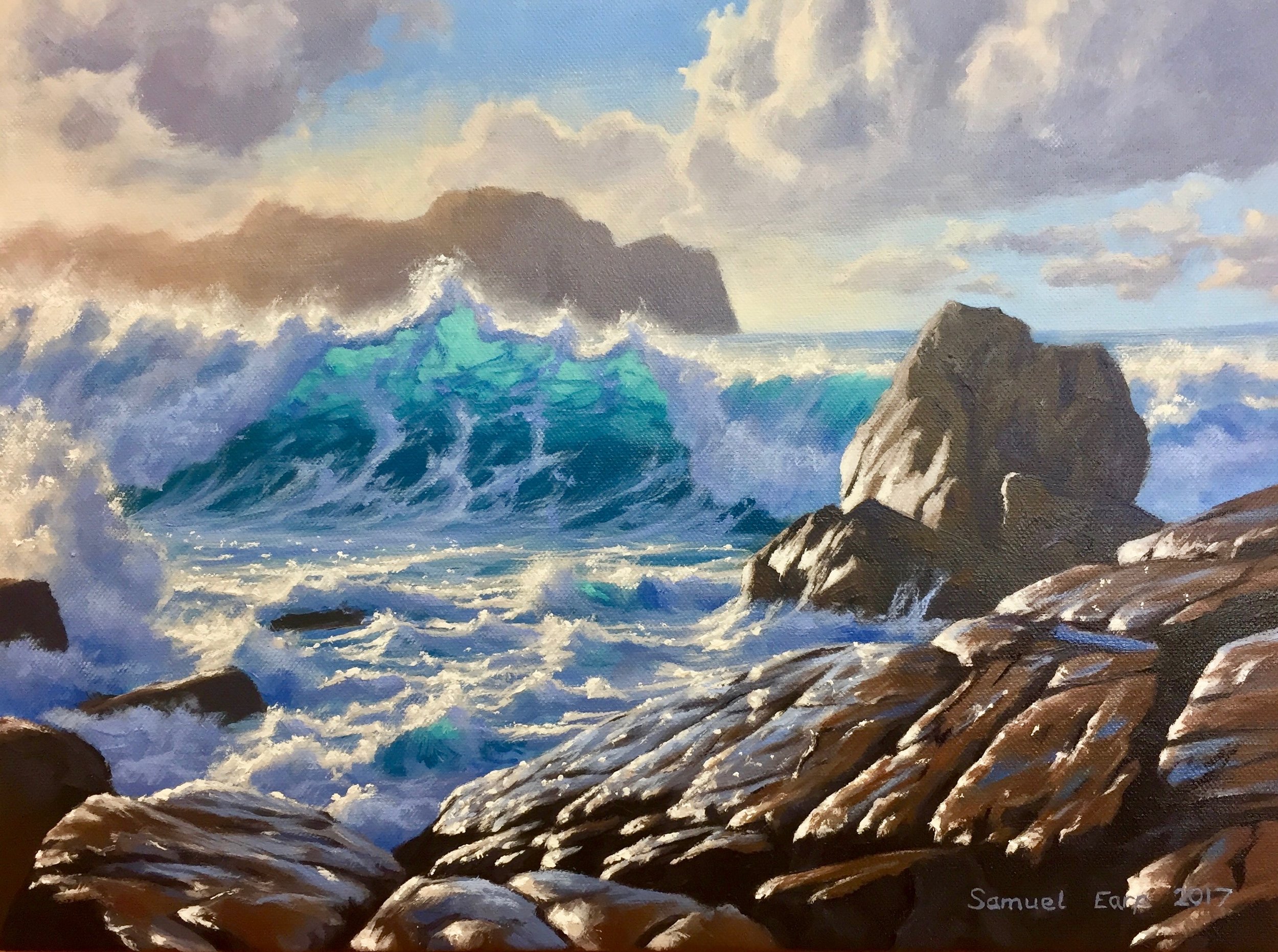
Painting seascapes is one of the subjects I love to paint most. Every so often I visit the island of Guernsey which is the place I was born. Guernsey has amazing coastline, dramatic cliffs and the wild Atlantic Sea, the island is located in the English Channel and is very inspiring for coastal scenes.
In this step by step painting demonstration I will show you how to paint this seascape of a little place called Port Soif, located in the west of Guernsey.
Planning the Composition
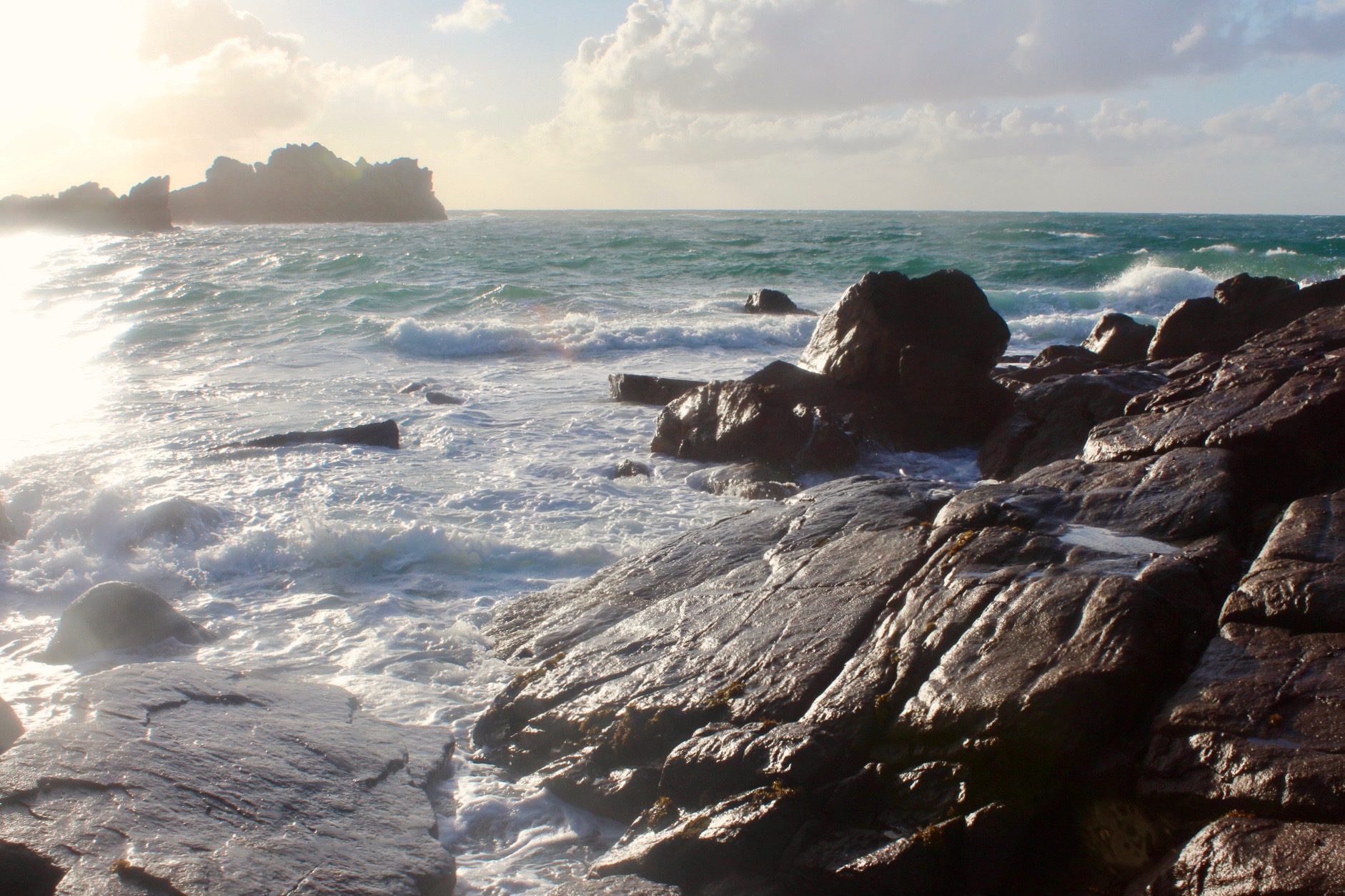
To begin with I gather my photo reference and decide on which photos I will use to plan my composition. It’s quite difficult to get a perfect composition from a photo and so it is necessary to start making changes to the composition to create a pleasing art work that will engage the viewer.
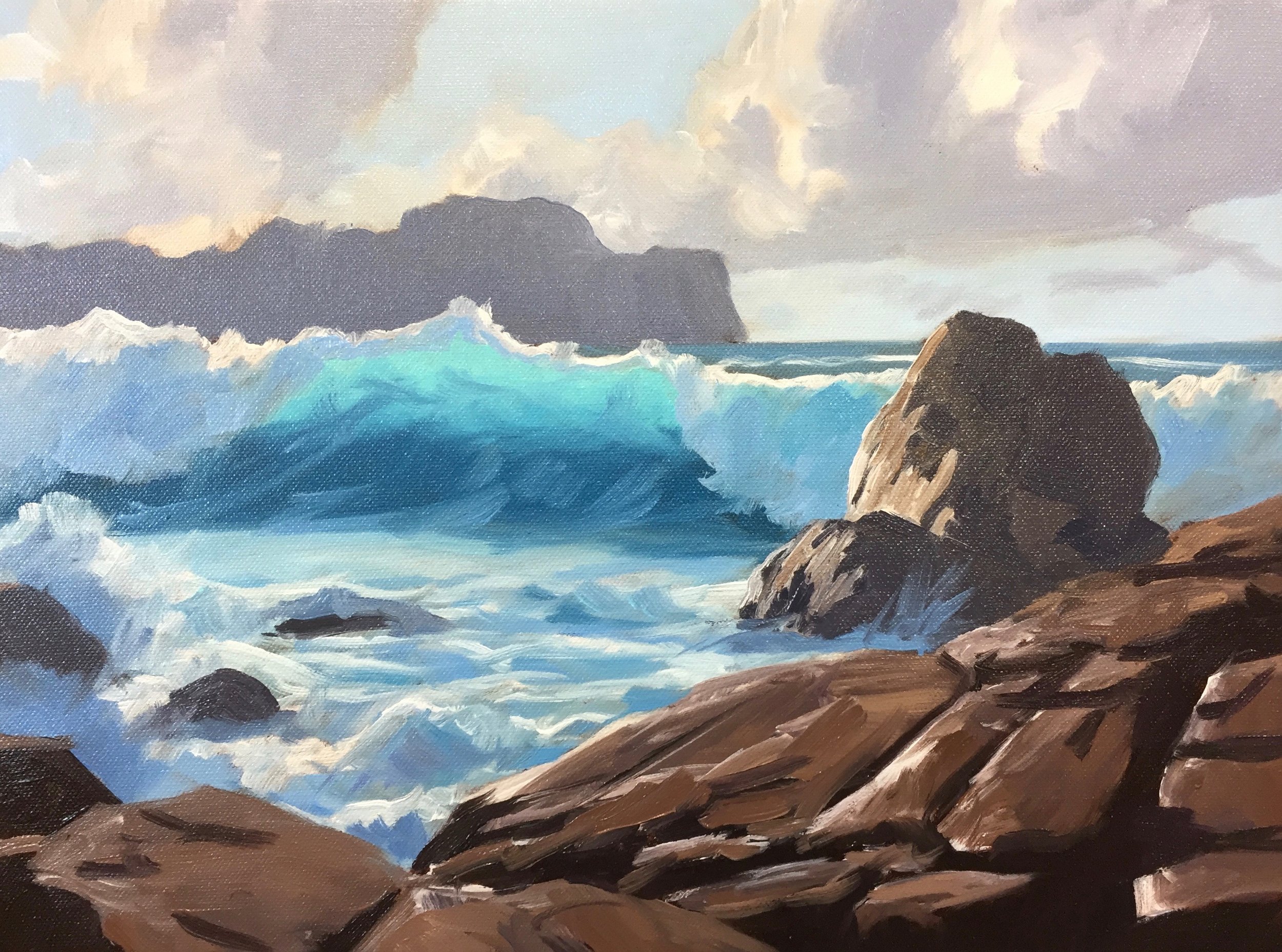
This is one of the reference photos I used for the painting, I really love the rocky shoreline of Port Soif and given it faces in a westerly direction there are plenty of shadows which will create a more dramatic painting. There had also been a strong westerly wind which had whipped up a large swell so there were plenty of crashing waves and whitewater.
Whilst the rocks, shoreline, sea and sky already formed a relatively good composition it still needs some improvements and changes so as always I got out my sketch book and started creating some sketches for a composition.
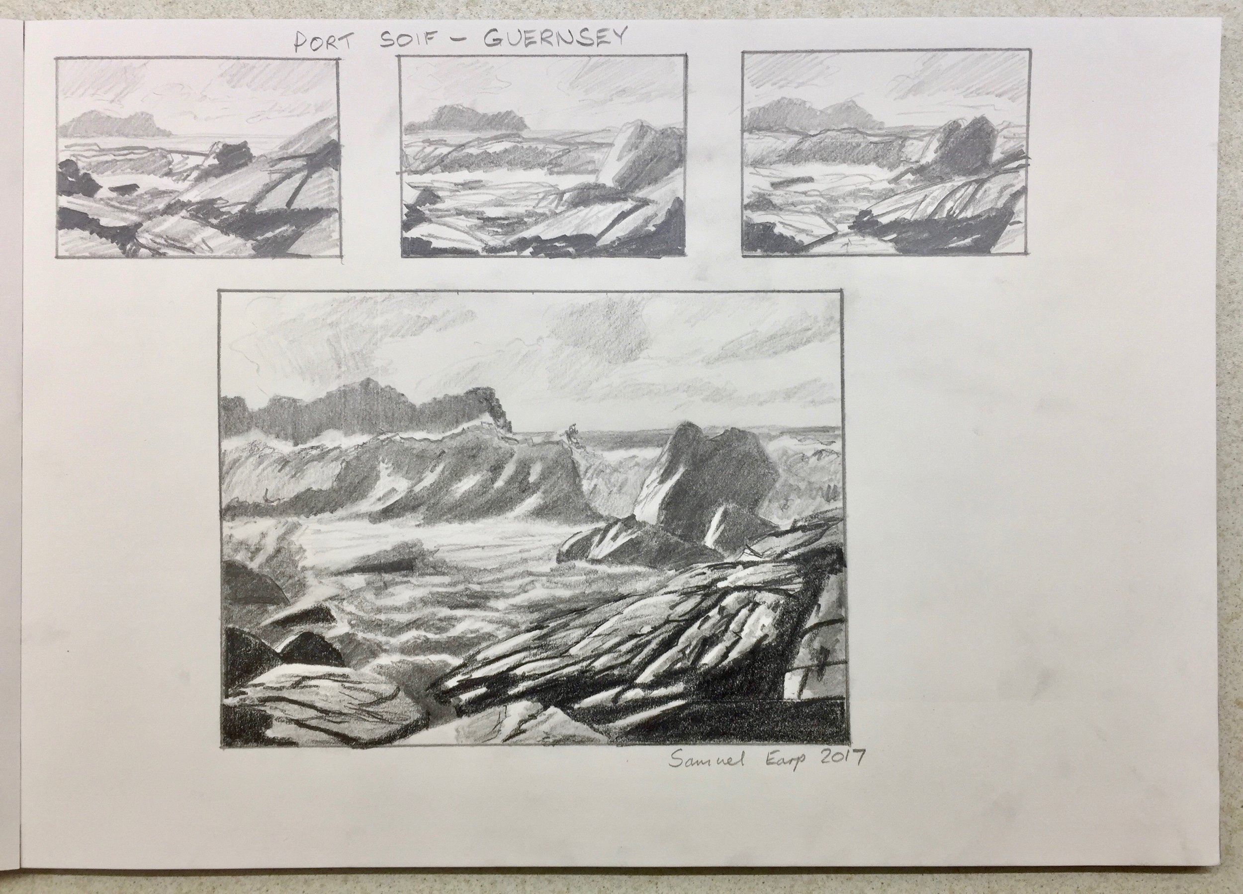
Pencil Sketch
After gathering my photo reference I sit down with my sketch book and draw a few quick thumbnail sketches to get an idea for a composition. This will culminate in a final pencil drawing which I then refer to when I start on the colour study.
Sketching is an important part of the painting process as it helps if you have an idea of where you are going and what the final product will look like. Sketching is not only good fun and good practice but it could also save you many hours of frustration in the studio as a result of a painting not working because your composition did not go to plan. Believe me, this happened to me a lot in the early days when I just went straight into painting with no prior planning, it was very frustrating and I have a mountain of failed art works as a result!
In my final sketch I have made the breaking waves as my focal point with the rocks, clouds and distant rocks leading the eye back towards it. I use my pencil sketches to get an idea of the tonality of the scene and I achieve this by using a range of pencils including 4H, 2H, HB, 2B and 4B.
Paint Stunning Seascapes Step-by-Step
4 x Step-by-Step Painting Tutorial Videos – $27
My Colour Palette
I am using Langridge Handmade Oil Paints, which include:
- Titanium white
- Cadmium yellow
- Cadmium yellow deep
- Yellow oxide
- Burnt sienna
- Burnt umber
- Cadmium red light
- Quinacridone magenta
- Ultramarine blue
- Cobalt blue
- Cobalt teal
- Pthalo green
Beginning the Painting – Blocking-In
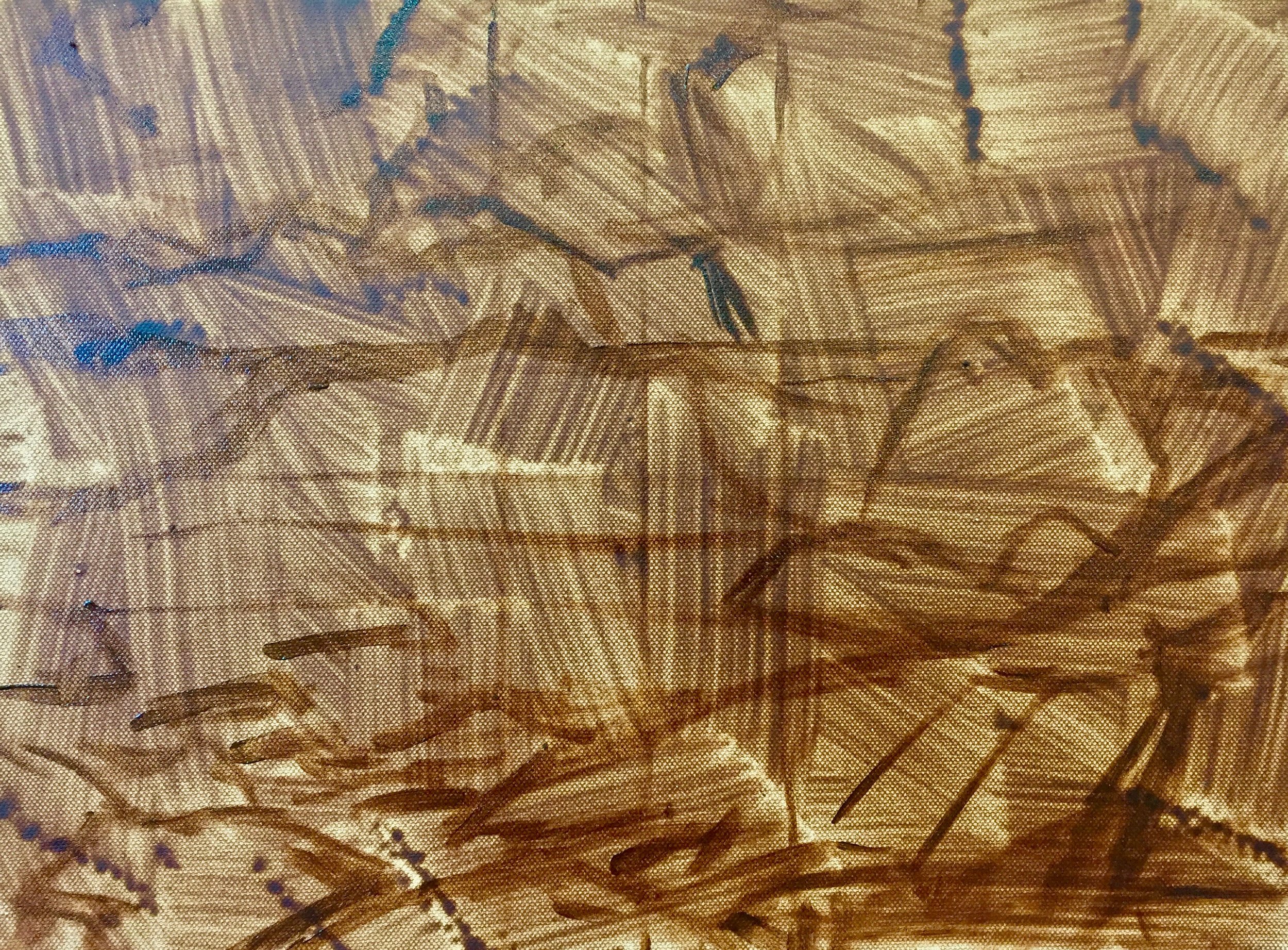
I start my art work with an underpainting of burnt umber, this gives vibrancy and warmth to the painting as it comes through the paint layers. It also helps with establishing tone and colour as they are not distorted by the white canvas. An underpainting of burnt sienna or burnt umber also gives the painting a traditional look.
Once the underpainting is dry I sketch out the scene with burnt umber. There vertical and horizontal lines conform to the golden ratio (1:1.618) which helps me to place focal points.
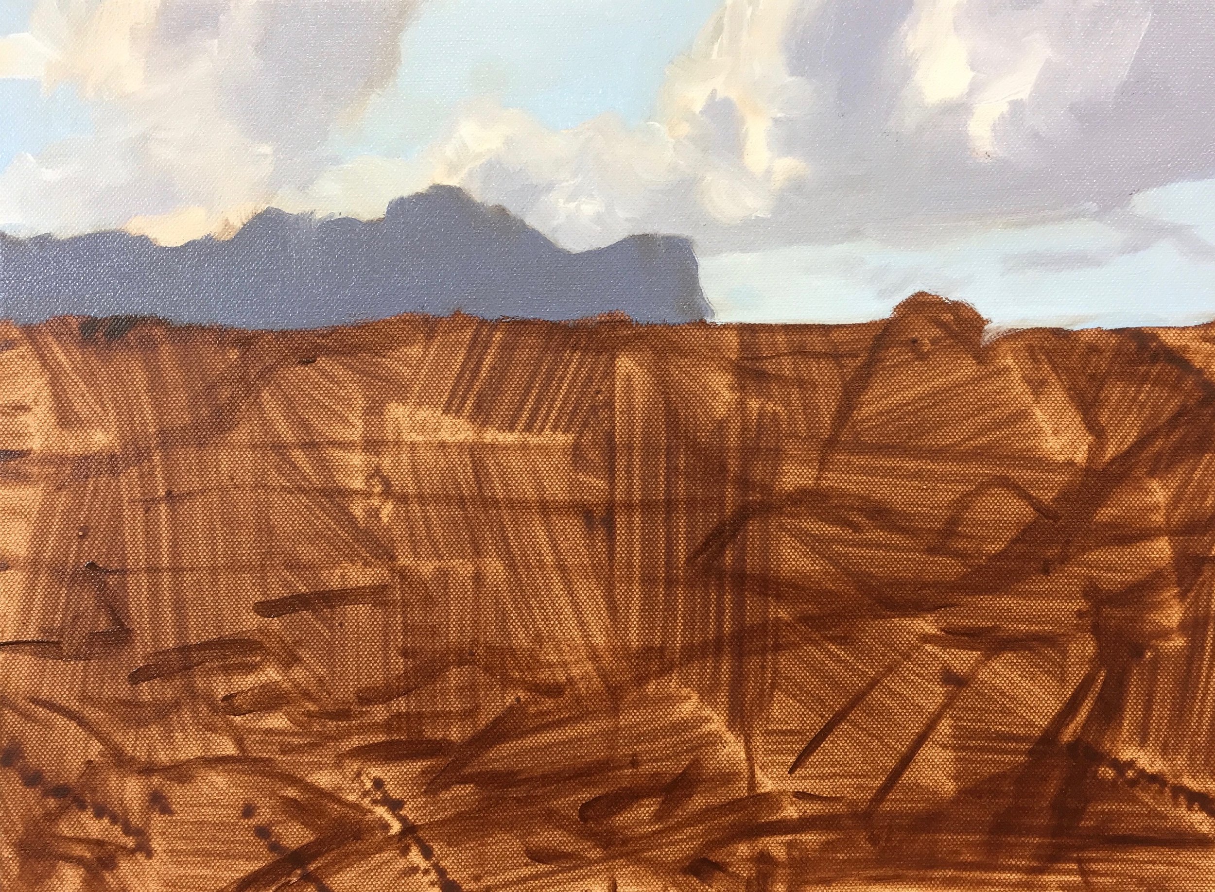
When blocking in the painting I start by painting the sky as this helps me to gage the overall tonality of the painting. I’m not worried about detail when blocking in the painting, for me it serves as a map that marks out the zones that I will work in once the painting is dry.
I mix the blue of the sky with cobalt blue, cobalt teal and titanium white. I mix the clouds with ultramarine blue, burnt umber which reduces the saturation of the blue and I add quinacridone magenta to give the clouds a violet tint. I increase the tone of the cloud by adding titanium white.
I start painting in the rocks in the distance using the same colour combination as I used for the clouds, ultramarine blue, burnt umber, quinacridone magenta but with less titanium white. Using the same colours helps to create harmony in the painting as they coordinate better.
Next I start blocking in the sea, I use titanium white mixed with liquin and mark in the various zones where the highlights of the waves and whitewater will be. I’m not too worried at this stage that the titanium white is tonally too bright as it will soon mix with the other colours causing the tone to drop which is absolutely fine at this stage. I just want an idea of where to work.
I mix the colours of the translucency of the wave using cobalt teal, pthalo green and titanium white. For the main body of the wave I mix ultramarine blue, cobalt blue, cobalt teal and pthalo green, reducing the amount of titanium white to darken the hue as it approaches the trough of the wave. I apply this using a flat bristle brush.
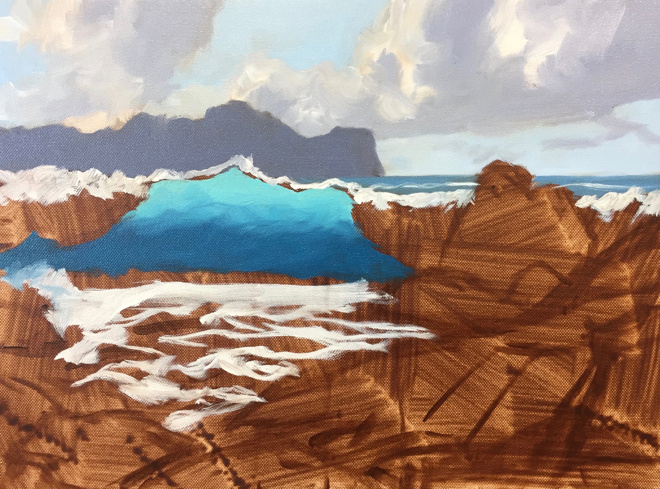
I paint the shadows of the the breaking wave and the white water. I use the same colour combination I used in the wave and for other areas of foamy water, I use more ultramarine blue and cobalt blue.
Next I mark in the shadows of the rocks and create lines which will depict cracks in the painting. I make the tone of the rock on the right in front of the wave tonally a little lighter than the rocks in the foreground, this makes it recede a little. I mix these dark shadow tones with burnt umber an ultramarine blue which creates a near black.
Note: I never mix pre-made black as this doesn’t coordinate well with other colours and can dulling effect on your mixtures.
Finally to complete the blocking-in process I paint the main body of the rocks using a varying amounts of burnt sienna, burnt umber, ultramarine blue, quinacridone magenta and titanium white. I apply this with a flat bristle brush.
I use burnt umber mixed with titanium white for the mid-ground rock on the right of the painting. I mix in titanium white to mark the edge of the cracks in the rocks where light is reflecting off it.
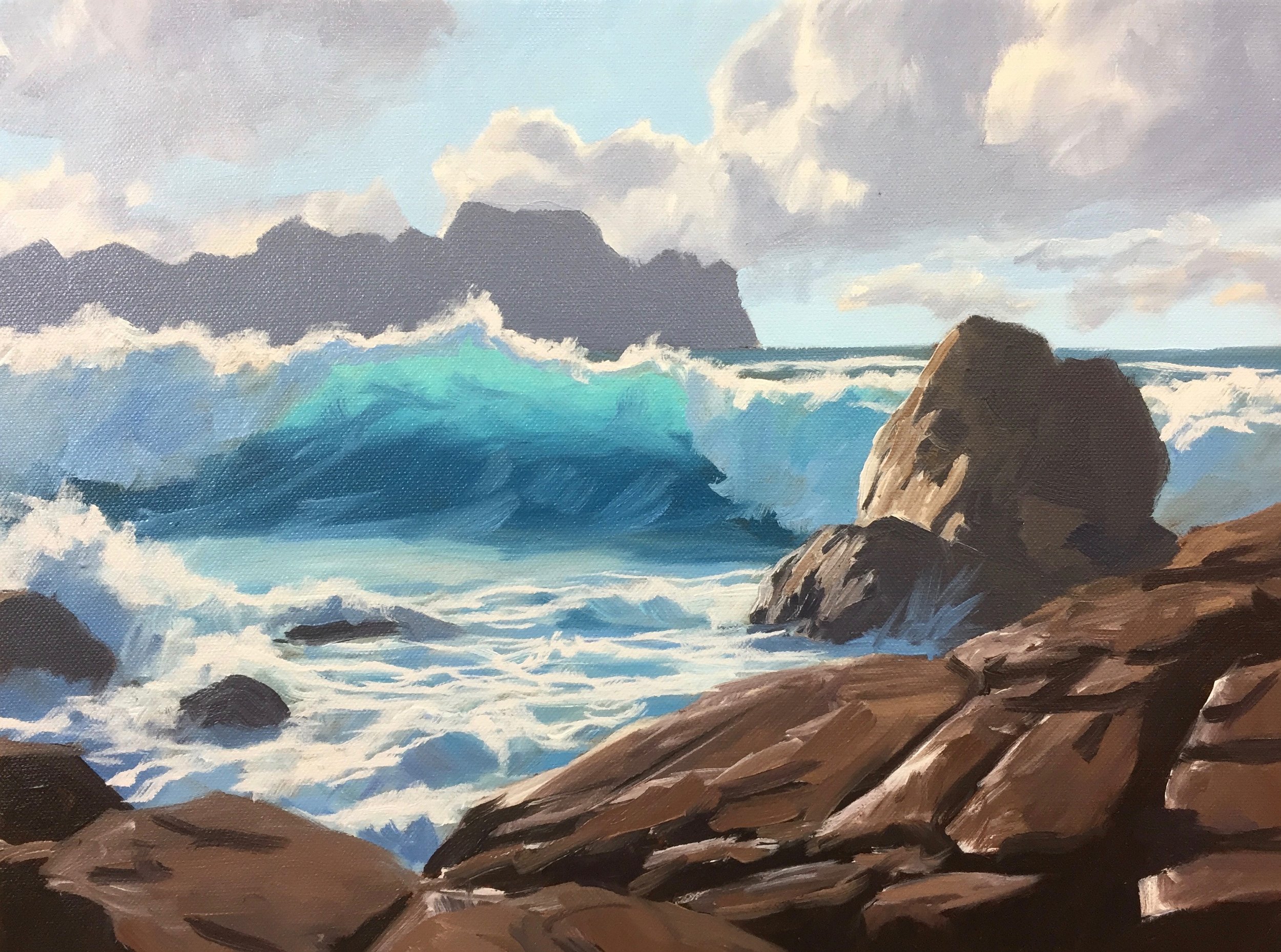
Now that the blocking-in phase is complete I allow the painting to dry before I can start working on building up the detail of the painting.
Building up the Detail and Refining the Image
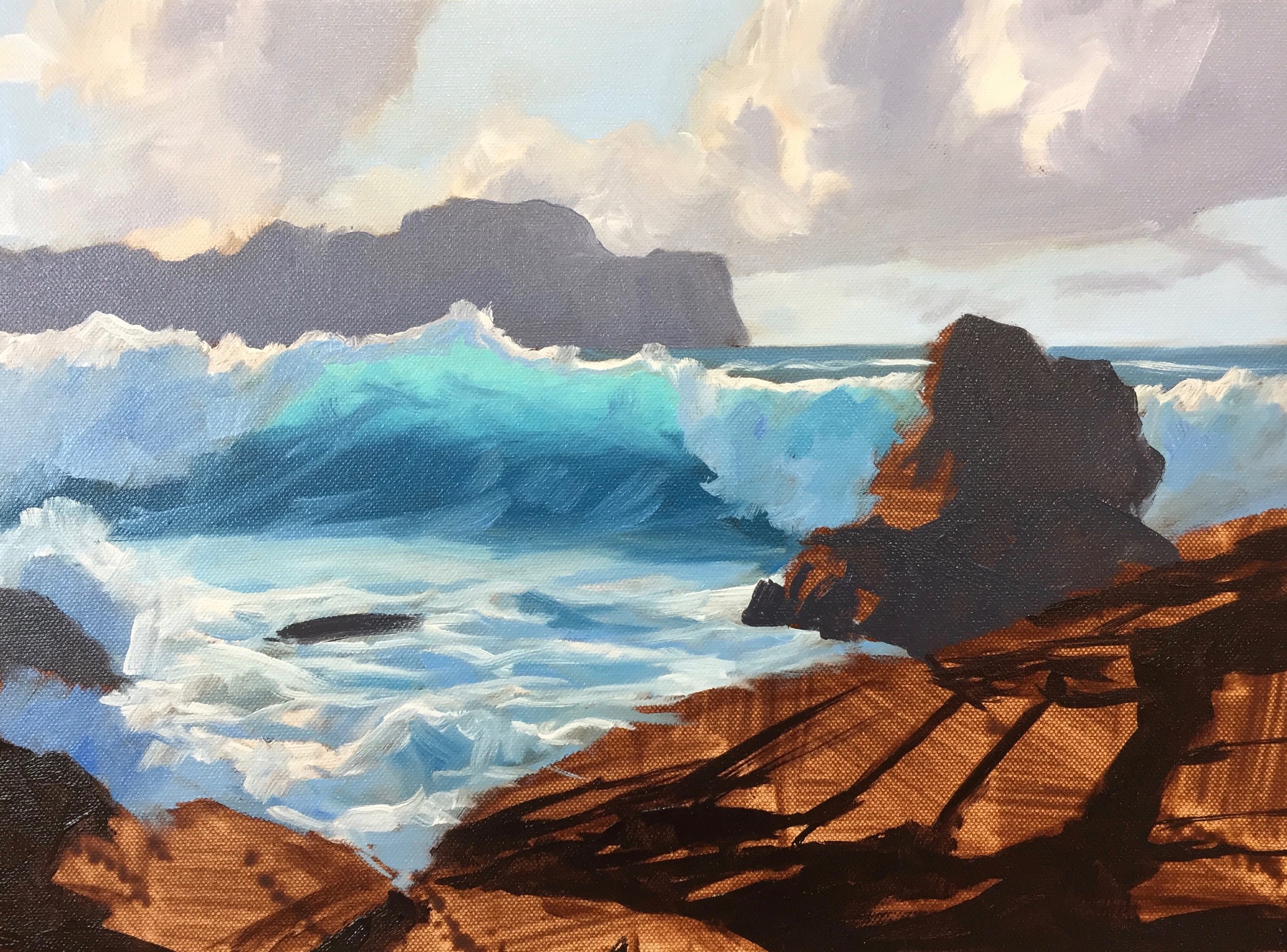
So now that I have allowed the painting to dry I start working on the detail. I start back with the sky and begin defining the clouds. I use ultramarine blue, burnt umber to reduce the saturation, quinacridone magenta to give the clouds a violet tint and titanium white to increase the tone.
I use a flat bristle brush and a dagger brush to define the shapes of the clouds.The highlights of the clouds are white, but not a pure brilliant white, instead I have dropped the tone by mixing the white with a small quantity of ultramarine blue, burnt umber and quinacridone magenta.
I start adding in the detail of the white water and the crest of the breaking waves. I want to preserve my lightest tones until the very end of the painting, so although it looks white in the photo it’s actually not quite white. I drop the tones of the white by mixing in a little burnt umber, ultramarine blue and quinacridone magenta.
Once I have added more highlights to the white water and the crest of the breaking wave I start building up the detail of the shadow areas. I mix these hues with a combination of ultramarine blue, cobalt blue and titanium white. I also in some areas add a little quinacridone magenta and if the colour is too saturated I can knock it back with a little burnt umber.
I paint more highlights in the rock in the mid-ground with burnt umber mixed with titanium white.
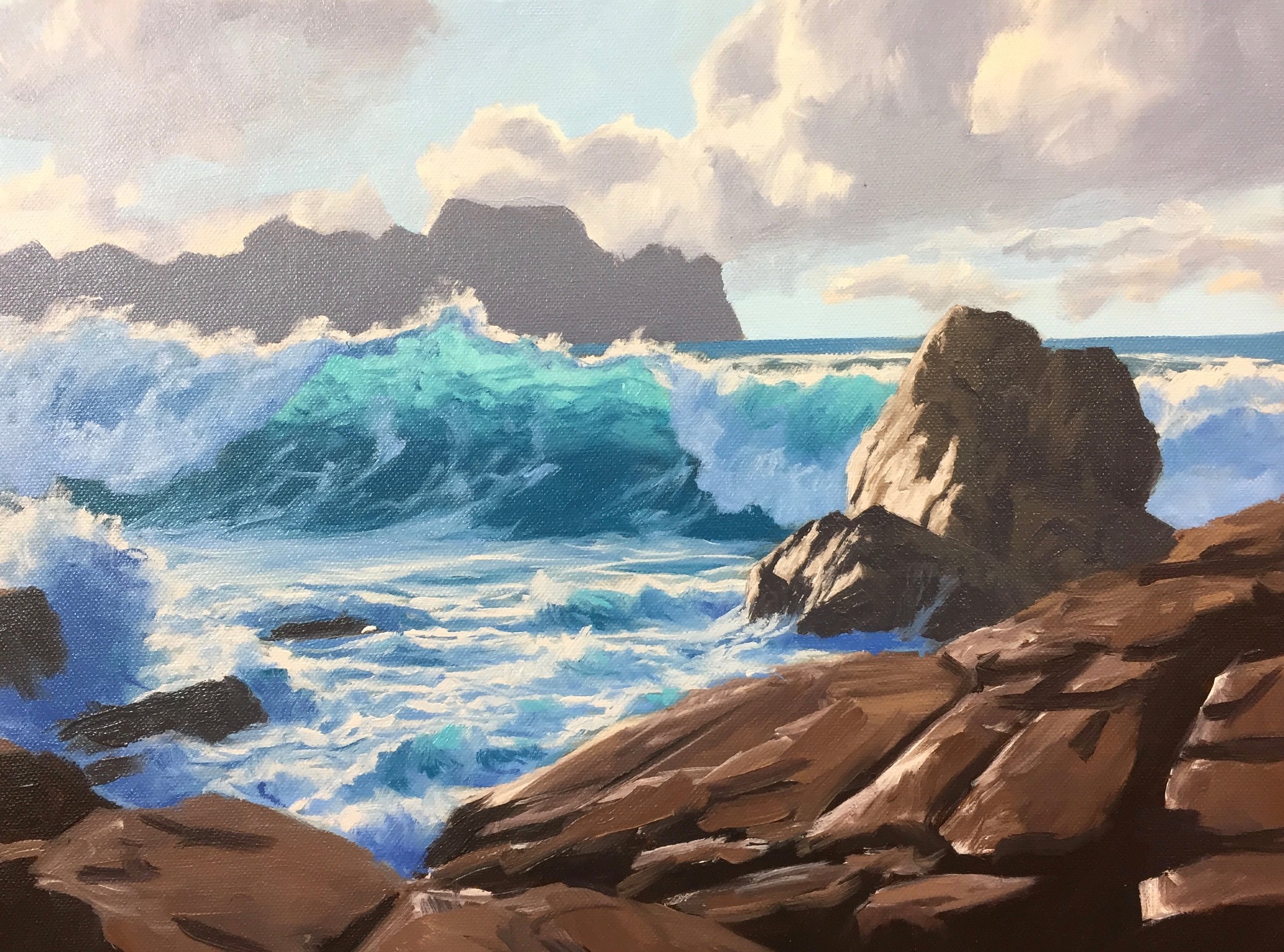
Next I start working in the detail of the rocks in the foreground and I use a combination of burnt sienna, burnt umber, quinacridone magenta, ultramarine blue and titanium white. Given the rocks are closest to the view I can use a full tonal range where my shadows will be at their darkest and my highlights, lightest.
I introduce lighter tones on the sunward facing edges of the cracks in the rocks, I also want to give the illusion that the rocks are wet so I paint some of these areas with cobalt blue mixed with titanium white. I keep in mind that the wet rock surface is reflecting the sky.
Continuing to work on the rocks in the foreground I add highlights on the rock, crack edges where the sun is directly reflecting the light. I don’t use pure white as I am saving that until the end so I still add a little burnt umber into the mix.
I reinforce the cracks in the rock by mixing burnt umber and ultramarine blue to create a near black. I use a dagger brush in order to paint the cracks and achieve varied marks.
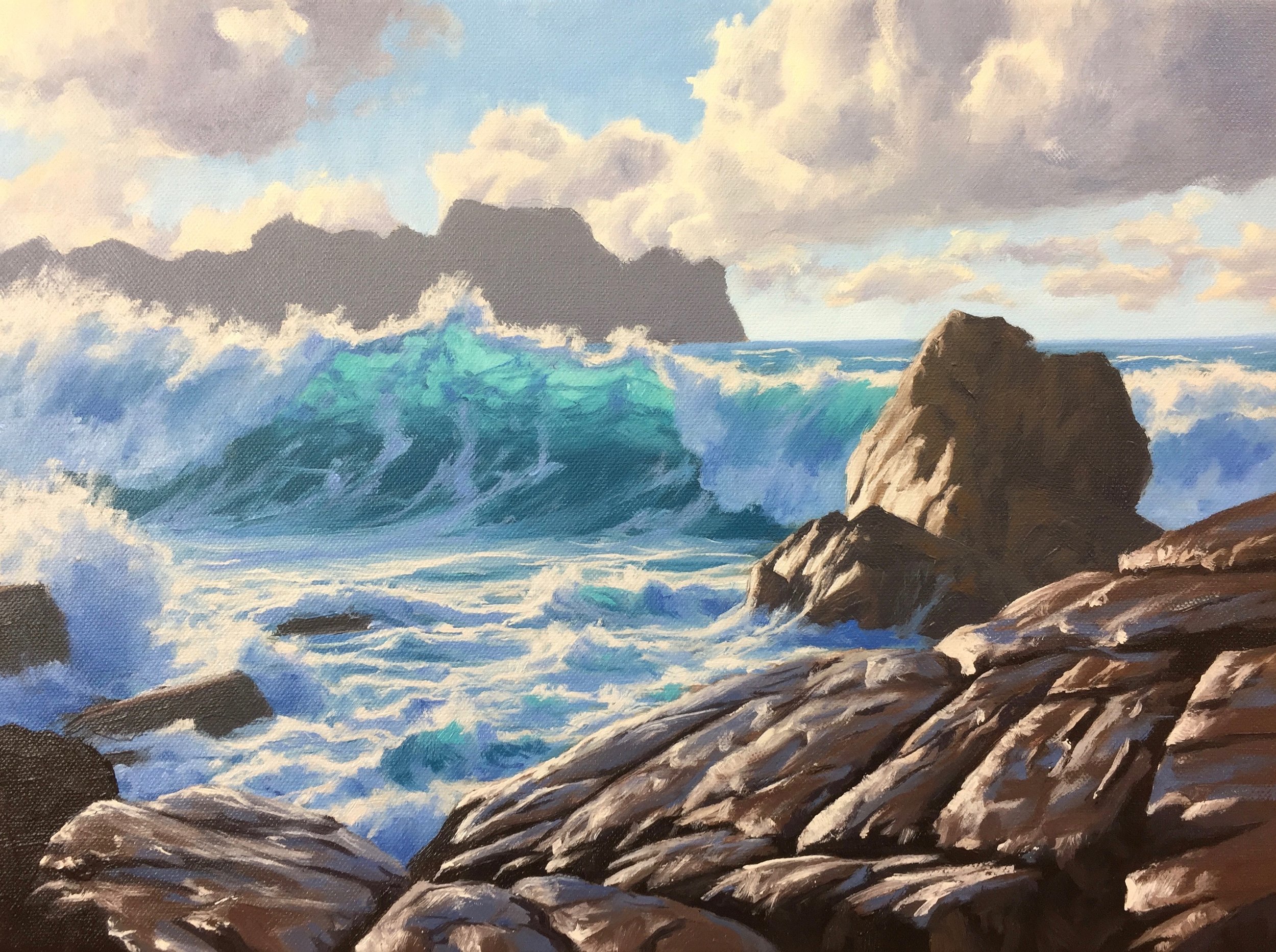
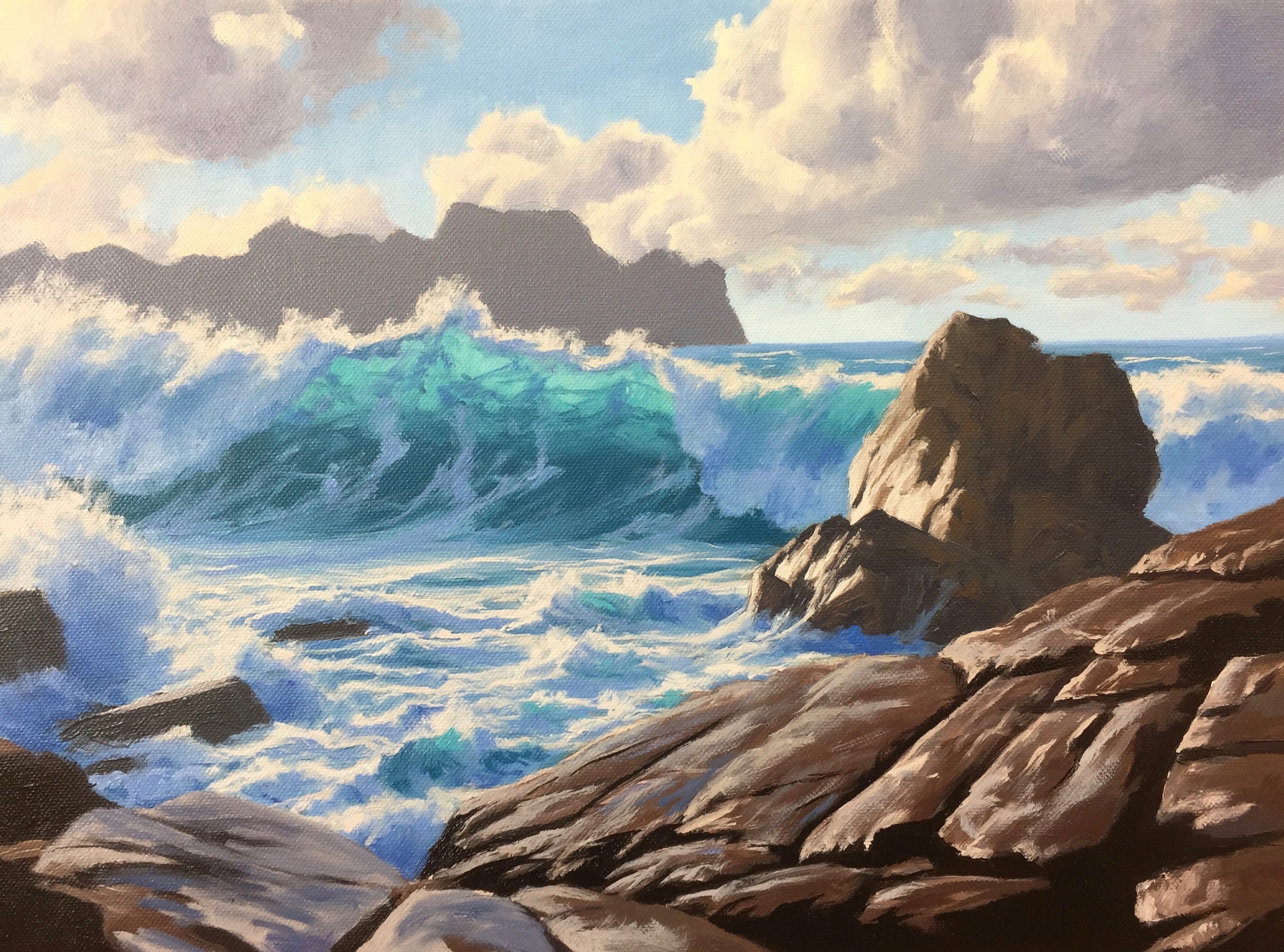
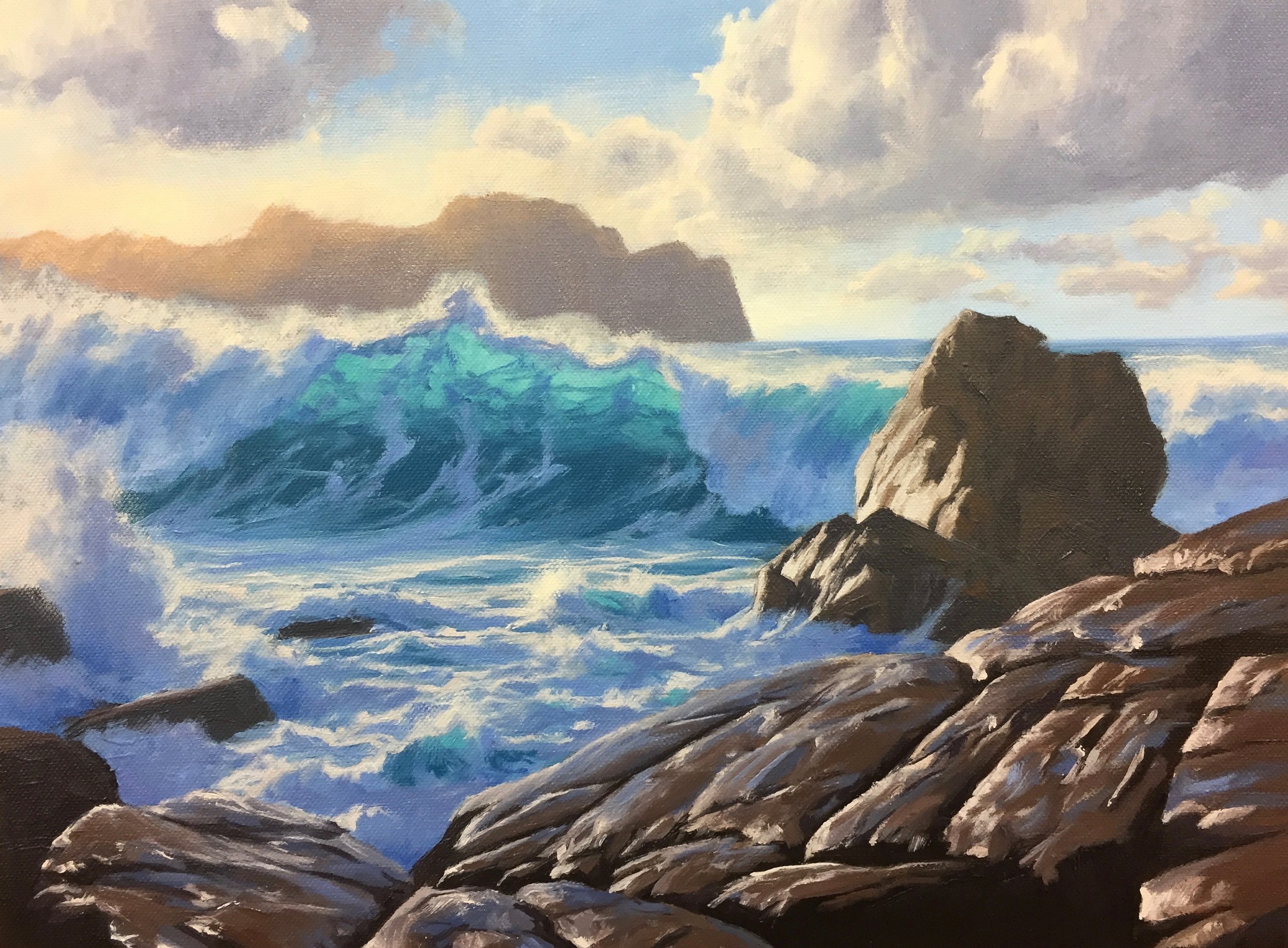
At this stage of the painting I am getting near completion and I am now refining the image. With the distant rocks I wanted to create the illusion of the bright evening sun illuminating the back of the rocks and the sea. I dry brush a glaze of yellow oxide mixed with a little quinacridone magenta and titanium white.
I add some more detail to the clouds adding lighter tones and refining the overall shapes.
Final Details
To complete the painting I add final details in the reflected light in the white water and breaking wave itself and I mix these colours using a combination of ultramarine blue, cobalt blue and titanium white adding quinacridone magenta in other areas.
Finally I add my lightest tones in the splashes of the white water and breaking wave where I have been using pure titanium white. I paint white dots in the sea to create the illusion of sparkles in the water.
I add highlights of pure titanium white in the rocks to give the illusion of glistening rocks where the edges are reflecting the sunlight.
Thanks for reading 😊
