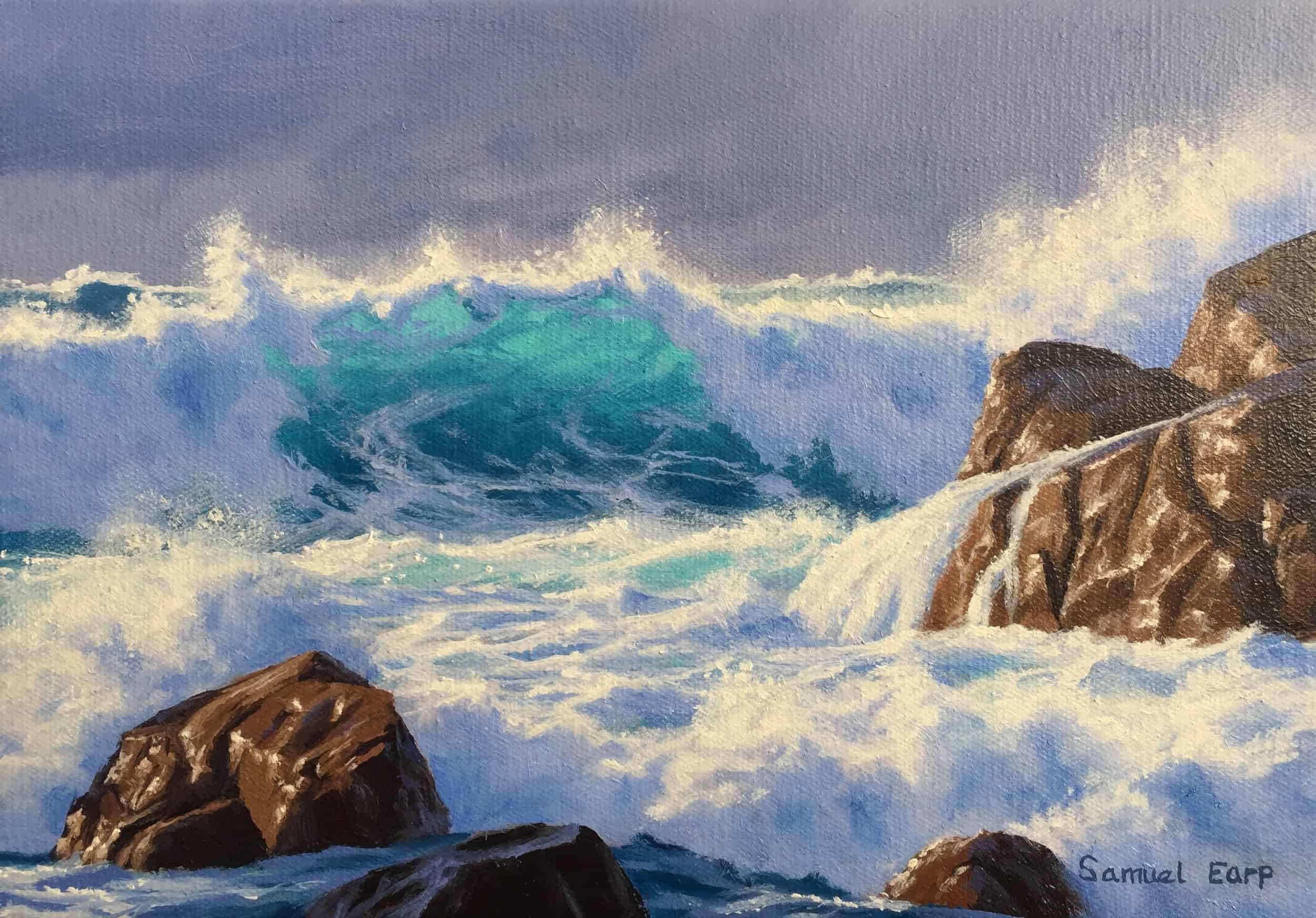
Continuing the theme of painting seascapes from the last blog and YouTube video I thought I’d show you how you can paint a breaking wave that looks dramatic and is full of light and atmosphere.
Painting seascapes is fun especially when you create stormy scenes so in the blog post I’ll show you some tips and tricks to create light and drama in your seascape. Don’t forget the accompanying YouTube video on how to paint this art work, you can view the video which is at the bottom of this page.
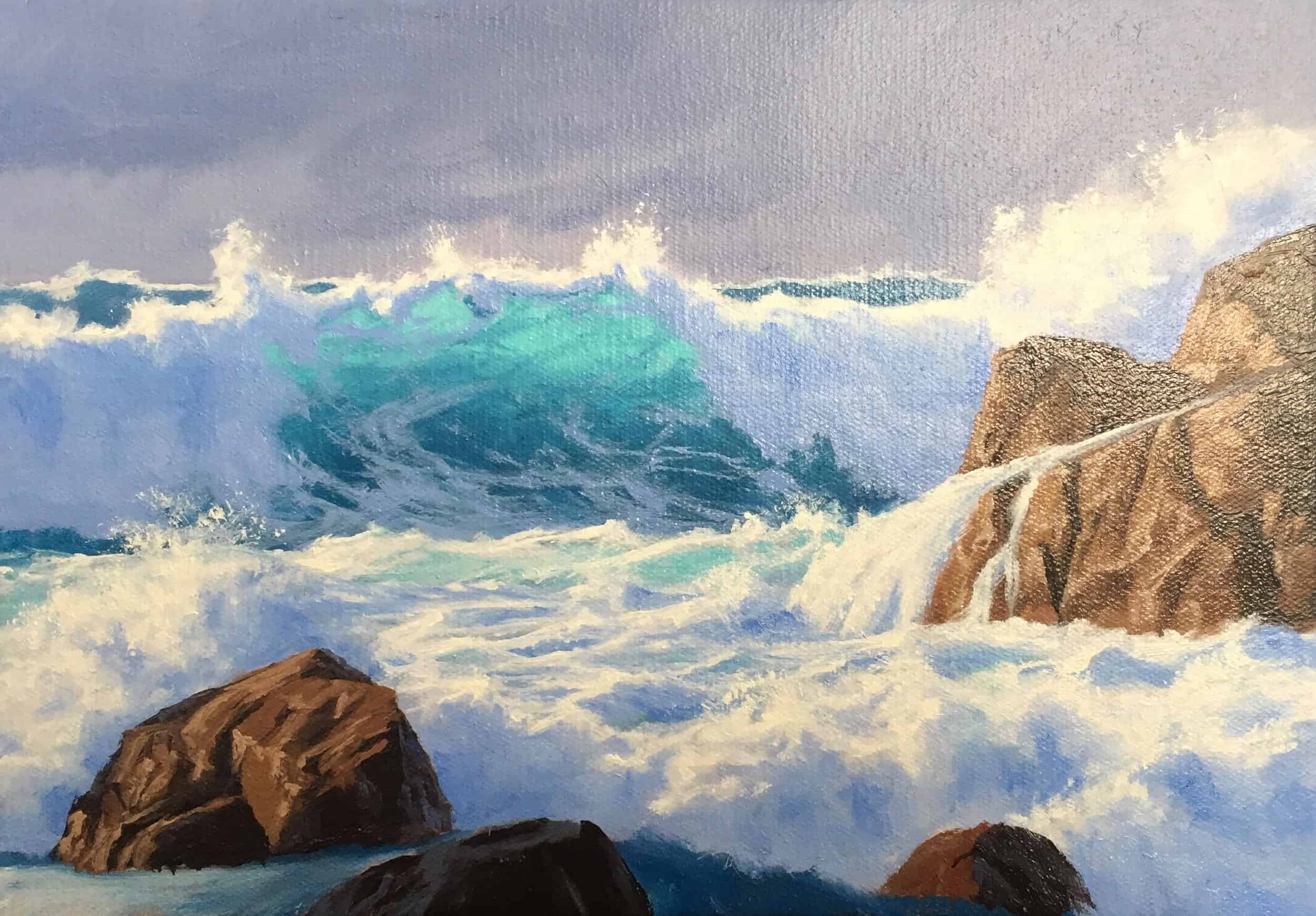
1. LIGHT AND ATMOSPHERE
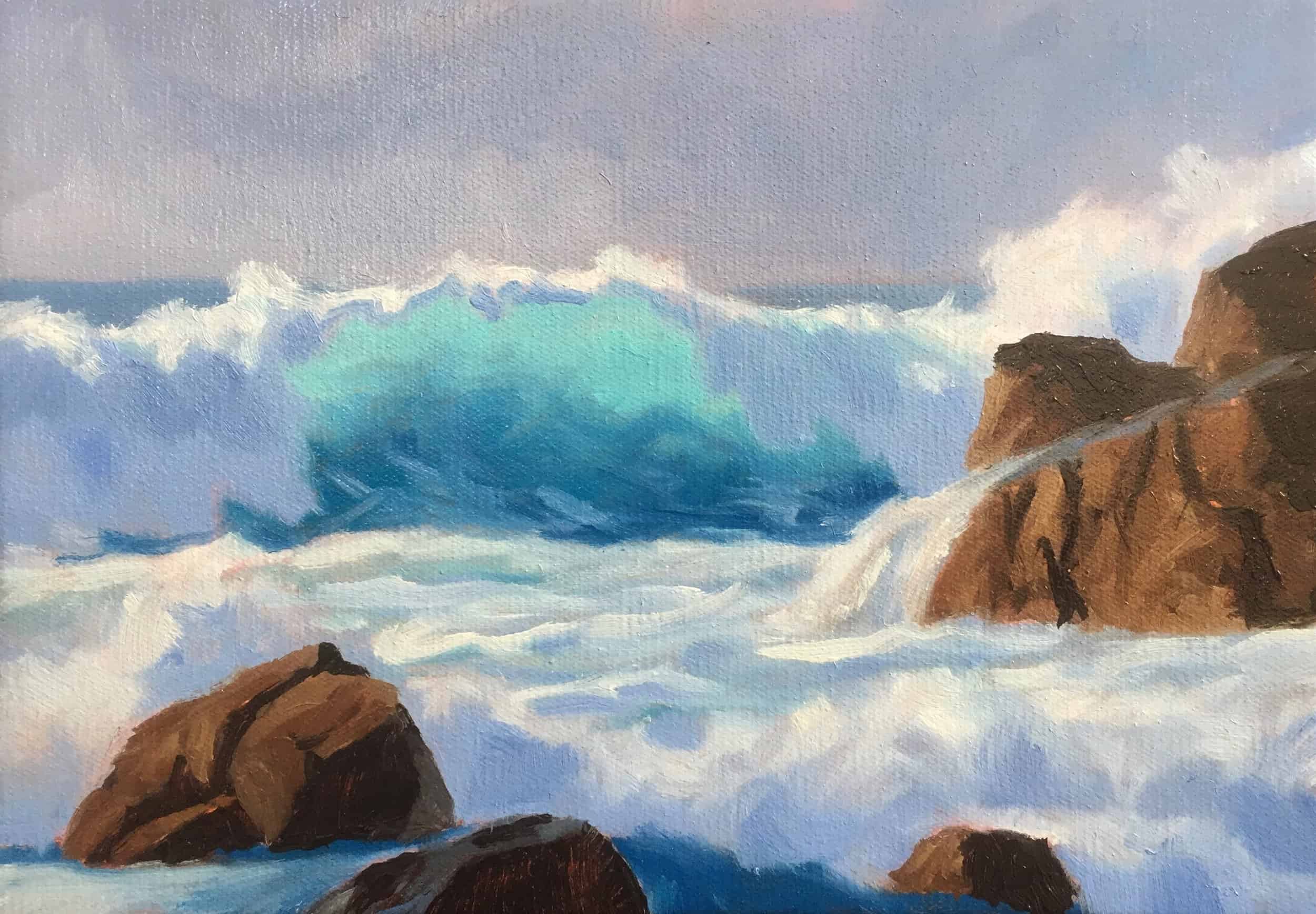
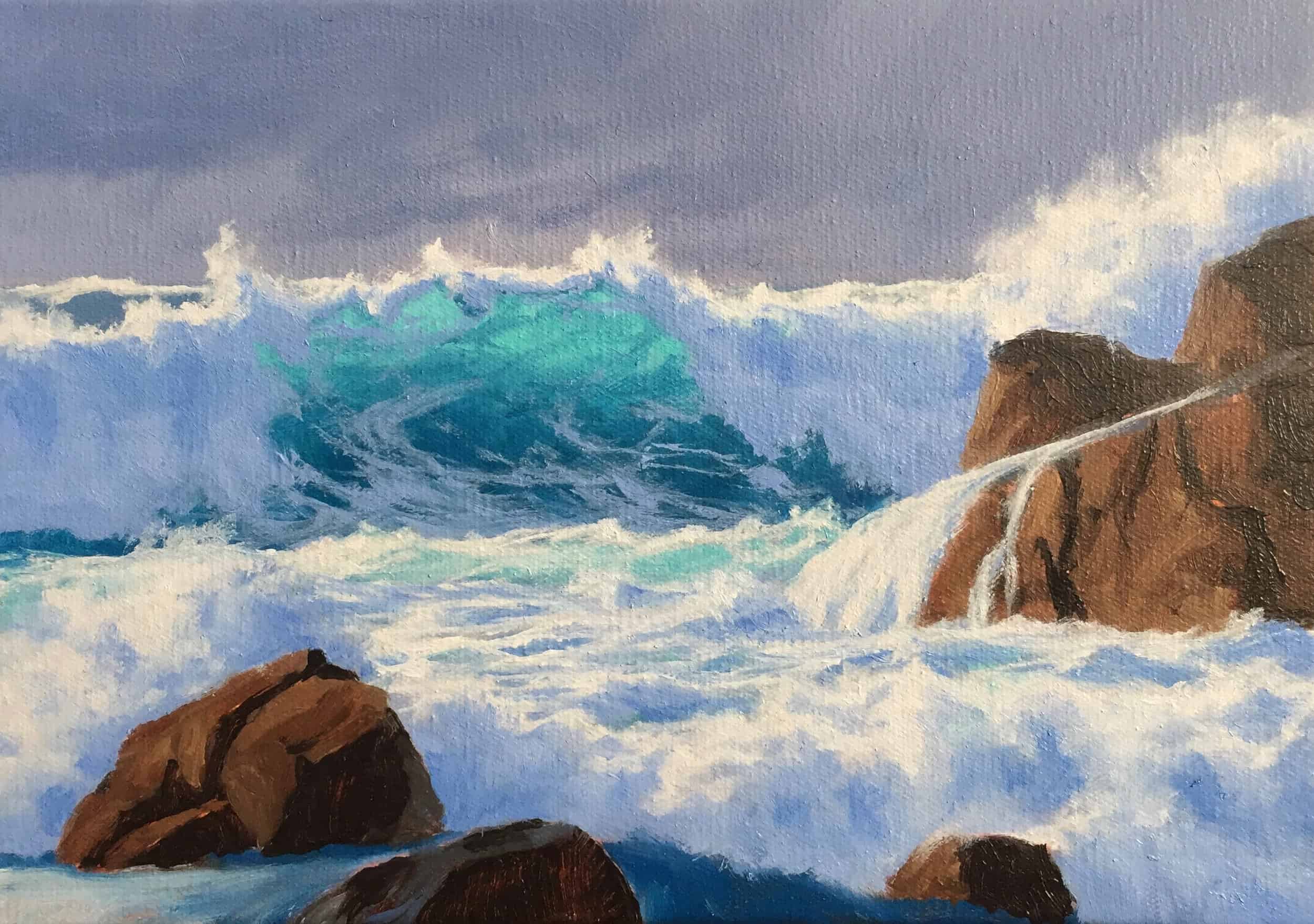
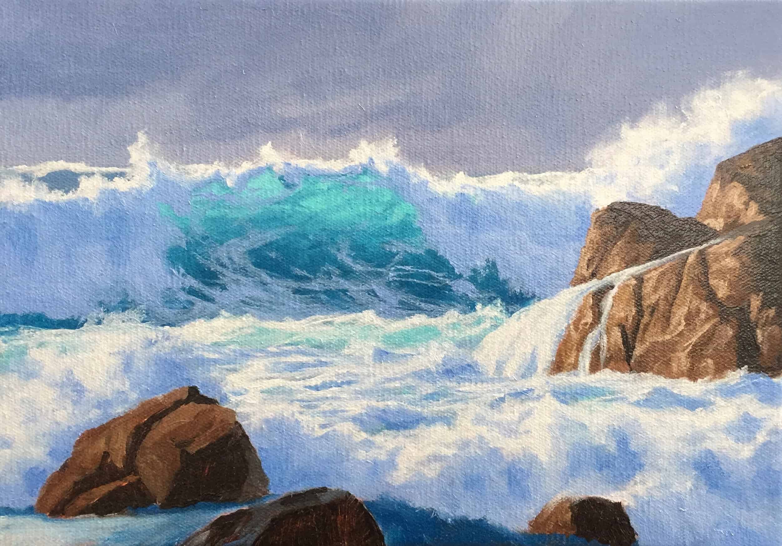
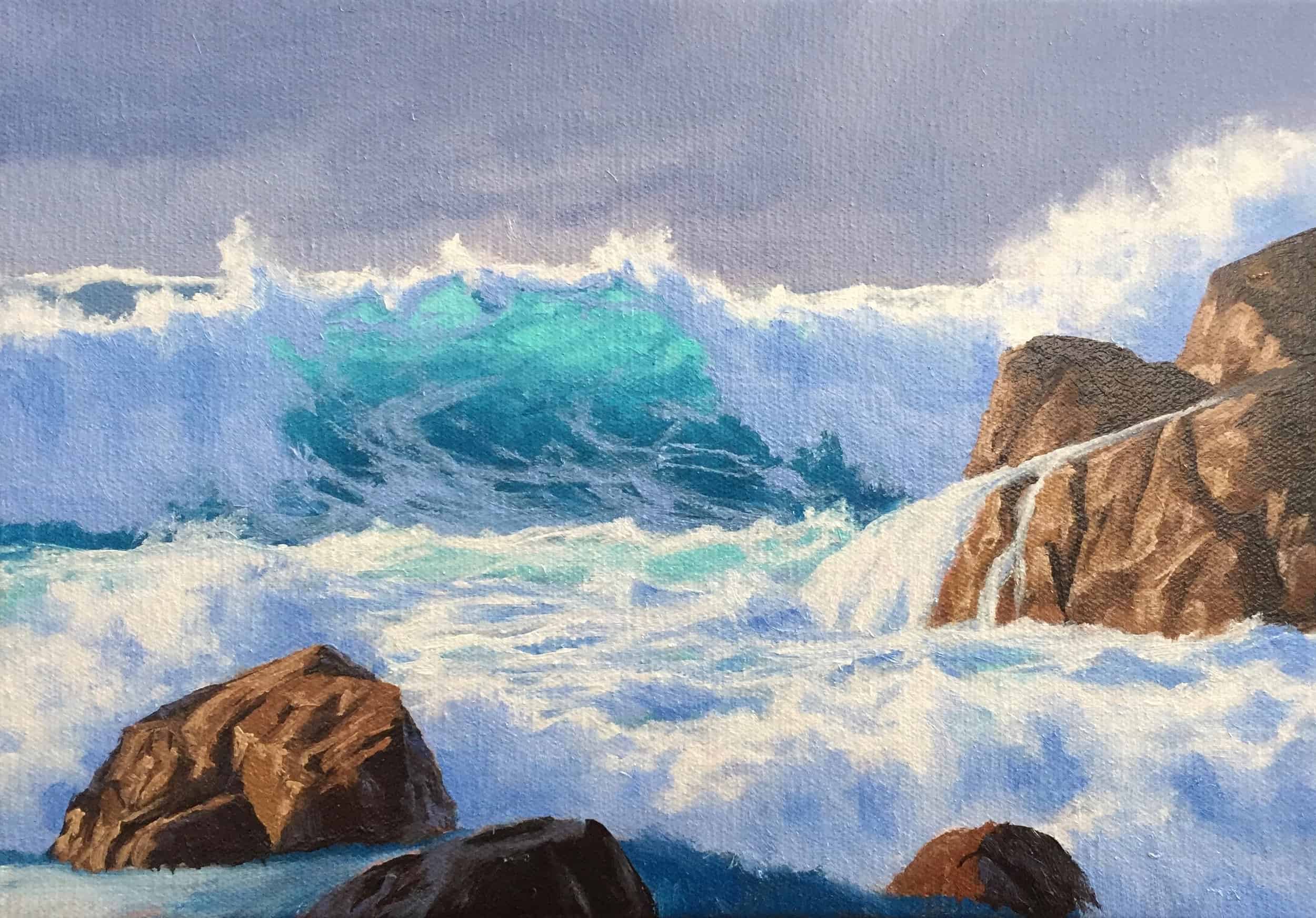
Last year I visited the island of Guernsey, located in the English Channel. Guernsey is so beautiful and it has some amazing coastline, featuring an often stormy Atlantic Ocean, beaches, rocks and cliffs so I took a lot of photos whilst I was there.
These are some of the photos I used as reference in this seascape painting, please feel free to use and copy them if you would like to have a go at painting this seascape.
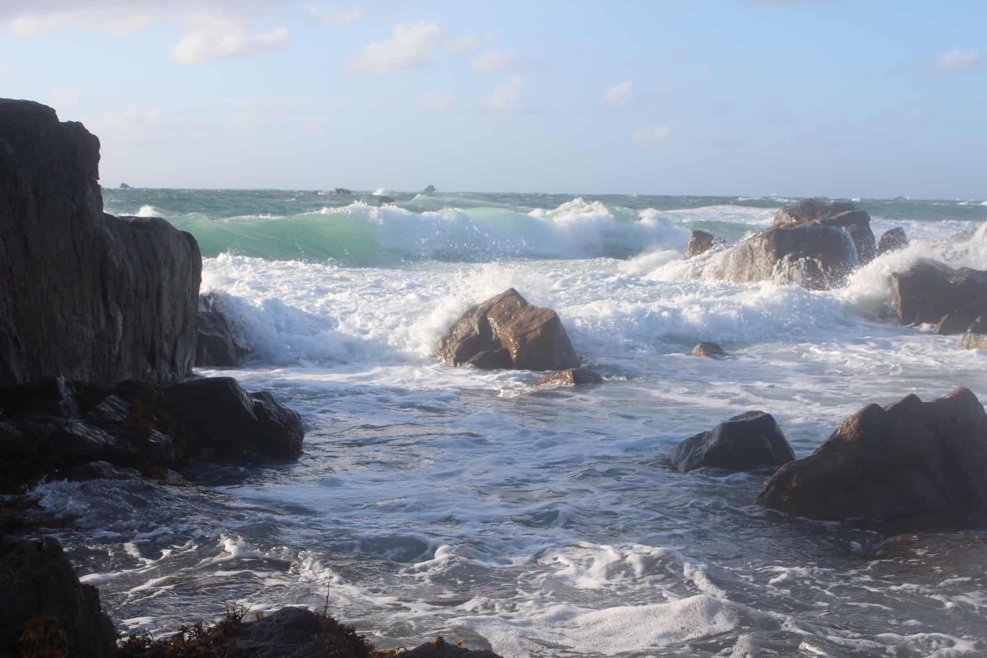
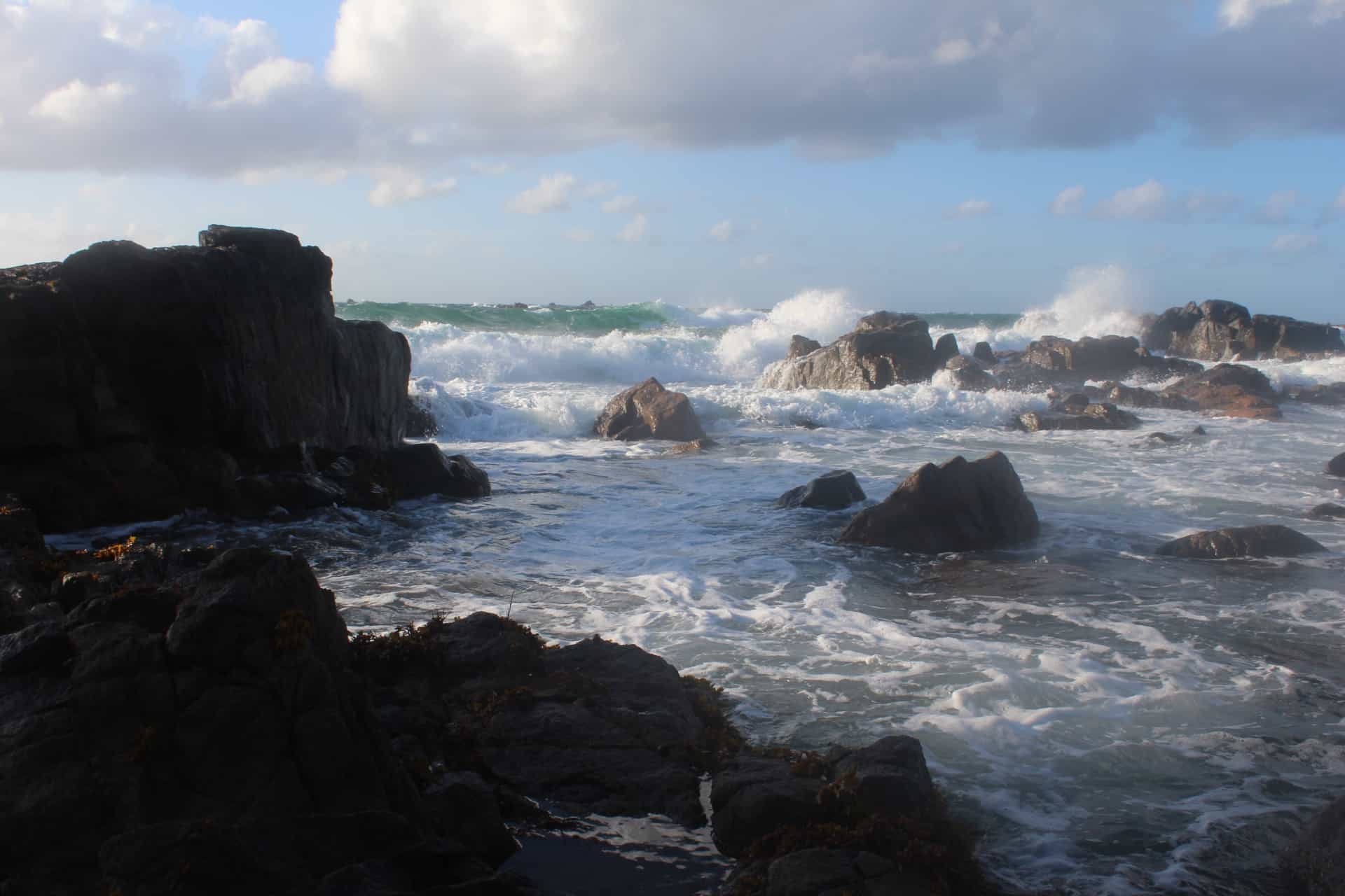
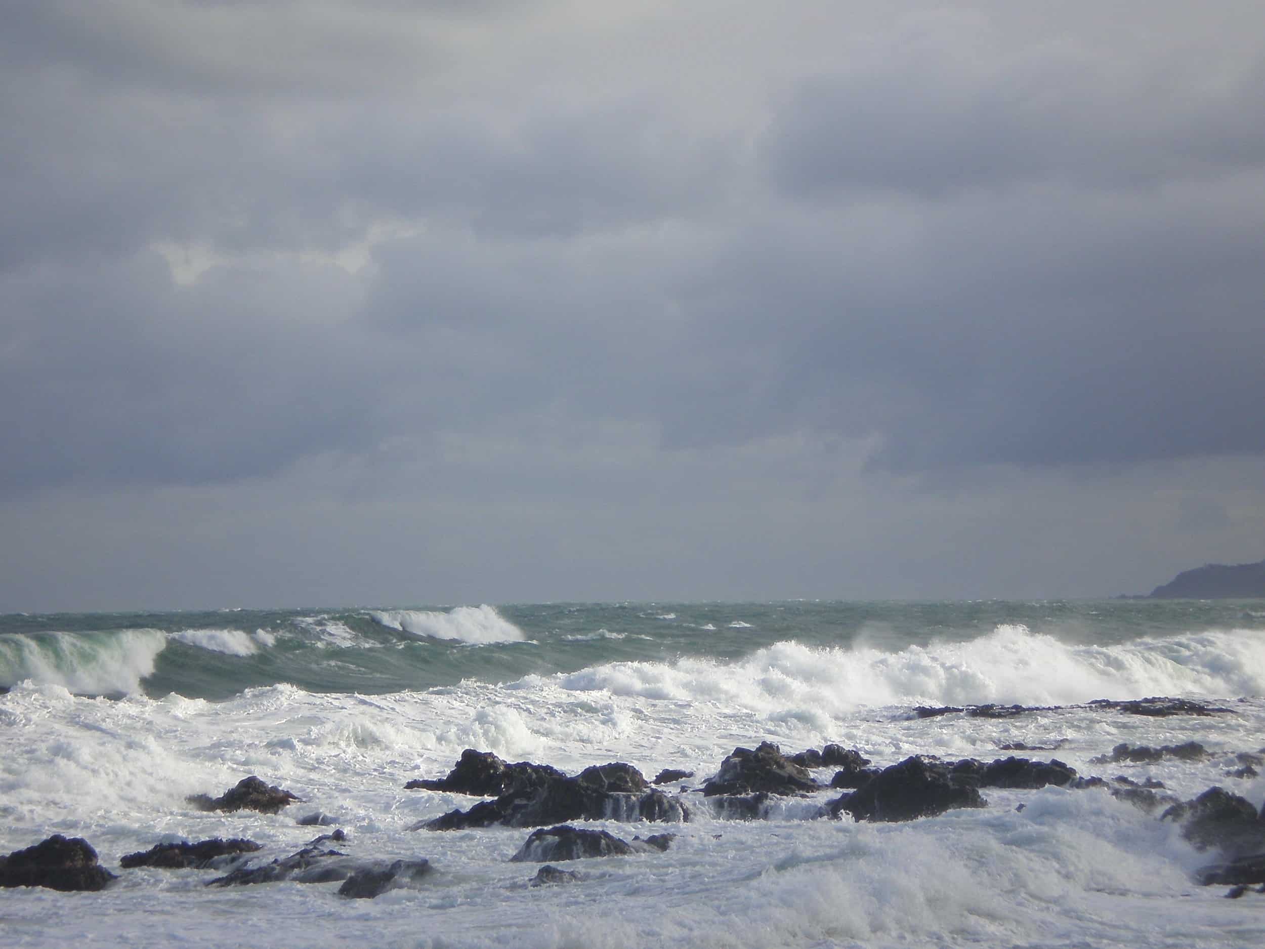
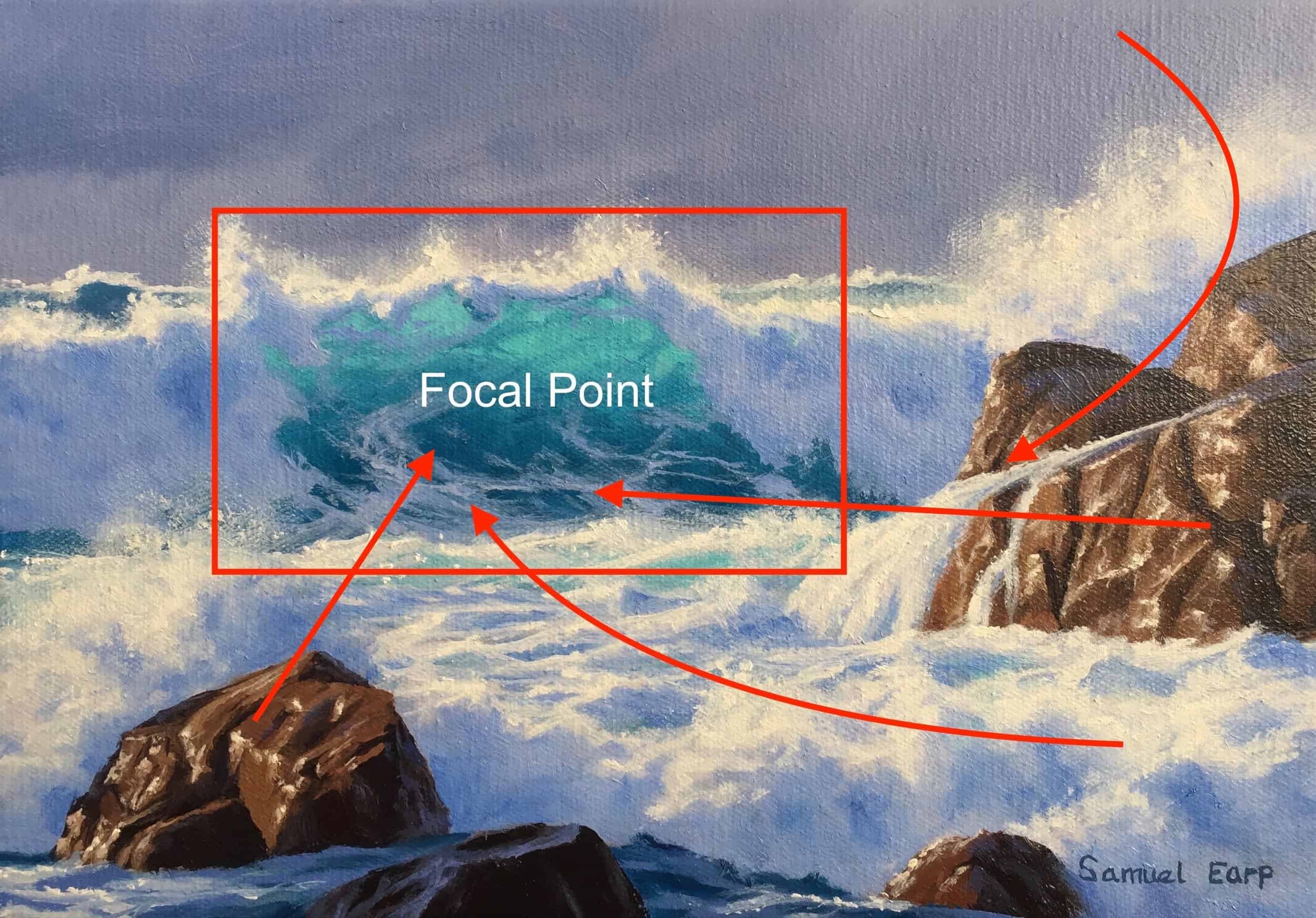
We have some great elements in these photos to create an atmospheric seascape painting. The ocean has a heavy swell and wild breaking waves which are also backlit by the sun. Whilst you can paint the sea from any angle, in general I have found seascapes easier to paint when the light is coming from the sides or behind the water. This is because you have a sharp contrast between the face of the breaking wave that is in shadow and then the crest that is in full sunlight.
This contrast between light and dark values falls into the subject of tonality which is the relationship between lights and darks in a painting. In general paintings where there is a sharp contrast between dark and light values will invoke a dramatic and agitated feeling in the viewer, whereas a softer graduation in tonal values will produce a more restful feeling.
A quick rule to remember with tonality is that as you come forward in a painting darks get darker and lights get lighter, however distant objects will have a much smaller graduation between tone as the scale is much narrower. Darks are not quite dark and lights are not quite light.
Paint Stunning Seascapes Step-by-Step
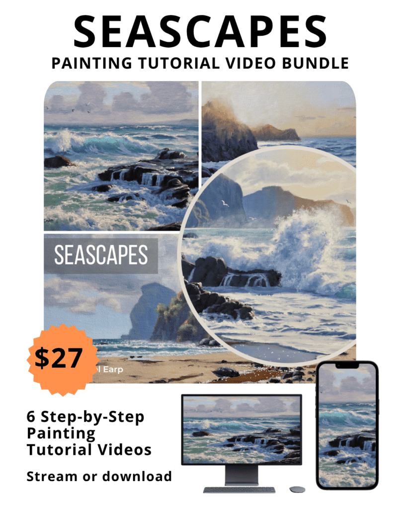
4 x Step-by-Step Painting Tutorial Videos – $27
2. CREATING THE COMPOSITION
Some general rules to follow in creating a composition are as follows:
- Never have your focal point in the middle of the painting
- Never have centre lines in the painting so in the case of a seascape either have a low or a high horizon line.
- Try and avoid repeating forms, objects, lines or vectors as this forms a displeasing static in the painting.
- Don’t overcomplicate your composition, sometimes you can have too much going on in a painting. Less is more!
In this painting the breaking wave is the focal point which is to the left of centre and I have opted for a high horizon line. The rocks add rhythm to the painting and subtly lead the eye towards the breaking wave.
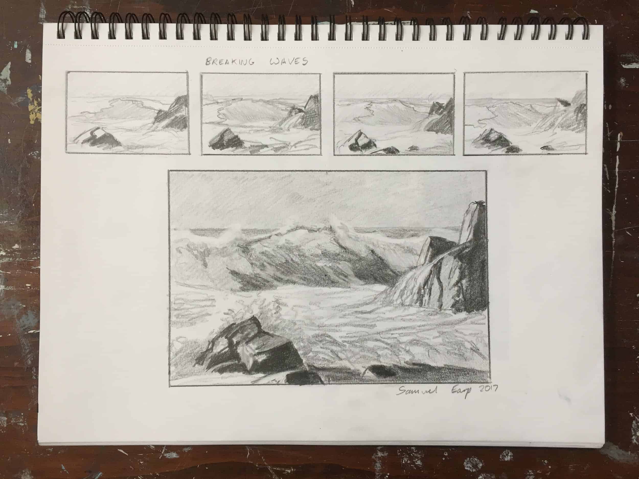
Sketching
After I get my photo reference I sit down with my sketch book and draw some small thumbnails sketches which results in a final sketch which I refer to when painting my seascape. I would thoroughly recommend you do some sketches before you get in to a painting, it’ll make it so much easier. Your sketches don’t have to be perfect works of art, just enough information that you can use it to refer to when you are painting.
Colour Palette
I used the following colours in this painting:
- Titanium white
- Cadmium yellow
- Yellow oxide
- Burnt Sienna
- Burnt Umber
- Cadmium red light
- Quinacridone magenta
- Ultramarine blue
- Cobalt blue
- Cobalt teal
- Phthalo green
Paint Brushes
I used the following brushes in this painting:
- No.6 flat bristle brush
- No.2 flat bristle brush
- No.2 filbert brush
- No.1 round brush
- No.4 fan brush
- 1/2″ dagger brush
- 3/8″ dagger brush
- 1/4″ dagger brush
- 1/2″ mundy mop brush
3. BLOCKING IN THE PAINTING
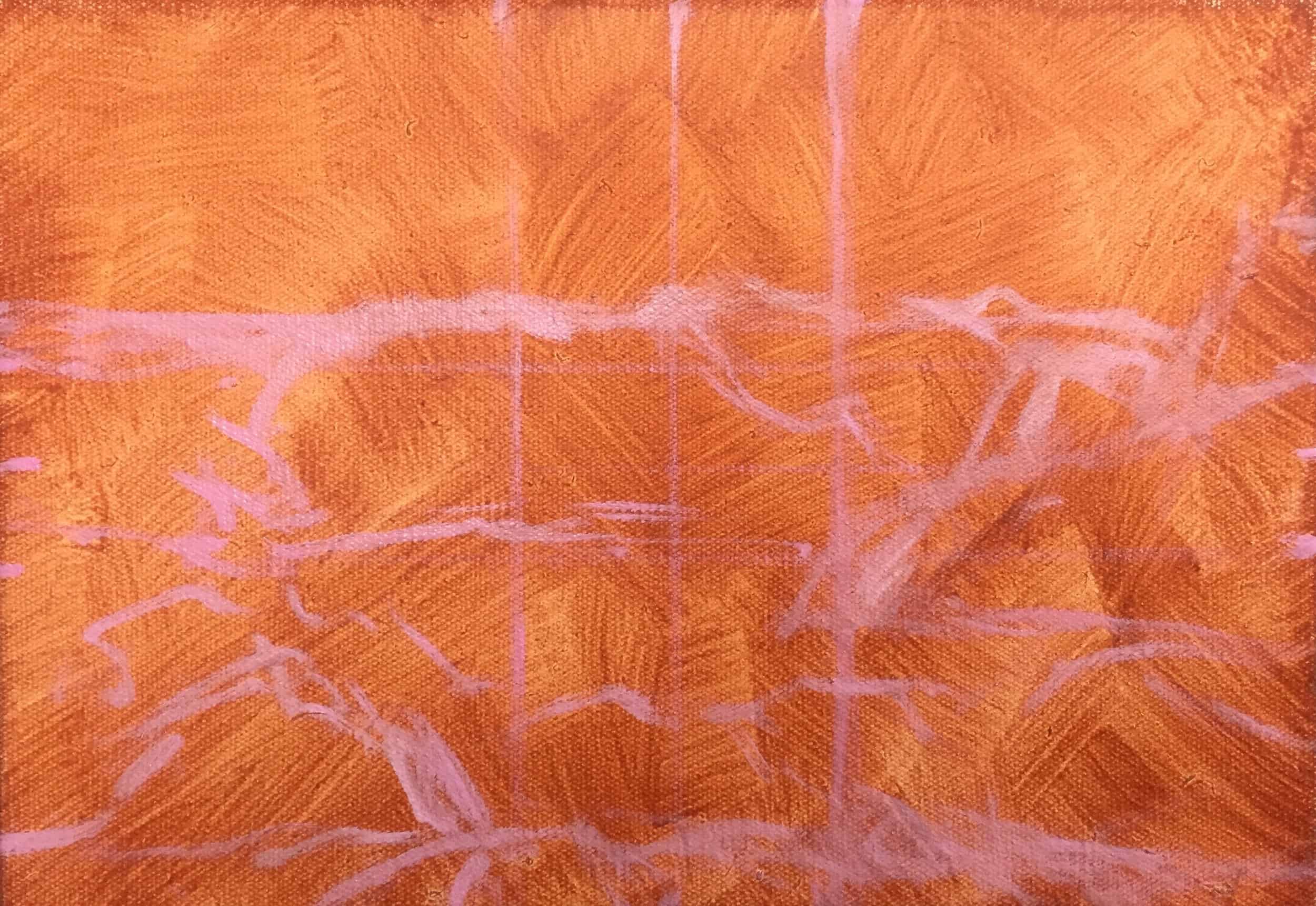
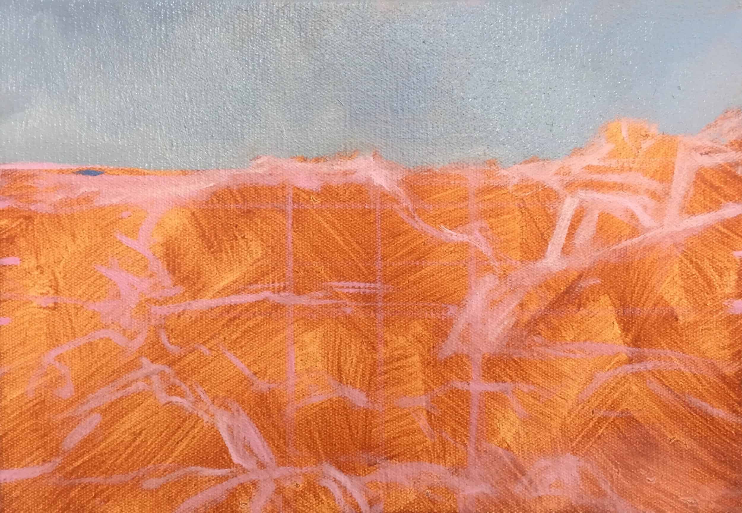
I started this painting by applying a layer of burnt sienna and letting it dry as this warms up the canvas as it comes through the paint layers, it also helps with colour and tone.
I sketched the scene using quinacridone magenta mixed with titanium white and I mixed it with Liquin Original which thins the paint and speeds up the drying.
I start the painting by blocking in the sky. I have deliberately opted for a dark, moody sky to indicate stormy weather conditions, but the dark sky will also contrast nicely against the wave highlights which will emphasise it and add more drama to the painting.
I mix the sky colours with a combination of ultramarine blue, burnt umber, quinacridone magenta and titanium white and apply broad gestural brush strokes with a No.6 flat bristle brush.
Next, I paint the horizon line of the sea using ultramarine blue, a little phthalo green, titanium white and burnt umber to desaturate the mix. I have opted for a high horizon so I can emphasise the drama of the foreground and when painting landscapes or seascapes you should never have your horizon in the middle of the canvas as this forms a distraction in the composition.
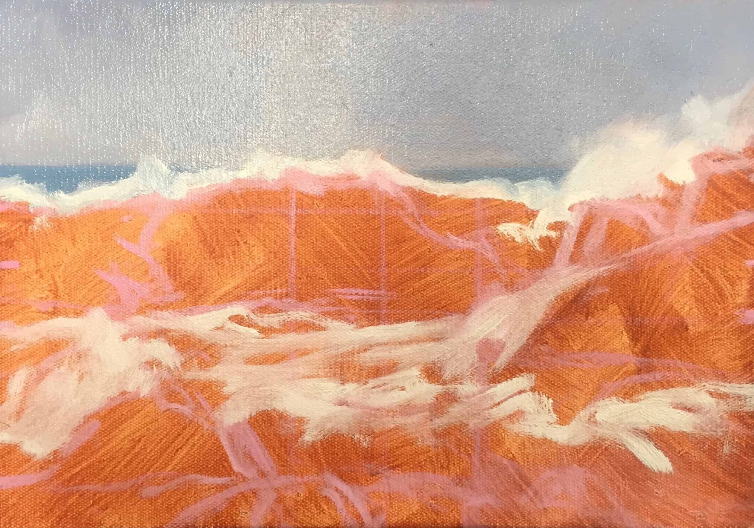
I outline the highlights of the waves and foreground white water with pure titanium white from the tube and liquin, I’m not concerned that I’m using white at this stage as it will soon mix with the painting outline and the colours I am about to add to the painting.
For this stage of the painting I am using a No.6 flat bristle brush
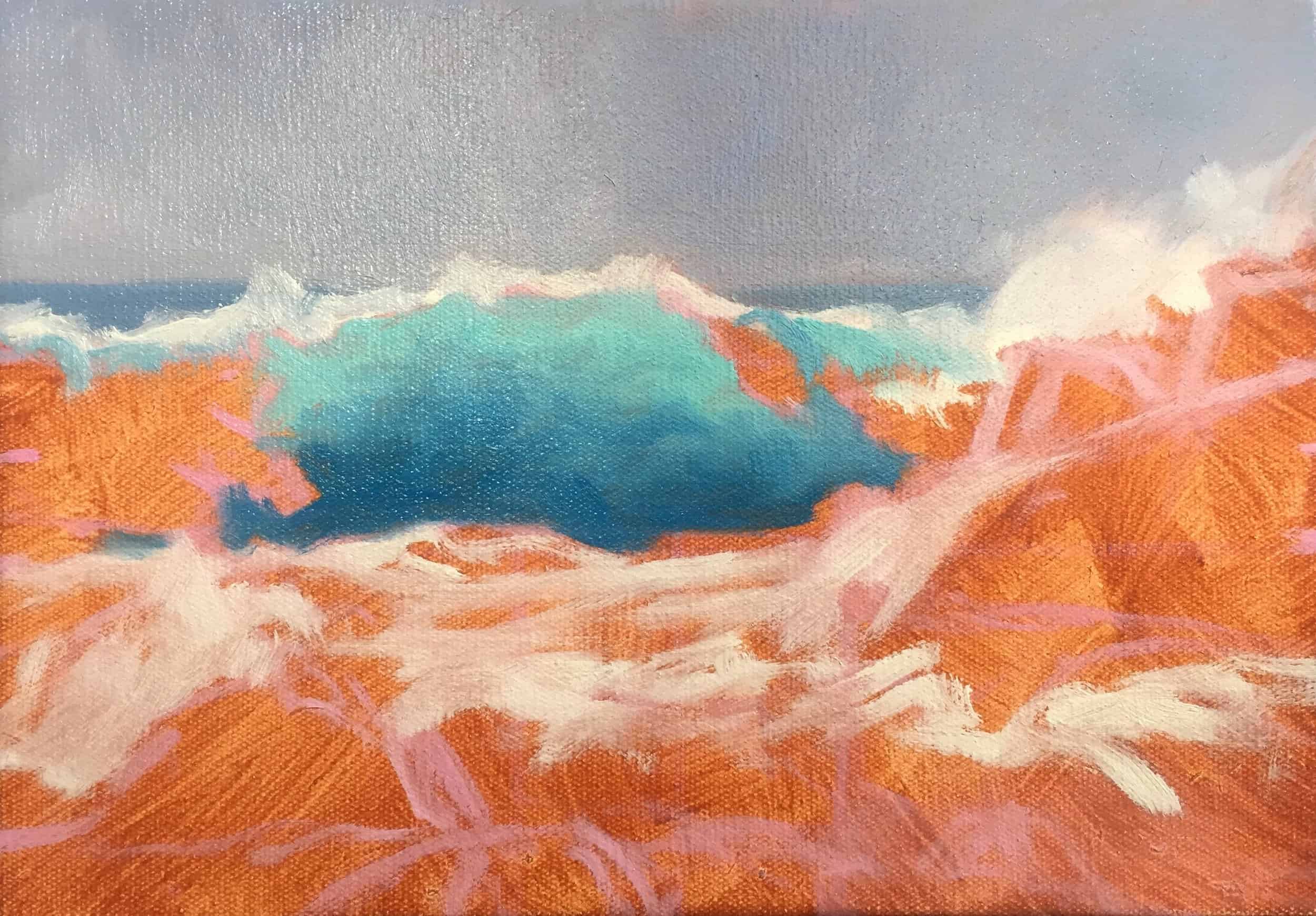
Using a No.6 flat bristle brush I focus on the main focal point of the painting, the wave itself. I paint the translucent area of the wave by mixing titanium white with cobalt teal and phthalo green and then as I move towards the trough of the wave I start introducing ultramarine blue and cobalt blue into the mix and using less titanium white.
I manipulate the paint to give the appearance of turbulent water and at this stage of the painting I am not at all concerned about detail, I just want a base to work from.
I start blocking in the shadows of the waves and white water using a combinations of ultramarine blue, cobalt blue, quinacridone magenta and titanium white. I vary the colour combinations to achieve a variety of tones in the water to give the illusion that it is turbulent and stormy.
I also apply some of my wave colour mix to the white water to add interest to the foreground.
To complete the blocking in stage I add in the rocks in which I have mixed the colours using a varying combination of burnt umber, burnt sienna, yellow oxide, cadmium yellow and titanium white. I keep the tone darker at this stage so I can add highlights later on in the painting.
I mix the rock shadows using a combination of of burnt umber and ultramarine blue which creates a very dark tone.
I use a 1/2″ dagger brush to block in the rocks.
4. BUILDING UP THE DETAIL
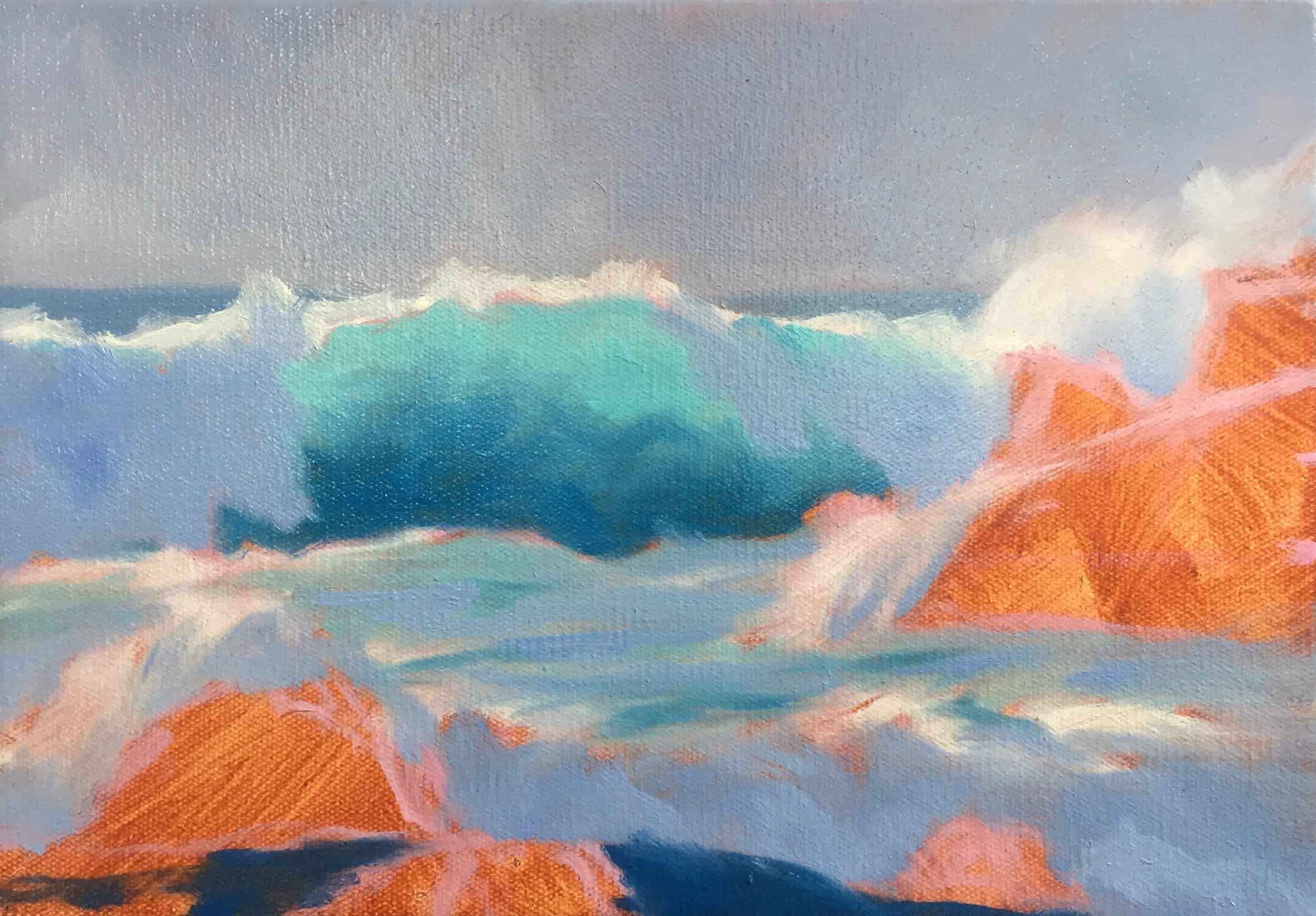
Now that the blocking in stage is complete and I’ve allowed the painting to dry I start working on the detail of the painting. I focus my attention on the wave highlights and the white water in the foreground but I don’t want to dive in there with pure titanium white from the tube.
If you look at the photo for the most part the white water and wave highlights are not quite white, only a few parts of it are, so I need to reduce the tone of the white by adding in a little ultramarine blue, burnt umber and quinacridone magenta, basically the same colours I used in the sky. By using the same colours that I used in the sky it’s actually creating more colour harmony in the painting.
By decreasing the tone of the water I can achieve a more 3D effect in the water later on in the painting by adding lighter tone at the end.
Next, using a 3/8″ dagger brush I paint the foam patterns of the breaking wave, little tendrils of trapped air in the water that form interesting patterns that add to the drama of the breaking wave. I use the same colours for the foam patterns as I did with the shadow areas of the white water.
Now that the water has gotten to the stage where I just need to add final highlights to it, I focus my attention on the rocks on the right. I mix burnt umber, burnt sienna, titanium white and a little ultramarine blue to create the illusion of wet rocks. I increase the tone by adding titanium white.
Using 3/8″ dagger brushes I paint the rocks in the foreground on the left using a combination of burnt umber, burnt sienna, yellow oxide and then in places a little cadmium yellow and cadmium red light to increase the saturation of the colour. I vary the tone by adding titanium white to the mix.
I am trying to give the illusion of wet rocks so I add highlights to some of the rock edges and faces to give the illusion of the sun reflecting off a wet surface.
Using a No.4 fan brush I start adding more highlights to the water to give the illusion of droplets of water as hits the rocky shore. Using lighter tone that the previous layer allows for a more 3D effect in the water.
I’ve been building up the detail of the rocks using a No.1 round brush and applying lighter tone of combinations of burnt umber, burnt sienna, cadmium yellow and titanium white.
I refine the shadows in the white water using 1/4″ dagger brushes and No.2 flat bristle brushes.
5. FINAL DETAILS
To finish the painting I had my final highlights to the rocks by mixing titanium white with a little cadmium yellow and burnt umber. I also add some reflected light to the upper surfaces of the rocks by mixing cobalt teal, quinacridone magenta, cobalt blue and titanium white which I apply using a No.2 filbert brush.
I add pure titanium white in small quantities to the crest of the wave and to the white water in the foreground. This is where I apply my lightest tones to truly bring the water to life and with that the painting is complete.
Paint Stunning Seascapes Step-by-Step
