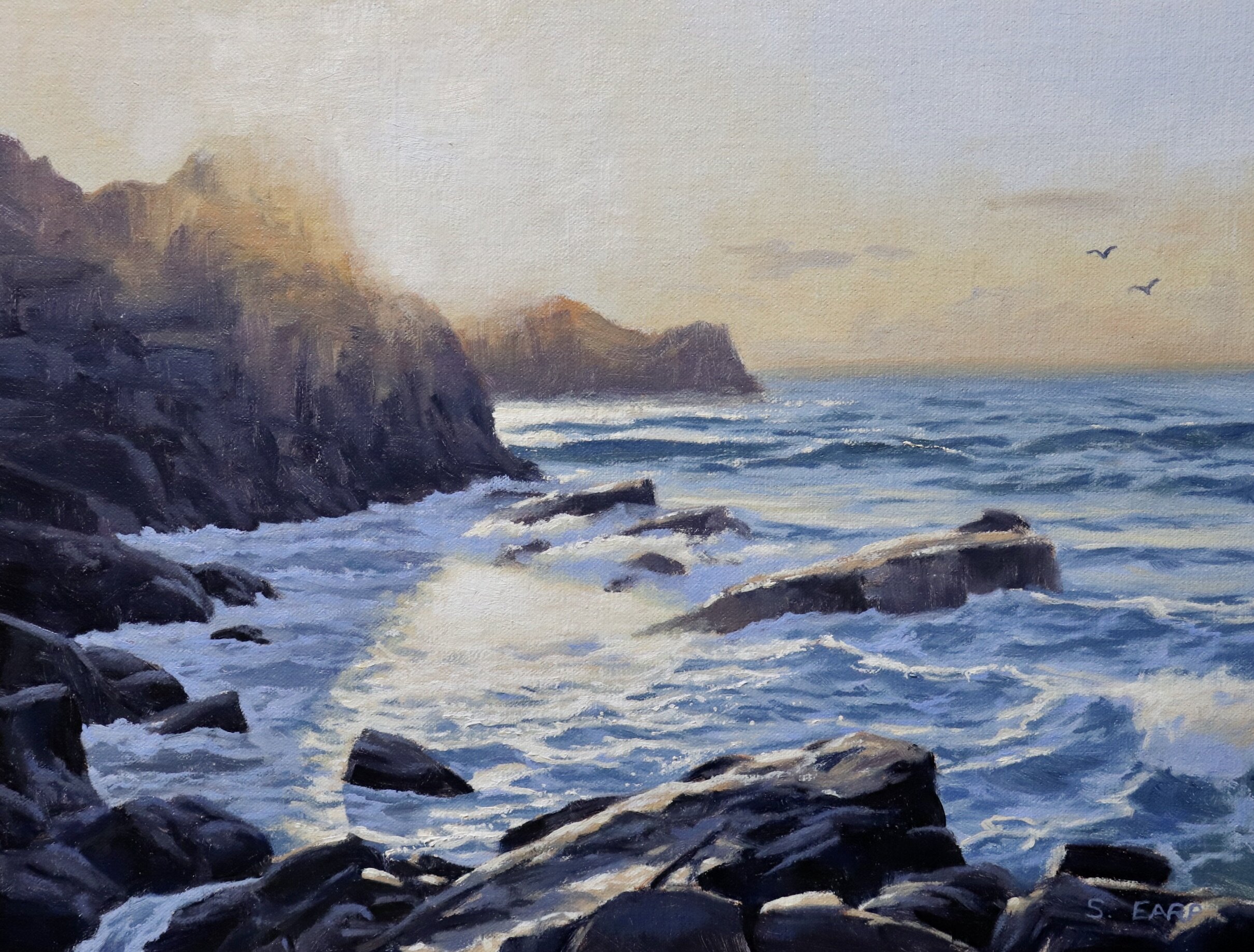
In this blog post, I will show you how to paint this seascape that features a bright sunset. I will also show you how to paint the bright sun in a way that looks like it’s popping off the canvas.
This painting is inspired by a place called Port Soif on the island of Guernsey which is located in the English Channel.
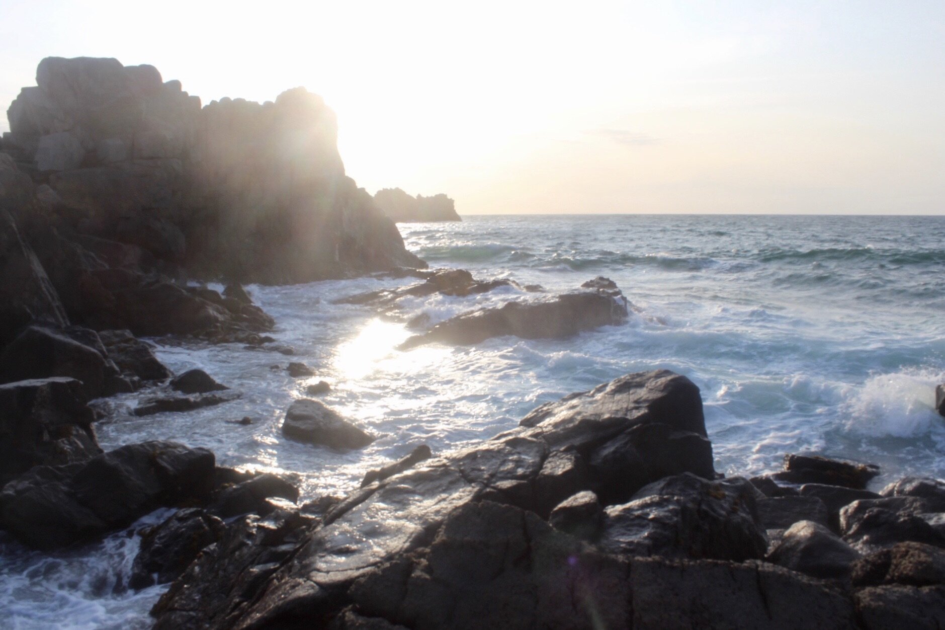
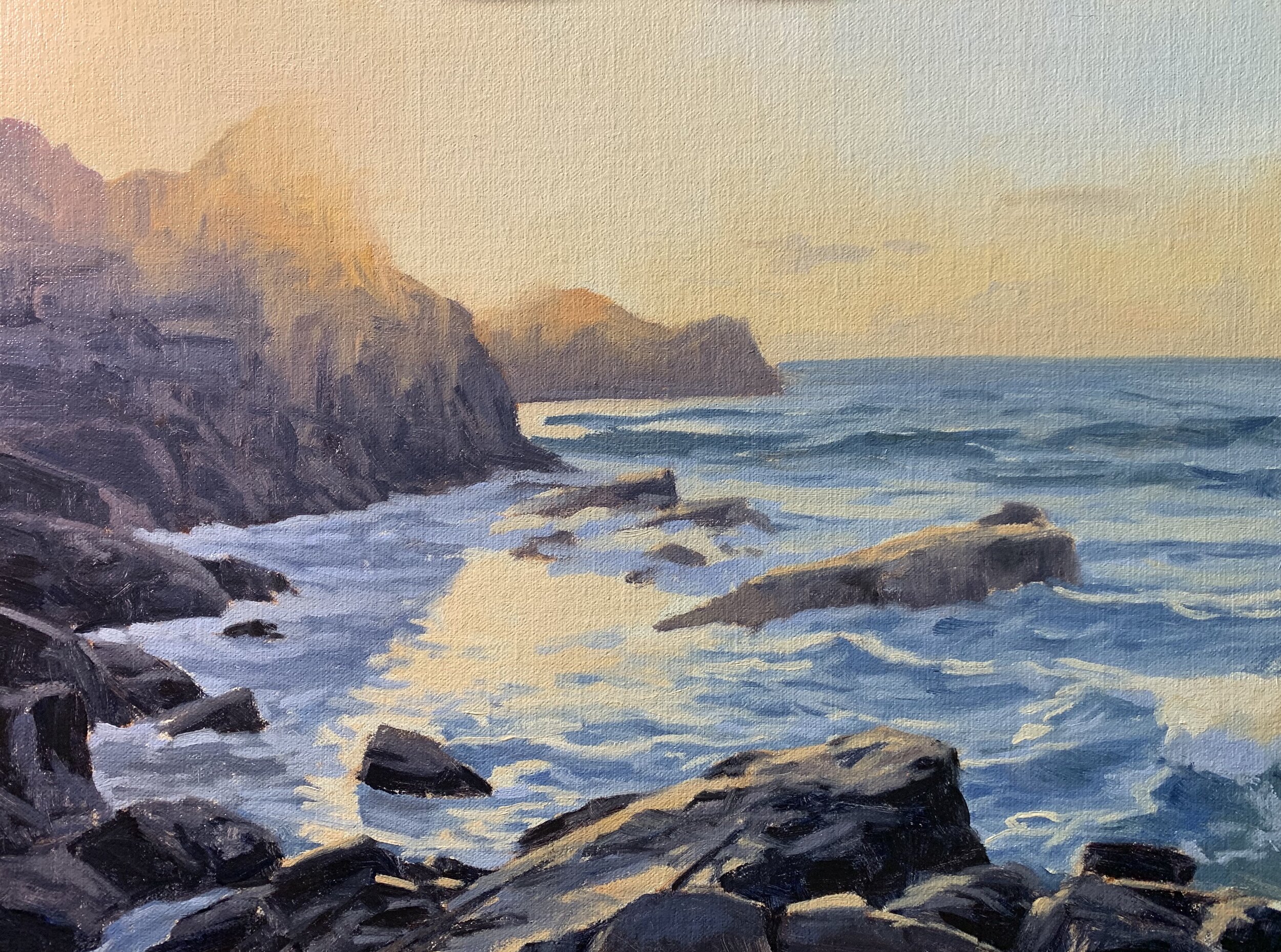
Reference Photo
Here is a reference photo I took and used in this painting. Please feel free to use or copy this photo if you would like to have a go at painting this artwork.
Colours
I painted this artwork using oil paint and the colours I used in this painting are as follows:
- Titanium white
- Burnt sienna
- Yellow oxide (you can also use yellow ochre instead)
- Quinacridone crimson (you can also use alizarin crimson instead)
- Ultramarine blue
Brushes
Here is a list of the brushes I used in this painting:
- No.5 flat
- No.3 flat
- No.2 flat
- No.3 filbert
- No.1 round
- No.0 round
Composition
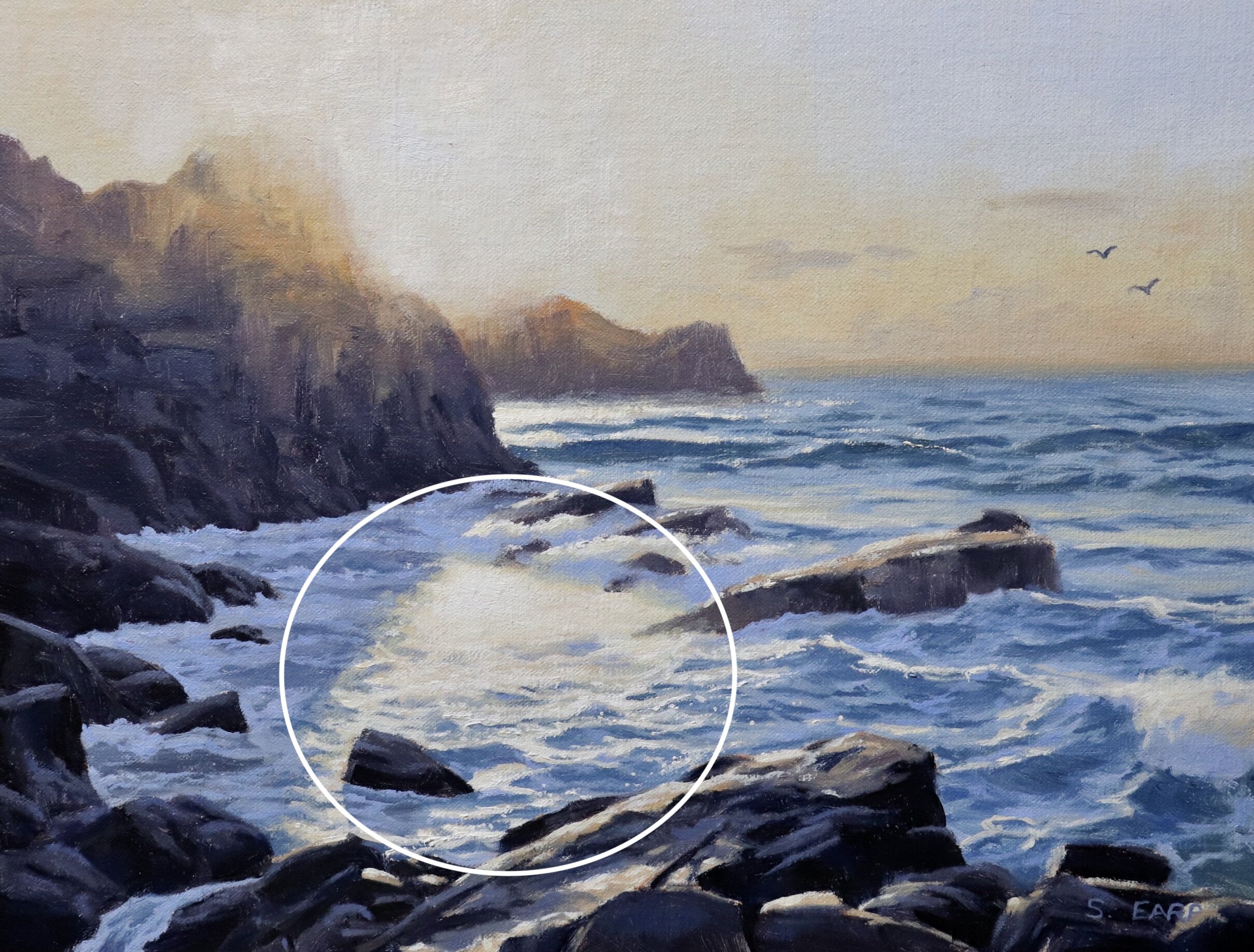
This painting incorporates a circle or ‘O’ composition which implies unity and space. The circle composition is a good solid design to use in your painting. In this case, the circle is in the foreground water surrounded by the rocks. The bright sun is also a focal area.
Things to be Avoided in Composition
- Never have your focal area in the middle of the painting, avoid centred objects
- Never have your horizon line in the middle of the painting, either go for a lower or higher horizon
- Avoid repeating objects, equal masses, repeating lines and vectors and aberrations in general.
- Avoid having too much detail as this could spoil the composition.
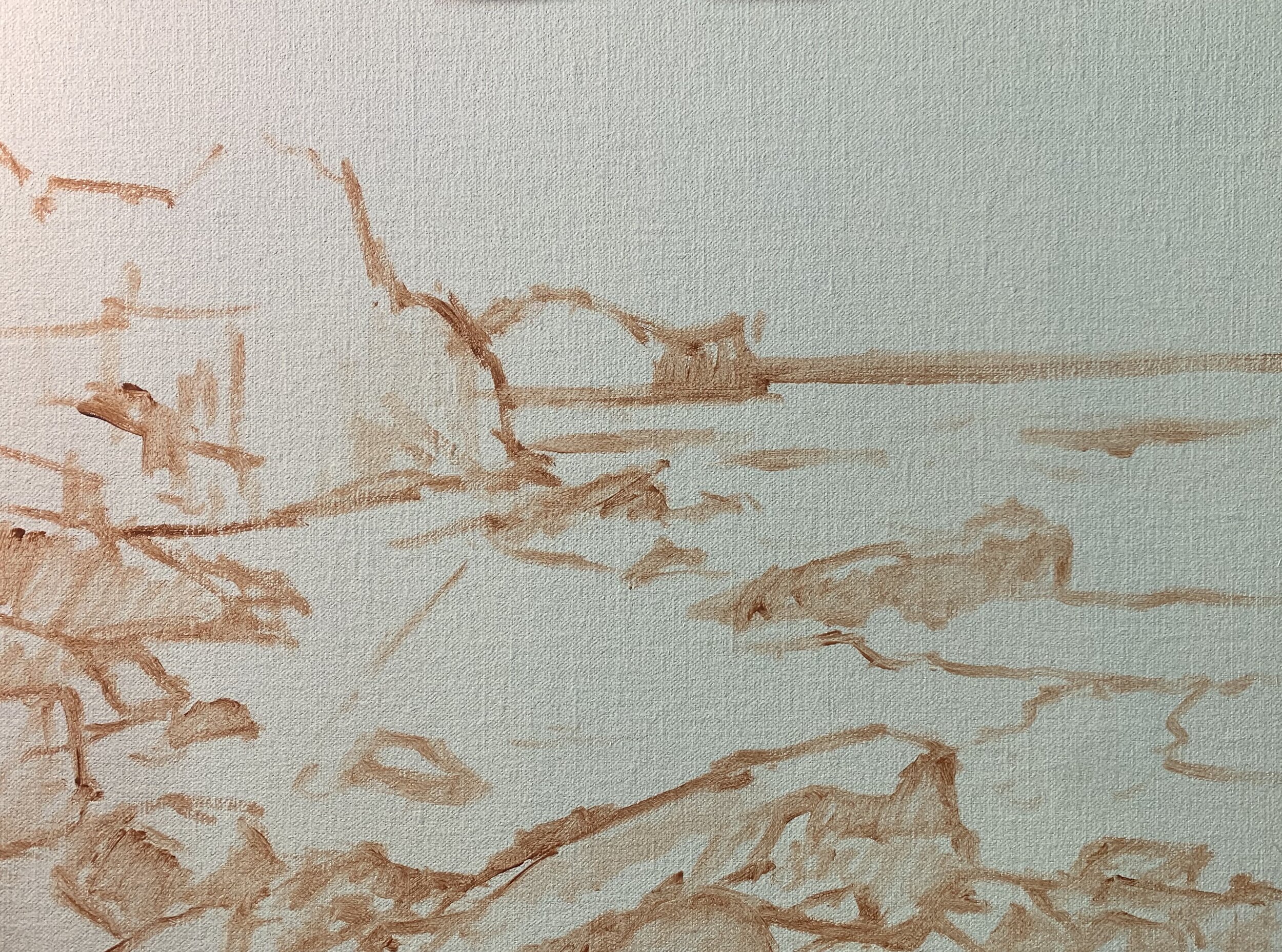
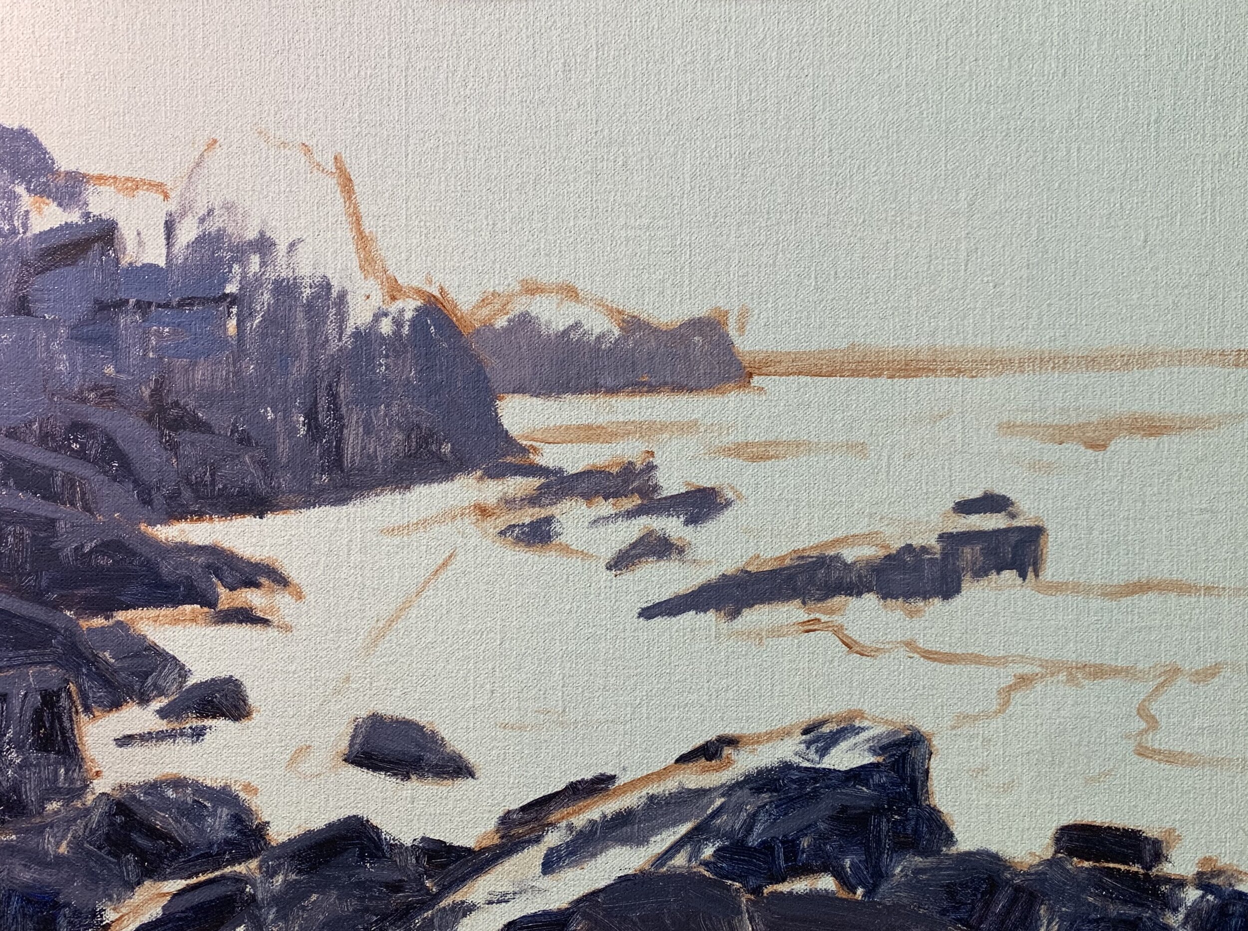
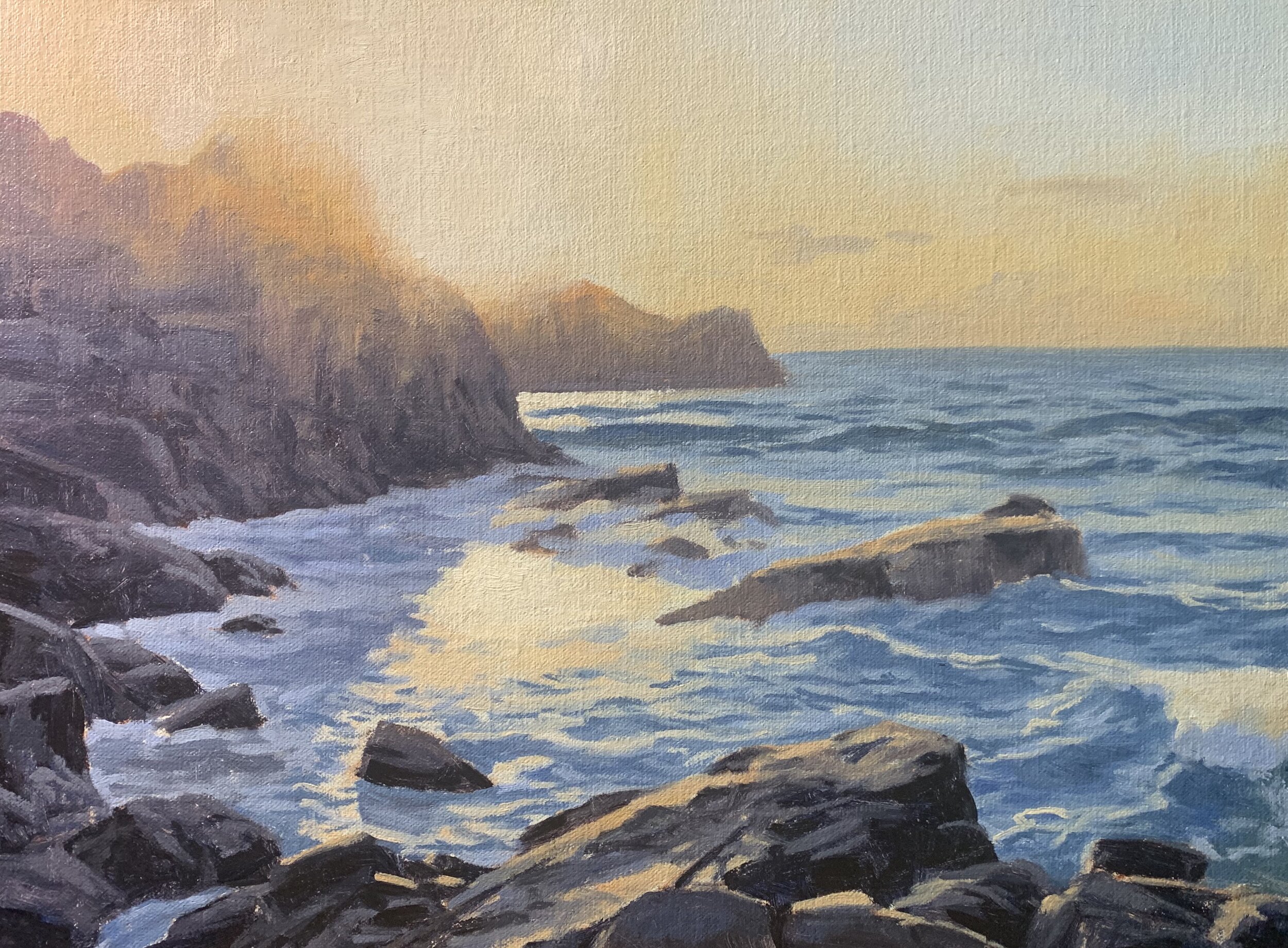
Stage 1 – Blocking in the Painting
I am painting on a 12” x 16” linen panel. The panel is pre-made with a medium weave linen that is oil primed.
I sketch out the composition using a No.1 round brush with burnt sienna mixed with Liquin Original (Liquin). I am using Liquin as a medium to thin the paint, it also has the advantage of speeding up the drying time.
I begin the painting by focusing on the dark values first. Value refers to how dark or light a subject is and here the darkest values are within the rocks. I want to mix some cool neutral greys for the rock shadows and I use varying combinations of ultramarine blue, burnt sienna, quinacridone crimson and titanium white.
You can mix some nice neutral greys with a combination of these colours but I always edge my mixtures towards the blue side so the colours don’t look muddy. The quinacridone crimson gives the colour a violet tint.
I’ve used the darkest colours in the rocks for the occlusion shadows and the cracks and fissures.
Once I’ve established the rocks I work on the sky. I want to create some warm tones here so I mix titanium white, yellow oxide and a little quinacridone crimson.
In order to create the illusion of bright sunlight it is necessary to paint the upper sections of the with my sky mix. This will help to make the sun look like there is a halo of warm light around it. I use the same colours I used in the sky but I increase the saturation by mixing in more yellow oxide and quinacridone crimson.
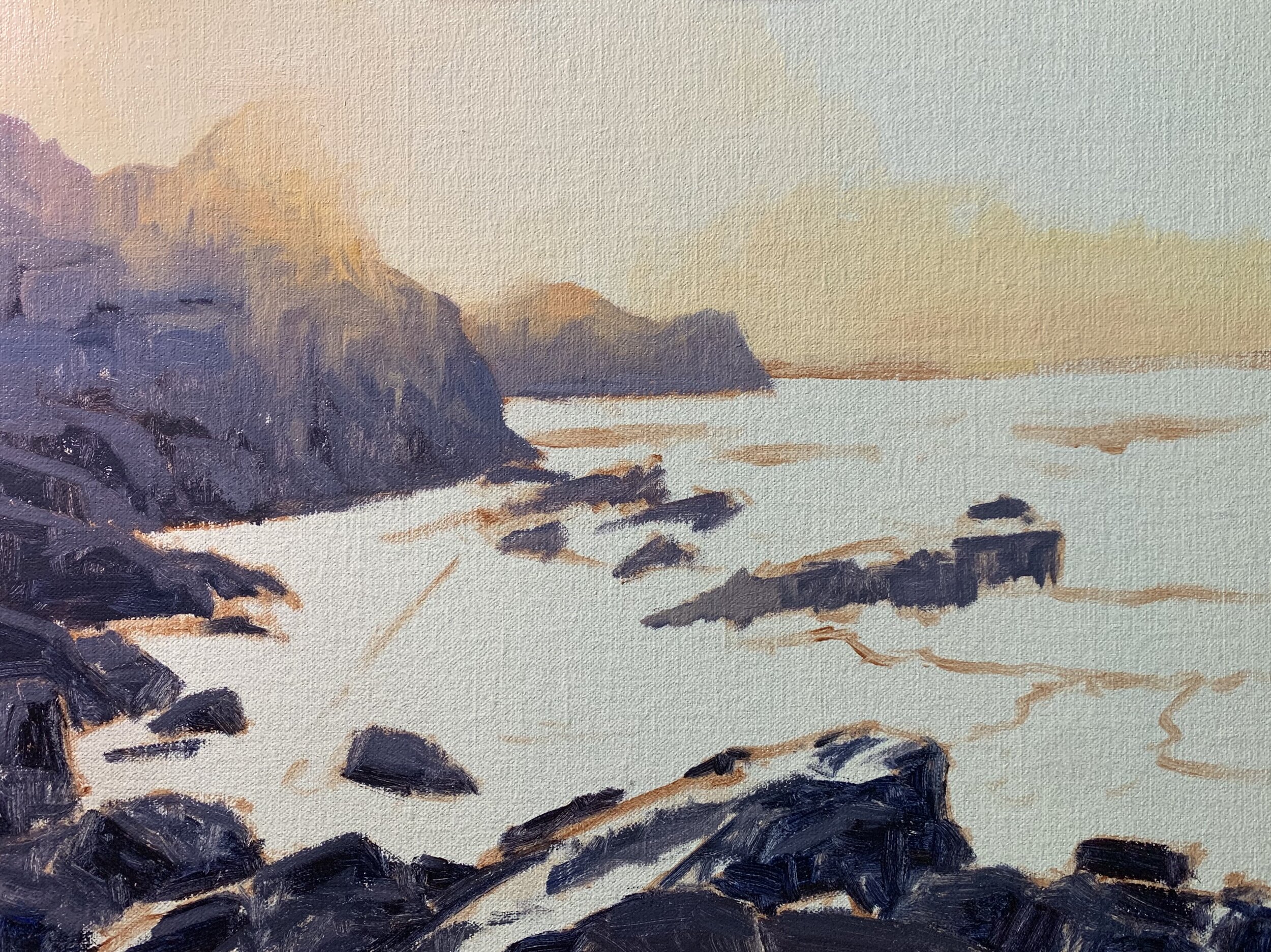
For the area around the sun I have mixed in more titanium white into my warm sky mix and I am able to use the same colour for the reflection in the water.
There is an area of blue sky visible in the upper right corner of the painting and for this, I mixed titanium white with a little ultramarine blue making sure to keep the value light.
I paint the ocean with a mix of ultramarine blue, a little yellow oxide and titanium white. For the darker values in the breaking waves, I use less titanium white in the mix and more ultramarine blue. I use more ultramarine blue in the water in the foreground and for the lighter values in the troughs of the waves and ripples I use more titanium white in my mix.
I paint the wet reflective surfaces of the rocks using the warm sky mix I made earlier. I also paint the white water around the base of the rocks, especially on the left side of the painting. For this, I use a mix of titanium white, ultramarine blue and a little quinacridone crimson.
At this point in the painting, I stopped to let it dry so I could begin adding details later on.
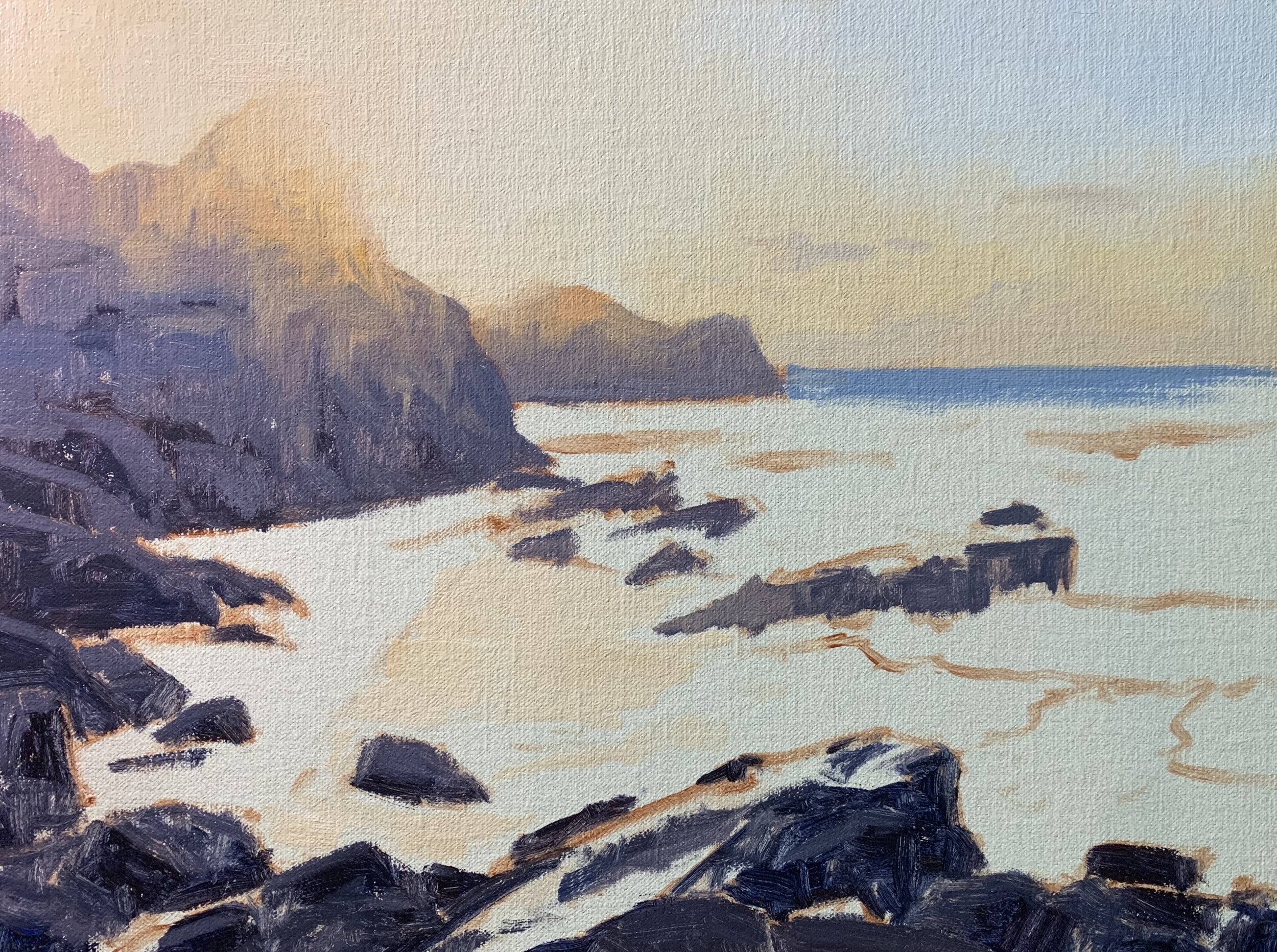
Stage 2 – Adding Details
Once the painting was dry I added finer details to the rocks and water in order to build up a three-dimensional form. Essentially I am using the same colours that I used during the block-in stage but I have been using lighter value colour in many cases.
I paint more halftones in the rocks with a mix of ultramarine blue, burnt sienna, quinacridone magenta and titanium white.
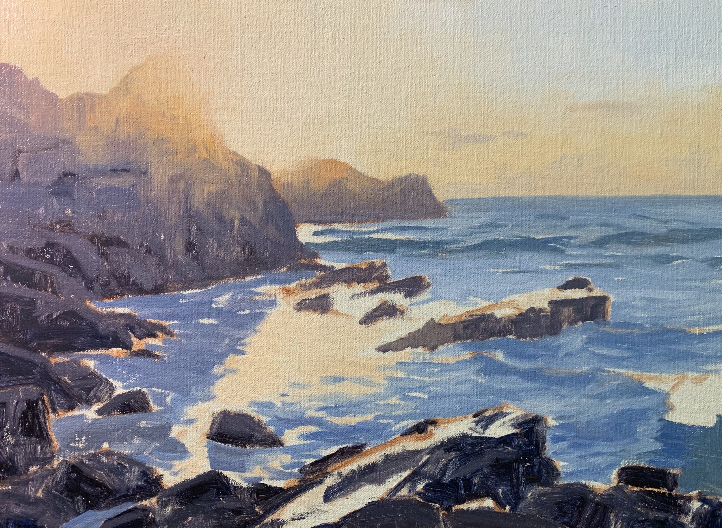
Stage 3 – Completing the Painting
I complete the painting by adding some final highlights to the bright sun with a mix of titanium white and the smallest amount of yellow oxide. I am then able to use the same colour mix for the highlights in the water where the sun is reflecting off the surface. I also use this colour mix for the highlights on the wave crests and to paint some sparkles on the water.
I paint further highlights in the troughs of the waves and ripples with a mix of titanium white and a little ultramarine blue.
Thank you for reading 😊
