In this article, I will show you 5 composition ideas that will improve your landscape paintings.
Why is Composition in Landscape Painting Important?
Composition is an essential aspect of landscape painting but is surprisingly overlooked. I have visited many art galleries with landscape paintings for sale, some with very high price tags and terrible compositions. Some of the compositions I’ve seen are so bad that it’s at that point I think to myself am I missing something here? Did I miss a meeting? It’s a shame because I have seen many a potentially good painting ruined by a bad composition.
So why is composition so important? It’s important because the scene you are painting ideally should be balanced, harmonious and pleasing to the viewer. A pleasing design and a balanced pictorial plan are essential elements of a fine work of art.
Now I’ll be honest with you, I haven’t always been good at designing engaging compositions and even now I don’t get it right. I am still learning. In fact, in the first few years I was painting I did no compositional planning, I copied photographs exactly as they were and didn’t do any prior sketches. As a result, many of my compositions were terrible. Add to the number of times I was halfway through a painting and had to stop because it wasn’t working due to a bad composition, it was very frustrating.
In the end, I was very fortunate to meet an artist who mentored me and emphasised the importance of composition for improving my paintings. When I realised I had never done any planning for my paintings it suddenly dawned on me that I could have saved myself a load of time and work. From that day on I have always planned my paintings in my sketchbook first.
Plan and Design Your Paintings in a Sketchbook First
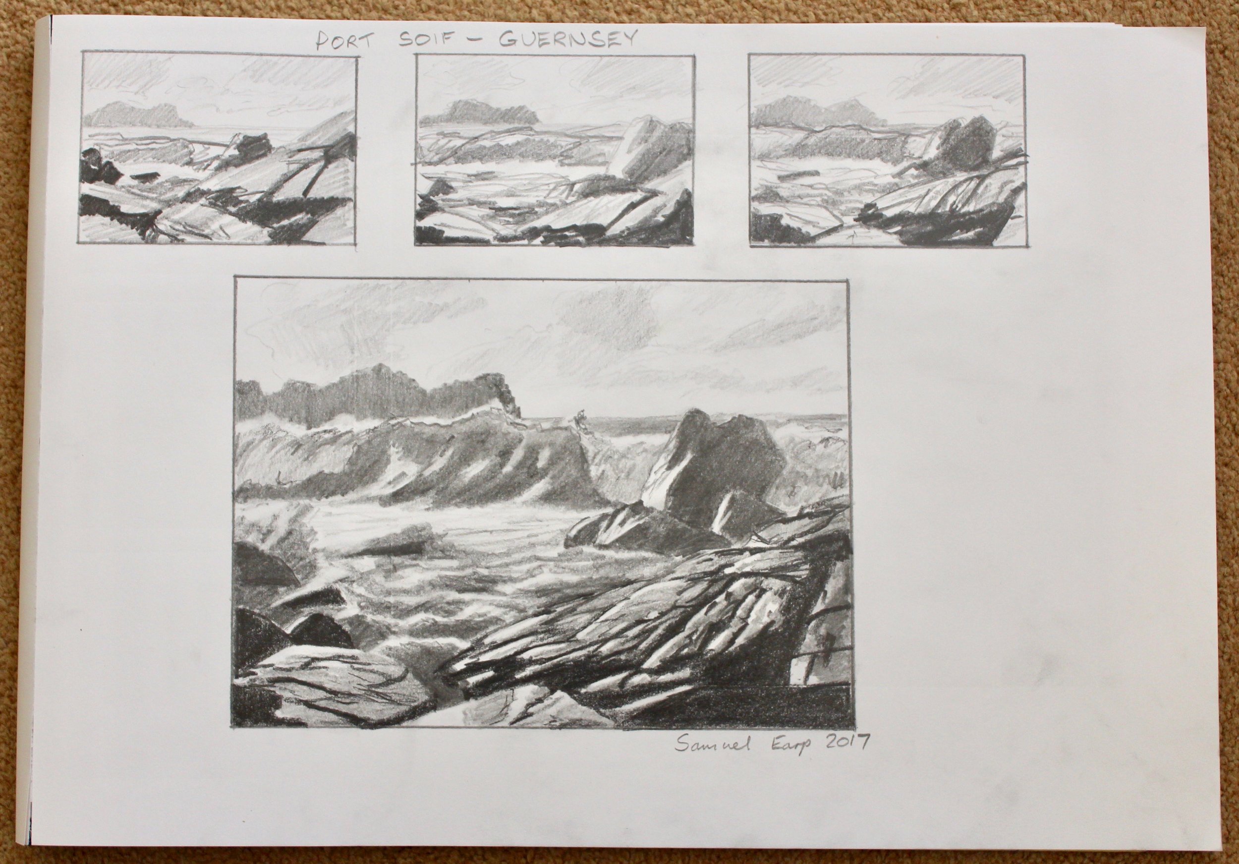
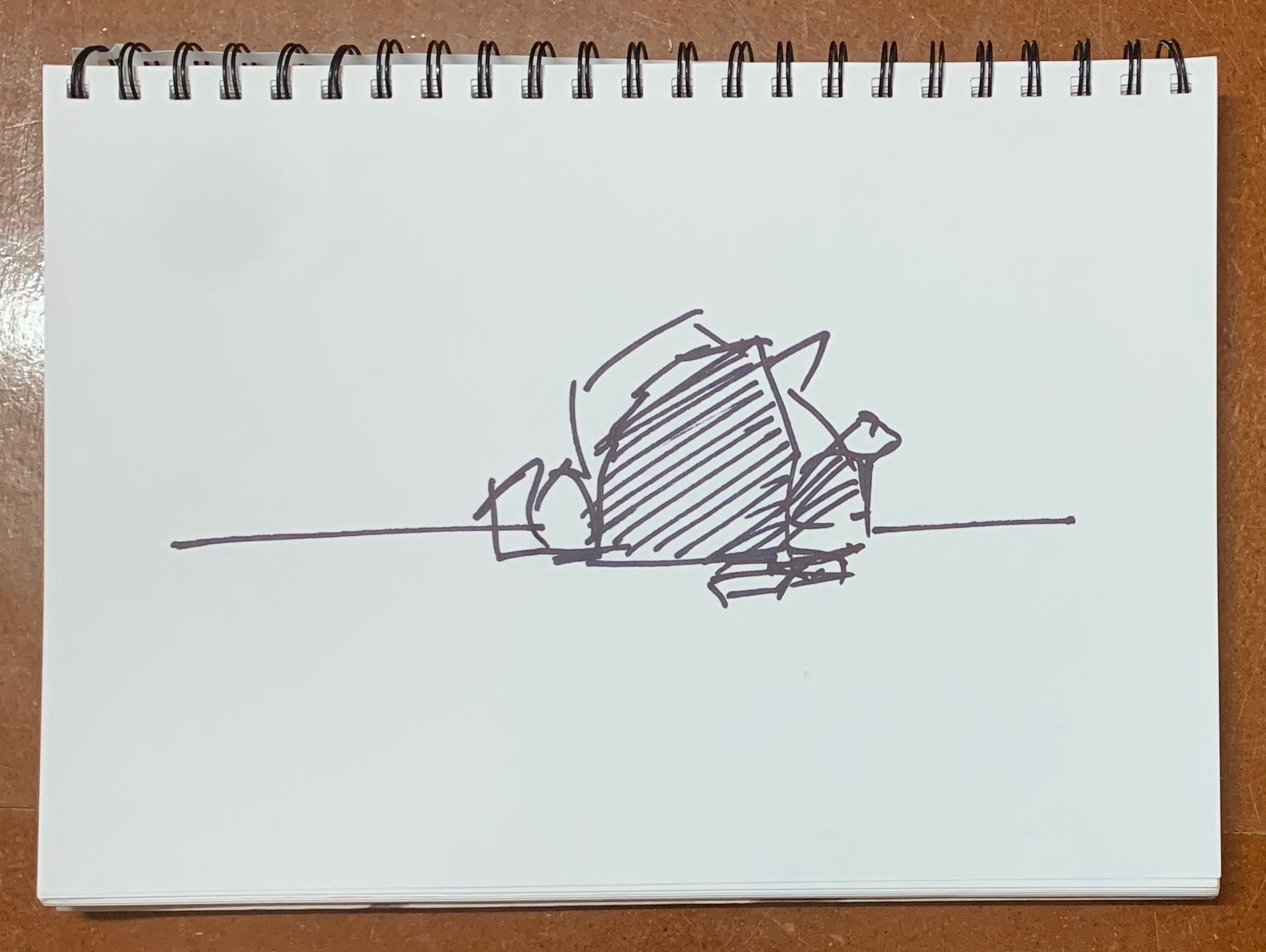
Before you start a painting, design it in your sketchbook first. This will not only save you hours of time in potentially running into trouble with a painting due to a bad composition, but it’s also fun as well. I love seeing what my potential paintings could look like in a sketchbook.
Start with some quick thumbnail sketches first and then when you are happy do a final sketch.
ARE YOU STRUGGLING WITH YOUR PAINTING?
JOIN MY ONLINE ART SCHOOL AND UNLEASH YOUR INNER ARTIST.
- Step-by-Step Painting Tutorials
- Helpful Tips and Techniques
- In-depth lesson notes
- Inspiring reference photos
- Instant access to all content, including videos, lesson notes, reference photos and more.
- A vibrant and friendly community, meet other members, ask questions, and share your art.
- Zoom meetings for Q&A’s, painting critiques and painting livestreams.
- Ideal for beginners and experienced painters.
- Lots of inspiration, help and support to take your painting skills to the next level.
Five Composition Ideas to Improve Your Landscape Painting
There are many ways to create engaging compositions in paintings and I find that it’s best not to overcomplicate your scene. So when composing a painting I find it easiest to stick to more simple compositional designs.
A few years ago I read Edgar Payne’s ‘Composition of Outdoor Painting’ and it’s a book I refer to all the time. It helped me to remember some basic compositional designs that I can use especially when I’m painting outdoors en plein air.
With this in mind here are five compositional designs based on what I have learned from Edgar Payne’s book, that you can incorporate in your own painting design. These are the compositions I most commonly use in my paintings as they are some of the simplest. I am using my own paintings as examples of compositions in this blog post.
1: Steelyard Composition
The steelyard composition, it’s one of the simplest compositions and is particularly good if you are painting outdoors en plein air. The artist Edgar Payne frequently used this style of composition in his paintings.
The steelyard composition is formed of a large mass that is counterbalanced on a theoretical fulcrum by a smaller mass further away from the centre.
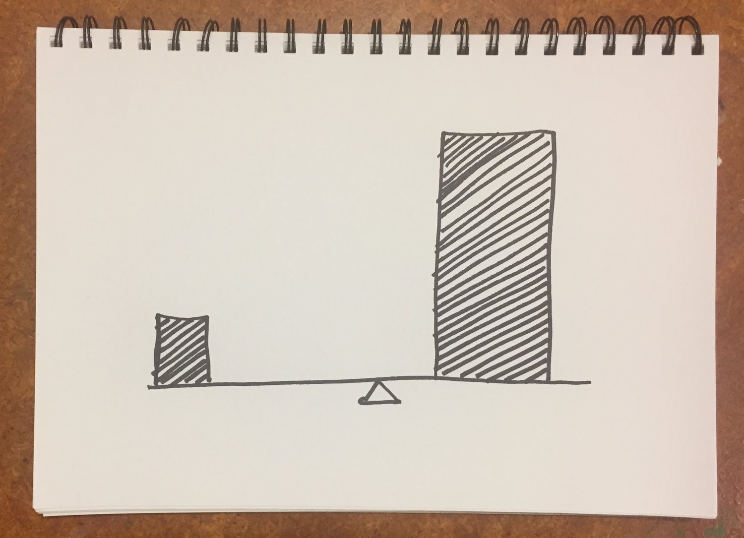
The area of interest would be near the fulcrum or main weight but sometimes the main weight itself could be the main point of interest, for example, a group of trees. However, there should be a connection between the main weight and the lesser one.
Overall the steelyard composition provides a sense of balance in the painting.
Now let’s look at some examples.
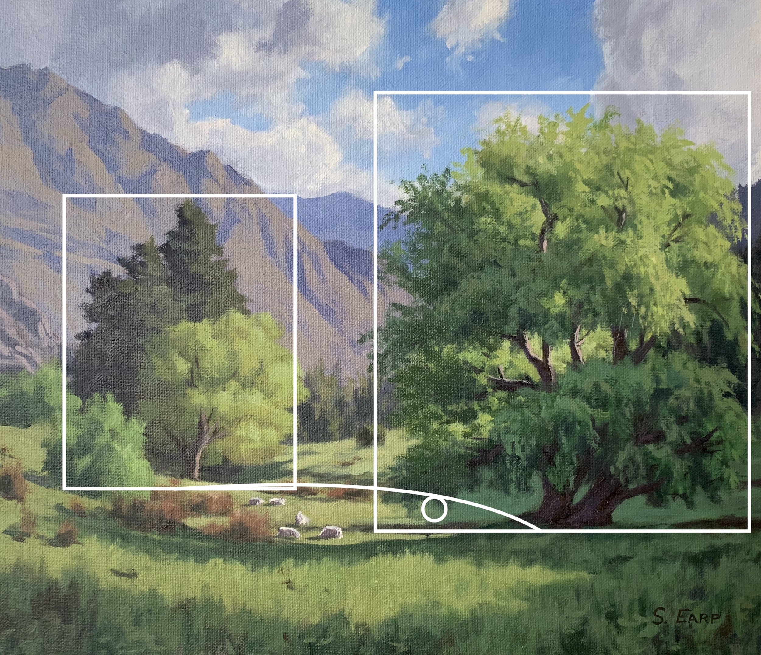
Here the group of trees on the left is the main focal area of the painting with the main weight being the willow tree on the right.
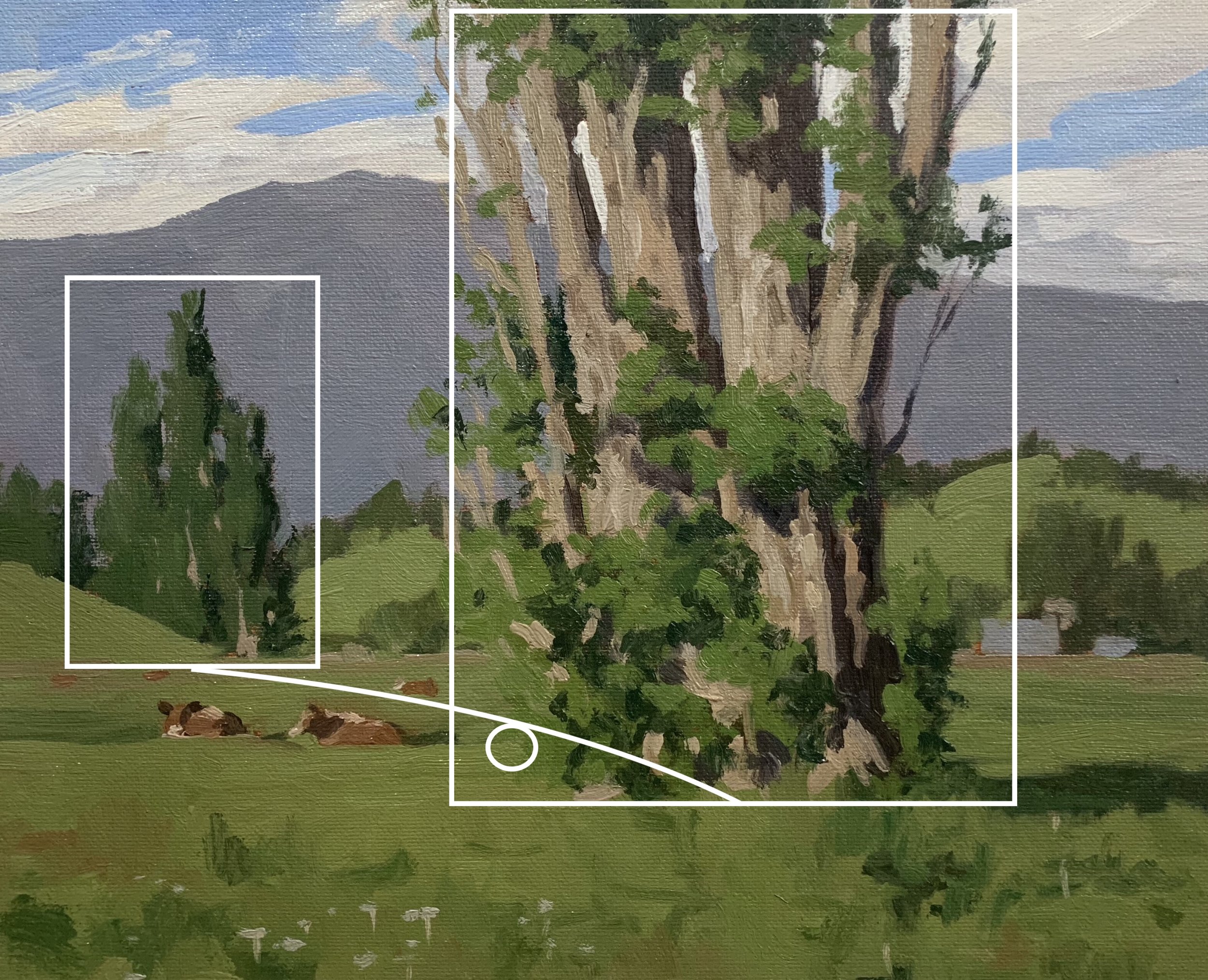
In this painting which I painted outdoors en plein air, the trunk of the Lombardy poplar is not only the largest weight but is the main area of interest in the painting. The painting is counterbalanced by the three Lombardy poplars in the mid-ground.
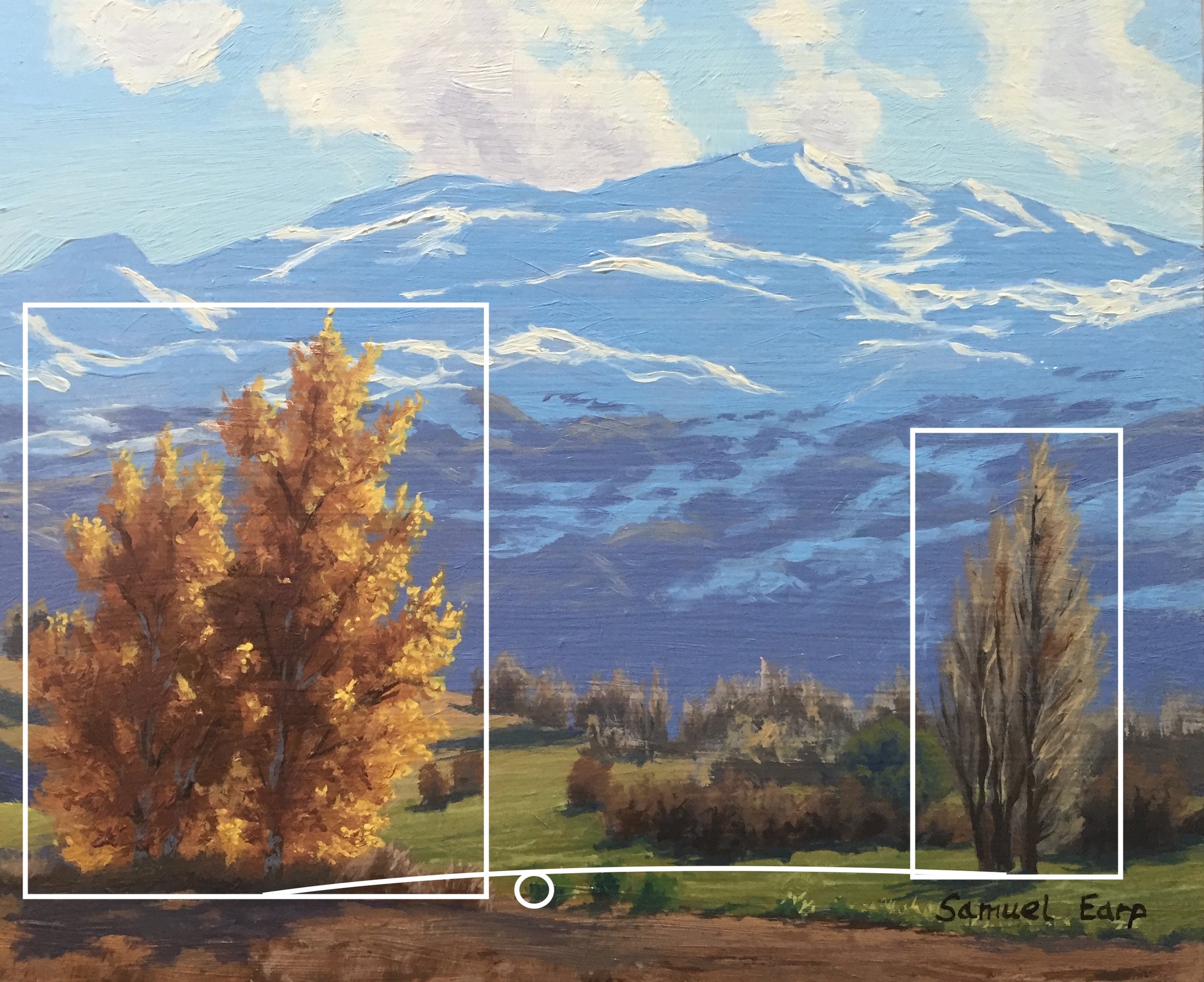
In this painting, the silver birch tree on the left is the main weight and is counterbalanced by the Lombardy poplar on the right. The shape of the mountain adds further balance to the composition.
2: ‘O’ or Circle Composition
The ‘O’ or circle is an easy composition to incorporate into a painting and it is a useful composition as it often produces unity and a solid design. The ‘O’ composition is characterised by a dominant opening or space that is formed by masses, lines or edges.
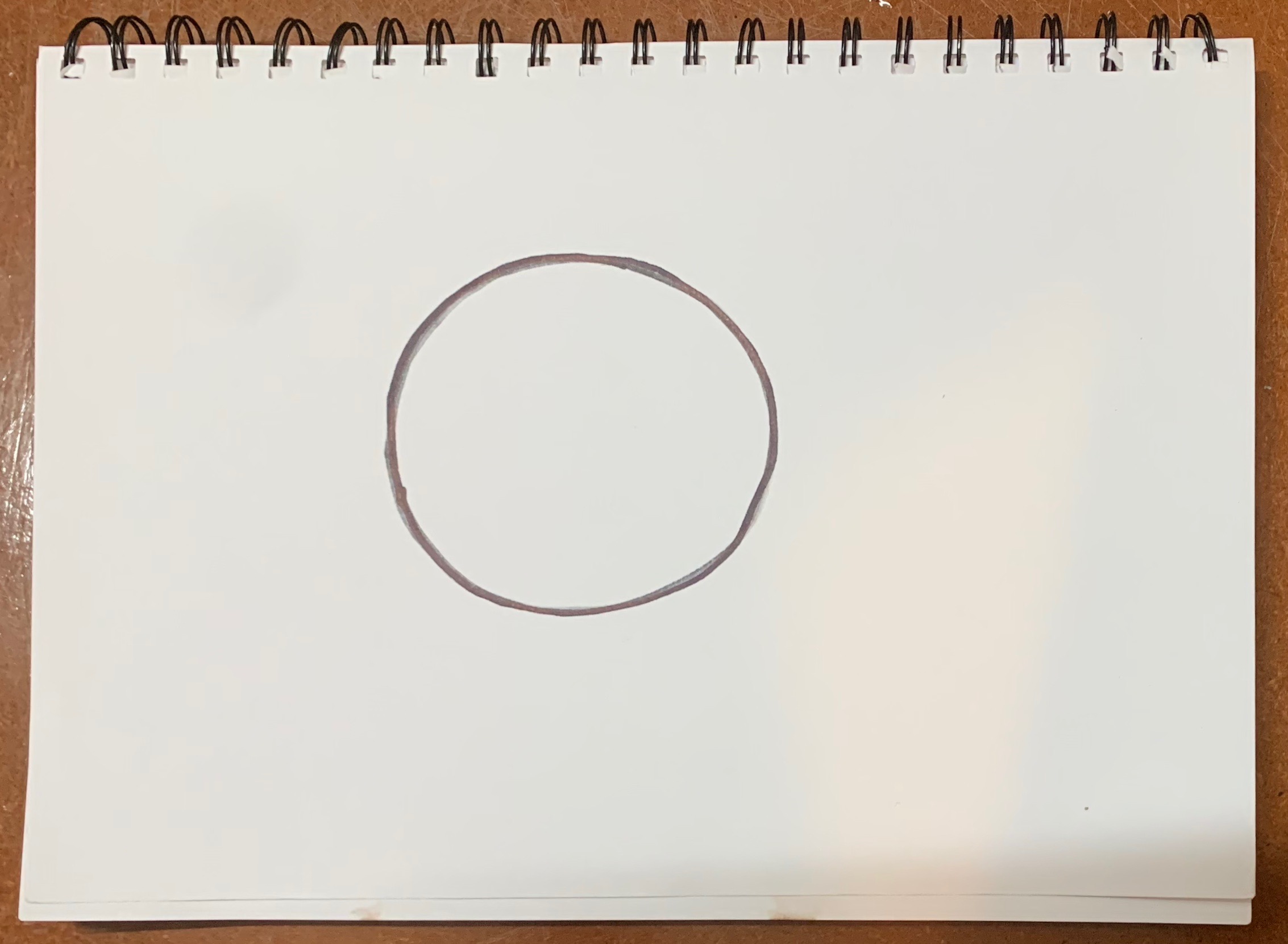
The circular composition maybe be shown as an oblong space or oval when perspective is applied to this composition and the main area of interest is the circle itself or something within it. Often the circle will allow the eye to travel around the canvas but never off it.
Let’s see some examples.
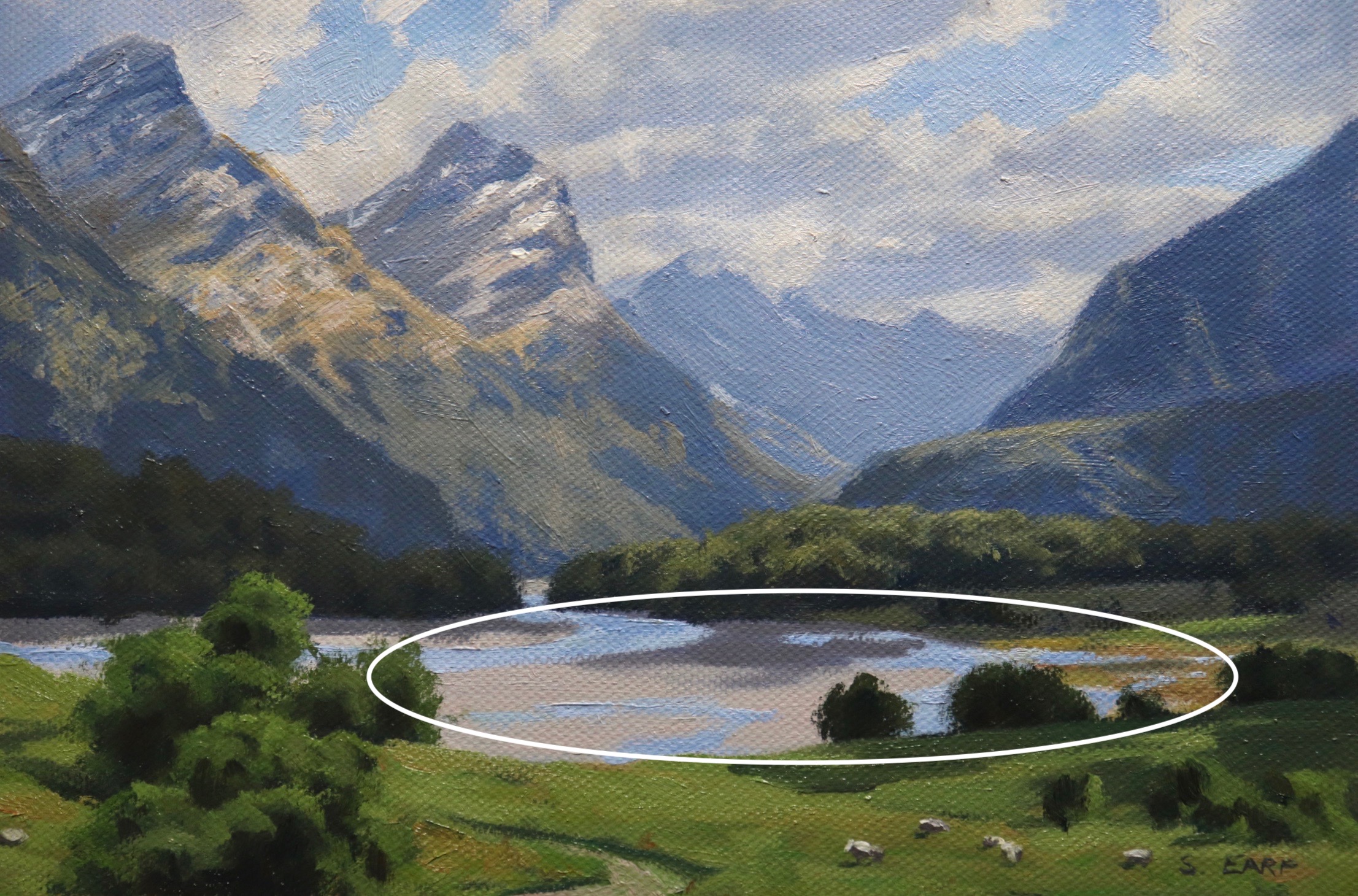
The O or circle is the mountain flood plain and the trees, meadows and mountains form the circle. The mountains themselves and another dimension to the painting help to anchor and solidify the composition.
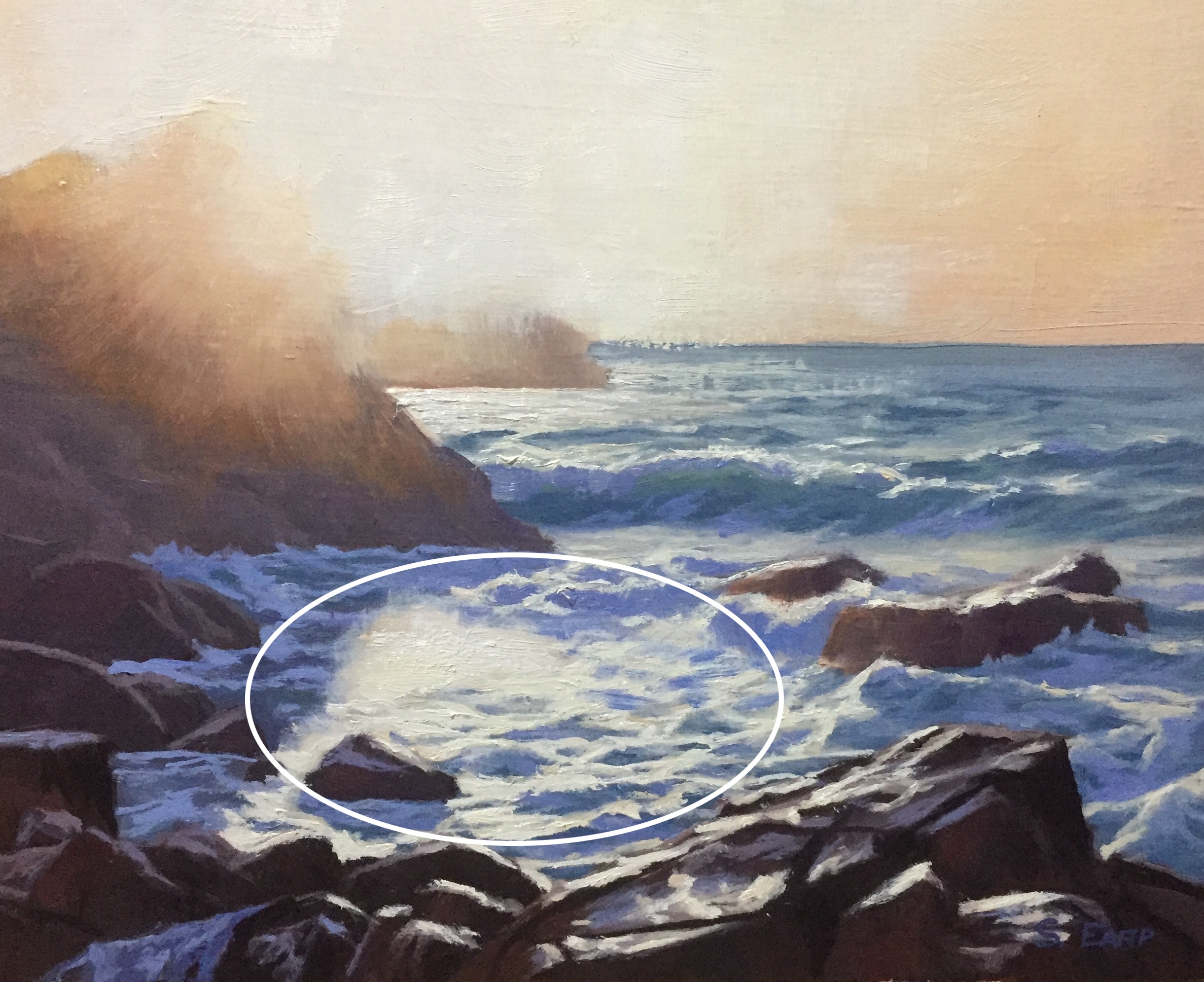
In this painting, the rocks in the seashore form an opening and a circular arrangement in the foreground.
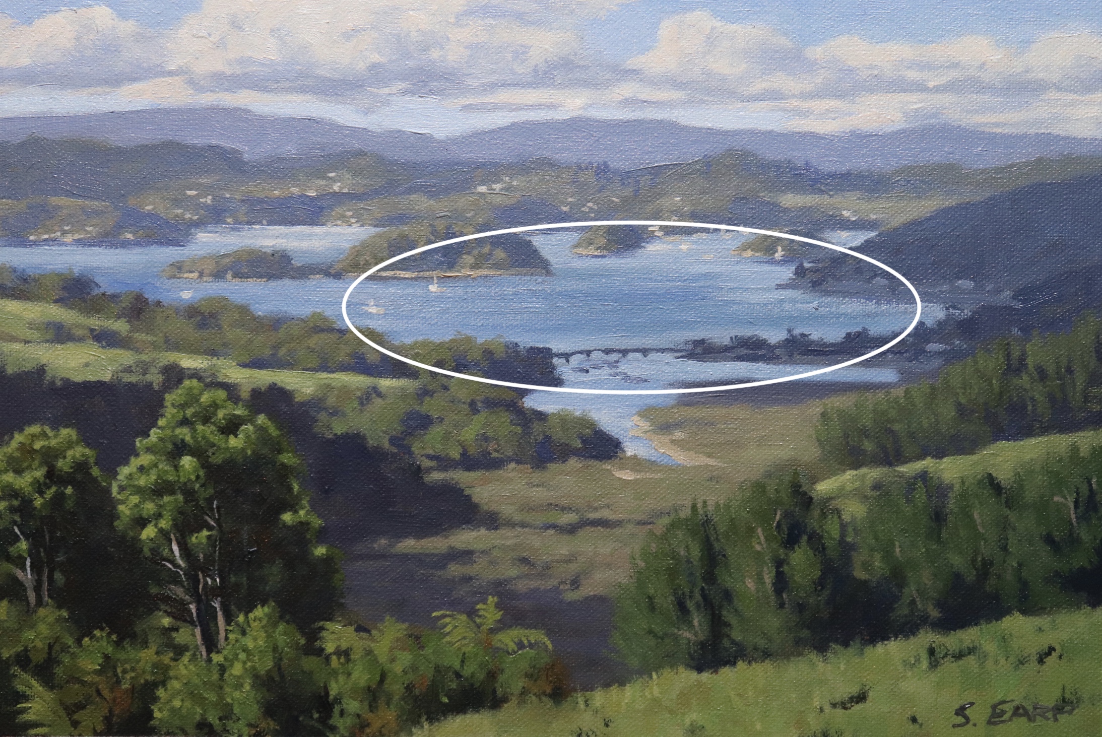
The circular composition is within the body of water in the coastal scene. The rocks, islands, cliffs and trees are arranged to form the opening in the composition.

3: ‘S’ or Compound Curve Composition
This is another useful composition especially if you are painting rivers, pathways, and roads as the composition is more defined by lines and edges rather than a mass. However, if there is a specific focal area or point of interest it should be at the near or on the converging ends of the main lines.
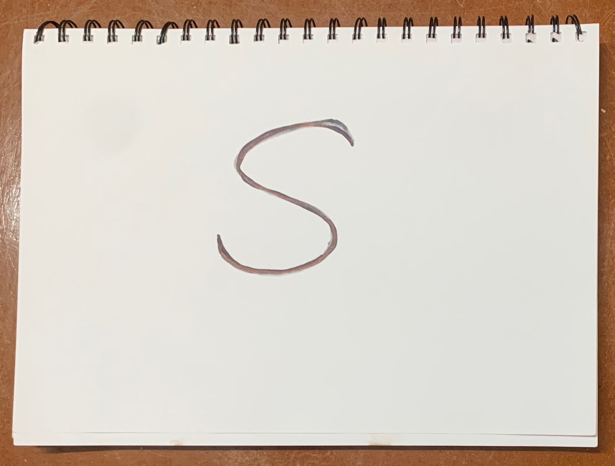
The ‘S’ or compound curve is a good failsafe composition to incorporate into a landscape painting especially if it features a river for example. The compound curve implies motion and rhythm in the painting and is especially good when there are some interceptions of straight verticals such as trees or horizontal lines such as land masses.
Let’s look at some examples.
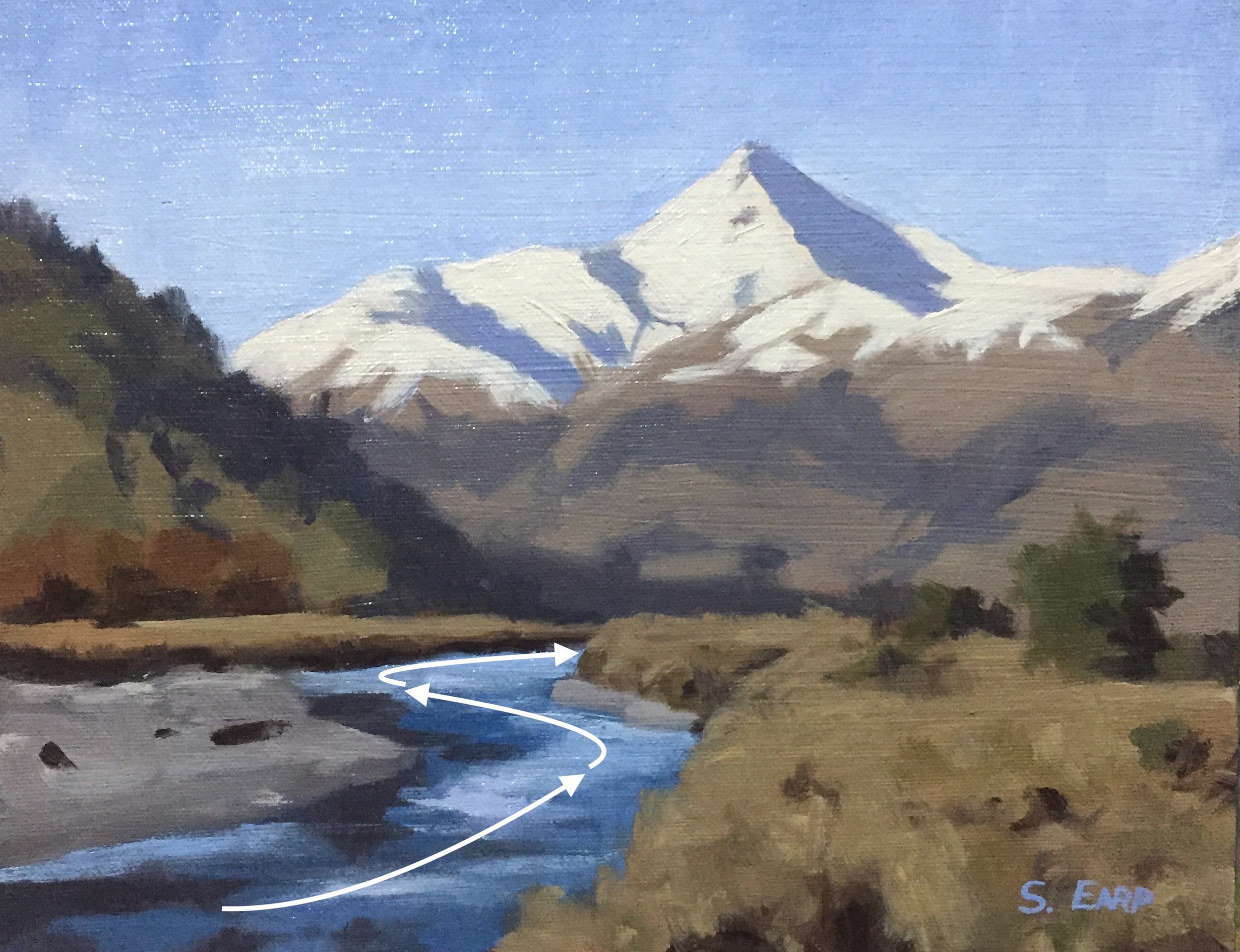
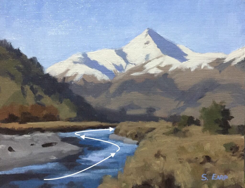
This painting is a simple design and incorporates a compound curve in the form of a stream which leads the eye towards the mountain.
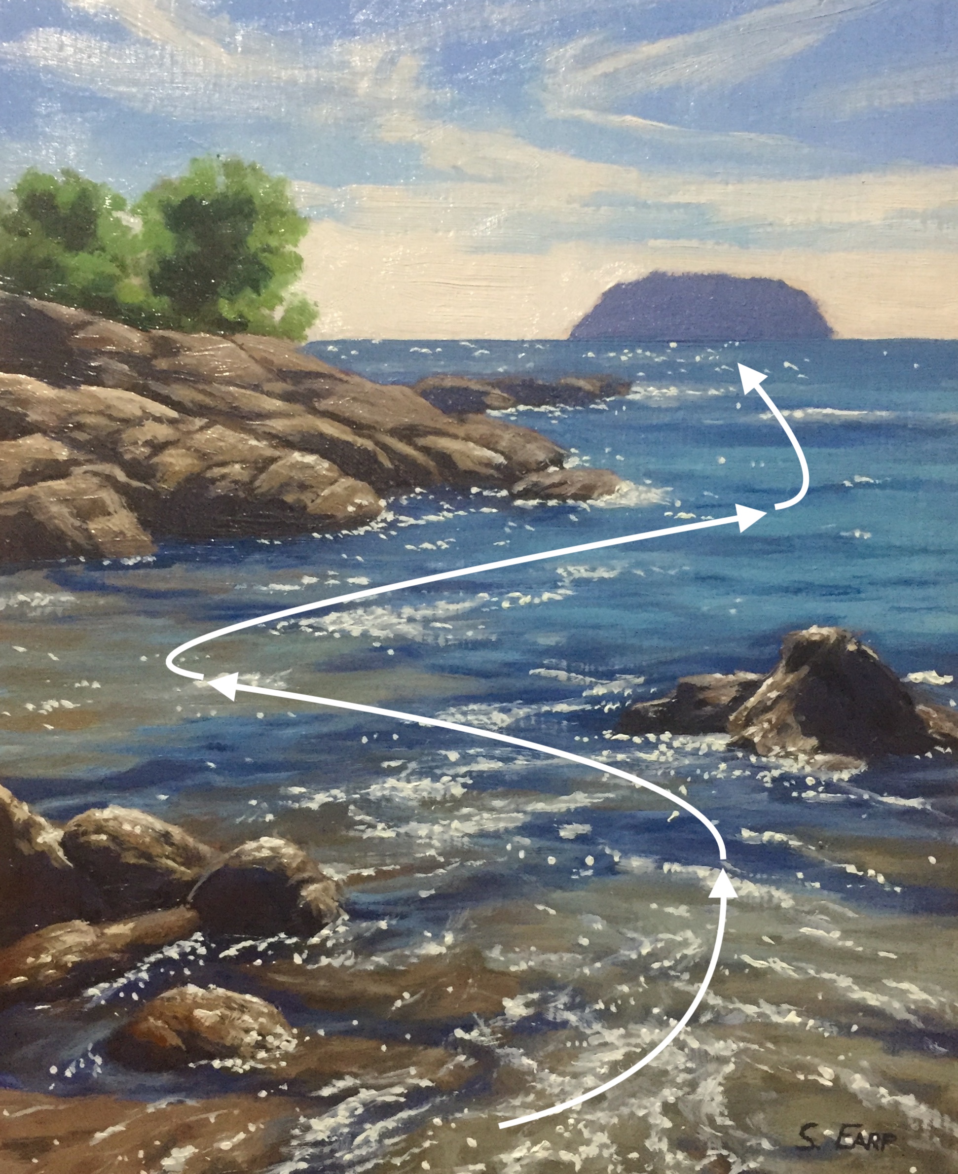
In this painting, I have positioned the rocks to lead the eye through the foreshore where the focal point, the island is at the end of the compound curve.
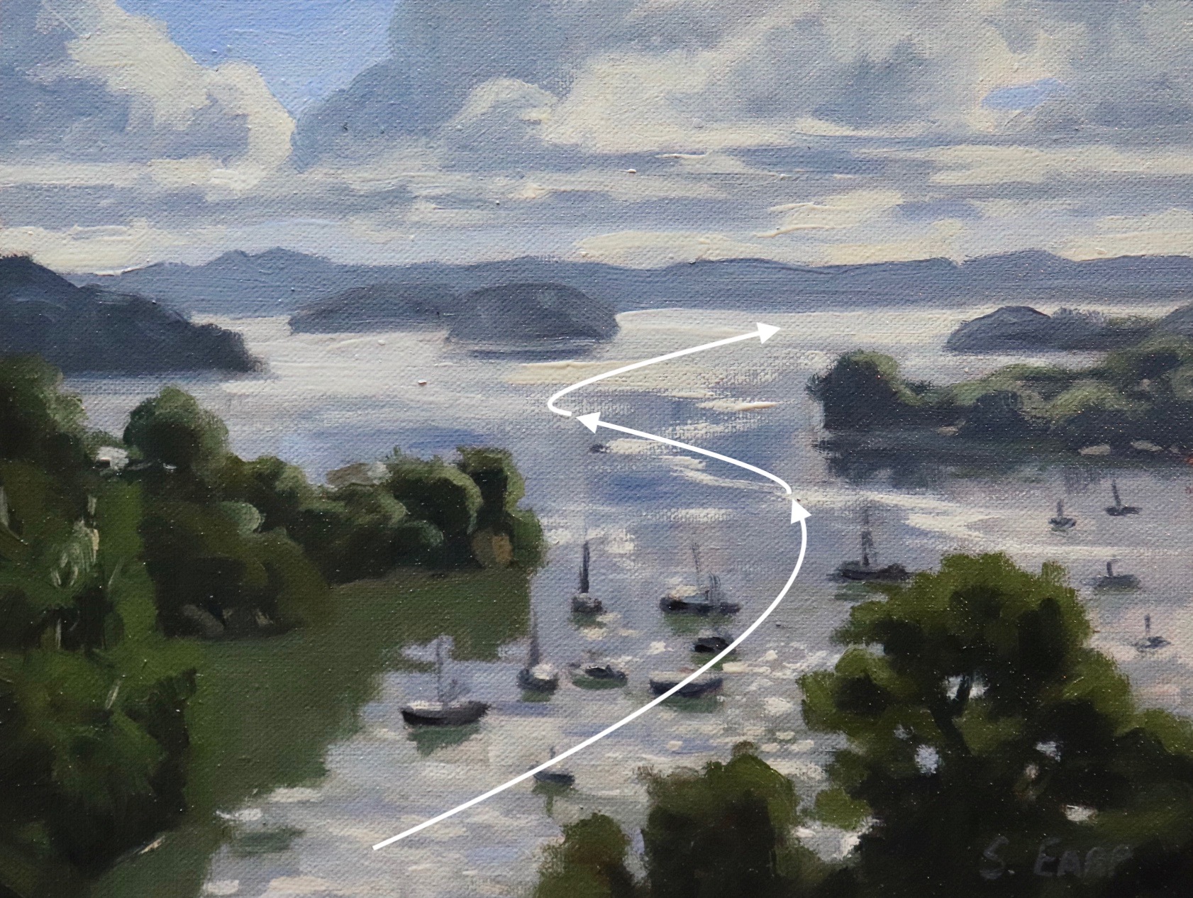
In this painting, the land masses help to form the compound curve which intercepts the hills in the distance.
4: Group Mass Composition
This is another relatively simple composition and one that I am fond of. The group mass is achieved by placing several masses into a large group.
Unity within the group mass composition can be achieved by making the area of interest of considerable size with a variety of forms, values and colours within its boundaries. The group mass composition works especially well with trees.
Some examples.
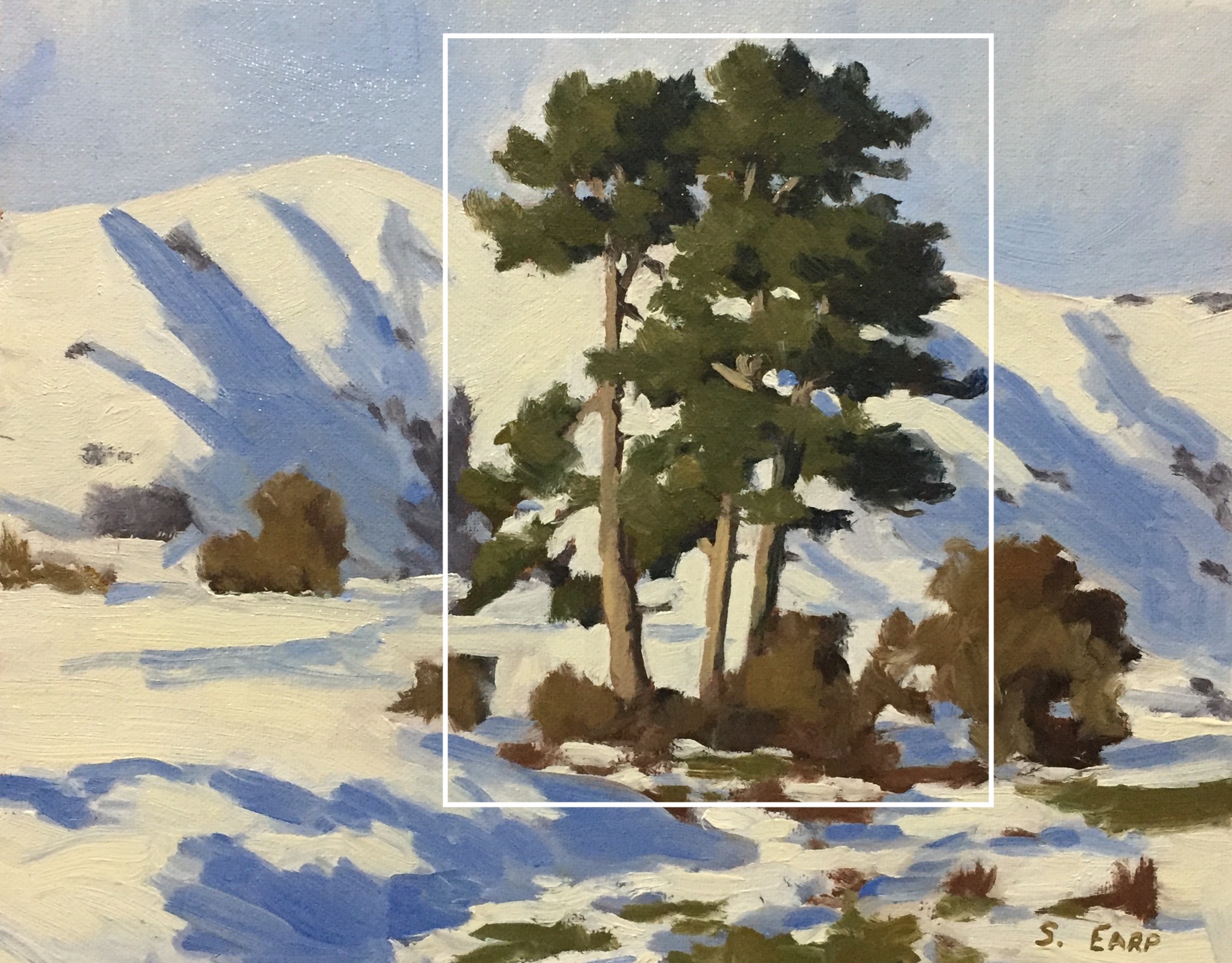
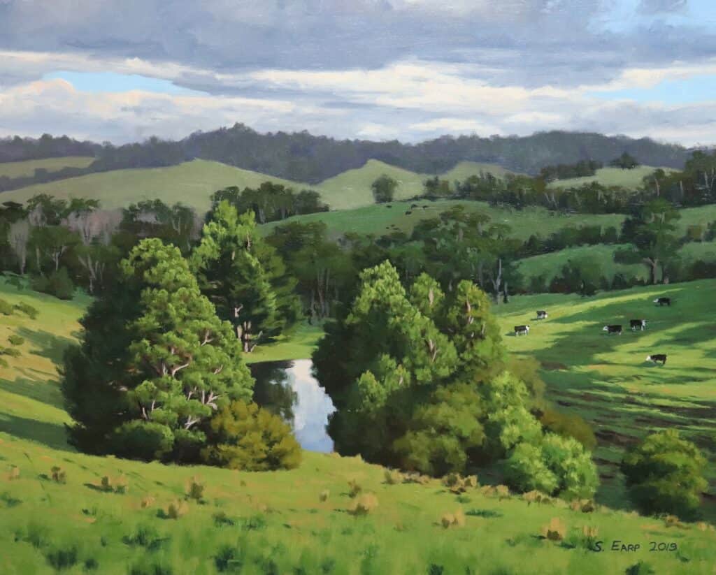
The stand of pine trees forms the group mass within the composition and is the dominant area of interest within the painting.
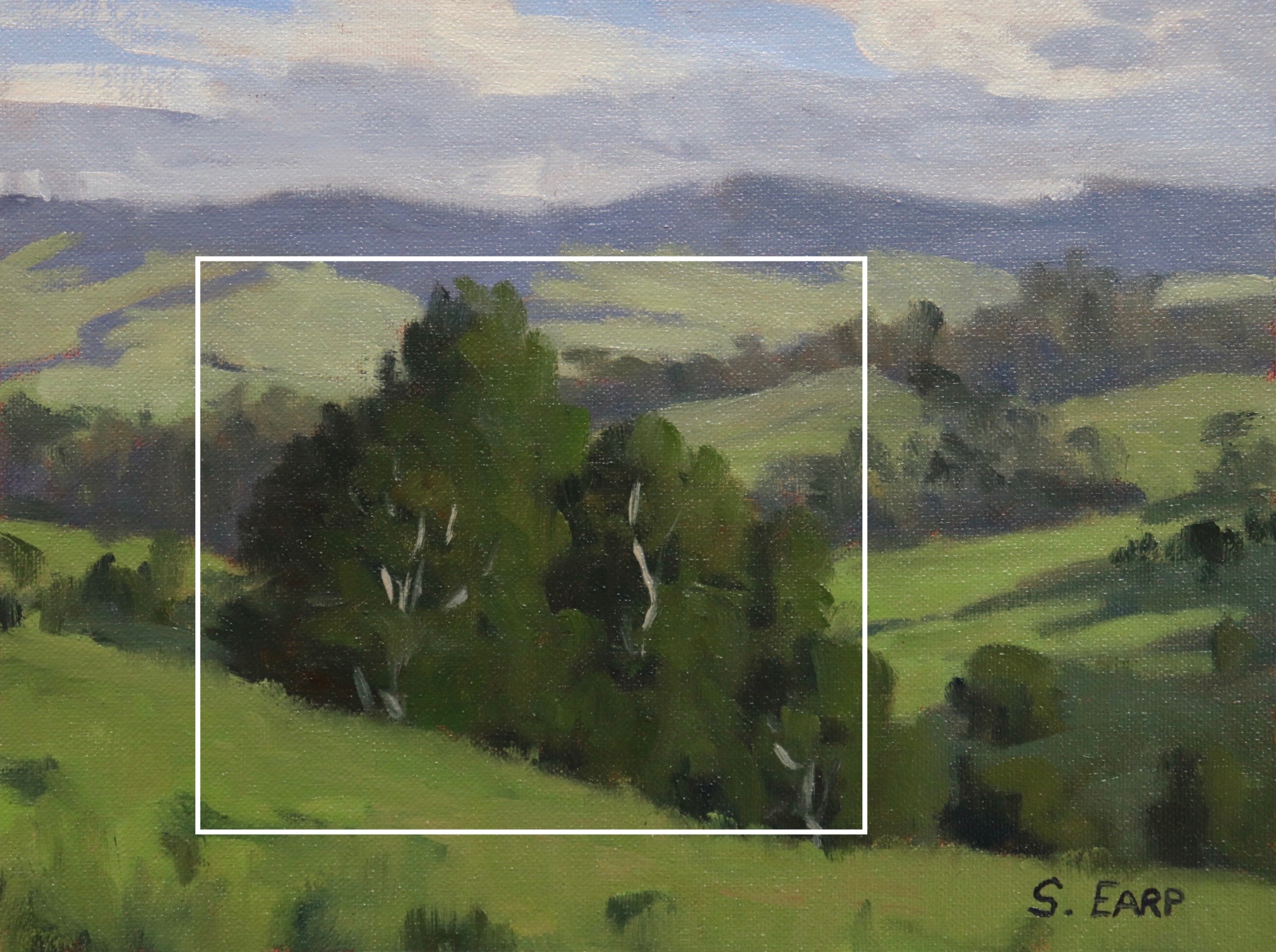
The trees in this group are of varying sizes and forms which adds interest to the composition.
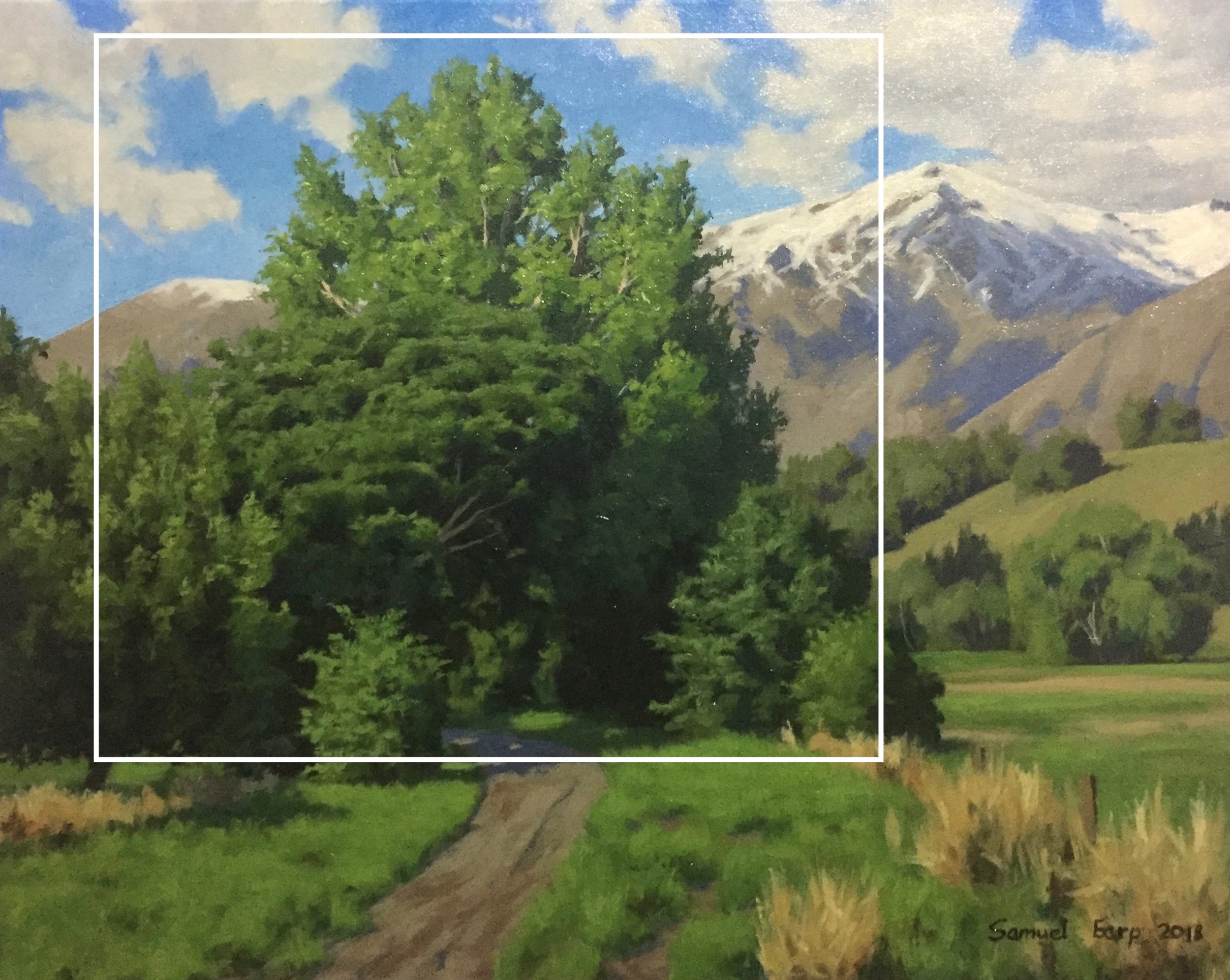
Again this group mass has a variety of sizes and forms within the composition.
5: Diagonal Line Composition
This composition is a bit more tricky but it is one I have used a few times when painting mountains outdoors en plein air.
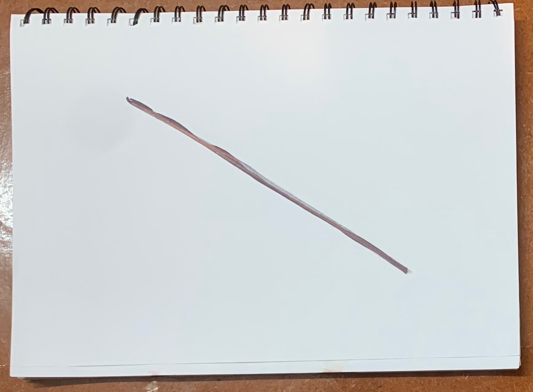
In general, the diagonal line composition incorporates a main line or series of lines that runs from the upper left corner to the lower right or vice versa. The main line is intercepted by other opposing lines with the composition itself being handled in a similar manner to the Steelyard composition.
Owing to the eye-carrying power of the strong diagonal line you have to be careful that it’s not so dominant that it leads your eye off the painting. This can be eliminated by adding in an area of interest below the lower end of the diagonal line, for example, a group of trees.
Let’s see a couple of examples.
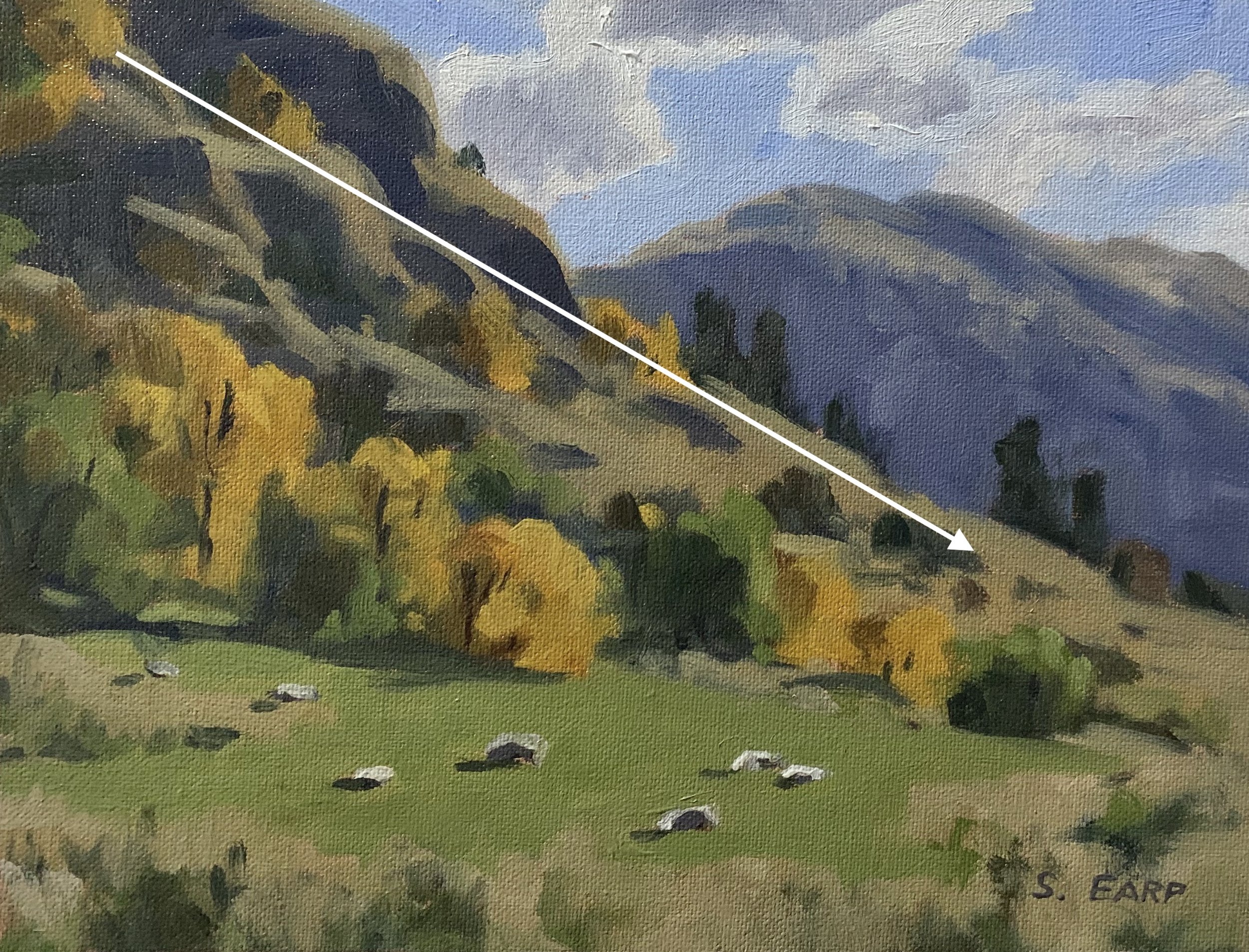
In this painting, the mountain slope forms the main diagonal line and is a dominant mass within the painting. It is counterbalanced by the mountain on the right in the distance.
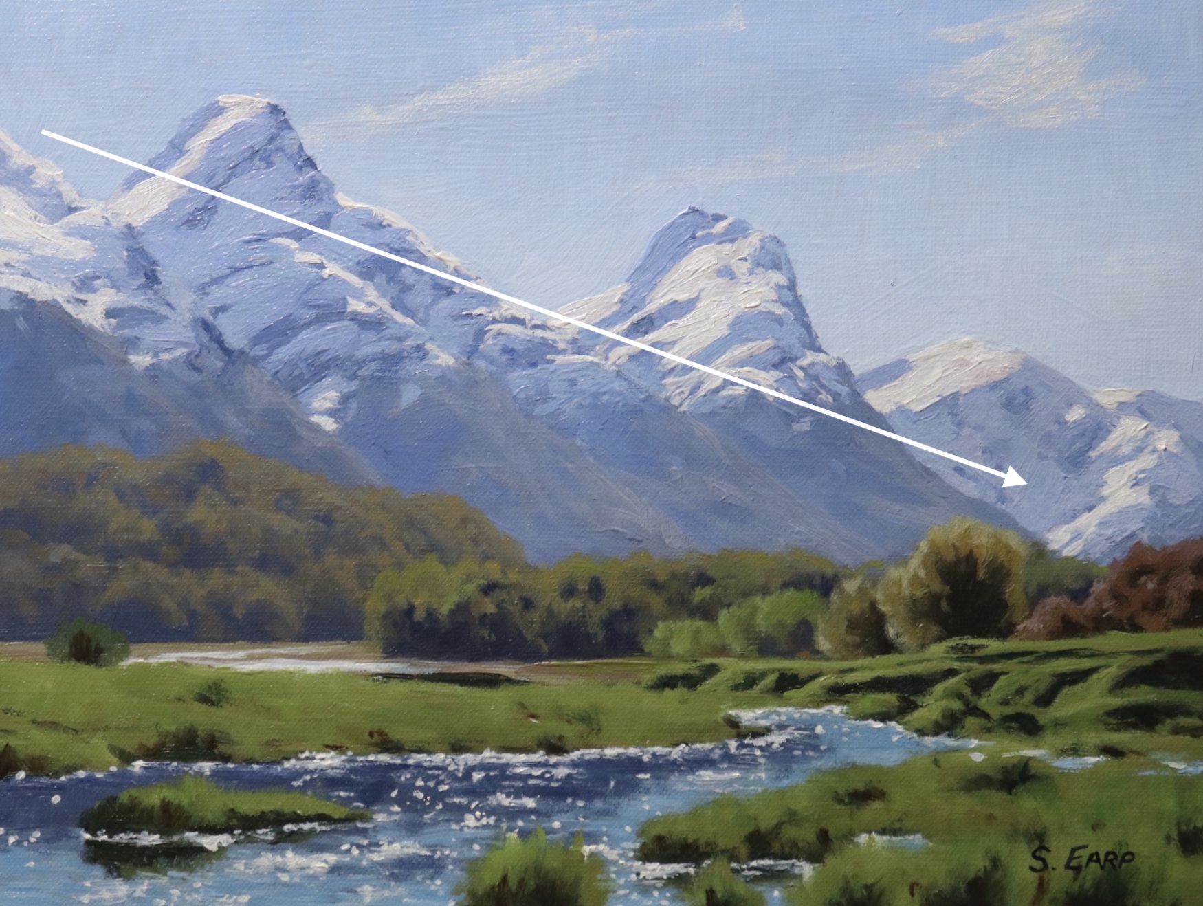
Again the main mountain on the left forms the diagonal line. The trees below the diagonal line near where it terminates help to provide balance within the composition.
PAINTING LANDSCAPES IN OILS – EBOOK
This book is a treasure trove of expert tips, techniques, and insights based on my many years of painting landscapes. From mastering composition to understanding the nuances of oil paints, brushes, and painting surfaces, this book will elevate your landscape painting skills to new heights.
Learn how to harmonize colors and values in your landscapes. This book guides you through designing your painting, capturing the scene’s essence, and conveying the emotions you wish to evoke through your art.
In addition to the theoretical knowledge, this book includes 11 immersive step-by-step painting demonstrations.
Things to Be Avoided in Composition
Before I finish this blog post I’ll show you a few examples of things to be avoided in composition. The examples I am about to show you are artworks I painted around ten years ago before I learned anything about composition. I was making some pretty basic errors in my compositions!
Centred Horizon
This is a bad composition, the painting is halved and as a result, forms a displeasing static within the painting.
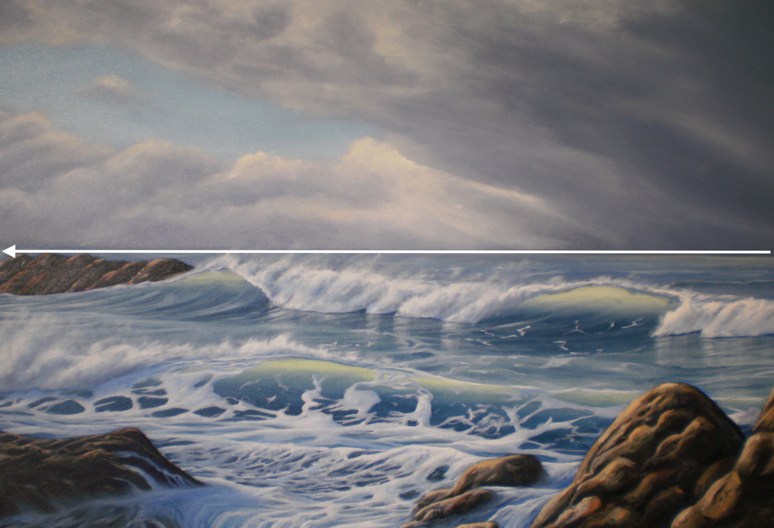
In this painting, the horizon line is centred resulting in equal areas of sea and sky and a displeasing composition. When painting landscapes and seascapes either have a low or high horizon.
Centred Objects
Areas of interest in the centre of your painting are a massive no-no, it destroys any kind of rhythm and harmony within the composition.
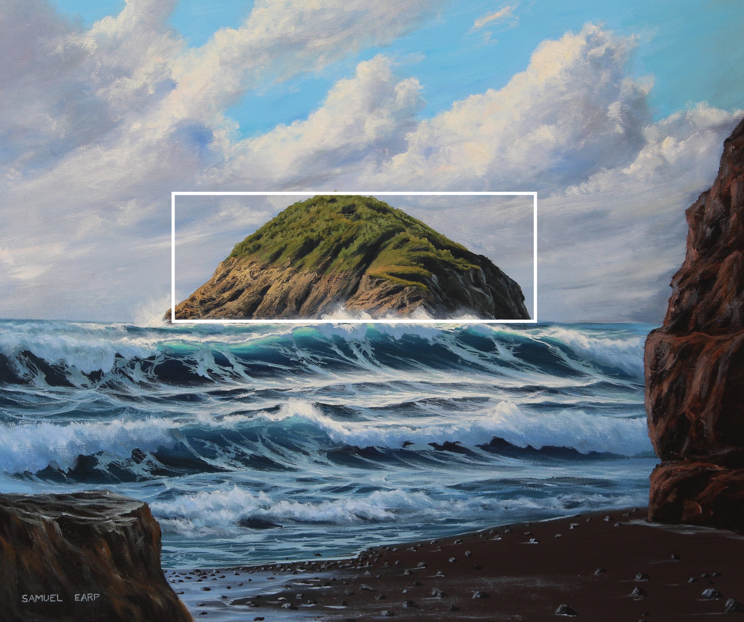
In this painting, the island is in the middle of the painting and is causing the composition to be uninteresting and distracting. The island perhaps should have been made smaller and either placed to the left or right of the centre.
Too Many Parallel Lines
This can be a problem, especially in seascape paintings. Too many parallel lines can cause the eye to be led off the painting and it’s also distracting as it causes disharmony in the composition.
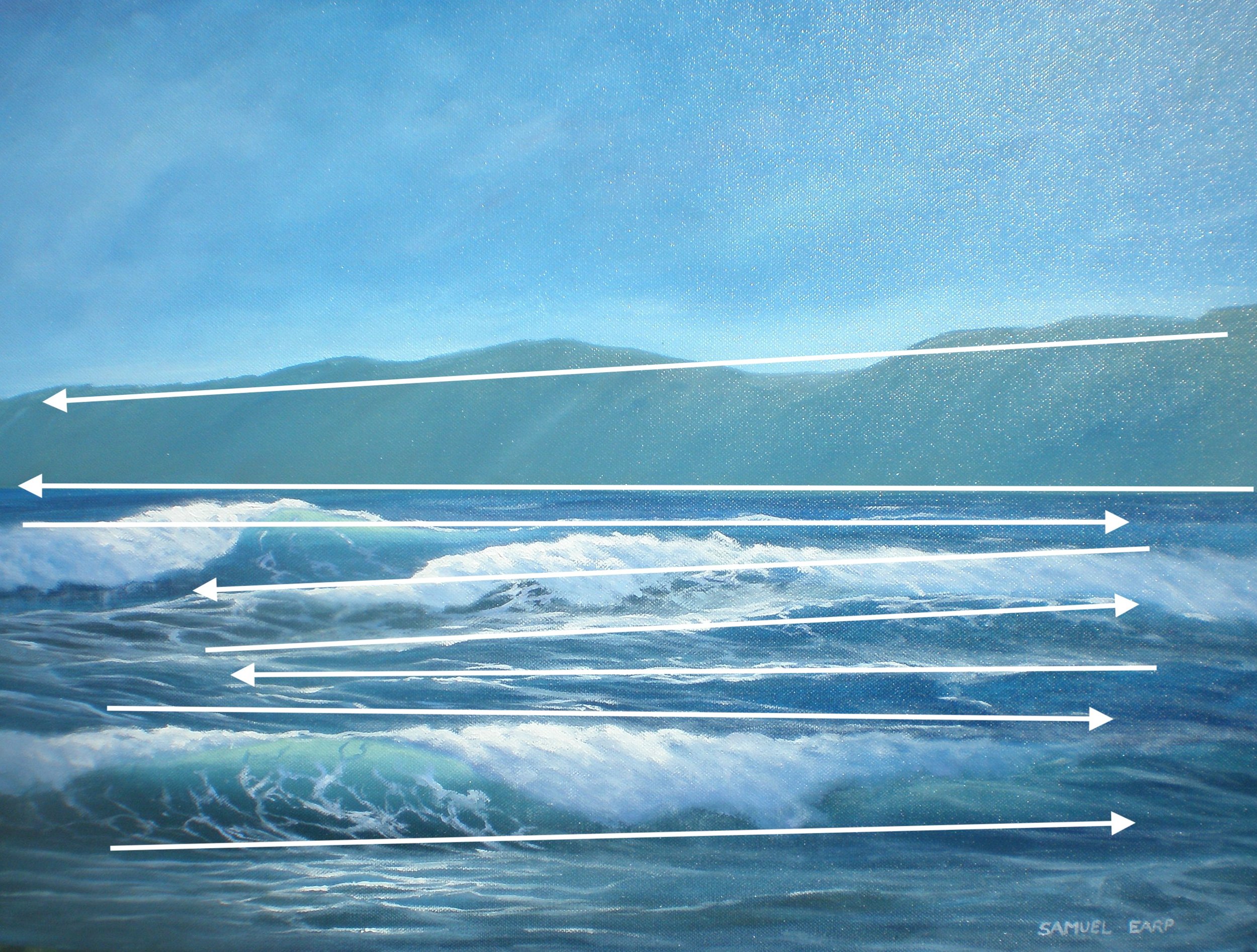
In this painting, it’s clear to see all the parallel lines of the waves, the horizon line and the gradient of the land in the background. This has resulted in a disharmonious painting and the eye being led off the canvas.
Equal Masses and Repetitive Shapes
This is a problem in composition as often you can create repetitive shapes and forms in your painting without realising it. It again leads to disharmony within the composition.
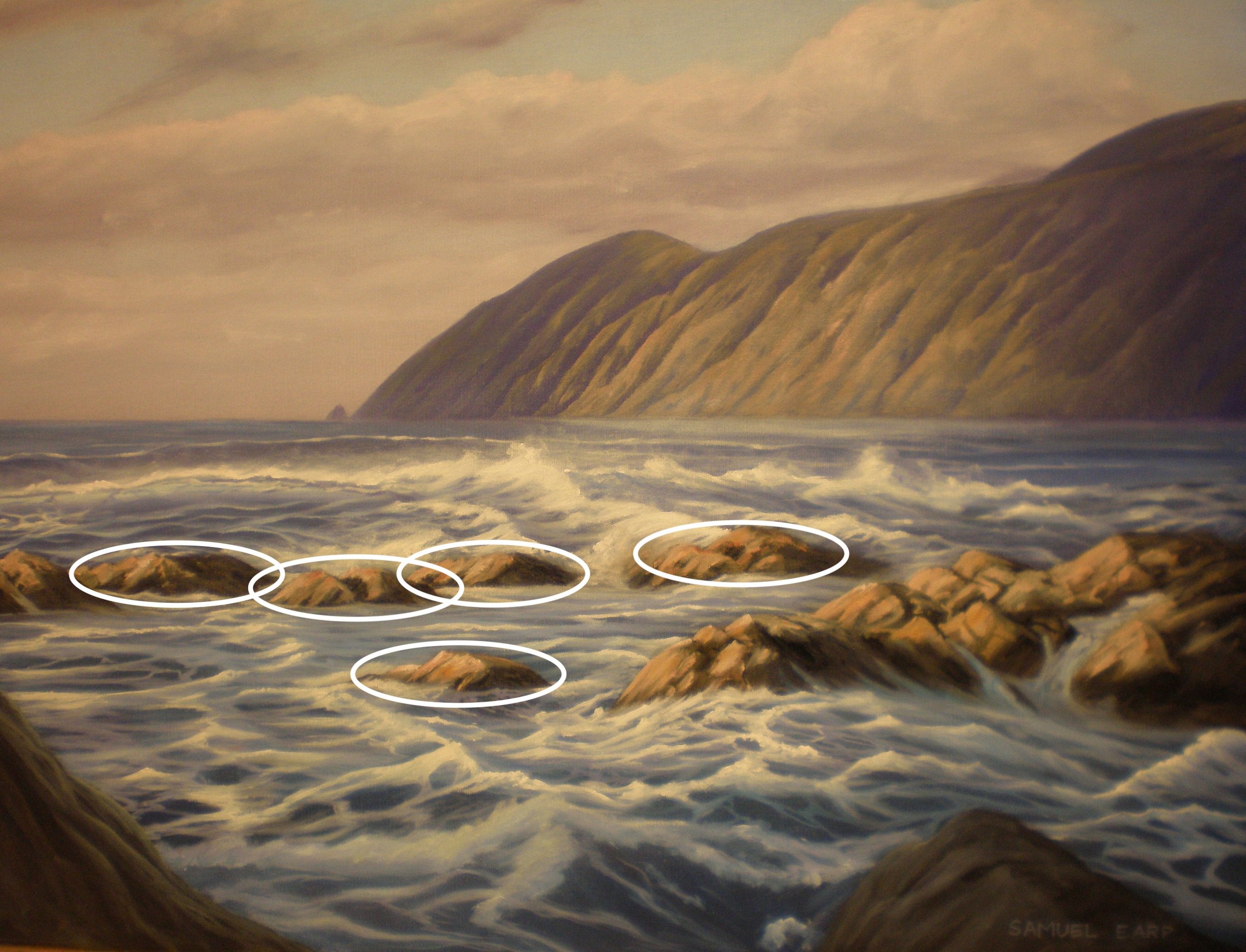
In this painting, many of the rocks are of equal mass which again is forming a distraction in the painting. Worse still most of the rocks are in a parallel line that is destroying any kind of rhythm in the painting.
Further Reading
If you would like to learn more about composition I would strongly recommend the following books:
References
Edgar Payne, 1941. Composition of Outdoor Painting. DeRu’s Fine Arts.
Ted Kautzky, 1979. The Ted Kautzky Pencil Book. Van Nostrand Reinhold Company.
Thanks for reading 😊
