This article may contain affiliate links, please read my affiliate disclosure for more information.
Have you ever been sat in your art studio feeling uninspired and like you’ve hit a wall? Well this sometimes happens to me when I’ve spent too much time in the studio and that when I know I need to get outside in nature and either paint en plein air, or take reference photos or both.
Recently I had one of those days where I couldn’t sit in the studio, so I grabbed my paints and easel, jumped in the car and drove out to the countryside to get some inspiration.
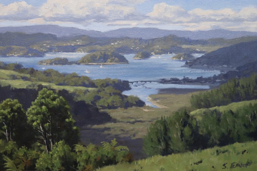
In this blog post I will show you how to get inspired by getting out in the landscape and painting outdoors. I will show you how I painted a landscape of a view of the Bay of Islands, New Zealand which started off as a plein air painting and the was completed in the studio where I added more details.
In this painting tutorial I cover the step-by-step process how I painted the above art work en plein air and then the details added in the studio. I will also cover the following:
- Composition
- Colours
- Brushes
- Plein air painting gear
- Plein air painting process – painting the landscape
- Studio additions – final details
Why Paint Outdoors?
Painting outdoors or painting ‘en plein air’ is a wonderful way to get inspired especially when you’re having a slump in the studio and feeling uninspired. As a landscape artist, I find that when I feel flat and the inspiration and paint ain’t flowing thats when I need to get outside amongst my subject, reconnect with nature and the landscape and get inspired.
Other things will happen when you paint outdoors, the more you do it the more you’ll want to paint outside, it’s addictive. You’ll have lightbulb moments when you paint outside and you’ll learn things about landscape painting that will be much more difficult to pick up in the studio.
When you paint outdoors your colour mixing and understanding of values and painting tonality will also greatly improve. You’ll see the colours much better in the landscape, better than using photos and you can use your field paintings as studies for studio paintings.
Plein air painting will teach you to paint more quickly and everything you learn out in the field can be applied to studio painting.
Finally, plein air painting will get you inspired and give you a sense of well being and enjoyment. It’s also a sociable activity as it’s awesome to paint along side some other painters.
Inspiration For This Painting
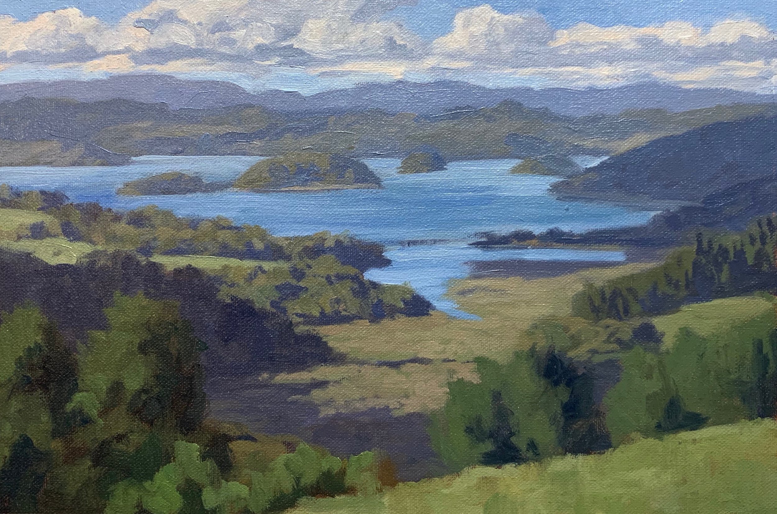
This painting was inspired by the beautiful Bay of Islands area in the north of New Zealand. The area is characterised by rolling vibrant green hills, native trees, beautiful bays and turquoise blue ocean.
I drove up to Mt Bledisloe (which is more of a hill rather than a mountain) and set up my easel at the top. Mt Bledisloe has a near 360 degree view of the Bay of Islands area and is a sweet location for painting outdoors.
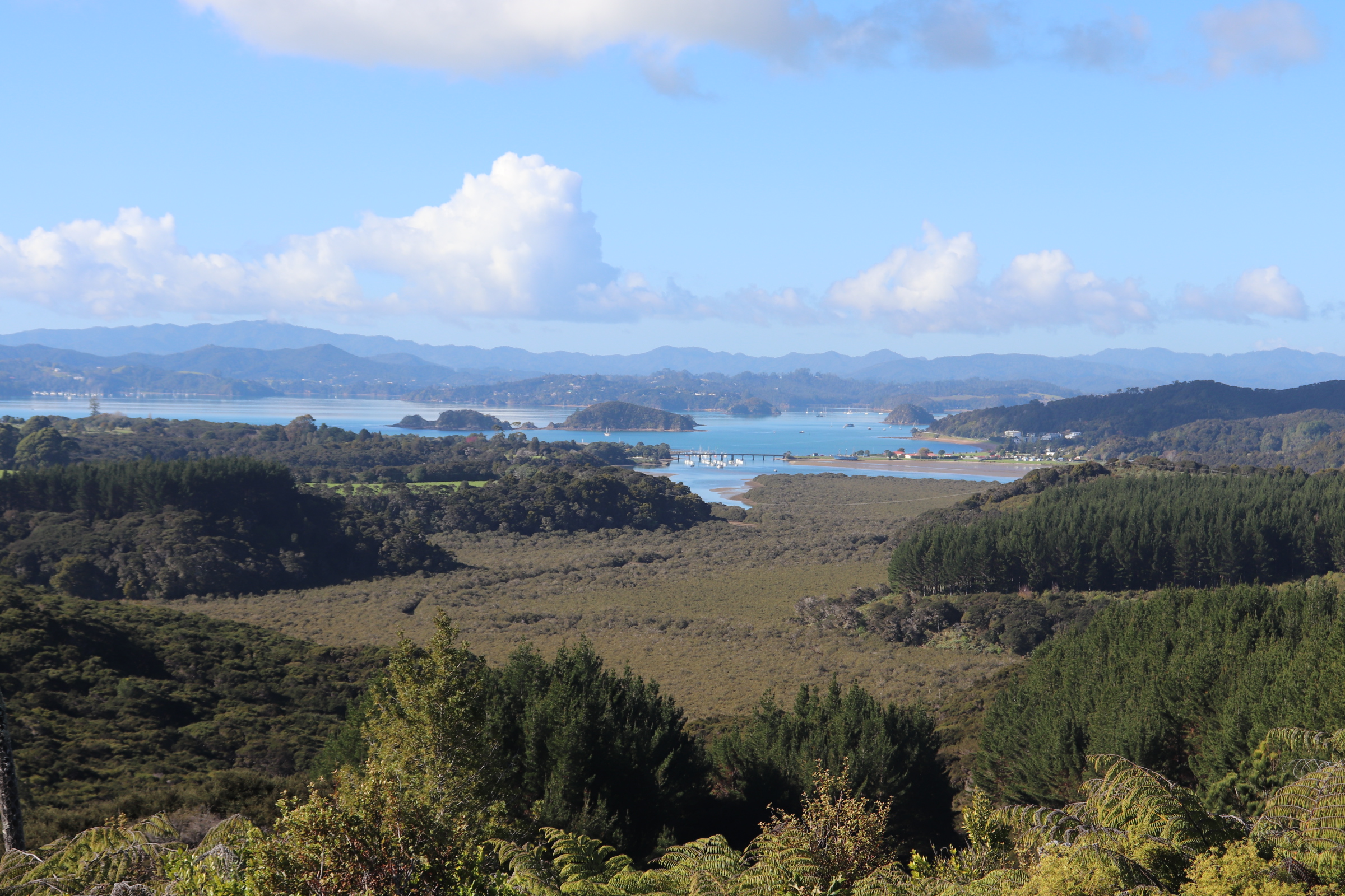
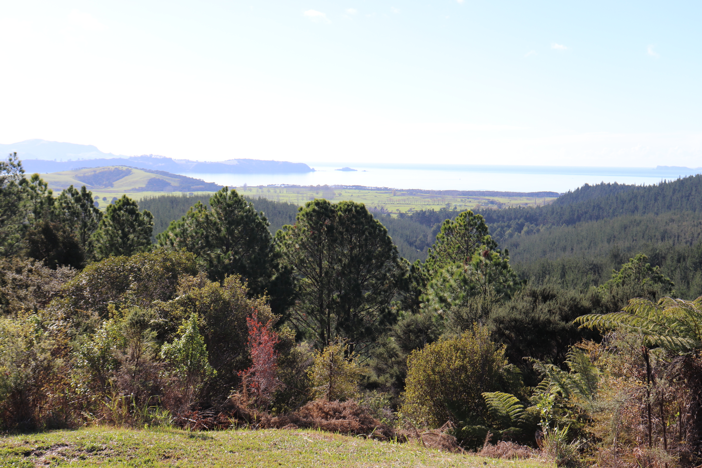
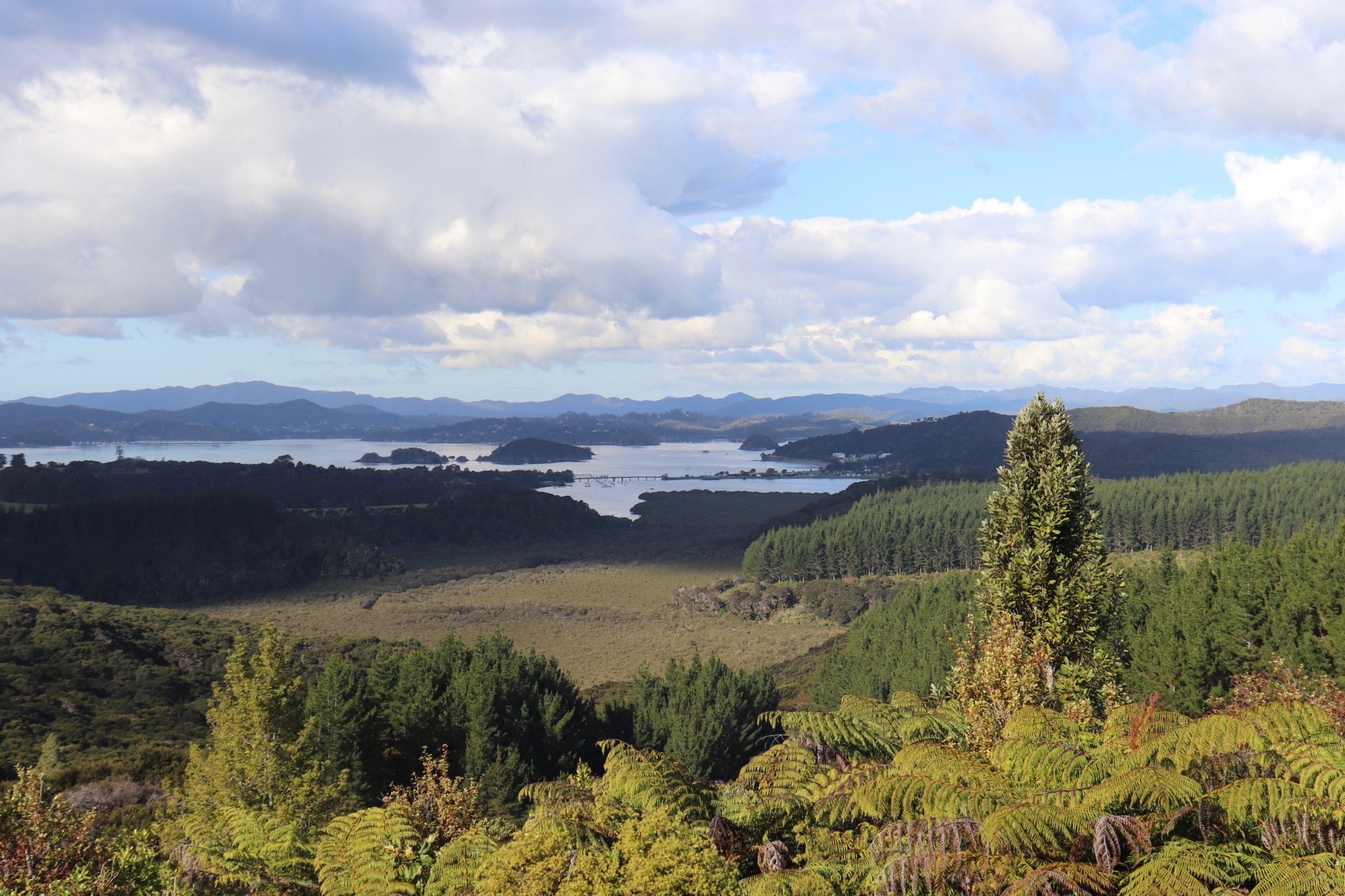
Reference Photos
Here are the reference photos I used when I completed this painting in the studio, feel free to use them and copy them if you would like to have a go at painting this.
Pine trees
Cloud reference
Composition
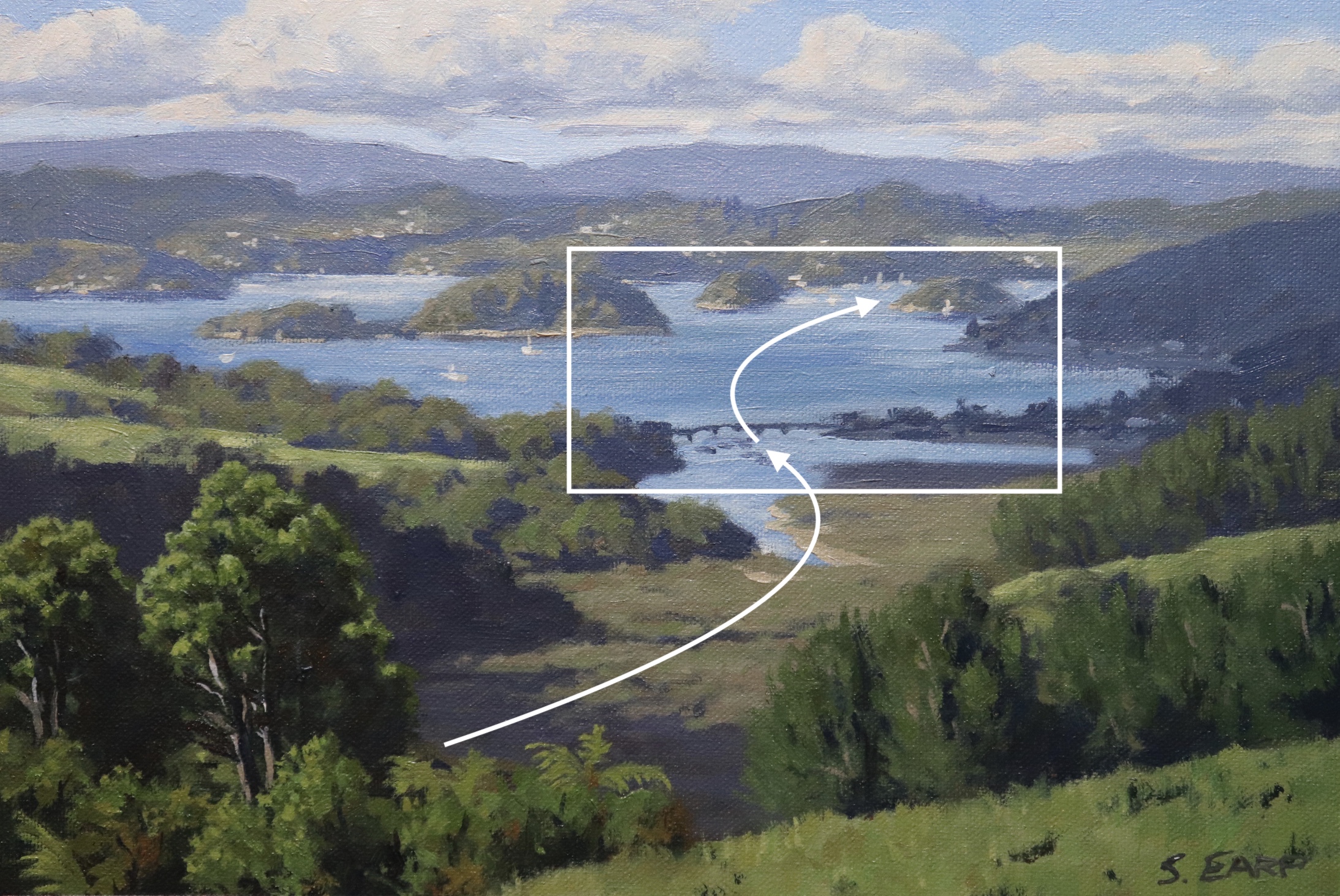
This composition incorporates an ‘S’ or compound curve composition where the mangrove estuary leads the towards the main body of water. This is the main focal area of the composition. The landscape itself incorporates a high horizon so that the hills, water and trees cover most of the painting.
Colours
I am painting in oils and the colours I used in this painting are as follows:
- Titanium white
- Burnt sienna
- Yellow oxide
- Cadmium yellow
- Cadmium red
- Quinacridone crimson
- Ultramarine blue
- Phthalo green
Brushes
Here is a list of the brushes I used in this painting:
- No.6 flat
- No.2 flat
- No.1 round
- No.0 round
- No.00 round
- 3/8 dagger
- 1/4 dagger
Plein Air Painting Gear
The equipment I use for plein air painting includes the following:
- Pochade box
- Camera tripod
- Canvas
- Board
- Masking tape
- Paints
- Brushes
- Brush cleaner
- Liquin
- Paper towels
- Rags
- Disposable nitrile gloves
Plein Air Painting Process – Painting the Landscape
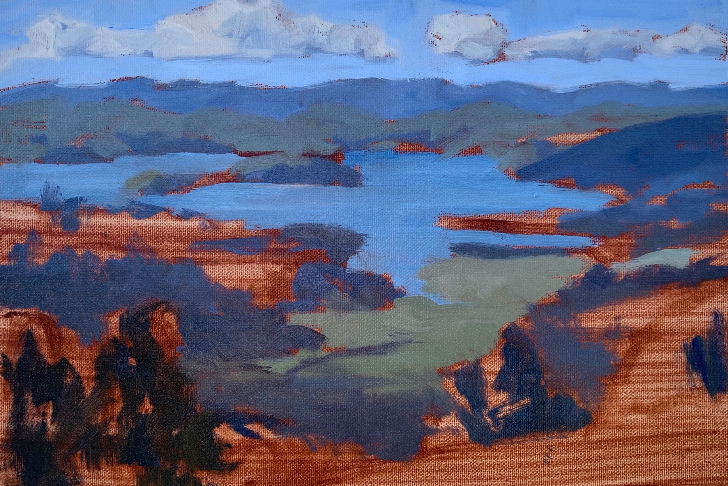
Step 1
The aspect of the painting process was done outdoors en plein air, however the painting technique is similar to how I would block in a studio painting.
I’m working on a 20cm x 30cm canvas which I have taped to a board with masking tape. This is an easy way of painting lots of plein air paintings without having to spend too much money or have your paintings take up lots of space. Once you start painting outdoors, it’s inevitable that you’ll end up painting lots of art works.
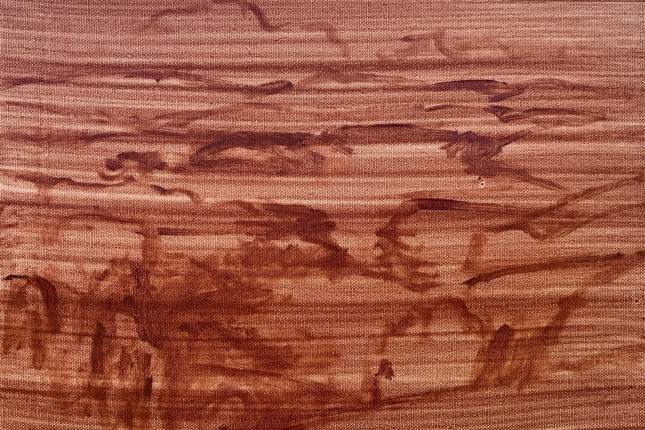
I tone the canvas with a layer of burnt sienna which warms up the painting and adds vibrancy to the colours. The preparation of the burnt sienna underpainting is done whilst back in the studio where I usually prepare a load of them at once. I mix one part burnt sienna, two parts liquin and about three parts gum turpentine and I find it easiest to mix them in an old jar which I seal with the lid. I then shake the mixture for about a minute to ensure it’s thoroughly mixed together. I then use a chip brush and paint it over the canvas.
I sketch out my composition with burnt sienna mixed with Windsor and Newton Liquin Original (liquin). It increases the flow of the paint and speeds up the drying time. I’ll be using this medium throughout the painting.
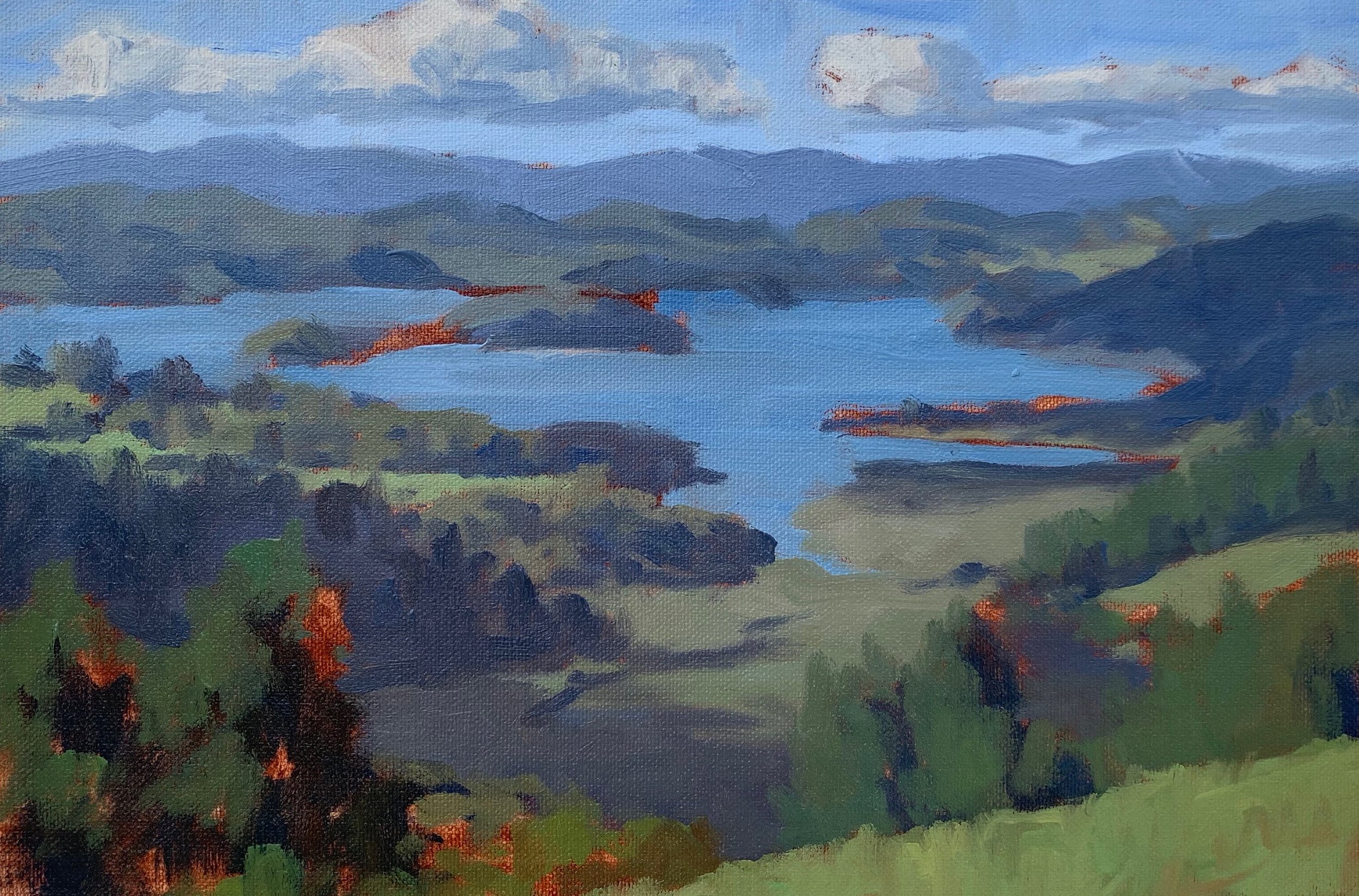
Step 2
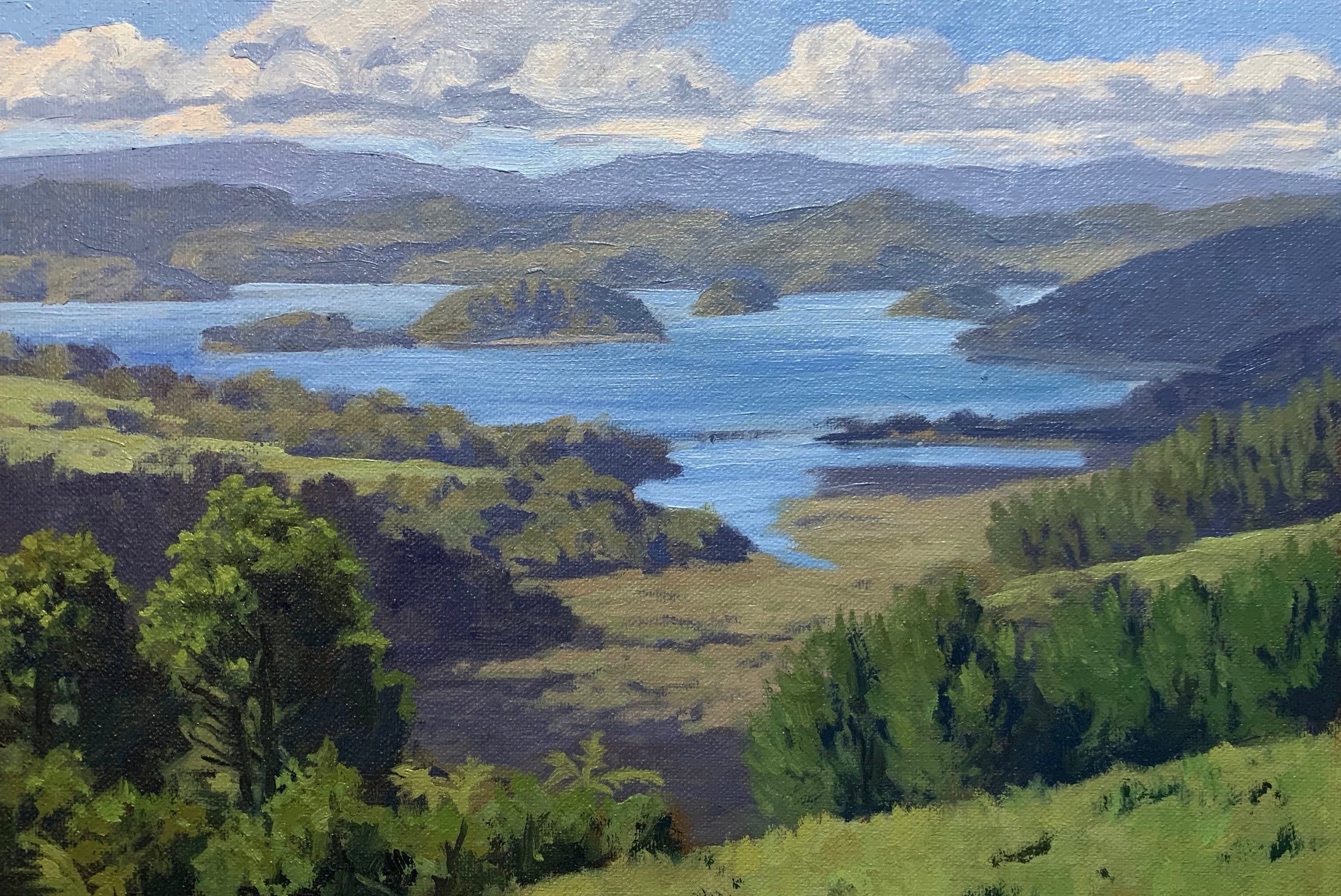
Whenever I paint outdoors or indeed in the studio, I like to work to a system so that I have more predictable results. When starting your painting whether it’s en plein air or blocking it in, in the studio it’s important to get the foundation right. Get the foundation right and you’ll find adding detail to your painting much easier.
The most important thing for me when painting a landscape is to make sure my colours and values are correct and that the interact and have relationships with each other that are in harmony so the painting reads well to the viewer.
Value refers to how light or dark a colour is and I find that when achieving a depth perspective in a landscape is easiest if you establish your darkest values and shadows first. From there it’s much easier to get the colour in associated light areas with the appropriate level of saturation (or chroma).
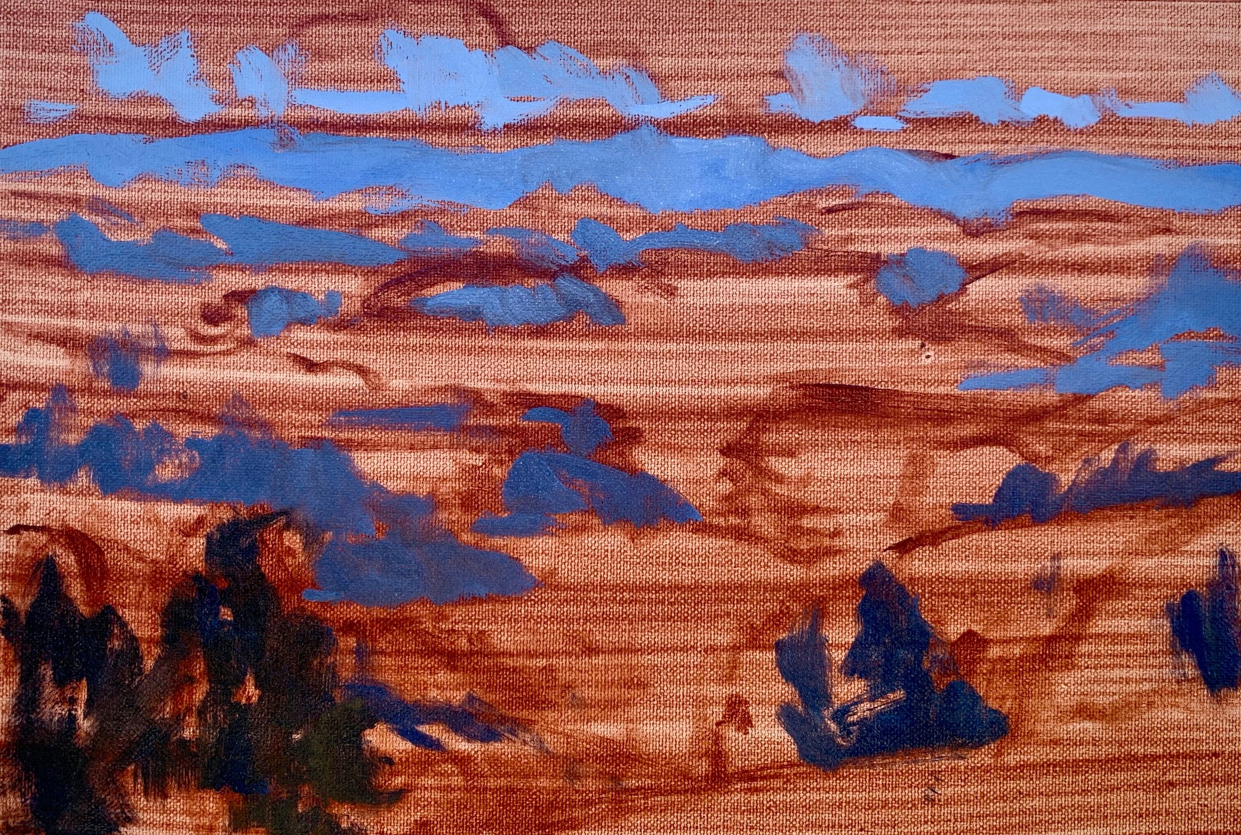
Using a No.6 flat brush I mix a combination of ultramarine blue, burnt sienna which takes out some of the saturation in the blue, quinacridone crimson which adds a violet tint and then I lighten the value with titanium white. I begin by painting the clouds shadows which are the lightest of my darks.
I use the same colour combination but with less titanium white so I can darken the value in order to paint the shadows in the background hills.
I darken the value further by using less titanium white and paint the shadows in the mid ground.
I create a different colour mixture for the pine trees in the foreground as I want to add a green element to the shadows. The foreground is where I’ll find the darkest and lightest values in the landscape and I mix a combination of ultramarine blue, yellow oxide and then I round off the mixture with burnt sienna which also adds a red element to the mix.
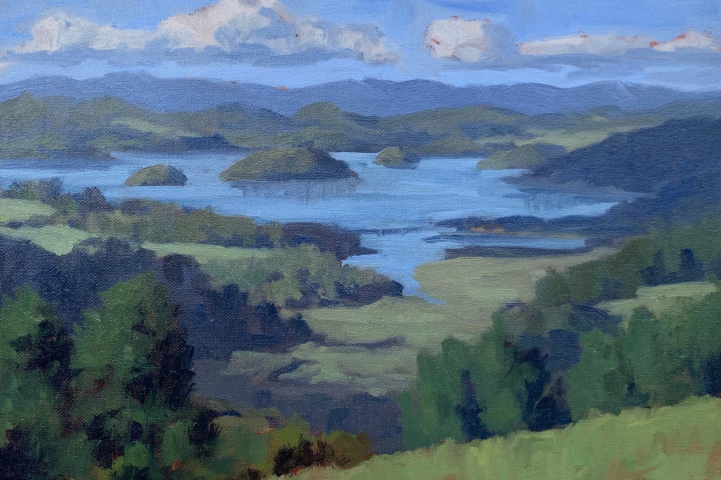
Step 3
I have roughly established my dark values which are the bones of the painting, now to start adding some meat to them. I begin by adding some cloud highlights which are a combination of titanium white mixed with a little burnt sienna which is going to help make the clouds recede in the painting. I allow the white to mix in with the cloud shadows.
I paint the sky with a combination of ultramarine blue mixed with titanium white and I use the same mixture to paint the water but I add more ultramarine blue and a little yellow oxide.
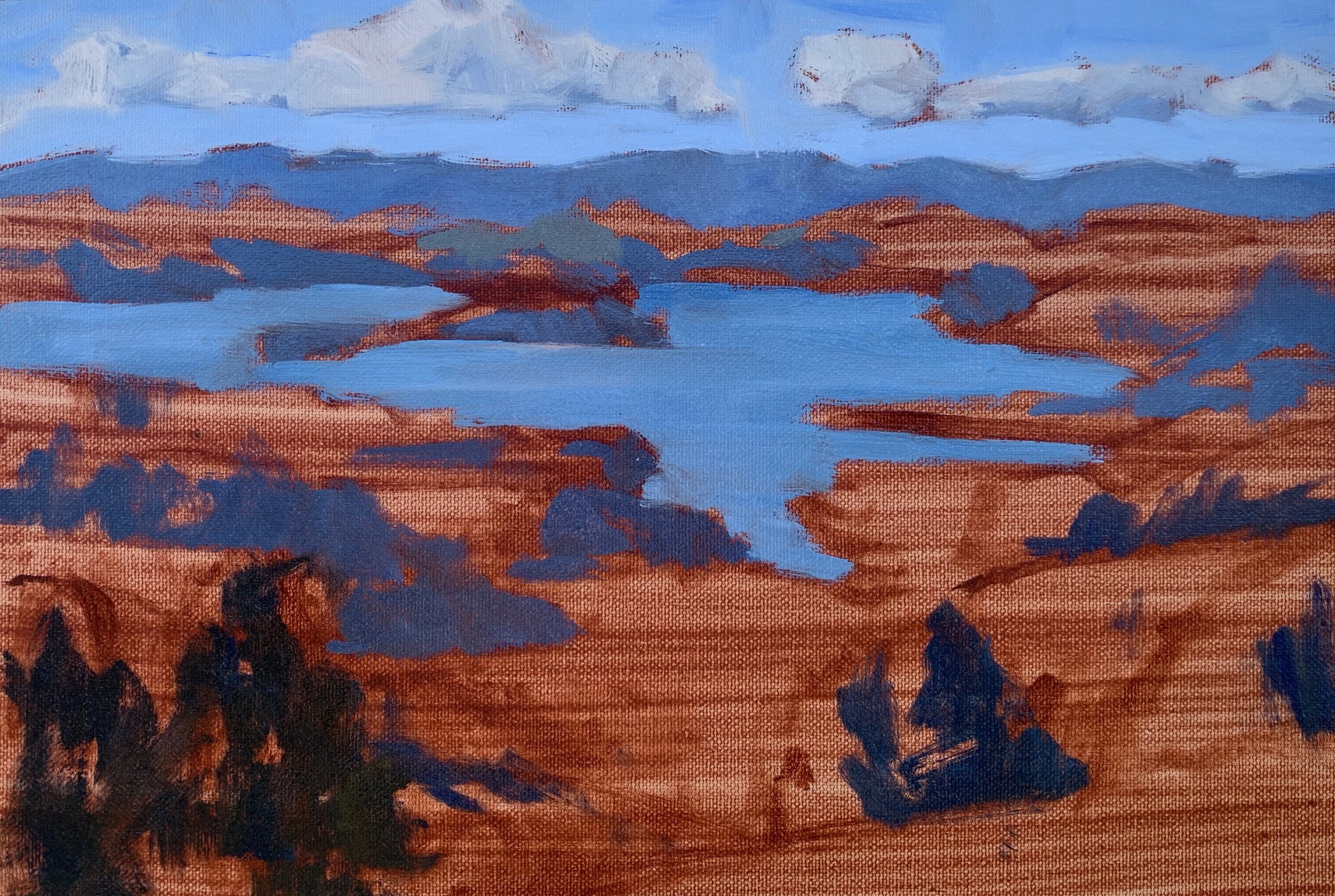
Step 4
Now to start painting the distant foliage in the background hills and for this I need to desaturate my green. If the green is too saturated it’ll jump forward int he painting and the depth perspective will be lost.
I mix a combination ultramarine blue, yellow oxide, burnt sienna and titanium white. The colour may look like a muddy grey on your palette but when placed next to the blue of the shadows, it’ll look green.
I use my existing green mix for the mangroves in the estuary but I increase the saturation by adding in a little cadmium orange, quinacridone crimson and if required a very small amount of cadmium yellow.
When I was painting this art work out in the field the clouds were increasing which was creating some awesome shadows so I decided to add a few more shadows in the painting. The shadows will help emphasise the form of the pine trees in the foreground.
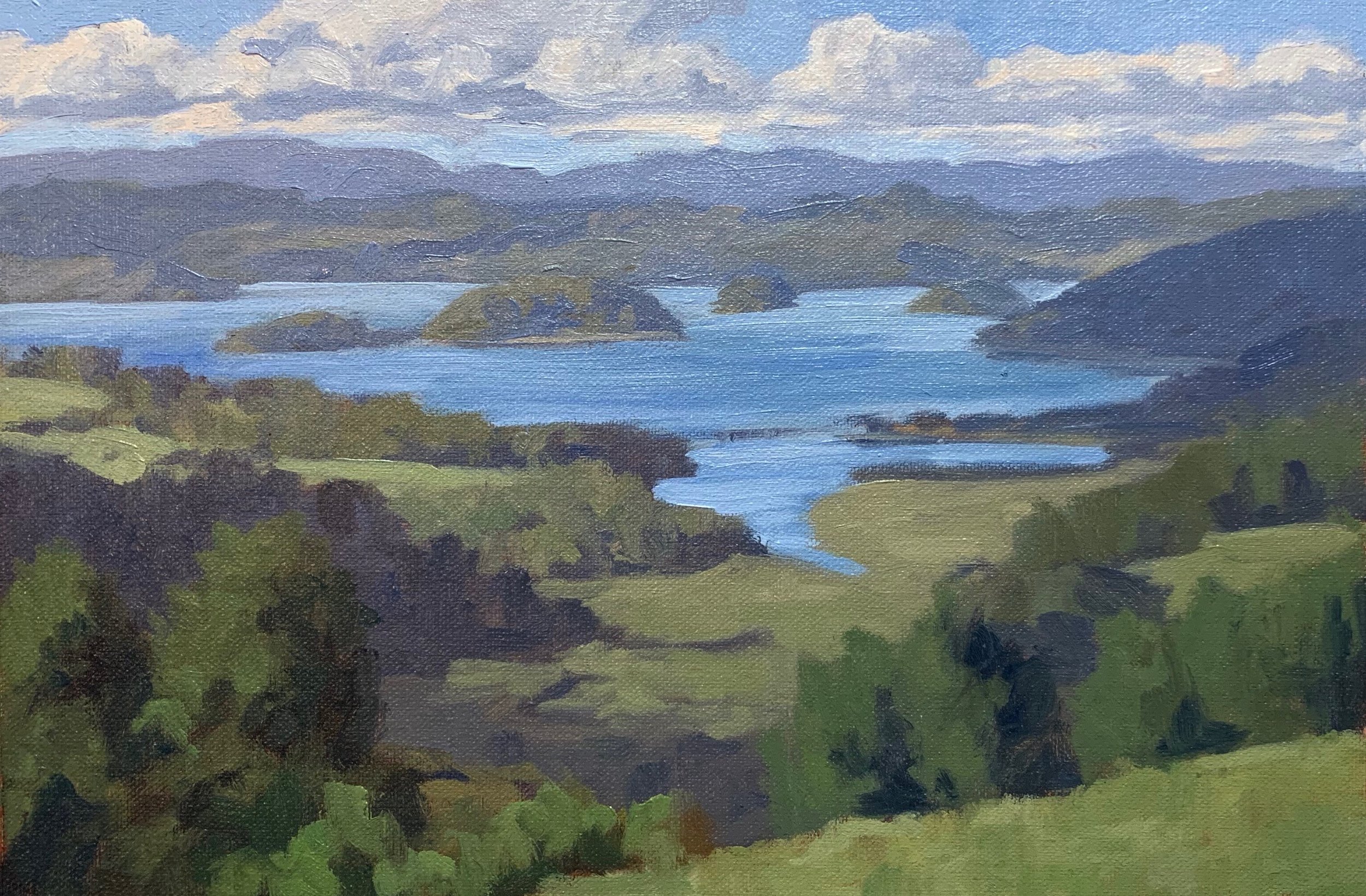
Step 5
I paint the pine trees in the mix ground and foreground. For this I increase the saturation of my green mixture and I start with a combination of ultramarine blue and cadmium yellow which creates a basic green mix. I then earth my green by adding in colours that contain its opposite on the colour wheel, red. So I mix in some cadmium orange and quinacridone crimson. I can further adjust the mixture and bring down the vibrancy by adding in some yellow oxide. Titanium white will lighten the value and adding in some phthalo green will kick up the saturation without altering the value too much.
The grass in the foreground is much lighter in value when compared with the pine trees, so although I am using my same green mix, I add more titanium white, yellow oxide, phthalo green and cadmium orange. If the green is looking a bit dull I can add more cadmium yellow.
I paint the trees in the mid ground using my existing mangrove mixture but I darken the value and increase the saturation by adding more ultramarine blue, cadmium yellow, cadmium orange and quinacridone crimson.
Step 6
At this point in my painting I have my basic colours and values established so I go back and tidy up the hills, water and trees. I sharpen up the shadows and add more colour to the foliage of the trees.
I use a 3/8 dagger brush to add more detail to the pine needle foliage in the foreground trees and these brushes are perfect for this job.
Each time I add more paint to the tree foliage I apply lighter colour to create a more three dimensional effect.
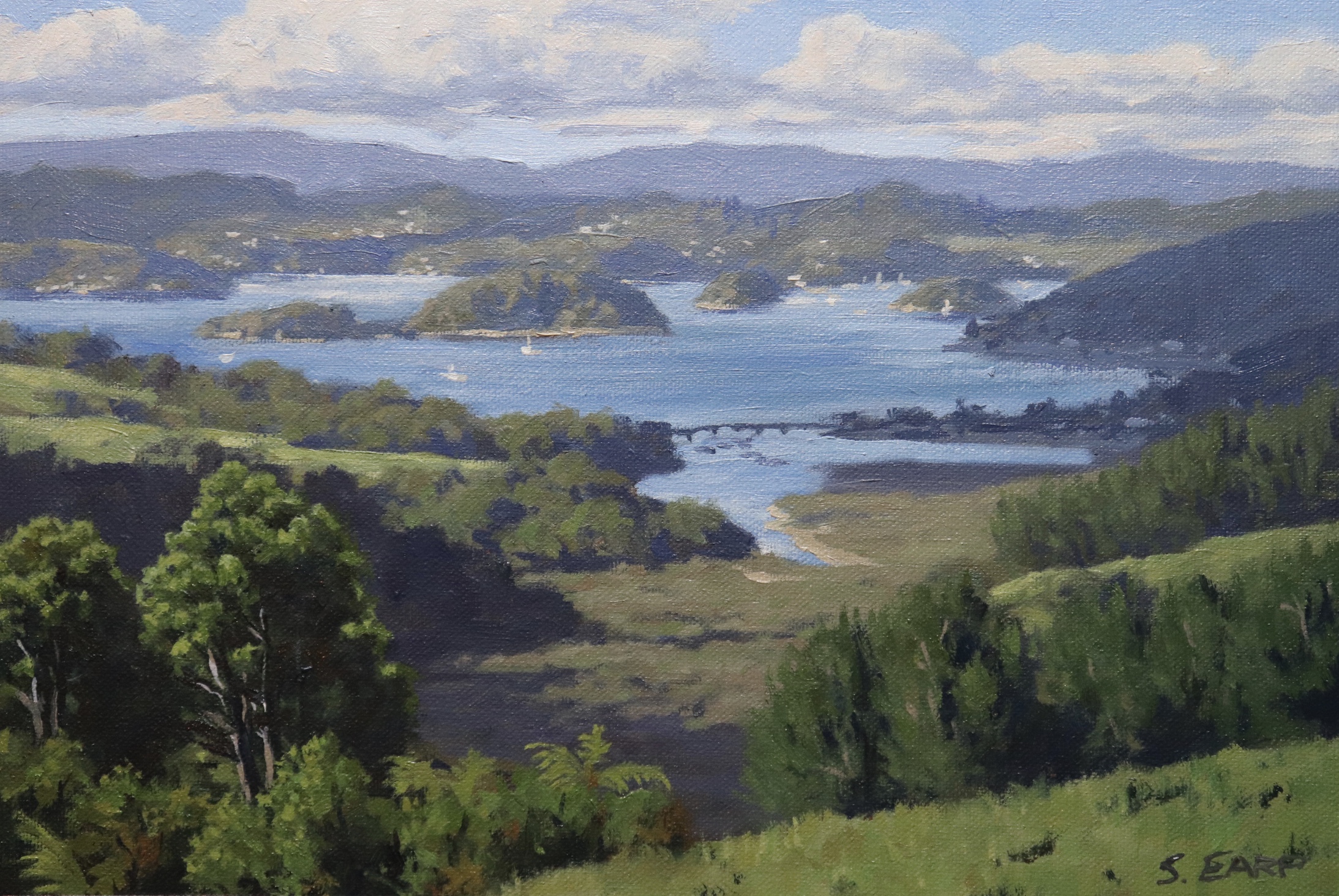
At this point of the painting the plein air aspect was complete, it also started raining so my painting got soaked so I knew it was time to pack up. I took my painting back to the studio, waited for it to dry and added some more detail to it.
Studio Additions – Final Details
Step 7
Now that the painting is dry I start adding detail. I refine the clouds and add more shadow and highlight. I decided to make more of a feature of the clouds especially as they were building up during the morning so I added more clouds and made them look more stormy.
I made a tonal adjustment to the background hills and added more refinement to the water.
Step 8
I am now starting to use smaller brushes, mainly No.2 flat brushes. I start adding more shadows in the mid ground trees to add more detail and definition to the forms. I make vertical downward brush marks to paint the details in the pine forests to communicate a dense stand of trees.
All the while I am using the same colour mixtures that I was using when I was painting this outdoors in the field.
Step 9
I’m now again switching to smaller brushes, this time using a No.0 round brush and I start painting the highlights of the pine needles of the two conifer trees in the bottom left corner of the painting.
I need a light, relatively saturated green, so i mix cadmium yellow, phthalo green, a small amount of cadmium orange, quinacridone crimson and titanium and I apply the paint to the tips of the foliage to create the illusion of clumps of pine needles.
I paint more branches to the pine trees on the right but adding lighter colour to define some of the individual branches.
I add much finer detail in the bottom left of the painting, adding individual leaves and painting fern fronds.
Step 10
Here is where I add final details to the painting. I use a No.00 round brush to paint the distant house and boats and I also add some final highlights to the distant hills which adds more definition the foliage.
I paint in fine details such as the Waitangi Bridge, the houses in the mid ground and some sand around the mangrove estuary.
I add main stems and branches to the trees, the highlight mixture being a combination of burnt sienna, yellow oxide, a little ultramarine blue and titanium white.
I add more highlight to the pine trees as I add my lightest values that makes the whole painting come alive.
I hope you have found this painting demonstration useful and that it’ll inspire you to paint outside, it will definitely improve your painting.
Thanks for reading 😊
