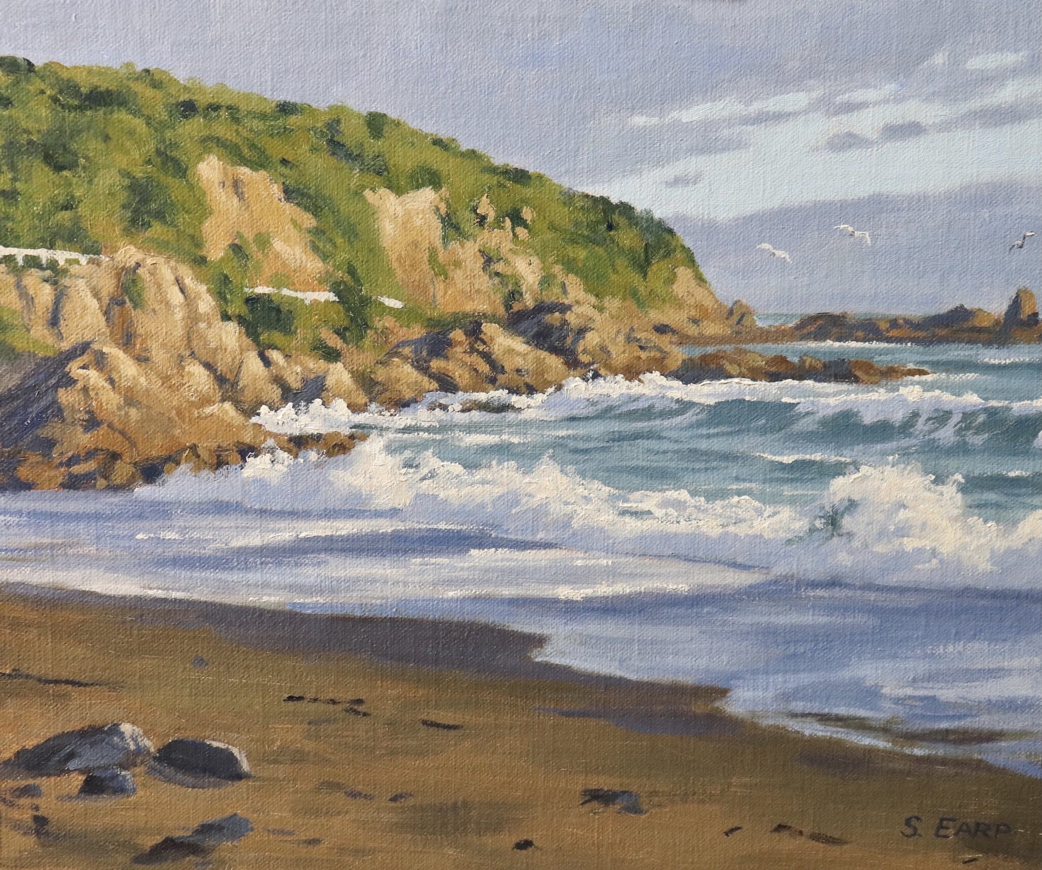
In this blog post I will show you how to paint ocean waves and cliffs in this painting inspired by a place called Houghton Bay, New Zealand.
I have painted this art work in oils but you can also use acrylics as well.
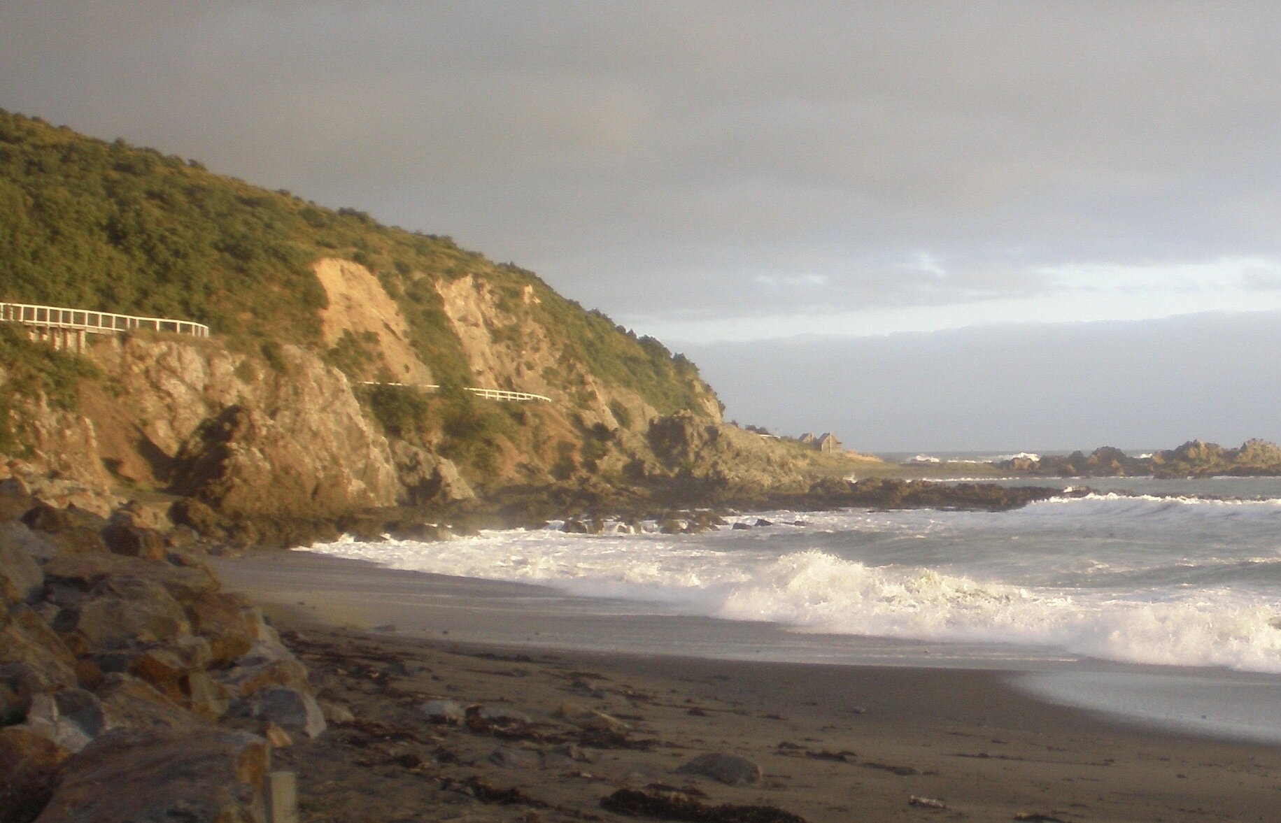
Reference Photo
Here is a reference photo I took and used in this painting. Please feel free to use or copy this photo if you would like to have a go at painting this art work.
Colours
I painted this artwork using oil paint and the colours I used in this painting are as follows:
- Titanium white
- Burnt sienna
- Yellow oxide (you can also use yellow ochre instead)
- Cadmium yellow
- Cadmium orange
- Quinacridone crimson (you can also use alizarin crimson instead)
- Ultramarine blue
- Phthalo green
Brushes
Here is a list of the brushes I used in this painting:
- No.6 flat
- No.3 flat
- No.2 flat
- No.3 filbert
- No.1 round
- No.0 round
Composition
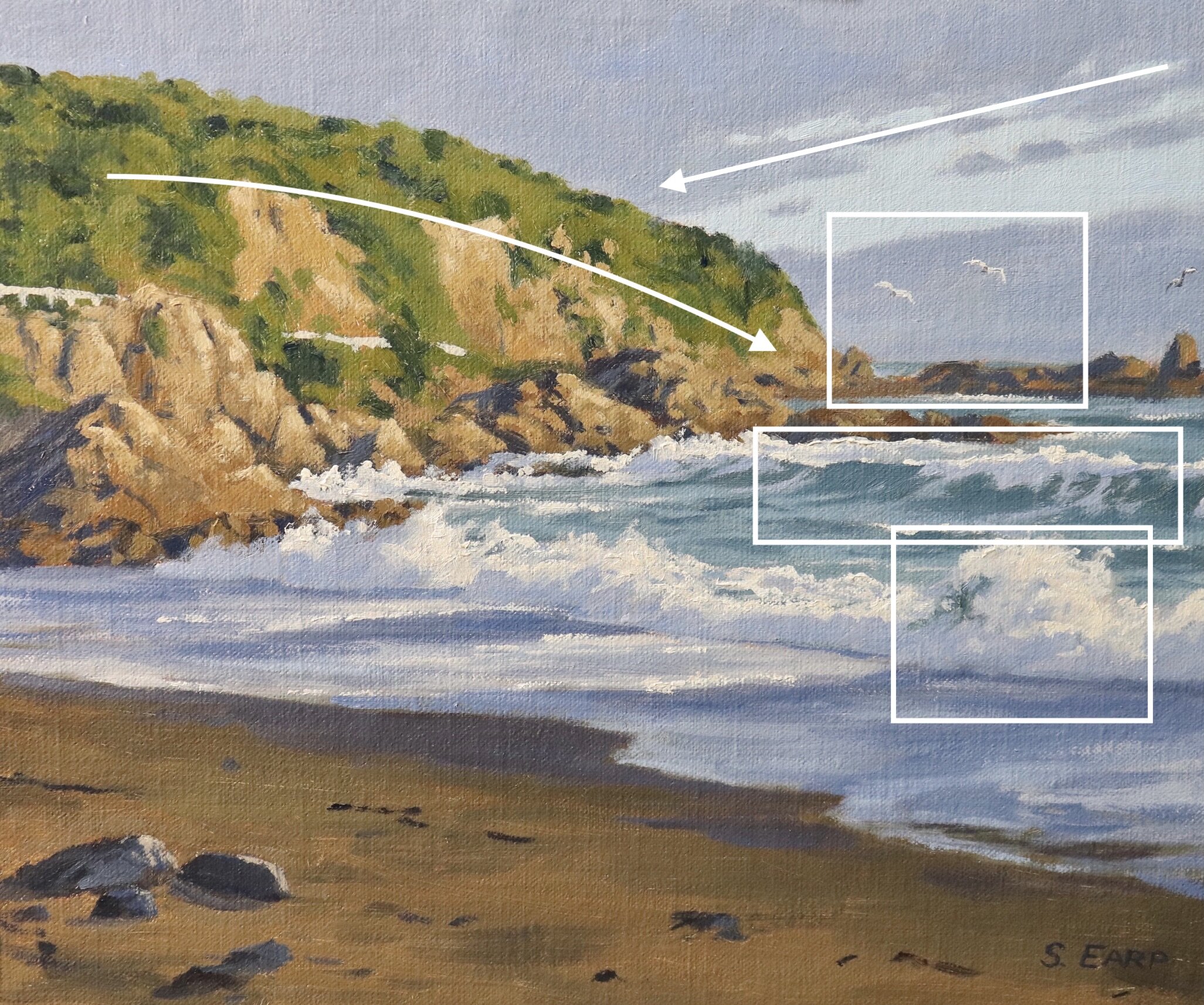
The breaking waves and white water are the main focal areas in this painting. The seagulls are a secondary area of interest.
I have implied rhythm in the painting with the direction of the cliffs and the clouds which leads the eye back towards to the headland.
Things to be Avoided in Composition
- Never have your focal area in the middle of the painting, avoid centred objects
- Never have your horizon line in the middle of the painting, either go for a lower or higher horizon
- Avoid repeating objects, equal masses, repeating lines and vectors and aberrations in general.
- Avoid having too much detail as this could spoil the composition.
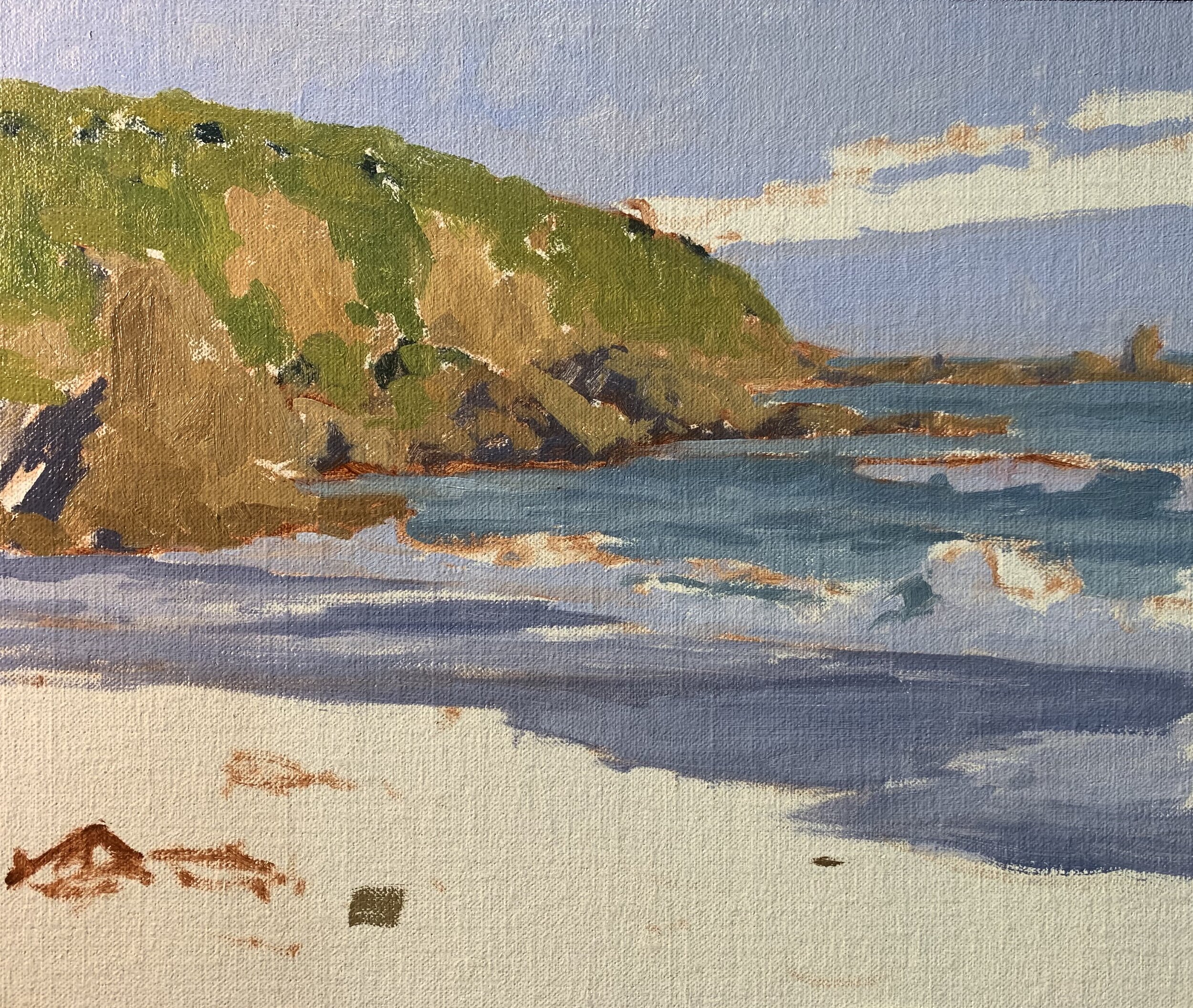
Stage 1 – Blocking in the Painting
I am painting on a 10” x 12” linen panel. The panel is pre made with a medium weave linen that is oil primed.
I sketch out the composition using a No.1 round brush with burnt sienna mixed with Liquin Original (Liquin). I am using Liquin as a medium to thin the paint, it also has the advantage of speeding up the drying time.
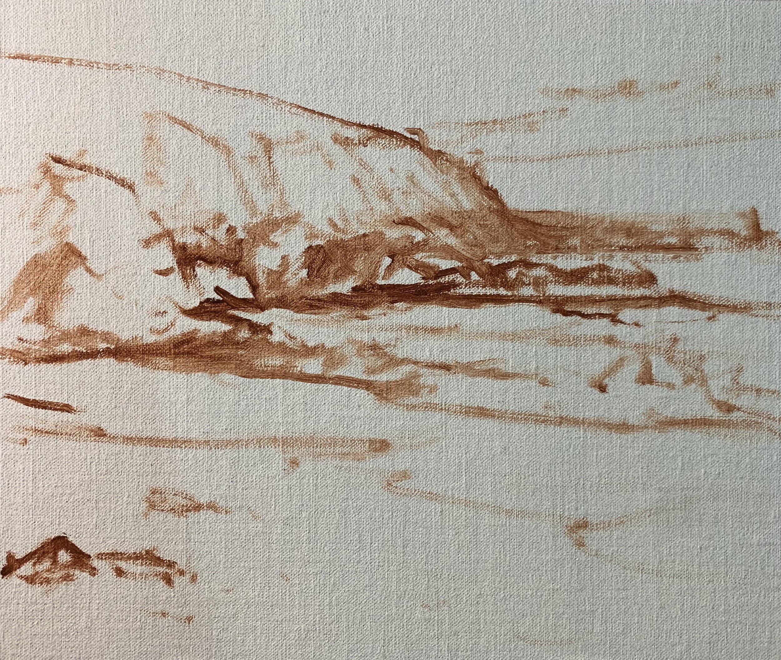
I start marking in the colour by first identifying where all my shadows and dark values are first. Value refers to how light or dark a subject is and we’ll find our darkest darks in the foreground however as landforms recede dark values become lighter. Darks are not as dark and lights are not as light.
I paint the sky with a mix of ultramarine blue, burnt sienna, quinacridone crimson and titanium white. I can use the same colour combinations for the rock shadows but I use very little titanium white to make the value darker.
For the shadows in the white water I use a mix of ultramarine blue, a little quinacridone crimson and titanium white.
The shadows in the vegetation on the cliffs are a mix of ultramarine blue and a little yellow oxide. These shadows are the darkest values in the painting.
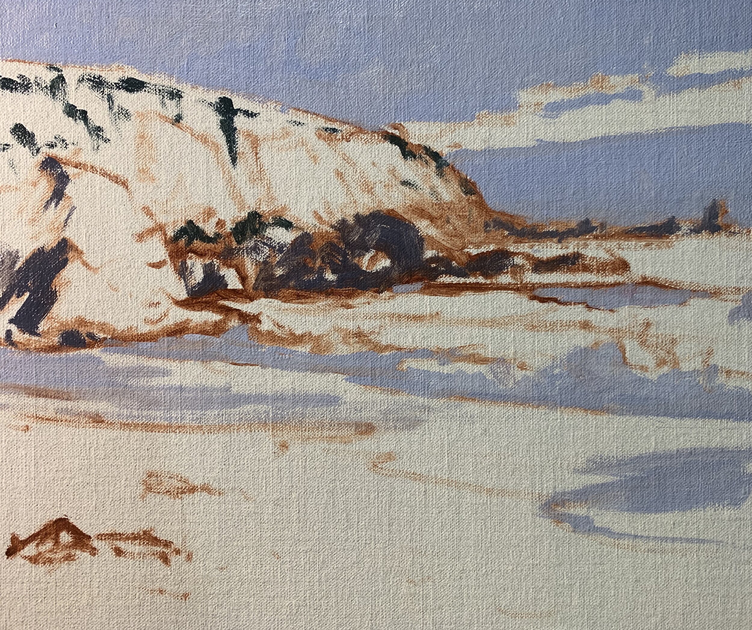
I paint the areas of the rocks that are in the sunlight with a mix of yellow oxide, burnt sienna and titanium white. I mix in ultramarine blue to desaturate the colour. I have used varying amounts of each colour to create different textures in the rocks and cliffs.
I paint the vegetation on the headland with a mix of ultramarine blue, yellow oxide, cadmium yellow and titanium white. I create some olive tones within the vegetation by mixing in some cadmium orange which also harmonises the green making it look more natural.
I paint the ocean with a mix of ultramarine blue, a little yellow oxide and titanium white. For the darker values such as the breaking waves I have used more ultramarine blue in my mix and less titanium white.
For the areas of water on the sand where the waves have washed up on the shore I have used a mix of ultramarine blue, burnt sienna, quinacridone crimson and titanium white. As this area of water is mainly reflecting the sky I have used the same colours.
The sand is dark and is also in shadow so I have used a mix of yellow oxide, burnt sienna, ultramarine blue and titanium white. If the mix is looking a little green I add more burnt sienna.
The rocks in the foreground are a varying mix of ultramarine blue, burnt sienna and a little titanium white.
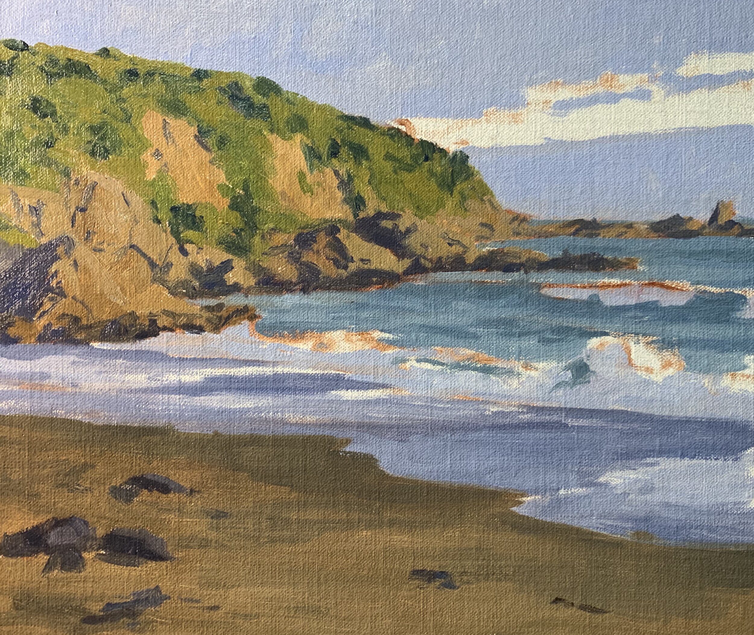
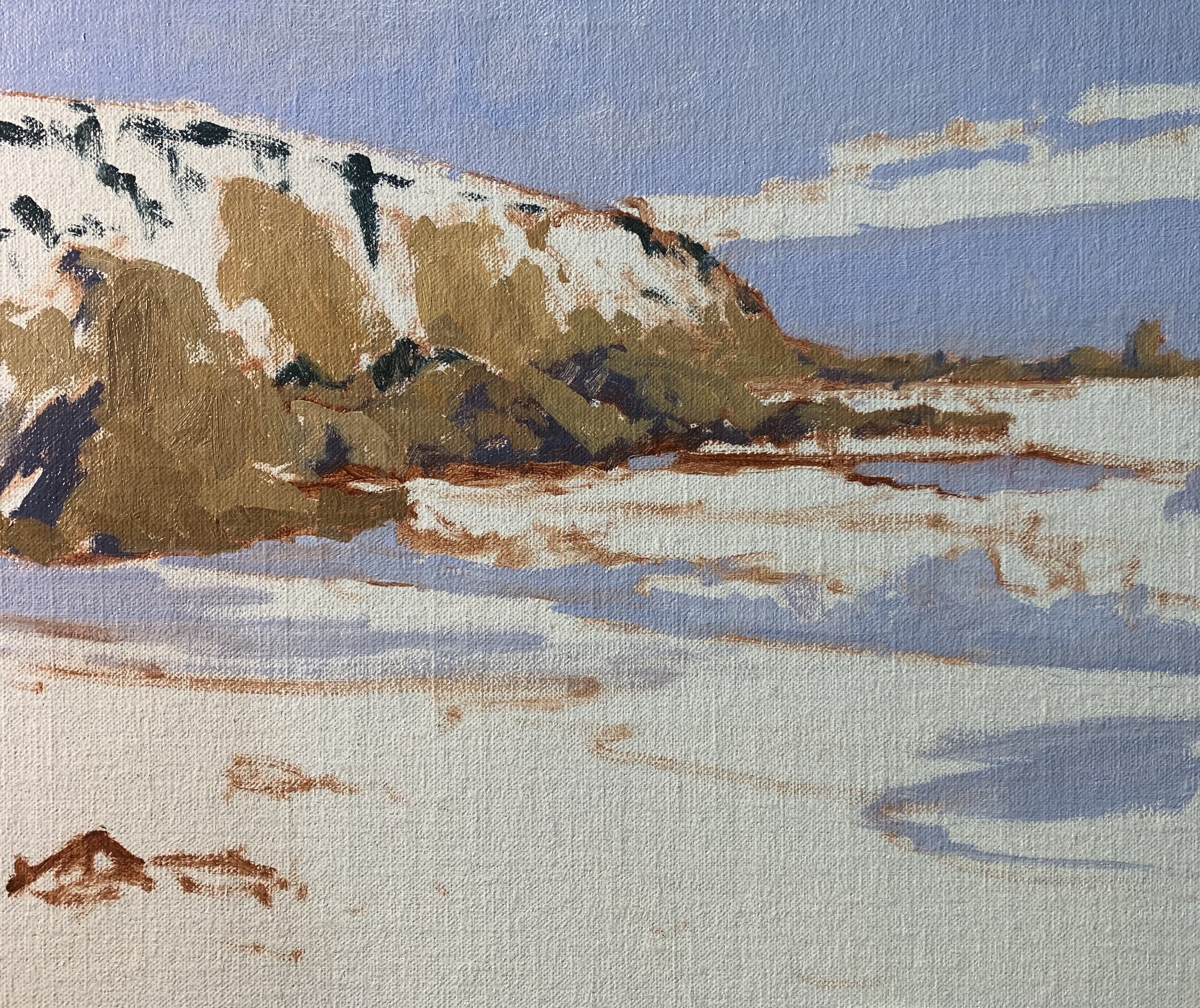
I paint the sky with a mix of ultramarine blue, titanium white and a little phthalo green. I use a lot of titanium white in the mix to create a light value colour.
The soft highlights on the breaking waves and white water are a mix of titanium white and burnt sienna. I am keeping the value of the colour a little darker so that when I paint my lightest values at the end of the painting the breaking waves will look much more realistic and three dimensional.
At this point I let the painting dry so I can add some finer details.
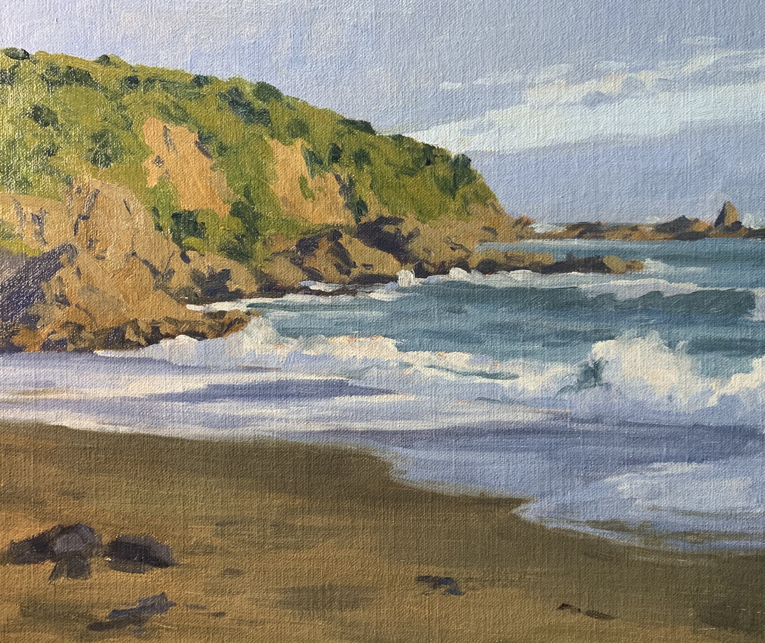
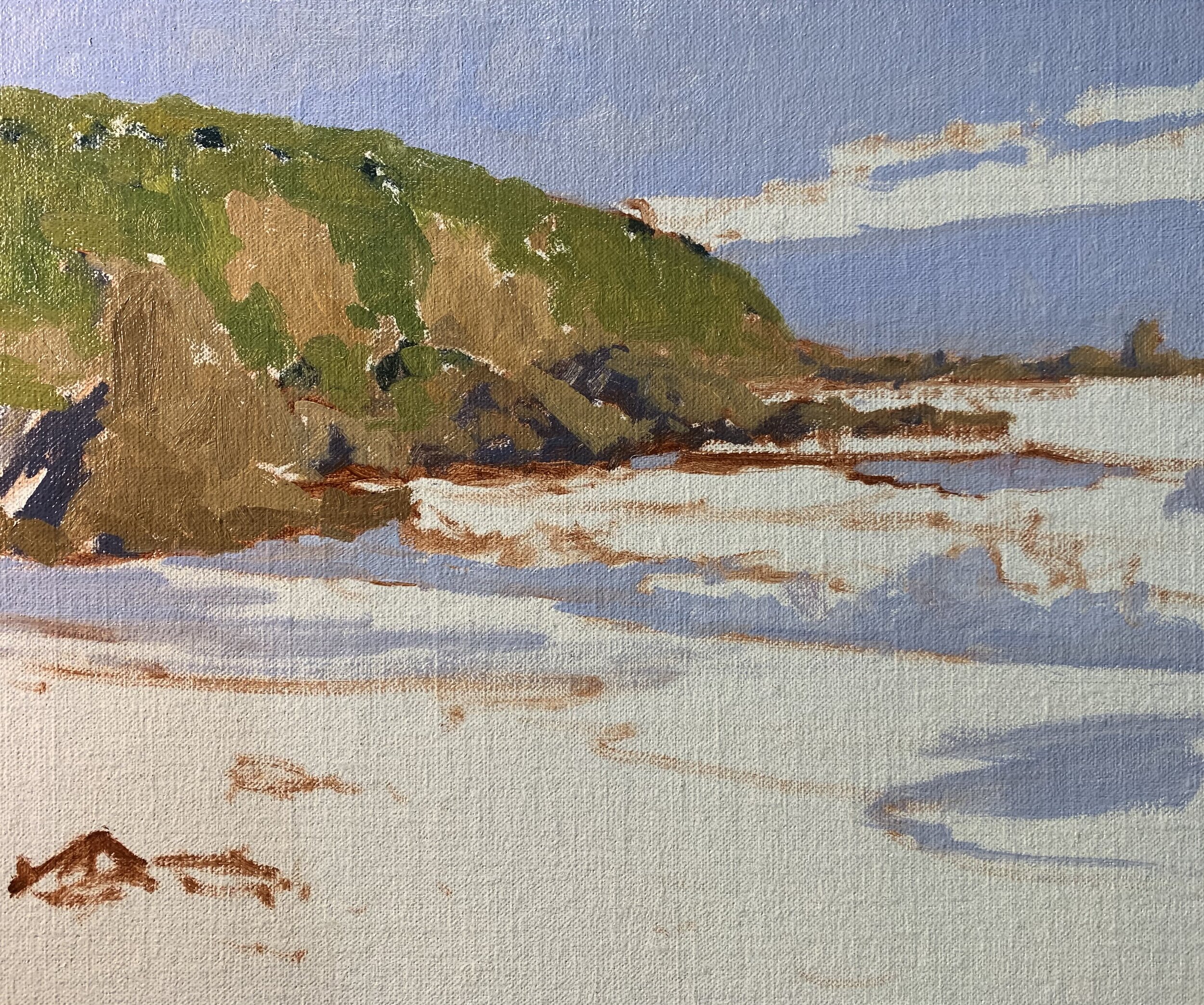
Stage 2 – Adding Details
Now the painting is dry I add more details in the cliffs, rocks and vegetation. I am essentially using the same colours that I used during the block-in stage but adding lighter layers of paint on top of the previous layers. I am also using smaller brushes including No.3 and No.2 flats and No.3 filberts.
I add more details to the waves including the reflected light within the troughs and I use a mix of ultramarine blue, a little yellow oxide and more titanium white. I also paint some foam patterns which adds to the drama of the breaking waves.
I paint more highlights within the breaking waves and white water with the same colours I used before but with more titanium white added. I also mix in a little yellow oxide.
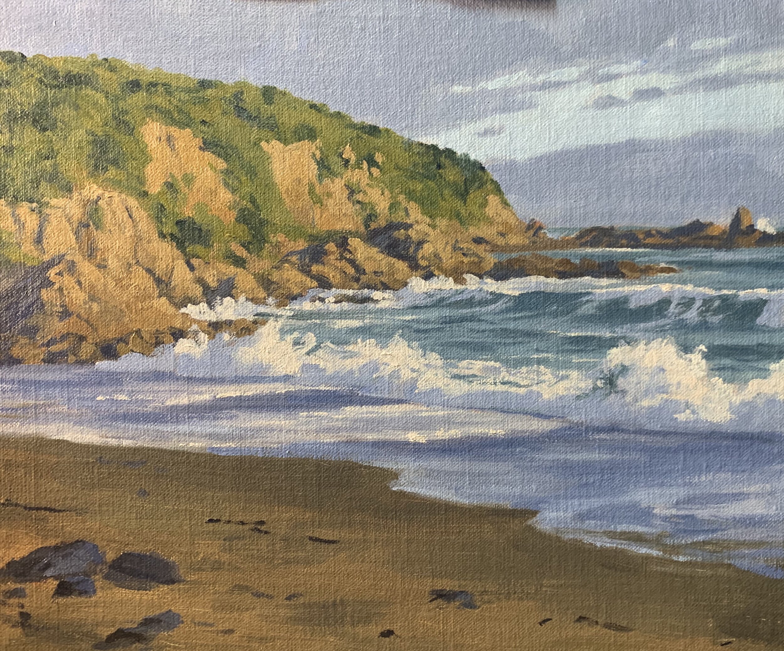
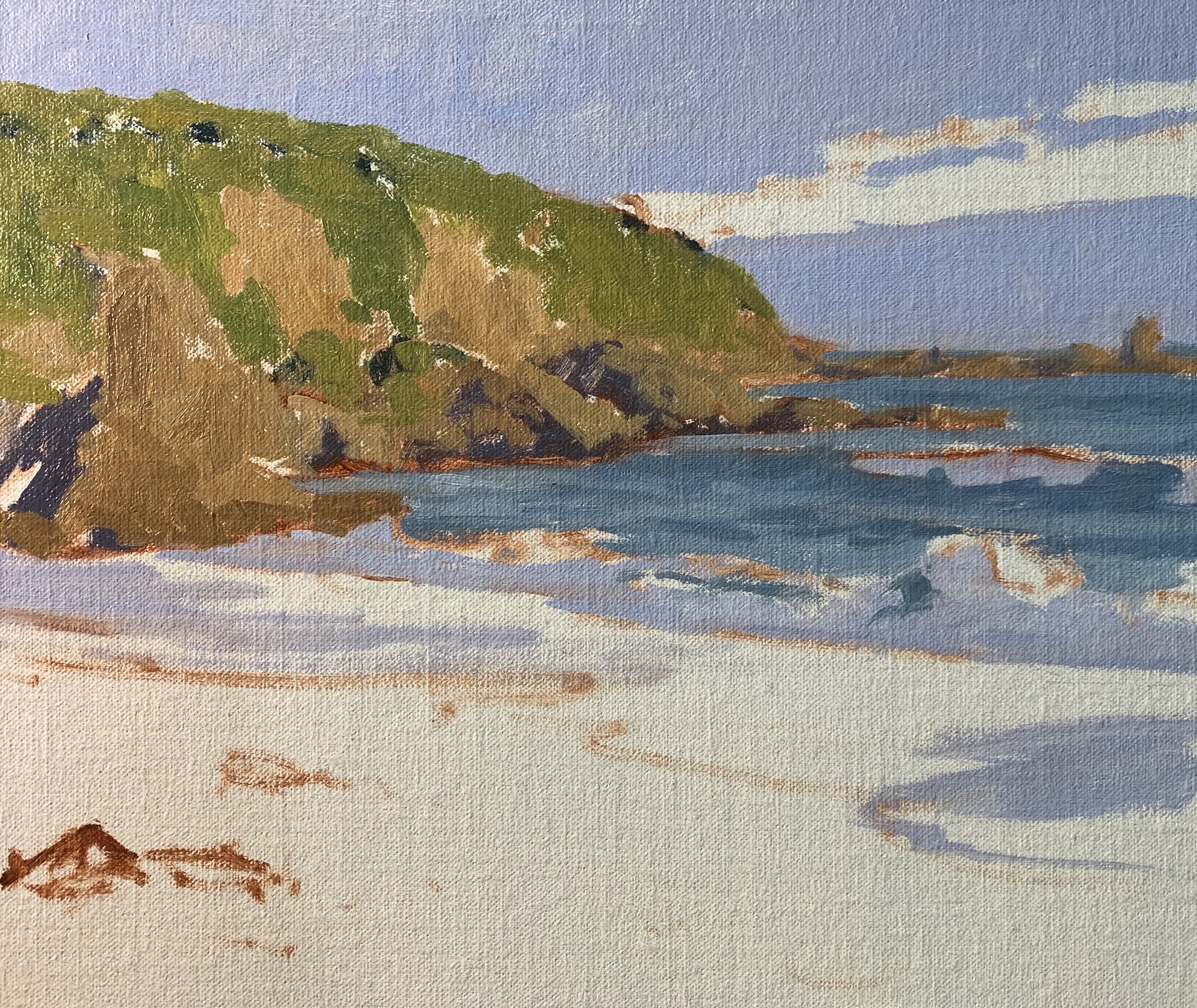
Stage 3 – Completing the Painting
I complete the painting by adding some final highlights to the rocks with a mix of yellow oxide, burnt sienna and titanium white. I also add my final highlights to the waves and white water with a mix of titanium white and a little yellow oxide.
I paint some seagulls a secondary focal area.
Overall I have kept the colour mixes simple in this painting and I have been conscious to use similar colours throughout in order to achieve colour harmony and a painting that reads well.
Thank you for reading 😊
