One thing I often get asked about with my seascape paintings is how do you paint the translucency of a breaking ocean wave? Well it is not as difficult as you might think.
In this blog post I give you some tips on painting ocean waves and how to achieve that magical translucency in the water as the sunlight shines through it. I also give you some general tips for painting seascapes in this step by step written tutorial.
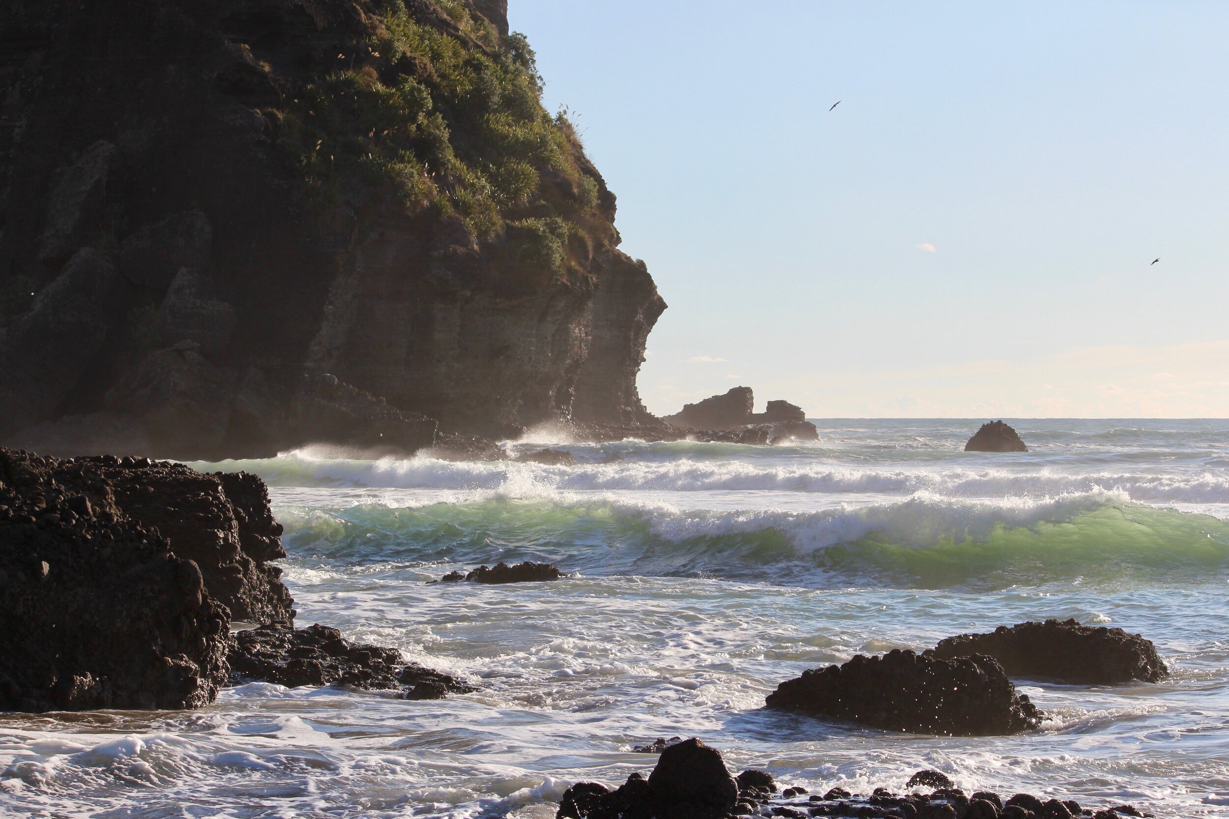
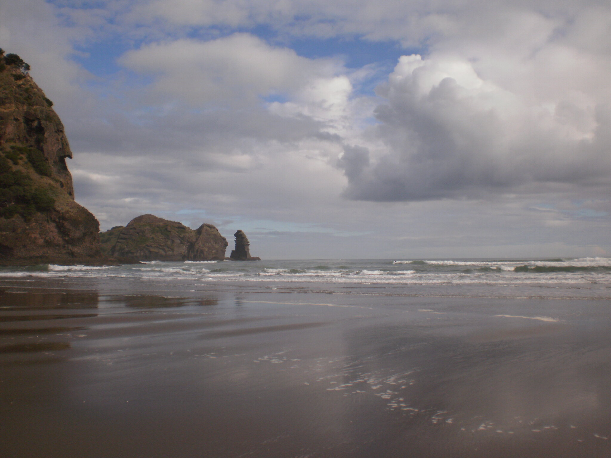
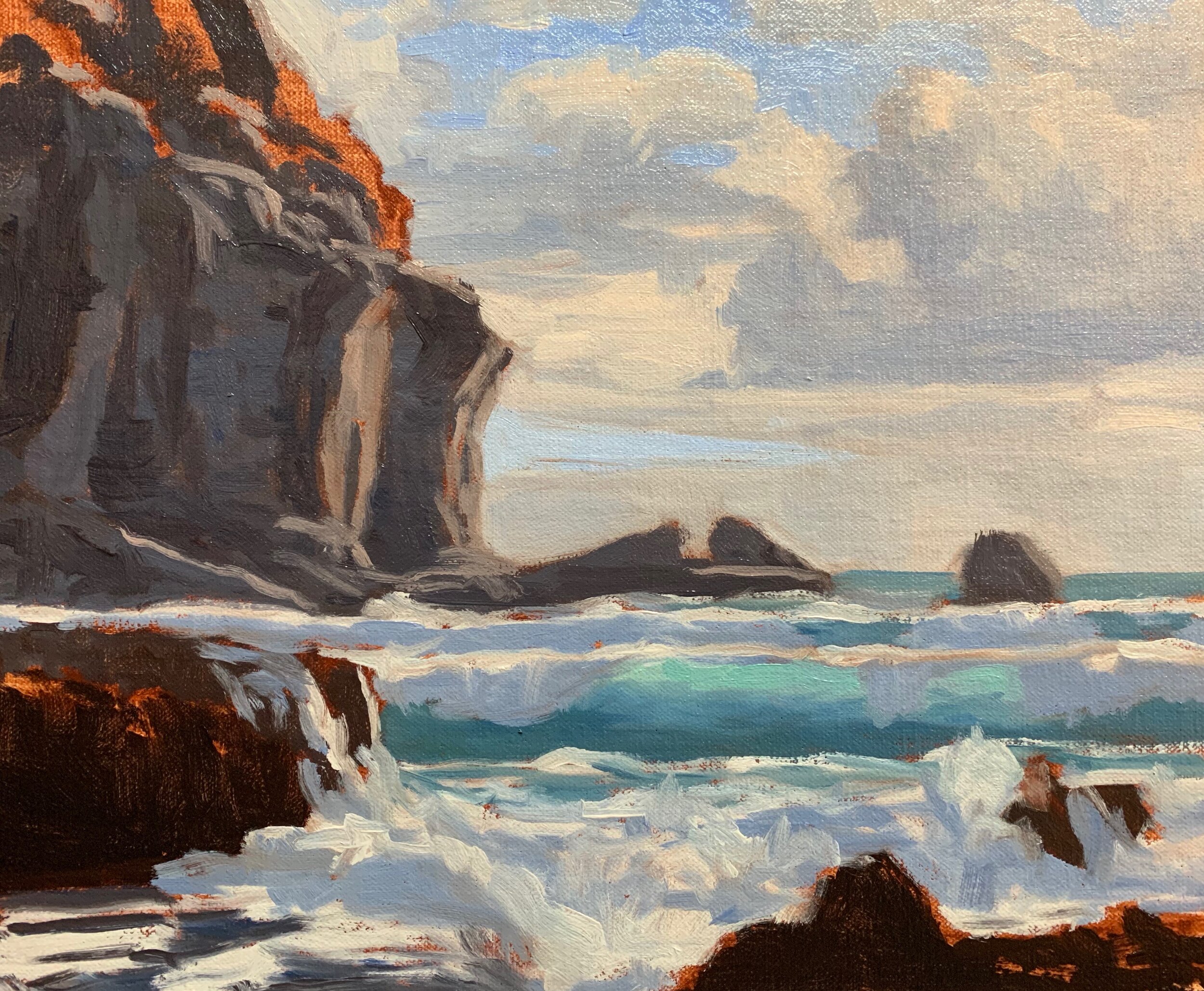
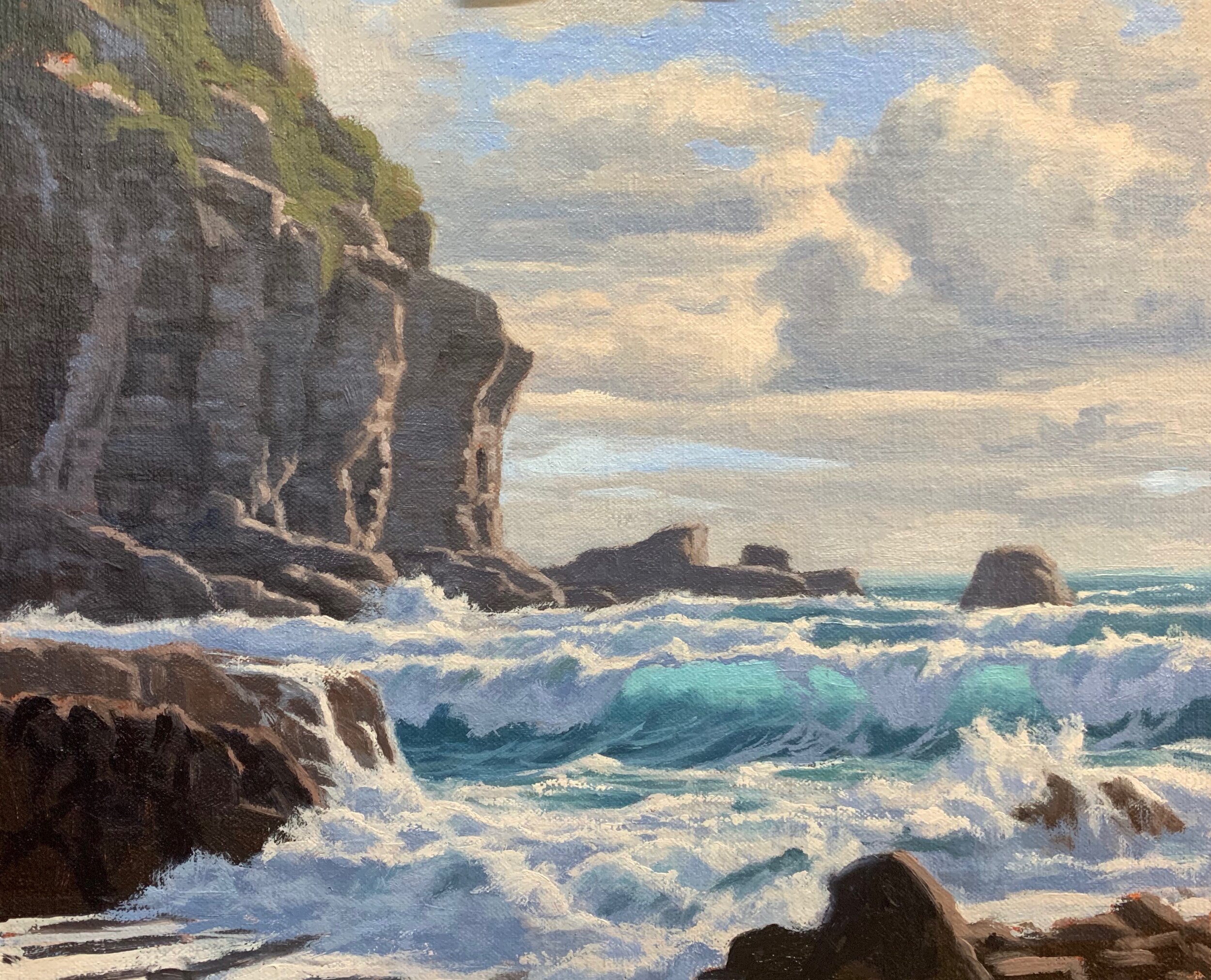
The inspiration for this painting came from a place called Piha Beach near Auckland in northern New Zealand. It’s a wild stretch of coastline often with heavy swells and rough seas as there is nothing separating the ocean between there and Australia.
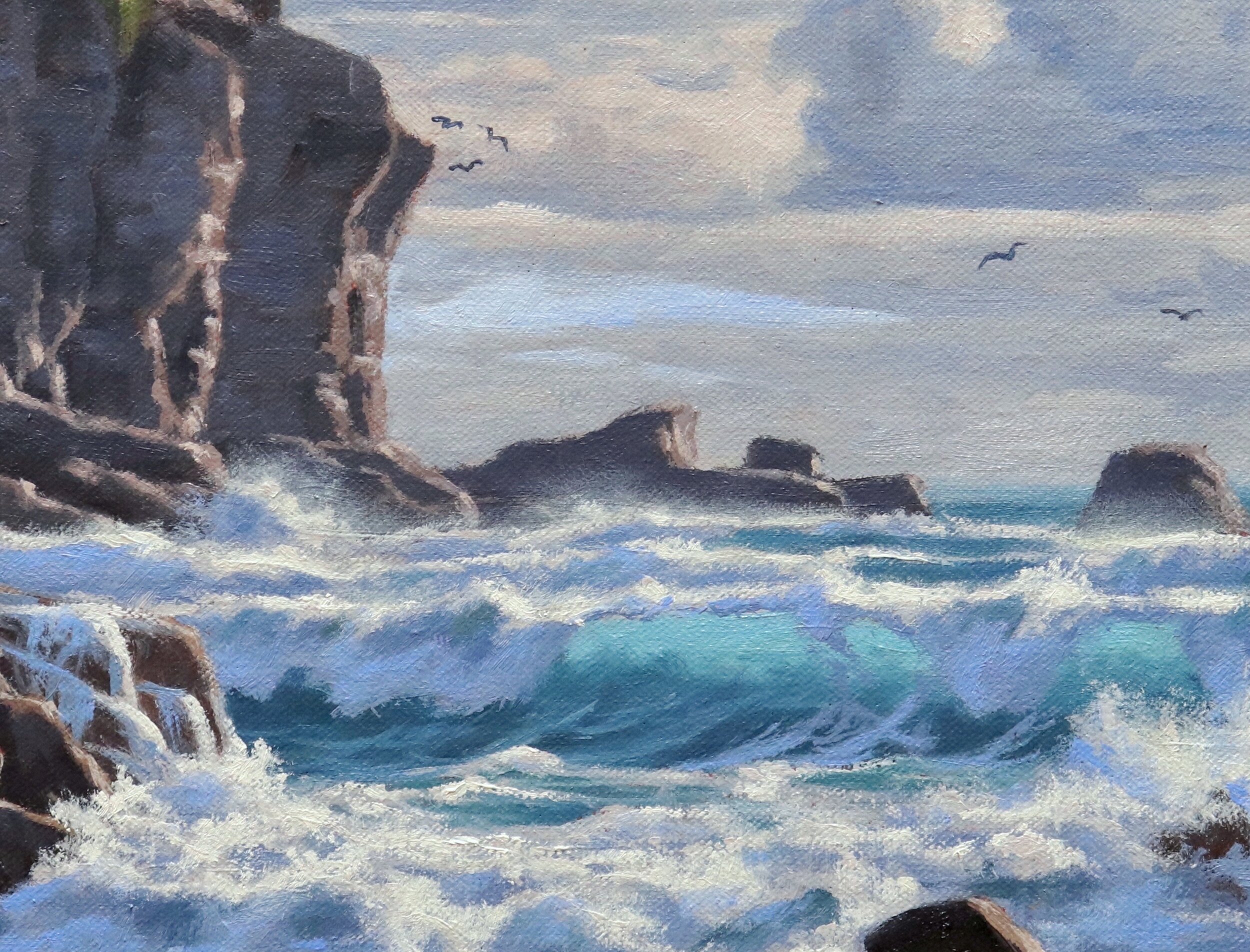
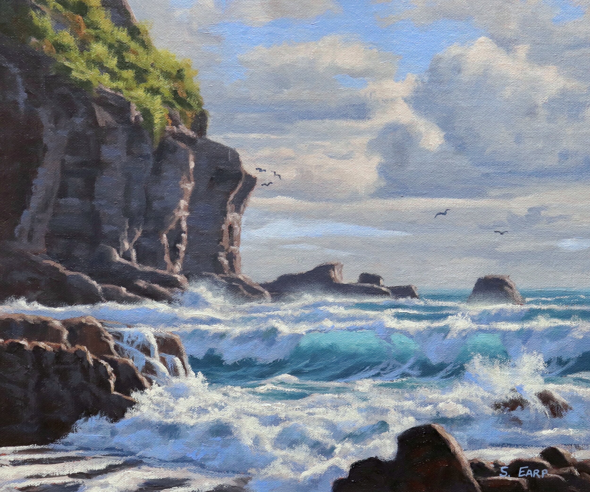
This painting focuses on the translucent waves and the surrounding rocks and cliffs.
Reference Photos
Here are a couple of reference photos that I used to create this art work. Please feel free to use them or copy them if you would like to have a go at painting this art work.
Composition
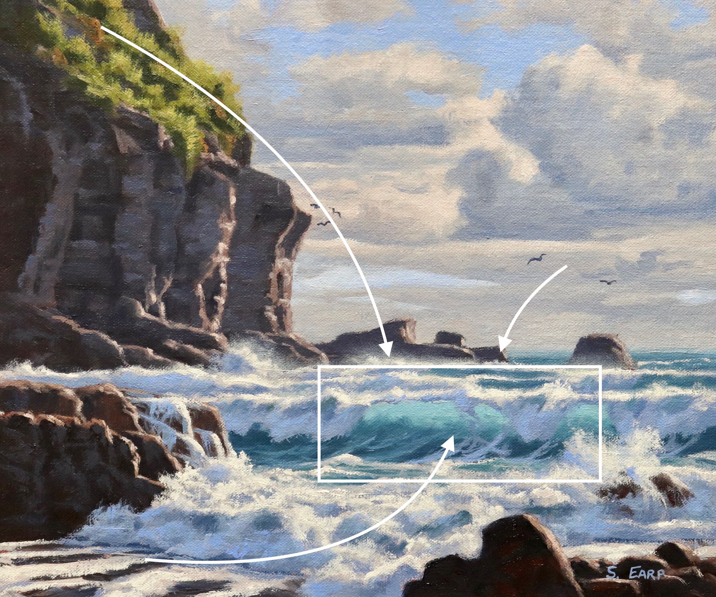
The main area of interest in this seascape is the translucent breaking wave. I have loosely incorporated an ‘S’ composition into the design where the channel in the foreground leads the eye towards the breaking wave. The positioning and form of the cliffs and the mid ground rocks help lead the eye towards the breaking wave.
Colours Used
I painted this artwork using oil paint and the colours I used in this painting are as follows:
- Titanium white
- Burnt sienna
- Yellow oxide (you can use yellow ochre instead)
- Cadmium yellow
- Cadmium orange
- Quinacridone crimson (you can use alizarin crimson instead)
- Ultramarine blue
- Phthalo green
Brushes
Here is a list of the brushes I generally use for plein air painting:
- No.6 flat (these are the brushes I use the most)
- No.4 short flat
- No.2 flat
- No.1 round
- No.0 round
- 1/4 dagger
Paint Stunning Seascapes Step-by-Step
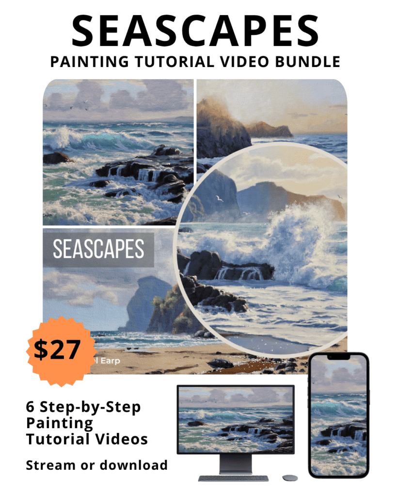
4 x Step-by-Step Painting Tutorial Videos – $27
Blocking-in the Painting
I am painting on a 8” x 10” linen panel which I’ve toned it with a layer of burnt sienna. This really helps with overall colour and tone of the painting.
I sketch out my composition with a No.1 round brush and burnt sienna. I am using the medium Liquin Original for this painting, which thins out the paint and speeds up the drying time.
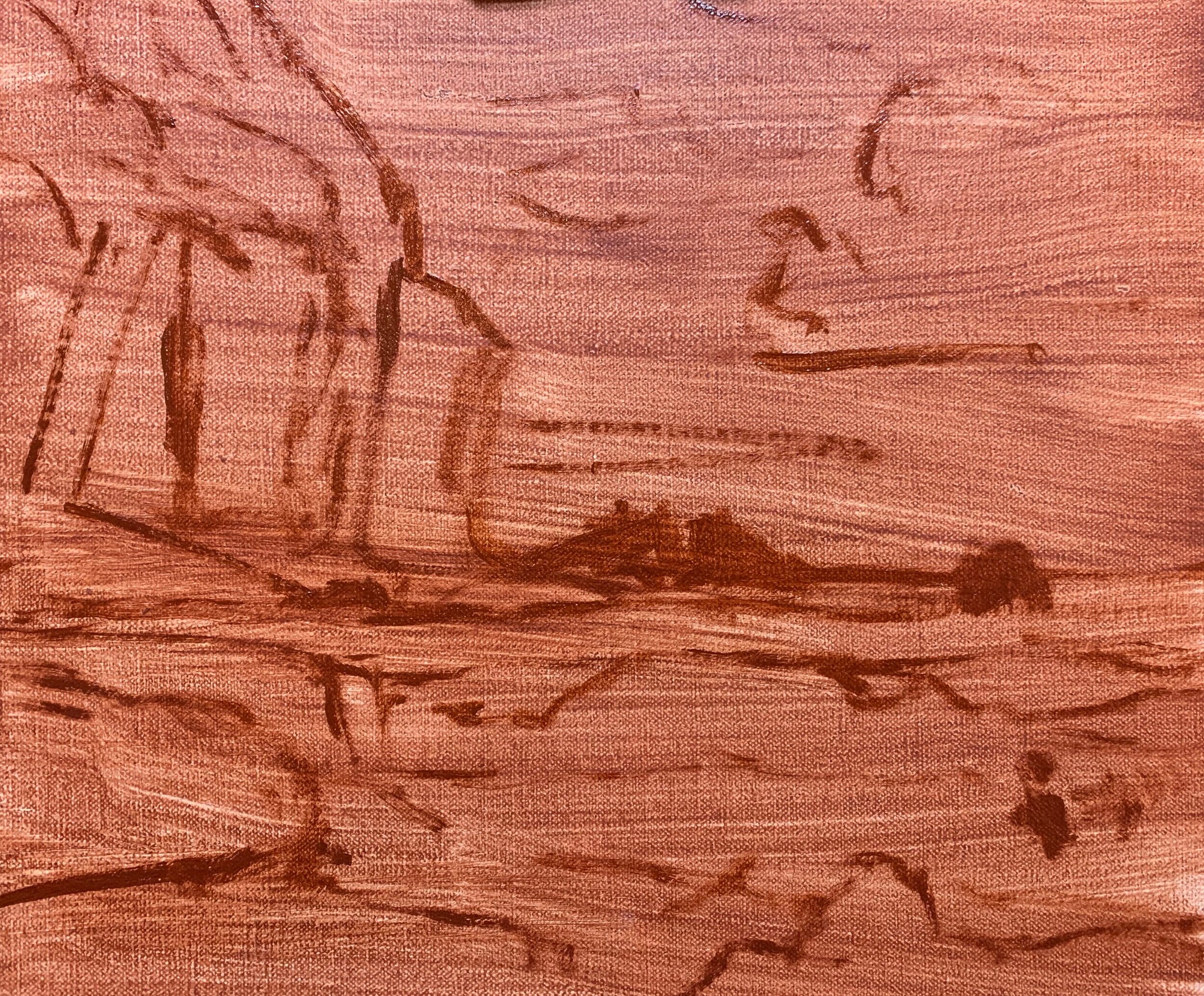
Whenever I begin blocking in a painting I normally start by establishing my dark values and shadows first, that way I can quickly establish the tonal range in the painting. It also then makes it much easier when you come to add the areas in light as well as getting the saturation of your colour correct.
In this seascape I started by painting the cloud shadows first, then I painted the shadows in the cliffs which are a much darker value. The darkest values are found in the rock shadows in the foreground. I used the same colours for the clouds, rocks and cliffs which included a mix of ultramarine blue, burnt sienna and titanium white to get the value that I wanted. I also mixed in a small amount of quinacridone crimson to give the shadow tones a violet tint.
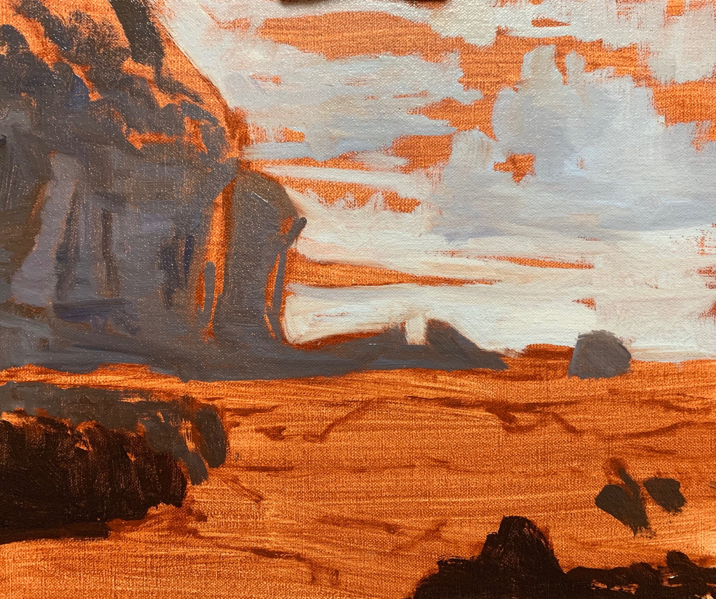
Once I have all my dark values / shadows established, it will make it much easier for me to paint the areas that are in full sunlight. It will also make it easier for me to get the values and colour saturation right.
Painting Translucent Ocean Waves
I start painting the translucent ocean wave by working on the upper section of the wave first. The barrelling wave is thinner in this section which allows more sunlight to pass through it. For this I start with a mix of ultramarine blue, a very small amount of phthalo green and titanium white.
Next I mix up a darker tone of the same colours but I also introduce more ultramarine blue and a little yellow oxide. I use less titanium white in order to make the value of the mixture darker. I use this colour combination to form a transition zone between the upper section of the wave and the darkest tones in the lower section.
For the lower section of the wave I mix ultramarine blue, a little yellow oxide and phthalo green and if required I also mix in a small amount of titanium white to adjust the value. I then blend the colours of the upper and lower section of the waves to form a nice transition between the two zones.
Keep the value of your breaking wave lighter in the upper section and add darker colour when you paint the lower section. Backlit waves often look more dramatic in seascapes and are generally easier to paint especially if you are a beginner.
Painting Tip
Good colours to use for painting sea tones include the Following:
- Ultramarine blue
- Yellow oxide (or yellow ochre)
- Phthalo green
- Titanium white
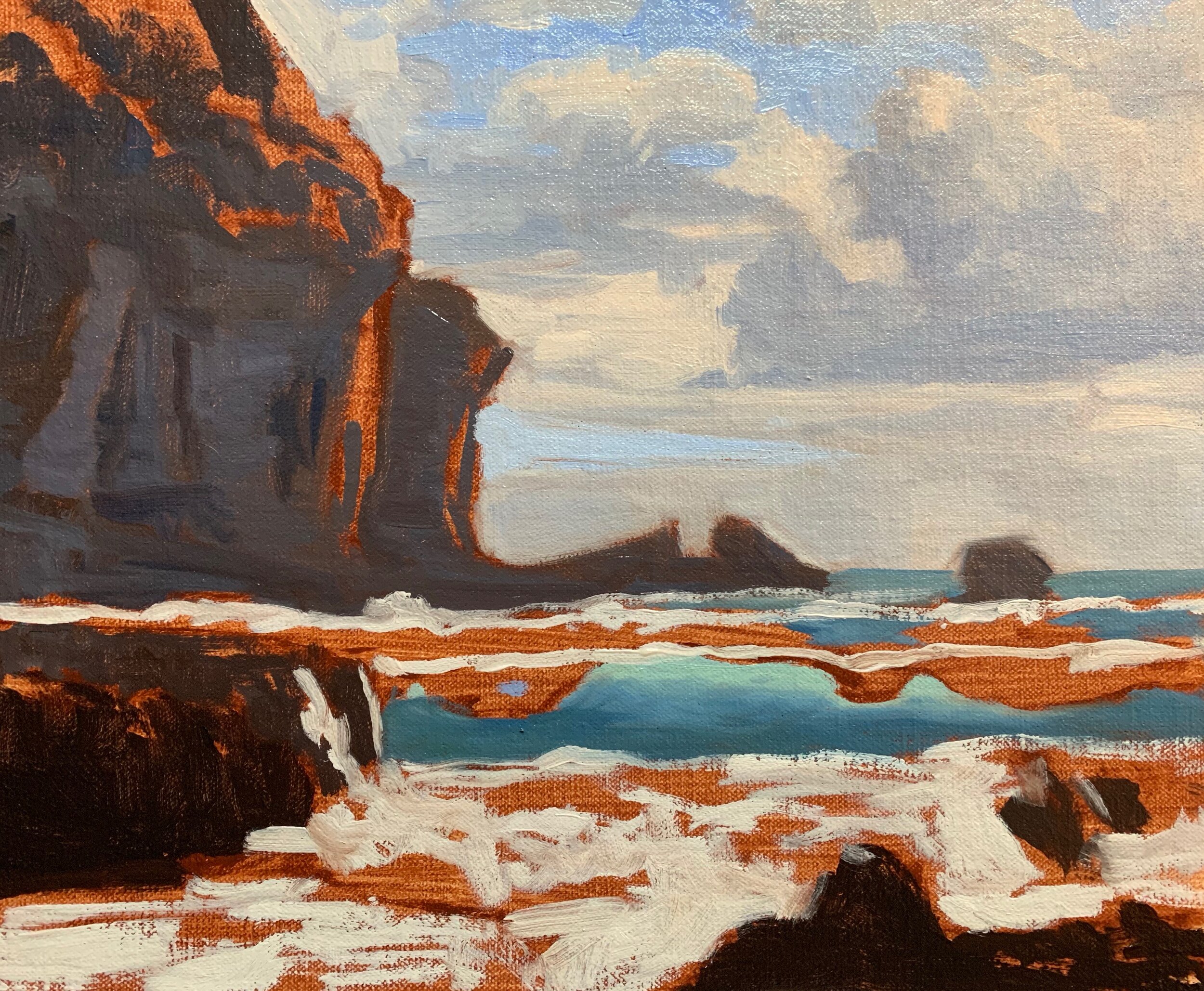
At this stage of the painting I have marked where I want the wave highlights and white water is to go. I’ve used titanium white with a little burnt sienna mixed in so the value is a little darker.
The shadow colours of the white water and the blanket of foam that is formed as the wave breaks when it is barreling over, was mixed with a combination of ultramarine blue, a little burnt sienna and quinacridone crimson and titanium white to create a light colour. The white water is reflecting the ocean and sky so it has a blue cast to it.
I paint the highlights of the cliffs and rocks with a varying mixture of ultramarine blue, burnt sienna, quinacridone crimson and titanium white.
Once the block-in is complete I allow the painting to dry so I can start adding details.
Painting Tip
If you can, try and block-in the whole painting in one sitting and don’t worry about painting details, that will come later on in the painting. The aim of the blocking-in stage is to provide a good solid foundation and a base to work from, where you can start building up detail.
Keep your brush work loose and gestural as this will add vibrancy, movement and life to your painting. You can add detail once the painting is dry, after the blocking-in stage is complete.
Adding Detail
Building up the detail in the painting will be the most time consuming part so take your time and have fun with it. At this stage of the painting you’ll likely have to restate some areas of the painting with fresh paint, especially some of those darker tones.
Try to use bigger brushes if you can as this will help you to cover ground more quickly and maintain a vibrant and painterly feel to your painting. However, use the best brush for the job, for example if you feel using a dagger brush is best for painting a rock then use that brush.
In general, you’ll be adding lighter layers of colour compared with your previous layers.
Final Details
This is the stage of the painting where we’ll be adding those last final tones that are going to complete the painting and make the whole this come to life. We’ve saved our lightest values until the end of the painting which in this case are the crests of the waves, foam, sea spray and white water. Here I have selectively added my lightest values with titanium white and a small amount of cadmium yellow.
Adding a couple of seagulls to a seascape painting can really add that extra something that will add to the story of your art work as well as create an additional area of interest within the painting.
Paint Stunning Seascapes Step-by-Step
4 x Step-by-Step Painting Tutorial Videos – $27
Thanks for reading 😊
