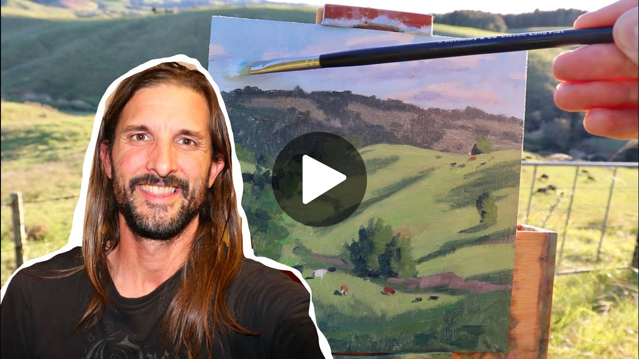
Forget everything you know about painting mountains. When I first experimented with a reverse technique long ago on a large canvas, the outcome was nothing short of astonishing. Today, I’ll walk you through the process of creating a New Zealand-inspired landscape that transforms with this unconventional method.
Our journey starts with the blocking-in stage, which I’ll detail shortly. But first, let’s sketch out the composition on a 20 by 24-inch linen canvas. I still remember the moment I realized that working backwards from what I’d been taught could unlock completely new possibilities in my mountain paintings.
This technique challenged every assumption I had about how light and shadow should be applied, forcing me to see landscapes in an entirely different way.
Getting Started: Materials and Inspiration
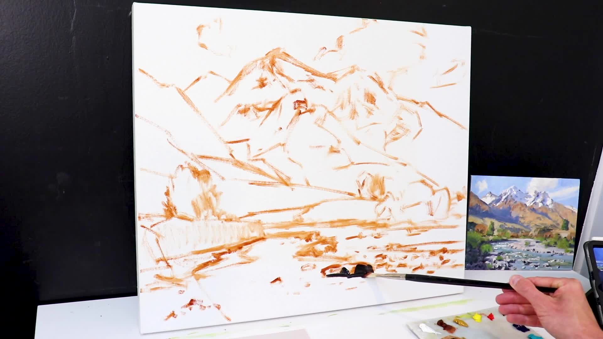
I’m working with Blue Ridge Oils, a brand of oil paint that I’ve found to be particularly effective. For sketching the composition, I’m using burnt sienna mixed with a bit of Oleogel, a non-toxic medium that enhances paint flow.
I’ve been using Blue Ridge Oils for several years now and consistently love their pigment density and smooth consistency. The combination of burnt sienna with Oleogel gives me the perfect sketching medium—fluid enough to move easily across the canvas but with enough body to establish strong compositional lines.
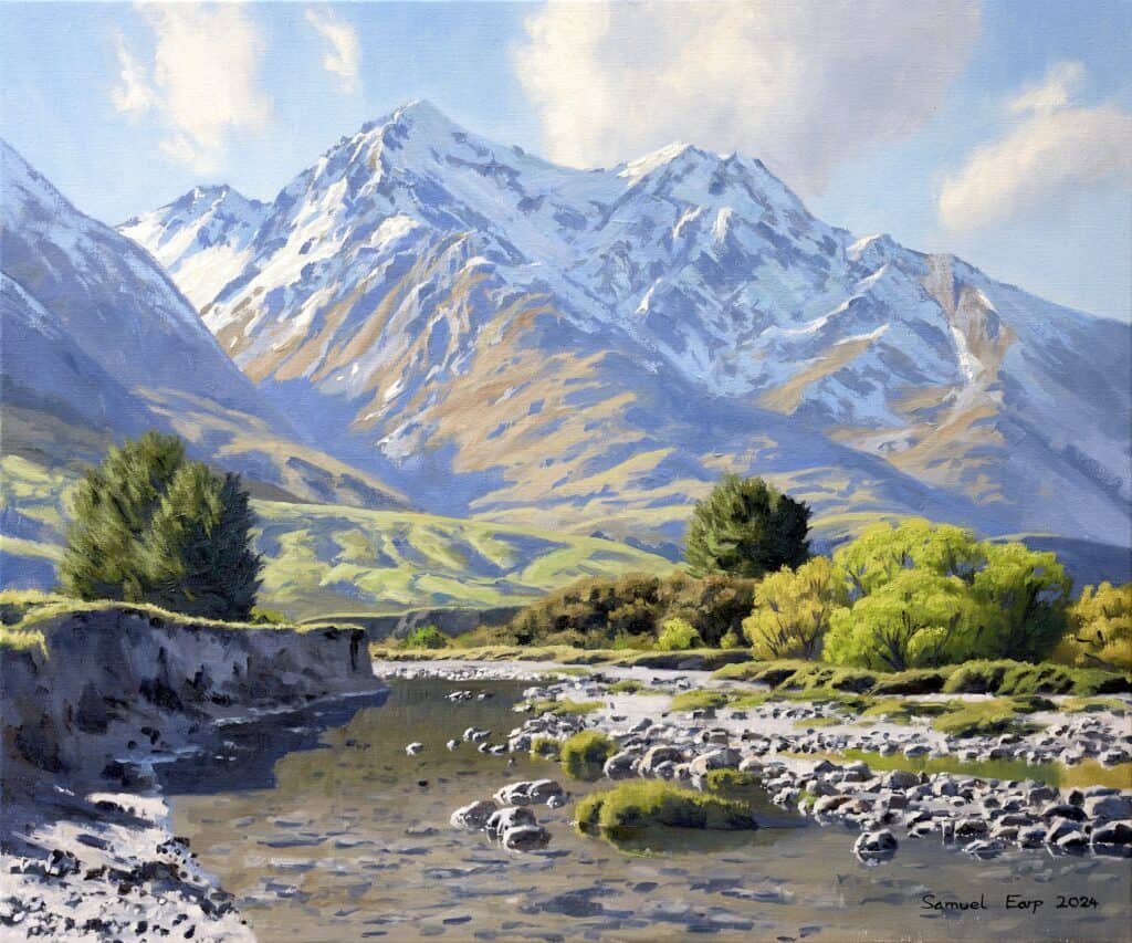
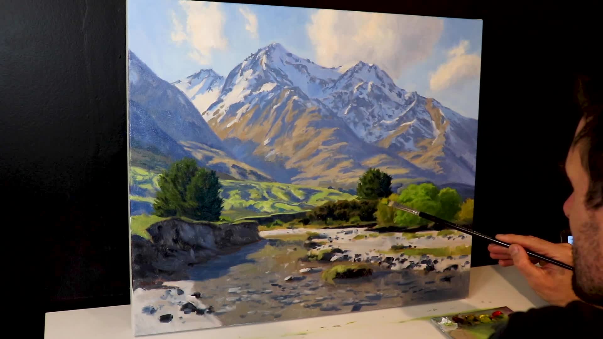
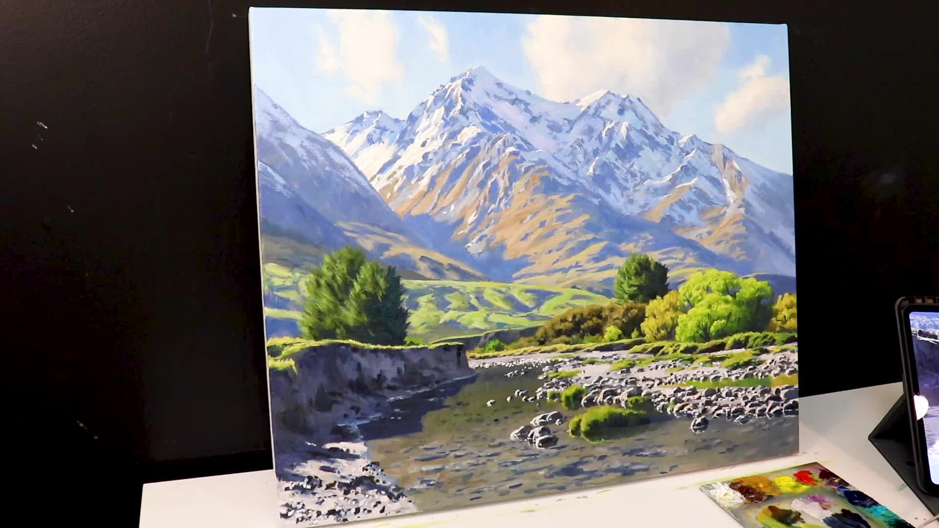
“This painting is inspired by an area called Glenorchy in southern New Zealand. It’s a truly magical place.”
Planning the Composition
Before diving into the painting process, planning is crucial. I’ve got one of my plein air paintings nearby to guide my use of color. This preparation included pencil sketches and a color study. What sets my work apart is painting the dark values first, a technique I discovered through plein air painting. This approach is particularly useful outdoors, where light is always changing.
Understanding Dark Values in Painting
The technique of starting with dark values helps establish a tonal framework for the painting, making it easier to gauge colors and saturation levels against those dark areas. Many artists prefer to start with the sky and work forward, but this can lead to overly dark midgrounds, with little tonal variety left for the foreground.
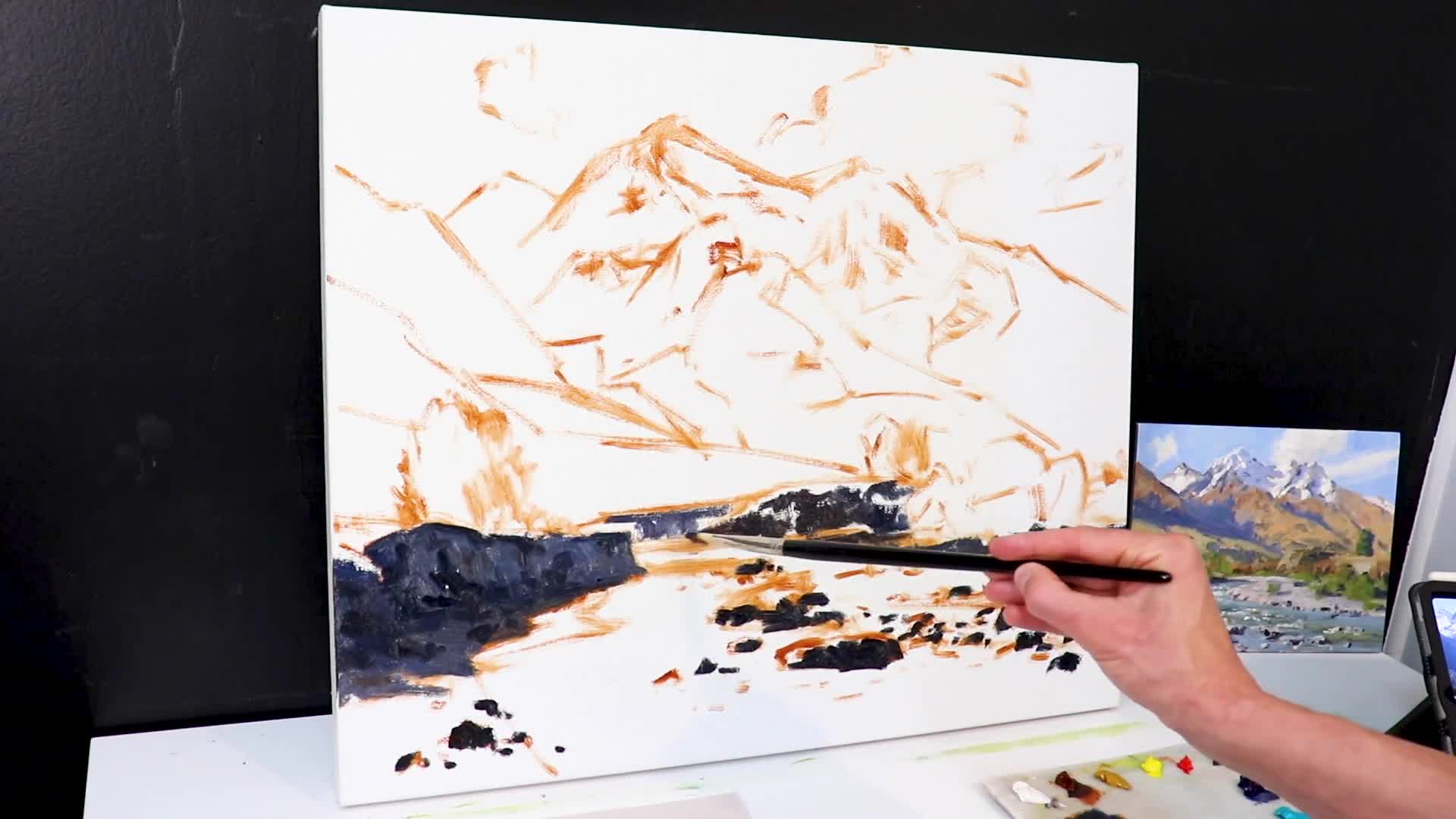
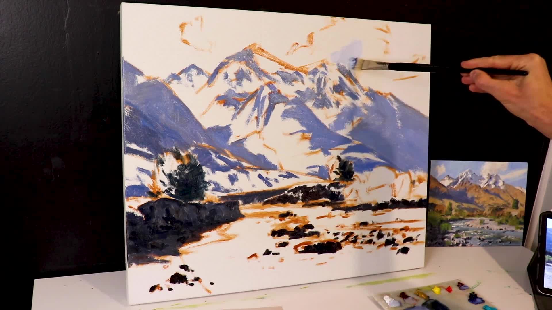
Creating the Dark Tones
For the darkest tones, I’m using a blend of ultramarine blue and burnt sienna to form a deep tone, complemented by alizarin crimson and titanium white for reflections and shading. I’ve discovered that this particular combination creates incredibly rich, complex darks that feel natural rather than flat or muddy.
The touch of alizarin crimson adds warmth to what could otherwise be a cold mixture, while the titanium white allows me to create subtle variations in temperature and value within the shadow areas.
“The tonal range narrows as landscapes recede; darks aren’t as dark, lights aren’t as light.”
Why Paint Darks First?
This approach helps maintain tonal balance and depth within the painting. Shadows in mountainous landscapes often absorb a blue cast, a detail well-suited to this technique. Additionally, by using big brushes, I can cover more canvas quickly without getting bogged down in details.
I’ve found that starting with darks gives me a solid foundation to judge all my lighter values against, preventing me from making everything too light or too dark. This method also forces me to think about the overall structure of the mountain before I get distracted by surface details. By establishing these deep shadow masses first, I create a framework that supports every decision I make moving forward.
Working with Large Brushes
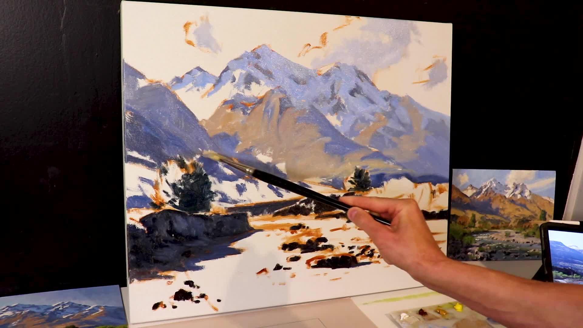
Using larger brushes allows more freedom and looseness in the painting. This technique can help you avoid the trap of over-detailing your work, yet keep a realistic feel. Here, I’m using number 10 flat brushes, which promote broad, expressive strokes and help establish the painting’s main dark areas.
Tackling the Challenging New Zealand Landscape
New Zealand’s rugged terrain presents a palette of low-chroma colors from the native vegetation. For the mountains, a mix of yellow ochre, alizarin crimson, titanium white, and a hint of ultramarine blue works well. It’s vital to avoid saturation that might push these elements to the foreground.
I’ve learned from painting New Zealand’s landscapes that the key is restraint—those muted, earthy tones are what give the terrain its authentic character. The moment I oversaturate these colors, I lose that sense of atmospheric distance that makes these mountains feel truly remote and majestic.
Building Up: The Modeling Process
Once the blocking-in stage is complete and dry, I move to modeling, adding more detail and refining specific areas. While I don’t focus overly on detail, my loose brushwork foundation allows for as much or as little refinement as needed.
“Values do all the heavy lifting, while colors get all the glory.”
Depth and Distance in Landscape Paintings
In landscape painting, understanding the desaturation of greens as they recede in distance is essential. For foreground elements like trees, my palette includes yellow ochre, cadmium yellow medium, ultramarine blue, and a touch of phthalo green, tempered with red hues like burnt sienna.
I’ve made the mistake countless times of keeping my greens too vibrant in the distance, which flattens the entire composition and destroys any sense of depth. Now I consciously add more burnt sienna and ultramarine blue to my distant greens, pushing them toward neutral grays that sit back naturally. This creates that atmospheric perspective that makes viewers feel they could walk right into the painting.
Creating Natural Greens
For a green landscape:
- Foreground Greens: Mix vibrant colors with reds to avoid excessive saturation.
- Distant Greens: Use low-chroma blends to give the illusion of depth.
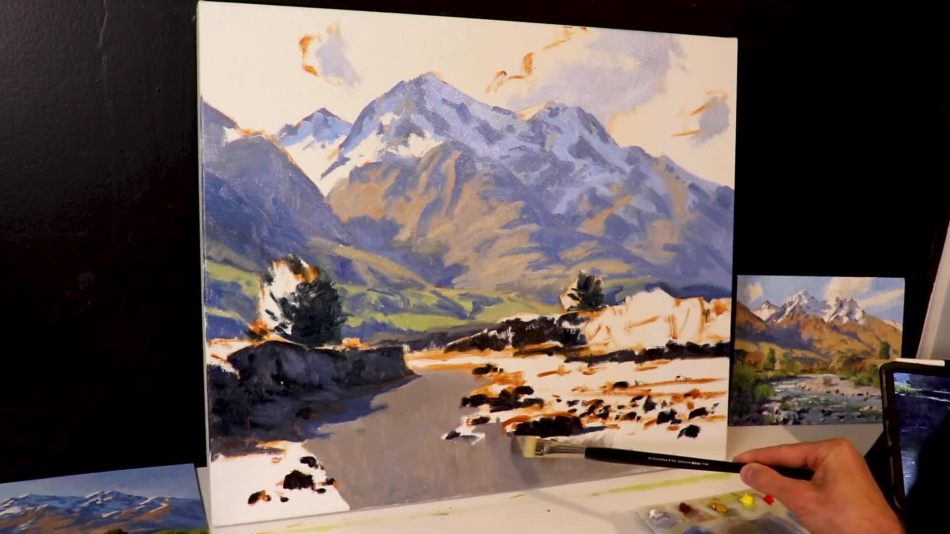
Bringing it All Together
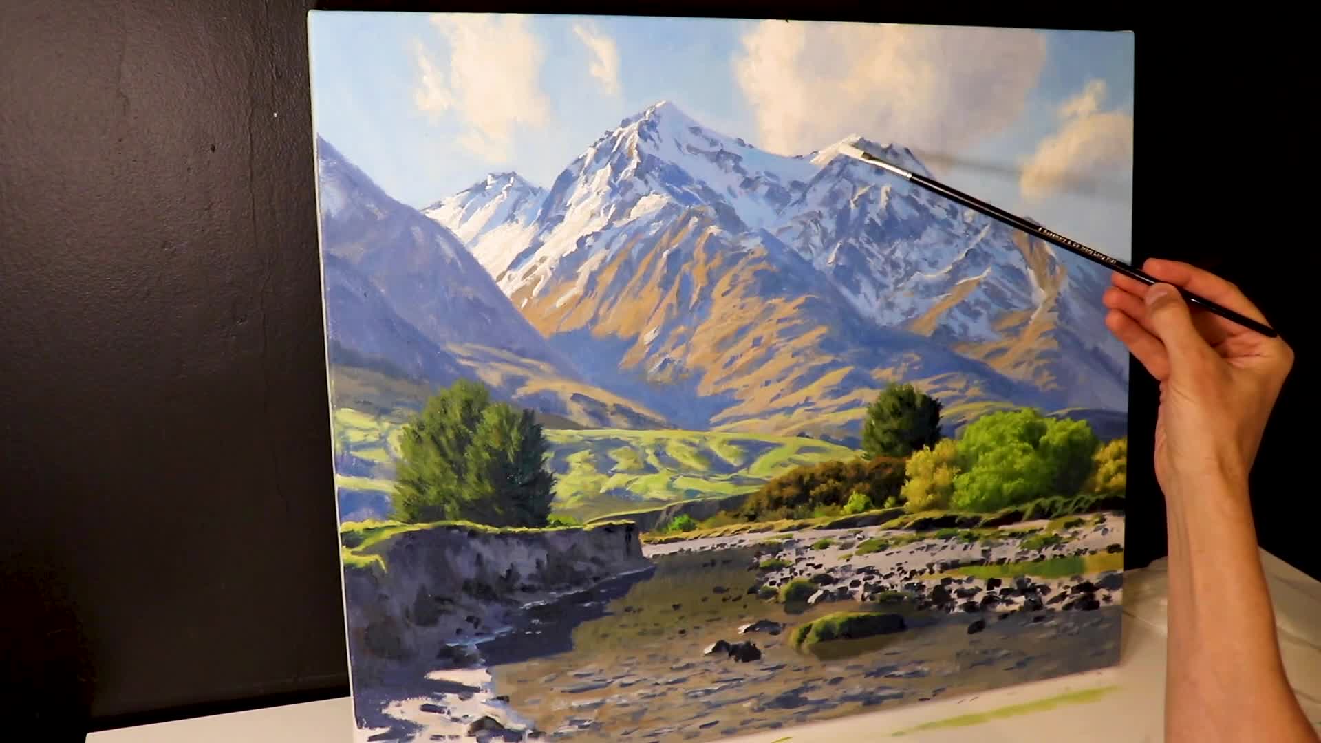
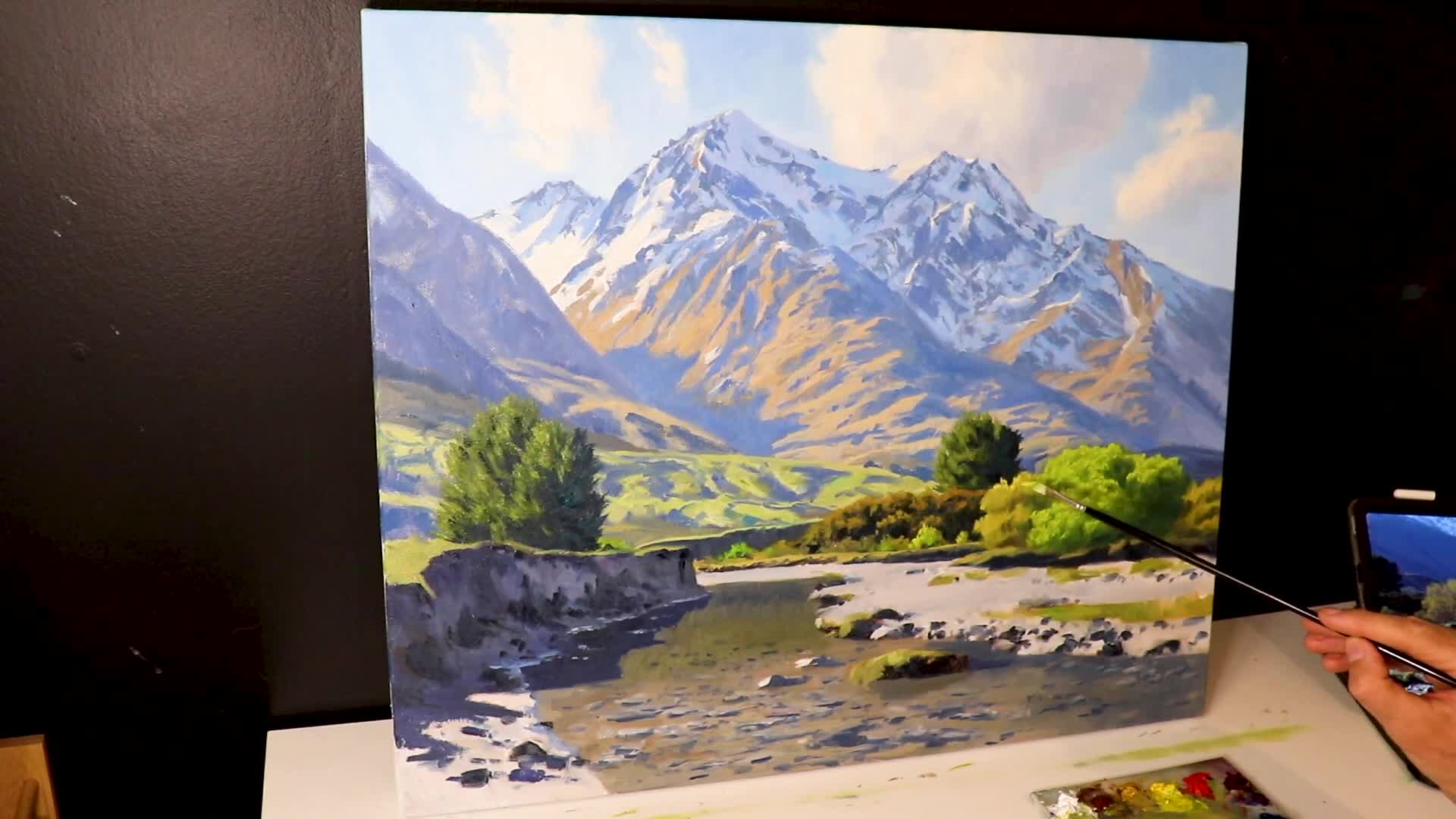
By this stage, I’ve covered significant ground with large brushes. The sky, painted using ultramarine blue with cobalt teal and titanium white, sets the scene. The foreground rocks and riverbank are built up from lighter tones mixed with underlying darks.
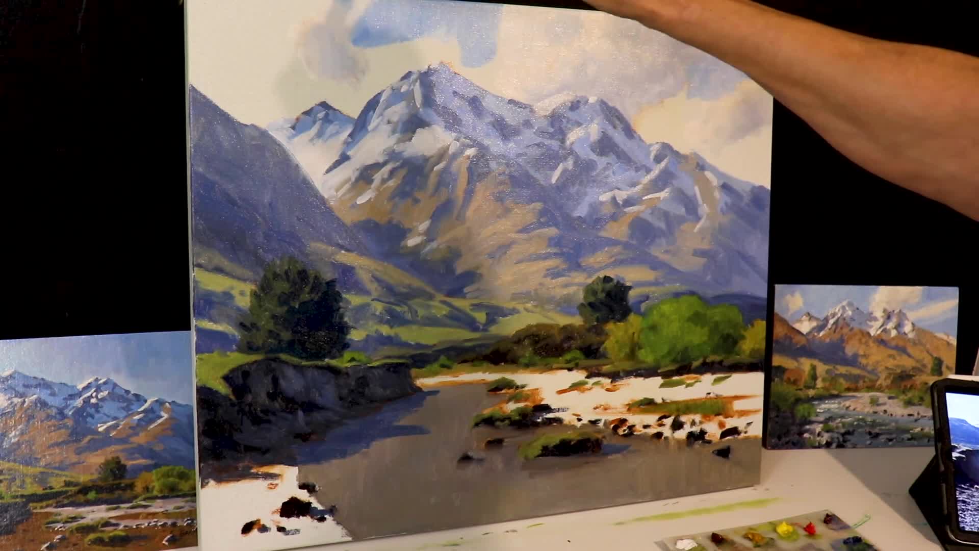
The Final Touches
As painting progresses, the final touches involve using smaller brushes—number 3 synthetic flats—for the last details. These highlights in the snow and rocks communicate bright sunlight and add depth.
The goal is to create a vibrant, yet realistically subdued painting that captures a sense of life. I’ve learned that these final highlights are what truly bring a mountain landscape to life—they’re the difference between a flat, lifeless painting and one that seems to glow with natural light.
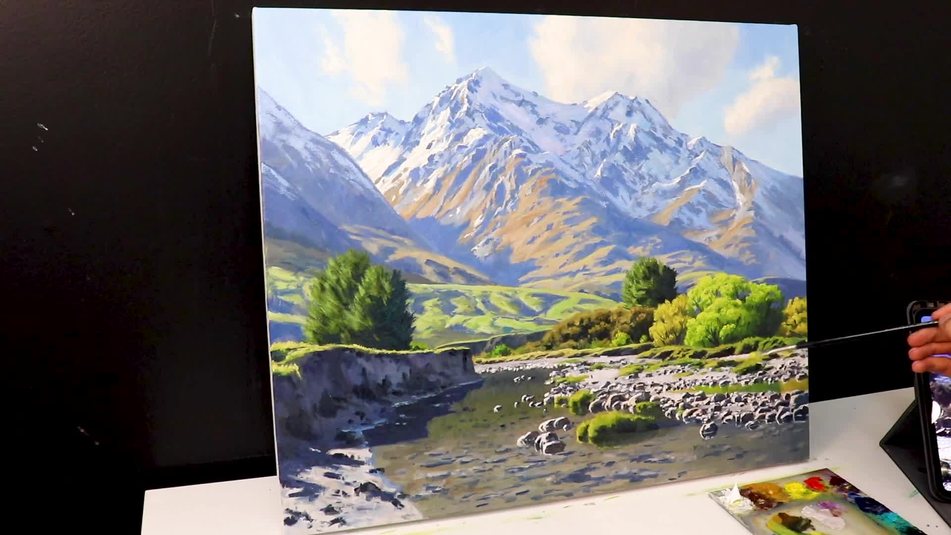
The key is restraint; I use these bright accents sparingly, placing them only where the sun would naturally catch the highest peaks and rocky outcroppings. This selective approach makes each highlight feel precious and authentic, creating that sense of crisp mountain air and brilliant sunshine.
Conclusion
Mountains offer a broad range of tonal values, aiding in the understanding of landscapes in painting. Their majestic presence is an alluring subject, inspiring my work as a landscape painter.
For those inspired by this technique, I’m offering my free Landscape Painting Blueprint, full of tips and a complete painting demonstration. Click the link in the description to access it.
“There’s so much beauty in the world, and I just want to capture it on canvas.”
Happy painting! If you’re eager to delve deeper into painting mountains, explore additional resources and continue to refine your artistic journey.