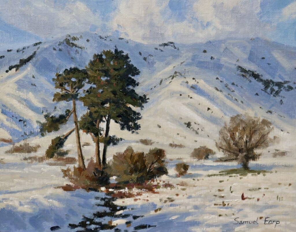
Does painting snow completely stump you? Do your winter scenes end up looking flat, way too white, and totally lifeless? You’re not alone—I definitely struggled with this for a long time. Snow isn’t just “white.” It’s filled with different greys, hidden colors, and shadows that give it depth. If you want to paint winter scenes that have punch and life, you’ll want to check out this super approachable, three-step process.
In this post, I’m walking you through—step by step—how I painted a snowy landscape with pine trees, sharing the colors I used, canvas choice, brushwork secrets, and tons of practical tips. You can apply these to your own landscape paintings and finally bring your snow scenes to life.
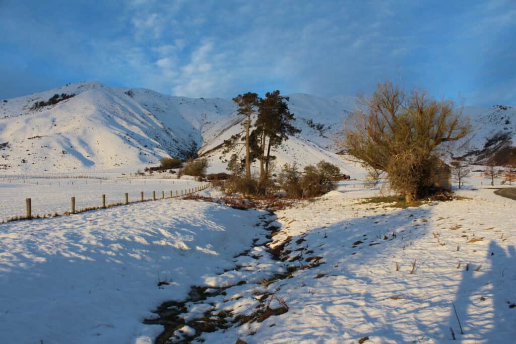
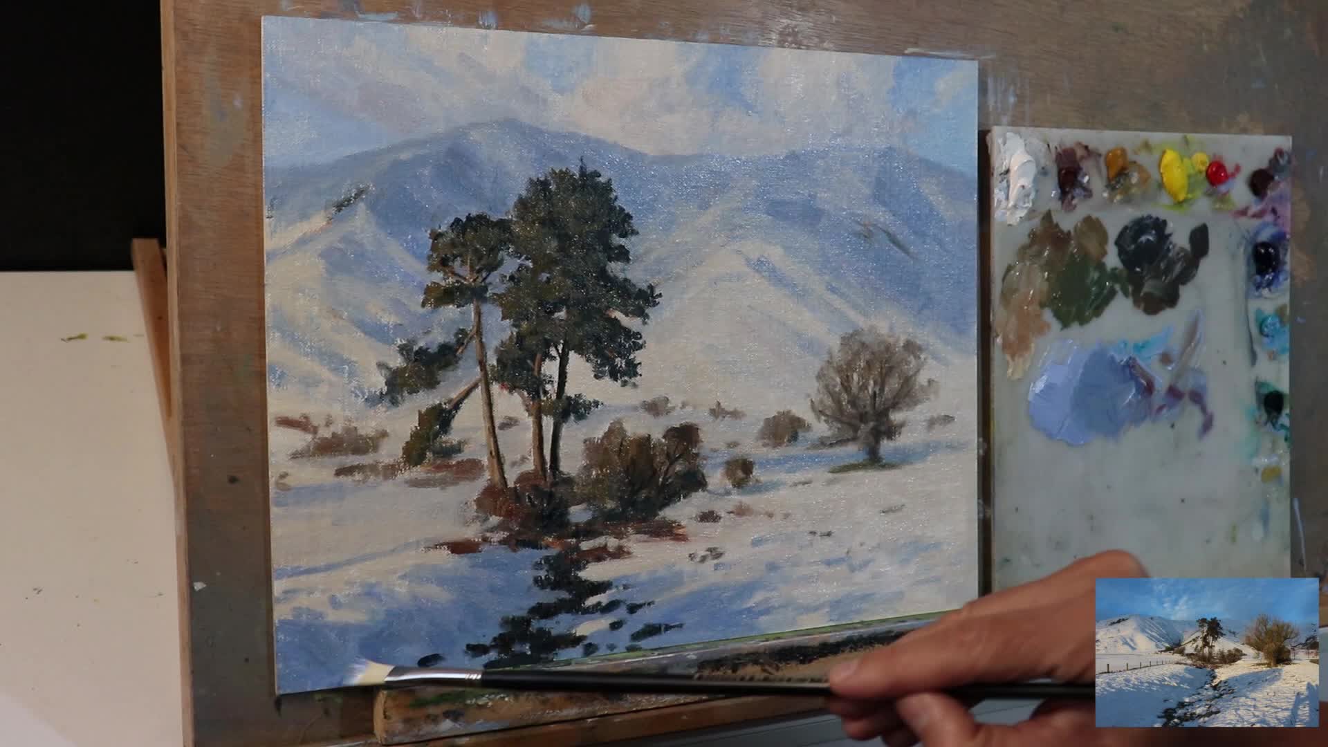
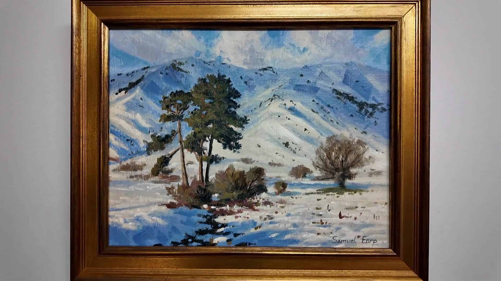
Reference Photo
Why Your Snow Paintings Might Look Flat
Let’s be real—snow is one of the trickiest things to paint well. I remember my first attempts: big, blank patches of pure white paint. No matter how much I fiddled, the scene looked plain, one-dimensional, and totally without oomph.
What changed everything for me? It clicked when I realized:
“Snow isn’t just white, but actually lots of different tones of greys and other colors.”
The key is painting snow as a living, changing, colorful part of your landscape. Once you stop treating it as just a blank white patch, your paintings will have actual depth and life.
Getting Started: Tools & Materials
Before we dive in, let’s talk tools. For this snowy landscape, I painted on an 11 x 14 inch linen canvas panel made by Saceteh. I used Blue Ridge oil paints, a reliable brand with vibrant colors and great texture.
- Pro tip: If you’re looking for recommendations, check out the links in the video description (or search for equivalents at your art store).
What You’ll Need
- Linen canvas panel (11 x 14 inches)
- Oil paints:
- Ultramarine blue
- Titanium white
- Yellow ochre
- Burnt sienna
- Alizarin crimson
- Cobalt teal
- Variety of brushes: Big flats for blocking in, smaller rounds/flats for detail
- Palette knives (optional)
- Palette for mixing
- Rags or paper towels
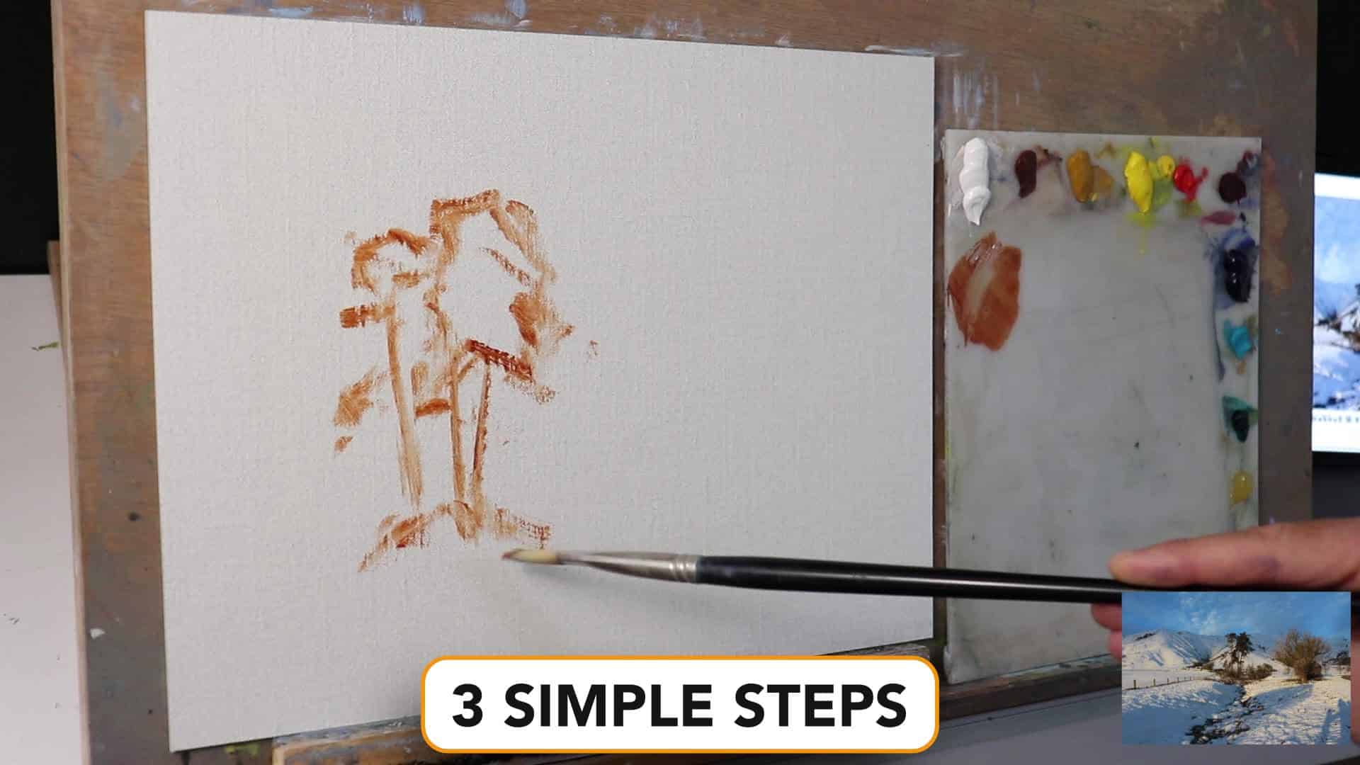
Step One: Laying in the Shadows and Dark Values
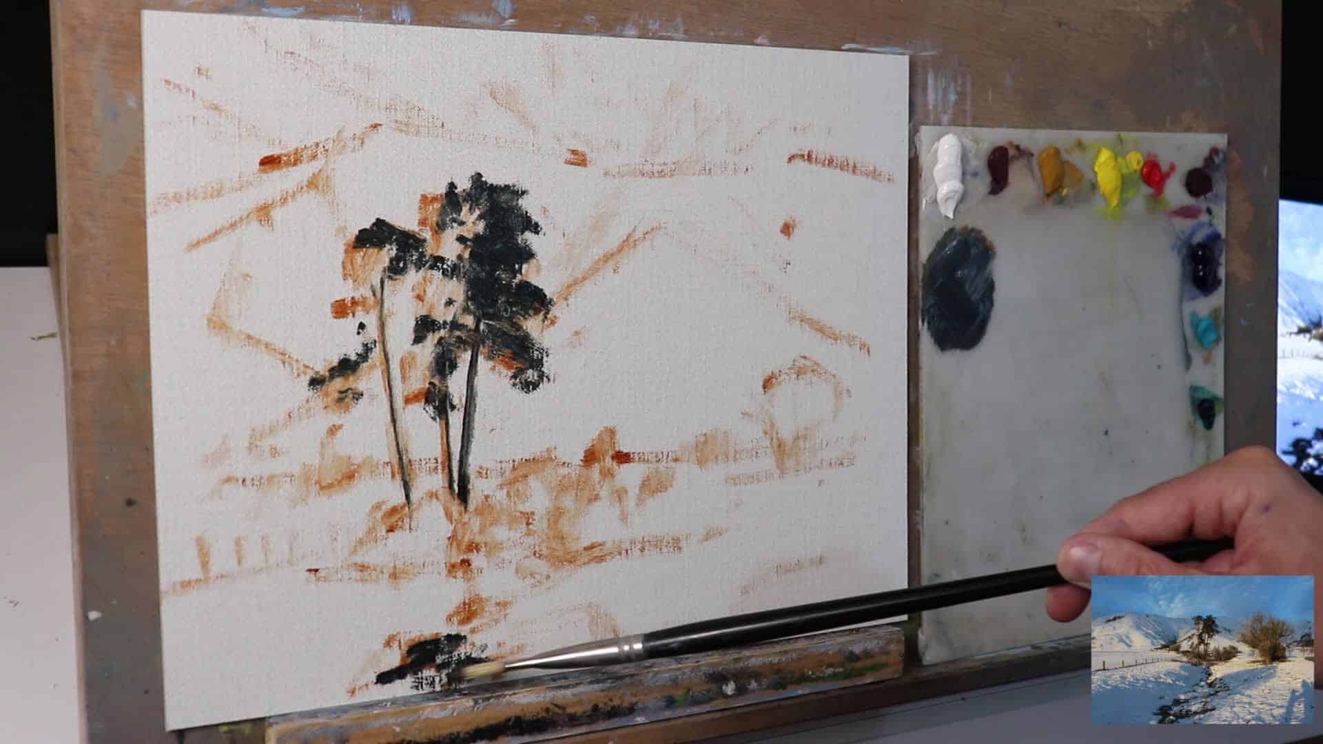
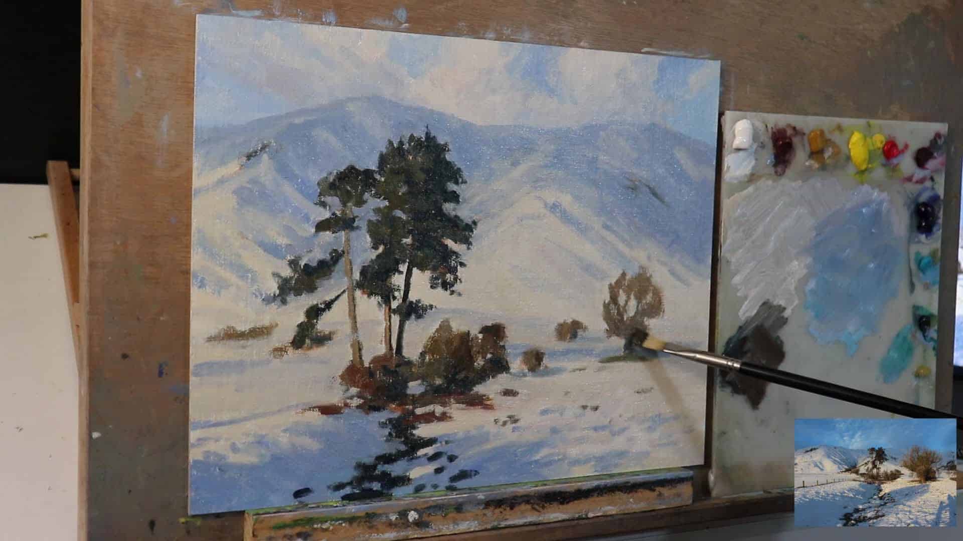
Whenever I’m tackling a landscape, I always start by dropping in the darkest values and shadow areas first. In snowy landscapes, that usually means the trees, particularly pine trees, and any shadowed snow.
Why Start with Dark Values?
- It sets the tonal range for your painting.
- Helps you keep track of light and contrast.
- Makes the lighter sections feel brighter later on (trust me!).
“I always start by painting the dark values and shadows first. So here the pine trees are the darkest values in the landscape.”
What Colors Do I Use for the Shadows?
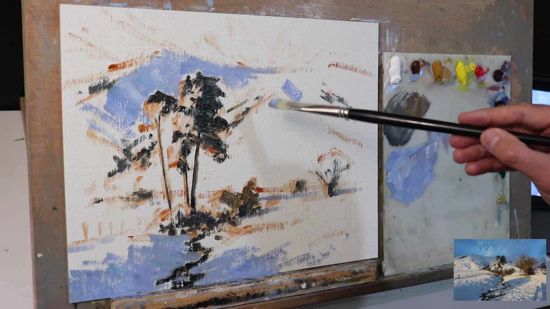
For the pine trees in my painting, here’s the go-to mix:
Ultramarine Blue + Yellow OchreThis classic combination creates a perfect neutral shadow tone that avoids the muddy look you get from mixing complementary colors directly. The ultramarine blue provides a cool undertone that naturally occurs in shadows, while the yellow ochre warms it just enough to keep it from looking artificial or too stark.
Play with the mix until you get a lovely deep, cool shadow that reads as natural green/dark in the landscape. Start with more blue than ochre, then gradually add tiny amounts of yellow ochre until you achieve that perfect balance where the shadow feels both cool and natural. The beauty of this mixture is that it shifts between appearing as a dark green or a warm gray depending on the surrounding colors in your painting.
Step Two: Blocking In the Snow—with Color, Not White!
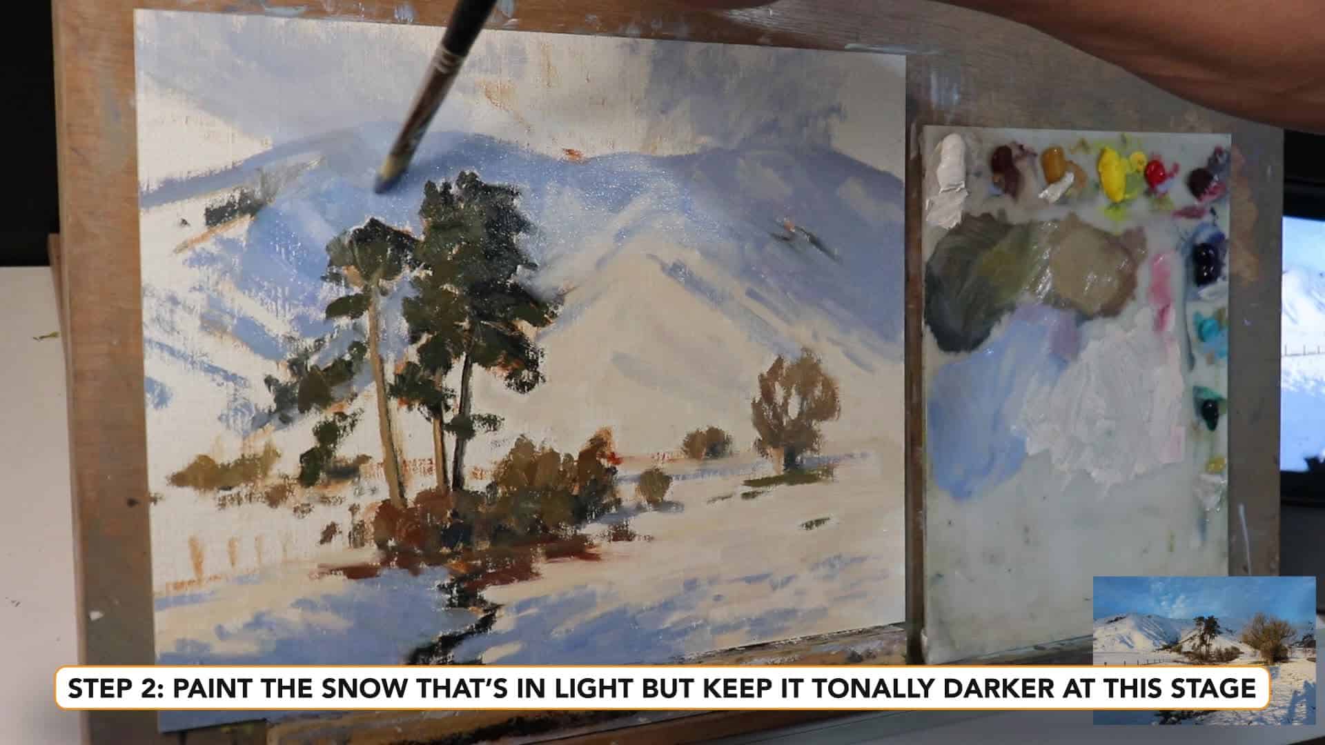
This is where most folks struggle: how do you paint snow so it doesn’t just look… white? The answer: start by painting the shadows within the snow before even thinking about highlights.
The Magic of Snow Shadows
Here’s the thing—snow usually has a blue cast in shadow, especially under a clear sky. But, as always in art, it depends on the light and surroundings.
“Snow often has a blue cast to it when it’s in shadow. Not always, but most of the time it does.”
My Go-To Snow Shadow Mix
Here’s a color recipe for beautiful, natural snow shadows:
Ultramarine Blue + Titanium White + Burnt Sienna (to desaturate) + Small amount of Alizarin CrimsonThis combination captures the subtle complexity of real snow shadows, which are never just pure blue. The burnt sienna acts as a neutralizing agent, preventing the shadow from appearing too saturated or artificial, while the touch of alizarin crimson adds the subtle warmth that occurs when light bounces around in snow.
The result? A cool, slightly neutralized blue that feels like shadowed snow, not a blue blanket. This mixture mimics how snow shadows actually appear in nature—influenced by the sky color above but tempered by the warm light reflecting from surrounding surfaces.
Pro tip: Don’t jump straight to the brightest whites! Snow is a light value, but the shadows are still noticeably darker. Think of snow shadows as being in the upper-middle value range rather than true darks—they should be light enough to clearly read as snow, but dark enough to provide proper contrast against the sunlit areas.
Keep It All Tonally Darker—At First
I know, it’s tempting to reach for pure white! But if you start too light, you have nowhere to go with your highlights. This is crucial:
“When you block in a painting, it’s always a good idea to keep your whole painting tonally darker anyway, and then you’ve got plenty of room to add lighter layers of paint.”
Understanding Snow Shadows: More Than Just Blue
Remember, lighting changes everything. Evening, midday, overcast—all affect your color choices. The color temperature of your light source will dramatically shift both the lit areas and the shadow colors, so you need to adjust your mixtures accordingly to maintain believable atmospheric conditions.
Evening Light on Snow
For this piece, I wanted to capture a warm evening feel, with sunlight adding a subtle yellow tone even in subzero temperatures. Evening light has that beautiful golden quality that transforms even the coldest scenes into something surprisingly inviting and cozy.
Here’s what I used for the lit snow areas:
Titanium White + Yellow Ochre+ a bit of Alizarin Crimson+ a touch of Ultramarine Blue (to darken the tone*The alizarin prevents the yellow and blue from mixing into green, which keeps those warm tones clear and fresh. Always think about local color, not just paint recipes.
Capturing the Right Light
“I originally painted another version of this outdoors on plein air, and I managed to capture the scene just before the sun set. So light… had a yellow tone to it.”
You can imagine how different that same snow would look in the morning, under clouds, or under street lights! Adjust your mixes for the scene you want.
Brushwork: Bold, Gestural, and Expressive
One thing that gives snow paintings energy is how you lay down the paint. Here’s where you want to embrace bold, confident brushwork.
Use Big Brushes for Blocking In
Flat brushes, especially big ones, are fantastic for blocking in snow and landscape shapes. The wide surface area allows you to cover ground quickly while naturally creating the kind of varied, broken edges that make snow and terrain look organic rather than overly controlled.
“By doing this, you’ll be able to get nice gestural, loose brush marks and it’s going to give your painting loads of life and vitality.”
Don’t fuss with tiny brushes for every detail—save those for later. Starting with large brushes forces you to focus on the big shapes and overall design rather than getting caught up in small details too early in the process. This approach builds a strong foundation that will support whatever details you choose to add in the final stages.
Loose First, Details Later
After blocking in (when the painting is dry or nearly dry), it’s time to pull in the details:
- Switch to smaller brushes if you want precision.
- Or stay loose if you prefer an impressionistic style.
It’s up to you!
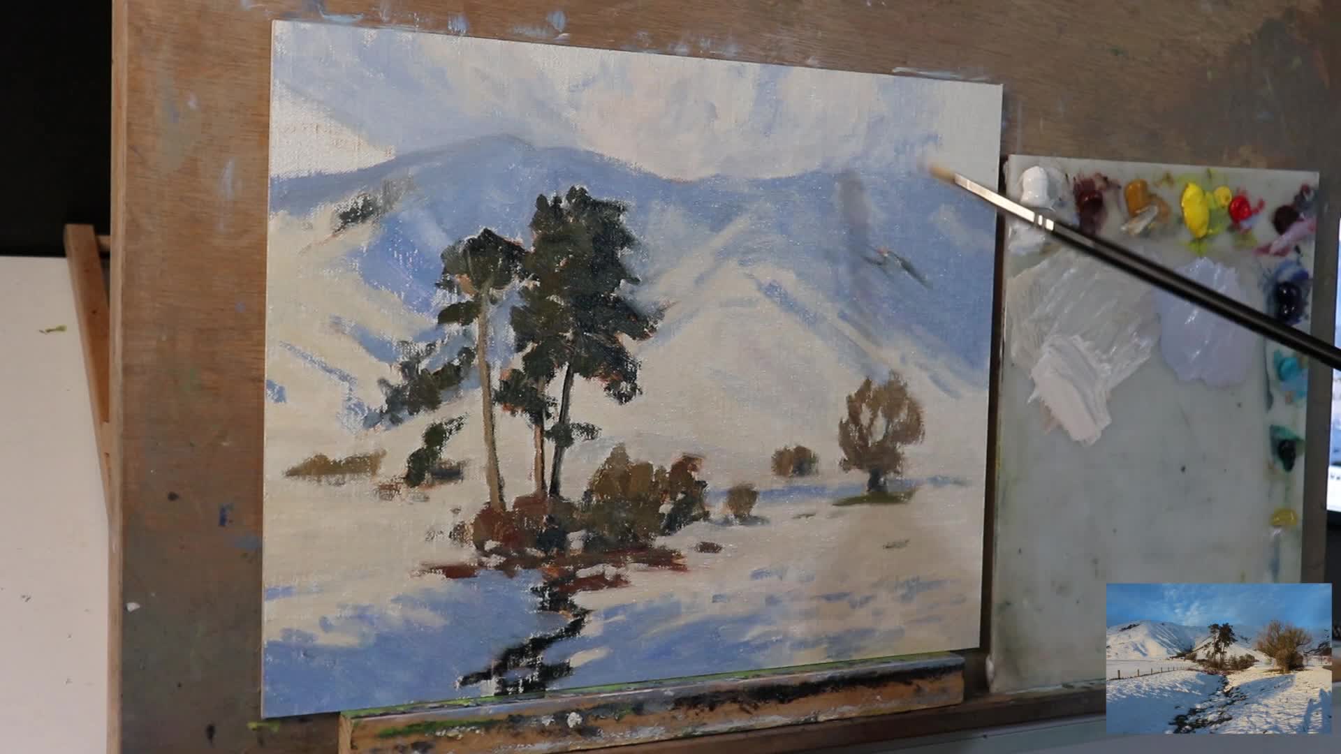
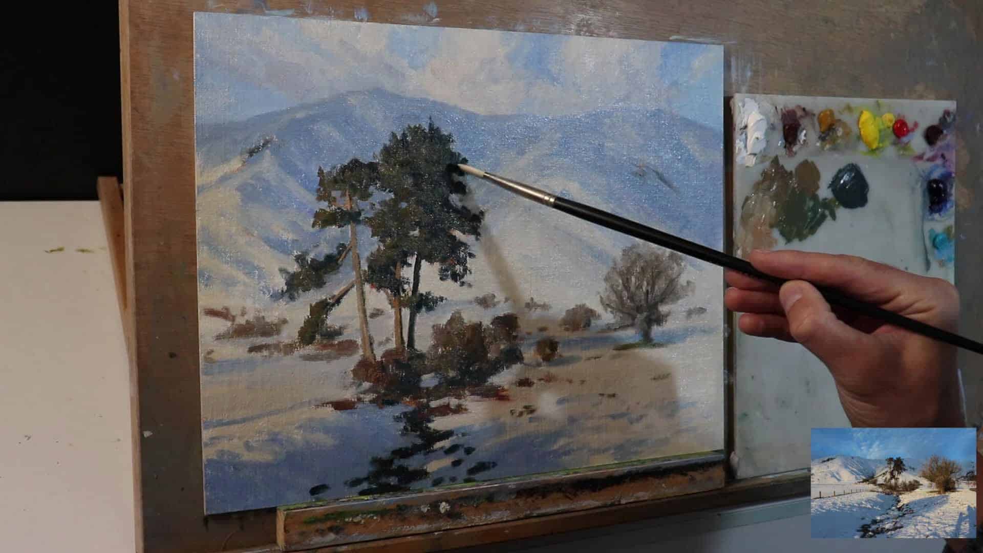
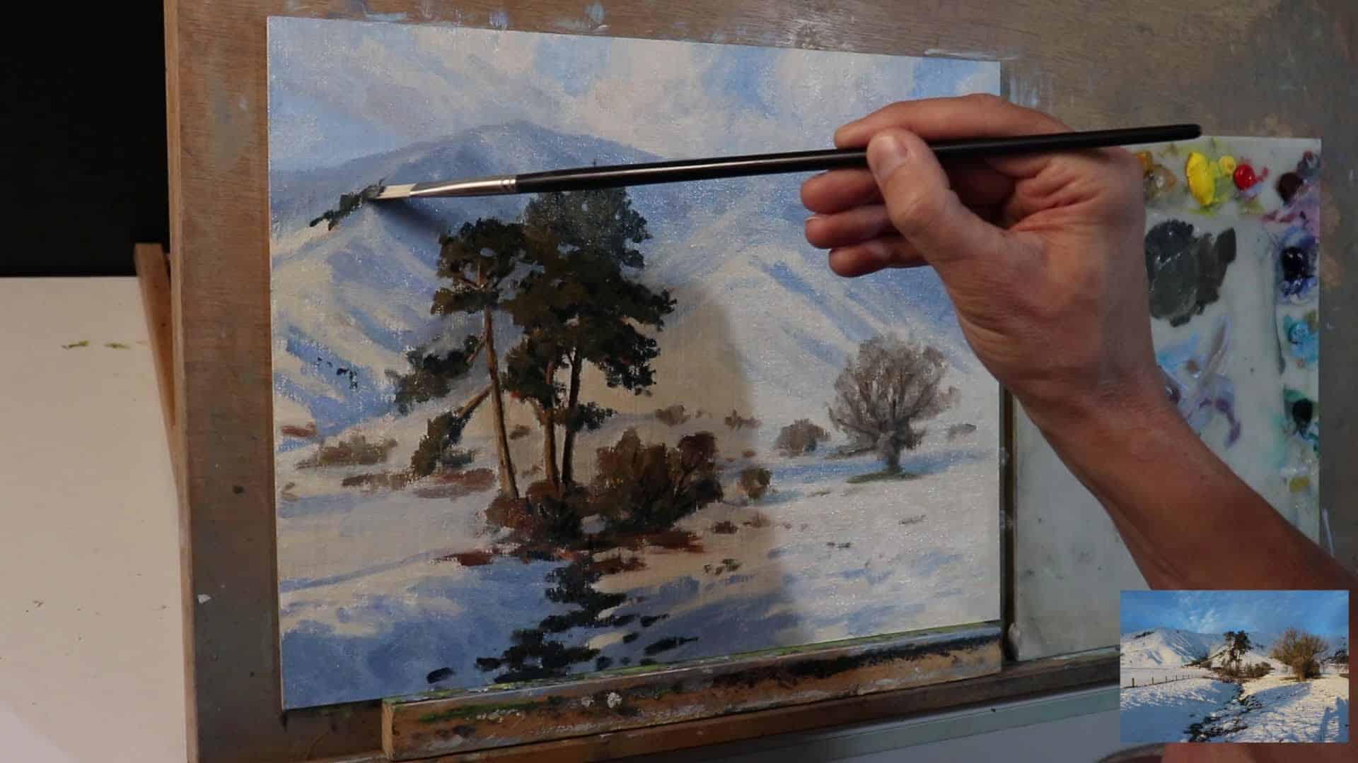
Modelling and Adding Details
Once the big shapes and values are in place, it’s time for the modelling stage—where you bring the painting to life by focusing on individual parts.
What to Focus On
- Restate the darkest shadows in pine trees.
- Add subtle color and value shifts to the snow.
- Paint the foliage in light and shadow.
- Model the shapes in the foreground: rocks, bushes, even patches where snow has melted.
- Add the texture of snow—folds, ridges, and banks.
Example: Pine Trees
“The thing with pine trees is the value of the foliage is pretty dark, so we’re not getting any sort of light coloured foliage here.”
Use confident marks, and keep them unified but not flat.
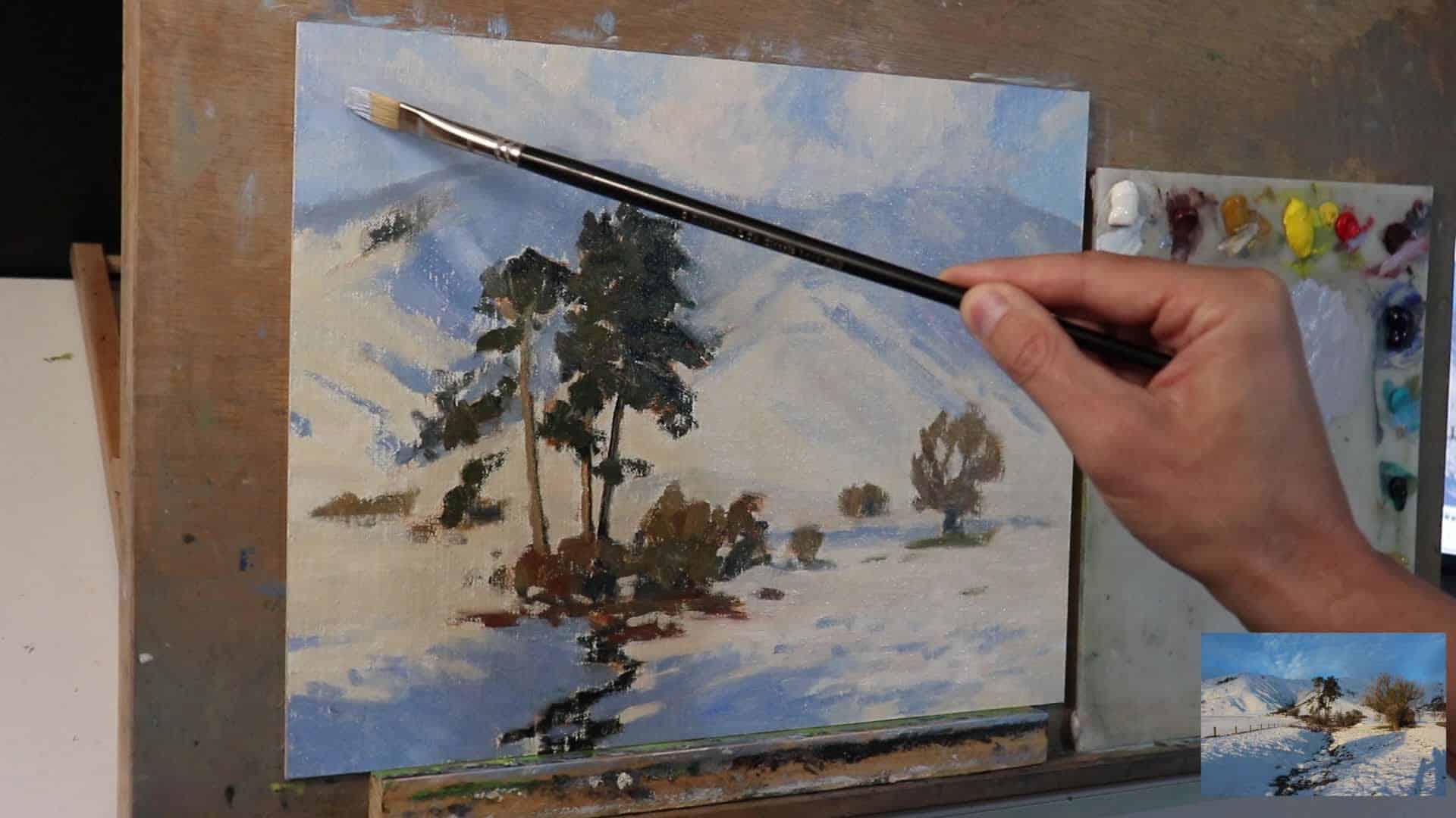
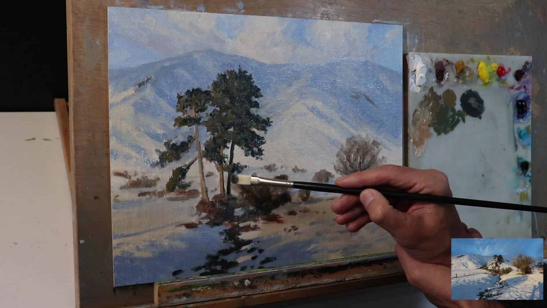
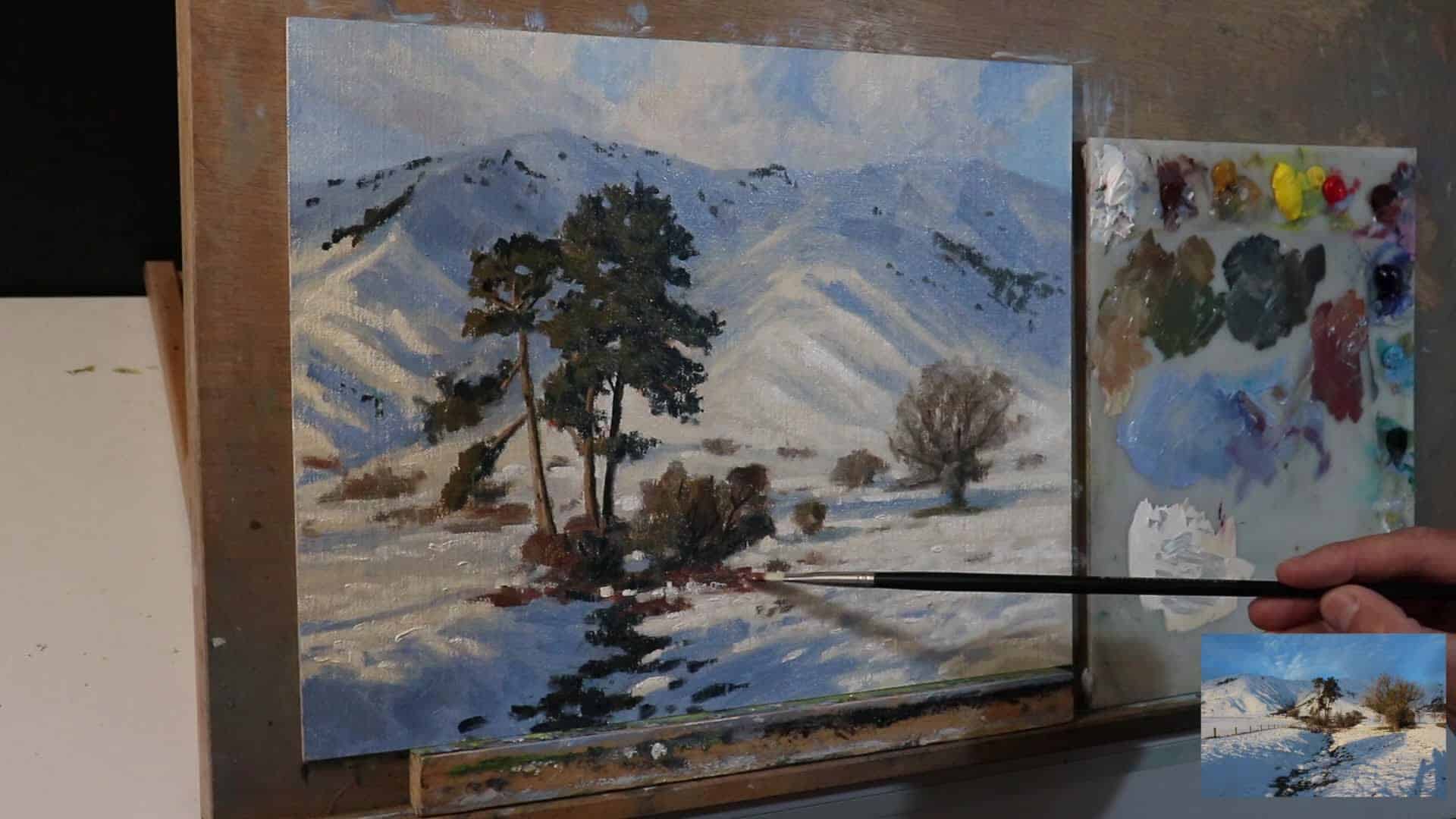
Adding Texture to Snow
This is where the painting starts popping off the canvas! Use those flat brushes and a slightly heavier hand to:
- Add subtle ridges.
- Mimic the “folds” and bends in snowdrifts.
- Bring texture to shadow and highlight areas.
My Shadow Texture Mix
Ultramarine Blue + Burnt Sienna + Titanium White + Alizarin CrimsonPlay with the ratio as needed, and use thick, lively strokes for snow texture.
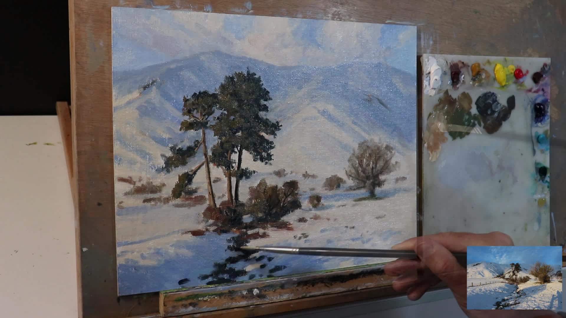
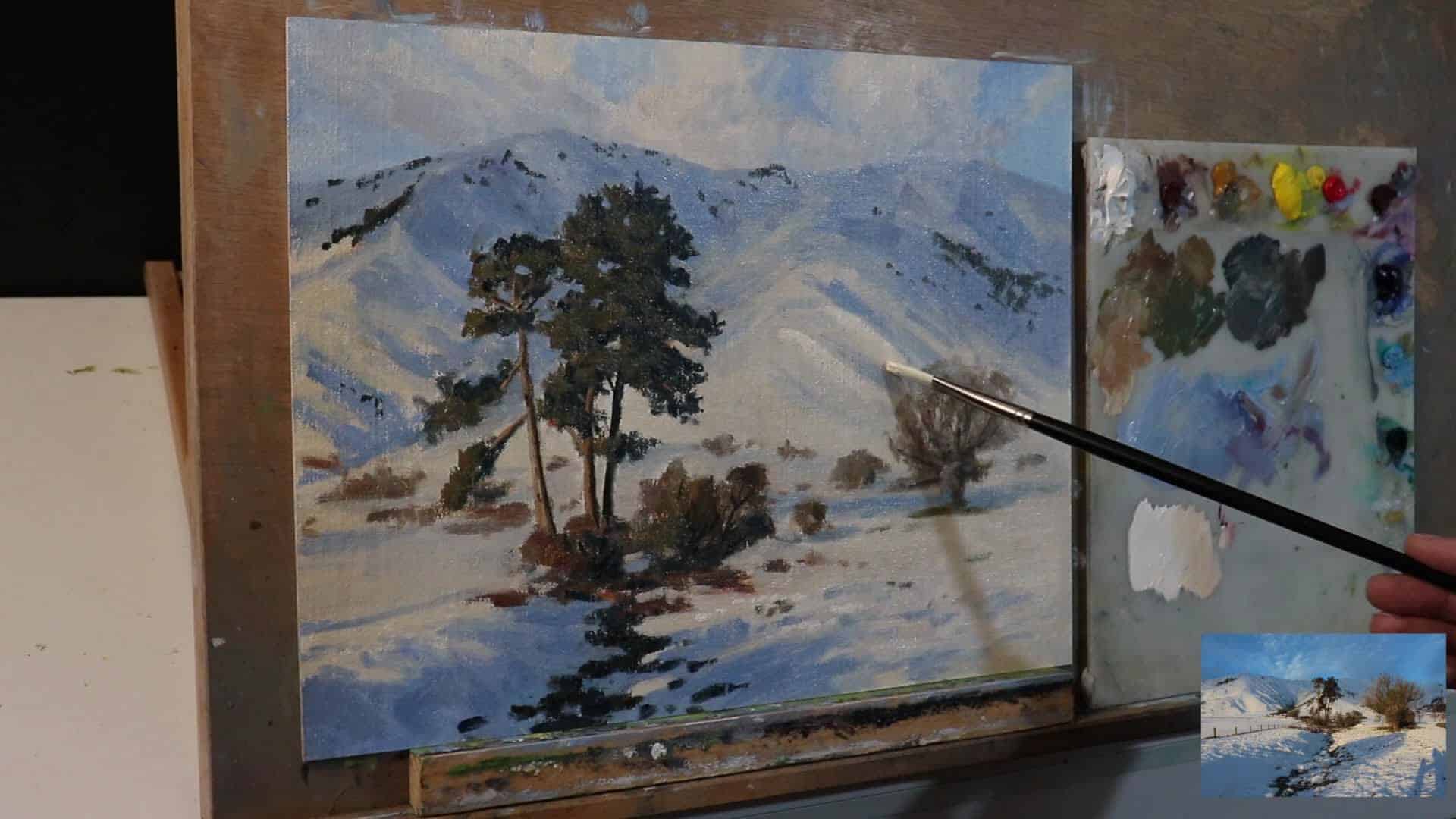
Step Three: Highlights and Texture for Convincing Snow
Now for the step that makes good snow paintings GREAT: selective, bold highlights and texture.
“This is how you can create convincing looking snow. I’m adding now my lightest lights using a mix of titanium white with a little bit of yellow ochre to convey that golden evening light.”
How to Highlight Snow
- Mix: Titanium white + touch of yellow ochre (for warmth).
- Placement: Add sparingly. Focus on the areas catching direct light—ridges, the top of snowdrifts, the edge of bank in sunlight, etc.
“From here, I’m sparingly adding those highlights, and that’s adding more depth and definition to the side of the mountain.”
Use Thick, Buttery Paint for Final Passes
Here’s a pro tip: save your thickest, most luscious paint for the highlights. Impasto adds a physical highlight—light in the gallery literally catches on the brushstrokes.
- Apply with a palette knife or firm brush.
- Let the texture build. Don’t flatten it out.
Why Go Thick?
- It’s less likely to crack over time.
- The texture catches actual light, making your snow look even brighter in real life.
Recap: The Complete Process
Let’s run through the process in three clear steps:
- Start with darks: Lay in the pine trees, snow shadows, and any other areas with deep values. Keep everything slightly darker than you want in the finished painting.
- Block in mid-values: Use a variety of light greys, blues, and warm light colors. Remember, snow isn’t just white! Leave room for your brightest highlights.
- Highlights and texture: When the underlayers are dry (or you’re ready for finishing), add your lightest lights—sparingly—and use thick, impasto brushwork for realistic sparkle.
“When painting landscapes in general, it’s best to start off your painting a bit tonally darker, and then you’ve got plenty of room to add lighter layers of paint as you work through the painting.”
Here’s a sample value plan for a snowy landscape:
Landscape Painting Resources
I know we covered a ton, but if you want to really dig deep, I have a free resource for you:
“If you’d like to learn more about painting landscapes, then check out my free landscape painting blueprint, where I detail my whole process for painting landscapes that you can apply to your own paintings.”
Get the Free Landscape Painting Blueprint here
Wrapping Up: Time to Make Your Own Snow Scenes
I hope seeing my process and paint choices gives you the confidence to tackle your next winter scene. The best thing about snow painting is that every day, every hour, every location gives you new challenges and chances to experiment with color, light, and texture.
“I hope you enjoyed this painting and that it inspires you to paint some snow scenes and some landscapes.”
Paint thick. Paint loose. And remember—it’s not just white!
Frequently Asked Questions (FAQ)
Why does my snow always look flat?
Chances are, you’re painting it with too much pure white, and missing the subtle color variations in shadows, reflected light, and local surroundings. Start darker and add your lightest highlights last.
What’s the best way to create texture in snow?
Use thick, buttery paint applied with a flat brush or palette knife for the highlights. Layer your snow, and don’t be afraid to let big, loose brush marks show—this creates sparkle and realism.
Can I use acrylics instead of oils for this method?
Absolutely! The process is the same, though acrylics might dry faster. Use heavy body acrylics for thick texture, and adjust your mixing to match the colors (the same recipe works!).
How do I mix snow shadow colors?
Start with ultramarine blue and titanium white. Add burnt sienna or alizarin crimson to desaturate and adjust warmth/coolness. Observe your real-life scene for local color hints.
Should I use reference photos or plein air (outdoor) painting?
Both options are great! Outdoor painting (plein air) helps you see and feel the true colors of snow. Photo references, especially if you took them yourself, are handy for practice at home.
Final Thoughts
Snow is one of the most challenging (and rewarding!) things to master in landscape painting. Don’t be discouraged by early struggles. The more you look, the more subtle color and light you’ll find in those winter scenes.
Start dark, build up your lights, and save your thickest, sunniest paint for the very end. You’ll be amazed at how much impact just a few well-placed highlights can have.
Happy painting—may all your snow scenes be rich, colorful, and full of life!
Loved this post? Have questions or want to share your snow painting? Drop a comment below! And check out my next video for more landscape painting tips.
