Is your seascape art falling flat? Do your ocean waves lack the life and energy you imagine? If you’re like most artists, you’ve probably struggled with painting transparent water, chaotic foam patterns, and that magical glow where sunlight hits the edge of breaking waves. In this in-depth guide, inspired by my experience painting Frazer Beach in Australia, I’ll break down my simple four-step process to transform your seascape paintings from static to stunning.
Whether you’re a beginner wanting to conquer your first seascape or a more advanced painter feeling frustrated with flat water and lifeless waves, this post is packed with practical tips, paint mixtures, and visual cues. We’ll go step-by-step through planning, blocking, brushwork, modeling, and the finishing touches—plus plenty of advice on materials and composition.
Let’s dive in!
The Most Common Struggle in Painting Seascapes
“Most artists struggle with three critical elements when painting seascapes. The transparency of water, the chaotic patterns of foam, and that magical glow when sunlight hits the wave’s edge.”
Before we get into brushes and paints, let’s call out the three main challenges most artists face in seascape painting:
- Transparent Water: How do you make your waves look translucent, not just blue blobs?
- Foam Patterns: The ocean’s foam isn’t tidy—it’s a beautiful mess. Capturing the random, frothy chaos can be tricky.
- The Sunlit Glow: That shimmer where light hits the tips of the waves—getting this right is pure magic.
This post is all about conquering these hurdles with practical, friendly steps. So grab your paints, and let’s get started.
Essential Preparation: Horizon Line & Materials
The Importance of the Horizon Line
One of the first things to consider in any seascape painting—before you even touch your brush—is the placement of your horizon line.
- Avoid putting it dead center: If you place it right in the middle of your canvas (equal parts sky and sea/foreground), your painting will look stiff and unbalanced.
- What works better? Go for a horizon that is slightly higher or lower. This applies to most landscape and seascape compositions.
“It’s really important that we don’t place the horizon line right in the middle of the canvas… In this case, I’ve placed the horizon line slightly higher.”
Tip: For expansive seascapes with more focus on water, place the horizon high. For dramatic skies, go lower.
Sketching Out the Composition
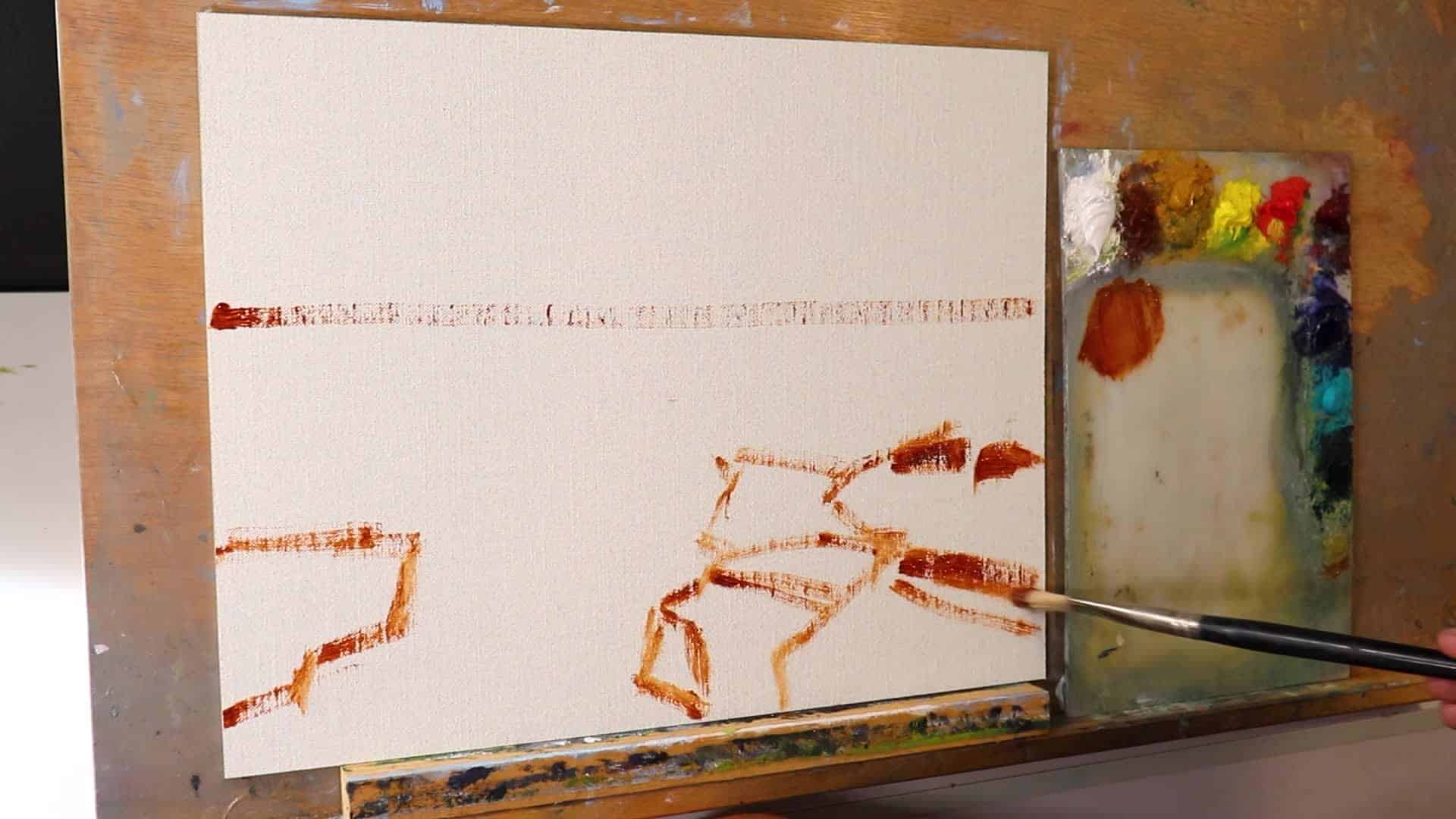
I start by sketching my composition using Burnt Sienna mixed with a touch of OLO gel. This helps the underpainting dry faster and keeps your lines loose and gestural.
- Canvas used: 11″ x 14″ linen canvas panel (CanvasPanel.com)
- Paint: Blue Ridge oil paints (link)
Above: Blocking in the basic composition with burnt sienna on linen panel.
Materials Breakdown
Here’s the basic kit I used (tweak according to what you have):
- Paints: Blue Ridge oil paints
- Medium: OLO gel for better flow
- Brushes: Large bristle flats (sizes 6 & 8), and later, synthetic flats for details
- Canvas: 11″ x 14″ fine linen panel
Above: Example of recommended brushes and paint colors for your seascape setup.
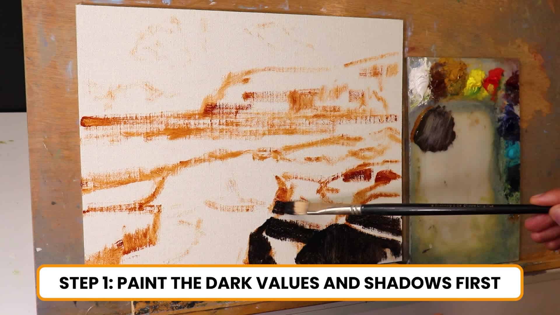
Step 1: Blocking in Dark Values and Shadows
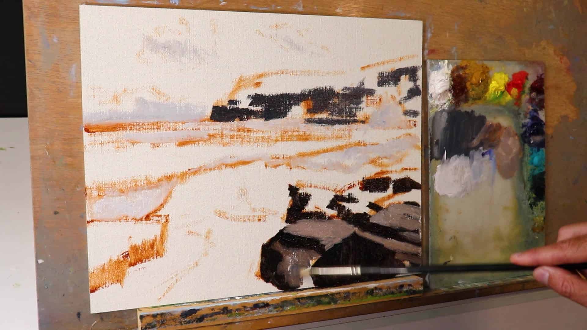
Getting your darks right is the backbone of any atmospheric painting—especially in seascapes, where depth and form can easily turn flat and lifeless. Always start with your shadow shapes and darkest values before worrying about the fancy details.
Why Dark Values First?
- Establishes your tonal framework: Painting your shadows and darks first anchors the painting and helps with later color choices.
- Aids recession and depth: Darks help separate foreground from background.
“Because if we’re getting our values correct—value is how light or dark your subject is—it’s going to make it a lot easier to get the recession of landforms in your painting.”
Observation Tip: Your darkest darks and lightest lights are usually in the foreground. Background cliffs or distant clouds? Their darks and lights are both more subtle and muted.
Mixing for Rocks & Cliffs
- Rocks Shadows (Foreground):
- Ultramarine Blue
- Burnt Sienna
- Alizarin Crimson
- Cliff Shadows (Background):
- Above mix + a touch of Titanium White (to lighten)
- Cloud Shadows (Distance):
- Mostly Titanium White with a hint of the above mix (very light)
Above: Early stage, blocking in major shadow shapes to create recession and depth.
Blocking Tips
- Don’t sweat the details: Big shapes only!
- Use a large flat brush: This keeps paint strokes confident and prevents muddying the values.
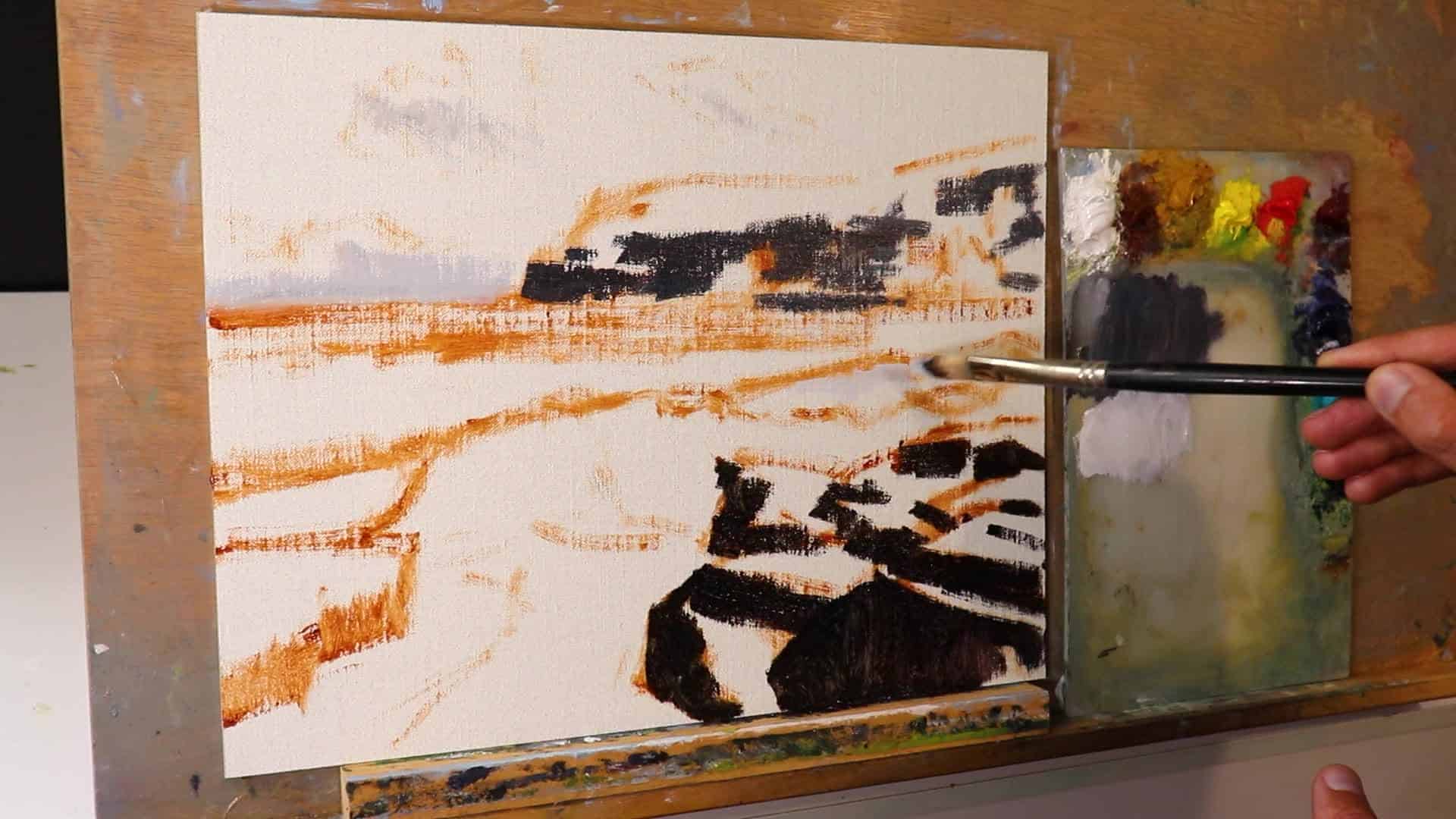
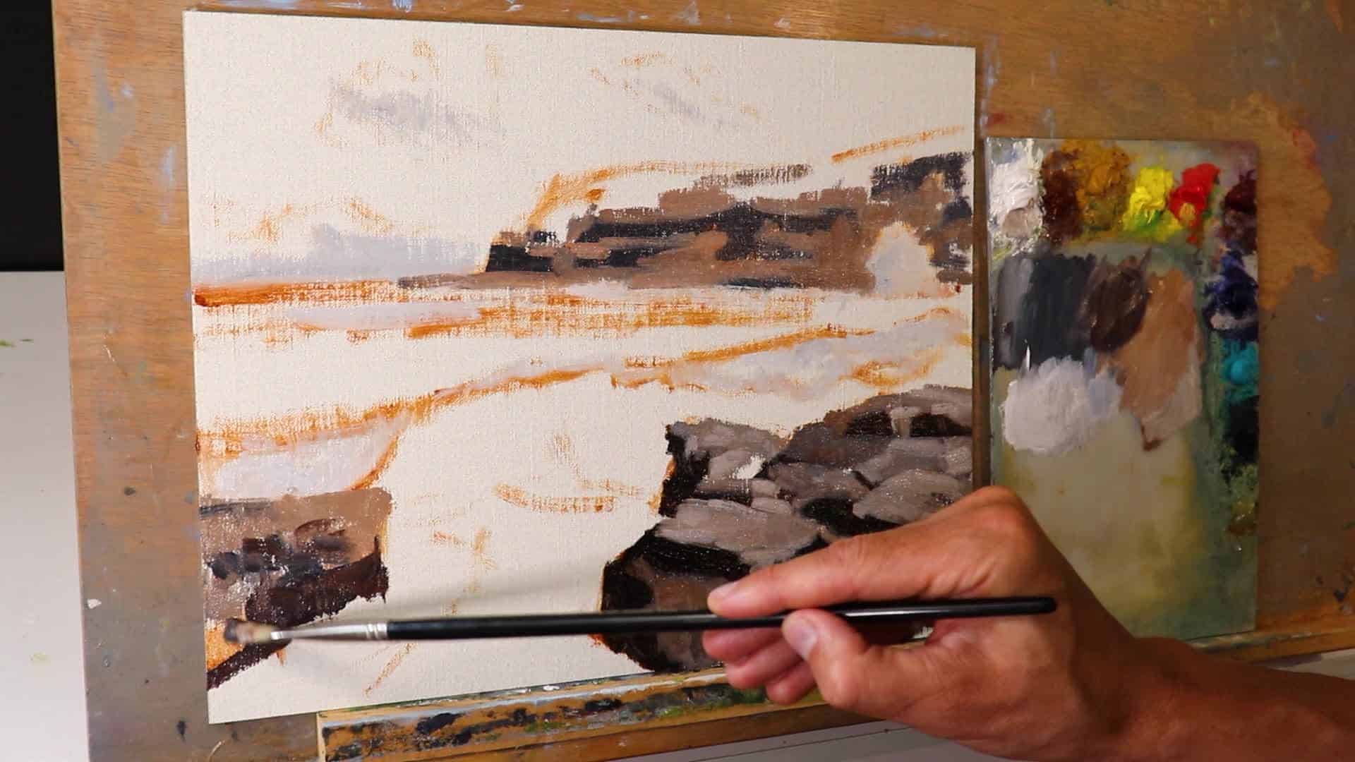
Step 2: Loose Brushwork – The Secret to Dynamic Paintings
Many artists get stuck making everything way too detailed, far too soon. If you want more dynamic, lively seascapes, the secret is to stay loose—especially in your block-in stage.
How to Keep Your Brushwork Loose
- Use the biggest brushes you can handle: For me, that’s #6 or #8 flat bristle brushes on an 11×14 panel.
- Work fast and block in areas boldly: Resist the urge to refine edges or chase tiny details.
- Detail can (and should) wait: You have lots of time to add detail when the painting is dry. Trust the process!
“If you’re someone that’s really struggling with making your artwork overly detailed—and you want to loosen up—start using the biggest brushes you can get away with in the blocking stage. Don’t worry about detail… you’ve got plenty of time for that later.”
Painting Rocks and Cliffs with Loose Color
I continue to use mixes of:
- Ultramarine Blue
- Burnt Sienna
- Titanium White
- Alizarin Crimson
- Occasional touches of Yellow Ochre (for warmth)
Tip: Most rocks are low chroma (saturation). Watch out for overly vibrant mixes—keep things a little muted for realism.
Above: Large brushes force you to suggest, not describe, and lead to more energetic paintings.
A Note on Painting Skies
Initially, I tried painting in some clouds, but the reference day was clear. I realized the composition felt cleaner—and popped more—without them. Trust your instincts, don’t be afraid to change direction.
- Sky Color: Ultramarine Blue + a touch of Cobalt Teal + Titanium White
Adding Vegetation to Cliffs
Mixes for foliage:
- Yellow Ochre
- Cadmium Yellow Medium
- Ultramarine Blue
- Titanium White (to desaturate/lighten)
- Cobalt Teal and Alizarin Crimson (to balance the green and keep it looking natural)
Adding Alizarin Crimson helps tone down garish greens, since red is opposite green on the color wheel.
Step 3: Modeling, Detailing, and Creating Depth
After your block-in is dry, it’s time to slowly build up layers, refining forms and adding character. Here’s where you can work smaller, use more controlled brushes, and start to fine-tune those essential details.
Adding Details to Rocks and Cliffs
- Modeling: Start adding lighter tones to the rocks and cliffs, building up from your dark foundation.
- This makes forms pop: Rocks become three-dimensional, not cartoon flat.
- Restate darks as needed: This helps create crisp shadows and interplay between light and dark.
Above: Adding mid-tones and highlights to carved rock forms. Notice how the depth increases.
“When you’re painting a landscape, it’s always best to start off darker and then work light. Build up lighter layers and save your lightest lights until the very end—that way, you’ll have a lot more depth and distance in your paintings and you won’t end up with flat looking paintings.”
Creating Depth & Distance
- Foreground: Darkest darks, brightest highlights, most saturated colors.
- Background: Lighter darks, paler highlights, desaturated colors.
- Distant cliffs get lighter and less saturated than foreground rocks.
- Color tip: Vibrant colors should sit up front in your painting; push receding shapes with less chroma.
Sky and Vegetation Adjustments
I went back and socked out the clouds I’d originally painted, making the sky clean and clear—true to my reference and the feeling I wanted. Then I built up more subtle layers over the background cliffs and their vegetation.
Key Brushwork for Detail
Switch from large bristle flats to synthetic flats for this stage. The edge is more defined, so you can clean up shapes, add crisp shadows, or suggest foliage without everything looking blurry.
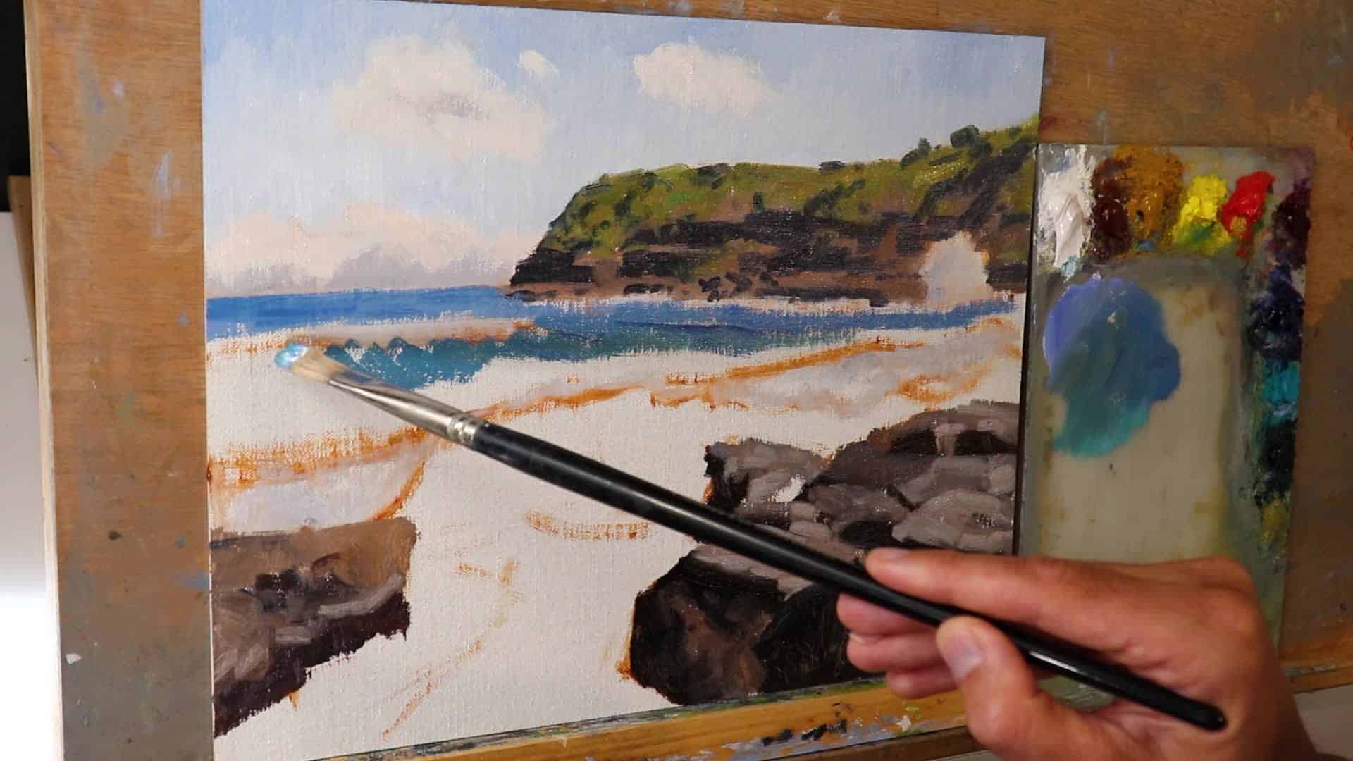
How to Paint the Ocean: Capturing Transparency, Foam, and Glow
Building the Base Sea Colors
The ocean at Frazer Beach is a glowing turquoise. To get this luminous color, I use:
- Yellow Ochre
- Ultramarine Blue
- Titanium White
- Phthalo Green
- Optional: Cobalt Teal & Burnt Sienna
Tip: Adjust the mixture to your reference or desired mood, but generally, start lighter and more turquoise at the top of the wave, then deepen as you move forward.
Above: Laying in the initial sea color block-in.
Painting Transparent Water
True transparency starts in the underpainting. For the top of the breaking wave:
- Ultramarine Blue
- Phthalo Green
- Titanic White (lots!)
- Small dash of Yellow Ochre
As you paint downwards (towards shore), add more Ultramarine and Phthalo for richer, darker color.
Painting Foam Patterns
The ocean’s foam is pure chaos and pattern—don’t get too precious here.
- Leave some gaps in your wave underpainting: You can fill these with titanium white and other colors for foam, but don’t use pure white yet!
- Foam mix for base layer: Titanium White + a touch of Ultramarine Blue, Burnt Sienna, and Alizarin Crimson (to lower the value and keep it from being too stark).
“When it comes to painting the foam patterns, this also starts in the blocking stage. And for this, I’ve used a mix of titanium white, but also with a little bit of ultramarine blue, burnt sienna and alizarin crimson, just to darken the value a bit. And then I’m going to add my lighter layers later on in the painting.”
White Water and Getting the Glow
- Don’t use pure titanium white at first!
- Start with darker, muted foam and white water.
- Save your lightest white until the end for the glowing effect.
- Build up layers slowly, dry-brushing as you move toward the lightest accents.
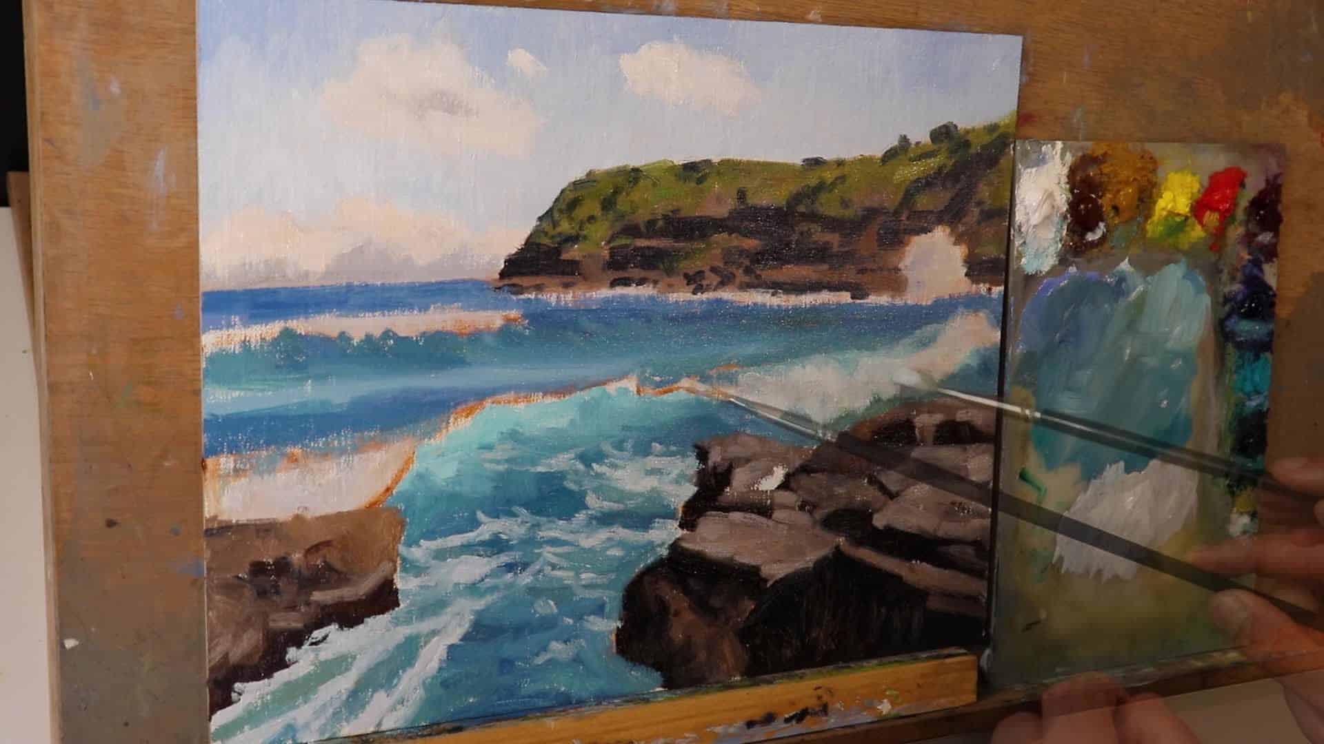
Above: Building up wave transparency and chaotic foam patterns.
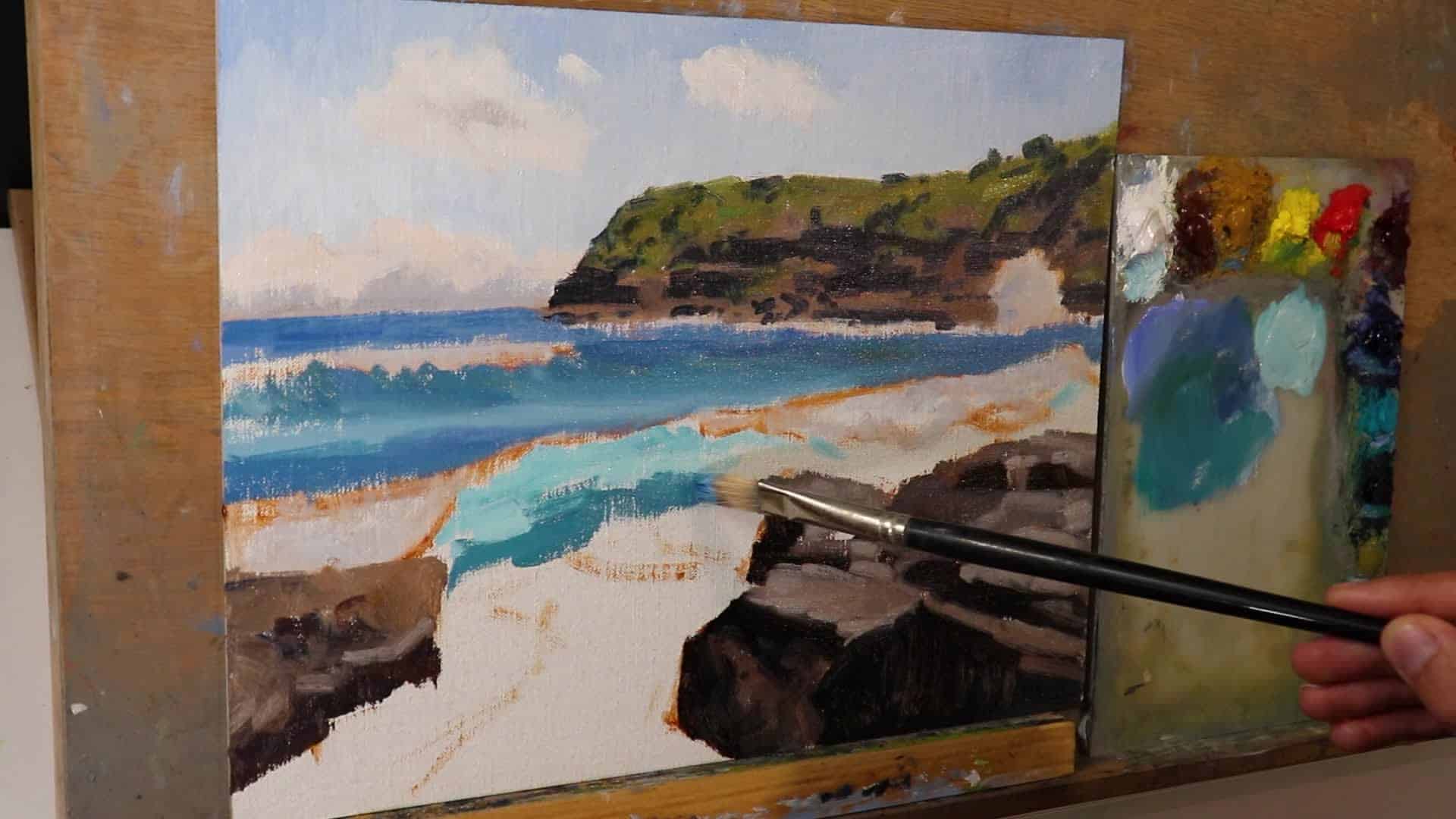
Step 4: Saving Your Lightest Values for Last
This is the game-changer. To make your painting pop—with the brilliant glow of sunlight on breaking waves—always save your lightest paints for the very final stage.
Why Save the Lights?
- Create drama and focus
- Amplify the illusion of sunlight
- Build believable form
Start with your darks. Layer up gently, transitioning to lights only when the rest of the form is established.
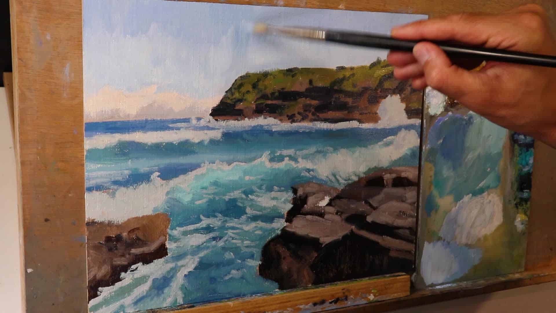
Final Layering Techniques
For the lightest glow and spray:
- Titanium White + a hint of Yellow Ochre (for warm sunlight)
- Use sparingly—just where the sun catches tops of waves and foam.
- Dry brush lightly around wave edges to suggest spray and capture that glowing effect.
“To create that glowing effect, I’ve added sparingly these lightest layers of paint. Also, I’ve dry brushed some of the paint around the breaking waves to create the illusion of spray and also a glowing effect.”
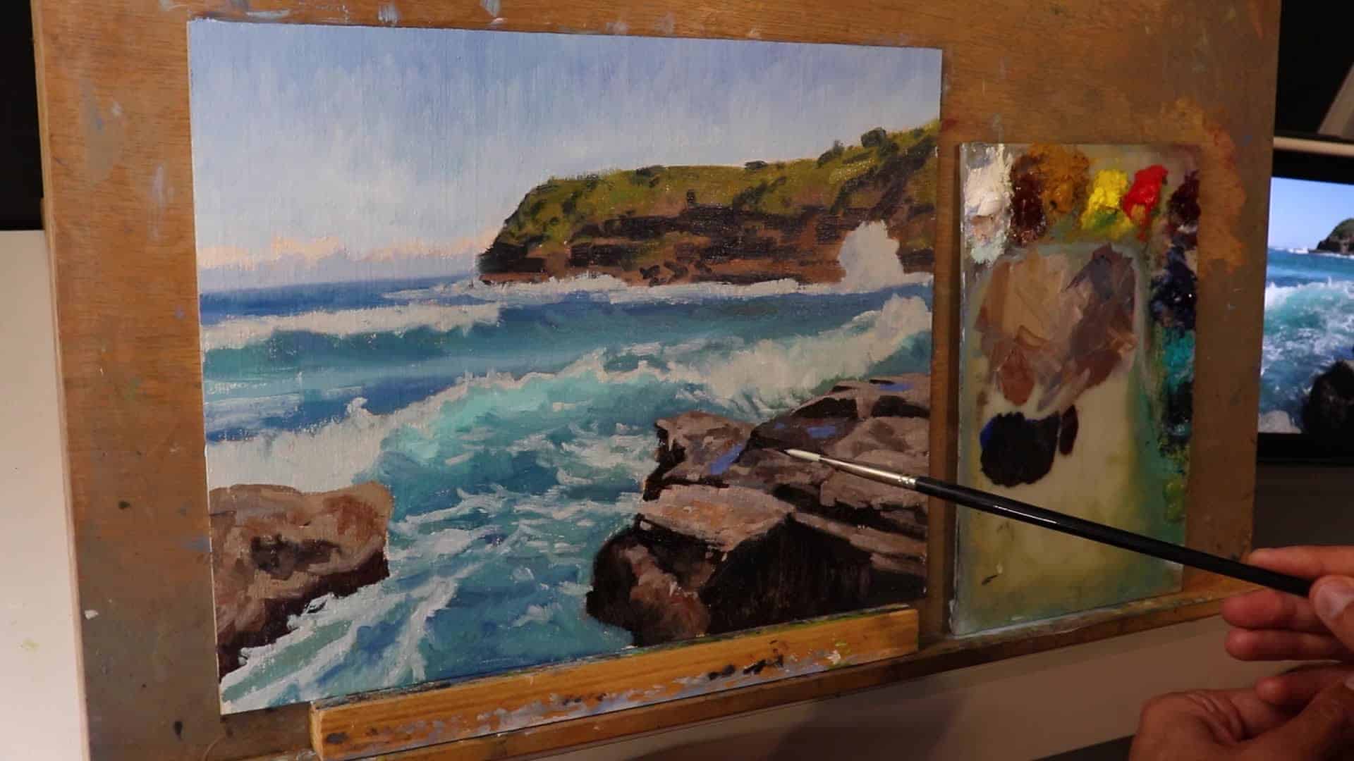
Above: Final highlights, foam spray, and the shimmering effect of sunlight on the water.
Key Takeaways and Lessons Learned for Painting Seascapes
Here’s a quick recap of how to move from a flat, lifeless seascape to an artwork bursting with energy, depth, and glow:
- Plan your composition: Horizon placement is key. Don’t split your canvas in half!
- Work dark to light: Block in shadows and shapes. Save your lightest values for the end.
- Use big brushes and stay loose at first: This helps suggest life and energy.
- Layer gradually: Build up details, colors, and values step by step.
- Reserve pure white until the finishing touches: This will give your painting that sunlit magic.
- Adjust as you go: Don’t fear changing up elements that aren’t working (eg. sky or clouds).
- Think about color and value recession: Foreground is more intense and contrasted; background is paler and less saturated.
- Final details: Use dry brushing and delicate highlights to get realistic foam, spray, and glow.
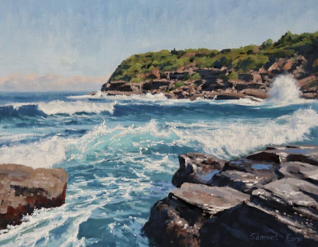
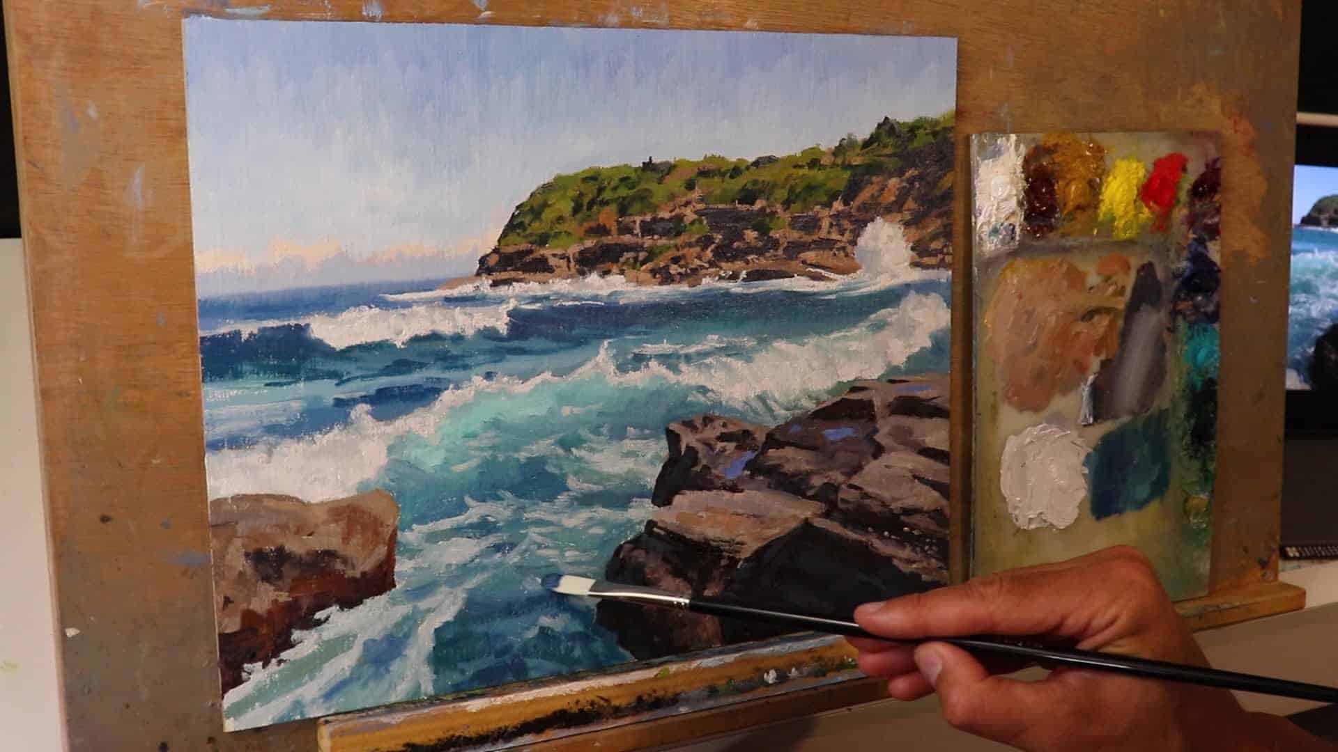
Above: Before and after comparison of the seascape—all steps combined for a glowing, lively ocean!
Join The Community & Further Resources
Are your landscapes and seascapes falling short of your imagination? Want more critique and hands-on help as you paint? I offer a friendly, practical online art school focused on landscape and seascape painting.
- What you get: Weekly live classes, in-depth critiques, tons of video tutorials.
- 7-day free trial available!
- Join The Landscape Painting Art School Now
Or, for more seascape techniques, check out my other tutorial videos linked here:
How to Paint Luminous Seascapes: Full Video Tutorial
“There’s weekly live painting classes, painting critiques, and tons of painting tutorial videos… I’m giving away a seven day free trial. Just click the link below to join.”
Final Words
Seascape painting is all about balance: structure and freedom, depth and glow, detail and looseness. Remember to enjoy the process. Don’t expect every wave to come out perfect! Experiment, adjust, and take in the beauty. You’ll see your paintings transform from flat and timid to vibrant, glowing, and full of life.
Thanks for reading. Now, pick up your brushes and start painting your own Frazer Beach-inspired masterpiece!
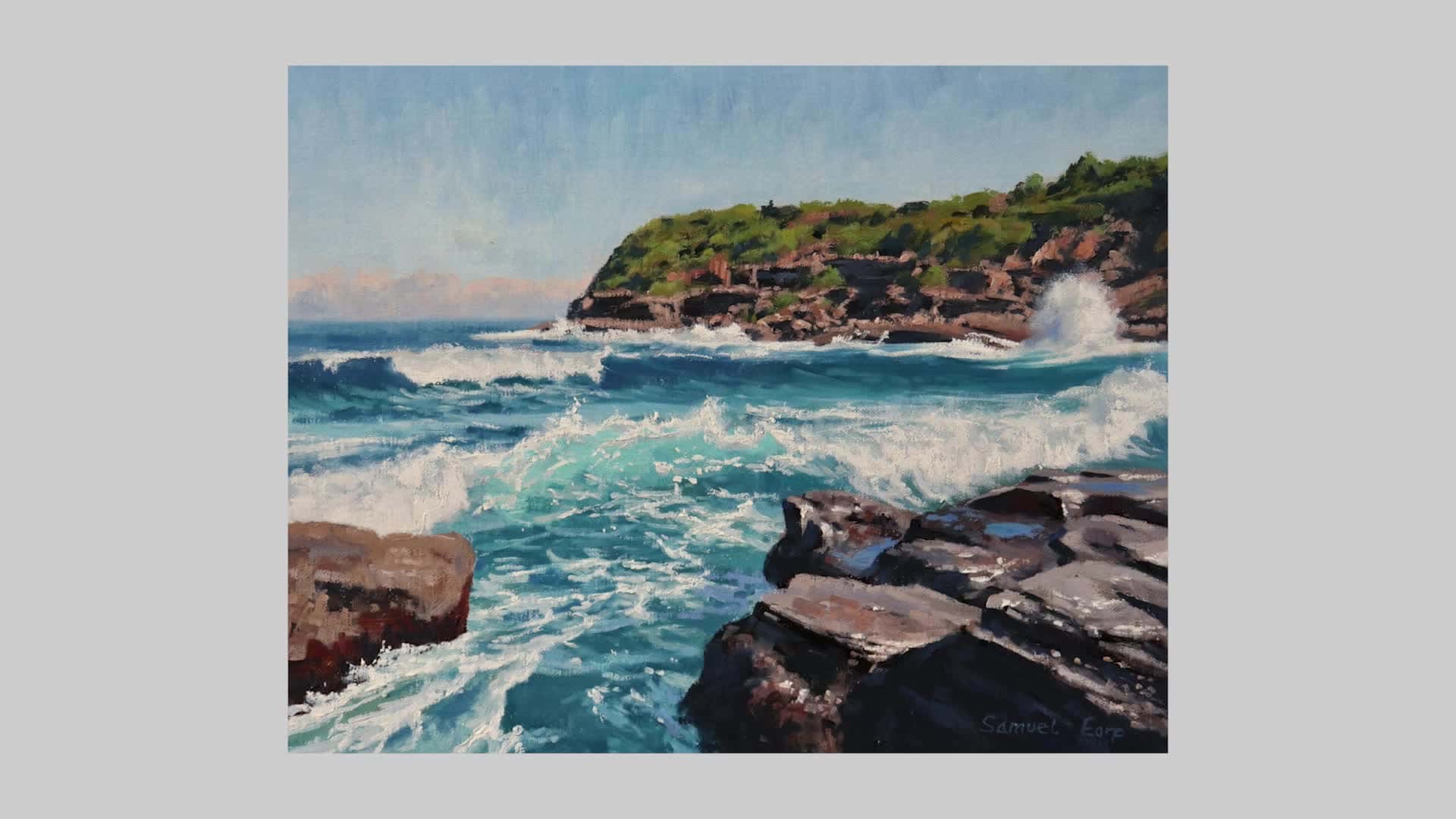
Above: Finished painting of Frazer Beach, alive with breaking waves, dynamic foam, and golden sunlight.
If you found this guide helpful, please share it, leave a comment, and subscribe for more art tutorials and inspiration.
Happy painting, and see you at the easel!
