Inspiration For This Painting
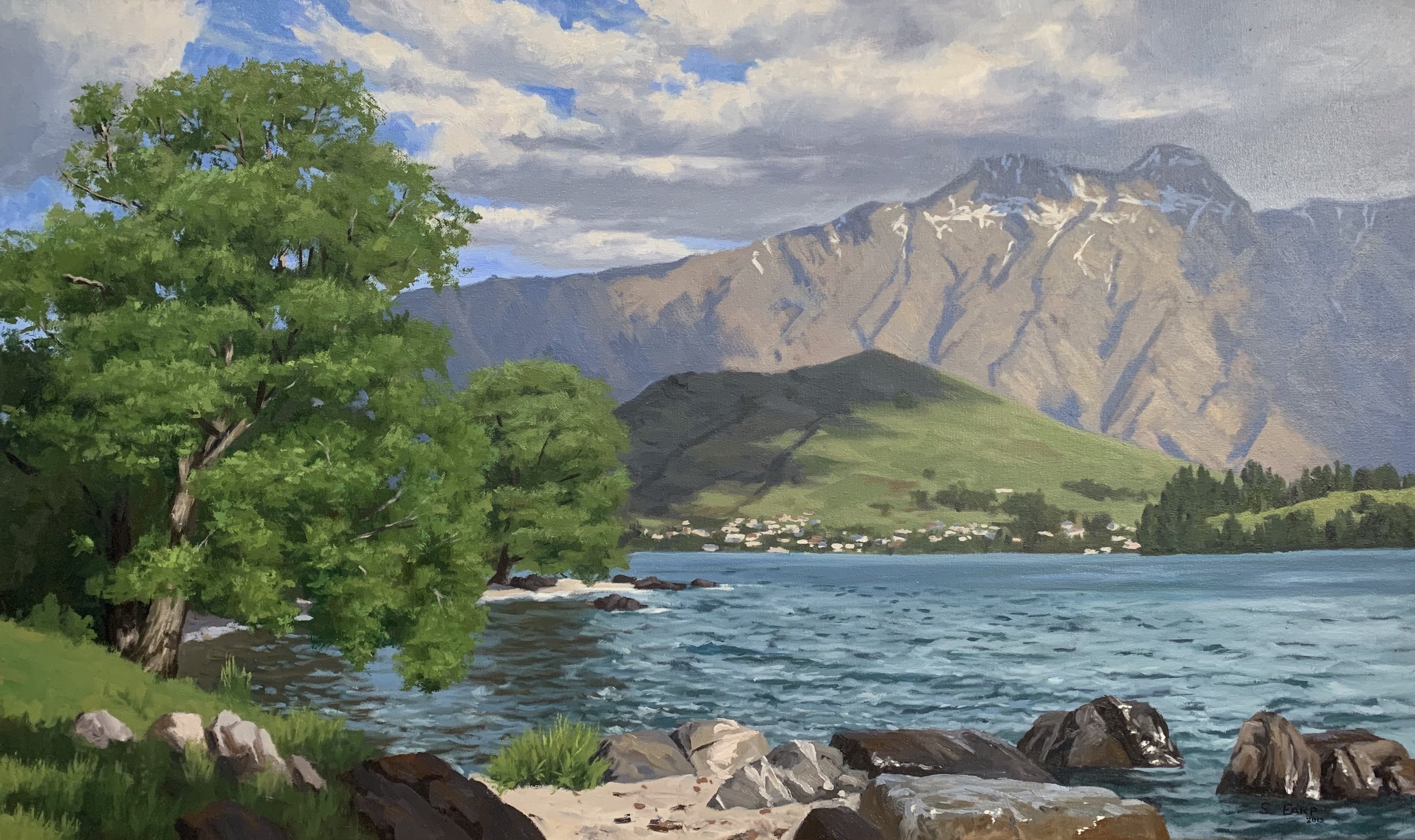
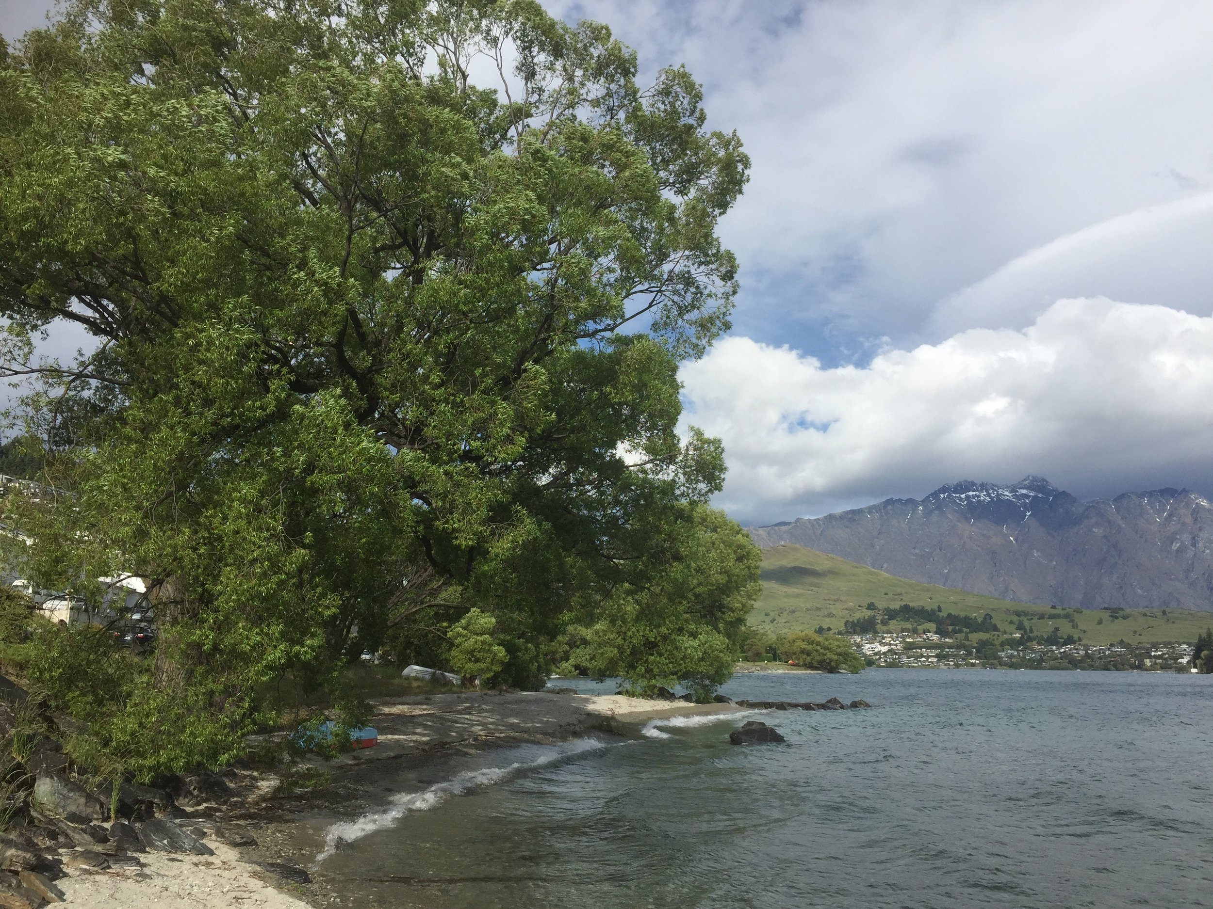
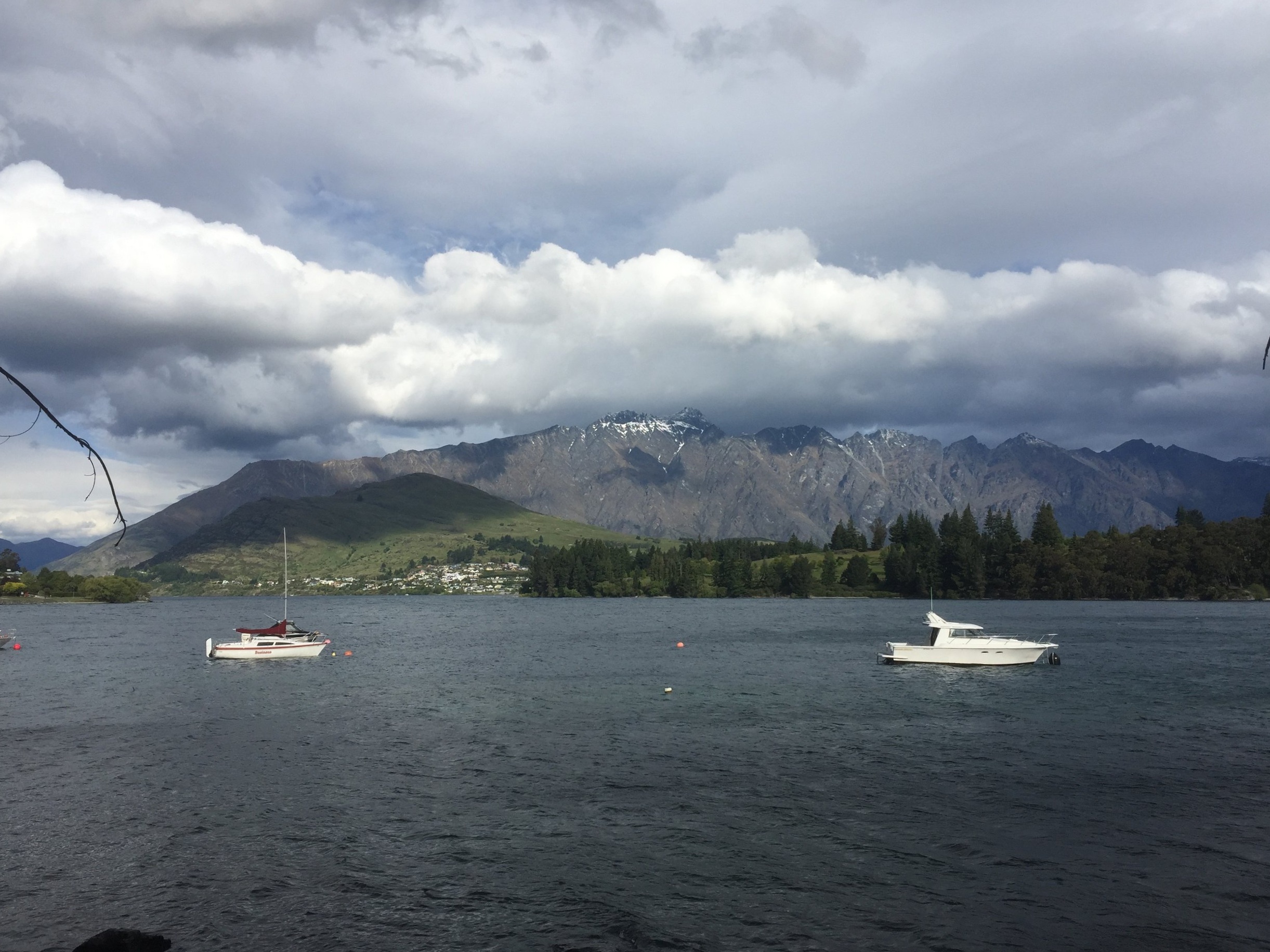
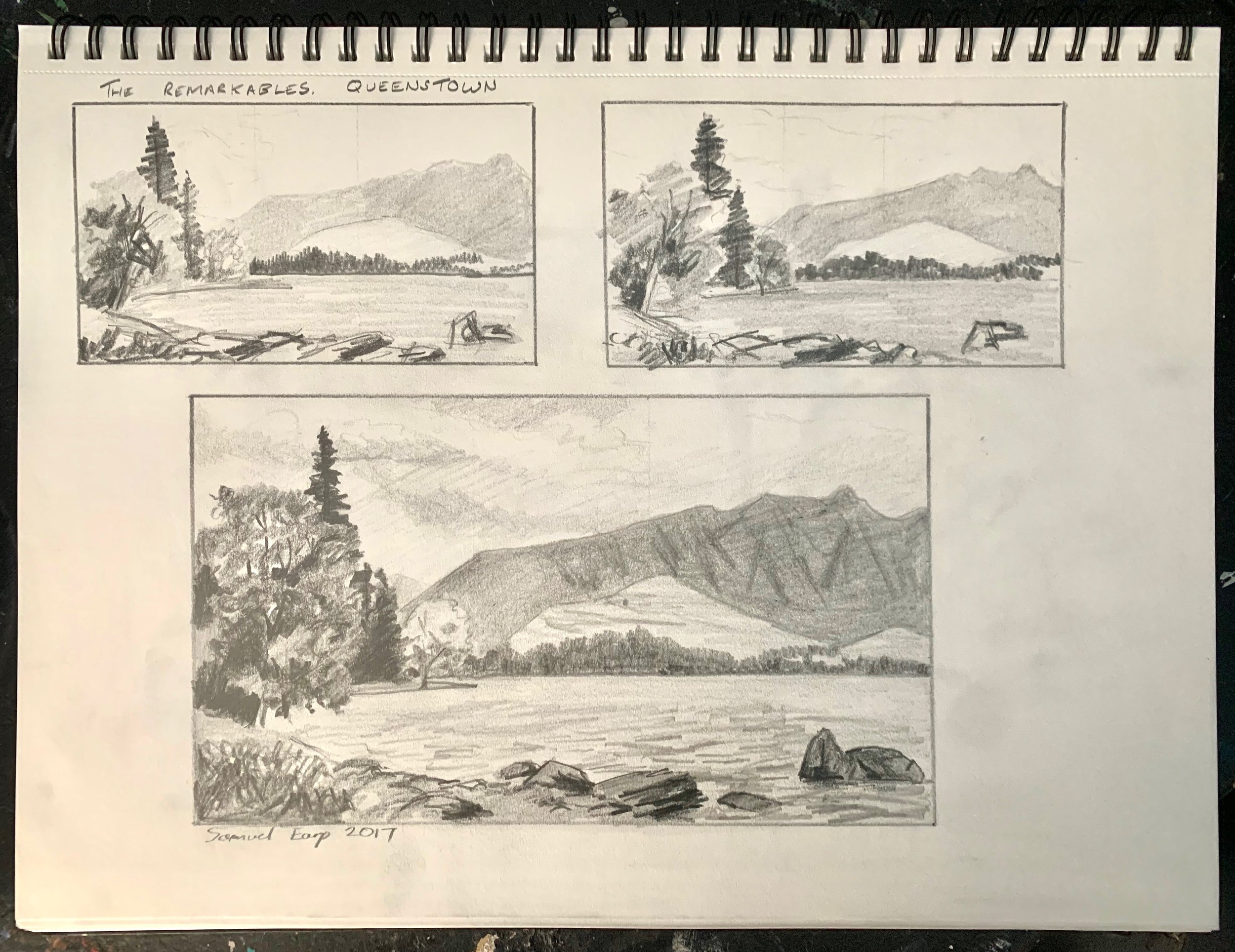
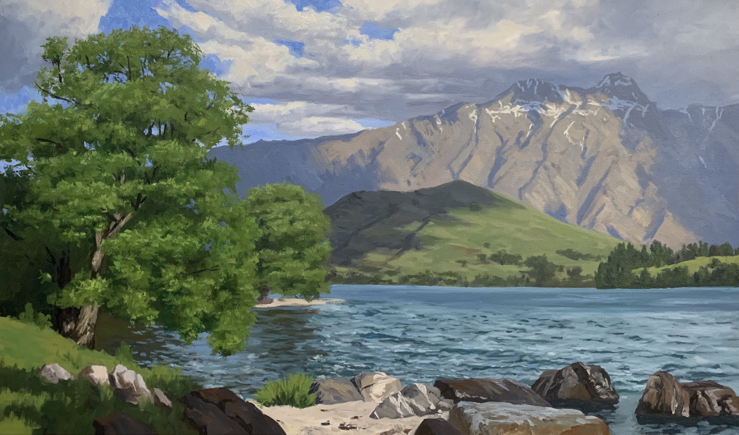
Last year I was commissioned to do a painting of this very familiar view in Queenstown, New Zealand. The painting features willow trees adorning the shore of Lake Wakatipu set to a backdrop of Dear Park Heights and the Remarkables Mountains.
This painting features water, trees and mountains which are three great subjects to include in a landscape painting.
In this painting tutorial I will show you the process of how I created this art work.
Reference Photos
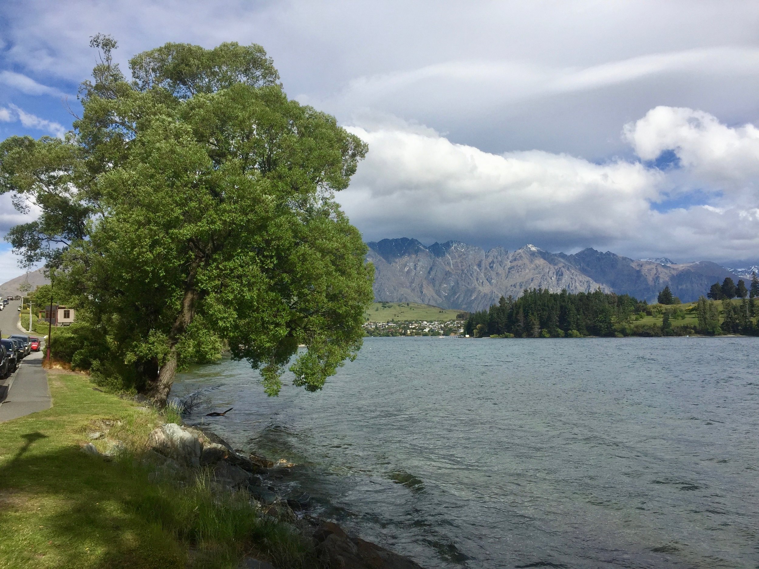
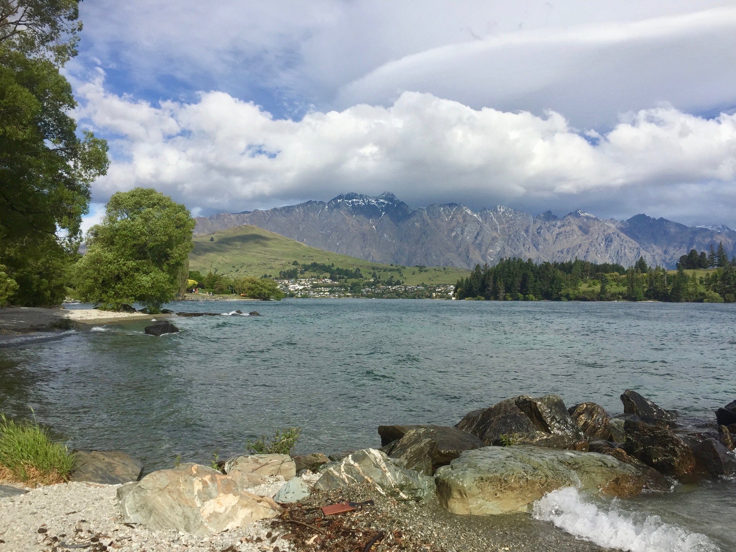
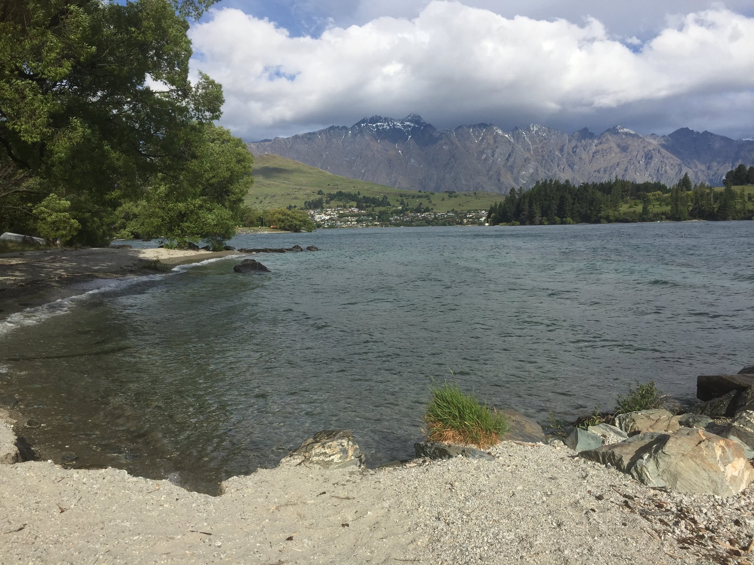
Here are some of the reference photos I took. Please feel free to use them or copy them if you would like to have a go at painting this art work.
In this tutorial I will cover the following:
- Colours
- Brushes
- Composition
- Blocking in the painting
- Adding detail
- Final details
Colours
I painted this artwork using oil paint and the colours I used in this painting are as follows:
- Titanium white
- Burnt sienna
- Yellow oxide
- Cadmium yellow
- Cadmium orange
- Perylene crimson
- Ultramarine blue
- Phthalo green
Brushes
Here is a list of the brushes I used in this painting:
- No.10 flat
- No.8 flat
- No.6 flat
- No.2 flat
- No.1 round
- No.0 round
- 3/8 dagger
Composition
The composition for this painting was a little bit tricky as this particular view in Queenstown is so well known that it’s difficult to move things around to improve the composition. As this painting was a commission I was a bit limited on what I could get away with.
I decided to look at some of the art works of some of my favourite 19th century landscape painters to see if I could get some ideas. One of my favourite 19th century painters was a German artist by the name of August Wilhelm Leu who was well known for painting mountain scenes of Norway and the Alps. Below is an example of one of August Wilhelm Leu’s paintings.
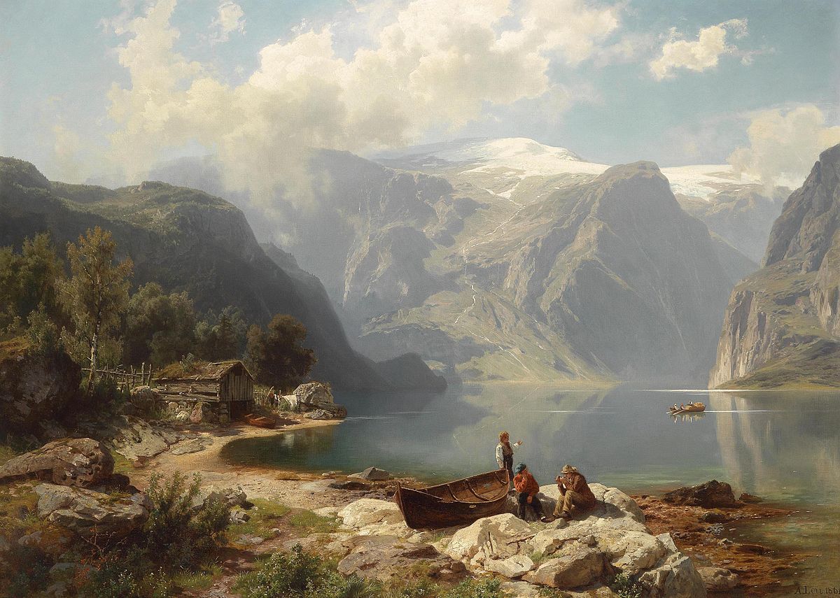
Leu’s artworks gave me an idea for my own painting.
I have roughly made Dear Park Heights and the Remarkables Mountains the main focal area of my painting and then I have positioned the trees, clouds and rocks to add a little rhythm to the painting.
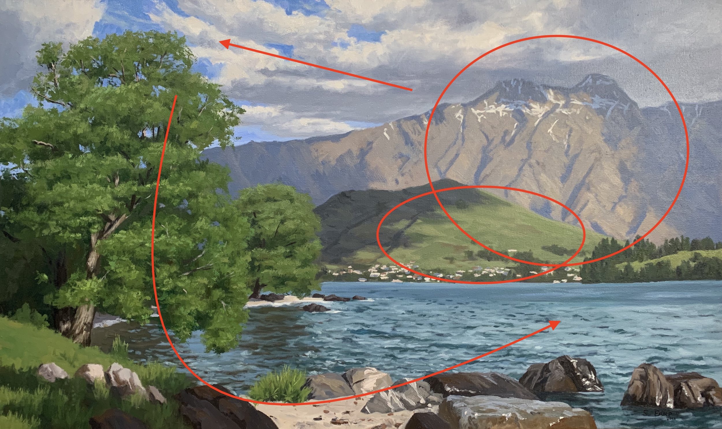
Before I began the painting I sketched out the composition and then a final sketch. I’d always recommend sketching before you begin a painting so you can create a good composition before you start.
Blocking in the Painting
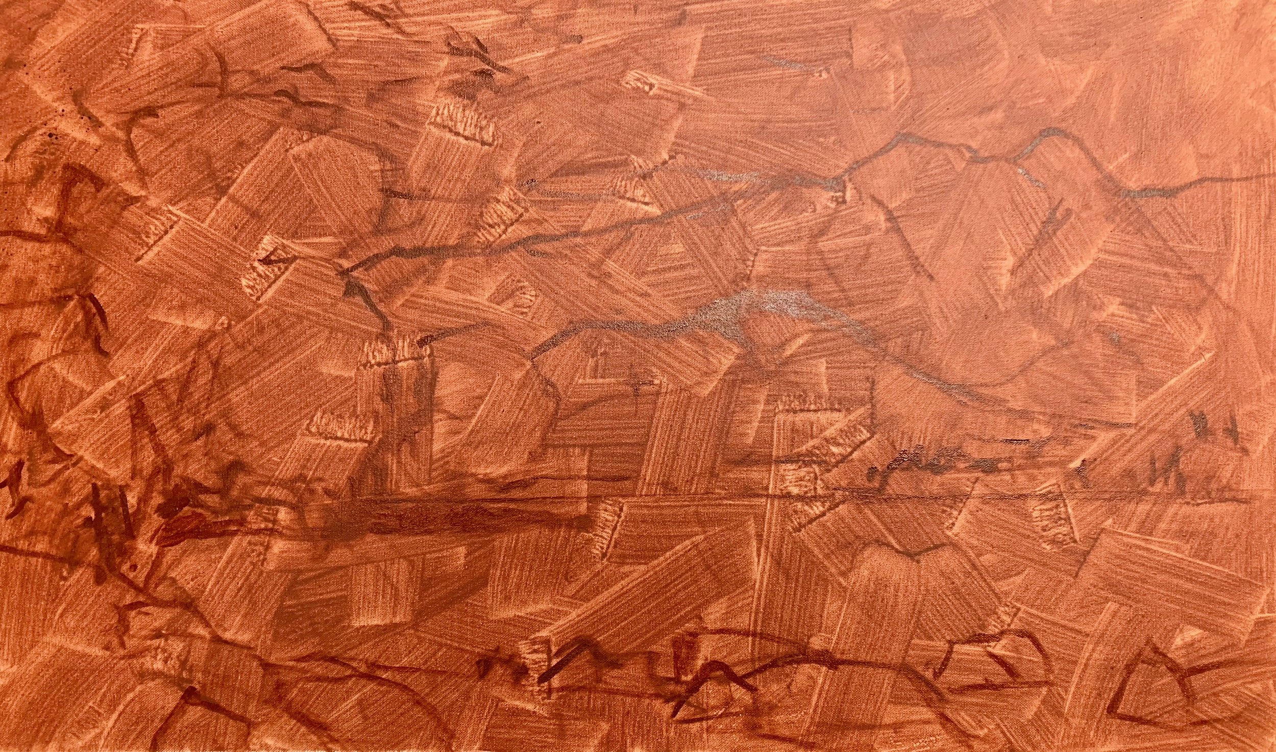
I’m using a 40cm x 70cm canvas. I prepared it with a layer of burnt sienna which helps warm up the painting as well as adding vibrancy to the colours.
I sketch out the composition with a No.1 round brush using burnt sienna mixed with a medium called Liquin Original. Liquin improves the flow of the paint and it speeds up the drying time so usually your painting should be touch dry within 24 hours.
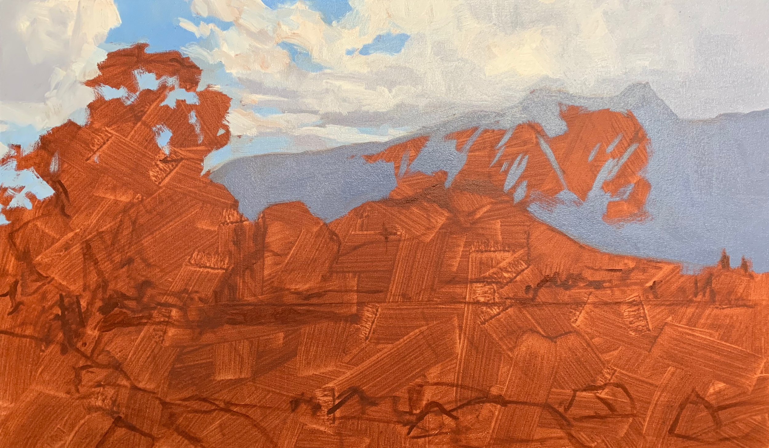
In order create a looser feel with the painting and cover ground quickly I use as large brushes as possible so I begin the blocking in stage by using a No.10 flat brush.
First and foremost, I am not at all worried about detail when blocking in a painting which is why I use larger brushes for this process. I just want to get my colours and values correct to start with so I have something to work with when I’m adding the detail later on. Using large brushes also helps to achieve a more ‘painterly’ effect.
I begin by painting the shadow areas of the Remarkables Mountains as I am going to use the tone of this mountain to gauge the rest of my values in the painting. I mix the mountain shadows with a combination of ultramarine blue, burnt sienna, perylene crimson and titanium white.
Next I use titanium white mixed with liquin to paint the cloud highlights and then I paint the cloud shadows which is a mix of ultramarine blue, burnt sienna, perylene crimson and titanium white. I then blend this in with the cloud highlights.
The sky is painted with a mixture of ultramarine blue, a tiny amount of phthalo green and titanium white.
Next I focus on the shadows in the trees and Deer Park Heights, the hill in the mid ground. The tree shadows are created with a mix of ultramarine blue, yellow oxide, burnt sienna and a tiny amount of phthalo green.
I paint the shadow on Deer Park Heights with a combination of ultramarine blue, yellow oxide, perylene crimson and titanium white.
I paint the areas in light on the Remarkables Mountains with a combination of ultramarine blue, yellow oxide sand, burnt sienna and titanium white. I am mindful to create a desaturated colour mix as the mountain faces are naturally low in chroma.
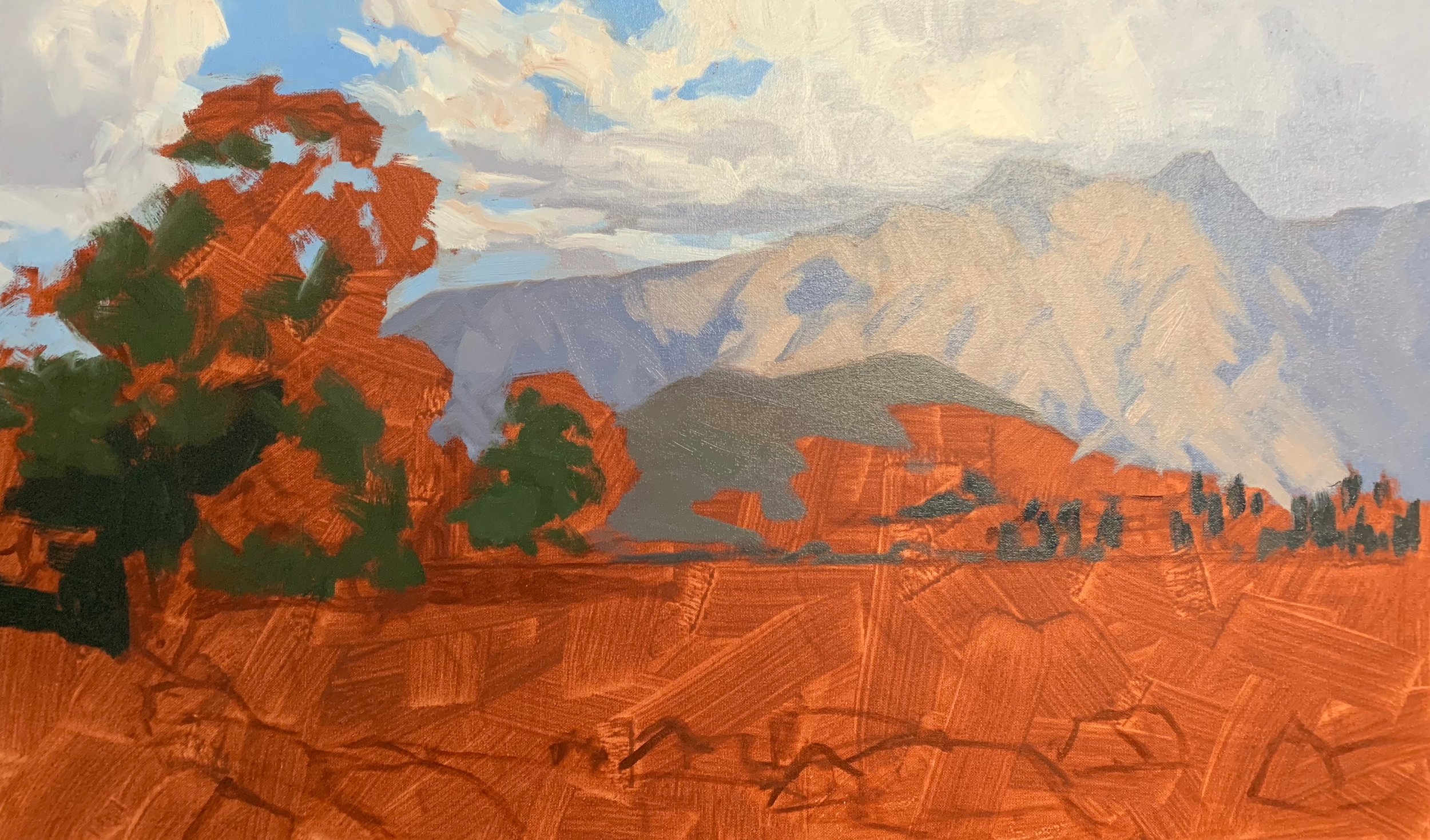
Next I focus on the areas in light on Deer Park Heights and the willow trees in the foreground. I want the grass on Deer Park Heights to resemble a nice meadow green, however I have to be mindful that the green is not too saturated otherwise it wont recede in the paint.
In order to mix the green I start with a desaturated green mix of ultramarine blue and yellow oxide, then I increase the saturation by adding in a little cadmium yellow. I then harmonise the green with a little cadmium orange and perylene crimson and finally I add some titanium white which has the effect of lightening the value and desaturating the colour.
The green of the willow tree foliage is a combination of ultramarine blue, cadmium yellow, a little cadmium orange and perylene crimson. I can increase the intensity of the green by adding a little phthalo green.
I start painting the water by mixing ultramarine blue, a small amount of yellow oxide and if required a tiny amount of phthalo green, then I lighten the value with titanium white.
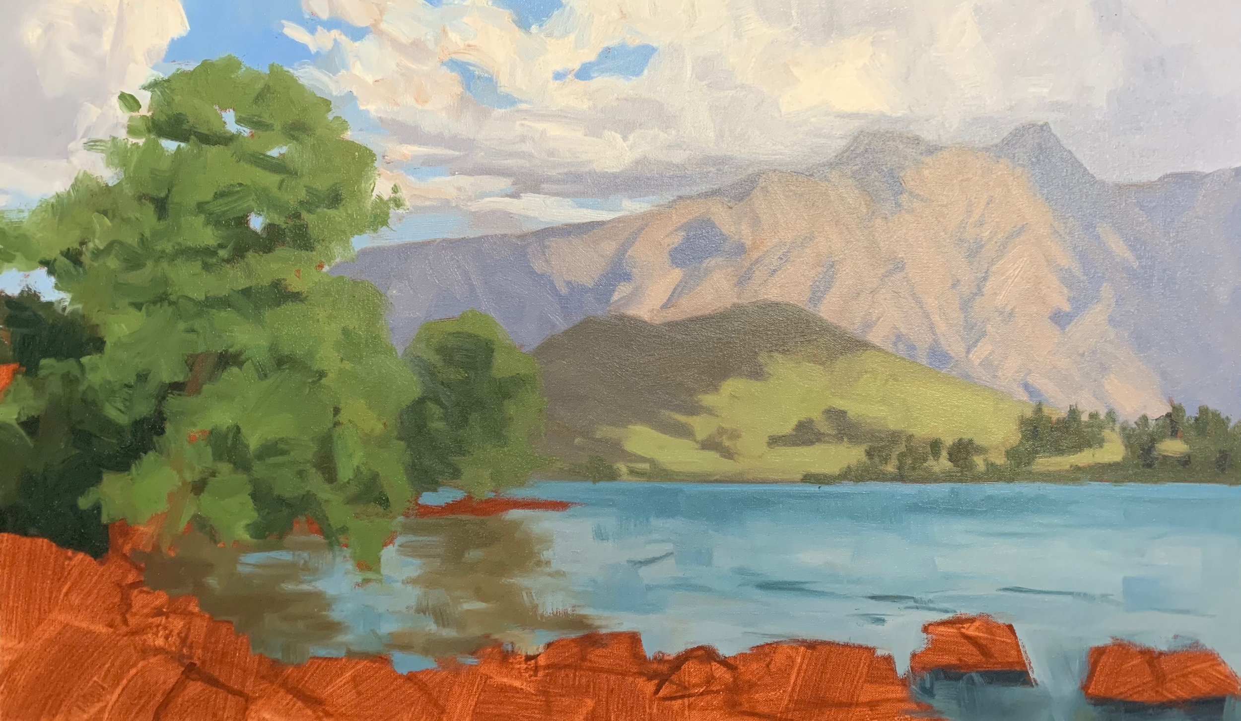
I complete the blocking in stage by painting the rocks in the foreground starting with the shadows first which is a combination of ultramarine blue, burnt sienna and perylene crimson. I use the same colours for the areas in light but add lots of titanium white to lighten the value. Here you will have to play around with your colour mixtures so you can create a range of colours and tones to add texture to the rocks.
The grass is mixed with the same colour combination as used for the trees, the only difference is the value is lighter, achieved by adding in a little titanium white and cadmium yellow which is a colour light in value anyway. If it is too yellow phthalo green can be added which doesn’t alter the value too much, then a little cadmium orange and perylene crimson to take some of the saturation out of the green and make it look organic.
Water
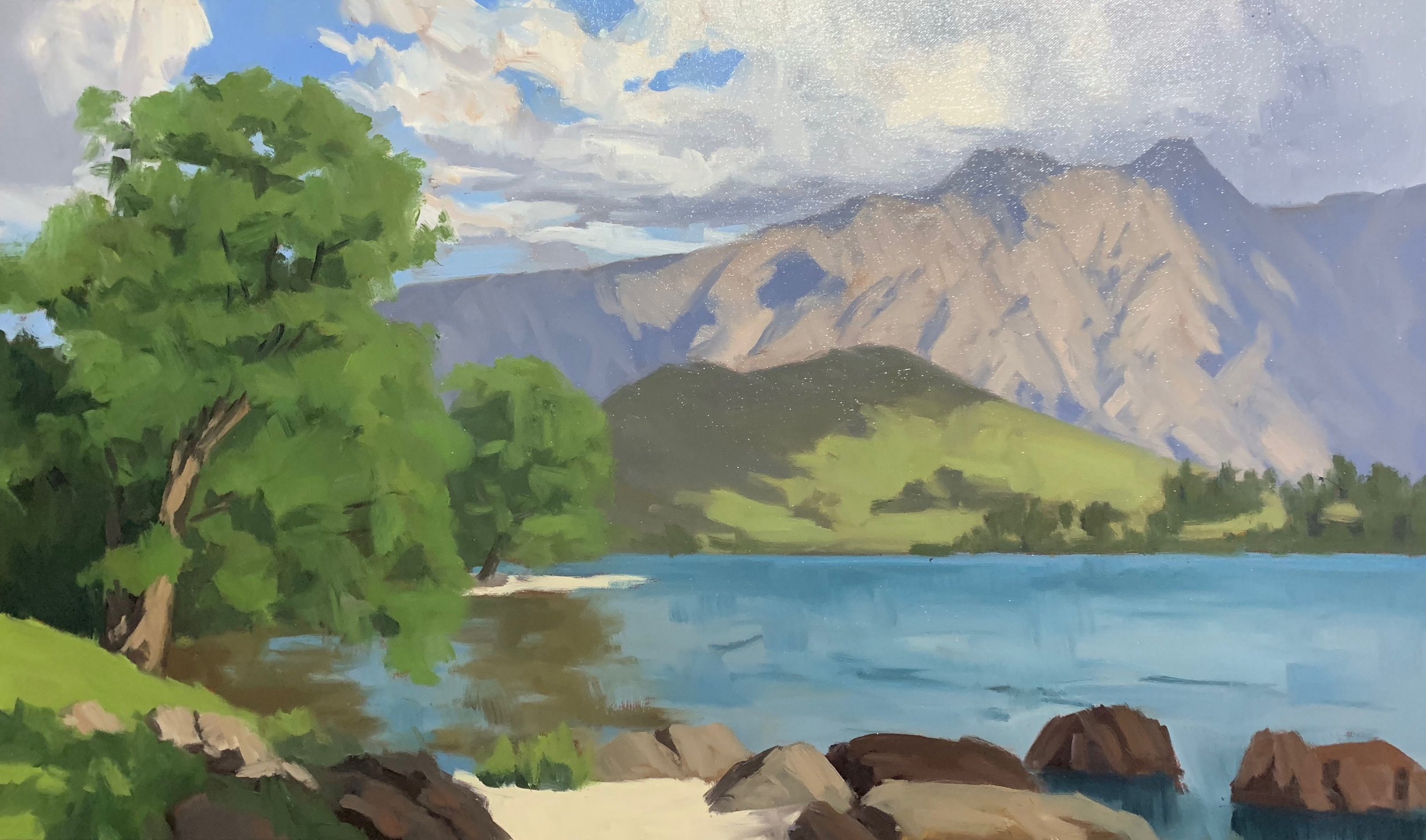
After blocking in the painting I allow it to dry so I can then start building up the detail in the painting. I begin painting the water by starting with the shadows in the ripples which I mix using ultramarine blue and a little yellow oxide and then apply with a No.2 flat brush.
Water can be a complex subject to paint as there is often a lot going on with it, so when I approach painting water I always try and simplify it. I think of the ripples as little hills with (in this case) the light shining behind it which means the face of the ripple will be in shadow. I paint these first.
Once the shadows are painted I add the peaks and troughs of the water which are directly behind the shadow face of the ripple. These peaks and troughs are reflecting the sky, mountains and trees on the left so these colours must be included in the water.
The water is mostly reflecting the sky and clouds so I mix ultramarine blue, a small amount of yellow oxide and titanium white. The water is naturally rich in minerals and mountain debris which can make the lake look turquoise so if required a little phthalo green can also be added.
I use a No.2 flat brush to apply the highlights to the peaks and troughs of the water which I apply in small sweeping brush marks. To see more on how I painted the water check out the YouTube video that accompanies this blog, the link is at the bottom of the page.
Trees
Like water, trees can also be a complex subject to paint especially if you are trying to paint foliage that looks natural and detail, but not laboured and overworked.
To paint the willow trees I used a 3/8” dagger brush as you can achieve a range of marks that are perfect for painting foliage. There is the broadside of the brush which is ideal for painting in shadows in the tree’s crown where not too much detail is required, then you can use the tip of the brush to create the illusion of individual leaves.
Before I start painting the illuminated leaves I reinforce the shadows using the same colours I used in the blocking in stage.
I paint the trees canopy that is in light using the same colour combination I used in the blocking in stage, ultramarine blue, cadmium yellow, a little cadmium orange and perylene crimson adding also titanium white and phthalo green where required.
Painting the willow tree’s canopy required several passes where with each successive layer I was applying lighter tone to achieve a three dimensional effect which I applied with a 3/8” dagger brush.
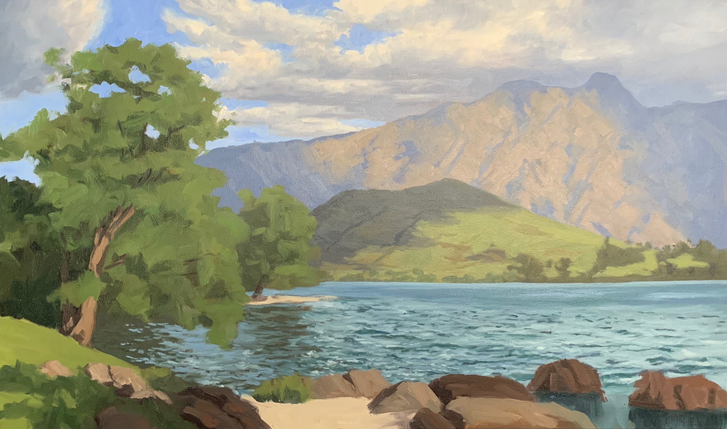
Mountains
I am still using the same colours as I used in the blocking in stage for the mountains. I first tidy up the shadow areas of the mountains and reinforce the suggestion of crags and fissures in the rock face. for the illuminated areas of the mountain I am still using the same colours I used in the blocking in stage, ultramarine blue, yellow oxide, burnt sienna and titanium white but I am lightening the value in areas in order to give the illusion of three dimensional form.
I add the snow by mixing titanium white with burnt sienna, which helps the snow to recede in the painting. For the areas of the snow that is in shadow I use a combination of ultramarine blue, perylene crimson and titanium white.
Final Details
I complete the painting by adding fine twigs and branches in the willow tree and adding highlights to the trunk. This is a combination of ultramarine blue, burnt sienna and titanium white primarily but I can also add texture and colour to the bark by adding in a little perylene crimson and / or yellow oxide.
I always save my lightest values until the end so paint some highlights on the rocks, water and foliage.
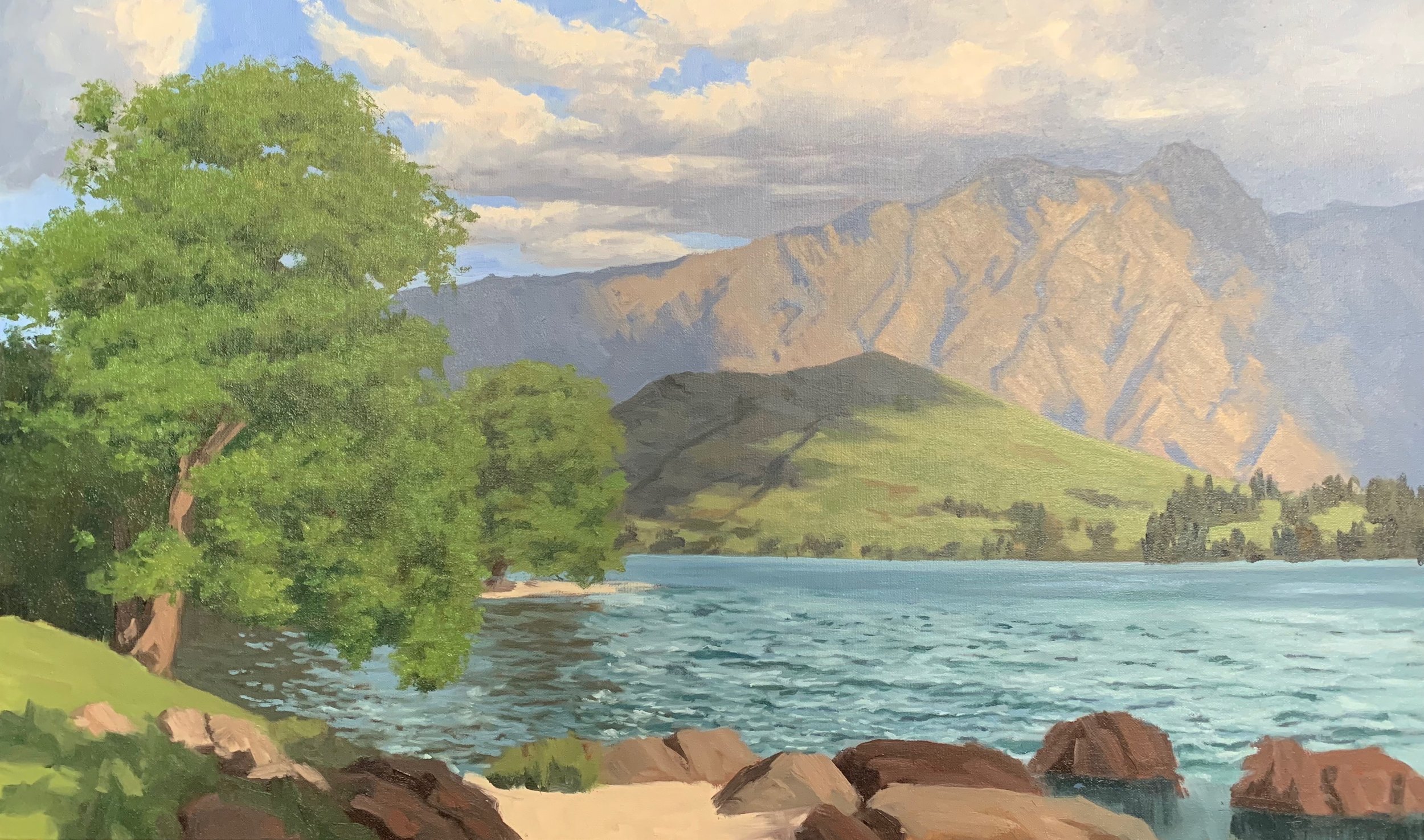
I add in the houses to Dear Park Heights in the mid ground as this is a local recognisable scene, which completes the painting.
Thanks for reading 😊
