Have you ever looked at your acrylic landscapes and thought they just look… flat? Maybe you’ve put in hours mixing colors and carefully dabbing in detail, only to step back and wonder why your mountains still look lifeless. You’re not alone. This is the number one thing I see artists struggle with, whether they’re just starting out or have been at it for a while.
After 20 years of painting landscapes, showing my work in galleries, and coaching hundreds of artists, I’ve developed a method for breathing life and depth into acrylic landscapes.
In this post, I’ll walk you through exactly how I approached a painting of Mount Clarke in Southern New Zealand.
You’ll get a step-by-step breakdown of my process, from planning the composition to adding the final details. Along the way, I’ll share practical, easy-to-follow tips for color mixing, brush technique, and capturing that elusive sense of realism while keeping the painting loose and expressive.
Whether you’re brand new to acrylics, an oil painter giving them another try, or someone looking to deepen their understanding of value and color, there’s something here for you. Let’s get started!
Why I Painted Mt Clarke?—The Story Behind the Painting
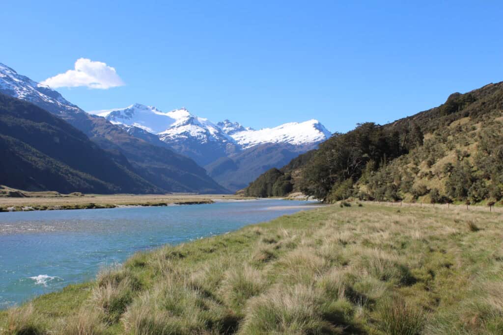
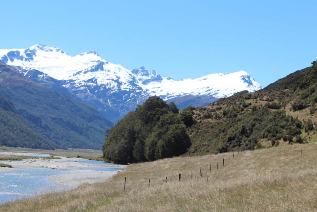
Imagine a crisp day in southern New Zealand, standing in front of the dramatic silhouette of Mt Clarke. That’s the memory that inspired this painting. A little while back, I joined a plein air painting day with a group of artists. The mood was light and the landscape was absolutely stunning—an artist’s dream.
Ever since, I’ve wanted to try a studio version of that scene, to capture not just the view but also the feeling of that day.
“Most of the time, I normally paint with oils, but more recently I’ve been trying out acrylics again and just seeing what effects I can get.”
Whether you’re an oil painter testing the waters with acrylics or a die-hard acrylic fan, sometimes the transition offers new creative possibilities—and a few challenges!
Getting Started: Planning, Materials, and Composition
Every strong painting starts long before the first brushstroke. For me, planning the composition is a non-negotiable. I always get out my sketchbook and play with the basic layout before I even touch the canvas.
Materials List
- Surface: Wooden panel, primed with two layers of gesso
- Palette:
- Burnt sienna (for sketching and mixing)
- Ultramarine blue
- Titanium white
- Alizarin crimson
- Yellow ochre
- Cadmium yellow
- Cadmium red light
- Phthalo green
- Brushes: Shiraz brushes (by Rosemary & Co.), especially large flat and pointed round brushes
Pro Tip: I paint on a white background. I’ve tried toned backgrounds, but white helps me set the lightest lights and build the overall structure based on value.
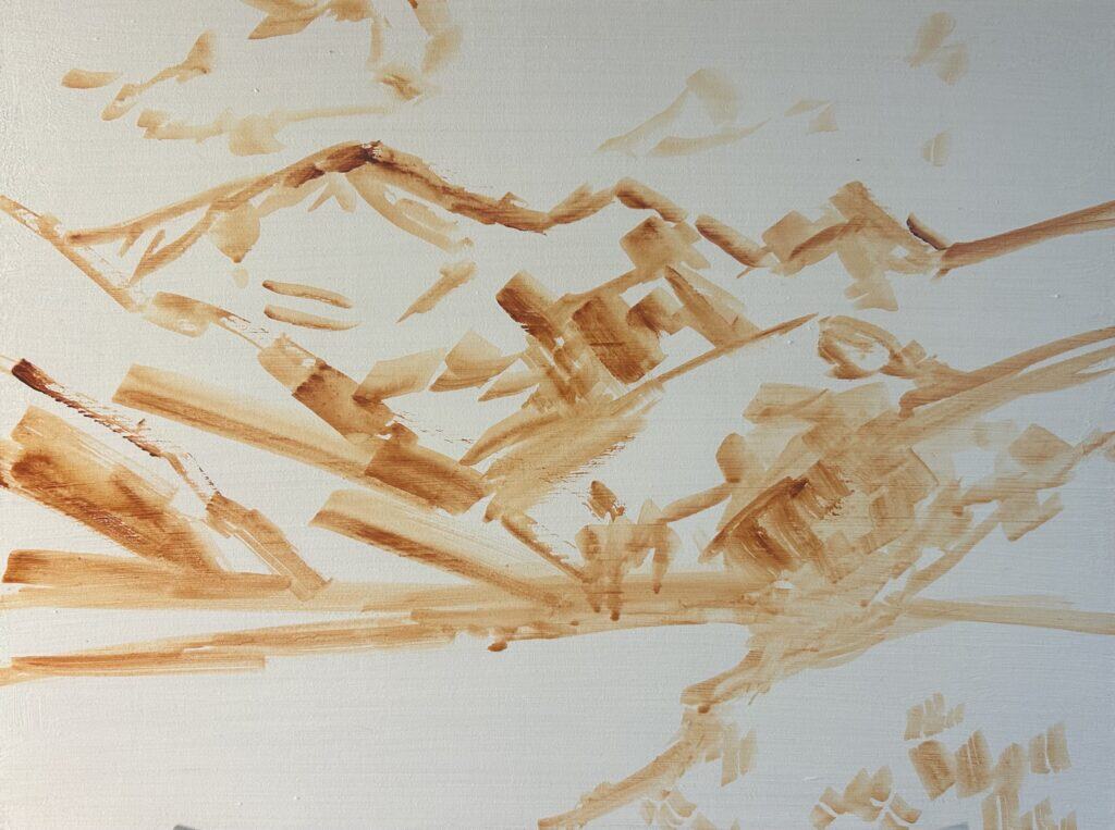
Initial Sketch and Composition
At the start, I use a bit of burnt sienna thinned with water to lightly block in:
- Main masses: Position of mountains, river, and major tree groups
- Planes: Separating foreground, middle ground, and background
Skipping this step leads to trouble down the road! I always do a design sketch in my notebook before painting. Even for looser, impressionistic work, a planned layout ensures your painting won’t end up muddled.
Example of initial compositional sketch for Mt Clark.
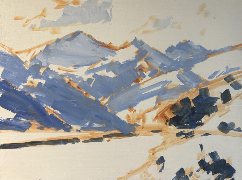
Blocking in with Big, Loose Strokes
One of the biggest mistakes I see is jumping straight into tiny details with tiny brushes. Resist the urge! Instead, grab your biggest flat brush. Here’s why:
- Big brushes force you to think about major shapes and value relationships
- Loose, gestural marks set the energy and mood for the whole piece
For the first layer, I use a combination of:
- Ultramarine blue
- Burnt sienna
- Titanium white
- Alizarin crimson
As I start blocking in, I try to keep mixtures bluer in the background (those distant mountain shadows). In New Zealand’s mountain light, shadows often have a cool, blue cast—try to keep this in mind for a sense of place.
“A lot of shadows, especially in New Zealand and in the mountains, tend to have a blue cast to them. So this is something that I want to convey from the get go in this painting.”
Let the big shapes and bold marks guide you at first, the details will come later, and painting “loose but believable” is much easier this way.
Very loose, blocked-in beginnings with focus on major shapes and values.
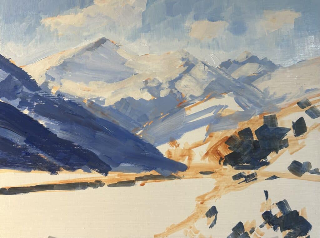
Understanding Value: The Secret to Depth
Value—how light or dark a color is—makes or breaks a landscape painting. It’s what makes your mountain recede or jump forward, and it separates a snowy peak from a drab one.
Here’s the rule I live by:
- The darkest darks and the lightest lights are always in the foreground.
- As landforms move into the distance, both darks and lights move toward the middle.
This “value compression” is absolutely essential for building believable space. Use your white background to help you judge where the brightest brights are; for shadows, anchor your values using trees in the immediate foreground.
Quick Value Checklist:
- Trees in the front: the darkest
- Riverbank shadows: also very dark
- Mountains just behind river: a bit lighter, but still darkish
- Distant mountains: much lighter, avoid solid blacks or deep darks
- Sky: lightest value, but save the lightest white for snow highlights
“Whenever I paint, whether I’m painting in oils or acrylics or even gouache, I’m always thinking about the value because the value is what creates the depth and distance in the painting.”
A value study showing darkest and lightest areas, with clear transition from foreground to distance.
Color Mixing Tricks for Mountains, Water, and Trees
Mixing Mountain Colors
My go-to mixes for mountains:
- Distant mountain shadows: Ultramarine blue + burnt sienna + titanium white (leaning more blue than brown)
- Mid-ground shadows: Same mix, but slightly less white and a hint of alizarin crimson for a muted purple undertone
- Snow:
- First layer: Titanium white + a little ultramarine blue, burnt sienna, and alizarin crimson (for a “not-too-bright” base)
- Highlight: Titanium white + touch of yellow ochre for warmth
Remember: Acrylics dry darker, so start slightly lighter than you need.
Water and Reflection Colors
- Base water color: Ultramarine blue + titanium white (for the sky reflection) + a touch of yellow ochre and phthalo green (for riverbed and grass reflection)
- Layering lighter colors over dried darks lets you get the shimmer and sense of flow right at the end.
Tree and Grass Color Recipes
- Foreground grass: Yellow ochre + cadmium yellow + ultramarine blue + titanium white
- For extra saturation, add phthalo green
- To knock it down (to avoid cartoony greens): mix in a dash of cadmium red light or burnt sienna
- Distant tree greens: Use more yellow ochre and titanium white; add a dab of alizarin crimson to mute the green (this is absolutely key)
“If we were to use a green that was as saturated as the grass in the foreground in those greens in the background mountains, then that would pull the mountains forward and then suddenly we’d lose that depth.”
Color chart showing variations of green for foreground, midground, and distance.
Layering and Adjusting: Handling Acrylic’s Fast Drying Time
Acrylics dry fast—sometimes too fast! But you can actually turn this to your advantage with a few strategies:
- Work in thin layers: You can lay down great gestural shapes, let them dry, and then glaze or layer lighter/darker colors right on top.
- Acrylics dry darker: Plan for this by mixing your colors a hair lighter than you think you need. If an area dries too dark, don’t stress—just road test and glaze back over.
- Not enough time for blending? Embrace the “broken color” effect—lots of visible, loose marks can actually look more lively.
For sky, I used ultramarine blue + titanium white + a bit of phthalo green, working fast while the paint stayed wet for smoother transitions.
Acrylic techniques: wet-in-wet blending vs dry, layered application.
Foreground vs Background: Building Depth with Greens
Nothing kills a landscape quicker than green, green… and more green. In reality, the greens in your landscape need careful tuning for depth and realism.
The Secret Sauce: Lower Chroma in the Distance
- Foreground grass: Mix a vibrant green using yellow ochre, cadmium yellow, ultramarine blue, titanium white, a touch of phthalo green, and, if needed, a jot of cadmium red light to keep it natural.
- Background mountains: Desaturate by using yellow ochre, ultramarine blue, titanium white as the base, then blend in earth reds (burnt sienna or alizarin crimson) to knock the chroma way down.
“It’s really important that the green is of a low chroma or low saturation, and then that’s going to help it to sit back in the landscape.”
Pro Tip: Use the color wheel! Red is opposite green, so a hint of red or brown (burnt sienna) neutralizes green for distance.
Foreground and background green comparison; swatches viewed side-by-side.
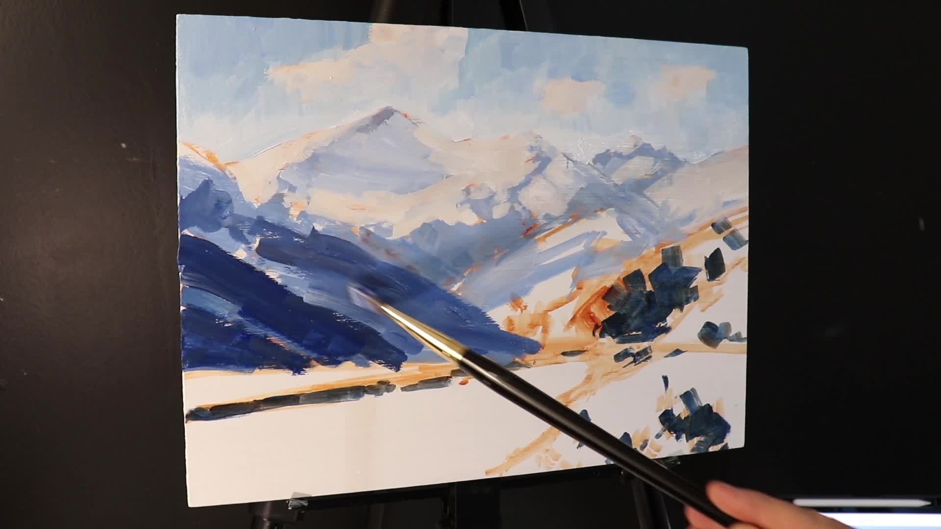
Adding Realism: Painting Snow, Water Ripples, and Trees
After establishing the big shapes, values, and colors, it’s time for details that make your painting pop.
Snow on Mountains
- Start with a not-too-bright snow layer—titanium white plus a tiny bit of ultramarine, burnt sienna, alizarin crimson.
- Add bright, warm highlights last: pure titanium white with a smidge of yellow ochre for sunlight
Close-up of snow layers showing progression from shadow to highlight. These snow and mountain techniques can be adapted for everything from dramatic alpine peaks to gentle rolling hills in winter light.
Water Movement
- Use small, loose strokes with lighter blue and white to indicate ripples and reflect sunlight
- Don’t overdo it—too many details flatten the illusion
Understanding how to paint water ripples and reflections opens up possibilities for depicting lakes, rivers, streams, and coastal scenes in your work.
Foreground Trees
- Pointed round brush for branch suggestion—don’t paint every branch, just the impression
- Save your richest, darkest mixes for these trees to pull them forward
The approach to painting foreground trees—suggesting rather than detailing, works equally well for forests, woodlands, and individual specimens across all seasons
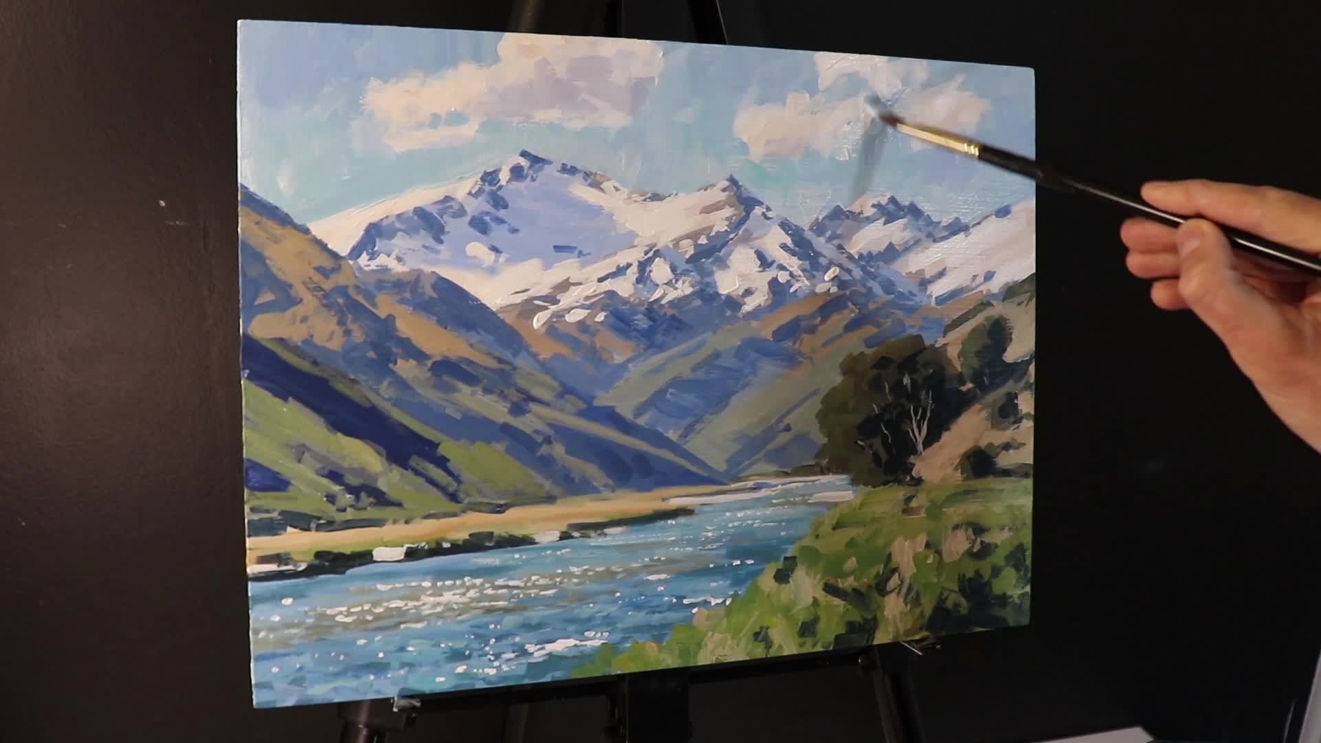
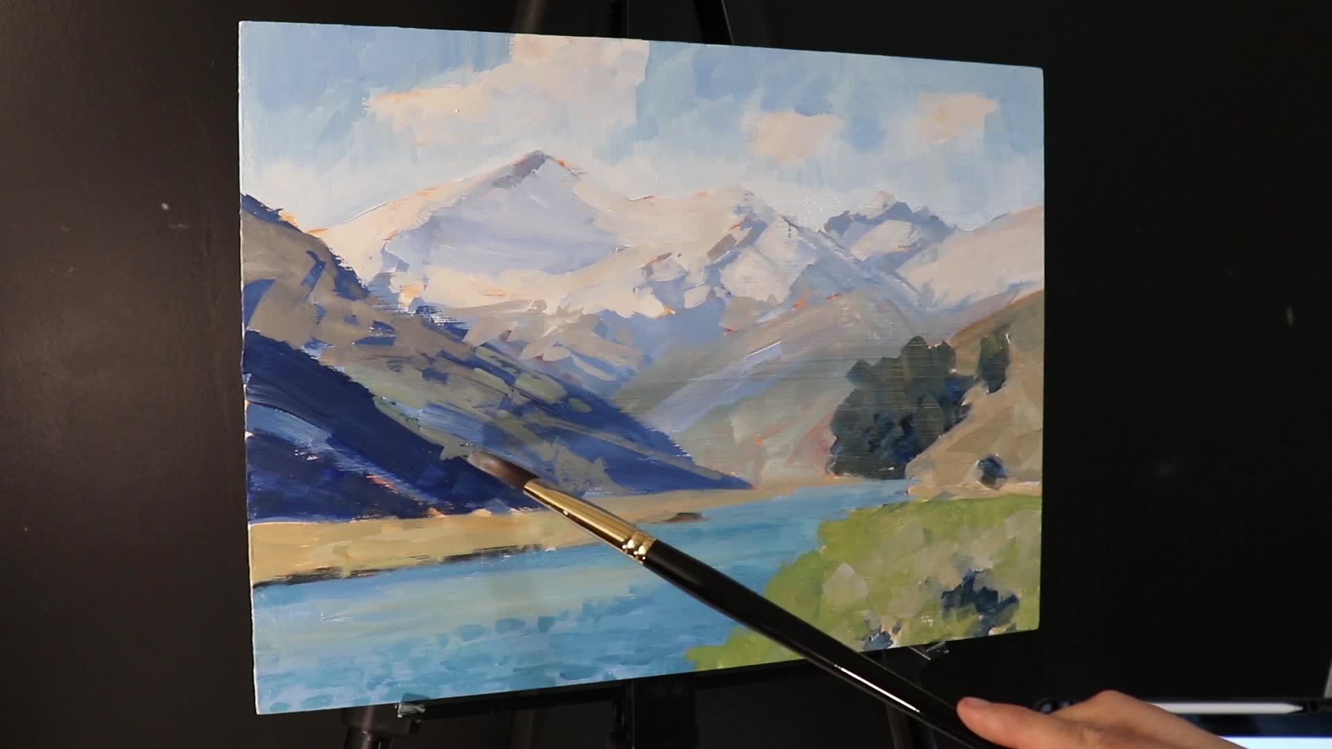
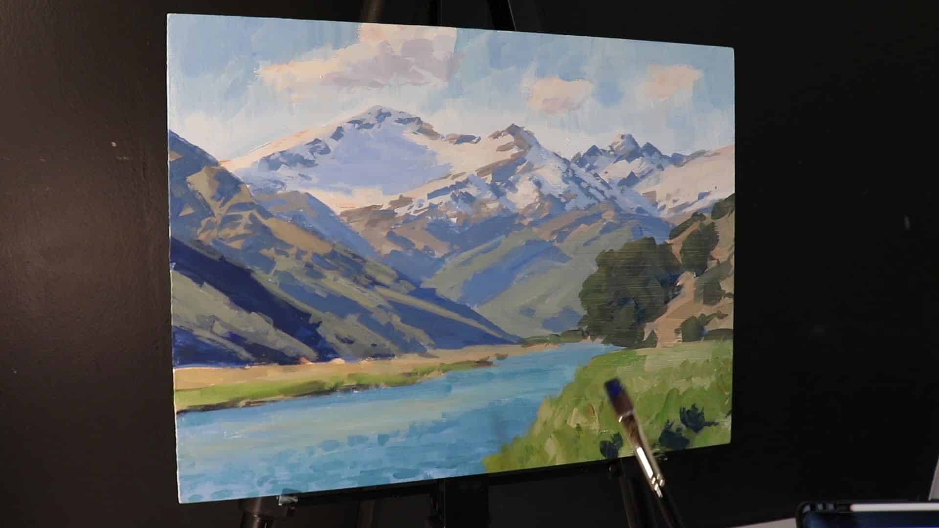
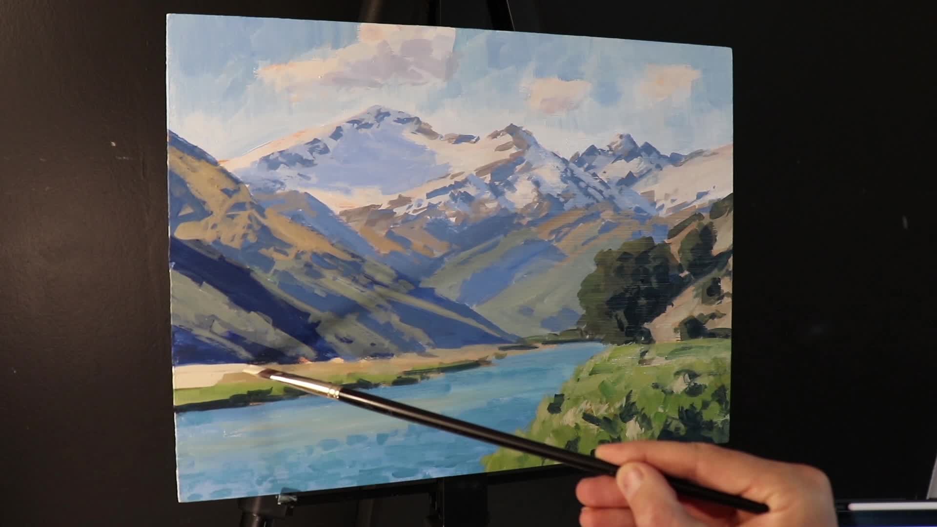
“I finished up this painting by just adding a few last details, a few tonal adjustments, and a few details to the mountains. And with that, it was complete.”
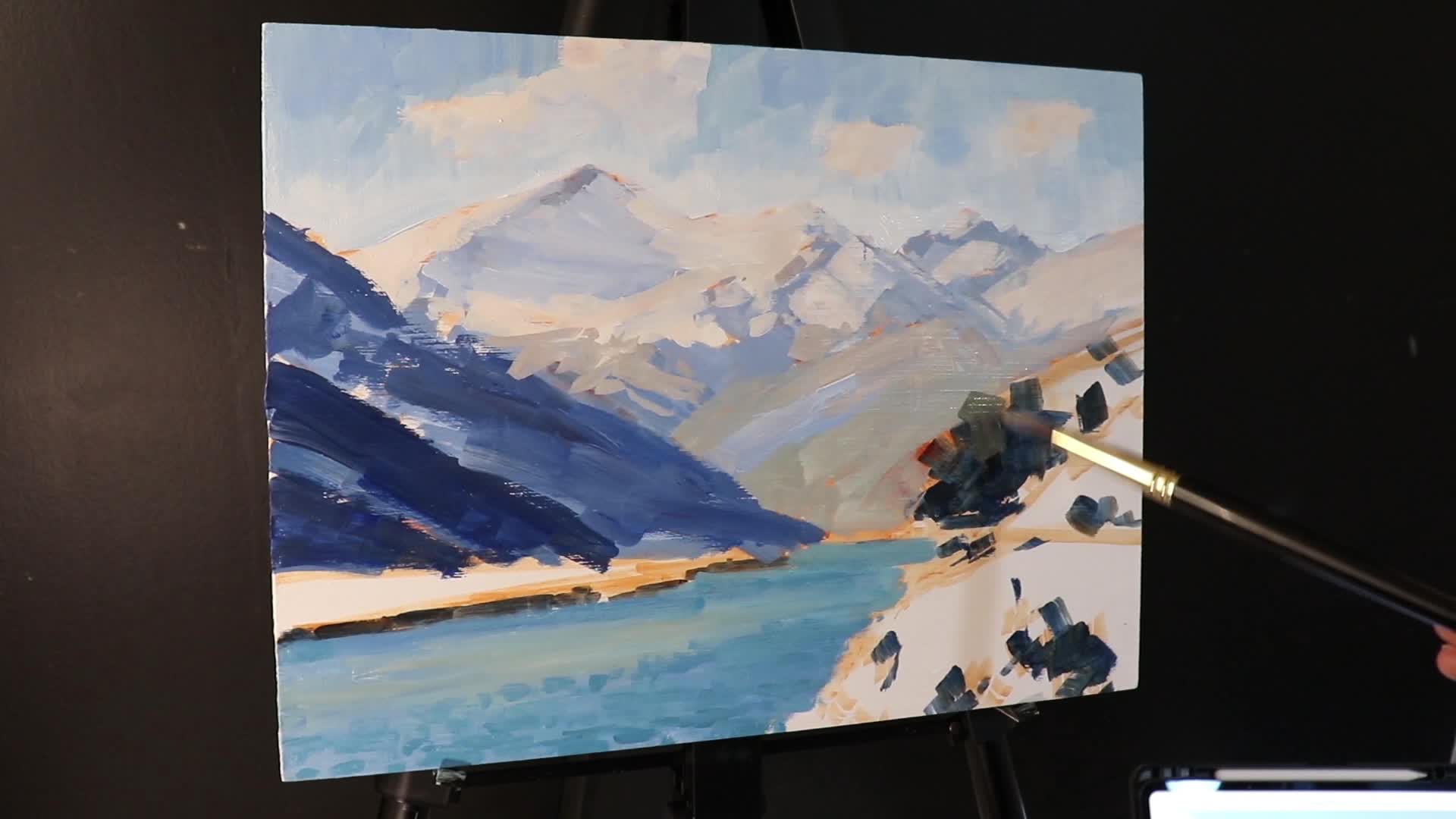
Final Details and Bringing It All Together
Right at the end, step back. What stands out? Adjust only what needs adjusting, and remember:
- Reserve your brightest whites for the final highlights: snow, river sparkles, a glint on a rock
- Make “tonal adjustments” to ensure your light/dark structure hasn’t drifted during all the color layering
- Add just a few extra details—a few more hints of trees, maybe a shadow or two, just enough to “sell” the realism without tightening up the brushwork too much
“As I said, in general, I saved my lightest values until last. And I just added some sparkles on the river there just to give it more life and add more realism to it.”
Finished painting, highlighting areas of richest contrast and brightest sparkle.
My Top Tips for Acrylic Landscape Painters
Here are some of the most important things I’ve learned (often the hard way!) about painting landscapes in acrylics:
- Plan your composition: Sketch first in your sketchbook and again quickly on your panel.
- Think Big: Start with the biggest brushes and shapes you can manage.
- Nail your values: Always check that your lightest lights and darkest darks are in the right places. This does more for realism and depth than “right” color.
- Adjust color for distance: Desaturate greens and lighten values as things recede.
- Acrylics dry darker: Plan for it and don’t be afraid to go over areas with lighter/darker corrections.
- Details last: Let loose brushwork establish the scene, then add details only as needed.
- Enjoy the process: Loosen up and have fun! Sometimes “impressionistic” marks create more realism than fussy, tight ones.
And most importantly:
“If you’ve been struggling with creating realism and depth in your paintings, or struggling with tonal values, composition and color mixing… you can absolutely get better, and quickly, with the right methods and practice.”
Join the Community
Painting can feel solitary, but it doesn’t have to be. If you’re looking for support, feedback, or want to be part of a group of people working to improve their art, join my art school! We run:
- Weekly live painting classes (with Q&A)
- Loads of step-by-step painting tutorials
- A friendly, supportive community where you can share your work and get direct advice
Whether your goal is to sell your art or just make paintings you’re proud to hang on your wall, you’ll find a home.
Join the Art School — Click Here for More Info!
Screenshot or group photo from a live class/community gallery.
Further Reading and Resources
- Acrylic Painting Techniques for Beginners
- How to Paint Depth in Landscapes: Value and Color
- Recommended Acrylic Supplies and Brushes
- Rosemary & Co. Brush Shop
For more demos and live workshops, make sure you subscribe to my YouTube channel, and check out this video here:
“If you want to learn more about acrylic painting, check out this video here. Thanks for reading, and I’ll see you in the next painting!”
Frequently Asked Questions
Q: Can I use these techniques with oils or gouache?
Absolutely! The theory of planning, value, and color mixing applies no matter what medium you use. Adjust your process for drying time (oils stay open much longer; gouache reactivates with water), but the big ideas remain the same.
Q: I always get muddy greens—what am I doing wrong?
It usually comes down to mixing complementary colors without enough clarity. For clean foreground greens, use fresh yellow and blue (try ultramarine and cad yellow or yellow ochre). Add reds and browns only as needed to adjust saturation.
Q: Why do my acrylics dry looking so much darker?
This is one of acrylic’s quirks. Try mixing your colors a bit lighter than you think, and always allow paint to dry before judging the final value.
Final Thoughts
Painting a landscape like Mt Clark isn’t about slavishly copying every detail—it’s about capturing the energy, the light, and your own emotional response to a place. Keep things loose and lively, build up depth with careful value structure and color mixing, and don’t be afraid to experiment. Most importantly: stick with it. You’ll get better, often much faster than you think.
If you have questions, want feedback, or are interested in a step-by-step critique, drop a comment or join the art school community. And don’t forget to check out the video demo for more tips. Happy painting!
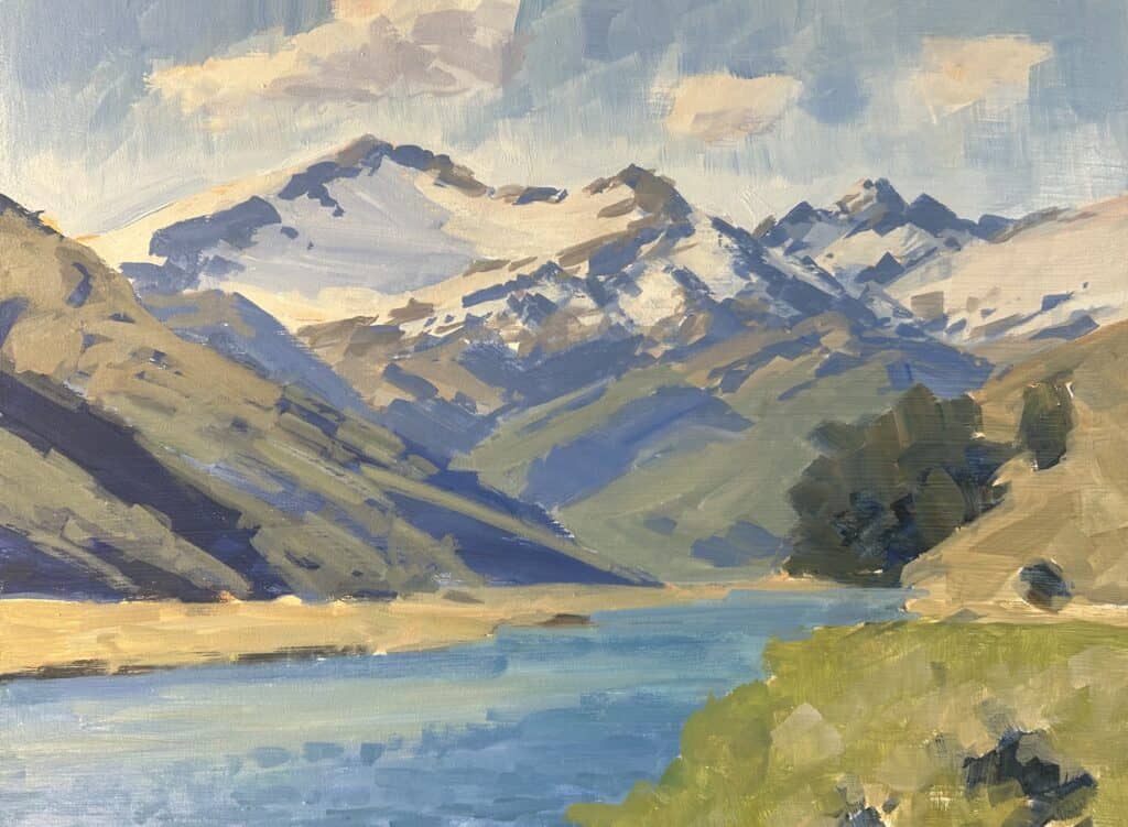
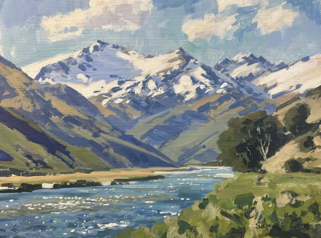
A full view of the finished Mt Clark acrylic painting, ready for framing!
“The aim of this group as well, apart from the joy of painting, is to help you to improve your artwork quickly so that if you want to, you could have paintings that are good enough to sell or just have paintings that you’d be proud to hang on your wall.”
Paint on!
