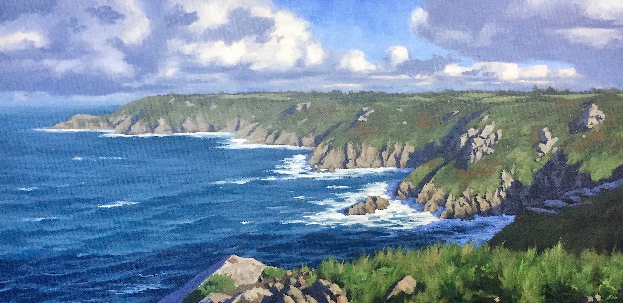
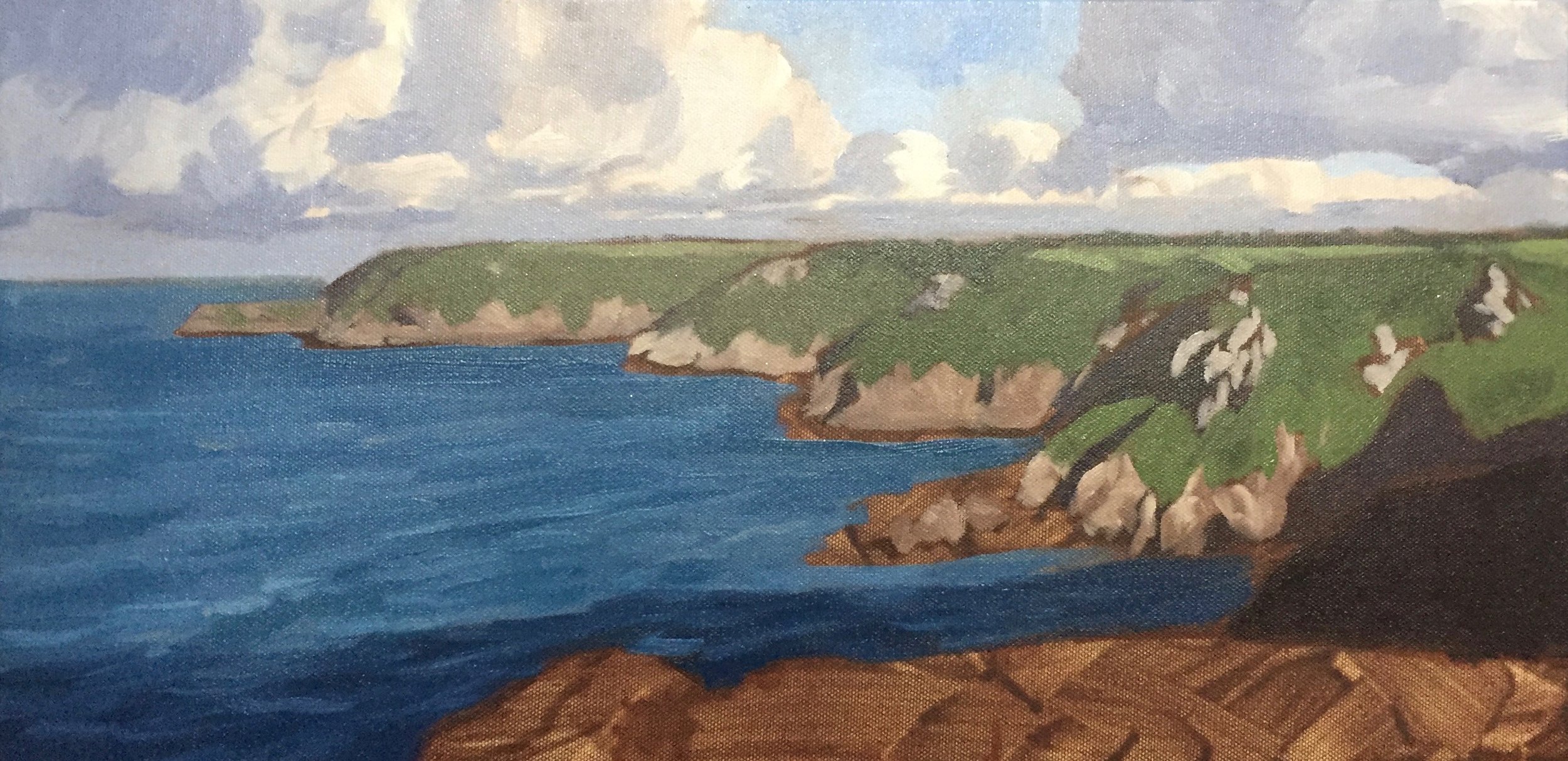
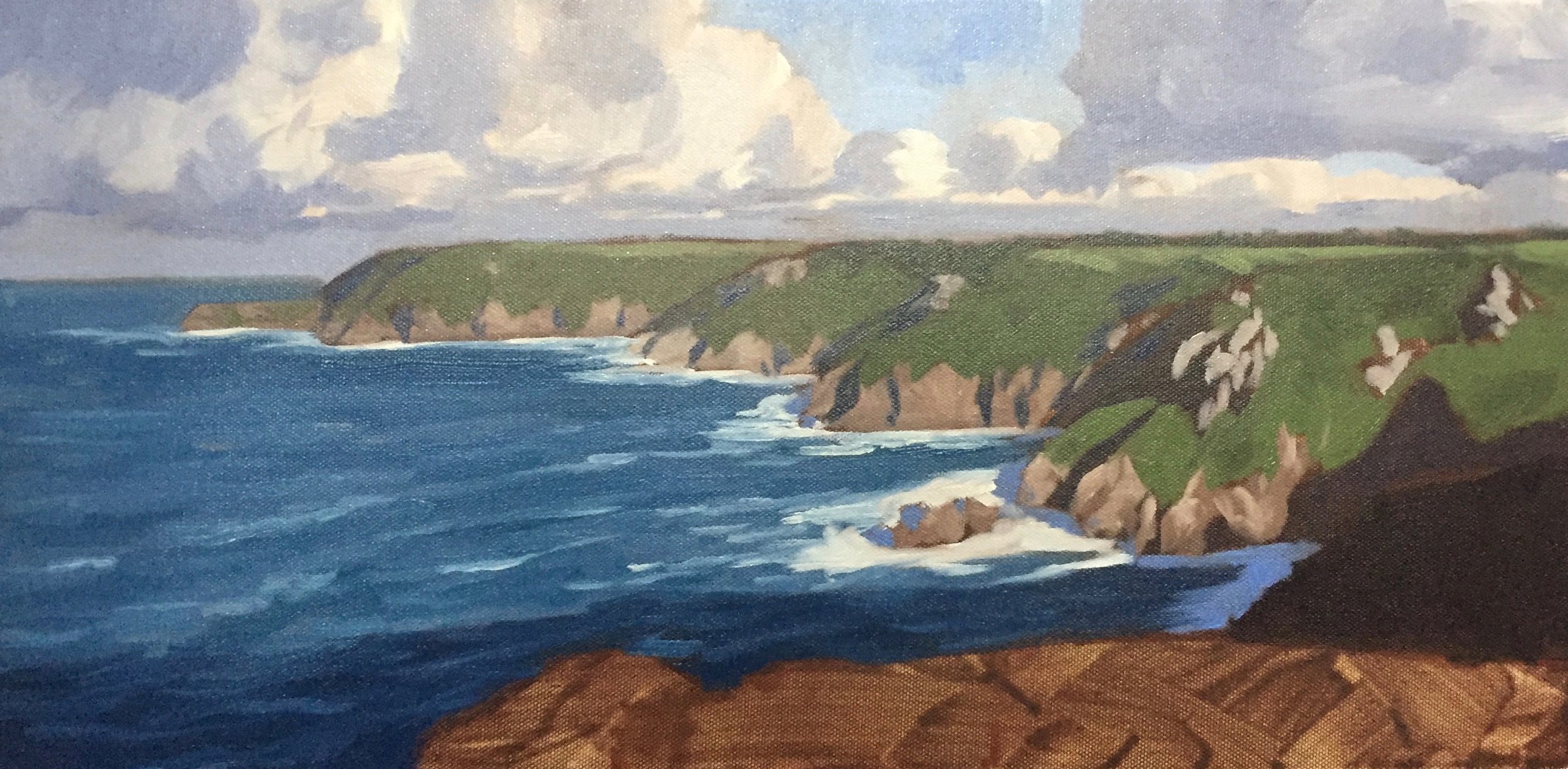
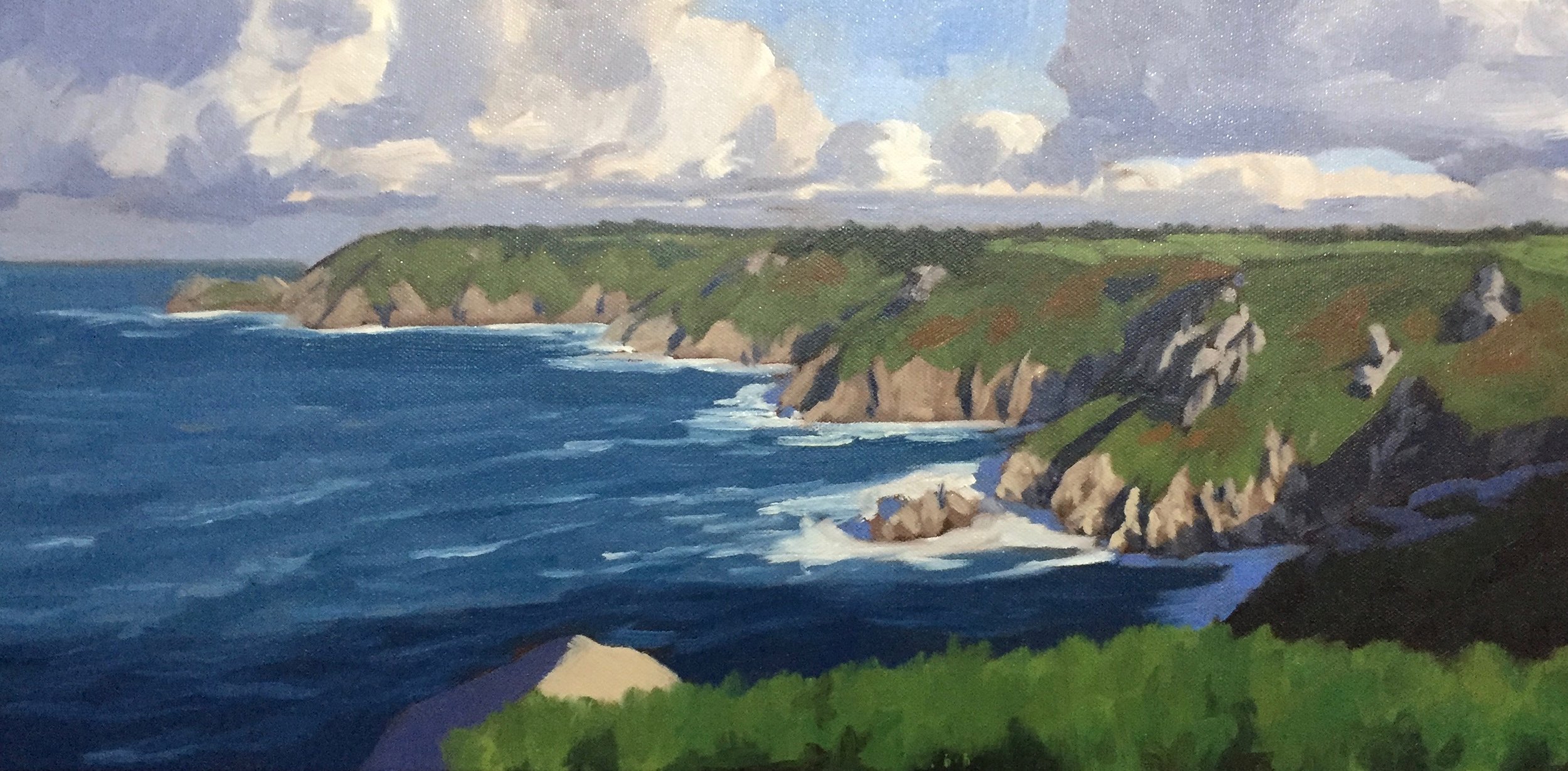
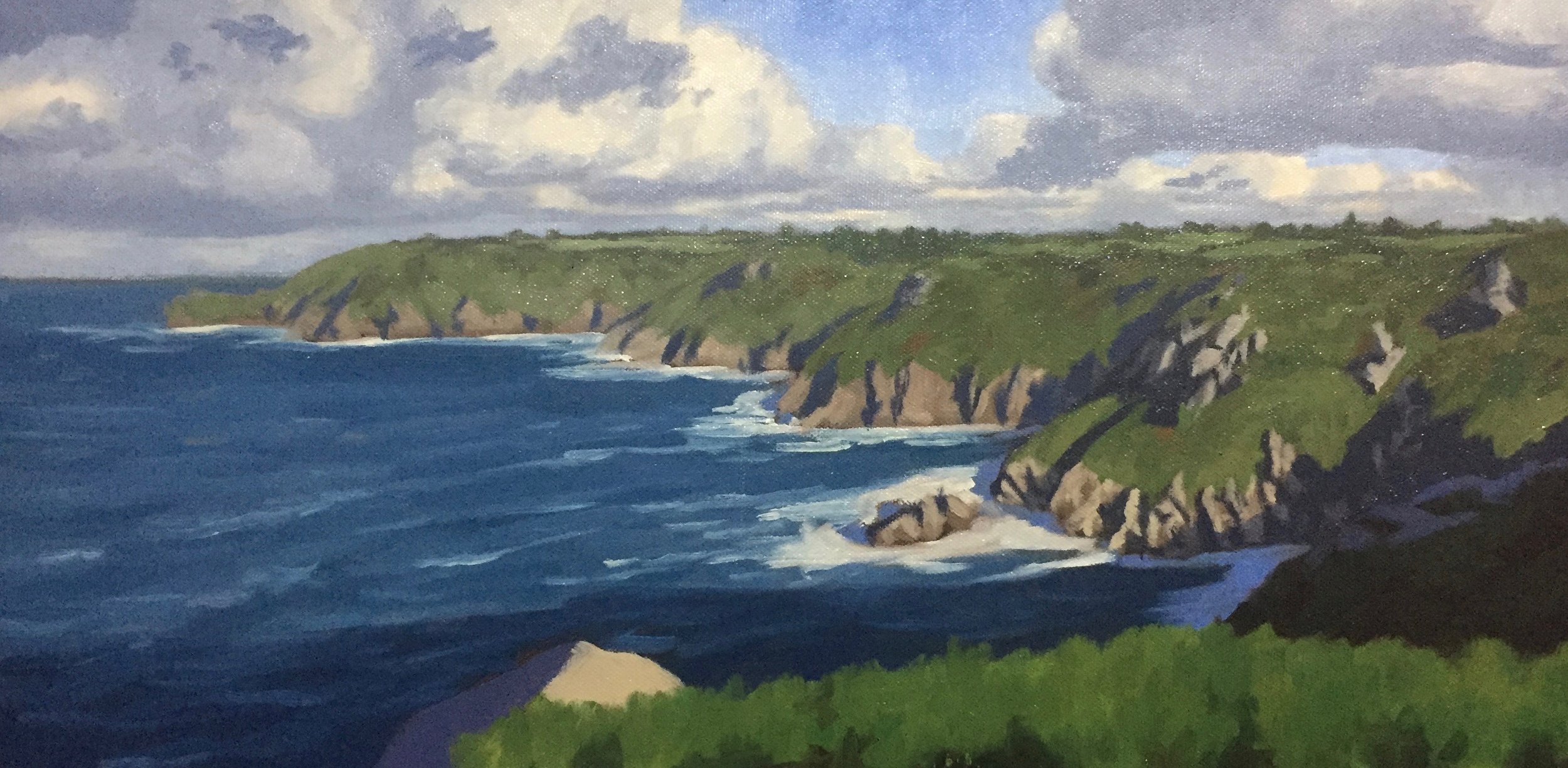
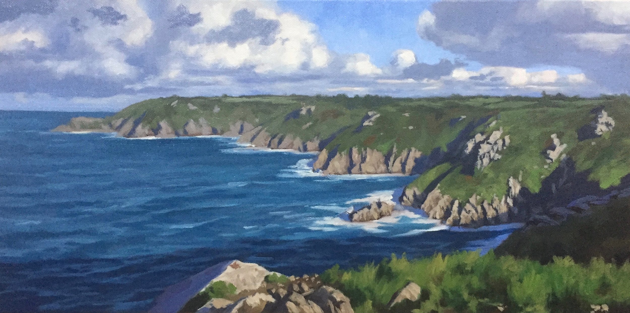
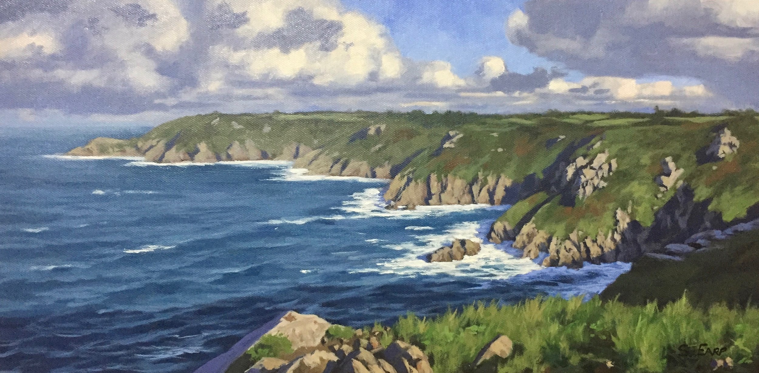
One of the subjects I love to paint most are coastal scenes and for years I have wanted to paint this iconic view of Icart Point on the island of Guernsey, located in the English Channel.
Last year I visited Guernsey as I have a lot of family that lives there, I visited Icart Point and took lots of photos.
I painted Icart Point and in this blog post, I will show you how I created this painting.
Inspiration For This Painting
Icart Point in Guernsey has in my opinion one of the most spectacular views on the island. Guernsey itself is not very big, only 24 square miles and the south of the island has these beautiful cliffs.
I loved the colours of the cliffs, the salmon coloured rocks, the earthy green hues of the foliage and when juxtaposed against the vibrant greenish blue of the Atlantic Ocean, you have the ingredients for a tasty painting.
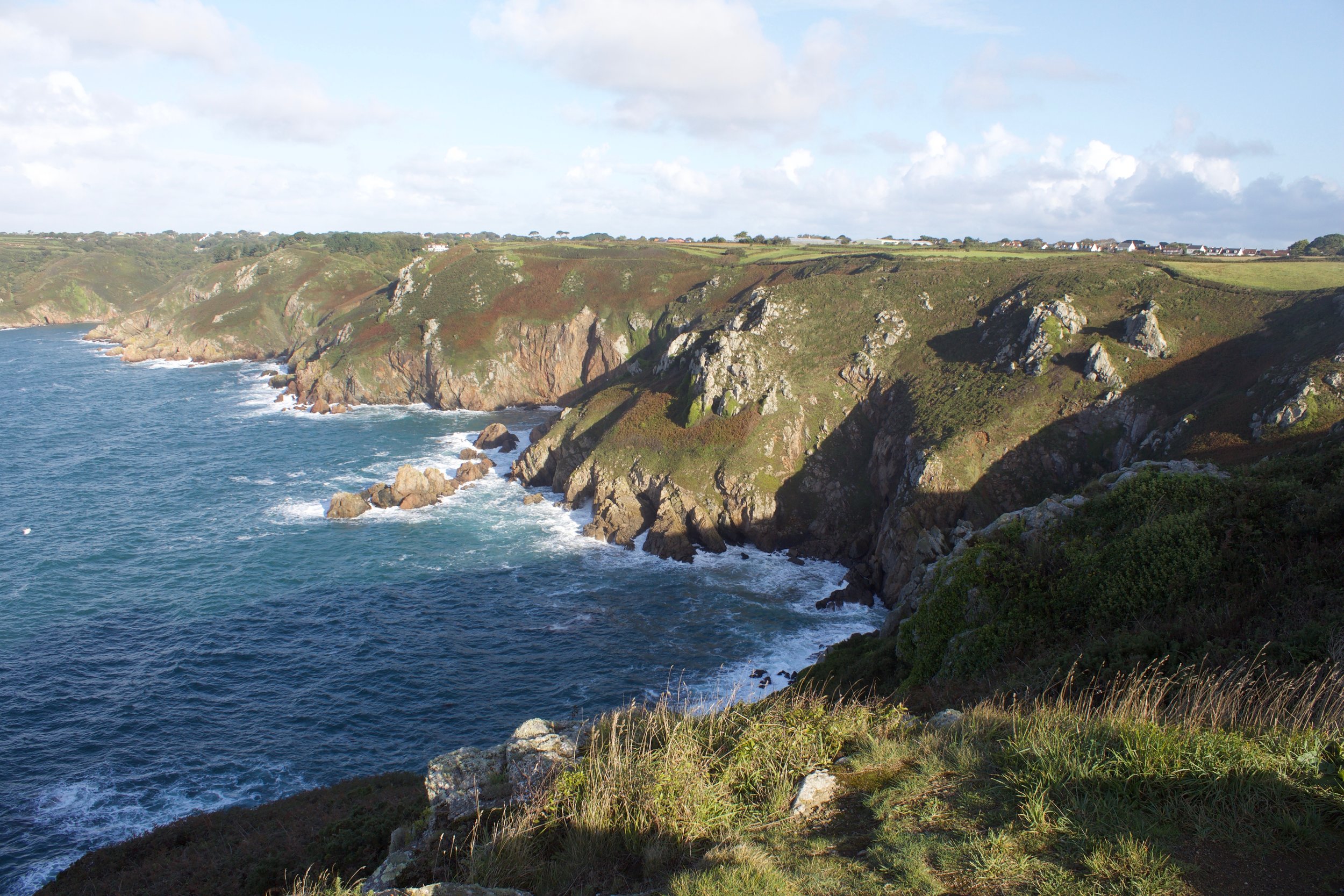
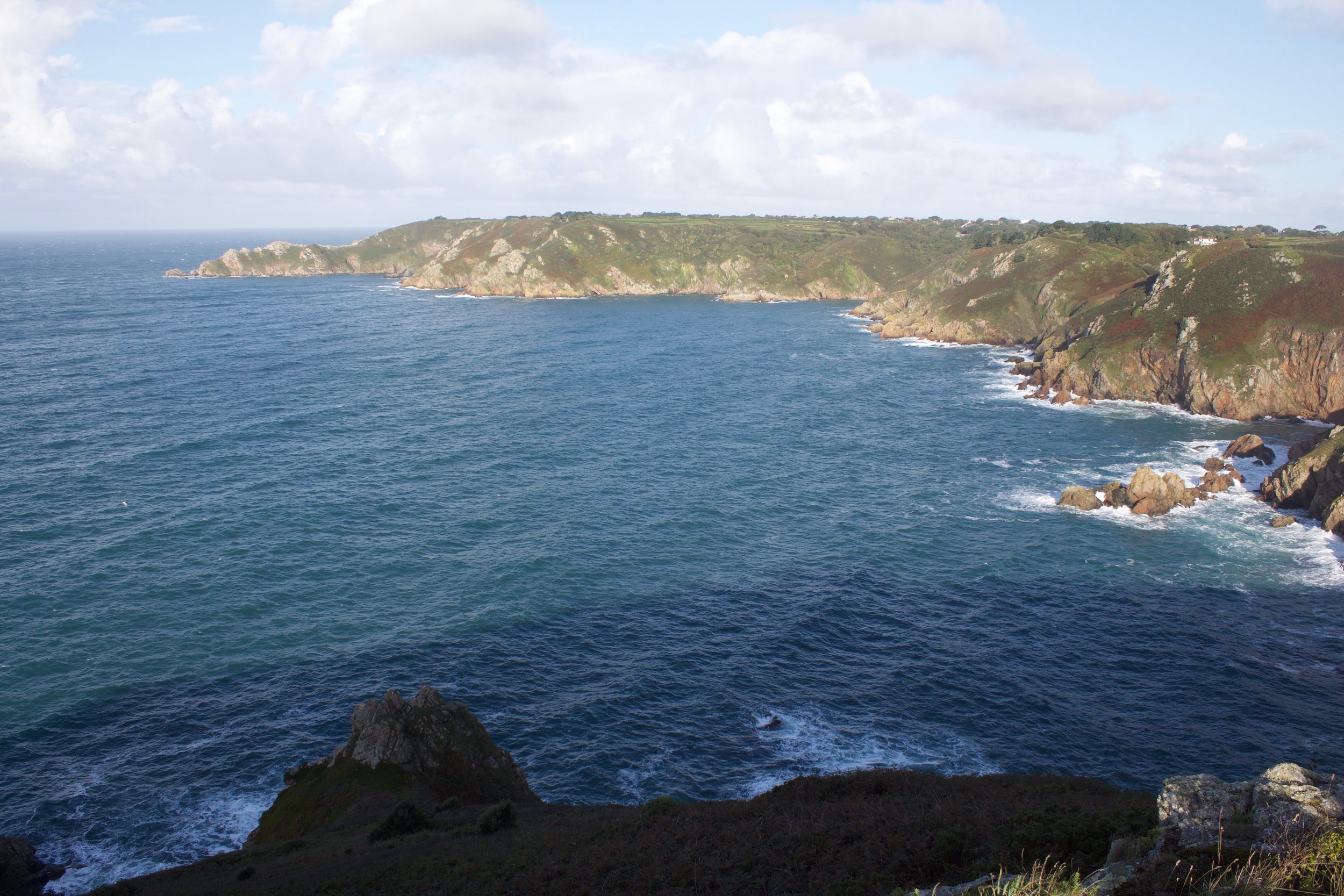
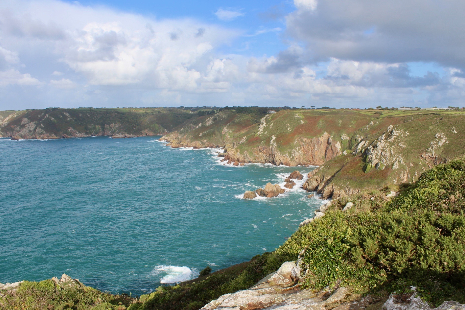
These are some of the photos I used to created this art work, please feel free to use them if you would like to recreate this painting.
In this tutorial I will cover the following:
- Colours
- Brushes
- Composition
- Blocking in the painting
- Adding detail
- Final details
Colours
I painted this artwork using oil paint and the colours I used in this painting are as follows:
- Titanium white
- Burnt sienna
- Yellow oxide
- Cadmium yellow
- Cadmium orange
- Quinacridone magenta
- Ultramarine blue
- Phthalo green
Brushes
Here is a list of the brushes I used in this painting:
- No.8 flat
- No.6 flat
- No.4 flat
- No.2 flat
- No.2 filbert
- No.1 round
- 3/8″ dagger
Paint Stunning Seascapes Step-by-Step
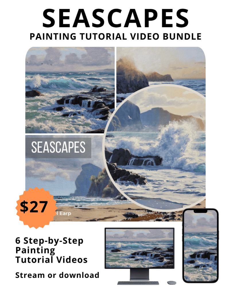
4 x Step-by-Step Painting Tutorial Videos – $27
Composition
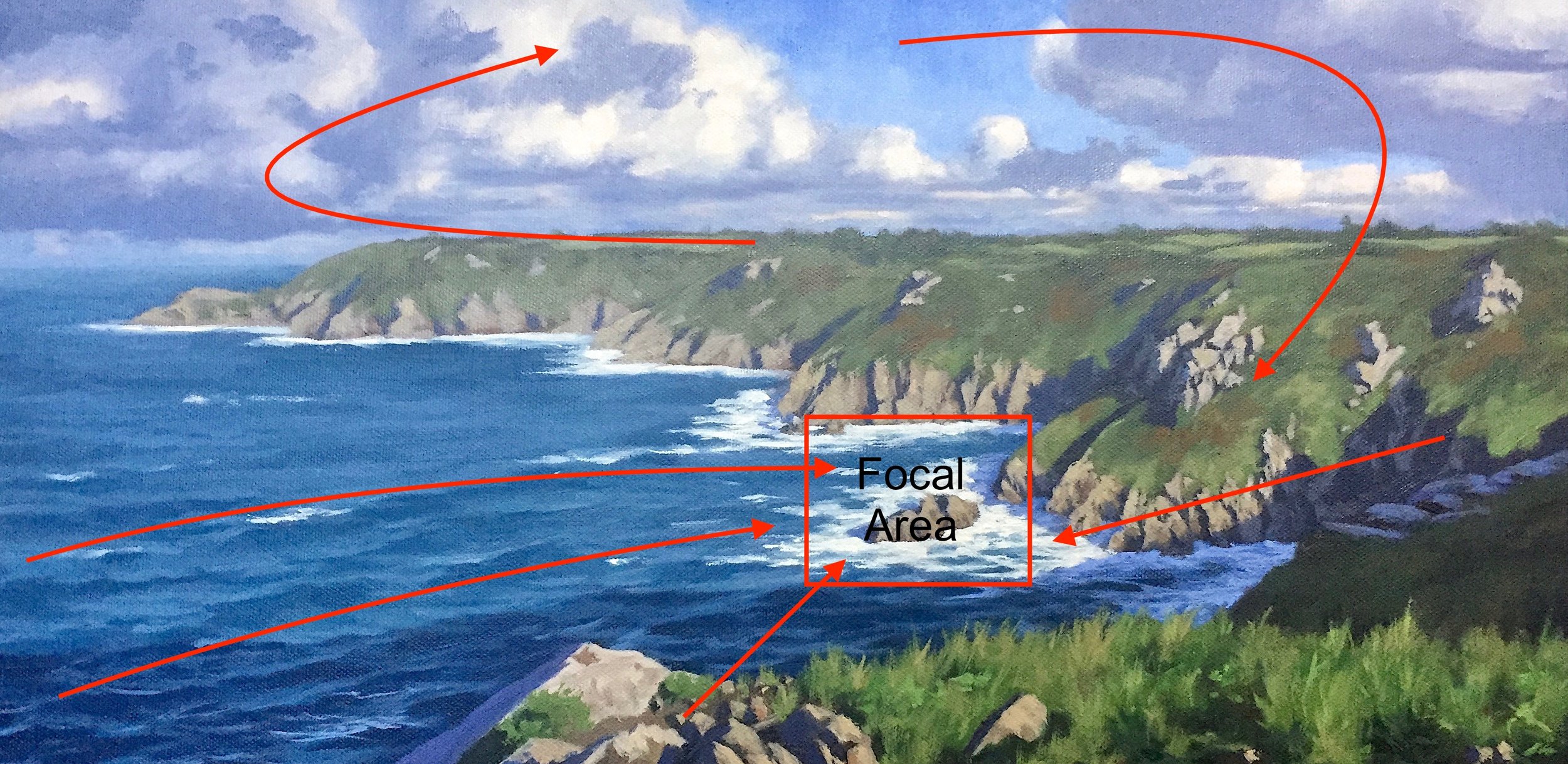
The composition of this view is a bit trick especially as I didn’t want to alter it too much as it is such a well known landmark, however the key to the composition was to have a sense of rhythm in the painting.
I painted this art work on a 25cm x 50cm canvas, and I made the rocky outcrop the focal area of the painting. From there I have added subtle objects and vectors in the painting to lead the eye to the focal area.
As I wanted to include the main form of the cliffs of Icart Point and give the view a sense that they are standing on the edge, I opted for a high horizon. You should never have your horizon line in the middle as it forms a displeasing static in the painting. So either go for a high or low horizon.
The cliffs in the mid ground on the right and rocks in the foreground subtly lead the eye towards the rocks. I painted the direct of the clouds so the will ultimately lead the viewers eye back towards the focal area. Finally the direction of the waves in the main body of the ocean also leads the eye to the focal area.
Before I began the painting I sketched out the composition and then a final sketch. I’d always recommend sketching before you begin a painting so you can create a good composition before you start.
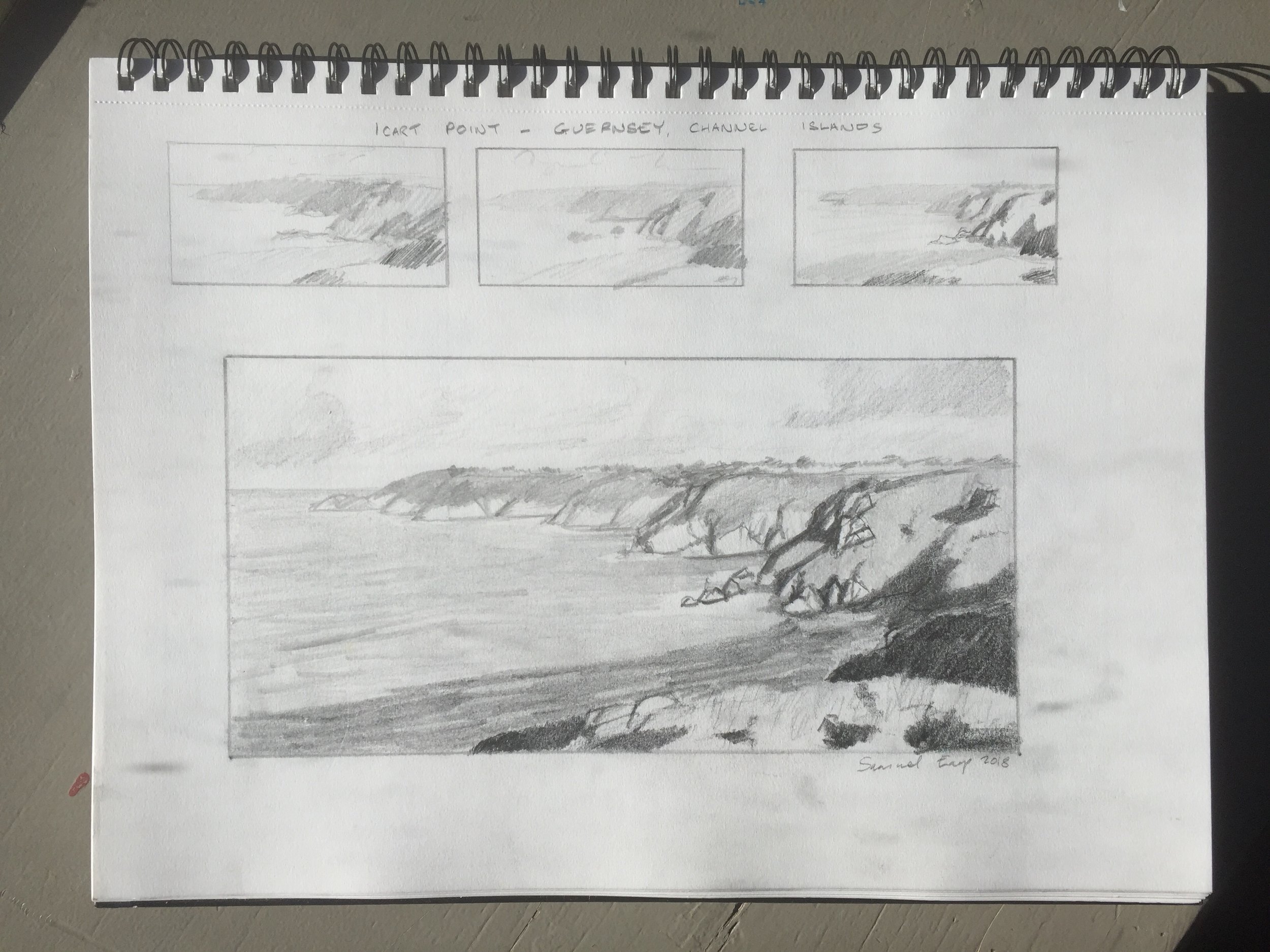
Following the sketch, I then did a small colour study to make sure the painting would work before starting the final painting.
Blocking in the Painting
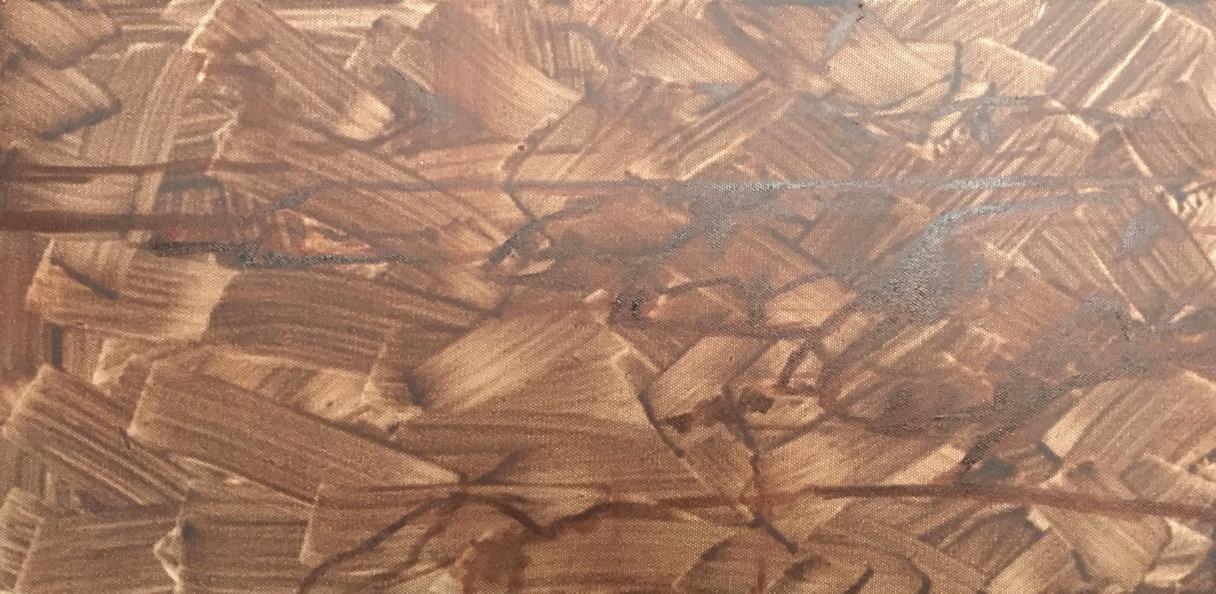
I’m using a 25cm x 50cm canvas. I prepared it with a layer of burnt umber which helps with tone and colour. Now I prepared a whole batch of these canvas’s months ago and I mainly use either burnt sienna or burnt umber for an under painting, however I will not be using burnt umber in this painting.
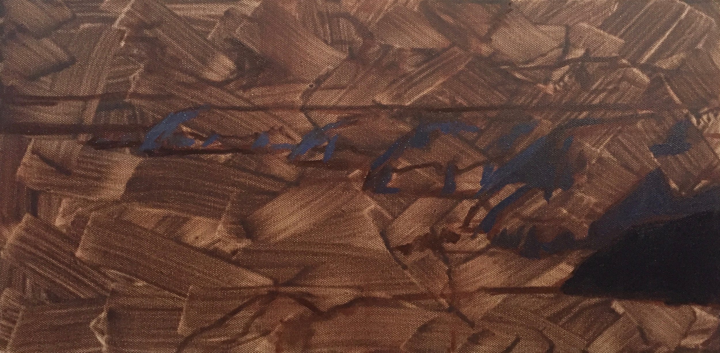
I sketch out the composition with a No.1 round brush using burnt sienna.
In order create a looser feel with the painting I carried out the entire blocking in process with a No.6 flat brush. I prefer using bigger brushes as I can cover more ground quickly and have a more vibrant feel to the painting.
One thing you may notice about the cliffs in the photos is that there are not many shadows as the sunlight is shining directly on them. I was drawn to the colours of the cliffs and sea, but in order to create a bit more of a 3D effect and to make the painting process easier, we do need some shadows.
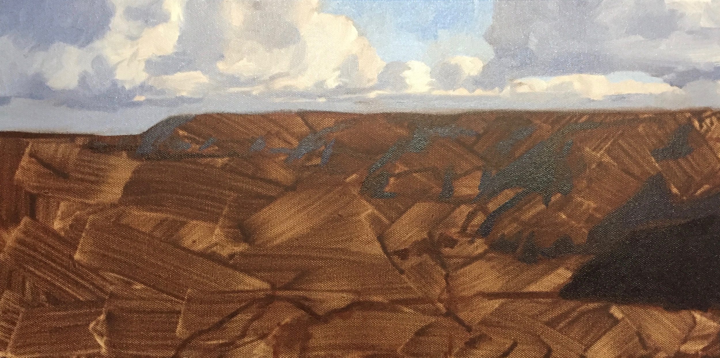
I have added a bit more shadow to the scene and made some of the bigger to communicate the forms of the cliffs. I start by blocking in my shadow mixes using a combination of ultramarine blue, burnt sienna, quinacridone magenta and titanium white. As the paint the cliffs that are further in the distance of the scene I lighten the tone by adding more titanium white to my mix.
Burnt sienna and ultramarine blue are the basis of my palette.
Having established the darkest values in the painting I move on to the sky. I want to keep the colours in the painting as cohesive and harmonious as possible, so I use the same colours I used in the cliff shadows as I do for the cloud shadows. Again I mix a combination of ultramarine blue, burnt sienna, quinacridone magenta and titanium white but I use much more titanium white.
For the cloud highlights I mix titanium white with a little burnt sienna, yellow oxide and titanium white, but I also allow this colour to mix in with my cloud shadow colours in order to keep the tone reduced. This will then help me to make a 3D looking cloud when I add my final marks to it with lighter tone. I will save my lightest tones towards the end of the painting.
I paint the sky with ultramarine blue and titanium white. In general I am trying to keep it simple with the colour mixing by using fewer colours. The benefits of this is that the colour mixtures look cleaner.
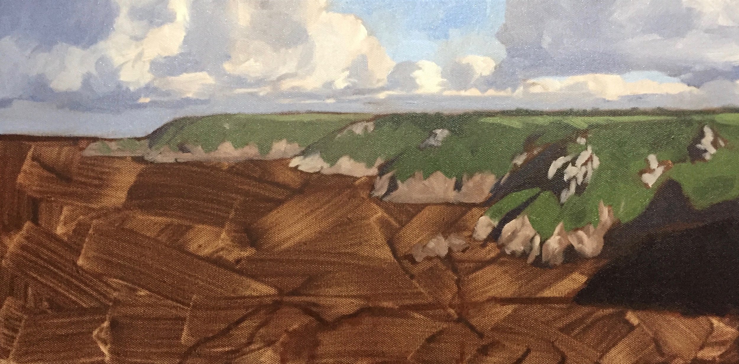
I paint the rocks and the cliff faces using a combination of burnt sienna, ultramarine blue and yellow oxide. I add more ultramarine blue to desaturate the colours and the burnt sienna prevents green been created in the rocks.
I use less ultramarine blue in the mid ground rocks to increase the saturation of the colour.
Next I paint the foliage and grass in the mid ground cliffs using a combination of ultramarine blue, cadmium yellow, cadmium orange, yellow oxide. The yellow oxide and cadmium orange helps to earth the greens and make them look more nature, it also reduces the chroma a little.
For the cliffs in the background I need to desaturate my greens others wise they’ll jump forward in the painting so I use much less cadmium yellow and more yellow oxide. I also mix ultramarine blue and instead of using cadmium orange I use burnt sienna instead which helps to desaturate the green. The red in the burnt sienna being the opposite to green cancel each other out.
Now for the sea, now you may be wondering how you would paint a large body of water and not get bogged down in the complexities of the waves and light hitting the water. Well, I keep it simple!
First of all I mix the colours which are primarily ultramarine blue with a little yellow oxide and titanium white. For the areas of the water that are in shadow I used the exact same colours, just less titanium white.
So how do you make the sea look likes its moving? I’ll explain. Think of think of the waves and ripples in the water like mini hills, the backs of the wavelets and ripples are reflecting the light in the sky, so the tone will be lighter, the front of the waves are reflecting the much darker tones in the cliffs so are darker.
Using a No.8 flat brush, I loosely mark in the form or the waves and ripples using a combination of ultramarine blue with a little yellow oxide and more titanium white. the I reinforce the shadows by using my original sea mix, ultramarine blue with a little yellow oxide and titanium white but I also add a little phthalo green into the mix too.
When painting a large body of water like this, you don’t want to have too much detail as you risk creating a distracting composition. By keeping it looser the human brain will fill in the rest of the information.
Next I paint the white water around the base of the cliffs using a combination of titanium white mixed with a little yellow oxide and burnt sienna.
For the whitewater that is in shadow I mix ultramarine blue with a little quinacridone magenta and titanium white.
I finish up the blocking in stage of the painting by adding the grass in the foreground. Here my greens will be at their most saturated as they are closest to the viewer and I mix this with cadmium yellow, ultramarine blue and titanium white as my base. I then vary the tone and hue of the mixture by adding yellow oxide or cadmium orange or burnt sienna. I can really kick up the saturation by adding phthalo green.
The shadows of the greens are created with ultramarine blue, phthalo green and burnt sienna. This is where my darkest tones will be.
Adding Details
Following the blocking in stage I allow the painting to dry. Now the fun begins! I revisit the sky and using a No.6 flat brush I rework the areas of the shadows and areas in light. I am using the exact same colours I used in the blocking in stage so the rest of this painting tutorial will focus on the rest of the process where we add detail and refine the painting.
For the cloud highlights I apply lighter tone to create that 3D effects and I’ve opted for dramatic clouds in this painting, I like the edginess and drama it creates in a painting.
I revisit the foliage on the distant cliffs, making tonal adjustments where appropriate. I then begin adding more detail to the rocks by adding lighter tone using a 3/8″ dagger brush. Dagger brushes are great for painting rocks as you can communicate sharp jagged angles.
Next I focus my attention on the sea building up the detail of the waves and ripples adding lighter tone. For the the backs of the waves I am using a No.6 filbert as I can achieve so finer marks with this brush and I reinforce the front of the waves that are reflecting the cliffs with a No.6 flat brush. I am using a combination of ultramarine blue, phthalo green, yellow oxide and titanium white.
Now I spend time on the foreground, at present it looks a bit uninteresting with just grass there so I decided to add a few more rocks and stones. Now normally if I were in a situation where there would be a massive change in the composition I would revisit my sketch book, but I was pretty confident I could I could pull this off so added the rocks and stones anyway.
I painted the shadows of the rocks and stones using a combination of ultramarine blue, burnt sienna, quinacridone magenta and titanium white. For the highlights I used yellow oxide, burnt sienna, cadmium yellow, titanium white and ultramarine blue. I formed the jagged edges of the rocks and stones using a 3/8″ dagger brush.
Final Details
I finish up the painting by adding my highlights and final details at the end of the painting. I make refinements to the clouds adding a bit more highlight and I add highlight using my lightest tones to the white water around the base of the cliffs. For this I am using titanium white with a little yellow oxide. I also add foam to some of the waves in the distant to make it look like there is a swell in the sea.
I add a little more lighter green into the cliffs and add some of the reddish brown foliage using a combination of burnt sienna, cadmium orange, a little quinacridone magenta and ultramarine blue.
I add a little more detail to the grass by applying lighter colour using a 3/8″ dagger brush and flicking it upwards in the direction of the grass blades. Again I haven’t gone too detailed as the human brain will fill in the rest of the details.
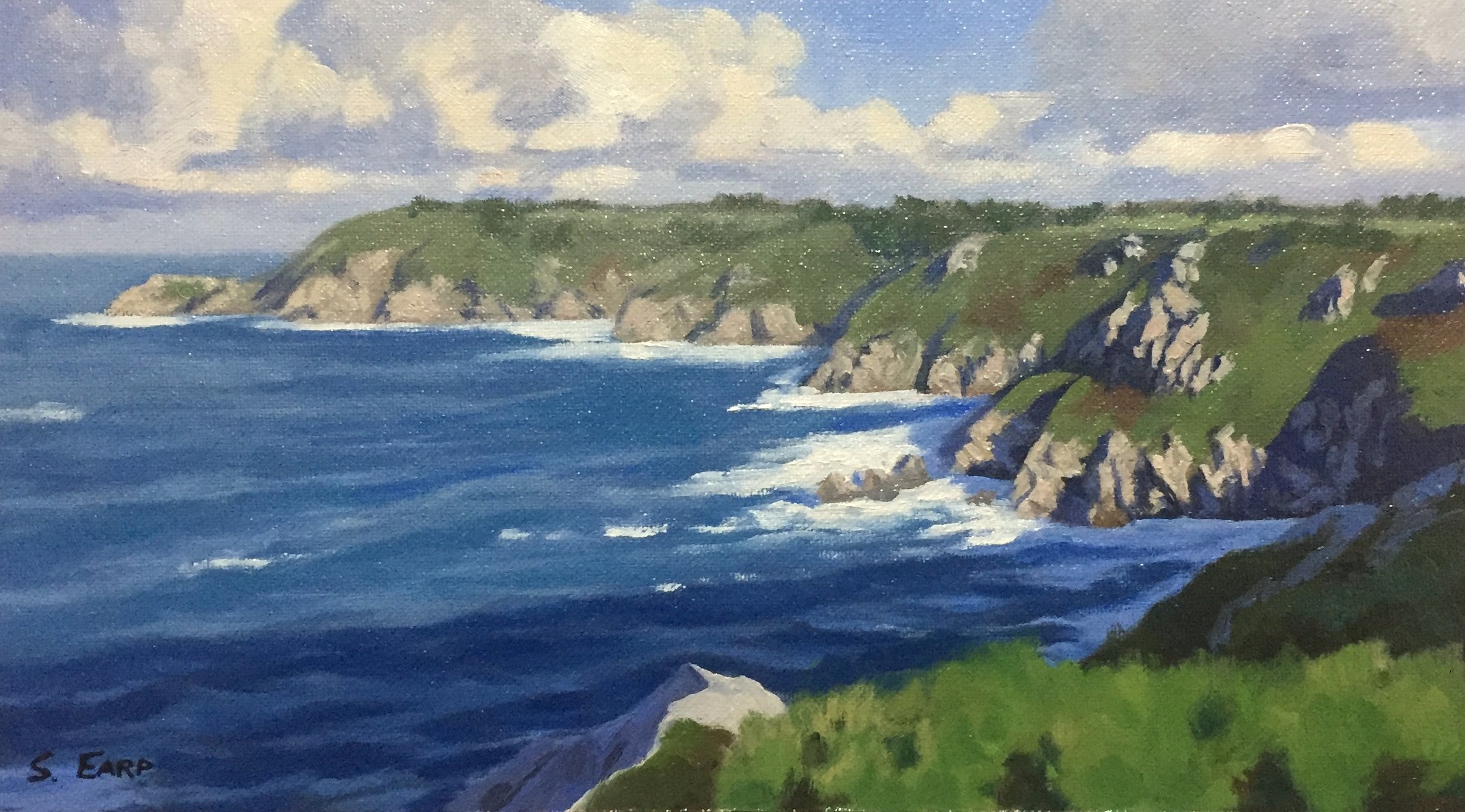
And with that the painting is complete.
Paint Stunning Seascapes Step-by-Step
4 x Step-by-Step Painting Tutorial Videos – $27
Thanks for reading 😊
