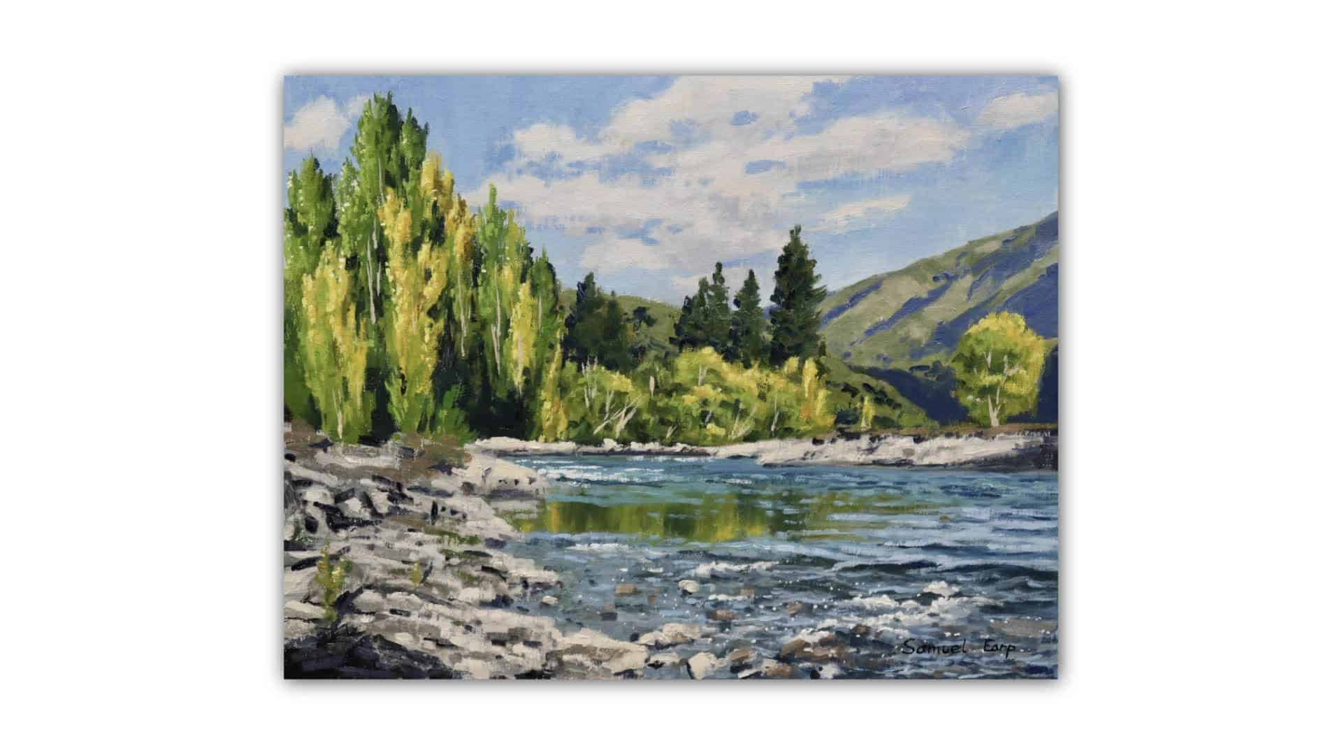
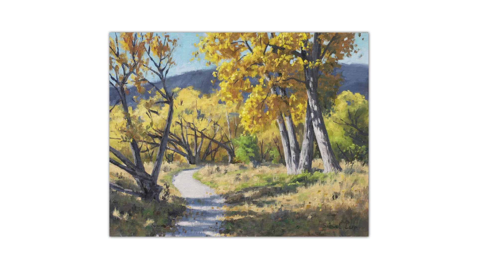
Landscape painting can be one of the most rewarding forms of art. There’s something about trying to capture the mood, colors, and atmosphere of nature on a canvas that keeps artists coming back again and again — I know, because I’ve been doing it for over 20 years! Through my own experience and teaching hundreds of students, I’ve seen some very common mistakes that tend to trip people up in the early days. Sometimes these are small things, and other times they can turn a good painting into a frustrating mess.
In this detailed guide, I’ll walk you through the top five mistakes I see beginner painters making, why they matter, and show you step-by-step how to avoid them. Think of this as the roadmap I wish I’d had when I was starting — helping you create paintings you can truly be proud of.
“I just used to want to get straight into a painting, wasn’t thinking about sketching or any kind of painting design. And whenever I did this, many of my paintings, I’d run into trouble with them.”
— Samuel Earp
Meet Your Guide — Samuel Earp
Hey, I’m Samuel Earp — a landscape artist with more than two decades of experience. Over those years, I’ve sold dozens of original pieces and, more importantly, have taught and helped hundreds of students improve their painting skills.
If you’re feeling stuck in your landscape painting journey, or you want to make sure you’re setting yourself up for repeatable art successes, you’re in the right place!
Let’s dive into the five biggest painting mistakes beginners make, and more importantly, how you can fix them.
Mistake #1: Skipping the Planning Stage
The Problem
It’s tempting to just start painting straight away. You get the itch, set up your canvas, and dive right in without a sketch or much thought. After all, you just want to paint, right? I’ll let you in on a secret: I made this mistake for years. Every time I skipped planning, my paintings almost always ran into trouble. Sometimes the composition didn’t work. Other times, the values were off or there just wasn’t a cohesive design.
Result:
You spend loads of time on a painting, only to hit dead ends or give up halfway through. It’s immensely frustrating and can make you doubt your abilities.
Why Planning Matters
Good planning = repeatable success.
Think of planning as laying the foundation for a building. If you skip it, everything on top gets shaky.
Composition Woes
A painting without a plan often ends up with:
- Awkward layouts
- Kicked-off balance
- Foregrounds that don’t fit the mood
- Focal points lost in the noise
Tonal Values All Over the Place
When you don’t plan, your values (the lights and darks) are random. This makes everything look flat and lifeless.
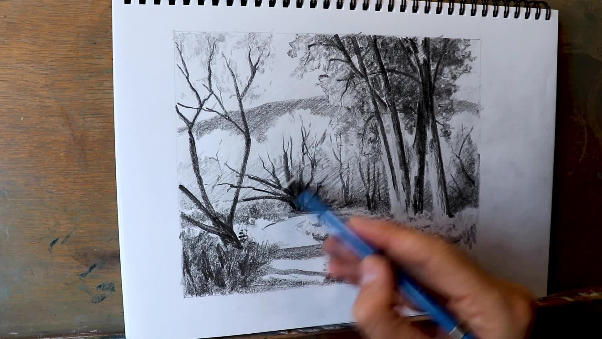
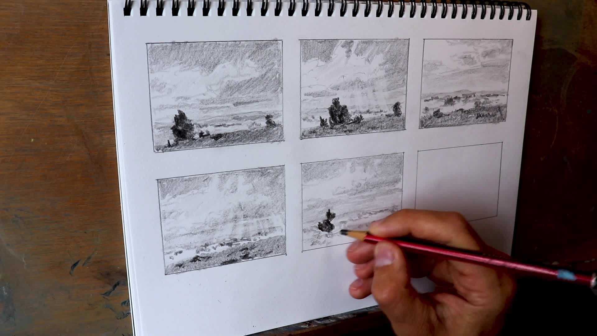
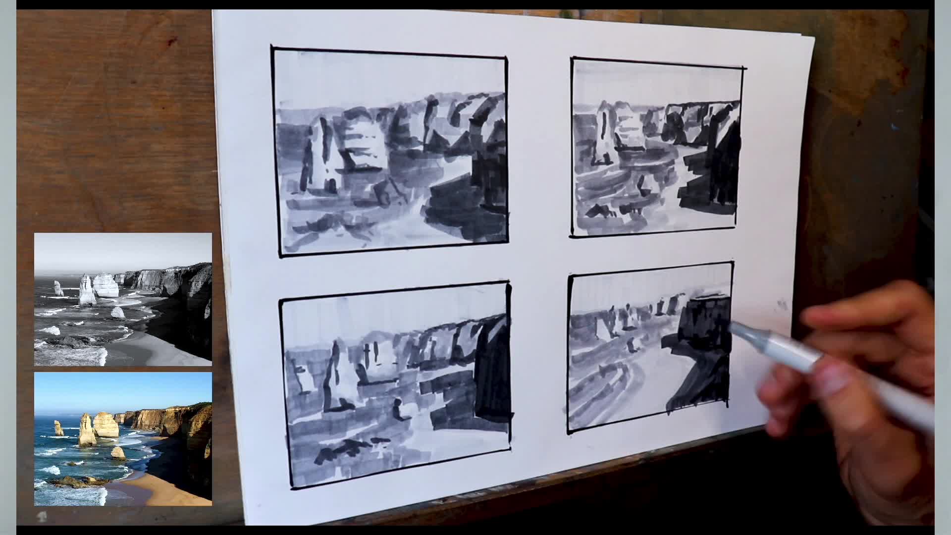
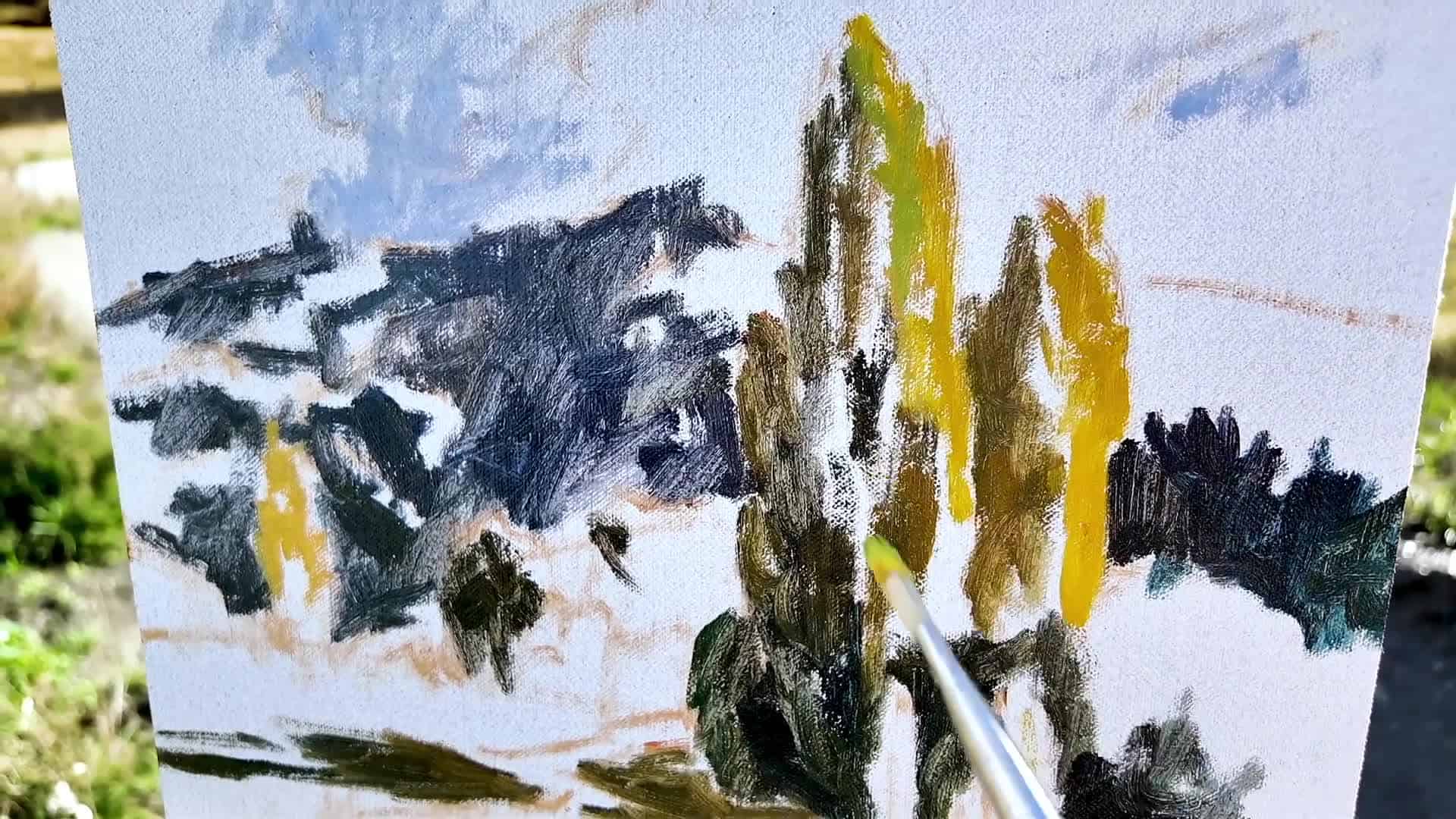
The Solution: Sketching and Thumbnail Studies
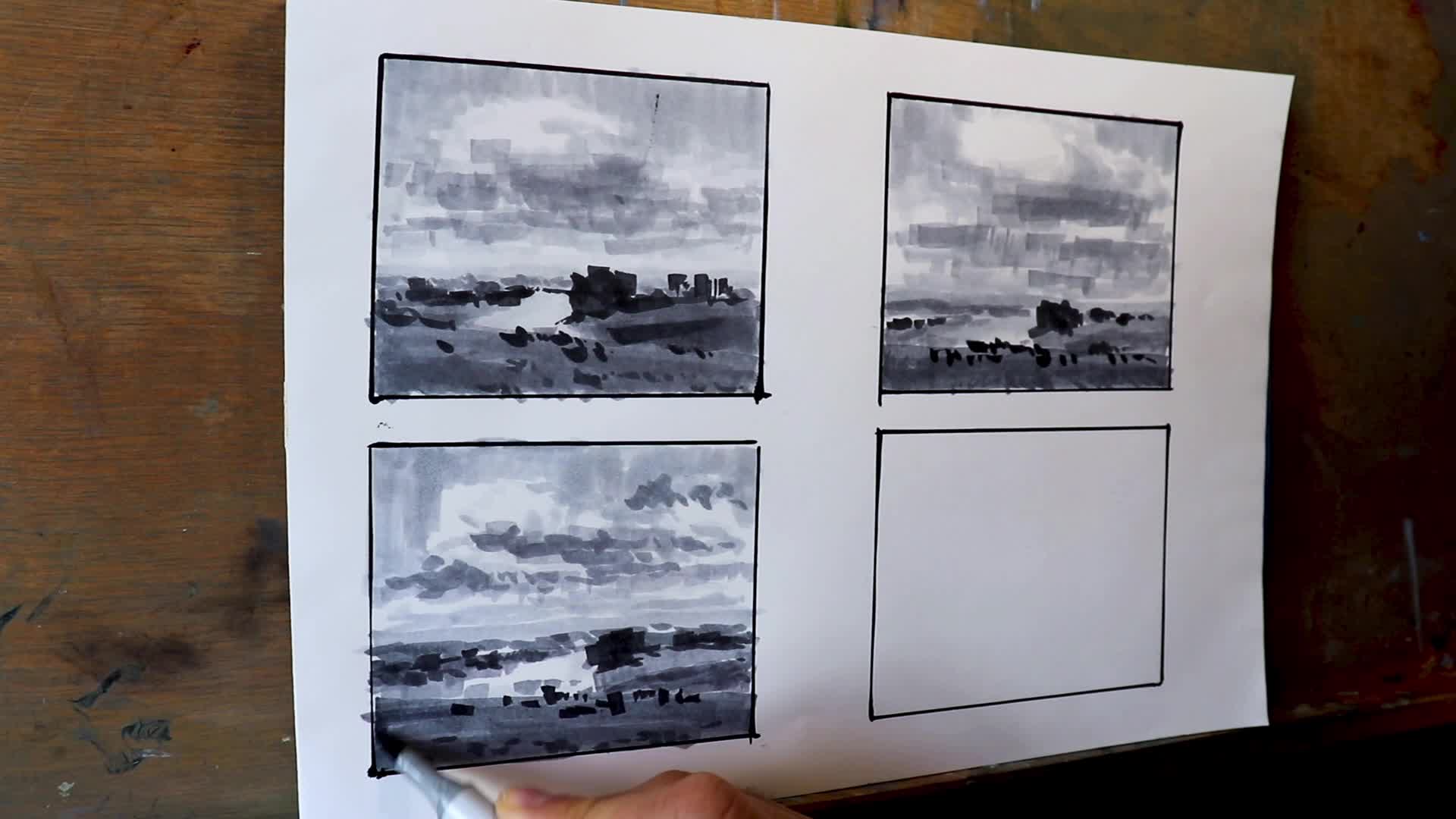
Start with simple sketches. Don’t worry, these don’t have to be masterpieces! I usually whip up thumbnail sketches — just quick, 10-minute pencil or marker pen drawings that explore composition ideas.
How To Practice Planning
- Use Pencil, Marker, or Digital Tools
I love using a range of grey-tone markers these days, but a sharp pencil or even a digital tool like Procreate works great. - Go Small
Use an A4 (8.5 x 11 inch) paper and fill the page with up to six tiny sketches. - Experiment With Values
Try using different pencils (4H, 2B, 8B, etc.) or grey markers to mock out the lightest to the darkest spots in your potential painting. - Do a Master Sketch
Take the best thumbnail and flesh it out into a bigger sketch — this becomes your painting “blueprint”. - Draw The Design Before Every Studio Painting
This crucial habit changed my painting forever. Once I started, my compositions improved overnight.
Example of thumbnail and master sketches for landscape planning.
Key Benefits
- Improves Drawing Skills: Since you’re practicing drawing shapes and layouts, your drawing confidence skyrockets.
- Boosts Tonal Value Sense: You start to “see” where the darks and lights should go even before you mix paint.
Mistake #2: Not Understanding Tonal Values
The Problem
Beginner artists often struggle with making their paintings pop — everything just looks flat, no matter how vibrant the colors are. When you don’t understand tonal values (how light or dark things should be), landscapes lose all sense of space and depth.
Visual example comparing flat-value (left) to strong-value (right) landscape painting.
What Are Tonal Values?
Put simply: Tonal value = how light or dark an area is.
In landscapes:
- Darkest darks and lightest lights: Usually in the foreground
- Darks less dark, lights less light: The farther into the distance you go
This is one of the easiest rules to remember and will make your paintings instantly more believable.
Why Tonal Values Matter
Even with bad color choices, if your values are right, your painting reads well.
But if your values are wrong, all the best color in the world won’t save it.
Building Tonal Value Awareness
How to Learn Values:
- Sketch the Landscape
Keep sketching with pencils or marker pens before you paint. Use the full range from light to very dark. - Try Limiting Yourself To Black-and-White Studies
This strips away color and forces you to see value only. - Refer to John Carlson’s Four-Value System
From “Carlson’s Guide to Landscape Painting” — a real classic!The Four Main Value Zones:- Sky: Among the lightest values
- Ground Plane (grass, fields): Also quite light
- Slants (mountainsides): Move darker
- Upright Planes (trees, buildings): Darkest values
Diagram showing Carlson’s four value zones in a landscape.
“If you get your tonal values correct, it doesn’t matter so much if your colors aren’t on point. You can still create depth and distance with good painting tonality.”
— Samuel Earp
My Own Experience
I was so stubborn about this for years — trying to figure it out using trial and error, sure that I could wing it. Only when I started focusing on tonal value did my work start to come alive. Trust me, understanding values will make every other part of painting easier.
Mistake #3: Overusing Saturated Colors
The Problem
It’s fun to load up the palette with all those brilliant, juicy tubes of paint. But beginners often make the mistake of trying to use every color in its brightest, most saturated form, no matter where it sits in the scene.
The result? Unnatural, sometimes eye-searing paintings that look harsh and amateurish.
Why It’s Common
- We all want our paintings to “pop”, so it’s natural to reach for maximum intensity.
- Many beginners don’t know how to desaturate (knock back) a color, or when to.
How Color Saturation Works in Landscapes
Most saturated (colorful) areas:
- Always in the foreground (closest to the viewer)
Colors lose intensity as they move to the distance
- This is called chroma drop-off
Especially true for:
- Greens
- Yellows
- Reds
Side-by-side swatches: saturated foreground hues vs muted background hues in a landscape painting.
Solutions For Managing Saturated Color
Two Easy Ways To Desaturate Colors
- Mix With Its Color Opposite (On the color wheel)
- To tone down green, add red (or a color that contains red).
Example: Mix a little alizarin crimson or burnt sienna into your green.
- To tone down green, add red (or a color that contains red).
- Mix With White
- This will lighten and desaturate — but be careful, as it raises the value.
Cultivate Basic Color Theory
Just understanding a bit about the color wheel — what the opposites are — will help tremendously. It all circles back to understanding the interplay of value and color.
Pro Tips
- For Distance, Use Lower-Chroma Colors:
My go-to’s are yellow ochre, burnt sienna, ultramarine blue, and titanium white.
You can mix almost any distant-landscape color with these few paints.
Painting demo showing chroma drop-off from foreground to background.
Mistake #4: Using Too Many Colors On Your Palette
The Problem
Paint stores are a candy shop for the eyes, but just because a color exists doesn’t mean you need to own and use all of them. In fact, too many tube colors can wreck your paintings, giving you muddy, disharmonious results.
What Goes Wrong:
- You buy loads of paint to “cover all the bases”.
- You hope the perfect shade is in there somewhere, just waiting to be squeezed out.
- In reality, the more colors you use, the more chance you’ll lose control over harmony.
- Your painting ends up with accidental, clashing colors everywhere.
Create Color Harmony: Less Is More
Color harmony is that feeling when a painting’s colors just “work.” Usually, people can’t even put a finger on why they like it, but the colors just look clean, natural, and unified.
“Often there’s many artists that think they can’t mix the color they want with fewer colors … half the colors that are for sale in art stores, I don’t think you really need them.”
— Samuel Earp
My Palette: A Simple Example
Here’s my typical palette (and I still sometimes think it could be smaller):
- Titanium White- Ultramarine Blue- Cobalt Blue (optional)- Yellow Ochre- Cadmium Yellow- Burnt Sienna- Burnt Umber- Alizarin Crimson- Viridian GreenNote: I could eliminate even more if needed!
Close-up photo of a well-organized minimalist landscape palette.
- When you use fewer colors, you are forced to mix and reuse colors throughout the painting.
- This unites the painting visually, resulting in natural, harmonious scenes.
- You save money and space, too.
Real Student Transformation
One of my students was struggling with harsh, clashing colors. After guiding her to a limited palette, her paintings improved almost overnight — cleaner, more pleasing, and miles more professional.
Mistake #5: Painting With Brushes That Are Too Small
The Problem
It’s easy to think that tiny brushes mean you’ll get “finer” results. In truth, starting a painting with small brushes almost always means you get bogged down in details you don’t need. Your painting becomes stiff, overworked, and confusing — with too much info packed into every inch.
What Actually Happens If You Start Small:
- Every brushstroke takes forever.
- You lose the energy and boldness that makes landscapes sing.
- Your painting feels choked and static.
- It’s incredibly easy to quit before you’re done due to frustration.
The Fix: Go Bold With Big Brushes
Start With The Biggest Brush You Can Handle!
- When I start a painting, I’m reaching for #10 bristle flats (sometimes only those!) even on an 11 x 14″ panel.
- When you block in large shapes with big brushes, you get:
- A pleasing looseness and vitality
- Good brushwork “mystique” that keeps the painting feeling alive
- Speed! You’ll be amazed at how fast you can build the scene
Photo of big bristle brushes next to a blocked-in landscape canvas.
When To Add Detail
- Only after everything else is working, and the painting is dry or touch-dry.
- Then, and only then, grab a small brush for the final sparkles or highlights (maybe a shimmer on water or a highlight on tree leaves).
- Resist the urge to “fix” things with detail at the beginning.
Reality Check
Painting with big brushes might feel awkward at first. You might miss tiny details — but your painting will benefit hugely from the new energy.
How To Put It All Together: Step-by-Step Summary
Whether you’re struggling with composition, color, color mixing, or that elusive sense of depth, mastering these five foundational basics will transform your landscapes.
Here’s the step-by-step rundown:
- Plan Every Single Painting
- Use pencil, marker, or digital sketches
- Do thumbnail studies (idea-planning)
- Work up a master sketch (blueprint)
- Get Serious About Tonal Values
- Observe how lights and darks move from foreground to distance
- Try black-and-white studies
- Think in Carlson’s value zones
- Keep Colors Under Control
- Don’t oversaturate backgrounds/distance
- Learn to mute colors with complements and white
- Simplify Your Palette
- Stick to 7–9 core colors
- Mix, don’t buy, your shades when you can
- Start Big, Finish Small
- Use the largest brushes possible for block-ins and main shapes
- Only add detail at the very end with finer brushes
“Really, one of the next key things is to understand tonal values, the lights and darks in the scene, because this is going to help you to create the depth and distance in your paintings.”
— Samuel Earp
Bonus: Download My Free Landscape Painting Blueprint
Still feeling overwhelmed? Want to see exactly how I structure every painting from start to finish? I’ve put together a totally free resource that outlines my entire process — from thumbnail sketch to final brushstroke.
- Includes: My system, tools, and checklists so you can step through each part with confidence.
- Get it here: Download the Free Landscape Painting Blueprint (just click the link and I’ll send it right over!)
Mockup of the eBook cover: “Landscape Painting Blueprint.”
Final Thoughts and More Resources
Painting landscapes is an adventure — one that gets more fun and satisfying as you build skill. Remember:
- Everyone makes these mistakes. Even after years, it happens! The key is to spot them early and course correct.
- Have a process. A regular system or workflow is what helps you get repeatable results instead of relying on luck.
- Keep experimenting. Planning, values, color, and brushwork are never “finished” skills — they just keep getting deeper.
Want to keep learning?
Check out my in-depth video on landscape painting for even more tips and practical demonstrations: Watch Here
If you found this guide helpful, consider sharing it with other budding artists or leaving a comment below about your own biggest struggle as a painter. Thanks for reading, and happy painting — I’ll see you out there with brush in hand!
Ready for your next breakthrough? Grab your painting gear, a couple of big brushes, and leap in with confidence. The landscape is waiting for you!
Inspirational photo of an artist painting en plein air with distant hills in the background.
Tags:
#landscapepainting #arttips #beginners #paintingmistakes #arttutorials
