Painting Workshop No.11 – Rees Valley
Lesson Notes
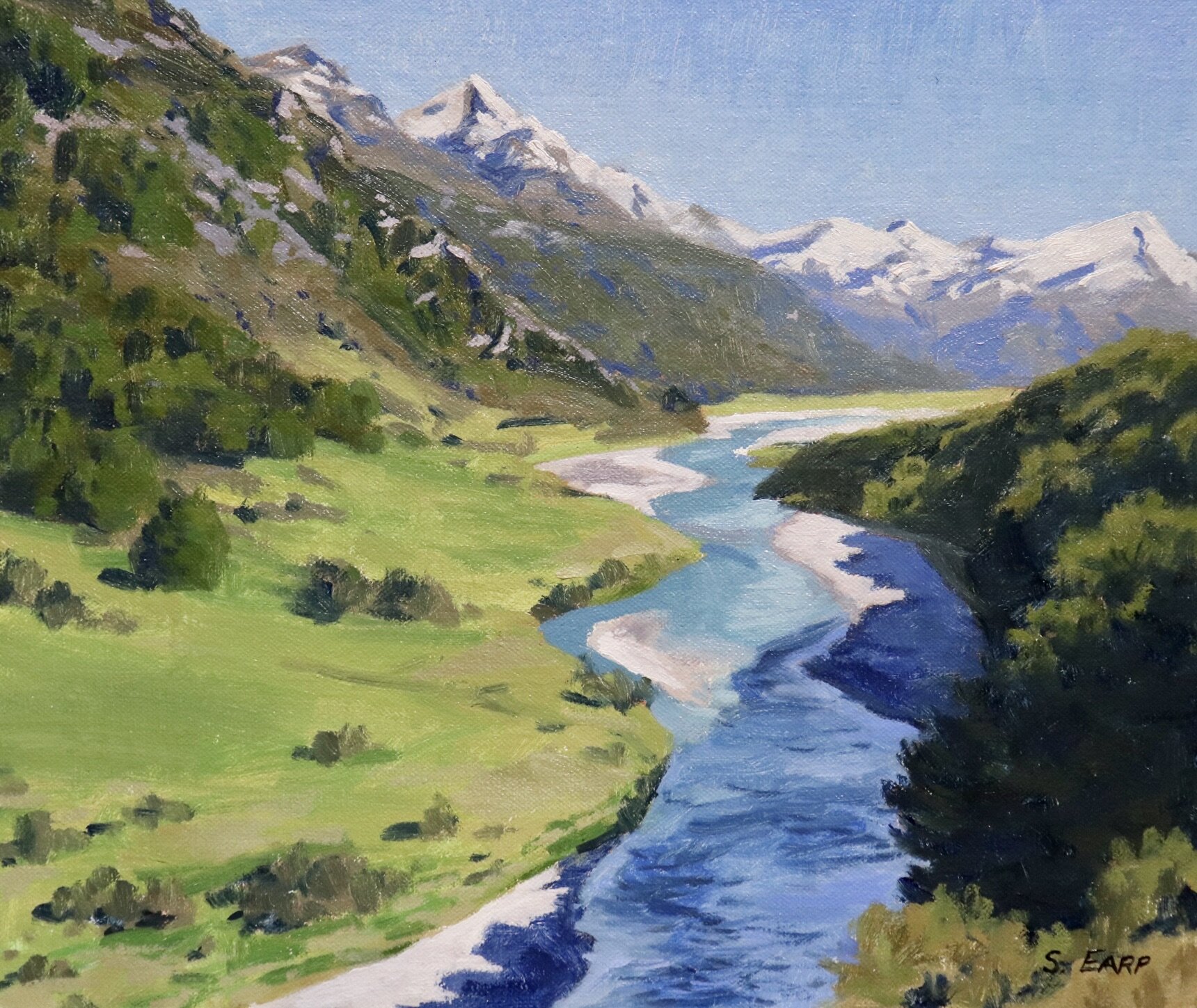
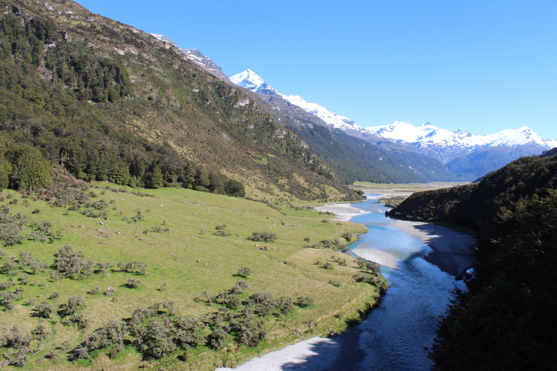
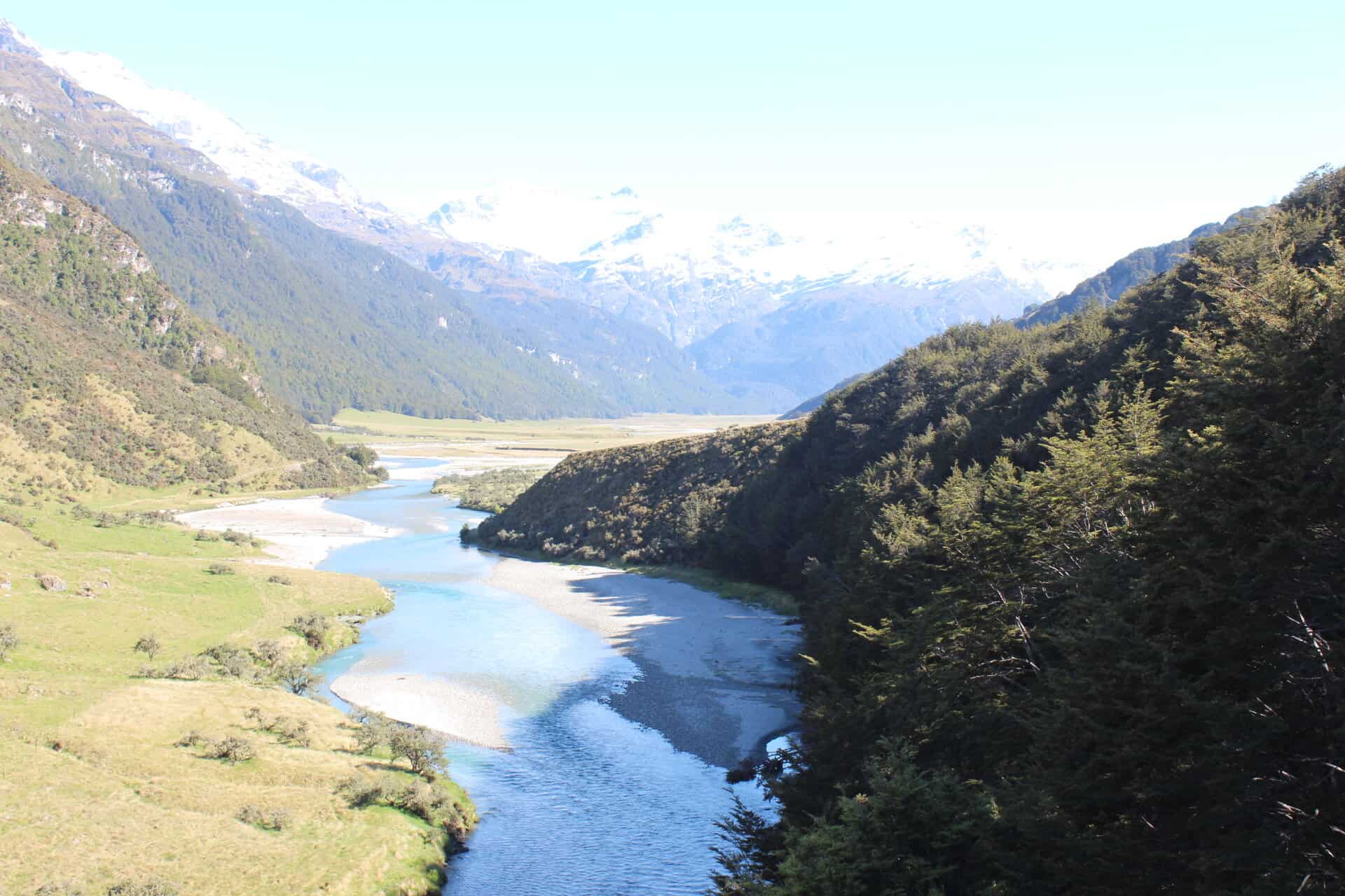
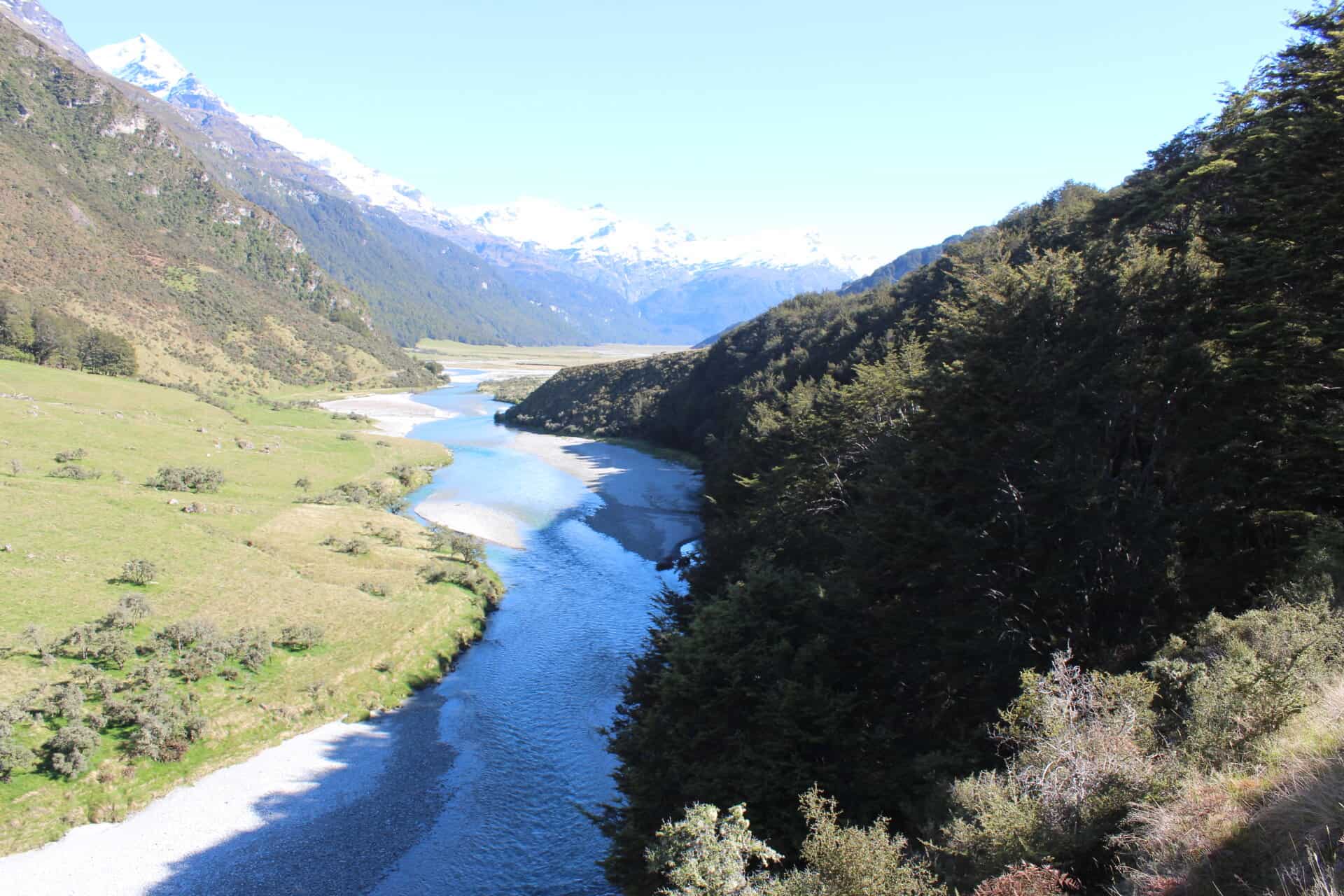
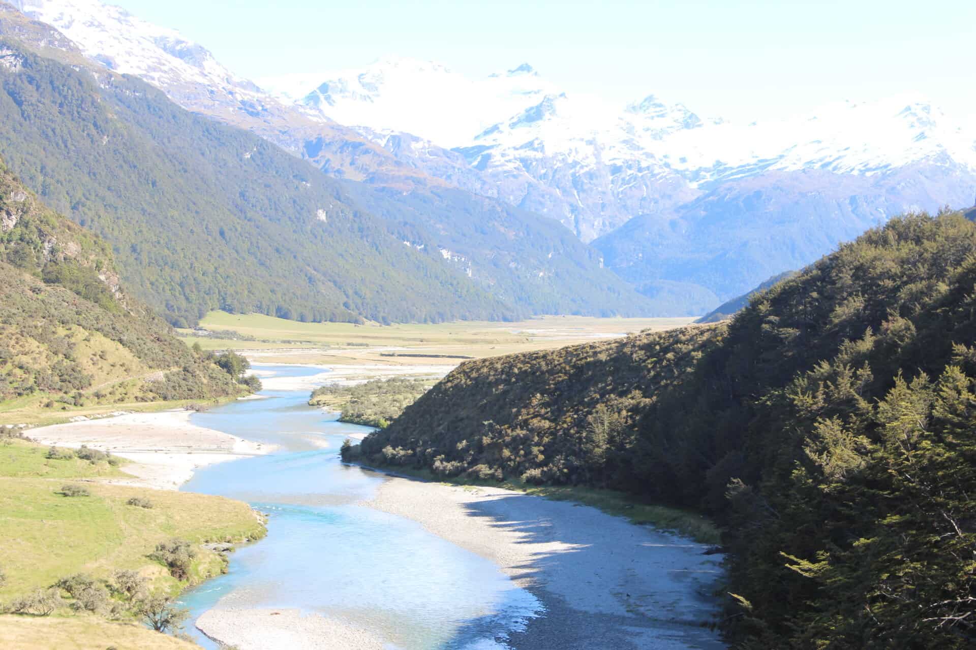
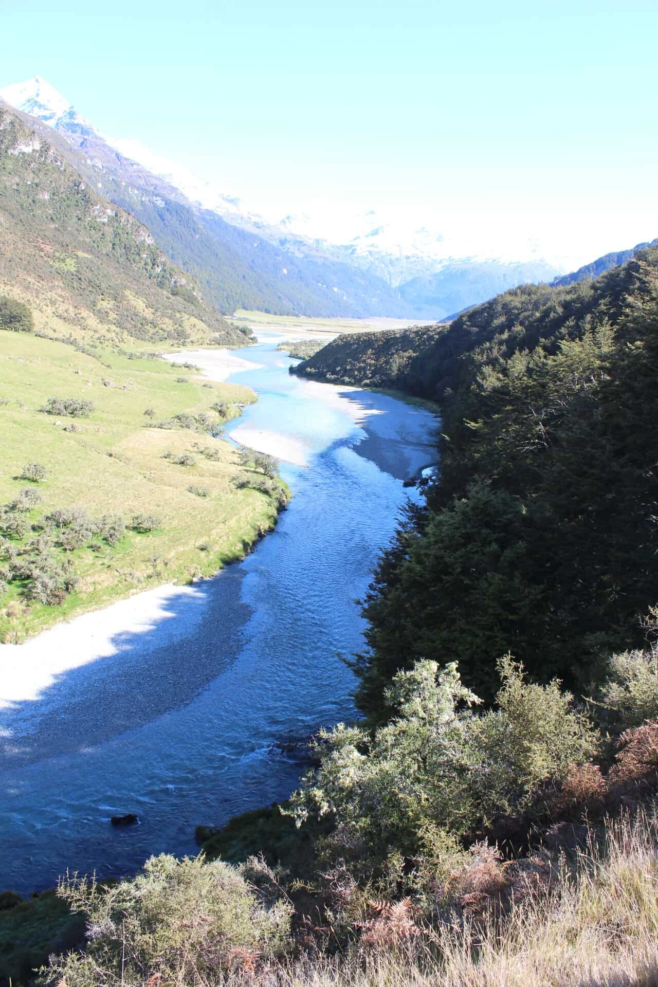
Reference Photos
Please feel free to use the reference photos provided.
Planning Your Painting
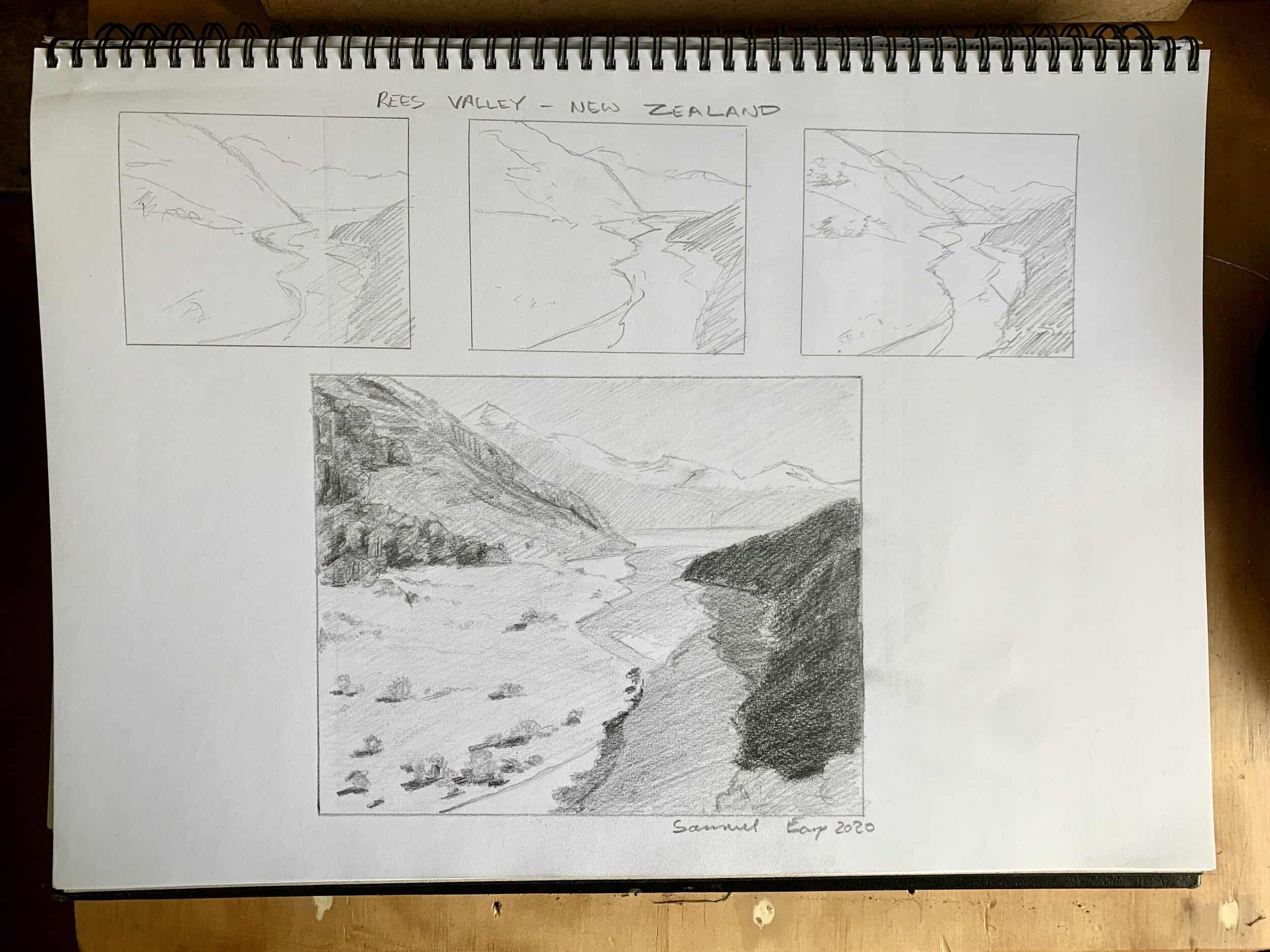
Whenever I paint a studio art work I always do some prior sketching before I start. Sketching is an enjoyable part of the painting process and it can help you to see the road ahead. It can also help you to avoid potential problems when you come to paint your studio art work, especially compositional errors.
So if you can, I would always recommend doing some pencil sketches before you paint. They don’t have to be perfect, but they can be very helpful to you.
Colours Used in This Painting
I am using oil paints but you can also use acrylics as well. The colours I used in this painting are as follows:
-
Titanium white
-
Burnt sienna
-
Yellow oxide
-
Cadmium yellow
-
cadmium orange
-
Quinacridone crimson
-
Ultramarine blue
-
Phthalo green
Brushes
Here is a list of the brushes I used in this painting:
-
No.5 flat
-
No.3 flat
-
No.2 flat
-
No.3 filbert
-
No.1 round
-
No.0 round
What is Atmospheric Perspective?
Simply put, using atmospheric perspective is a way of creating the illusion of distance and depth in a landscape painting, for example making distant hills and mountains look like they are far away. This can be achieved by understanding the values in the landscape, how light and dark a subject is and the colour saturation. Many colours especially greens and yellows lose their intensity intensity the further into the distance they are.
Composition
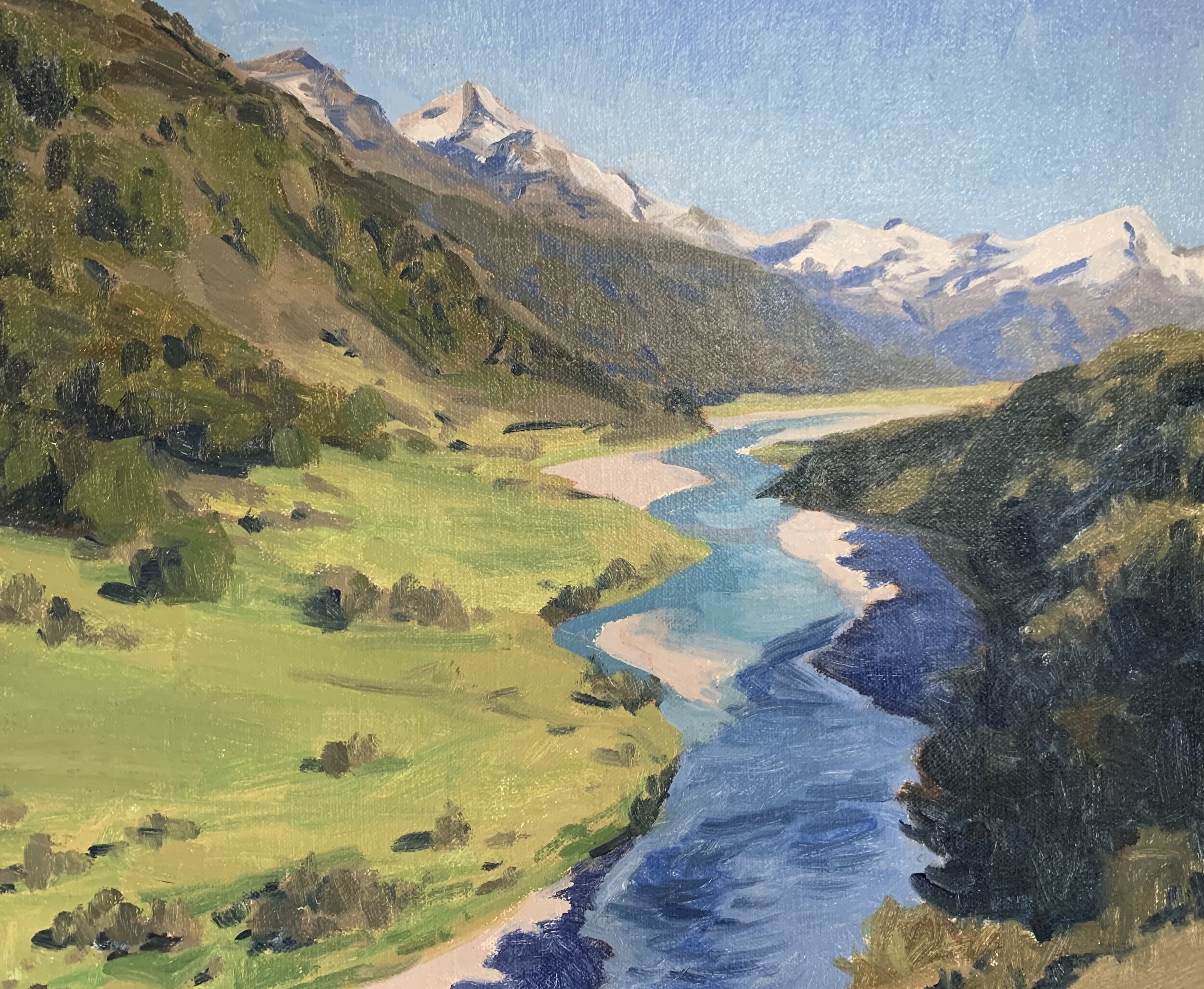
When painting landscapes it is always best to simplify the composition. The main features of this painting are the distant mountains and the river. The river implies rhythm in the composition leading the eye towards one of the main areas of interest, the distant mountains.
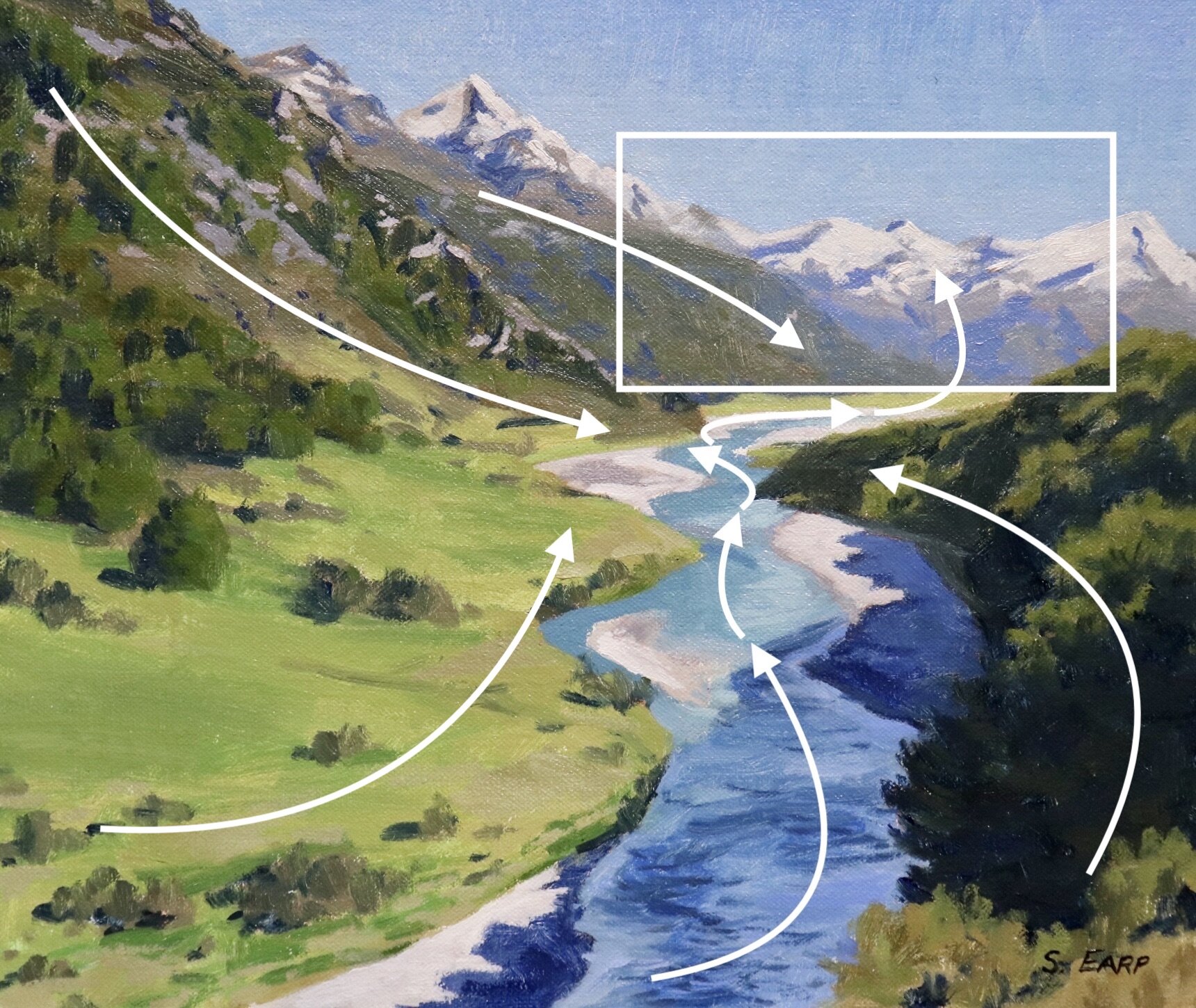
In order to communicate great height within the mountains I have placed some of those mountain peaks near the top of the canvas and even off the canvas in the case of the foreground mountain slope on the left.
The horizon line is a high horizon. Never have your horizon line in the middle of the canvas as this is predictable and causes disharmony in the composition, either go for a low or high horizon. This also applies to focal areas, never place them in the centre of you painting as again it disrupts the harmony in the painting causing a displeasing static.
The direction of the mountain slopes, headland and river are subtly leading the eye towards the distant mountains.
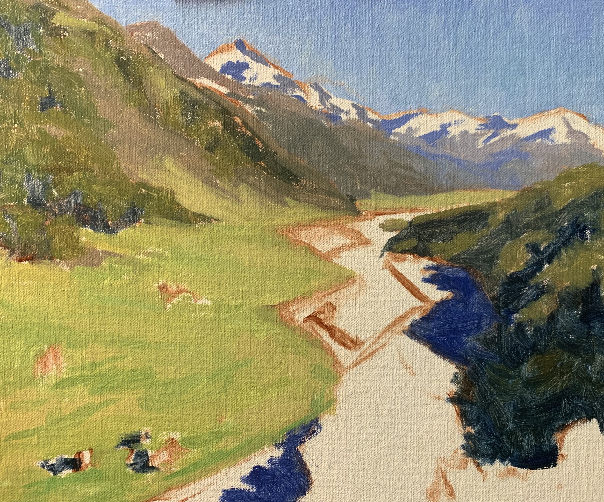
Stage One – Blocking-In The Painting
I am painting on a 10” x 12” oil-primed Belgian linen panel. I love the convenience of canvas panels as they are easy to frame, they come in standard sizes and the are easy to work with and easy to ship which is very useful if you are selling your art online.
I sketch out my composition using a No.1 round brush and burnt sienna mixed with Liquin original which is an alkyd medium used for thinning and improving the flow of the paint. It also has the added advantage of speeding up the drying time.
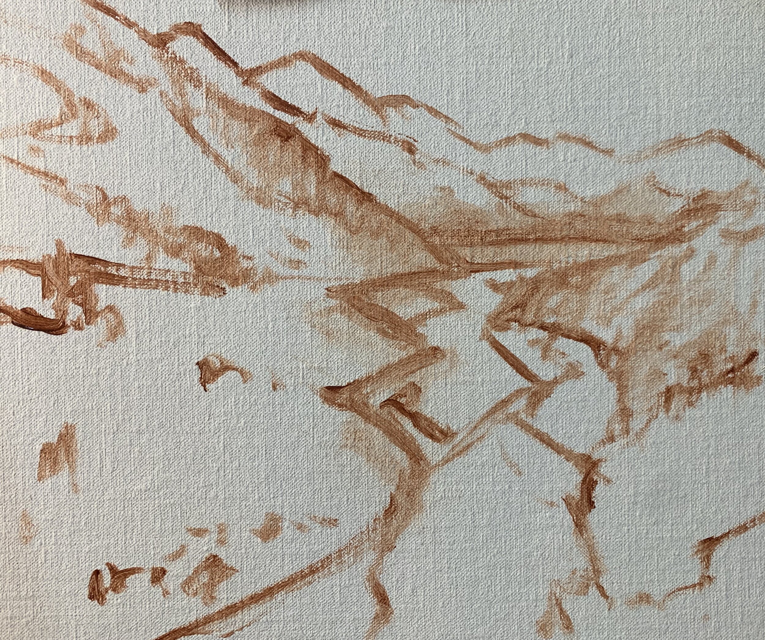
Whenever I start a painting I always establish my dark values first. Value refers to how light or dark a subject is and by painting your darks first it makes it much easier to create a tonal dynamic in your painting.
Shadows Appear Lighter the Further into the Distance They Are
As landforms recede into the distance darks are not quite as dark and even light values are not quite as light. We will find our darkest darks and our lightest lights in the foreground of a landscape. Colours change as well, as landforms recede into the distance and many colours drop out. Blue wavelengths are quite dominant in the landscapes and are scattered most which is why the distant landforms especially mountains have a bluish cast to them.
I start my painting by marking in the shadows in the distant mountains and as you can see this colour mix is a mid tone. I’ve also created a shadow mix with a blue cast by mixing ultramarine blue, burnt sienna and titanium white. I also mix in a small amount of quinacridone crimson to give the colour a violet tint.
The darkest values are found in the tree shadows in the foreground and here I have mixed ultramarine blue with a little yellow oxide and a little burnt sienna. The shadows in the mid ground trees are starting to get lighter (because they are further away into the distance) so therefore I mix in a little bit of titanium white into my tree shadow mix.
The shadows in the rocks and stones along the river are also quite dark in value. This is a mix of ultramarine blue, burnt sienna, quinacridone crimson and titanium white.
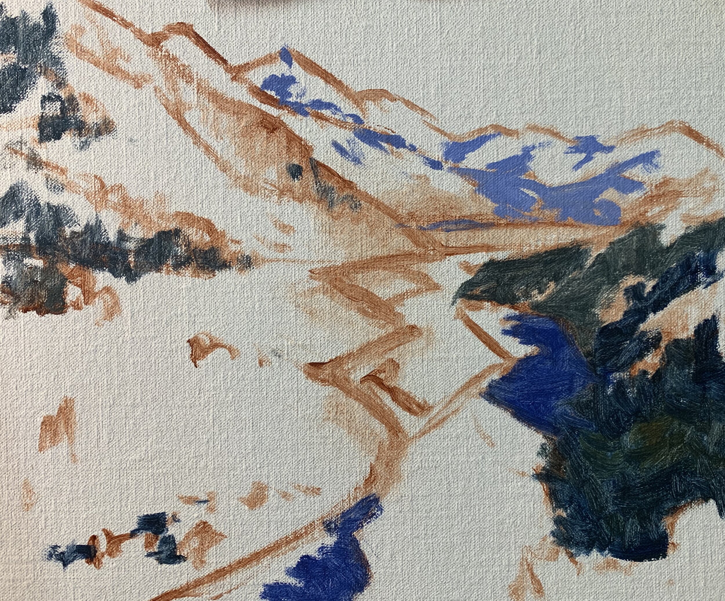
Once I have established the main areas of shadows in my painting I start with the furthest zone away and work forward. I paint the sky with a mix of ultramarine blue, titanium white and a little phthalo green.
Now that I am painting the areas of the mountains that are in the full sunlight I need to mix colours that will make them recede in the landscape. There are exposed rocky surfaces and vegetation such as grass, trees and forests to paint, so how do we make these mountains recede? We need to desaturate the colours.
I paint the areas of the mountains in full sunlight using the same colours as I used in the shadows but using more burnt sienna and titanium white. The colour looks like a warm grey on my palette and is low in chroma. This low chroma colour will make it sit back in the landscape.
For the distant forests I need to mix a low chroma green again so it will recede into the distance. If the green is too saturated it will leap forward in the painting. So how can we desaturate a green? By mixing something containing green’s colour opposite, red. I mix ultramarine blue, yellow oxide and titanium white, then I desaturate the colour with burnt sienna, which contains red. The titanium white also helps to desaturate the colour as well.
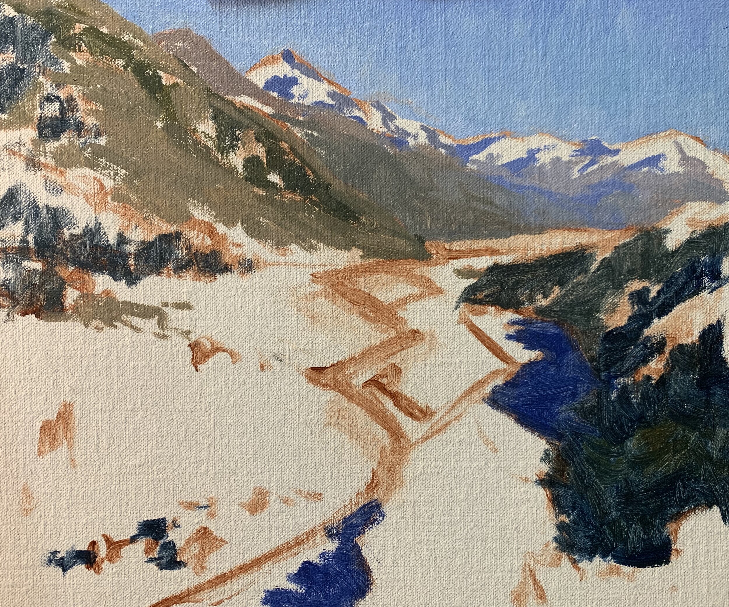
As I work my way forward in this painting I begin increasing the saturation of my colours especially in the grass and trees. The saturation and intensity of many colours increases the further towards the foreground they are especially greens.
Trees are some of the darkest values to be found in the landscape as they often have dark coloured foliage and occlusion shadows. For the trees in the mountain on the left side of the painting I mix a combination of ultramarine blue, yellow oxide and cadmium yellow. Cadmium yellow increases the saturation of the green and I also mix in a little phthalo green and cadmium orange as well to create a variation in the colours. I don’t mix the colours together thoroughly on my palette as I want some of those individual hues to come through.
I paint the grass using the same colours I used for the trees but with titanium white added. Grass is one of the lighter values to be found in the landscape and much lighter than the trees, so this must be taken into consideration otherwise the trees will get lost in the grass if they are a similar value.
I have mostly been using No.5 flat brushes in the painting so far as I like the loose gestural brush marks that you can create with them.
I paint the river with a mix of ultramarine blue, yellow oxide, a little phthalo green and titanium white. I also restate the dark values in the paint which helps to build up definition within the mountains and trees.
I paint the snow on the mountain with a mix of titanium white with a little burnt sienna and ultramarine blue which is going to make the value of the colour a little darker which will make it sit back in the landscape.
At this point I allow my painting to dry and it’s at this point I want to check if my whole tonal dynamic is working and that I am happy with the colour and value relationships.
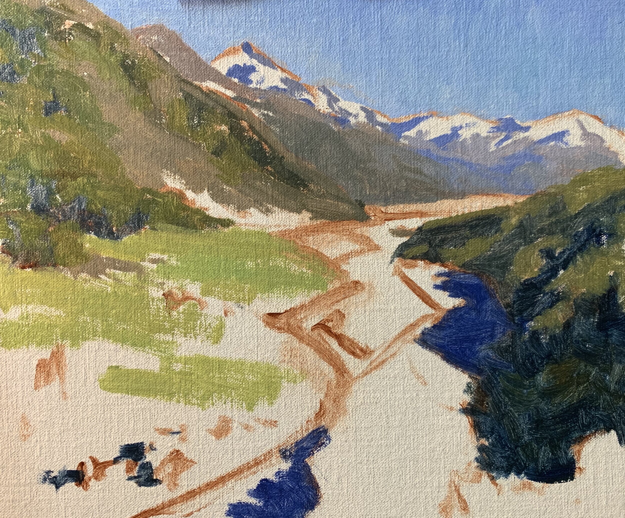
Stage Two – Adding Details
The painting is dry and as I did most of the work during the blocking-in stage there are just a few details to add and the painting will be finished. I am also going to be saving my lightest values until the end of the painting.
I am using smaller No.2 flat brushes and No.3 filbert brushes to add details such as the exposed rock faces and vegetation in the side of the mountain. There are also more details to be added in the river.
I have saved my lightest values for the snow in the distant mountains, painting a few highlights with a mix of titanium white and a little burnt sienna.