Painting Workshop No.1
Mountain Valley – Lesson Notes
Painting mountains is a great subject to paint especially if you are a beginner. With bold shapes, epic height and dramatic light, painting mountains are an excellent and interesting subject to paint. They are also great for helping new artists to get their head around values, colour saturation and atmospheric perspective and depth.
These lesson notes are intended to compliment the Painting Workshop No.1, Mountain Valley video. I hope they help you to gain a better understanding of landscape painting techniques, composition, colour mixing, painting tonality and how to create atmospheric depth.
Watch Trailer
Painting Video
Download the video that accompanies these lesson notes.
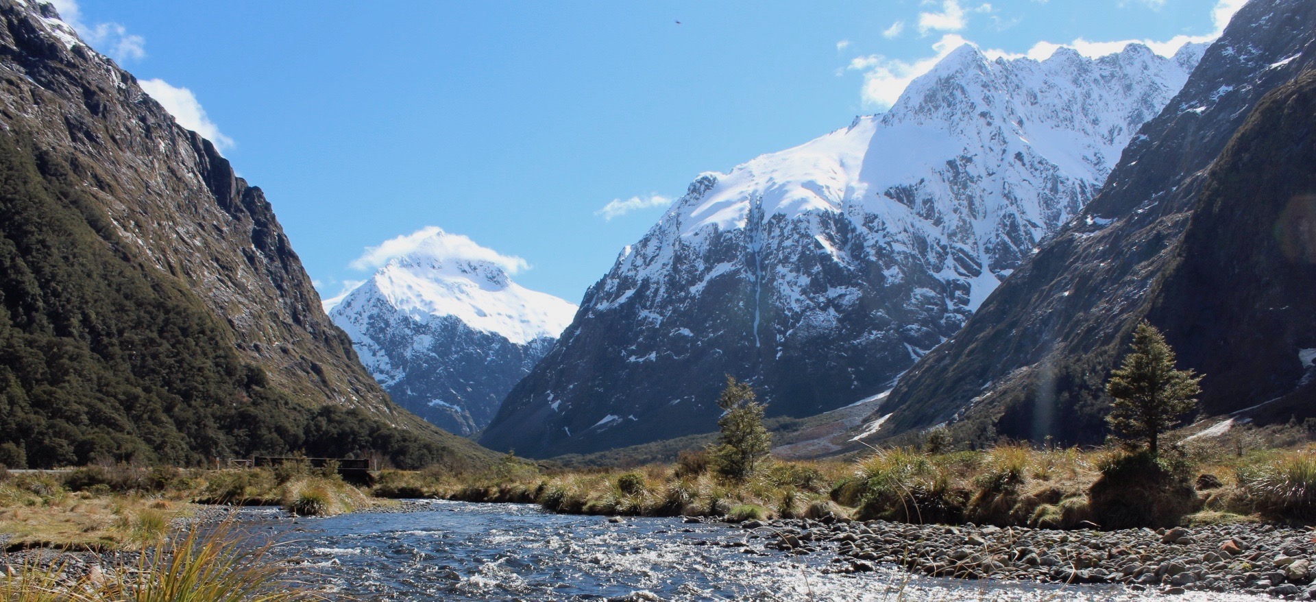
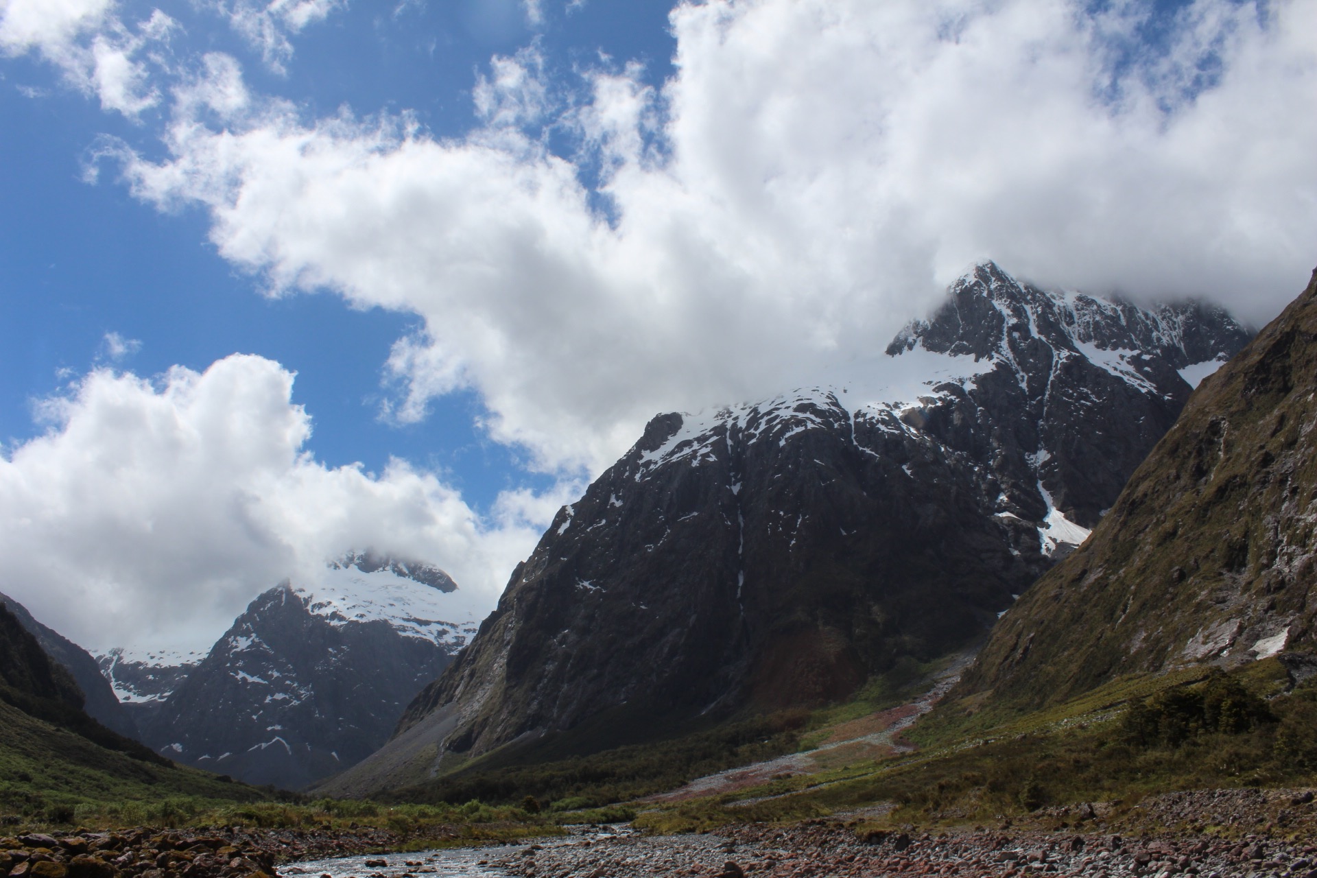
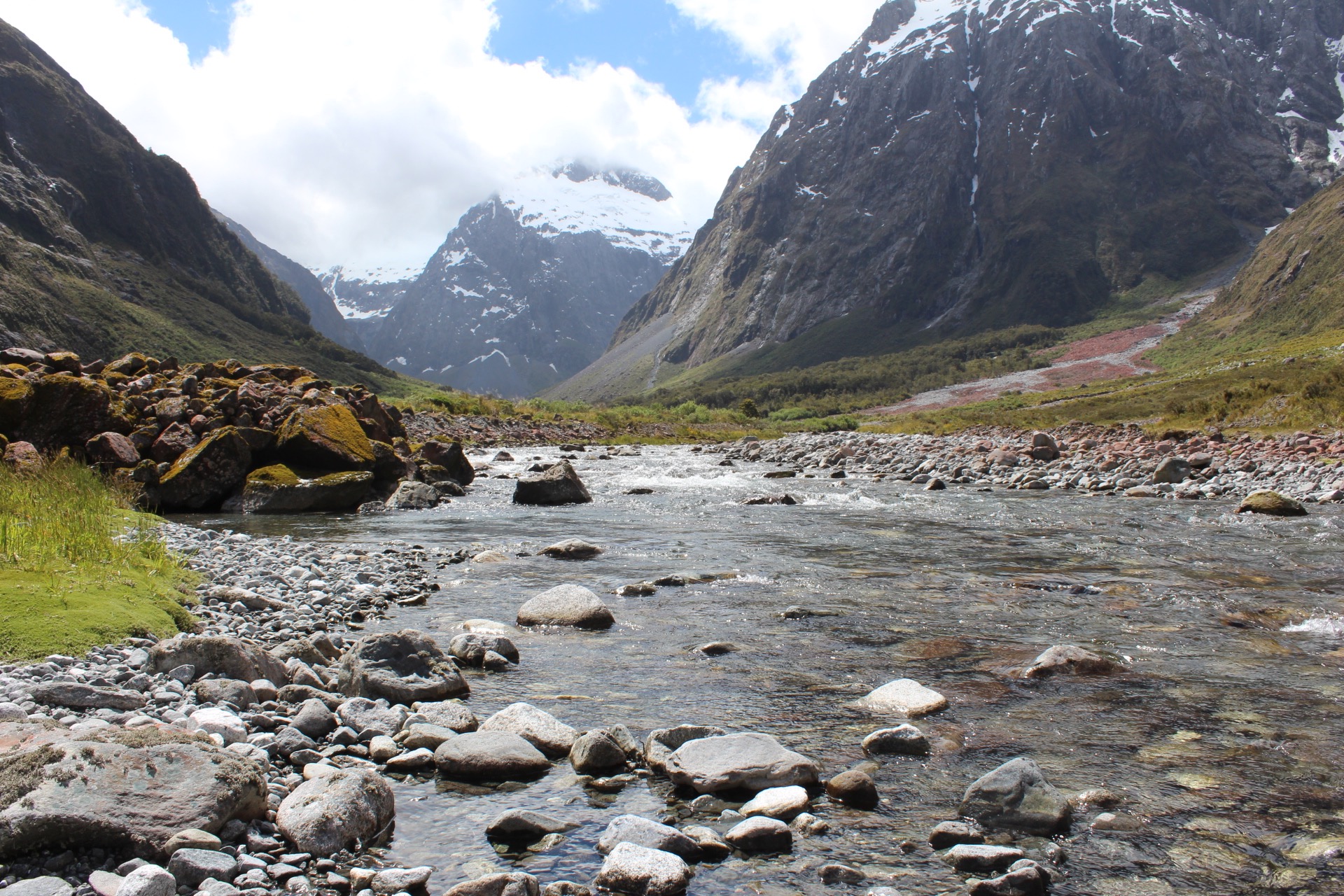
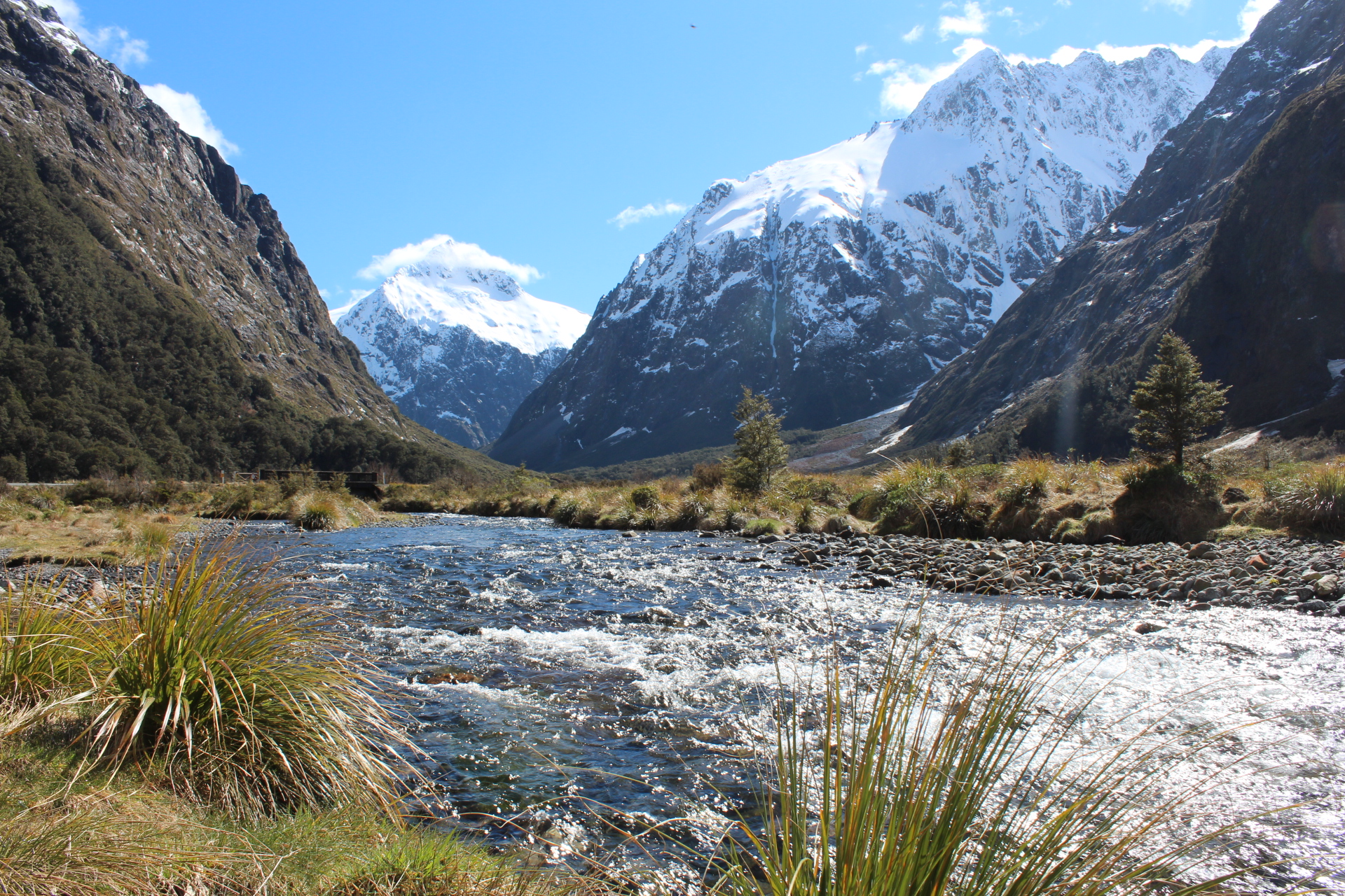
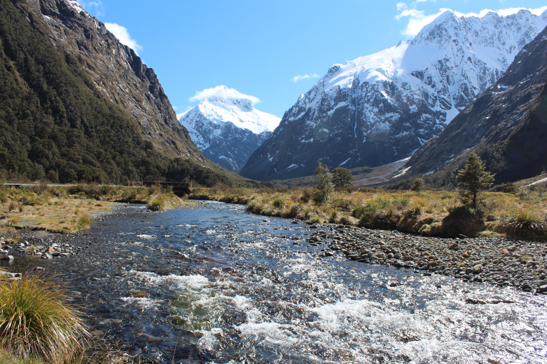
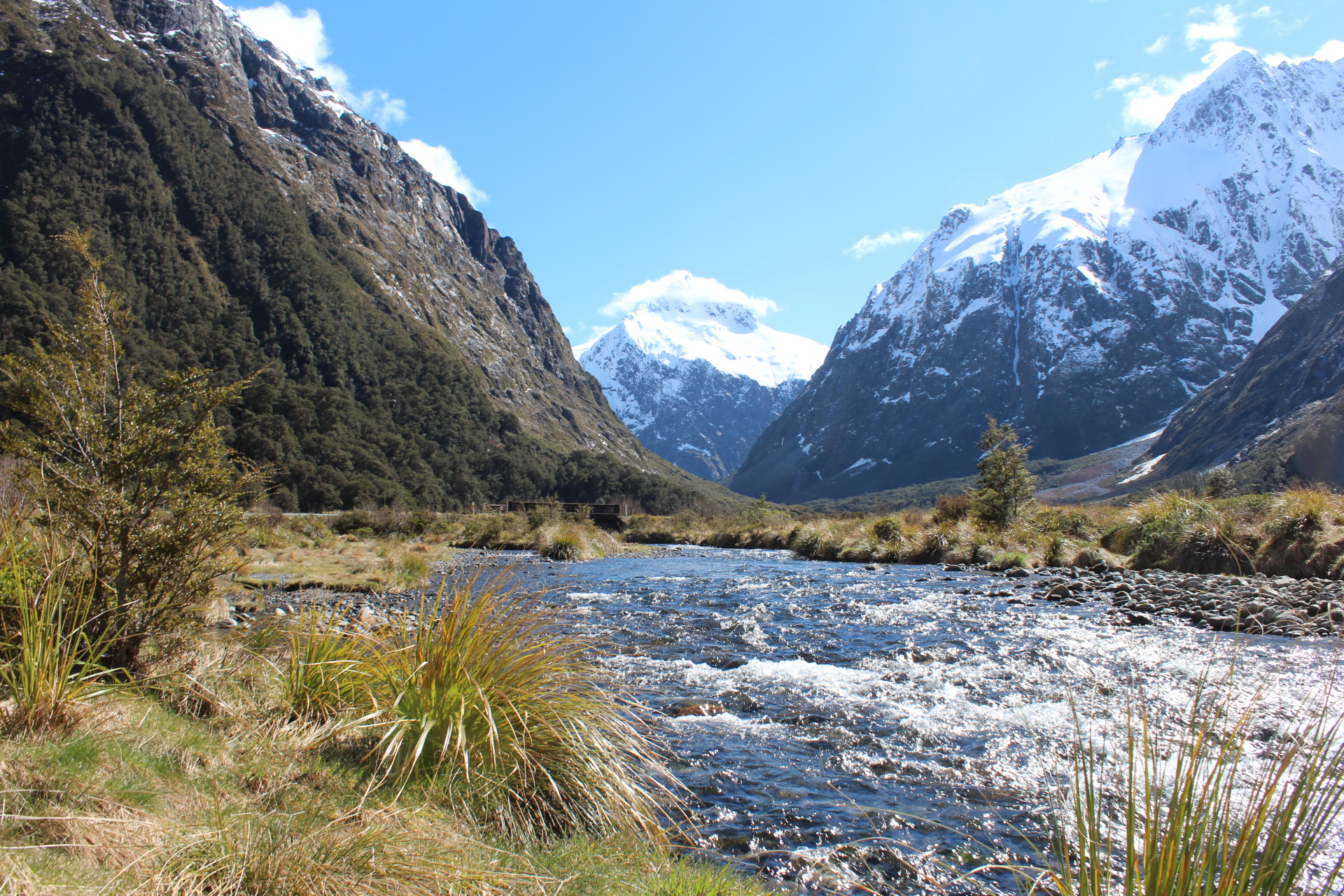
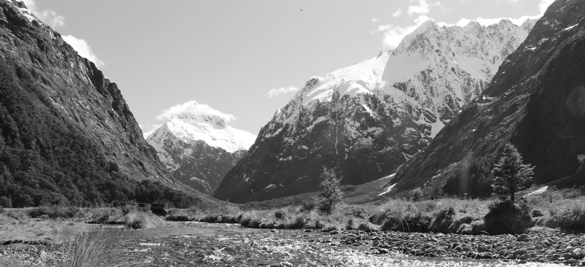
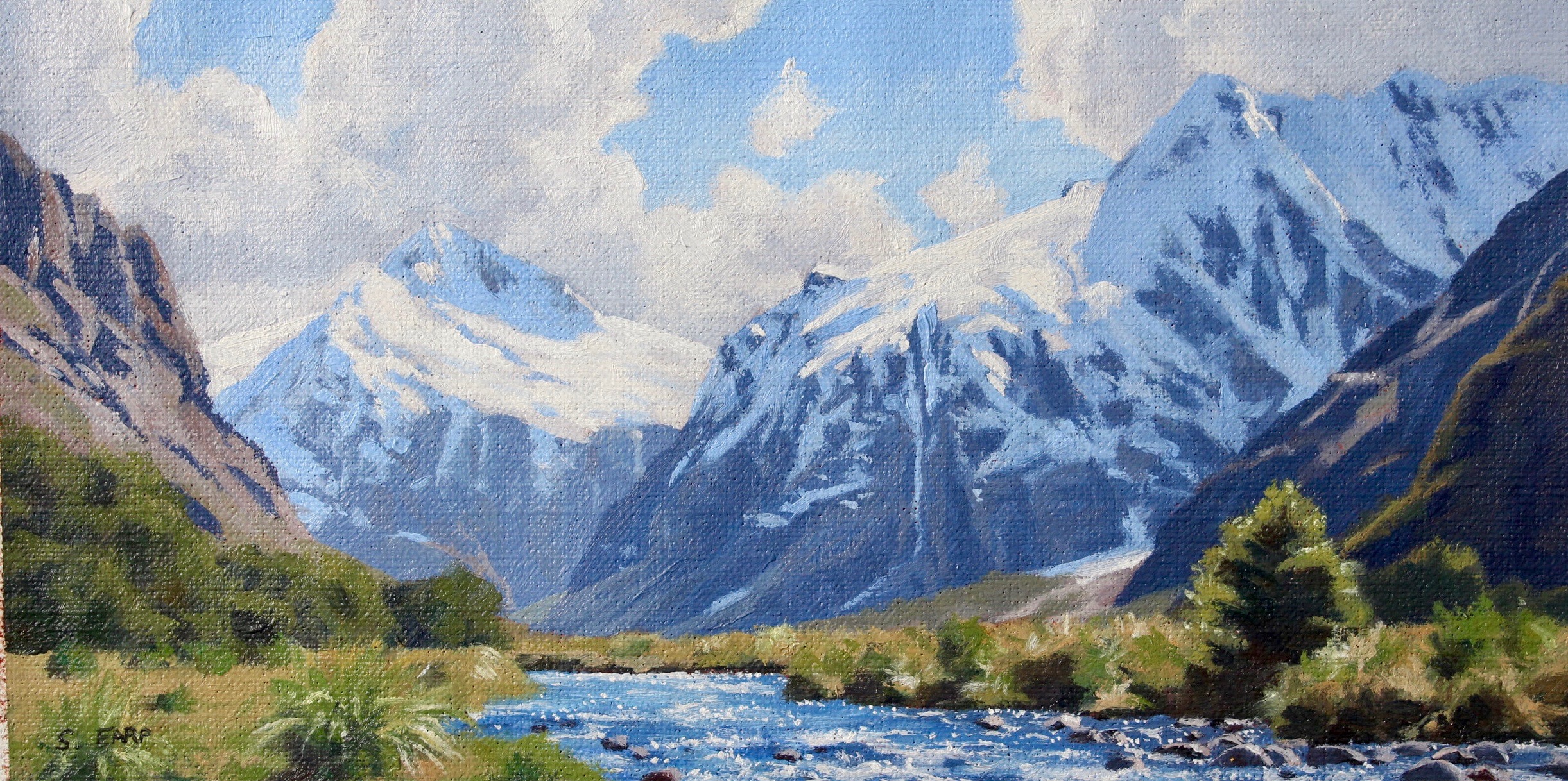
Reference Photos
Here are the reference photos I used in painting this art work. Feel free to copy and use them.
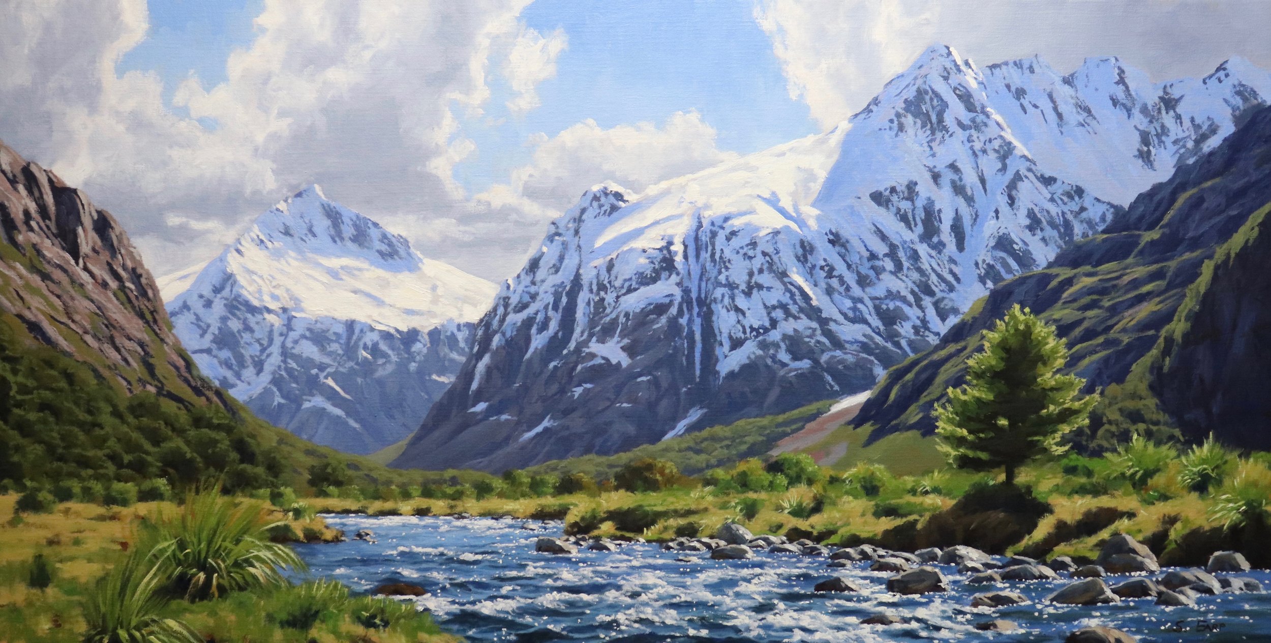
Composition
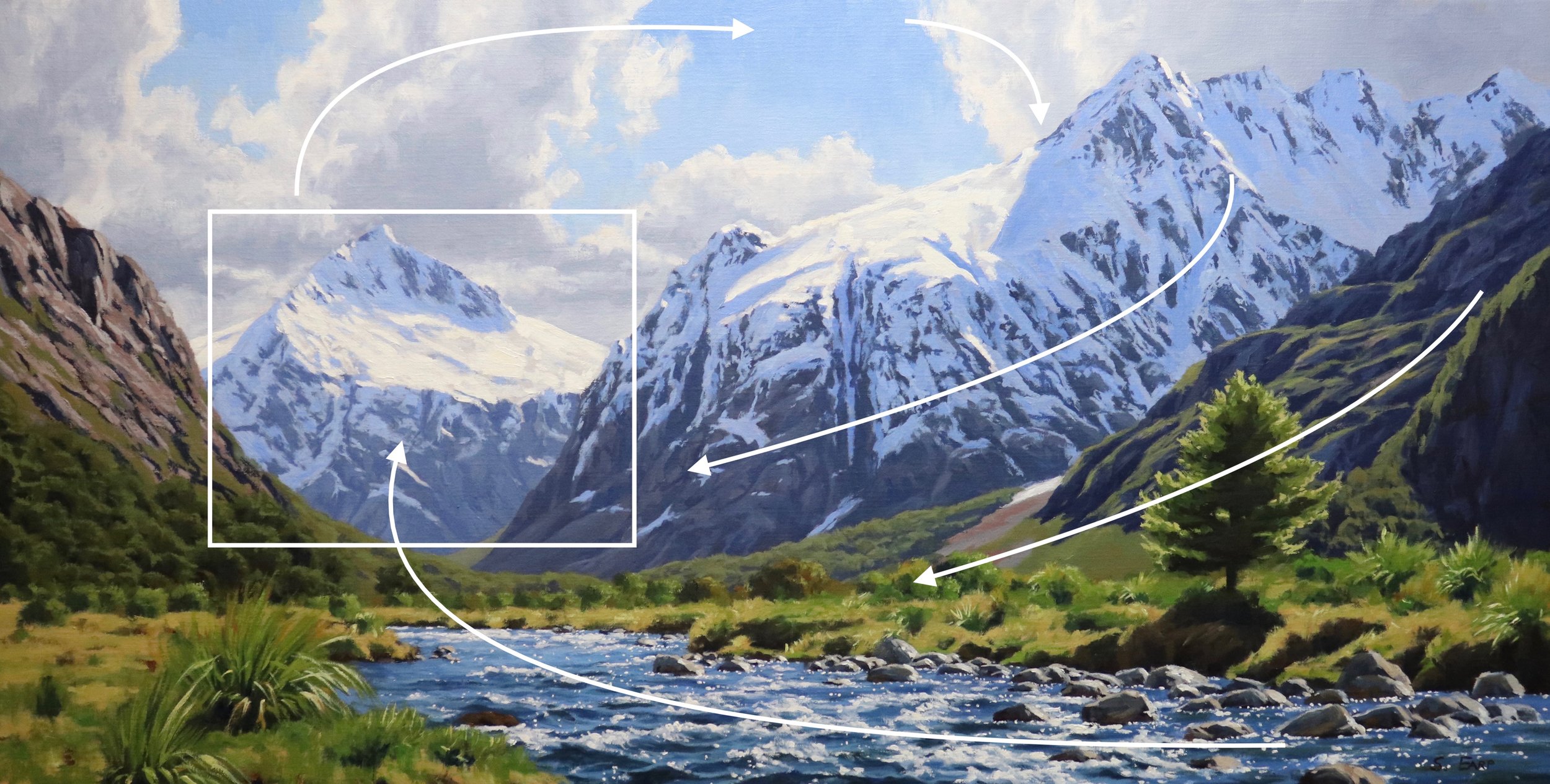
Mt Talbot is the focal area and the painting. Whilst this landscape naturally forms a good composition it’s often difficult to find a pleasing composition out in nature and so some adjustments will be required.
It’s perfectly ok to move objects, elements, forms in your painting in order to create a good composition and it’s nearly always required. Remember we are artists and we are creating a painting, not a photograph.
The mountain stream forms a vector that leads the eye towards Mt Talbot. Streams and rivers are also good for creating a sense of rhythm in a painting. I have painted the clouds so it leads the eye across towards Mt Crosscut which is the mountain in the mid-ground. The natural shape of the mountains helps to lead the eye back towards the stream and therefore back to the focal area.
The tree sapling on the right in the foreground helps to anchor the composition and give it a sense of perspective.
Things to Be Avoided in Composition
-
Centred Horizon: This is bad composition as it results in the painting being halved for example half sky and half land and as a result forms a displeasing static within a painting. Either choose a low horizon or a higher horizon.
-
Centred Objects: Areas of interest in the centre of your painting is a massive no no, it destroys any kind of rhythm and harmony within the composition.
-
Equal Masses and Repetitive Shapes: This is a problem in composition as often you can create repetitive shapes and forms in your painting without realising it. It again leads to disharmony within the composition.
Colours and Values
Throughout the video you will hear me talk about colours and values. It is important to have a basic understanding of colour theory and values when painting as it will actually make colour mixing easier for you and you will be able to better create atmospheric depth in your paintings. Luckily it’s easy to learn the basics and the rest is just brush mileage.
Colour Theory Terms
Below are some terms I use throughout the video and their meanings.
-
Hue: This refers to the main attributes of a colour and is dependent on its dominant wavelength, irrespective of how light or dark the colour is. For example, the colour is discernable as blue or a red etc.
-
Saturation or Chroma: This refers to the purity or intensity of a colour. You can reduce the saturation of a colour by adding a neutral grey or an opposite colour on the colour wheel.
-
Value: This is how light or dark a colour is. Getting your values correct is one of the keys in the success of a painting.
-
Tone: This is a broad term for describing a colour that is not a pure hue or black or white. It is a widely misunderstood term.
The Colour Wheel
For the benefit of people who are new to painting that are watching this video I will briefly go over the basics of the colour wheel as remembering how this works can really help you with colour mixing.
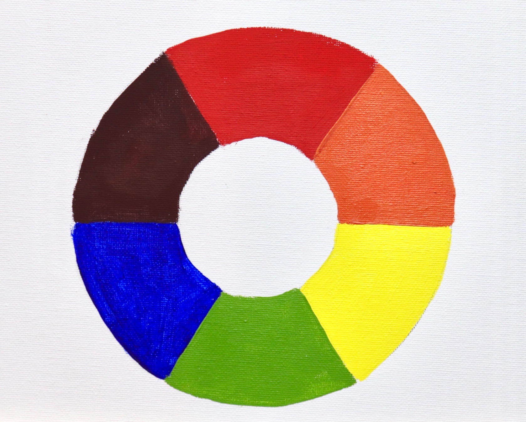
Above is a simplified colour wheel. The colour wheel contains three primary colour blue, red and yellow and three secondary colours orange, green and violet. When any two primary colours are mixed together they make a secondary colour, so red and yellow make orange, yellow and blue make green and blue and red make violet.
When these colours are arranged on the colour wheel a primary colour is always opposite a secondary colour and are known as compliments or complimentary opposites. So, blue is opposite to orange, red is opposite to green and yellow is opposite to violet.
So why is this important?
If you want to desaturate a colour you can do this by mixing its complimentary opposite as the two colours will cancel each other out. In this manner you can create some neutral greys and browns especially when combined with white.
Complimentary colours also look good next to each other in a painting, for example greens often look more harmonious in a landscape if there are some reds amongst the mix or colours that contain red. If you look closely in nature, you’ll see naturally occurring complimentary opposites everywhere.
The Value Scale
Value is how light or dark a colour is and is perhaps one of the most important concepts in painting. The success of a painting rests on the relationship between the values in the painting. If they are not working and not in harmony then the whole painting can lack any kind of depth.
Values in art work are represented on a scale with the highest value being white and the lowest value being black. The greys in between are known as mid or half tones.
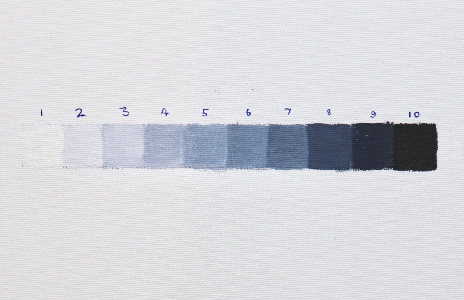
In general, you will find your darkest darks and lightest lights in the foreground of a landscape. However, as landforms recede into the distance darks are not quite dark and lights are not quite light as the tonal scale narrows.
If you are unsure of where your light and dark values are in the scene you are painting, switch your reference photo to black and white and you’ll be able to clearly see where your light and dark values are.
In general, you’ll find that the sky is often one of the lightest values in the landscape. Grass is also generally lighter in value. Rocks and mountain faces are darker in value and often occupy the mid-tone range of the value scale. Trees are generally some of the darkest values in the landscape.
Planning Your Painting
The key to creating a successful painting is having a solid foundation. This can be achieved by some planning prior to starting your painting. I’d recommend spending some time planning your painting as you are much less likely to run into problems when carrying out the final art work.
There is nothing more frustration than getting halfway through a painting only to discover it’s not working because of a bad composition or a tonal dynamic that’s flat because what you saw in the landscape didn’t translate well in your painting.
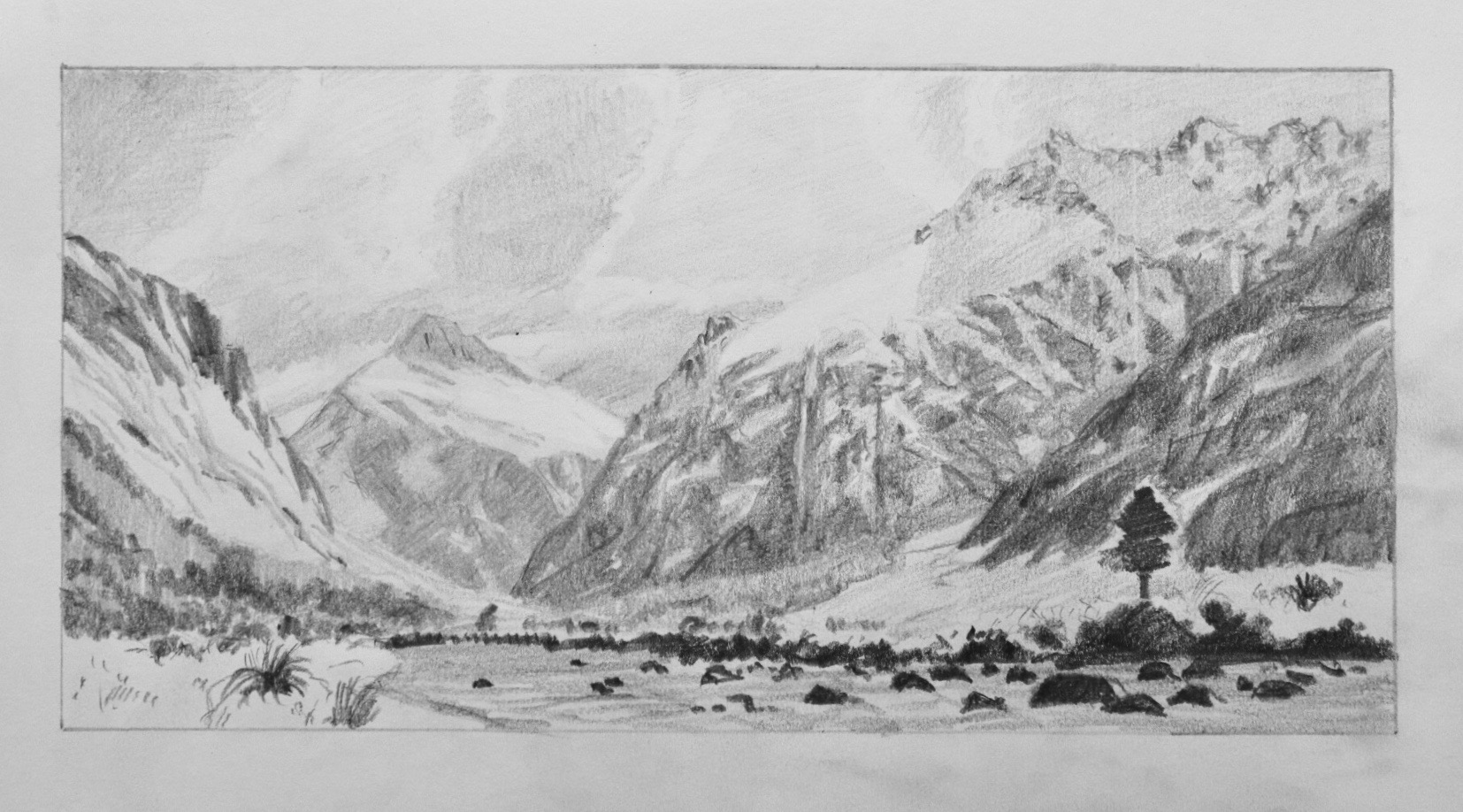
Pencil Sketches
Whenever I have the intention of painting a large studio art work I always begin by designing the composition in my sketchbook. I start with quick two to three-minute thumbnail sketches and when I have an idea for a painting I will do a final detailed sketch.
Have fun with this, your sketch doesn’t have to be perfect but it can be really exciting to quickly see what your final painting could look like.
Colour Study
When painting a large art work it can be helpful to paint a small colour study first. A colour study is literally a small painting and a small version of your final art work.
Colour studies are particularly useful as you can paint them quickly and it will give you an idea of whether your large final painting is going to work. You may also spot something when doing a colour study which might need changing for the final painting, in which case it’s a lot easier to change things on small paintings.
Colours studies make great little paintings and you can sell them as well.
Colours Used
I am painting in oils but you can also use acrylics. The colours I used in this painting are as follows:
-
Titanium white
-
Burnt sienna
-
Yellow oxide (you can use yellow ochre instead)
-
Cadmium yellow
-
Cadmium red
-
Quinacridone crimson (you can use alizarin crimson instead)
-
Ultramarine blue
-
Phthalo green
Brushes
Here is a list of the brushes I used in this painting:
-
No.10 flat
-
No.8 flat
-
No.6 flat
-
No.4 flat
-
No.2 flat
-
No.6 filbert
-
No.2 filbert
-
No.1 round
-
No.0 round
-
3/8 dagger
-
1/4 dagger
Blocking-In the Painting
I consider the blocking-in stage of the painting one of the most important parts of the painting process. It’s here that you want to make sure that the relationships between your colours and values are working.
When I block-in a painting I find it’s easiest to paint the shadows and dark values first. By doing so you’ll find it easier to create atmospheric depth in your paintings. You’ll also find it easier to get the tone and saturation of your colours correct when you paint areas that are in light.
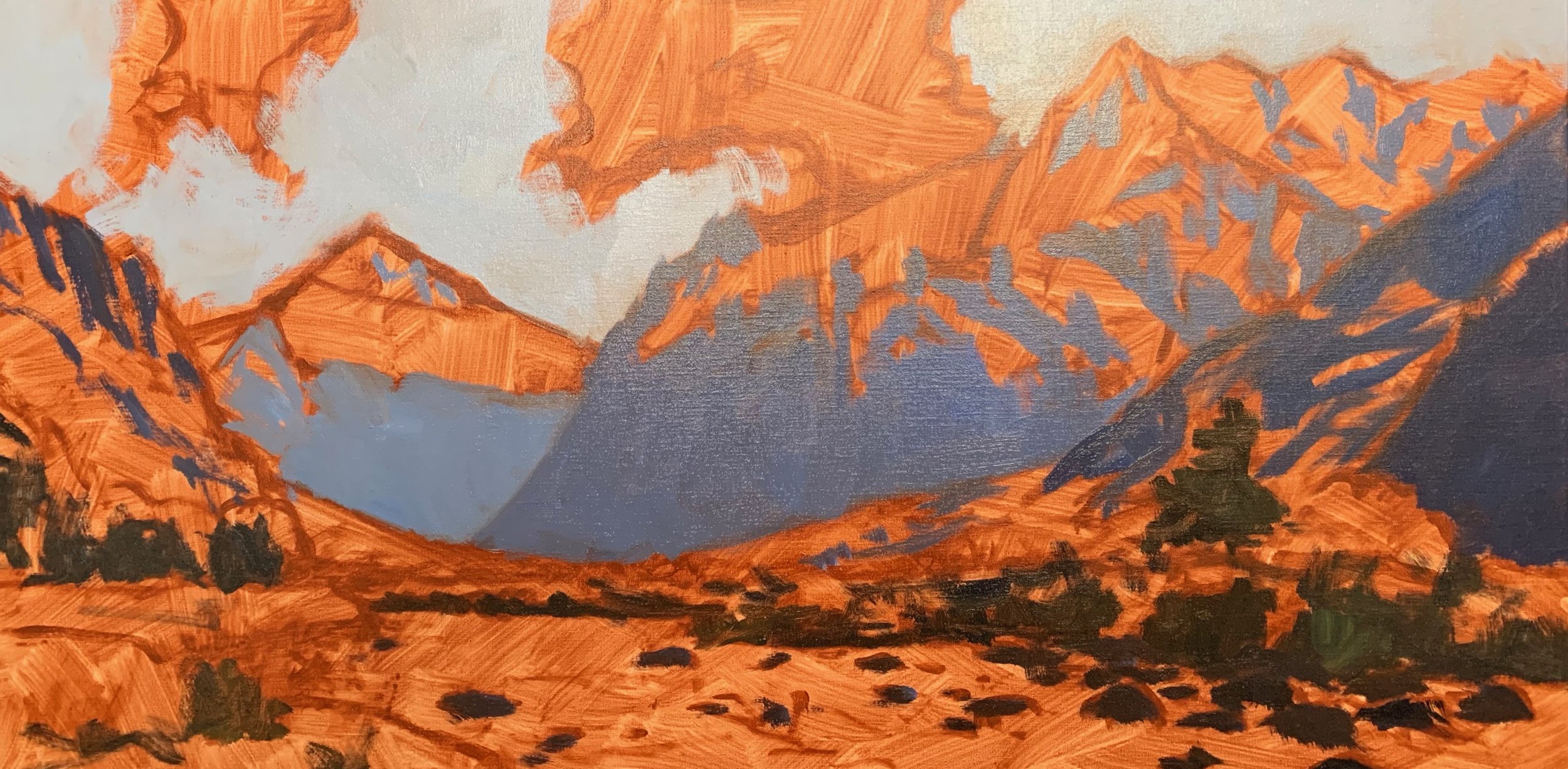
If I can I generally try and block-in the painting in one go. I also use big brushes so I can cover ground quickly and achieve a more painterly effect. Make sure you keep your values a little darker so you have plenty of room for adding lighter tones later on in the painting.
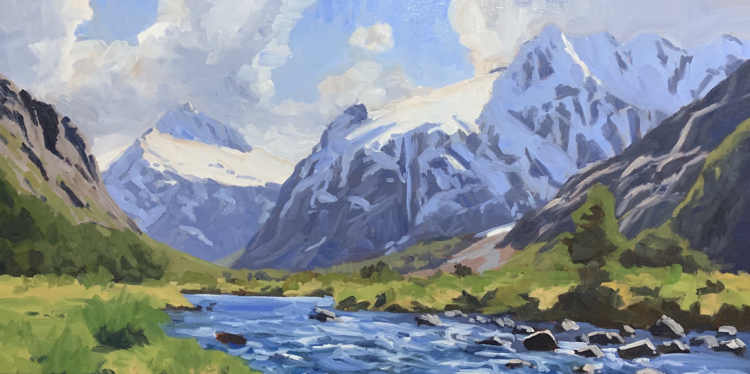
Adding the Details
Once your painting is blocked-in and you’ve allowed it to dry you can start the modelling stage and adding the detail. At this stage I still try and use big brushes but I can start using smaller one if required.
I also still want to keep my colours and values a little darker so I still have room to move. It’s here that you are creating a solid base to add the final details at the end of the painting.
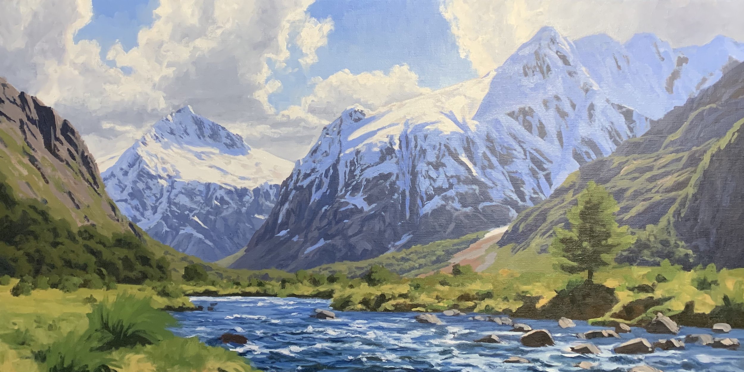
Refining the Painting and Final Details
Once you have the majority of the details in place and you are happy with the colours and tonal dynamic of the painting you can start tidying up areas of the painting to make sure that it reads well. Once this process is complete then you can start adding those finer details such as highlights in the tree foliage or reflected light in the snow shadows for example. This is where you’ll need your smaller brushes.
I always save my lightest values until the end of the painting so the very last thing I add is highlights to the snow on the mountain and the sparkles in the water.
Thanks for reading
Get the video, Painting a Mountain Valley, available in store now