If you’ve ever strolled past a coastal painting, wondered how all that light, shadow, and water movement comes together, and felt a little overwhelmed by the idea of creating your own, you’re not alone.
Painting seascapes, especially iconic views like Australia’s Twelve Apostles, can look tricky at first glance. But when you break it down into manageable steps, the process becomes surprisingly approachable.
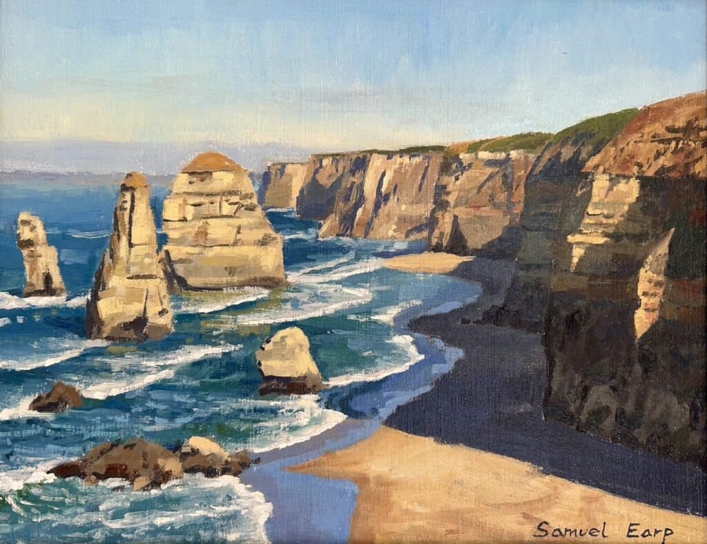
This blog post walks you through my method for painting this dramatic landscape in oils, just as I did in my recent video. I’ll share the materials, my planning process, color mixes, brush techniques, and tips for building up layers so you end up with a calm, believable seascape you’ll feel proud of. Whether you’re a beginner or an intermediate painter aiming to improve your skills, this post will guide you, step by step.
Let’s get started!
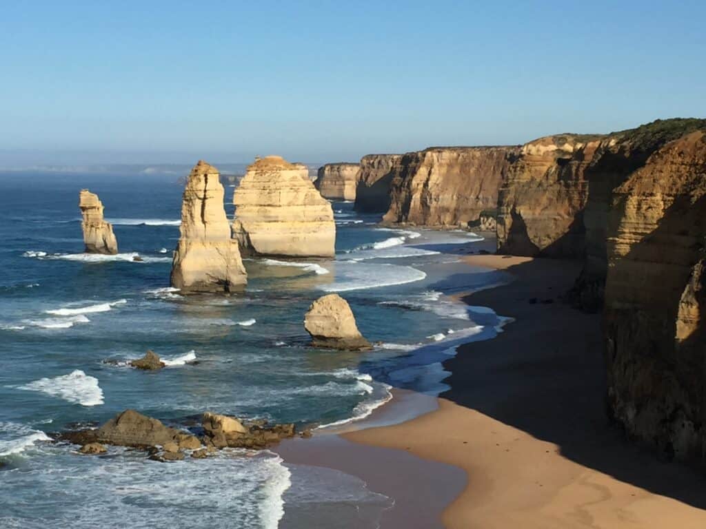
Reference Photo
Materials for a Coastal Painting
![]()
Before we dive into the painting process, a quick word on supplies. Here’s what I used to paint my 11×14 inch Twelve Apostles coastal scene:
- Paint: Blue Ridge oils (find Blue Ridge oils here)
- Canvas: 11 inch by 14 inch linen panel (linen panel link)
- Brushes: Size 10 bristle flats (large!), plus smaller brushes for details
- Colors used frequently:
- Burnt Sienna
- Yellow Ochre
- Ultramarine Blue
- Alizarin Crimson
- Titanium White
- Phthalo Green
- Cadmium Yellow (for highlights)
- Extras:
- Easel and palette
- Reference photo (I worked from a photo of the Twelve Apostles, but you can use any coastal scene you love)
“You don’t want to worry about detail when you start a landscape painting. Using big brushes will help to solve this.”
— Twelve Apostles Painting Tutorial
Sketching Your Composition
![]()
The foundation of a great painting is thoughtful planning. Before any paint hits the canvas, I spend time sketching thumbnail sketches and working on a master sketch. This helps me break the scene down into simple shapes and values and gives me a roadmap for the painting.
How I Start the Sketch:
- Tint the canvas: I often start by brushing on a light wash of burnt sienna. This warms up the panel and provides a neutral background.
- Outline major shapes: Using burnt sienna, I sketch out the cliffs, sea stacks, horizon, and areas for water. I’m not fussing over detail yet—just marking out placement and scale.
- Refer to thumbnails: Before the master sketch goes onto the final canvas, I’ve done quick small thumbnails to work out composition, values, and focal points.
Sketching Tips:
- Focus on the “big shapes” first, not details.
- Keep lines loose—corrections are easy at this stage.
- Have fun! Sketching is about planning, not perfection.
Establishing Dark Shapes & Shadows
Once my sketch is on the canvas, I always start by identifying and painting the darkest darks—the deep shadows in the foreground and under the cliffs. This creates a framework for everything that follows.
Why Paint the Darks First?
![]()
Imagine building a sandcastle. You start by digging the deepest trenches so you can pile up the highest towers. Painting your dark values first is like laying the foundation for your lights.
- Foreground darks anchor the painting, making it look solid and three-dimensional.
- As the scene recedes, dark areas become lighter, due to atmospheric perspective.
“It’s easier to paint the dark values and shadows first… it sets a whole tonal framework that makes painting the lights easier afterwards.”
My Shadow Color Mixes
For the cliff shadows and dark shapes, I use a blend of carefully selected pigments that create rich, luminous darks without turning muddy:
- Yellow ochre
- Burnt sienna
- Ultramarine blue
- Touches of alizarin crimson
- A dash of titanium white
As the shadows recede into the distance, I cool the colors, adding more blue and violet.
Understanding Tonal Framework in Landscapes
Landscapes aren’t just about painting what’s there―they’re about capturing light and making viewers “feel” space and distance.
The Rule:
- Darks are darkest, and lights are lightest in the foreground
- As the landforms recede, both darks and lights compress
How This Looks in Practice:
![]()
Closer cliffs and rocks have sharp, deep shadows. Farther away, those shadows are lighter, bluer, and more diffuse. This instantly signals depth in your scene.
Mixing Colors for Distant Landforms and Shadows
One of the most frequent questions I get is: “Why do my landscapes look flat?”
The answer usually lies in how colors and values are handled—especially in shadows.
My Color Recipe for Distant Shadows:
- Ultramarine blue
- Burnt sienna
- Titanium white
- Tiny dash of alizarin crimson
Add more white and blue as the cliffs recede, fading into a blue-violet hue in faraway stacks and headlands.
Atmospheric Hints
- The farther the object, the cooler (bluer) and lighter it gets.
- Warm shadows in the foreground, cool in the distance.
Building Up the Warm Tones
Once the darks are set, it’s time to build up the sunlit sides of cliffs, rocks, and sea stacks—the warm, glowing parts that catch our eyes.
My Warm Tone Mixes
- Yellow ochre
- Burnt sienna
- Titanium white
- Ultramarine blue
- Alizarin crimson
![]()
Sometimes, a bit more yellow ochre for increased warmth, sometimes burnt sienna for richness.
Technique
Big, loose brush strokes keep things lively and painterly. At this point, I’m still not fussing about tiny details—I want broad areas well blocked-in.
Brush Choice: Go Big Early
Here’s a tip that changed my painting style forever: use big brushes to block-in your first layers. For my 11×14 inch canvas, I’m reaching for size 10 bristle flats.
Why Big Brushes?
- Encourage bold, sweeping marks.
- Stop you from over-focusing on detail too early.
- Help foster energetic, natural textures.
- Make covering the canvas fast and fun.
![]()
If you find yourself getting lost in the details right from the start, try this strategy:
“Use the biggest brushes you can get away with and just start off by blocking in the big shapes. Don’t worry about detail.”
Working on Sand and Rock Textures
With the larger shapes established, I move to the sand and the finer textures in the rocks and sea stacks.
Sand Color Mix
- Yellow ochre
- Alizarin crimson
- Titanium white
- Small touch of ultramarine blue
![]()
These earth tones create a sunlit, natural look for sand and rocky surfaces.
Blocking-in Tips:
- Keep values a little darker than you see; you’ll lighten them with later layers.
- Don’t aim for perfect realism yet—just broad color fields and shifting tones.
Painting the Ocean Blues
No seascape comes alive until you get the water right. Here’s how I mix up deep, believable ocean colors:
Key Mix for Sea Blues
- Ultramarine blue
- Titanium white
- Yellow ochre (very little)
- Phthalo green (tiny amount for turquoise!)
Application
- Big, sweeping strokes cover the main body of the ocean.
- Watch how these blue mixes “frame” the negative spaces around the sea stacks.
- At this stage, I fill in around rocks and cliffs, helping to define their shapes further.
If you’ve struggled with mixing colors for ocean scenes, give this combo a try. It works for nearly any coast with blue-green water.
Blocking in: Why Start Darker?
![]()
A crucial key to successful oils is to start with colors and values slightly darker than you intend them to be in the final piece.
Why Block In Darker?
- Leaves room to build up lighter, brighter layers later.
- Lets underpainted colors shine through, adding depth and richness.
- Makes highlights and sunlit areas “pop” when you add them at the end.
Blocking Phase Checklist
- Cover the canvas quickly and loosely.
- Focus on broad shapes and big tonal differences.
- Keep everything a shade or two darker than your mid-point goal.
“We don’t want to go too light to begin with because we risk not having anywhere to go with our values if they’re too light.”
Handling White Water and Breaking Waves
White water in breaking waves and foamy surf is tempting to paint as plain, pure white. But if you do, your painting will look flat. Early on, I block in the areas where the white water will go, but the values are not pure white yet.
Wave Highlight Mix
- Titanium white
- Tiny bit of burnt sienna
- Ultramarine blue (just a touch)
- Alizarin crimson (minuscule)
![]()
This “toned-down white” creates believable foam, with space left for final highlights later on.
Technique Tips
- Mark the general areas for white water early.
- Save your lightest lights (true highlights) until the very end—this gives your finished painting more punch.
Sky Techniques for Seascapes
The sky sets the mood! While I sometimes add clouds for drama, in this piece I followed the reference photo and left the sky clear.
Adding Interest
- Even with a blank blue sky, aim for plenty of texture.
- Use big, vertical brush strokes for painterly effects.
- Vary the blue—consider mixing in a little white or violet for subtle gradients.
![]()
This keeps the sky from looking too uniform, adding a sense of movement and realism.
Building Up Details and Refinements
By now, the paint has dried enough that I can switch to smaller brushes. This stage is about gently adding lighter layers and bits of detail—like sunlit edges, crisp highlights, and little variations in rock and water.
Tips for Detailing
- Use color mixes from earlier, but start making values lighter.
- Add cadmium yellow for vivid highlights on sunlit cliffs and stacks.
- Let some underpainting show through—don’t cover everything up.
Overcoming Flatness
If your paintings look flat or lack depth, focus on gradually shifting value and color temperature as you work from foreground to background.
Restating Shadows & Reflected Light
One of my “secret” moves in landscapes is restating the shadows after building up the lights. This deepens contrasts and refreshes form.
Why Restate?
- Helps carve sharper edges on cliffs and rocks.
- Pushes forms forward to improve three-dimensional effect.
- Realistic shadows anchor the composition.
“Shadows really go a long way in landscape paintings to making them look more realistic.”
![]()
Also add touches of reflected light in cliff sides—small areas of lighter, warm color that suggest sunlight bouncing around.
Detailing with Shadows
- Use earlier mixes for shadow color, adjusting as needed for final pop.
- Don’t be afraid to go bold, especially where rocks meet water or recede into distance.
Adding Final Highlights and Details
The final magic comes from saving your brightest highlights until the very last layer. This is especially crucial for breaking waves, sun strikes on rock, and little sparkles on water.
Bold Highlights for Impact
- For breaking waves: titanium white + touch of yellow ochre for warm glow
- Add ripples, foam, sparkles in water
- Edge highlights on cliffs and sea stacks
The Result
Under gallery lighting, these intense highlights make your painting “pop” and feel much more three-dimensional.
Resources and Further Learning
If you’re loving this process and want to keep improving, check out the following resources:
- Blue Ridge oils (my recommended paint brand)
- Linen canvas panels (affiliate link)
- Thumbnail sketching techniques (YouTube link)
- Free video: How to create depth and distance in landscape painting
- Join my art school for in-depth tutorials and live painting classes
Final Thoughts
Painting a complex scene like the Twelve Apostles coastline is absolutely doable, even if it feels intimidating at first. When you break things down—starting with big shapes, focusing on tonal values, using bold brushes, and building up layers from dark to light—you’ll surprise yourself with what you can achieve.
Don’t get stuck on tiny details at the start. Let loose, enjoy the process, and save those eye-catching highlights for the very end.
“If you’d like some more in-depth painting tutorials plus live painting classes, come and join me at my art school.”
Ready to try your own seascape? Grab your brushes and paints, and remember, the best way to learn is to experiment along the way!
FAQs
What size canvas should I use for a coastal painting?
For this tutorial, I used an 11×14 inch linen canvas panel, which is a convenient size for plein air or studio work. You can work smaller for sketches, or larger if you want a statement piece.
What paints are best for seascapes?
I used Blue Ridge oils, but any artist-grade oil paint with strong pigment and buttery texture works. Focus on gathering a good selection of earth tones, blues, and whites.
How do I keep my painting from looking too flat?
Start by blocking in dark shapes, use big brushes, layer progressively lighter and cooler colors into the distance, and save your strongest highlights until the very end.
What brushes do you recommend?
Size 10 bristle flats for early blocking and coverage, then smaller rounds and filberts for detailing later.
How do I mix realistic ocean colors?
Ultramarine blue, titanium white, a little yellow ochre, and a touch of phthalo green for turquoise tones is my go-to mix.
My highlights don’t stand out. What am I doing wrong?
Try saving the purest titanium white for the final details. Adding a bit of yellow ochre for warmth helps. If you use all your whites too early, your highlights won’t have impact.
How do I create depth?
Use atmospheric perspective by lightening and cooling colors as landforms recede. Experiment with thumbnail sketches first to plan it out.
Useful Links
- Blue Ridge Oils
- Recommended Canvas Panels
- Thumbnail Sketching Techniques – YouTube
- Free Video: Creating Depth and Distance in Landscape Painting
- Join My Art School
Thanks for following along, and happy painting! Got questions or want to share your work? Drop a comment below or tag me on social media—I love seeing what you’re working on.
See you next time for another painting adventure!
