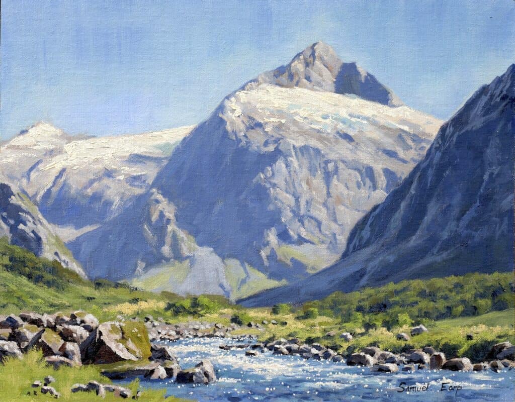
If you’ve ever struggled to capture the majestic feel of mountains in your paintings, you’re in the right place. In this blog post, you’ll learn step-by-step secrets behind creating mountains that leap off your canvas—full of realism, depth, and convincing atmospheric distance. Let’s dive into the complete process, inspired by the stunning landscapes of New Zealand’s South Island.
Introduction: Why Mountain Landscapes?
Painting mountains can be one of the most rewarding experiences, but it’s equally challenging. If you want your mountains to look distant, majestic, and natural, depth and distance are crucial.
“If you’ve ever struggled with making the mountains in your paintings look distant and majestic, this guide will change everything for you.”
The trick? We’ll focus on a few main painting secrets every artist should know, starting with clear tonal values and a well-structured palette—without getting bogged down in unnecessary detail right from the start.
Materials and Canvas Preparation
Let’s start with your setup and supplies. You don’t need a mountain of materials—just the right ones to get started and build your skills effectively.
Canvas:
The foundation of your painting begins with an 11″ x 14″ linen canvas panel. The artist recommends the Saceteh brand for its quality and reliable texture, which provides an excellent surface for oil painting techniques.
Paints:
You’ll be working with oil paints by Blue Ridge Oils throughout this tutorial. These paints offer good consistency and color quality for developing your painting skills.
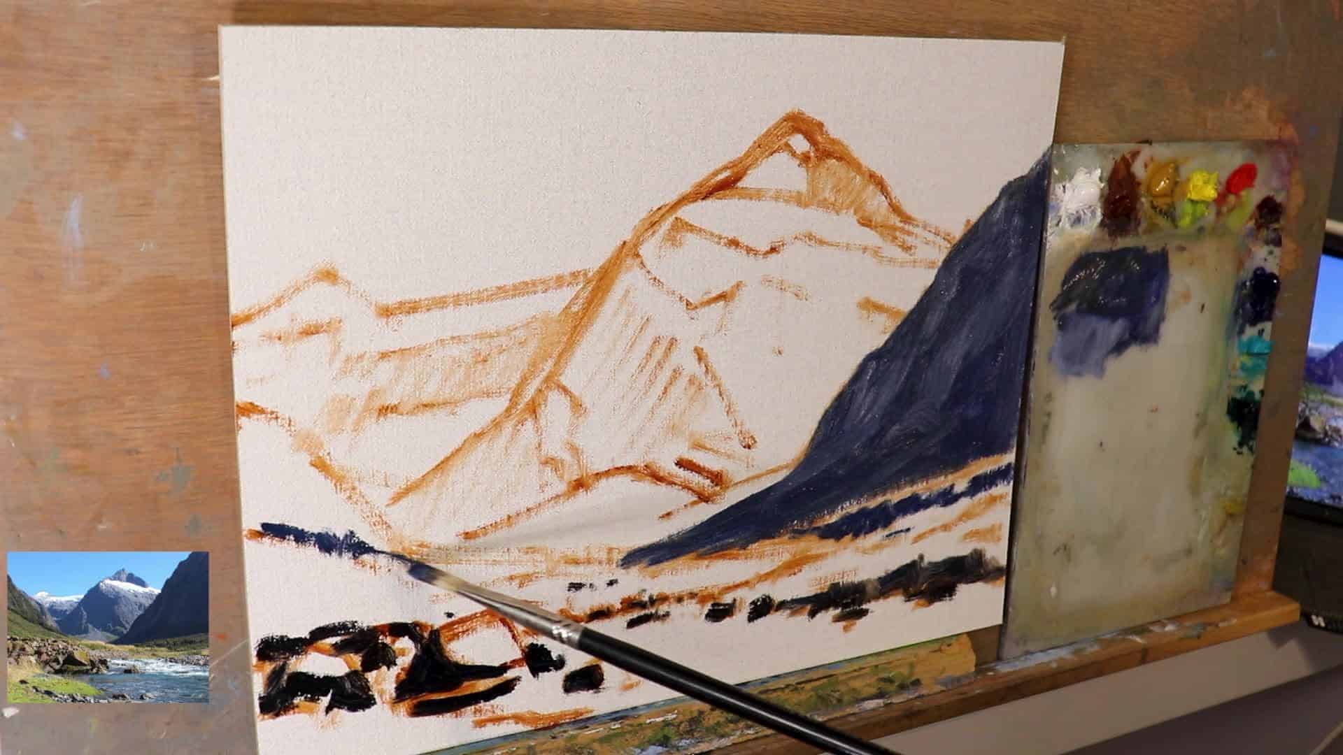
Initial Drawing:
Before applying your main colors, sketch out the composition using burnt sienna mixed with a touch of pale drying gel. This combination allows you to establish your drawing while maintaining a workable surface that won’t interfere with subsequent layers.
Brushes:
Start with larger brushes for blocking in your initial shapes and masses—a #6 bristle flat brush works particularly well for this stage. Beginning with bigger brushes helps you focus on the overall composition and major forms before refining details.
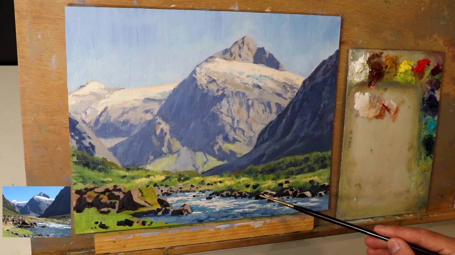
Visual: Your prepared canvas, sketched and ready to go!
Tip: Big brushes keep your marks loose and energetic at first, so you don’t fuss over detail too soon.
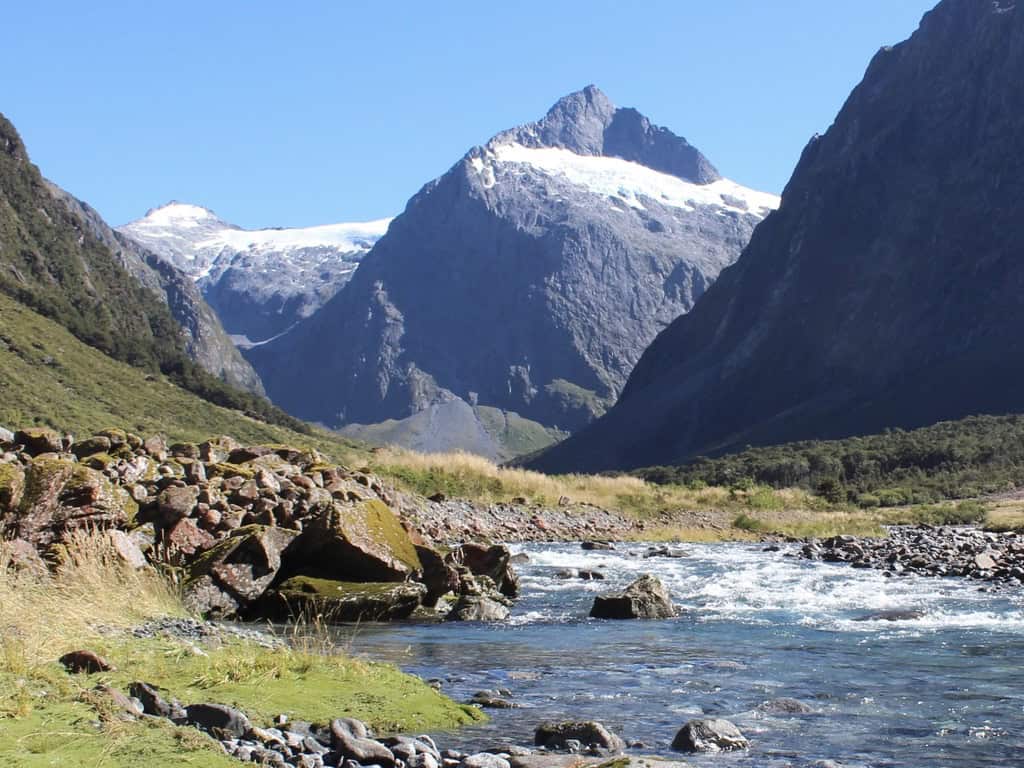
Reference Photo
Blocking In and Setting Tonal Values
Now the magic begins—blocking in the mountain landscape and setting up the all-important tonal structure.
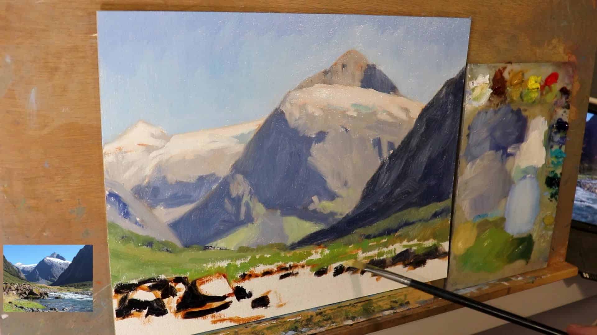
- Start with Dark Values and Shadows:
This is a painting game-changer. Begin with the darkest darks, especially in the foreground. This gives you a reference for value as you build up the rest of your scene. - Why Start Dark?
By painting the shadows first, you quickly establish the painting’s tonal range. It’s easier to judge the lights when the darks are already in place.
“Creating distance and depth in your mountain landscape starts right at the beginning by painting the dark values and shadows first.”
- Landscape Rule of Thumb:
- Darkest darks and lightest lights are found in the foreground
- As mountains recede, both darks and lights get paler
Blocking in:
- For rocks and boulders by the stream, mix ultramarine blue + burnt sienna (which creates a rich dark), plus a hint of alizarin crimson.
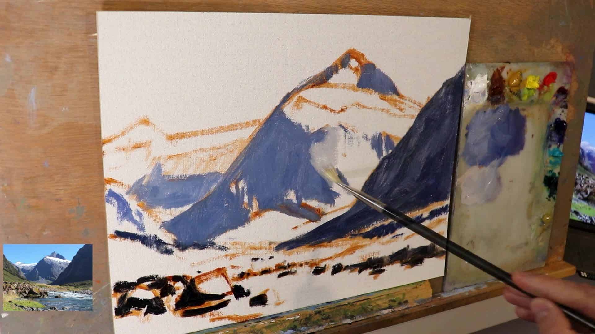
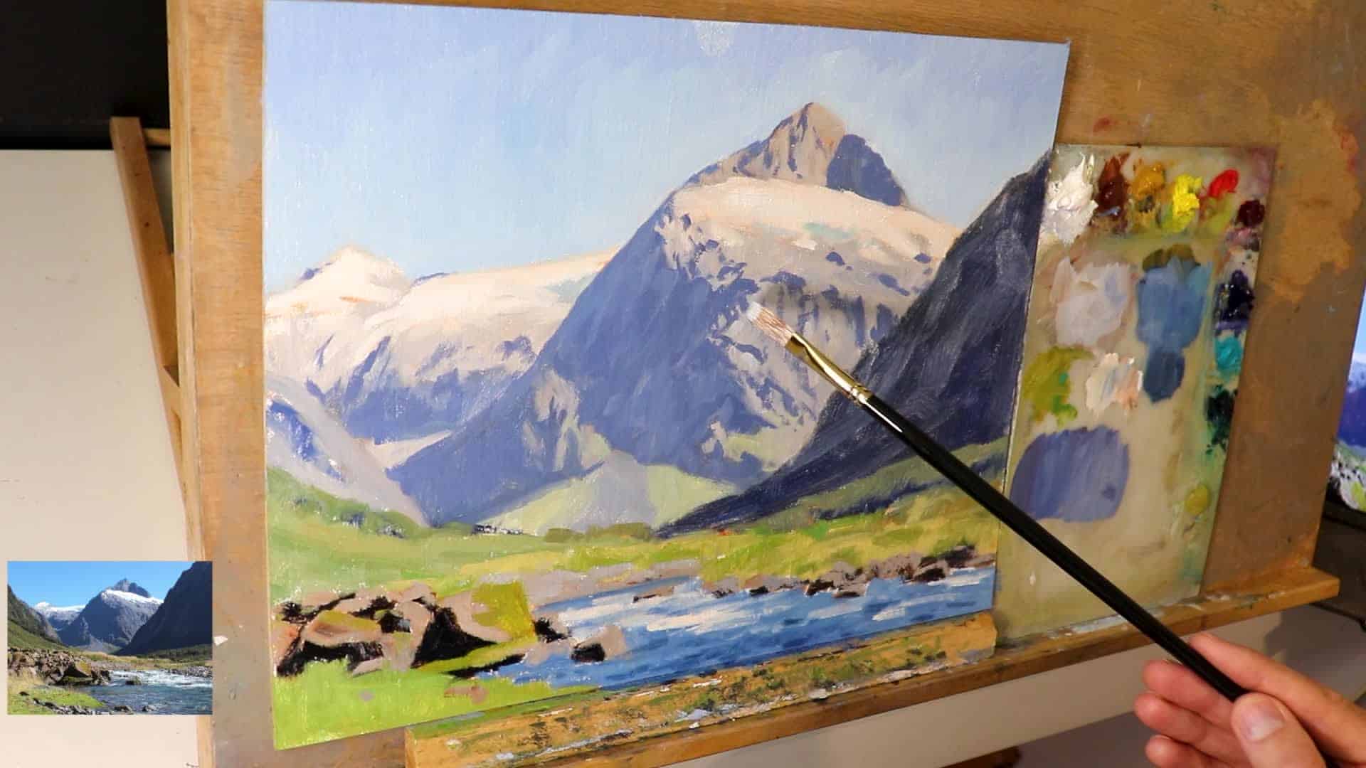
Creating Depth: Foreground, Midground, and Background
Foreground
- Use full-strength darks.
- Use the biggest brushes you feel comfortable with to lay in bold blocks of shape and color.
Midground
- Shadows get lighter as they recede.
- Use the same dark mix, but lighten with titanium white and keep it bluer to mimic atmospheric perspective.
- Large, painterly marks. Don’t start detailing yet!
“If you’re struggling with painting too much detail, start the blocking stage with the biggest brushes you feel comfortable with.”
Background / Distant Mountains
- The furthest peaks should be painted with even lighter, bluer tones.
- Use more titanium white and ultramarine blue.
- Keep your colors clean—avoid muddy colors by limiting the number of hues you mix together.
Mixing Colors for Realistic Mountains
A good mountain painting relies on a tight, harmonious palette. Here’s what you need to know:
Essentials for Mountain Shadows:
- You don’t need many colors. For shadow areas, stick mostly with:
- Ultramarine blue
- Burnt sienna
- Alizarin crimson
- Titanium white
This minimal palette keeps the painting from looking muddy.
A Sample Mix for Rocks:
Ultramarine Blue + Burnt Sienna + Alizarin Crimson (+ Titanium White, as needed)Handling Greens in Your Landscape
Green is tricky for many artists—not every landscape should pop with crazy-bright greens! Here’s how to treat them right.
- Greens in the Distance:
Keep them less saturated and more atmospheric. Mix in extra blue and white. - Greens in the Foreground:
Gradually increase saturation as you come forward.
Use combinations of yellow ochre, cadmium yellow medium, ultramarine blue, and titanium white.
Adjusting Greens:
- Touches of cobalt teal or phthalo green can boost or shift hue.
- Always add a little red (like alizarin crimson or burnt sienna) to your greens. It helps make them look more “natural,” and if they get too strong, this is how you dull them.
“The red is going to help bring harmony to the greens, make them look more organic and natural.”
BREAKOUT TIP
- Want rich, believable greens? Try a touch of cadmium red light in the mix, especially for foreground grasses!
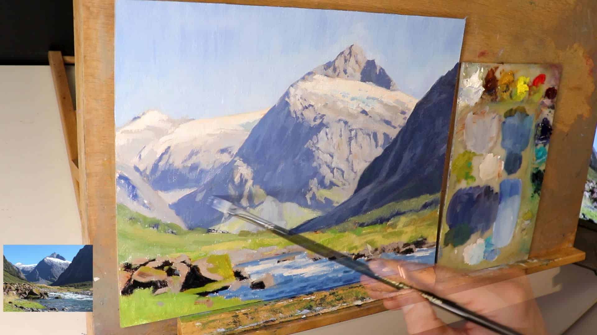
Painting Water and Achieving Color Harmony
Painting the Stream
- Mix ultramarine blue, yellow ochre, titanium white, and a little phthalo green to block in water.
- Don’t forget to add brushwork that follows the movement of water!
Color Harmony Is Key
Use common colors throughout the scene:
- Ultramarine blue and titanium white appear in nearly every mixture.
- Burnt sienna ties together rocks, earth, and even shadows.
“Color harmony is where your painting will just look nice. It reads well to the viewer, and you’ve just got nice natural but vibrant looking colors.”
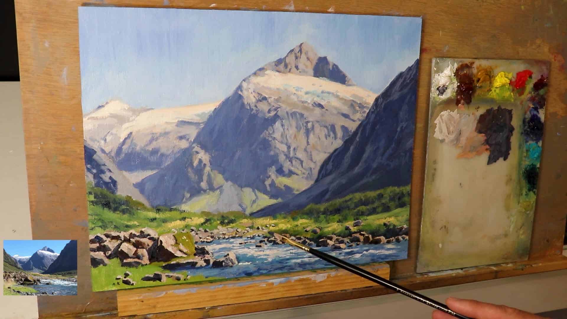
Building Realism: The Modeling Stage
Now you’ve blocked in, set up your big shapes, and mapped out values. What next? It’s time to start modeling and developing the forms that make your painting come to life.
Zone-by-Zone Modeling
- Work on individual zones: background mountain, midground slopes, foreground rocks, water, and vegetation.
- Add lighter layers of paint than the previous layer.
- Try mixing yellow ochre, alizarin crimson, and titanium white for some lovely yellow grass highlights. Let these mixes bump into your greens for a harmonious transition.
Detailing Rocks, Shadows, and Vegetation
After you’ve built up the main forms, it’s time to sharpen focus in select areas.
Switch Brushes:
- Move from bristle to synthetic brushes for the finer details—they hold a precise edge.
Foreground Rocks:
- Restate dark shadows.
- Add cracks and accents.
- Build up highlights carefully, reserving your brightest paint for the very end.
“With starting off with a painting with loose brushwork, we can add as much detail as we like afterwards, and the painting is still going to have a looseness and vibrancy to it.”
Vegetation and Grasses:
- Use lighter tones to highlight tufts of grass, especially on sunlit banks.
- Gentle overlaps between green and yellow mixes produce convincing transitions.
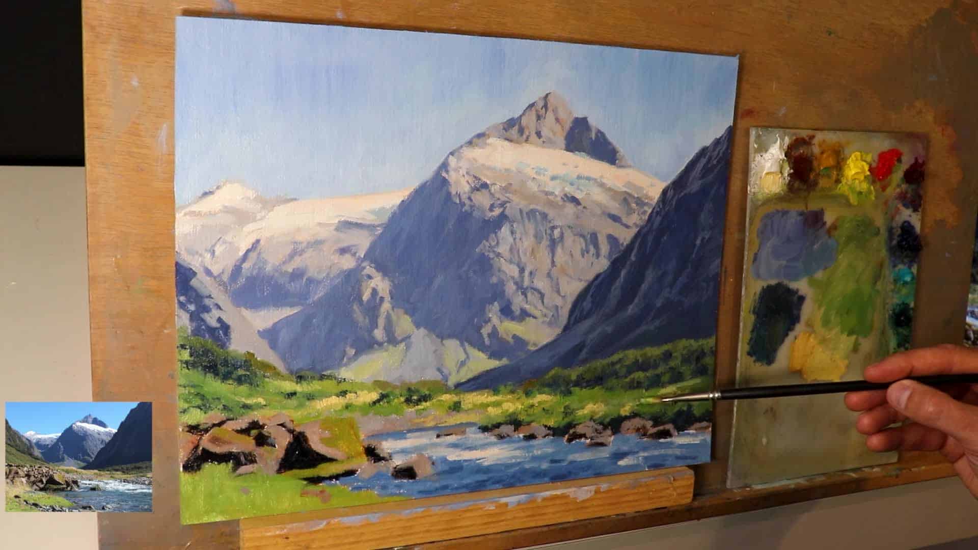
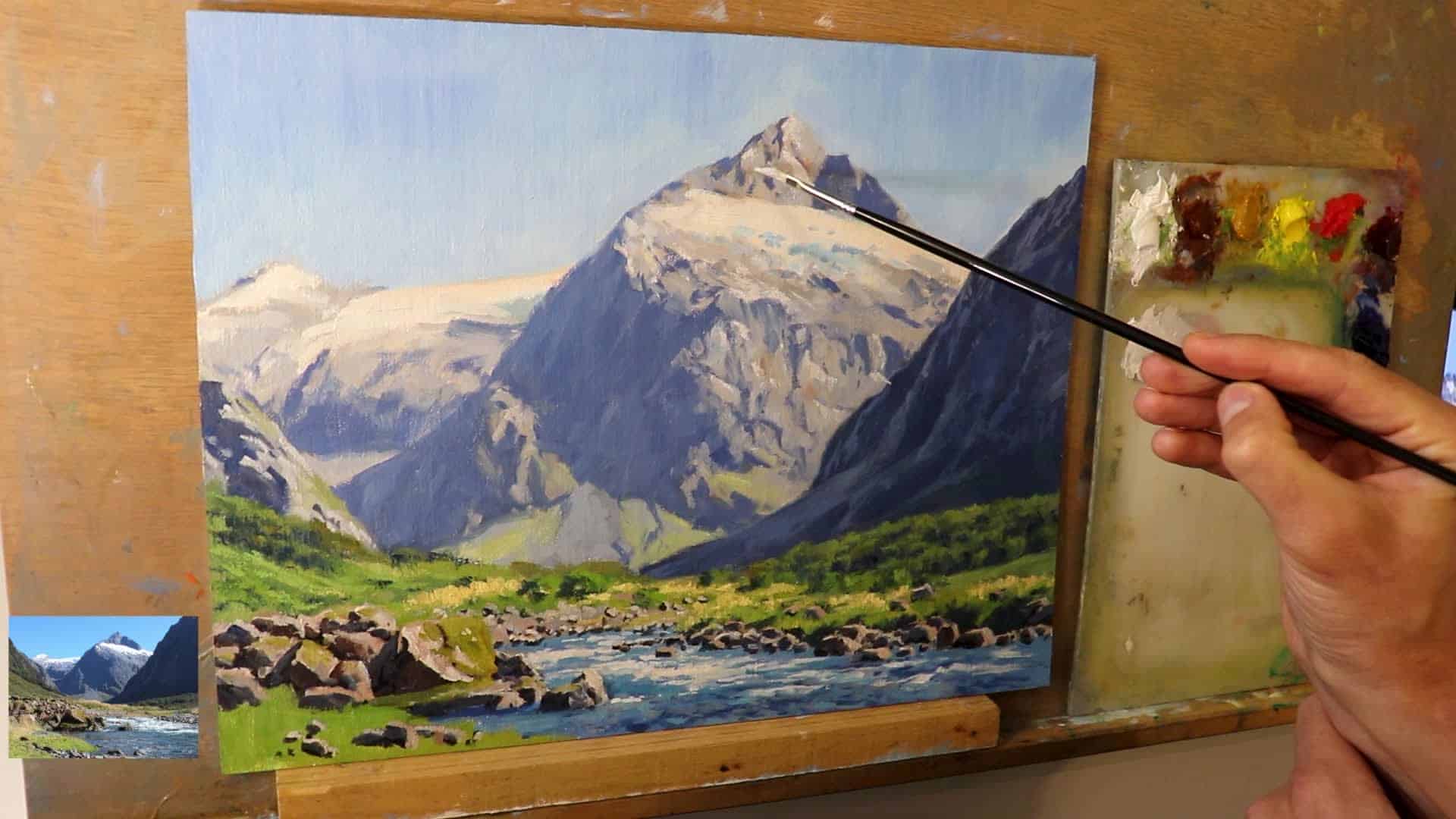
Adding the Lightest Lights and Final Touches
This is where your painting really starts to pop.
- Work from Dark to Light:
Save your lightest values until the very end. This approach gives you tons of headroom to build up depth and dazzling highlights. - Even Snow Stays Darker at First:
To keep snow from popping too early or looking fake, tint it gently with burnt sienna, ultramarine blue, or alizarin crimson. When the painting’s dry, you can add crisp white highlights on top.
“Even the snow here in the mountains, I’ve made the value a little bit darker by adding some burnt sienna, ultramarine blue, and alizarin crimson. Just the tiniest amount, but it’s enough to darken that layer of white so that it sits back in the landscape.”
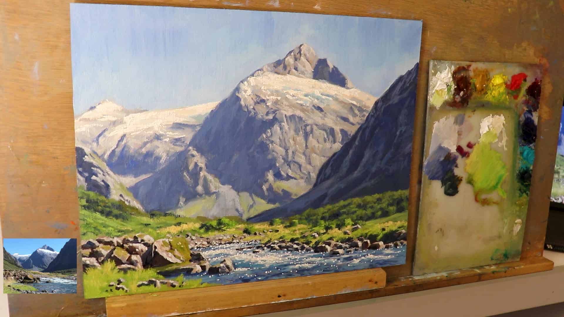
Secret Techniques for Painting Snow
Painting snow convincingly is an art in itself. Here’s the insider formula:
- Base Layer:
- Use titanium white with a smidge of yellow ochre to warm it up.
- Paint Application:
- Save these keenest highlights for the very last step.
- Apply sparingly with a small, detail-focused brush. Rigor brushes are perfect for glistening snow or water sparkles.
“I’m then able to use that same mixture to add the highlights and sparkles to the water.”
Quick Recap: Essential Mountain Painting Tips
Before you wrap up your painting, let’s review the principles that guarantee depth, realism, and that magical mountain glow:
- Start with dark values and shadows.
- This sets up the whole tonal framework.
- Loose brushwork first.
- Builds energy; you can always add detail later.
- Paint tonally darker to begin with.
- Gives you headroom for highlights.
- Model zone by zone.
- Develop details as you move from background to foreground.
- Save your lightest lights until the end.
- Use them for snow, sparkles in water, and final highlights in foliage and rocks.
“In this case, painting the snow on top of the mountains and sparkles in the water and adding a few highlights to the foliage and vegetation—as well as the rocks—is what is going to make your painting pop and create that convincing sense of depth and distance.”
Recommended Gear, Resources, and Final Thoughts
- Paints: Blue Ridge Oils
- Brushes: Rosemary and Co.
- Tripod Easels and Accessories: KraftGeek Get 15% off Craft Geek with code: Samuel Art at checkout!
“I was looking for a tripod easel that would fit into my small studio, and that’s when Craft Geek reached out to me … I absolutely love it.”
If you want to dive deeper into landscape painting, don’t miss the free Landscape Painting Blueprint. It covers even more about composition, value, and color mixing.
Watch and Learn
Ready to put brush to canvas? Sometimes, seeing is believing!
Final Inspiration
Remember, painting mountains is about building up depth—one careful layer at a time. Don’t worry about perfection in the early stages; focus instead on big, bold shapes, clean color mixing, and saving your brightest highlights for when they’ll have the most impact.
“I hope this post inspires you to paint some mountain landscapes. Take your time, enjoy the process, and keep experimenting with depth and distance.”
For more, watch this in-depth video on painting mountains and see you in the next project!
Happy painting! If you give this method a go, share your results, or ask questions in the comments below.
See you at the easel!
