Have you ever thought you were just about finished with a painting, only to spot a mistake that’s about to ruin the whole piece? Trust me, I’ve been there! In this blog post, I’ll walk you through my painting process for creating broadleaf willow trees and dramatic lighting effects, just like those stunning views in Arrowtown, New Zealand. We’ll take a deep dive into materials, my step-by-step painting approach (including what went wrong and how I fixed it), tips for capturing trees, water, and reflections, and a behind-the-scenes look at tweaking color temperature to save a painting that almost went off the rails.
This post is packed with real insights and mistakes as well as fixes—so whether you’re a beginner or a seasoned landscape painter, there’s something here for you.
Introduction: Inspiration from Arrowtown
Arrowtown in southern New Zealand is famous for its breathtaking autumn light and a gorgeous carpet of deciduous trees that explode into color every year.
“I was really captivated by the stunning autumn light on one of my visits there. What I love about this location is all the deciduous trees that produce beautiful colors in autumn. I’d been meaning to paint this scene for years.”
For ages, I’d wanted to capture this scene. I’m finally bringing it to life—not just in paintings, but in this step-by-step guide that lets you join me for the entire process.
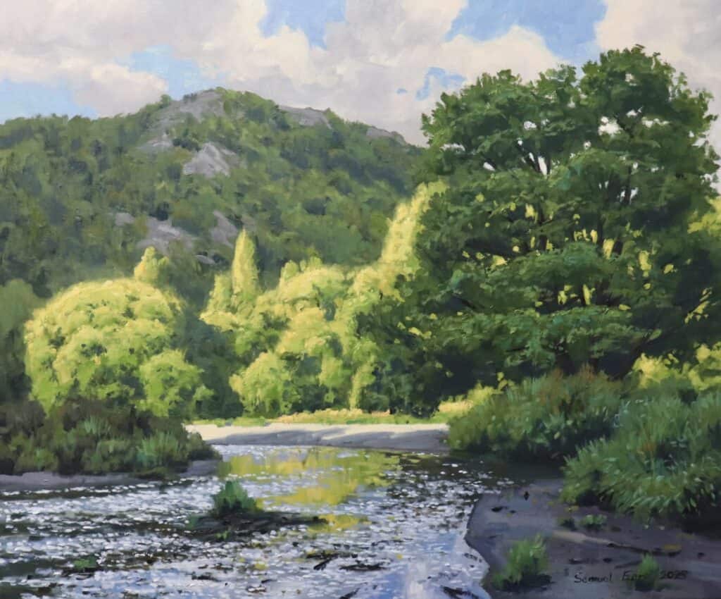
Stunning autumn view in Arrowtown, the inspiration for this piece.
My Materials & Studio Setup
If you’re curious about the tools and materials I used, here’s a breakdown:
- Canvas: 20″ x 24″ oil-primed Belgian linen stretcher—durable and perfect for rich, buttery oil paints.
- Paint: Blue Ridge Oils (love their color quality and texture).
- Easel: Craft Geek tripod easel (ideal for both small studio spaces and plein air painting).
- Brushes: Number 10 bristle flat brushes for big work, plus synthetic filberts for details.
- Palette: Titanium white, ultramarine blue, yellow ochre, cadmium yellow medium, cadmium red light, cobalt teal, phthalo green, burnt sienna, and alizarin crimson.
Tip: If you want to try the paints and easel I use, check out the links in the description.
A look at my workbench with my favorite Blue Ridge Oils and trusty bristle brushes.
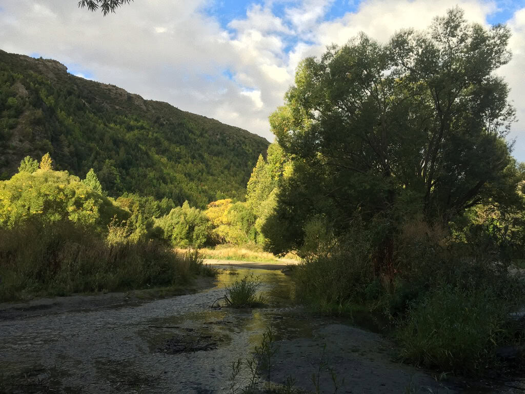
Reference Photo
Laying the Groundwork: Planning and Color Studies
Before I put brush to canvas, I always plan ahead.
The Steps:
- Sketches
I started with small, loose pencil sketches to work out composition, leading lines, and the main tree shapes. - Color Study
A fast, small (often 5″x7″) run-through in oils, just to get the feel for the color temperature and mood. This helps expose problems before they happen at full scale. - Reference
I used photo references and memories from my Arrowtown trip, especially for accurate autumn colors.
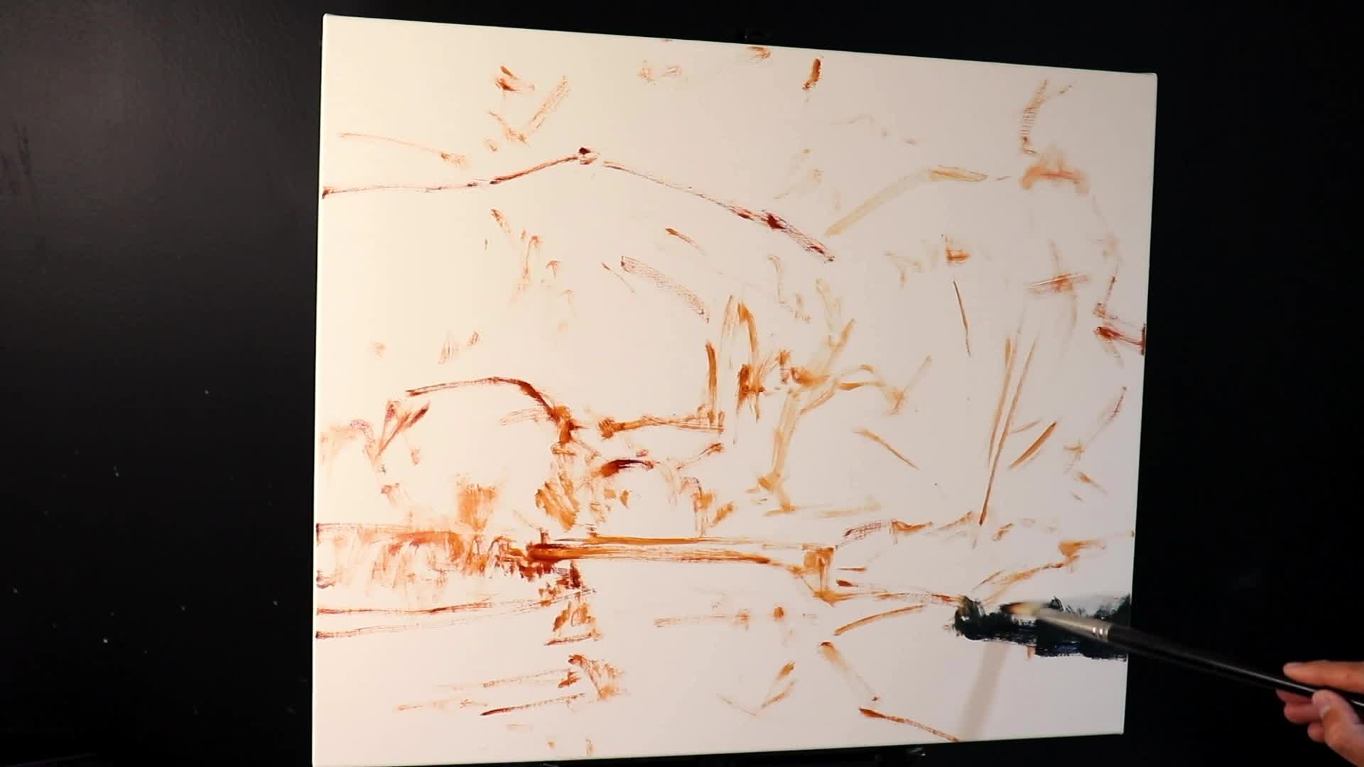
A simple color study can save your painting from mistakes later.
Why This Matters:
Planning means you already know your path, so you don’t freeze up or lose track when painting. Color studies are especially helpful—they catch those color temperature errors before they become big headaches.
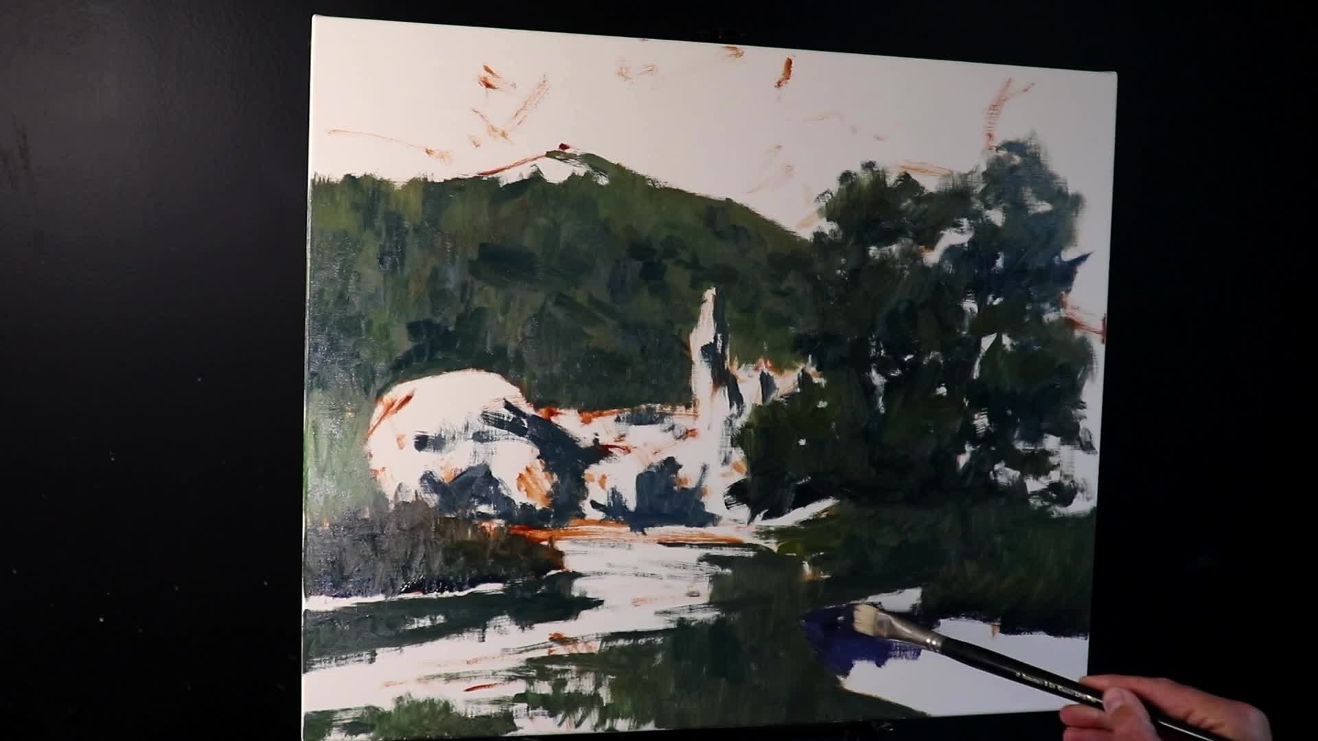
The Block-In: Capturing Values and Shadows
Let’s dive into the painting itself. My first move is always blocking in the darkest values:
Step 1: Painting the Darkest Darks
- Foreground Willow Tree:
Mixed ultramarine blue and yellow ochre for a deep, natural-looking green—dark enough but not overly saturated. (Tip: Use big brushes at this stage! I love number 10 bristle flats.) - Broad Strokes:
Start with as large a brush as possible. This keeps things loose and spontaneous.
“I try and use the biggest brushes that I can get away with. The shadows also have a slight green cast to them as well.”
Step 2: Distance Equals Lighter Shadows
- Background Shadows:
Moving into the distance, shadows get lighter—so add a bit of titanium white to your mix.
Step 3: Understanding Value
- Values are the backbone of painting. I always think:
- Foreground = Darkest darks
- Background = Not as dark, not as light
- This builds depth and keeps your landscape from going flat.
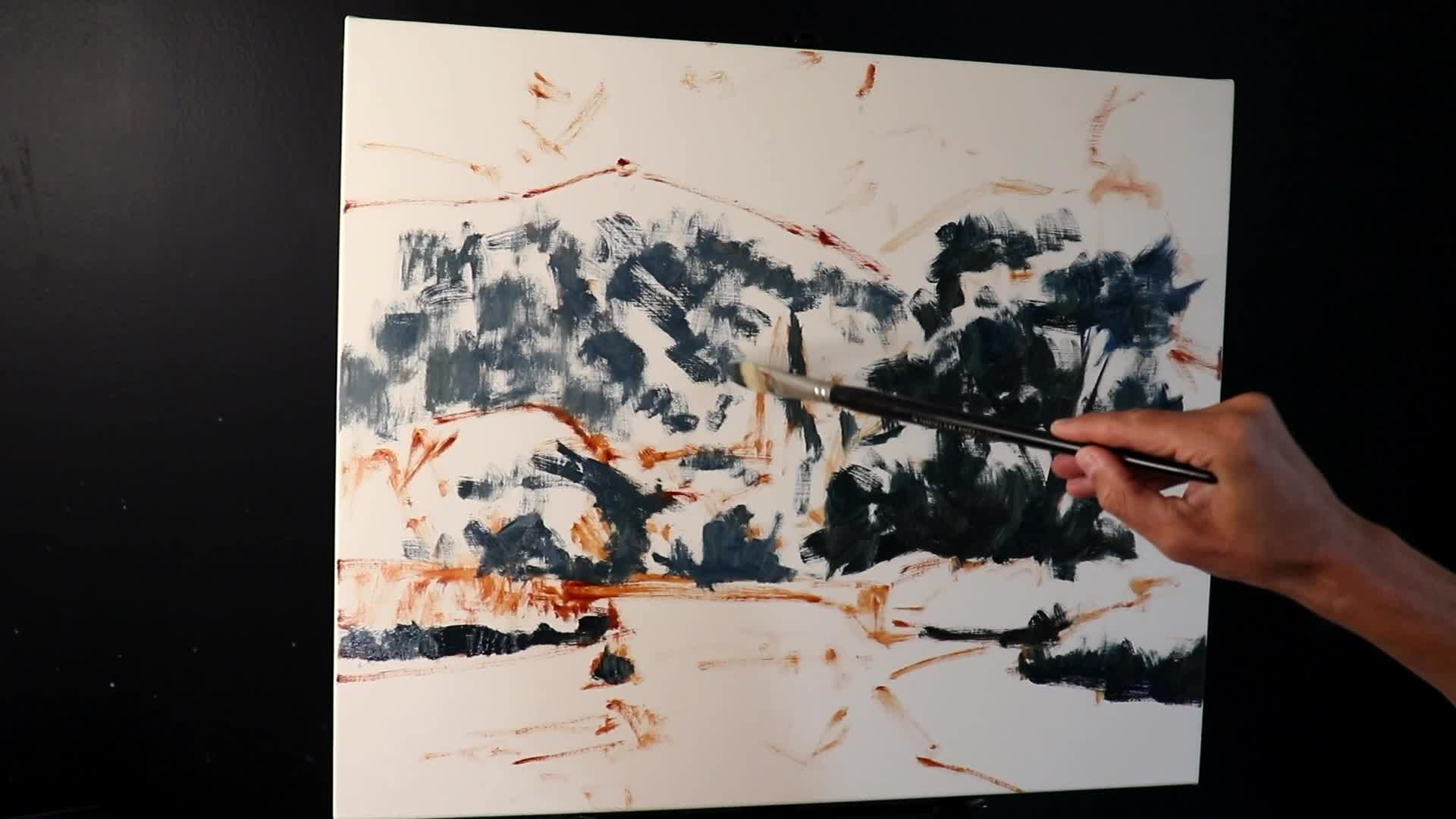
Blocking in darks brings structure and form to your composition.
“Trees tend to be some of the darkest values in the landscape, especially when they’re growing as part of a woodland or a forest, because there’s lots of occlusion shadows.”
Paint Mixtures for Shadows
- Basic Shadow Mix:
Ultramarine Blue + Yellow Ochre + touch Titanium White
- Increased Saturation (Mid-Greens):
- Add a little cadmium yellow medium, cobalt teal, alizarin crimson.
Note: At this stage, I ignore detail completely—just looking for gesture, big rhythms, and simple masses.
Building Form: Adding Layers and Modeling Trees
Once the foundation is there, the painting looks pretty rough—but that’s exactly what you want.
Step 4: Modeling the Trees
- Feathering and Massing:
Rather than painstakingly painting every individual leaf, I mass in main shapes and feather out edges of the canopies to suggest leaf clusters.
“One of the things that artists get really tangled up in when it comes to painting trees is trying to paint every single leaf, especially from the get go. The way I paint my trees is to treat them as masses.”
Feather the tree canopies for a leafy, soft, and natural look.
Step 5: Painting Reflective Light and Gradual Build-Up
- Main tree canopies (foreground willow):
- Mixes of yellow ochre, ultramarine blue, cadmium yellow medium, titanium white, cobalt teal, alizarin crimson
- Shadow Trees:
Keep values dark if they’re in shadow, using earlier mixes. - Modeling and Building:
- Always start dark, then layer up with lighter mixes, saving pure highlights for the very end.
Step 6: Background and Composition Adjustments
- Background Trees:
Don’t fuss with every tree—indicate the suggestion of a lot of trees. - Compositional Tweaks:
Don’t be afraid to move a tree if the layout isn’t working, as I did with a misaligned Lombardi poplar.
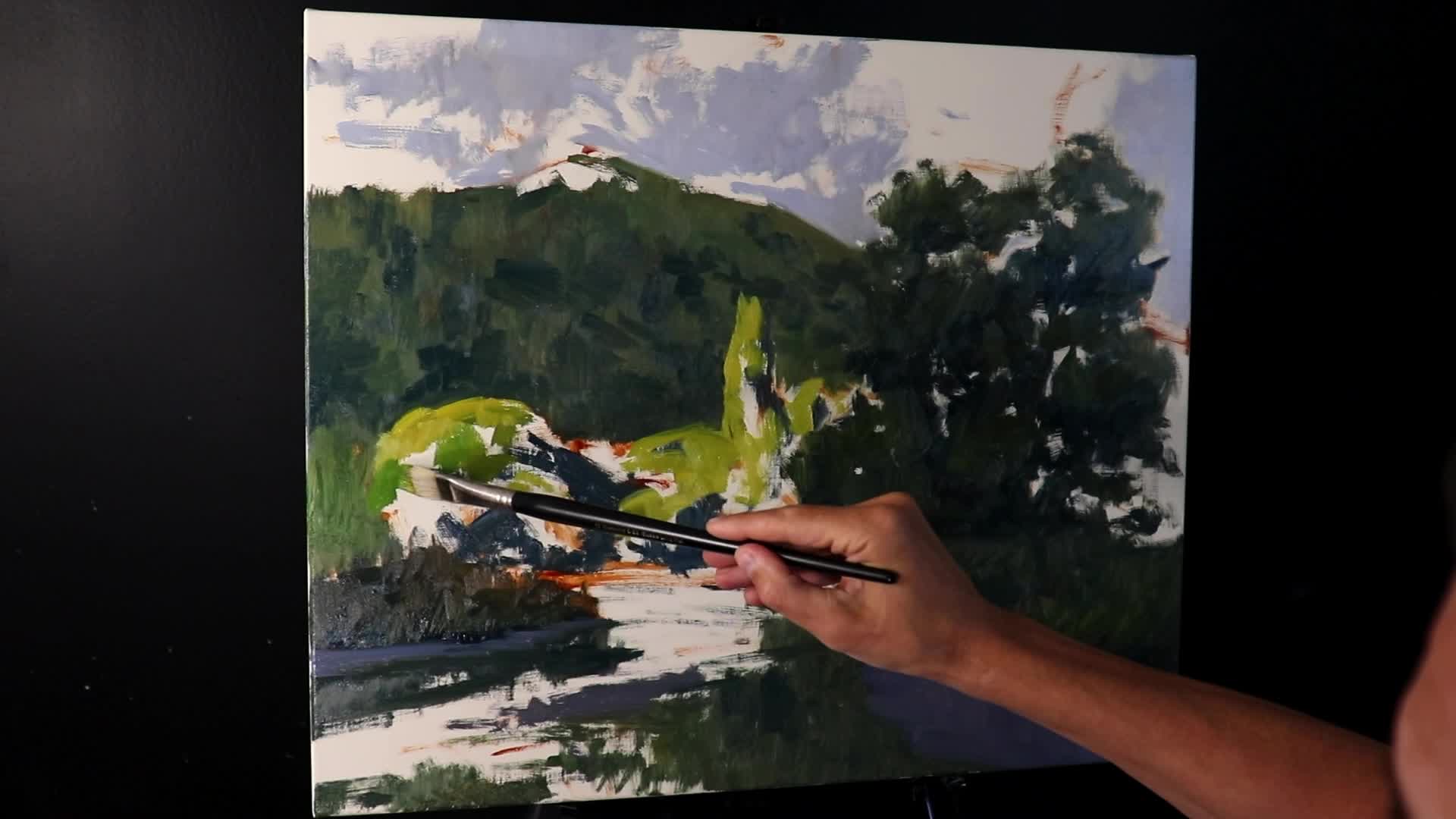
Loosely suggested background trees make for depth without overworking detail.
Painting Water: Techniques for Reflection and Movement
The river in my painting plays a key supporting role. It leads the eye in classic “S” composition while giving contrast and depth.
Step 7: Painting Reflections
- Start with Shadowed Reflection:
Using darker versions of your landscape colors, pull brushstrokes downward in the water area.
“Another way to create reflections is to pull your brushwork downwards.”
S-composition leads the eye through river reflections into the heart of the scene.
Step 8: Add Light and Ripples
- Light Areas:
Use sky color mixes (ultramarine blue, touch burnt sienna, titanium white, alizarin crimson). - Ripples:
These mostly reflect the sky, so use your lightest blue mixes. Switch to a synthetic filbert for finer ripple detail.
Tips for Water
- Paint still water first (usually more reflective).
- Add ripples after the reflections for movement.
- Shallow rivers often show riverbed color—adjust values and colors accordingly.
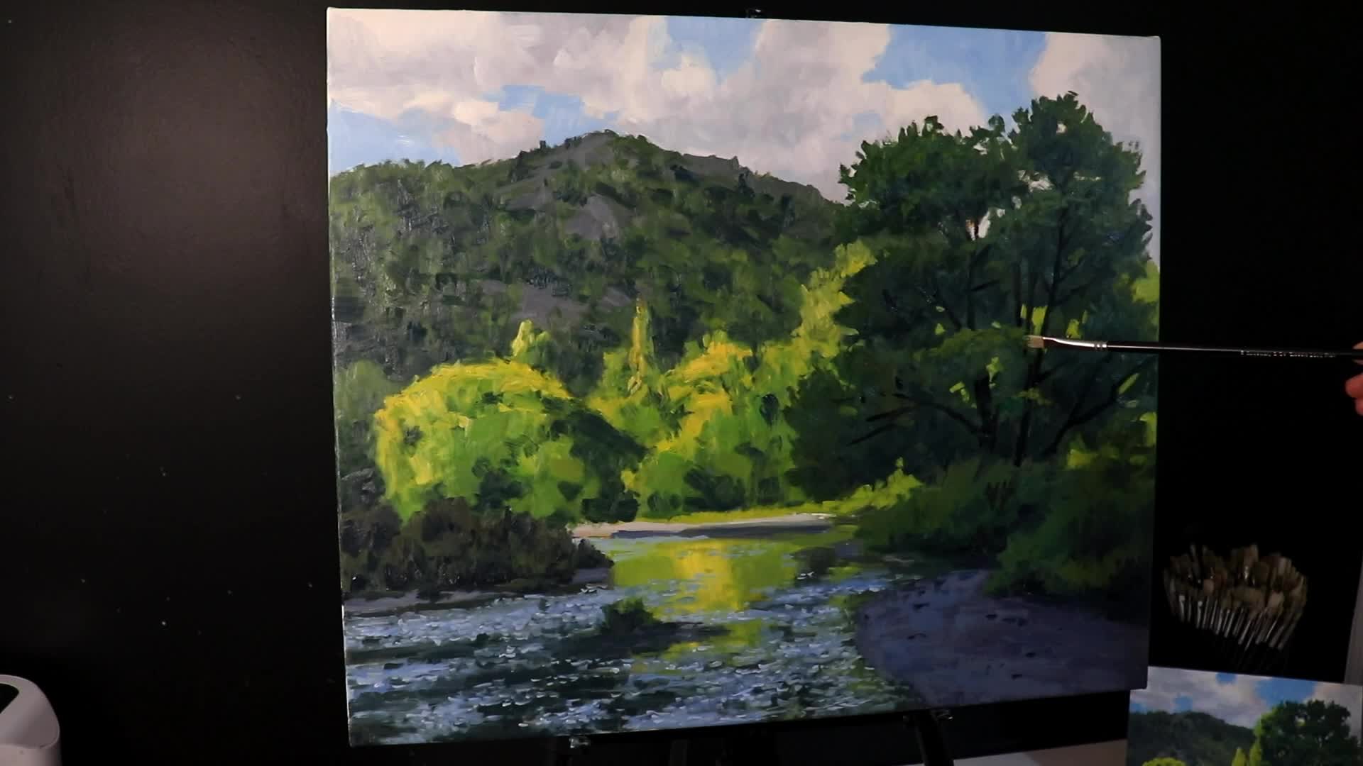
Detailing: Grasses, Finer Leaves, and Final Touches

With the painting dry and my major values in place, it’s time to add selective detail:
Step 9: Foreground Grasses
- Approach:
Build up from dark to light, just like with the willow tree. - Brushwork:
Use upward brushstrokes to imply blade direction. Don’t try to paint every blade (unless you want to go mad!). - Mix:
Use variations of your earlier greens; imply rather than copy.
Implying detail with brushwork—a faster, more natural result.
Step 10: Light Touches in the Trees
- Switch to smaller brushes for details.
- Add lighter highlights to canopies and restate darks for form.
- Go back and forth as needed until things feel dimensional.
“Having shadows in your landscapes and your trees is just going to make things easier to paint and also make it easier to convey a three-dimensional looking landscape.”

Dapples of sunlight and layered color bring midground trees to life.
The Big Mistake: Muddy Greens and the Fix
What Went Wrong?
Towards the end, I thought I was almost done—but the more I looked at the foreground willow, the more its greens looked muddy and dead.
- Original plan (in my color study): Foreground tree should be green, in shadow but lively.
- What happened: In my main painting, I chased autumn colors, adding too many golden/rusty tones. The tree lost freshness and became “muddy.”
“I think one of the mistakes that I made here was I deviated from my color study too much… I added too many golden and rusty tones in the trees’ canopy and it just made it look a bit muddy.”
The Fix
- Step Away and Reassess
- I let the painting sit, looked at it in different lighting, and confirmed: I’d gone off track.
- Repaint the Foreground Tree Canopy
- Scraped back the muddy layer.
- Remixed a much cooler, fresher green: more cobalt teal, phthalo green, alizarin crimson, and titanium white.
- Layered with a synthetic flat brush, feathering new greens over the canopy.
- Result
- Foreground willow looked vibrant, believable, and alive again—matching my original plan.
A before-and-after of the foreground willow, showing the rescue with cooler greens.
“At this point in the painting, it was complete and I was much happier with the end result.”
Key Takeaways for Painting Realistic Landscapes
Here are the biggest lessons I learned—and ones I’d suggest to anyone tackling landscape painting:
1. Start with Planning
- Do quick pencil sketches.
- Always make a small color study—catch mistakes early.
2. Block in Dark Values First
- Use the biggest brushes you can so you’re not trapped by detail.
- Treat trees and other shapes as masses.
3. Think in Values, Not Just Colors
- Foreground should have the deepest shadows; background, lighter.
- Save your lightest highlights for last.
4. Use Broken Color
- Don’t over-mix; let dabs of pure color peek through for vibrancy.
5. Build Up Layers
- Add detail gradually, from biggest shapes to smallest.
- Let some layers dry between steps if in oils.
6. Adjust and Step Back
- If something isn’t working, trust your eyes and your color study.
- Don’t be afraid to repaint an area if it means a better final painting.
7. Suggest, Don’t Render
- You don’t need to put every leaf or blade of grass.
- Suggestion and smart brushwork often read more “real” than detail.
“Most of the time, I’m just painting the few suggestions of leaves… treat them as masses.”
A landscape comes together with careful planning, layers, and creative fixes.
Level Up Your Art: Join the Community
I hear from a lot of artists who get stuck on similar things: muddy colors, flat landscapes, or trees that look pasted on. If you struggle with painting trees—or any other part of landscape painting—I want to help you out.
I run an online art school where you can find:
- Comprehensive tutorials
- Live Zoom painting classes where you ask questions in real time
- A community of fellow artists rooting for you
- Artwork critiques to help you grow fast
“The goal is simple. Get your artwork to a standard you’d be proud to hang on your wall or even sell.”
Sign up here
Watch the YouTube Video
Further Resources
If you want to go deeper on some of the topics I covered here, check out these resources:
- Three Simple Composition Formulas (video link)
- My recommended art supplies (link in description)
- Prints and Originals for Sale – like my style? You can own a piece of it!
- Learn How to Paint Trees (Video)
Want more guides like this? Follow for updates and more step-by-step landscape lessons.
Conclusion
Painting broadleaf willow trees and autumn landscapes is about so much more than copying what you see—it’s planning, reacting, making creative choices, and fixing what doesn’t work. Arrowtown’s autumn inspired me, and I hope you feel motivated to get out your paints and try a dramatic landscape of your own.
Don’t get discouraged by mistakes; sometimes, they’re your best teachers.
If you’d like to level up your painting, join my art school, grab a painting for your wall, or simply keep learning through my free guides.
Thanks for reading—now go paint some trees!
“So I hope you enjoyed this video and it inspires you to paint trees.”
Check out my art school for more, and see you in the next guide!
