As a landscape artist, I’ve poured countless hours into my craft, chasing the elusive magic of natural light and shadow that transforms a painting from ordinary to extraordinary. I’ve studied techniques, devoured books on the subject, and attended workshops. I’ve invested in the finest materials, from premium paints to professional-grade canvases. And I’ve practiced relentlessly, hoping each stroke would bring me closer to the vibrant, dynamic scenes I envisioned.
Yet, for the longest time, something felt missing. My paintings often lacked the life and energy I wanted them to convey. The interplay of light and shadow didn’t quite capture the depth and realism I admired in other works. It was frustrating, to say the least.
That’s when I stumbled upon a game-changing approach—one that didn’t just tweak my technique but completely revolutionized how I approached my art. It was like unlocking a secret door to a new realm of creativity, where my work finally started to reflect the beauty and emotion I saw in the natural world. This discovery transformed not just my paintings, but also the way I connected with my art and the stories I wanted to tell through it.
The Power of Starting with Shadows: A Painter’s Journey
Like many artists, I used to begin my landscapes by blocking in the sky or establishing mid-tones. It seemed logical – start with the biggest shapes, right? But my paintings consistently lacked depth and dimension. The breakthrough came when I completely reversed my approach, and today I’m sharing why starting with the darkest shadows first transformed my work.
The Common Struggles of Landscape Painting
Before I discovered this technique, I faced familiar challenges:
- Values that appeared flat and unconvincing
- Colors that looked muddy when layered
- Difficulty capturing the true depth of a scene
- Landscapes that lacked three-dimensional impact
- Shadows that seemed disconnected from the rest of the painting
Looking back, I realize these issues stemmed from approaching my paintings in the wrong order. By starting with mid-tones or lights, I was making it much harder to judge and establish proper value relationships – the very foundation of a successful landscape painting.
Why Starting with Shadows Changed Everything
Let me share why beginning with the darkest parts of your painting can feel strange at first, but actually makes the whole process easier and more enjoyable. This discovery completely changed how I approach my landscape paintings, especially when I’m painting mountains and forests.
Breaking Traditional Painting Rules
I know it seems natural to start with the sky or the main subject of your painting. That’s what I did for years, and I bet you’re doing the same. Think of those gorgeous mountain peaks or dramatic cloud formations – they’re what drew you to paint the scene in the first place, right? But here’s what I’ve learned: when we start with these eye-catching elements, we often make our shadows too light, and then everything else in the painting becomes a struggle.
How Dark Values Guide Your Painting
Starting with shadows is like creating a road map for your painting. Once you get those deepest darks in place – like the shadows between trees or the dark crevices in mountain faces – something magical happens. Every other color and value decision becomes clearer and more straightforward.
Here’s what I mean: when you place those dark values first, you’ve established your painting’s darkest point. This gives you a reference for every other tone you’ll add. It’s like having an anchor that helps you judge how light or dark everything else should be.
The most surprising benefit I’ve found is how this approach affects color mixing. When you know exactly how dark your shadows are, mixing the right colors for your mid-tones and highlights becomes almost intuitive. No more guessing or constant adjusting – you can see exactly what your painting needs.
Learn to Paint Four Stunning Landscapes
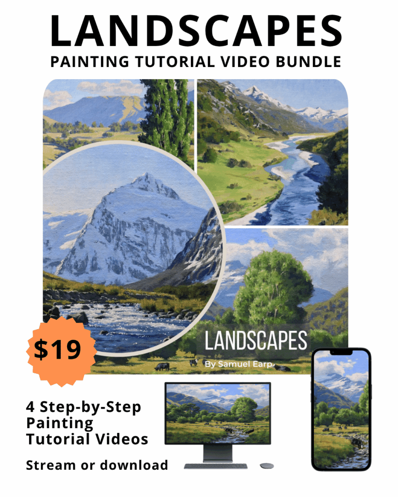
4 x Step-by-Step Painting Tutorial Videos – $19
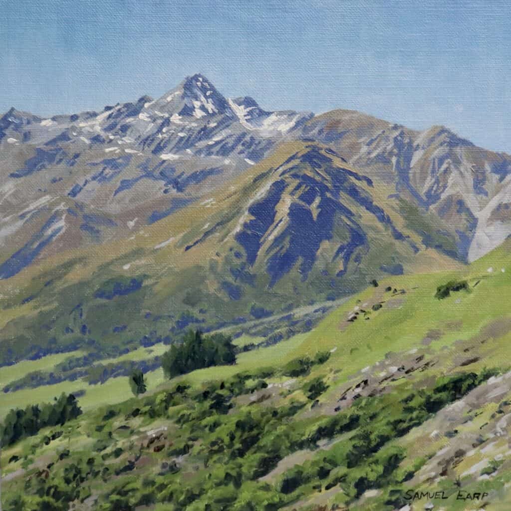
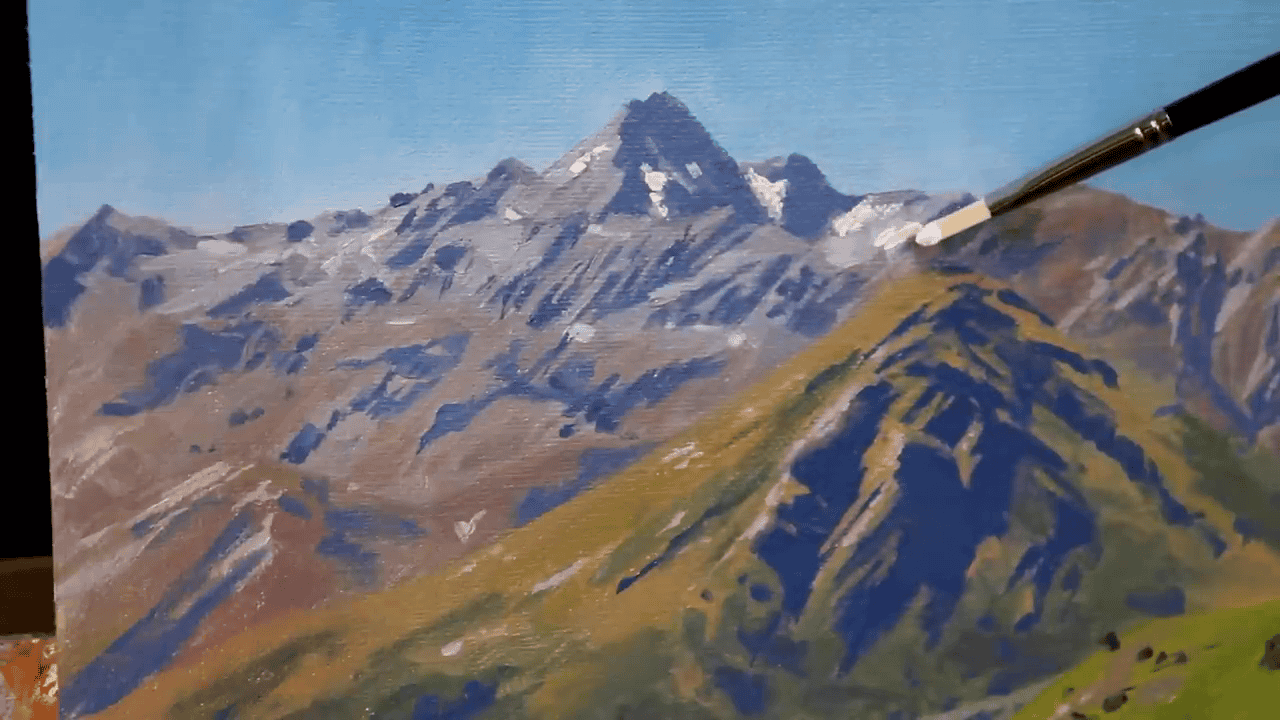
How a New Zealand Mountain Scene Taught Me About Depth
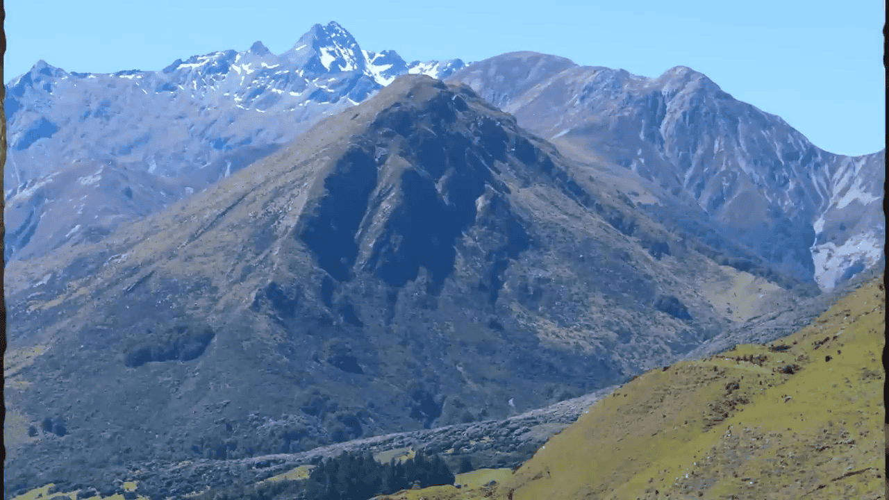
There’s something about New Zealand’s South Island that captures every landscape painter’s imagination. When I chose this scene for my demonstration, I knew its dramatic peaks and valleys would perfectly show how shadow placement creates the illusion of distance.
Finding the Right Scene for Shadow Practice
The South Island’s landscapes are nature’s perfect classroom for learning about depth in painting. Think about those majestic mountains that seem to stack one behind another, each range creating its own shadow pattern. This kind of scene presents both a challenge and an opportunity – it’s complex enough to be interesting but organized enough to be manageable.
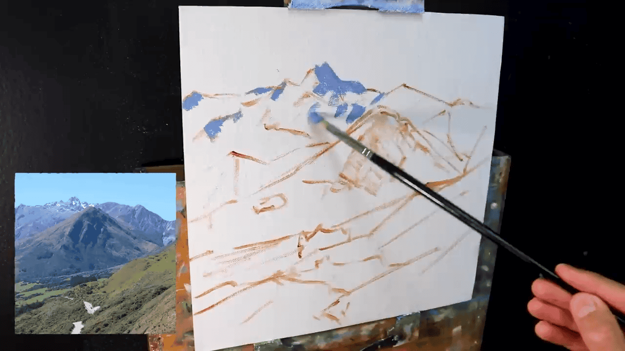
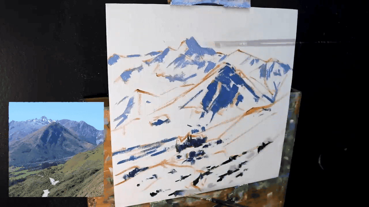
My Step-by-Step Shadow Journey
Looking back at this painting, which I completed a year before making my tutorial video, I can see how my approach to shadows has evolved. Today, I understand even better why those first dark marks are so crucial. It’s like laying the foundation of a house – everything else depends on getting it right.
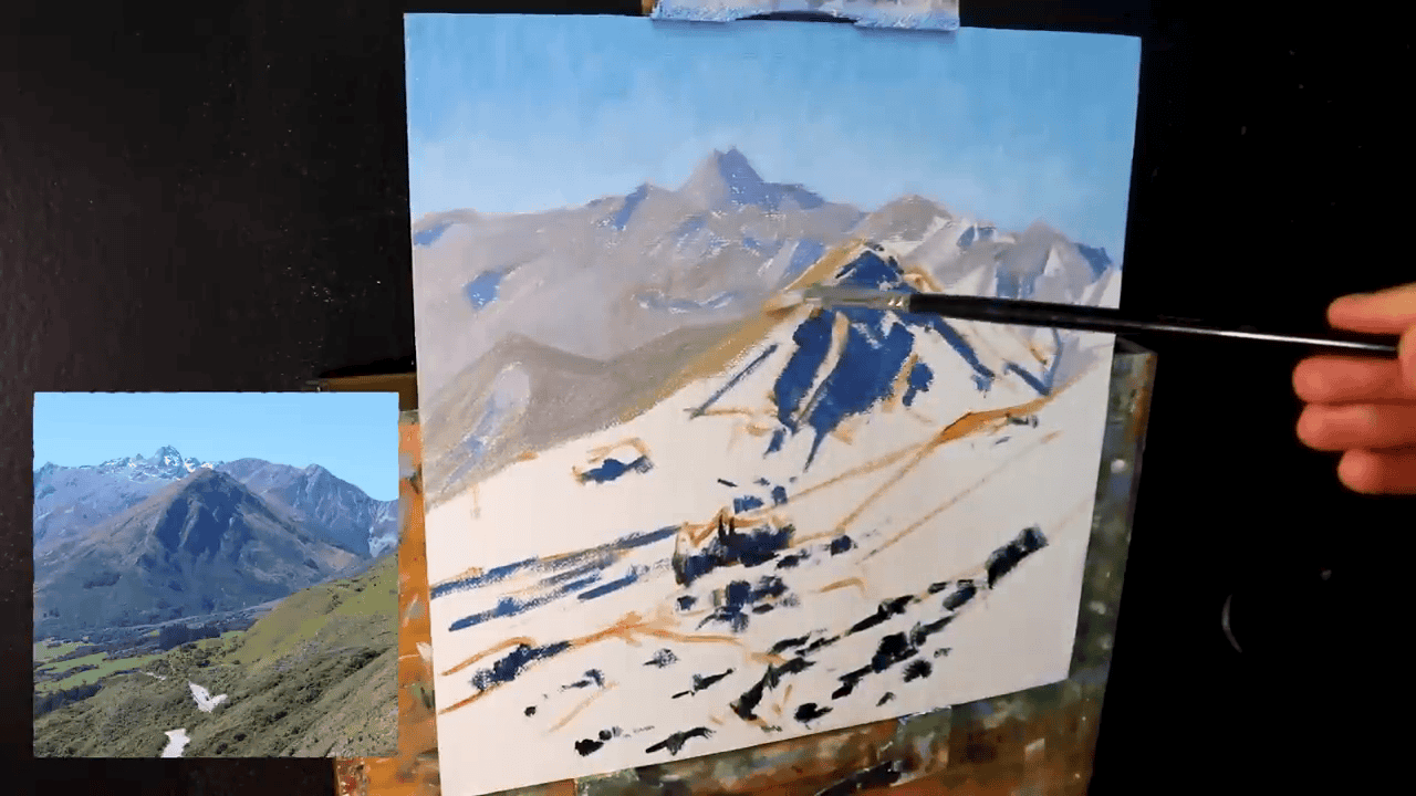
When I painted this scene, I began with the shadows in the distance. These weren’t the darkest shadows in the painting – those would come later in the mid-ground. Instead, I used slightly lighter values for the distant shadows, creating what artists call atmospheric perspective. This technique makes distant objects appear lighter and less distinct, just as they do in nature.
Think about how shadows work in real life: the further away a mountain is, the lighter its shadows appear. By carefully controlling these shadow values – making distant shadows lighter and mid-ground shadows darker – I could create a natural sense of depth that pulls viewers into the scene.
“Instead of starting with painting the skyline or the main features, I now begin with the darkest shadows first.” — Artist’s Discovery
Creating Life-Like Mountain Shadows: My Color Mixing Secrets
When painting mountain landscapes, getting your shadow colors right is crucial. Let me share the exact color combinations I use to create those rich, natural-looking shadows that give depth to scenes like my New Zealand mountain painting.
My Go-To Shadow Palette
The magic happens when ultramarine blue meets burnt sienna on my palette. This might sound like an odd combination, but there’s a good reason for it. The burnt sienna helps tame the intensity of the ultramarine blue, creating shadows that look natural rather than artificially dark. I then fine-tune this mixture with small amounts of titanium white and alizarin crimson to match exactly what I see in the landscape.
For those curious about tools, I find a number five bristle flat brush gives me the perfect control for laying in these shadow areas. It’s firm enough to apply the paint with confidence but still allows for subtle transitions when needed.
The Natural Laws of Light and Shadow
One of the most important lessons I’ve learned about painting landscapes is this: the strongest contrasts between light and dark always appear in the foreground. It’s like watching a mountain range at sunset – the closest peaks show the deepest shadows and brightest highlights, while the distant mountains appear softer and less distinct.
When I paint, I keep this principle in mind by:
- Making foreground shadows deeper and more defined
- Gradually softening both shadows and highlights as they recede into the distance
- Paying careful attention to how each shadow relates to the ones around it
Understanding these relationships has transformed how I approach mountain scenes. Once I get these shadow values correct, the rest of the painting flows naturally. The highlighted areas almost seem to paint themselves because I’ve already established the foundation they need to shine.
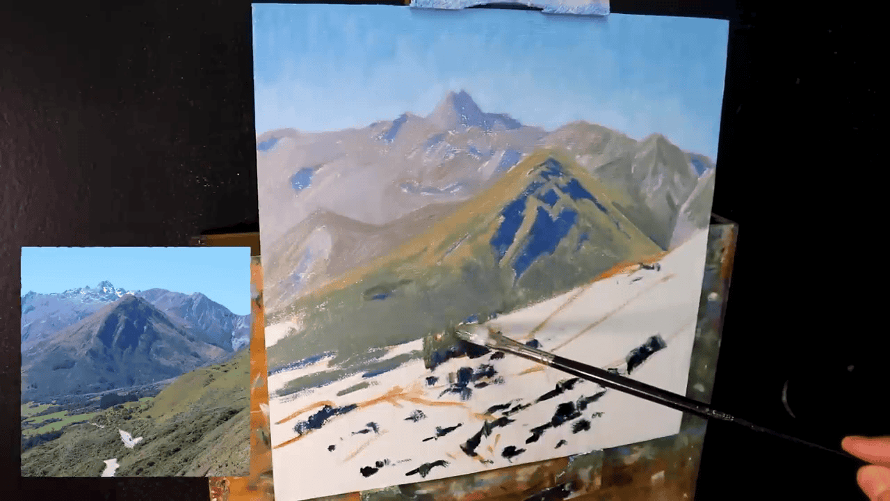
Bringing the Scene to Life: From Sky to Mountain Peaks
After establishing my shadow foundation, I move on to creating the atmosphere and light that will make the painting come alive. Let me walk you through how I approach these crucial elements of the landscape.
Crafting a Living Sky
The sky isn’t just a backdrop – it’s an active player in the scene that sets the mood for the entire painting. I’ve found that mixing ultramarine blue with titanium white creates a beautiful base, but the secret ingredient is a tiny touch of phthalo green. This subtle addition gives the sky that ethereal quality you often see in mountain landscapes.
When applying the sky mixture, I use deliberate brushstrokes that add texture and movement. Think about how clouds naturally flow across the sky – that’s the feeling I’m trying to capture. It’s not about painting every cloud perfectly; it’s about suggesting their presence and movement.
Painting Sun-Touched Mountains
Moving to the mountains themselves, this is where the careful groundwork with shadows really pays off. While I use the same basic colors for the sunlit areas as I did for the shadows, the key difference is in their proportions. The sunny faces of mountains need to sing against those darker areas we established earlier, but they still need to feel connected to them.
My tried-and-true palette for these light areas consists of:
Titanium white leads the mix, bringing brightness to the sun-touched rock faces. Burnt sienna adds warmth, while ultramarine blue and alizarin crimson help maintain harmony with the shadow areas. But here’s the crucial point – it’s not the colors themselves that matter most, but their values.
Think of value as the volume control on your painting. You can have the perfect colors, but if the values aren’t right, the scene won’t feel real. I pay careful attention to how light or dark each area should be relative to its surroundings. This attention to value relationships is what makes the difference between a flat painting and one that seems to have real depth and dimension.
Creating a Dynamic Foreground: The New Zealand Touch
Once the mountains and sky are established, the foreground becomes our chance to really draw viewers into the scene. Let me share how I capture those distinctive New Zealand tussock grasses that make these landscapes so unique.
The Art of Painting Mountain Grasses
The foreground grasses of New Zealand’s mountainous regions have a special character – they’re not the deep green you might expect, but rather a distinctive pale straw color that catches light beautifully. Getting this right is crucial for creating an authentic New Zealand scene.
Creating these subtle grass colors is like cooking with just the right ingredients in just the right amounts. I start with yellow ochre as my base, then carefully blend in ultramarine blue and titanium white to achieve that sun-bleached look. The secret ingredient? Tiny amounts of alizarin crimson that add life to what could otherwise be a flat color.
How Shadows Make Color Choices Easier
Here’s where starting with shadows proves its worth again. When you’ve already established your dark values, choosing the right colors for the grasses becomes much more intuitive. It’s like having a reference point that tells you immediately if your colors are working or not.
Think about it this way: if you place a blade of grass against a shadow and it looks artificial or jumps out too much, you know right away that you need to adjust its saturation or value. This immediate feedback is invaluable, especially when you’re working with complex elements like tussock grasses that need to look natural and integrated into the landscape.
The best part about this approach is how it builds confidence in your color choices. There’s no more guessing whether a color is too bright or too dull – the shadows you laid down earlier act as your guide, helping you maintain the right balance throughout your painting.
Modeling the Scene: Bringing the Painting to Life
Once I finish the block-in stage, I shift my focus to modeling the scene. This is where the magic begins. I refine shapes, add depth, and work on bringing a sense of three-dimensionality to the painting. It feels like the moment when the story starts to unfold, as forms emerge from shadows and details begin to take shape. Each brushstroke becomes an intentional step toward stabilizing the composition and guiding the viewer’s eye. This stage is all about building structure and creating harmony, ensuring the painting tells a story that feels alive.
Light, Shadows, and Form Defined
For me, mastering light and shadow is the heart of creating realistic and captivating landscapes. When painting mountains, I focus on ensuring they lean toward the light, allowing their features to stand out without becoming overwhelmed by darkness. Shadows are never just an afterthought—they’re my tool for adding depth, contouring shapes, and highlighting the contrast that brings everything to life. This balance is what makes the mountains feel real, drawing viewers in and holding their attention at a glance.
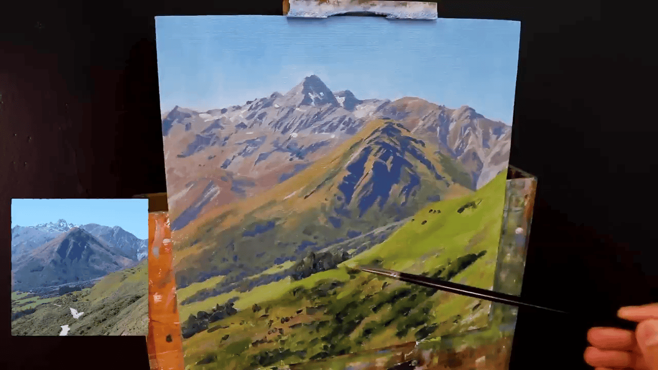
Snow and Detail: Finale Flourishes
As I near the finishing stages of a painting, I turn my attention to the details that make the scene unique. Elements like patches of leftover summer snow are some of my favorite additions. These small details not only enhance the color and contrast of the painting but also tell a story about the season and environment. Adding these final touches transforms the canvas from a simple depiction of a landscape into something that captures the breathtaking beauty of nature. For me, it’s these details that make a painting stand out and truly resonate with those who view it.
Mentorship and Mastery: A Case for Art Mentors
Developing a structured approach under the guidance of a mentor skyrocketed my ability—a method I highly recommend. Laying out thumbnail sketches for design, focusing purely on value studies, and perfecting color games was transformational.
Get the ** FREE Landscape Painting Blueprint to guide your upcoming projects now Download Now.**
Achieving the Art of Depth
For me, creating depth in a painting is about more than just adding layers—it’s about mastering tonal values and understanding how they work together to bring a scene to life. By carefully adjusting saturation, I can guide the viewer’s focus, making certain elements stand out while others subtly fade into the background. It’s this balance that creates a sense of layers, where parts of the painting seem to leap forward while others gently recede. This approach allows me to add complexity to the composition without losing the simplicity and harmony that make a painting feel cohesive and natural.
Final Notes and Further Exploration
When it comes to painting landscapes, greens often pose a challenge. They can feel dense, overpowering, or just hard to get right. I’ve learned that layering greens thoughtfully and experimenting with vibrant hues can add a dynamic perspective to my work. These adjustments address common concerns and turn a potential weakness into a strength, transforming landscapes into something truly memorable.
If, like me, you’re passionate about painting mountain landscapes, there’s always more to explore and learn. Be sure to check out the next blog, where I’ll dive deeper into techniques and tutorials to help you take your skills to the next level.
One tip I always remind myself of: starting with shadows creates a strong foundation. Shadows help define the forms and add depth, allowing me to paint with more intuition and expression. By focusing on depth and letting passion guide my brushstrokes, I’ve found that every painting becomes not just a piece of art, but a story waiting to be told.
