Welcome to another deep dive into landscape painting! In this blog post I want to share my honest experience with acrylics in my river scene. If you’re like me and have always leaned towards oil paints, you might be skeptical about acrylics.
I certainly was at least until I tackled this project. Let’s walk through my process, challenges, tips, and discoveries step by step. Whether you’re a painter who loves oils or you’re an acrylic enthusiast, I hope this detailed journey helps you see acrylics in a new light.
A Fresh Perspective: Why I Painted This Scene in Acrylics
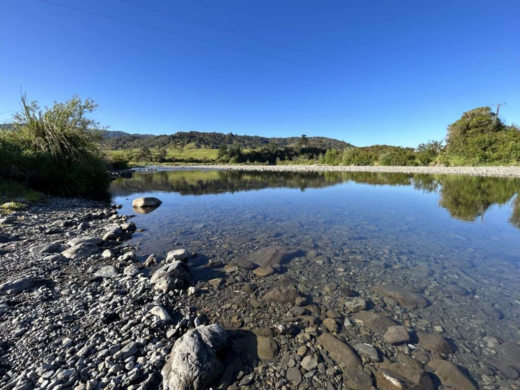
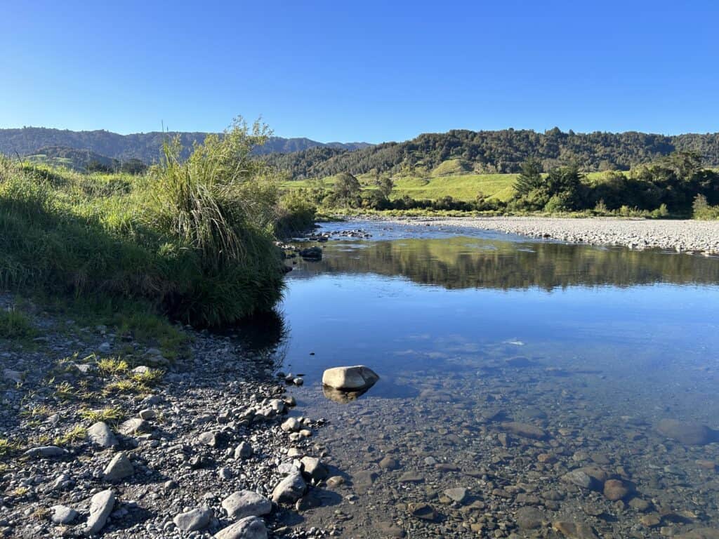
Honestly, I didn’t expect much from this acrylic painting. As an oil painter, I’ve always found acrylics a bit tricky—mostly due to their quick drying times and sometimes less forgiving nature. But what happened next made me rethink everything. I picked this beautiful river scene for its greens, that transparent water, and the submerged rocks you can glimpse beneath the surface.
“As an oil painter, I’ve always been a bit skeptical about acrylics, but what happened next has completely changed my perspective.”
Originally, I planned to paint this scene in oils, but I realized many of my viewers paint in acrylics. It felt right to give acrylics another shot and see if I could get results that I’d actually be happy with. So, let’s dive into the entire journey!
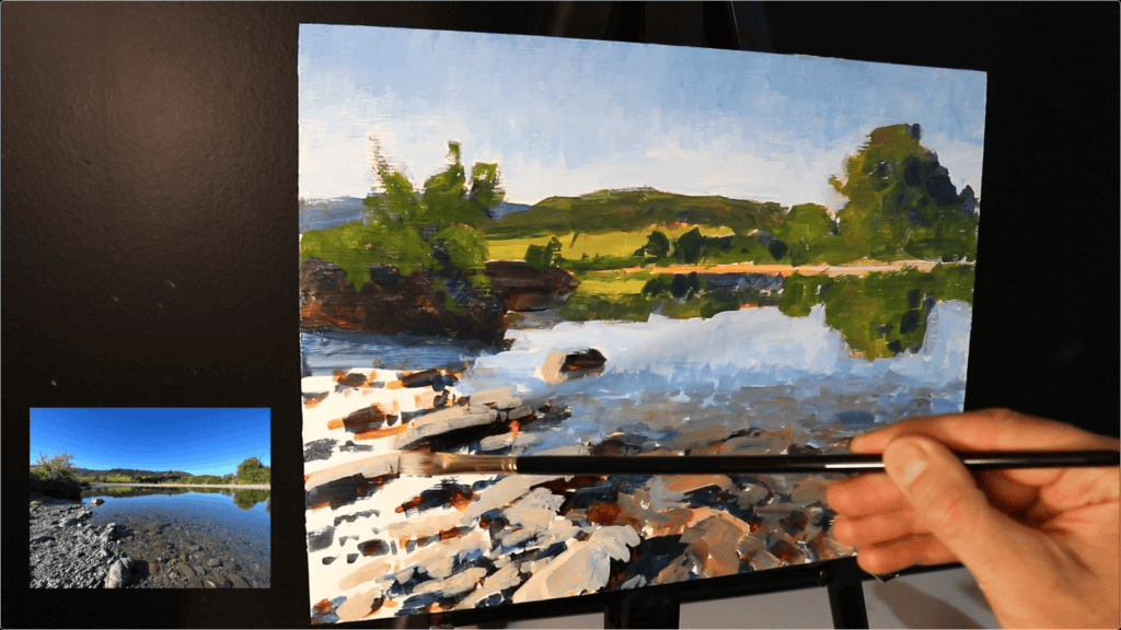
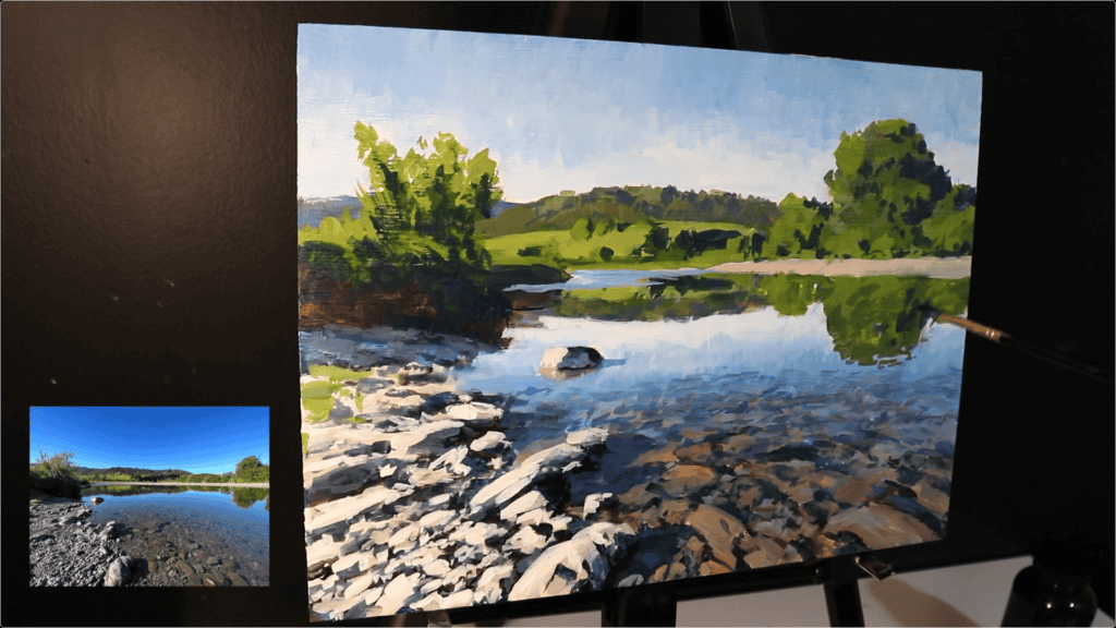
Reference Photos
Feel free to use these reference photos if you would like to paint this.
Setting Up: Materials, Surface, and Initial Sketch
Choosing the Panel
I painted on a 12″ by 16″ inch” wooden panel, primed with several layers of acrylic gesso. I’ve used canvas before but was never truly happy with the results when working in acrylics.
This time, I switched to a wood panel to try and get a smoother, more predictable surface. If you haven’t tried wood, give it a go, especially if acrylics have given you trouble in the past!
Sketching the Composition
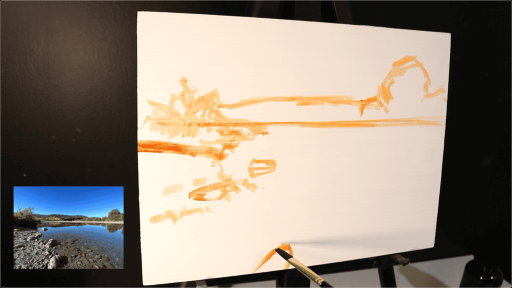
For the initial sketch, I used burnt sienna with a No.5 Shiraz flat brush (synthetic). The goal here was simple: clearly outline my composition before getting into details.
I designed the composition in my sketchbook.
“This is something I’d always recommend you do. But the landscape here was already naturally forming a pretty good composition, so I didn’t really change much.”
A good composition sketch always sets the tone and helps avoid surprises later. Even if your landscape already feels ‘naturally good,’ a quick sketch keeps things on track.
Blocking in: Tackling Values and Shadows
Starting With the Darks
Every time I paint a landscape, whether in oils or acrylics, I start by blocking in the darkest values first. This sets the whole foundation for the painting’s structure.
I checked my reference photos for the deepest shadows, which were:
- In the rocks (occlusion shadows)
- Along the riverbank
- In the trees
This particular scene was inspired by a spot in the lower North Island of New Zealand, shot in the morning while the sun was still low. That meant lots of clear shadows to capture.
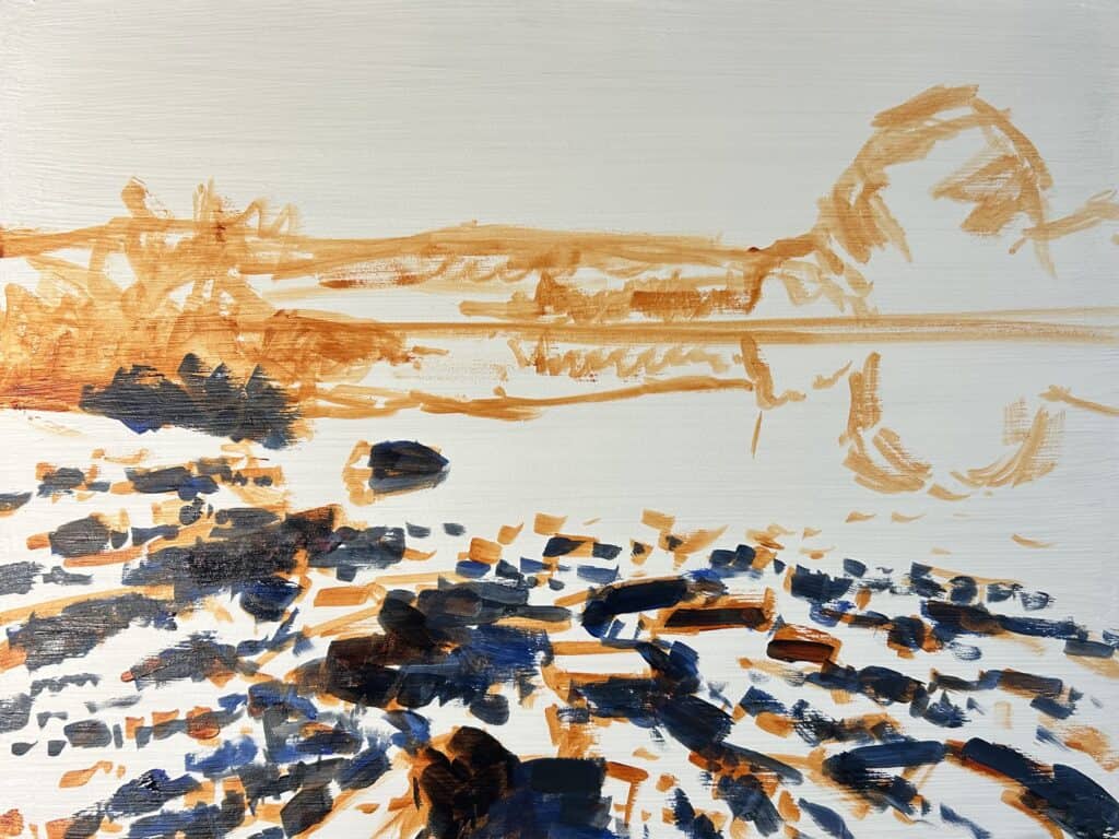
Mixing the Darks
For those rich darks, I used:
- Ultramarine Blue
- Burnt Sienna
- Alizarin Crimson
To lighten the blue areas, I added titanium white. Focusing on values is super important in landscape work:
- Darkest darks and lightest lights are both found in the foreground.
- As land recedes, both darks and lights become less pronounced.
“As landforms recede, the darks aren’t as dark and the lights aren’t as light.”
Marking in the shadows helps create depth—even if there aren’t a ton of shadows in your scene, the few that exist make the painting read more realistically.
Adapting My Technique: The Problem With Acrylics… and Solutions
Quick Drying Times
The legendary quick drying time of acrylics has been my biggest challenge. This time, I decided to change up my method compared to oils:
Solution 1: Looser, More Painterly Brushwork
I avoided strong detail and went for loose, gestural brush marks.
Solution 2: Wet Palette
Switching to a wet palette was a game-changer; no more worrying about paint drying out on the palette before I could use it!
Color Choices and Mixing Techniques
Building the Greens
For the vegetation and grass in the background, my base green mix was:
- Yellow Ochre
- Cadmium Yellow
- Ultramarine Blue
- Titanium White
I tweaked the greens by adding phthalo green or burnt sienna (a touch of red, opposite green on the color wheel for harmony).
I kept my values darker at first and would lighten them once dry.
Creating Depth With Color Saturation
Most saturated colors live in the foreground, so:
- Foreground greens: More cadmium yellow and phthalo green.
- Background/distanced greens: More yellow ochre and titanium white, less cadmium yellow and phthalo green.
Mixing “Broken” Colors
One trick—not mixing my colors completely! Leaving some hues visible creates more organic, interesting effects. It’s like letting bits of each color’s personality come through.
“I use broken colors. I don’t mix them all together thoroughly because I like to see some of those individual hues coming through on the paint.”
Learn to Paint Four Stunning Landscapes
4 x Step-by-Step Painting Tutorial Videos – $19
Painting the Sky: Bold Marks, Managing Acrylic Dry Time
Sky mixes included:
- Ultramarine Blue
- Titanium White
- Phthalo Green (tiny amount)
The sky was lighter towards the horizon and deeper blue as you move up the painting.
I had to work fast because acrylics dry quickly, but those solid, bold brush marks give a painterly, impressionistic approach.
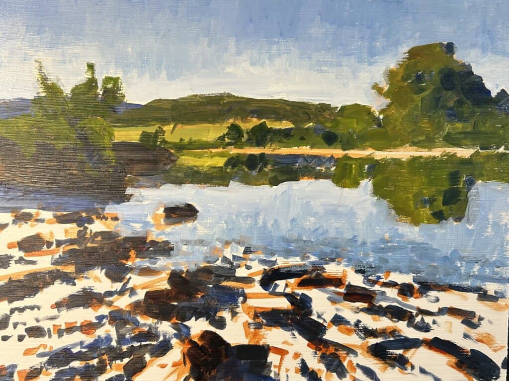
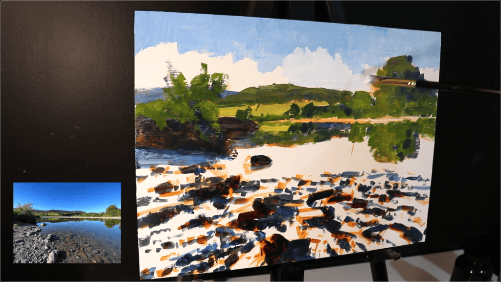
Reflective Water and Submerged Stones
Getting Reflections Right
After painting the background vegetation, I painted their reflections using the same colors, applied with downward brush marks.
Then, sky reflections followed—a technique that really pulls the river’s surface together.
Submerged Stones: Key Values and Colors
Submerged rocks should be darker than those above water. My mix:
- Ultramarine Blue
- Burnt Sienna
- Titanium White
- Alizarin Crimson
- Yellow Ochre (a touch)
Keep the mixes on the blue side, especially for underwater shadows.
For rocks above water, I went with more yellow ochre, titanium white, burnt sienna, and a touch of ultramarine blue.
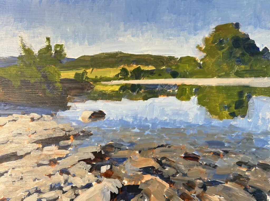
Adding Details and Highlights: Foreground Vegetation and Rocks
Once the first layers dried, I started to build up detail:
- Greens in the foreground: Yellow ochre, ultramarine blue, cadmium yellow, titanium white (base), boosted with phthalo green for saturation.
- Organic look: Added a little cadmium red light to the green mix—red balances the greens nicely.
With everything dry, I moved on to rock details, especially submerged stones and those on the riverbank.
Tip: Harmonious Color Palette
Throughout this painting, I mainly used eight colors (including titanium white). Using a consistent palette helps your landscape look harmonious and cohesive!
Depth, Tone, and Three-Dimensionality
Always start darker; if you go too light too soon, you can’t build up lighter tones later. Starting tonally dark and then building up with lighter layers gives the painting much more depth and realism.
“Best to keep everything tonally darker to start with, even when you’re painting in acrylics and then build up those lighter layers of paint.”
Working Zone by Zone
After the basic structure was down, I bounced around different zones:
- Tidied up tree forms in the background
- Re-emphasized tree reflections in the river
- Restated darks and shadows for rocks and vegetation
- Added highlights and lighter tones
I found the rocks—especially those partially submerged—were easier to paint with acrylics than oils. That was a surprise!
Final Touches
With the painting nearly finished, I added:
- Lighter tones to distant trees
- Reflected highlights on the banks
- Painted mid-ground rocks swiftly (using my trusty number three Shiraz synthetic flat brush)
- For foliage: occasionally switched to a rigger brush for more subtle texture
This stage is pure fun—adding details, adjusting forms, tweaking shadows and lights. Acrylics let me work quickly: paint a detail, let it dry, and come back to it in minutes.
Advantages and Surprises When Working With Acrylics
Acrylics have some downsides, but also upsides:
- Quick drying: Lets you add layers rapidly, perfect for building up complex surfaces or details.
- Easy corrections: If you’re not thrilled with a section, just let it dry and paint over.
- Fun painterly effects: The quick drying pushes you to be bold and gestural.
- Unexpected ease in painting rocks: The color mixes stay crisp, and layering is simpler than oils!
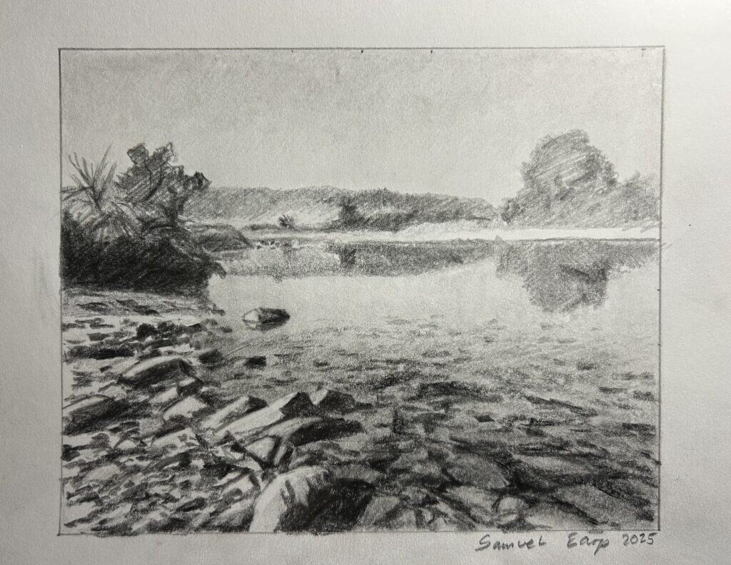
The Finished Painting: Rethinking Acrylics
By the end, the whole experience made me rethink acrylics completely. Painting on wood and using a wet palette solved so many frustrations, and the process was fast, enjoyable, and painterly. I’d encourage anyone who’s struggled with acrylics to give this combination a try!
“I have been very pleasantly surprised as some of the acrylic paintings that I did last year, I found a little tricky. However, I found that painting on a wooden panel and using a wet palette has made a huge difference.”

Tools and Materials Used
Here’s a quick list for those who want to try this process:
Surfaces
- 12″x16″ wooden panel, primed with acrylic gesso
Brushes
- Number 5 Shiraz flat brush (synthetic)
- Number 3 Shiraz flat brush (synthetic)
- Rigger brush for foliage
Palette
- Wet palette (absolute game changer for acrylics!)
Colors (my 8-color palette)
- Titanium White
- Burnt Sienna
- Yellow Ochre
- Cadmium Yellow
- Cadmium Red Light
- Alizarin Crimson
- Ultramarine Blue
- Phthalo Green
Pro Tips for Successful Acrylic Landscapes
Here are the main things I learned and would recommend to any acrylic painter:
- Try painting on wood if canvas hasn’t worked for you.
- Use a wet palette to keep paint workable longer.
- Start with darker tonal values so you can build up highlights later.
- Work loosely and gesturally—embrace painterly marks for impressionistic energy.
- Don’t overmix colors—broken color adds vibrancy and realism.
- Keep a limited palette for better harmony.
- Layer steadily as the paint dries—use the quick-drying time to your advantage!
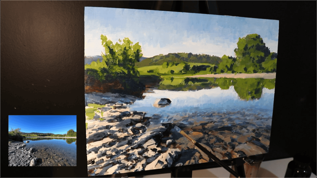
The River Scene—Step by Step Breakdown
1. Composition & Sketch
- Sketch outline in burnt sienna.
- Refer to sketchbook for composition.
2. Block in Darks
- Mark occlusion shadows in rocks, bank, trees.
3. Build Background
- Mix base greens; keep values dark.
- Paint distant trees and sky.
4. Water Reflections
- Use vegetation and sky colors for reflections.
- Paint with downward brush strokes.
5. Submerged Stones
- Use cooler, darker mixes for rocks under water.
- Layer in colors, blend gently.
6. Foreground & Details
- Add brighter, saturated greens.
- Restate rocks and highlights as layers dry.
7. More Details & Highlights
- Use flat and rigger brushes for finishing touches.
- Emphasize depth with lighter stones and subtle reflections.
8. Final Adjustments
- Tidy zones, restate shadows, tweak highlights.
Challenges and How I Overcame Them
The Fast Drying of Acrylics
Instead of fighting the quick drying time, I changed my approach:
- Used a wet palette to keep mixes moist and workable.
- Worked in thin, bold layers—allowed rapid buildup of color and detail.
- Avoided “fussing” over blending; focused on expressive marks.
Achieving Depth
- Always started with tonal darks. This kept space for light to “pop.”
- Used temperature shifts (blues vs reds) to push certain areas forward or back.
Color Harmony
- Blue-biased shadows unify the painting.
- Common palette tied all areas together.
Why You Should Try Acrylics (Again!)
If you haven’t been happy with acrylics, don’t write them off! Changing your surface and using a wet palette might make all the difference. Plus, if you love a fast, expressive process, acrylics push you to loosen up and work boldly.
“It’s making me rethink acrylics altogether. I know that some of my audience do paint with acrylics, so let me know in the comments section if you’d like me to do more of these acrylic landscape paintings.”
Additional Resources
If you’re looking to improve your landscape painting, I’ve got a free blueprint to help accelerate your skills—check the link below! Whether you’re into oils or acrylics, these principles apply.
- Free Landscape Painting Blueprint (link to your resource)
If you liked this painting, check out my fine art website, samuelepfineart.com, alongside many more paintings and prints. The site has a full gallery, and the link is in the description box below.
Watch the YouTube Video
Painting this river in acrylics was an unexpected joy. I’m planning to do more acrylic landscape paintings alongside my usual oil content. If you have any requests or want to see more, drop a comment!
If you want to deepen your understanding of painting water, check out my tutorial video linked below.
Related Reading & Next Tutorials
- How to Paint Water in Acrylics (link to video tutorial)
- Landscape Painting in Oils vs Acrylics: Pros, Cons, and Tips
- Compositional Sketching: Getting the Most Out of Your Sketchbook
Thanks for reading! If you want more painting tips, subscribe and stay tuned—I’ll be exploring many more techniques, materials, and scenes, both in acrylics and oils. Until next time—happy painting!
Learn to Paint Four Stunning Landscapes
