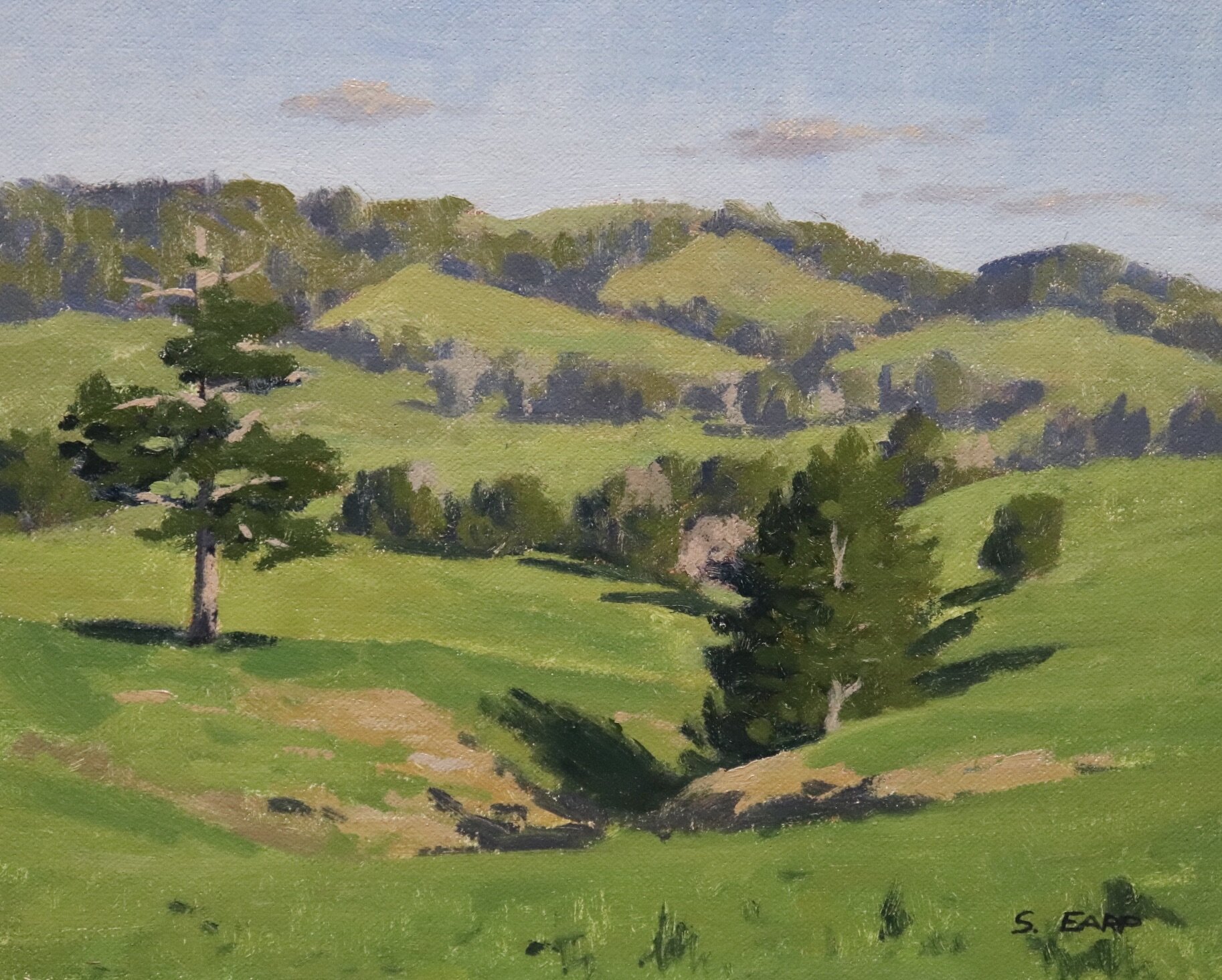
In this painting tutorial I will show you how to paint this pastural landscape inspired by the Northland area of New Zealand which I painted outdoors. Painting outdoors is known as painting ‘en plein air’. It’s a great way to improve your painting skills as it really makes you look at the landscape.
Suitable for oils and acrylics.
Why Paint Outdoors?
Painting outdoors can really help to improve your painting skills as it makes you look at the landscape you are painting. It will help you to get a better understanding of tones and values in the landscape as well as the chroma of the various colour. Most importantly, plein air painting teaches you to paint quickly as the light and weather conditions are changing and it will give you more confidence in your painting especially in the studio.
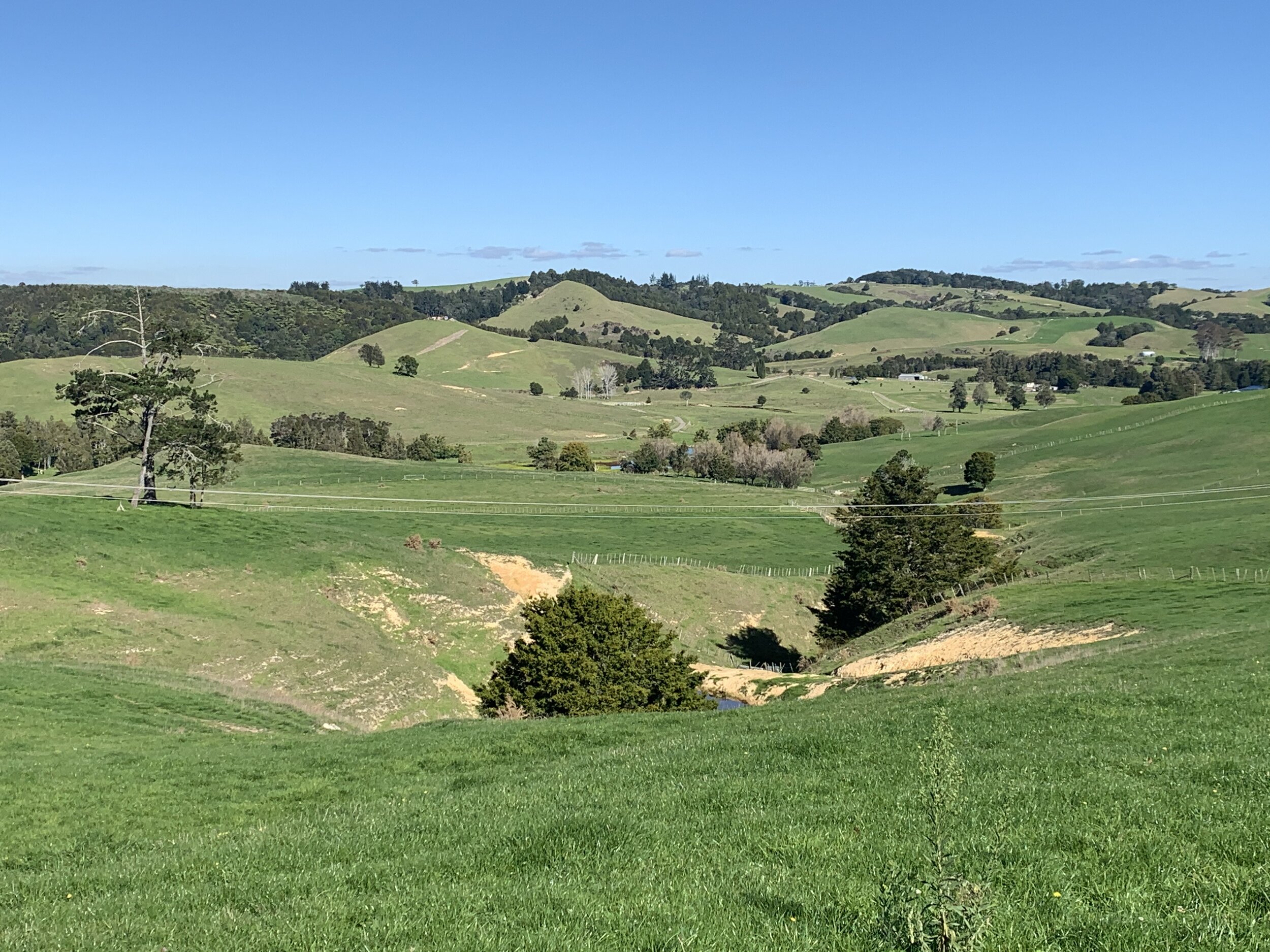
Reference Photo
Here is a reference photo I took and used in this painting. Please feel free to use or copy this photo if you would like to have a go at painting this art work.
Colours
I painted this artwork using oil paint and the colours I used in this painting are as follows:
- Titanium white
- Burnt sienna
- Yellow oxide (you can also use yellow ochre instead)
- Cadmium yellow
- Cadmium orange
- Quinacridone crimson (you can also use alizarin crimson instead)
- Ultramarine blue
- Phthalo green
Brushes
Here is a list of the brushes I used in this painting:
- No.5 flat
- No.3 flat
- No.3 filbert
- No.1 round
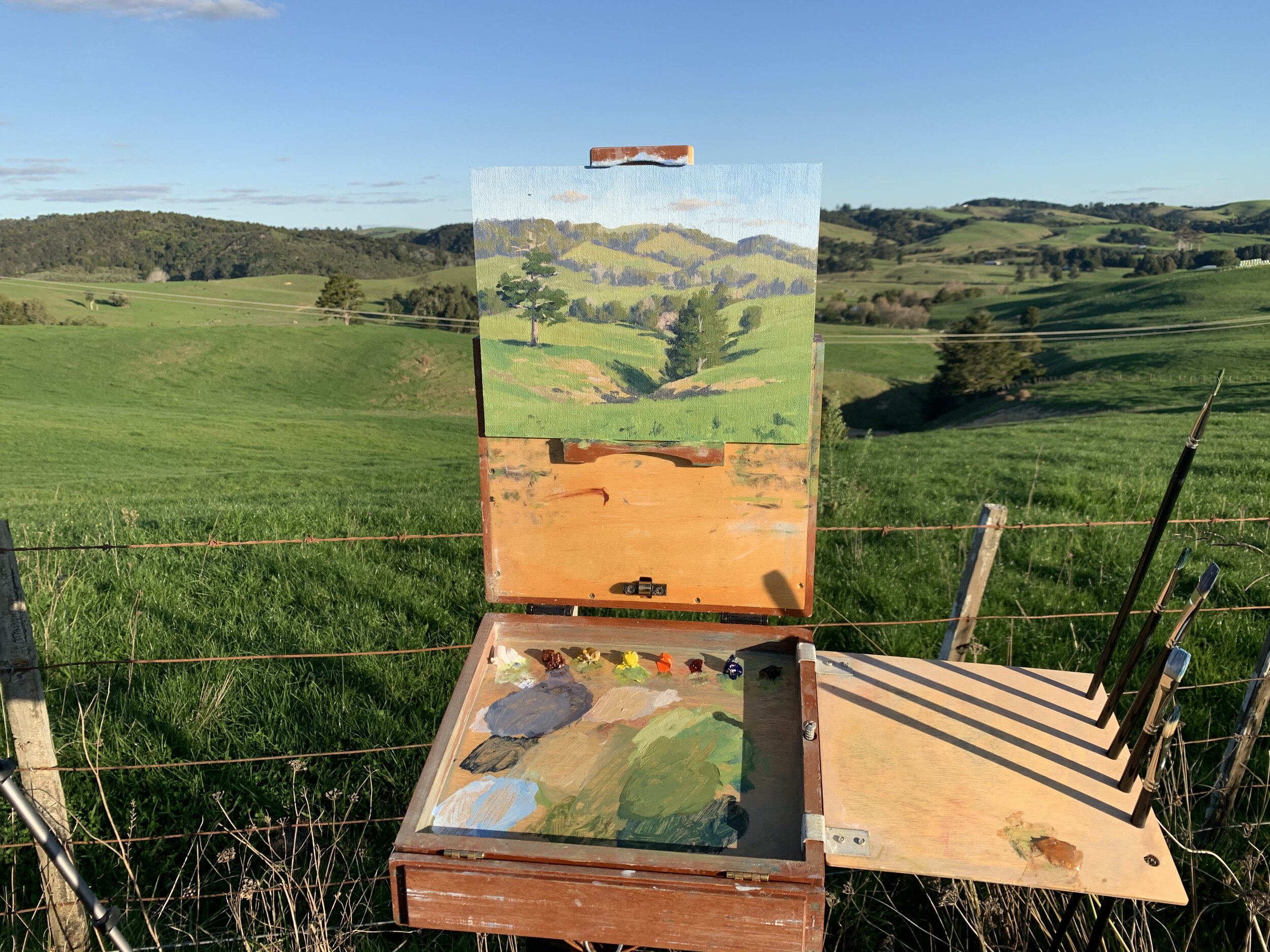
Painting Demonstration
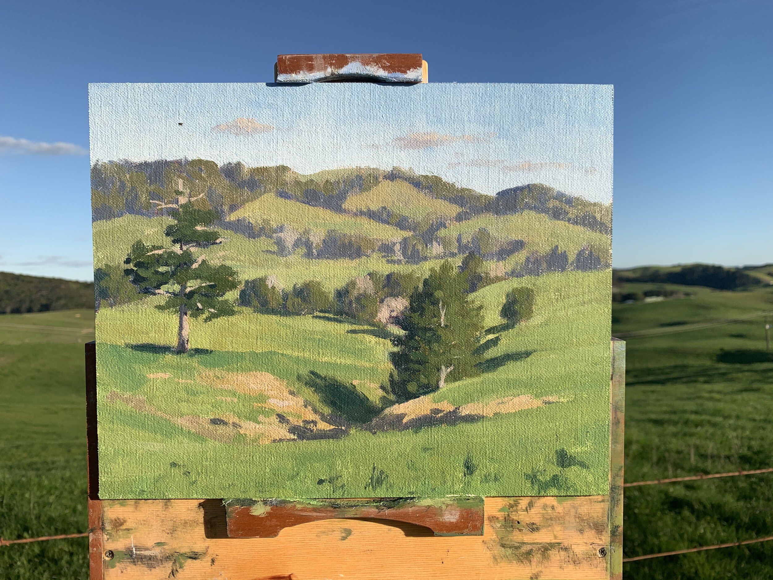
I am painting on an 8” x 10” linen panel. The panel is pre made with a medium weave linen that is oil primed. These are perfect for painting outdoors.
I sketch the composition using a No.1 round brush with burnt sienna mixed with Liquin Original (Liquin). I am using Liquin as a medium to thin the paint and it also has the advantage of speeding up the drying time.
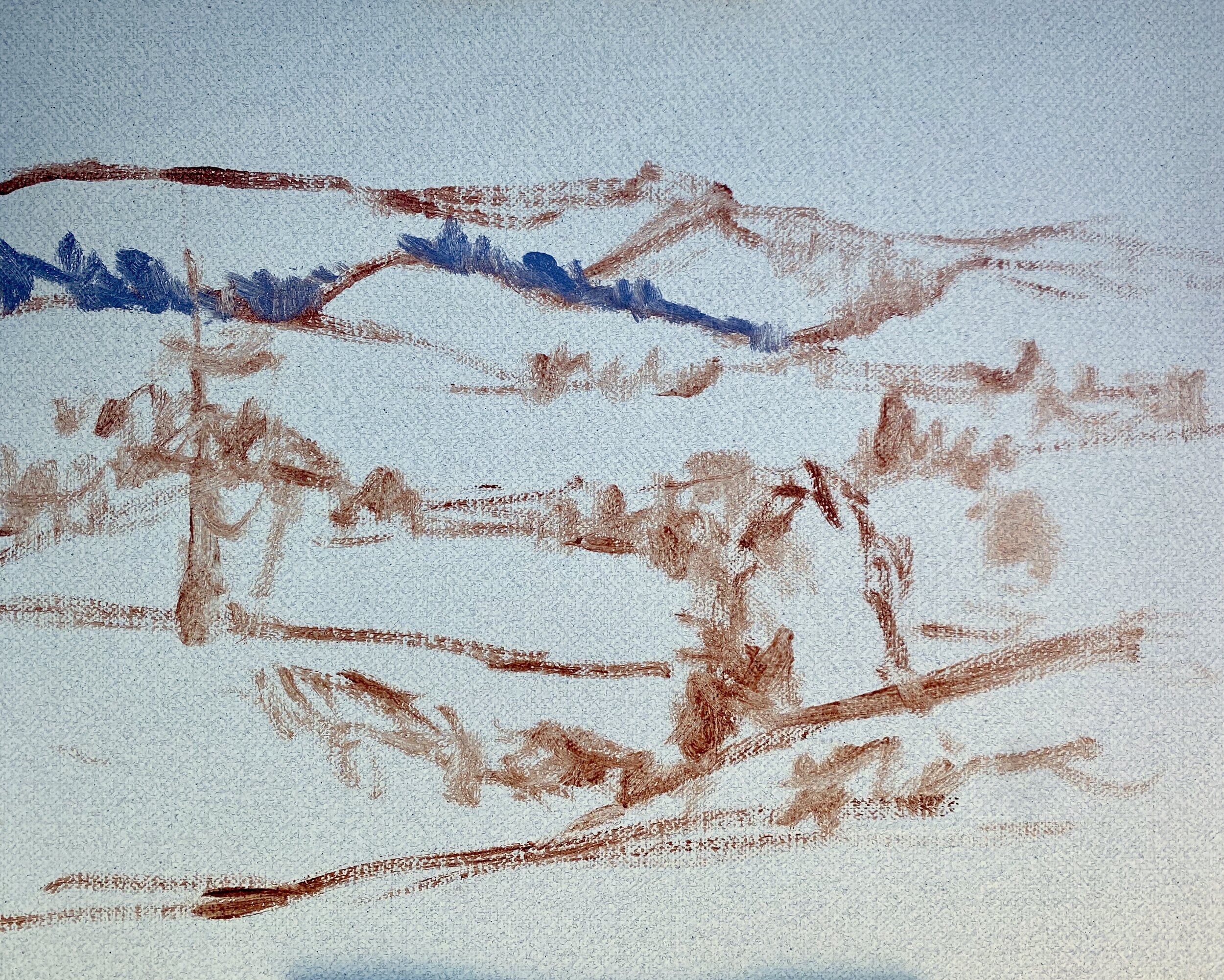
When painting outdoors I have found it easiest to establish all of my dark values and shadows first. This will not only help you to quickly create a tonal dynamic in the painting but it also means it won’t matter if the sun moves or the light and weather conditions change. Since painting outdoors I have applied this same approach to my art works when painting in my studio.
The shadows in the distant trees are a mix of ultramarine blue, burnt sienna, titanium white and a little quinacridone crimson to give the mix a violet tint.
As I work forward in the painting those shadows are getting darker so for the mid ground trees I use the same mix but with less titanium white.
The darkest shadows are to be found in the foreground trees and here I have used a mix of ultramarine blue and a little yellow oxide. Trees are some of the darkest values to be found in the landscape.
Once I’ve established my main areas of shadows I work my way back in the painting beginning with the sky which is a mix of ultramarine blue, titanium white and a little phthalo green.
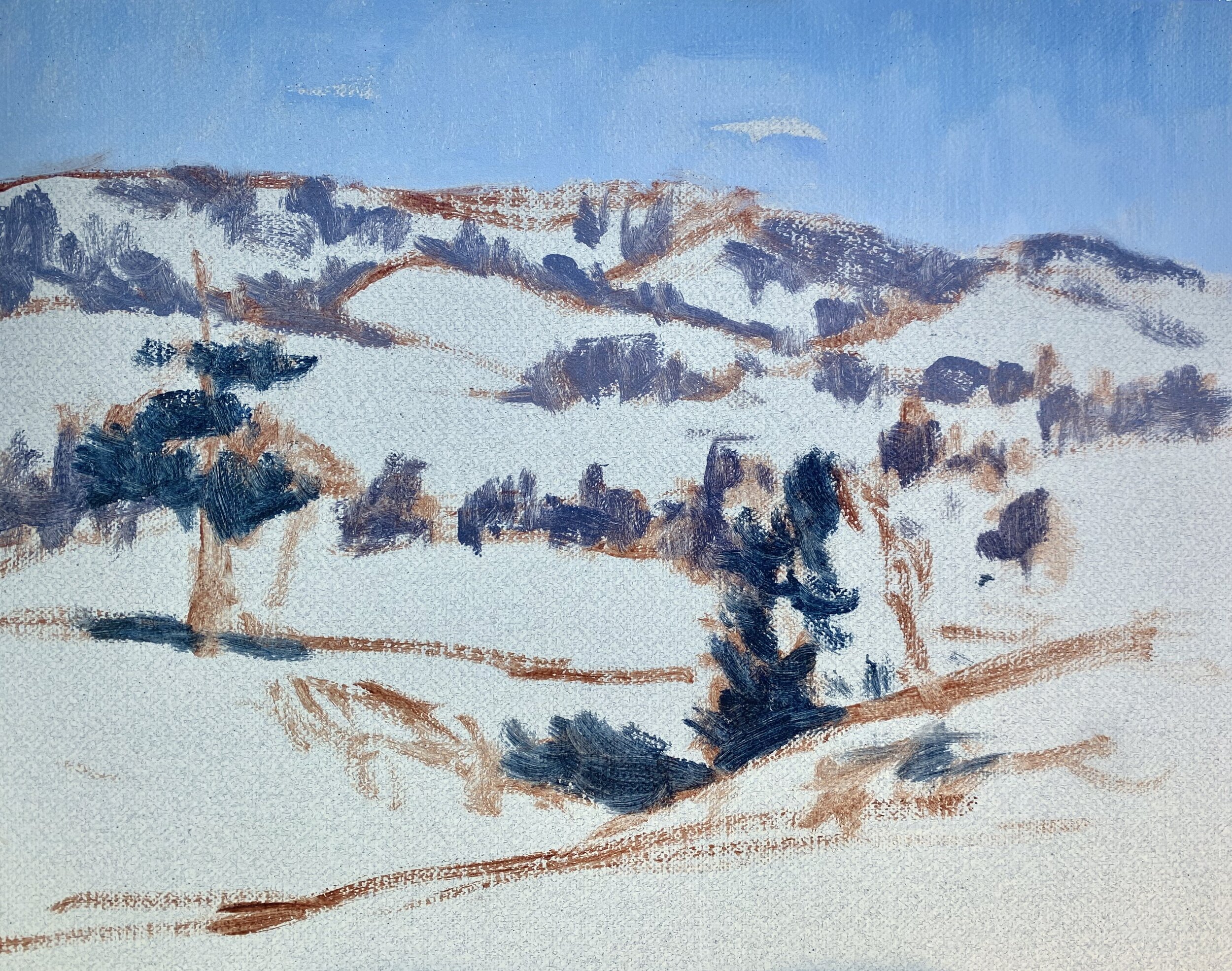
I paint the distant trees and as these trees are further away in the landscape the colours are not as intense or vibrant so I need to desaturate my colours. I mix the colours for the background trees using ultramarine blue, yellow oxide, titanium white and a little burnt sienna.
I use the same colours for the trees in the mid ground but I increase the saturation of the green by mixing in a little cadmium yellow.
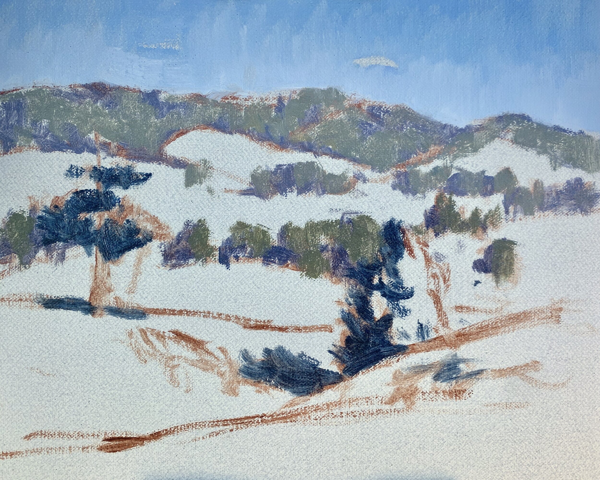
The grass is one of the main features in this painting but green can be an awkward colour because it is naturally vibrant. If the greens are not mixed properly they can look out of place and unnatural, so it’s very important to get the balance of the colour mixtures and the saturation correct.
For the background fields the greens will be a little less vibrant, so I start with a mix of yellow oxide, ultramarine blue, titanium white and a little phthalo green.
As I work forward in the painting I increase the saturation of my greens by introducing cadmium yellow and phthalo green. I round off the mixture with quinacridone crimson as the red that is present in this colour helps to harmonise the green.
Keep in mind that in general grass is a light value colour and much lighter than the values of the trees.
For the muddy areas in the foreground I have used a mix of yellow oxide, quinacridone crimson, titanium white and a little ultramarine blue.
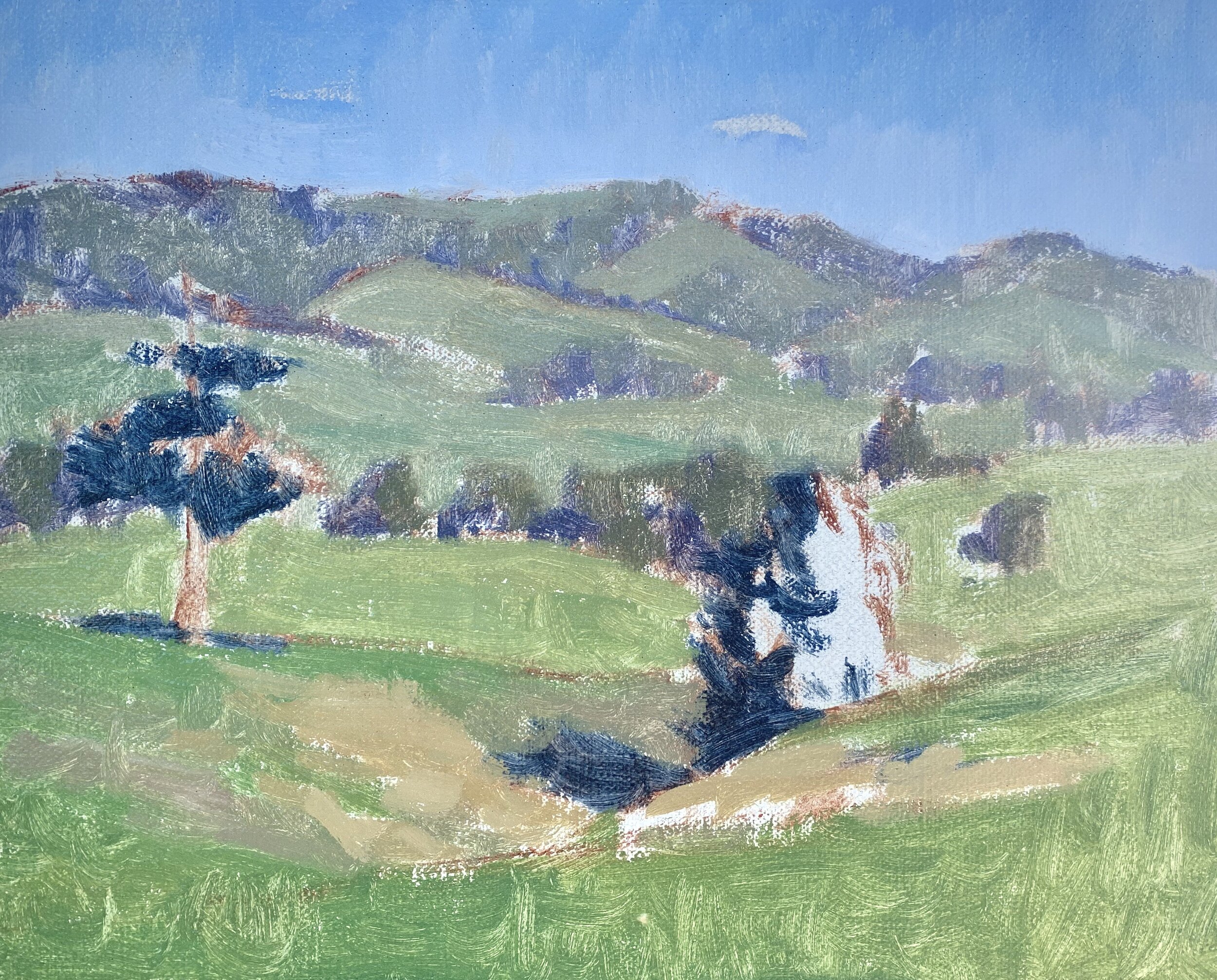
I paint the foliage in the pine trees with a mix of ultramarine blue, yellow oxide, cadmium yellow and cadmium orange. If I need to I can I can make the value lighter with a little titanium white.
For the pine tree on the left I also introduced a little phthalo green into the mix just to shift the hue of the green.
Once I had painted the trees I went over the painting again and restated the dark values. I also tidied up some areas and added a few details.
I finished the painting by marking in the stems and branches within the trees using a mix of ultramarine blue, burnt sienna and titanium white. I used the same colours to paint a few trees in the mid ground that had lost their leaves.
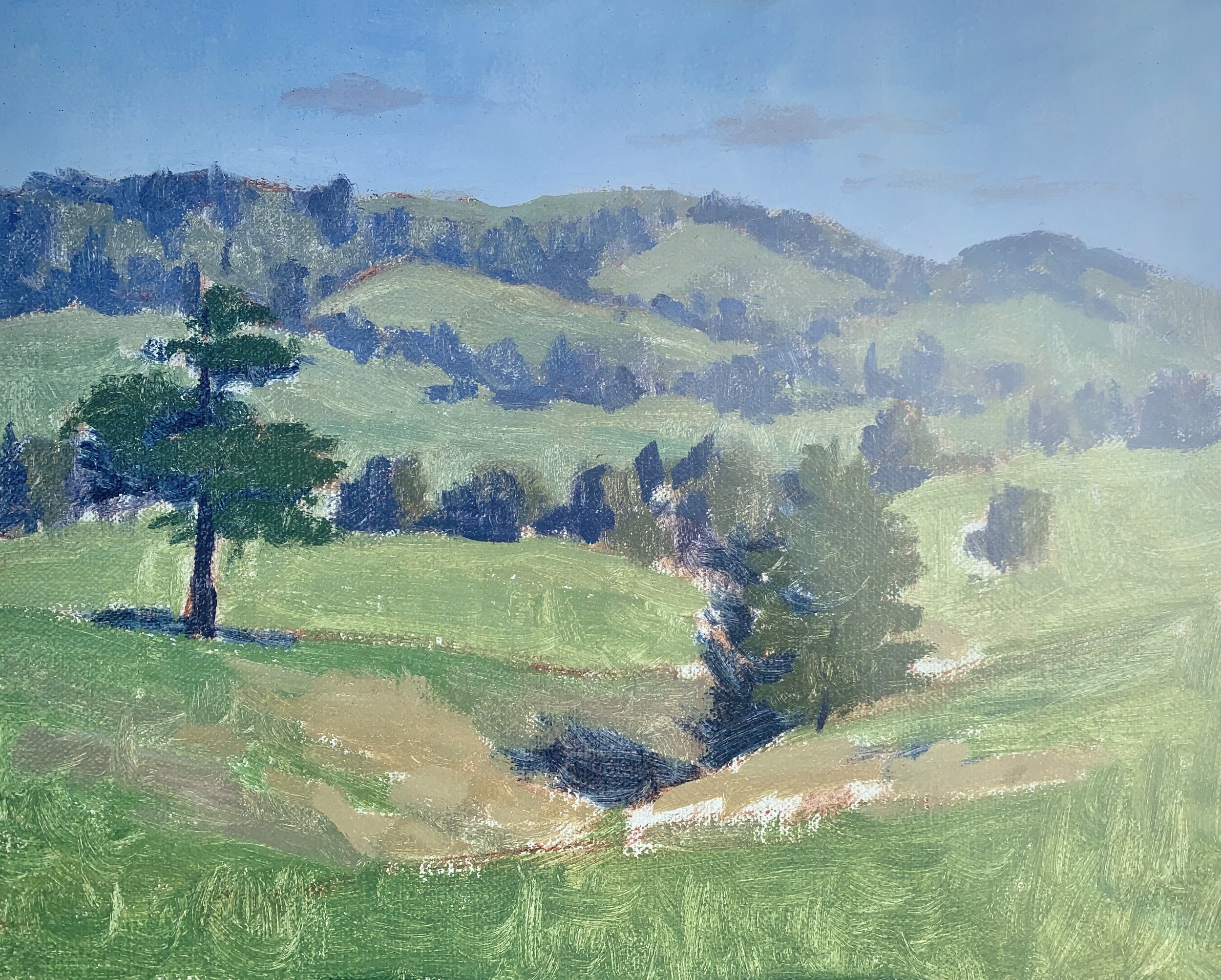
Once I had finished my painting I turned it around in the light to see what the colours looked like.
Final Thoughts on Painting Outdoors
I love painting outdoors as I have found that it has really improved my painting skills. It also has lots of benefits for your mind, body and spirit as it gets you outside in the fresh air and in the sun (assuming the weather isn’t too cloudy).
When painting outdoors I prefer to paint loose as I have found this is very beneficial for my brush work and techniques in general. We want to capture the mood and atmosphere of the scene we are painting as well as get the colours and values correct, so painting with a looser more gestural style can really help you to paint quickly. That being said sometimes I add some details to my plein air paintings when I get back to my studio.
Thanks for reading 😊
