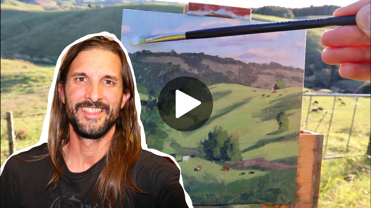
Have you ever painted a landscape only to find it feels flat and lifeless, like you’re looking at a postcard instead of peering through a window into another world? I know I have, and it’s one of the most frustrating experiences as an artist. You spend hours carefully mixing colors and placing brushstrokes, only to step back and realize your painting lacks that magical sense of depth that makes viewers feel like they could walk right into the scene.
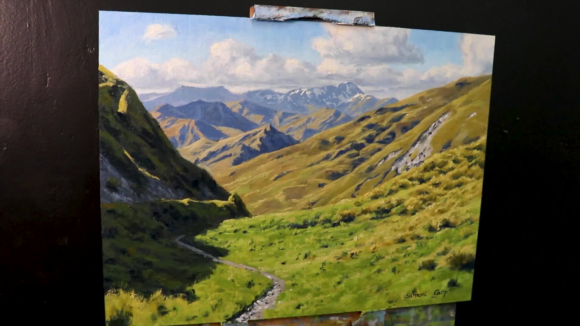
In this post, I want to share with you exactly how I approach this challenge by painting a rugged mountain scene inspired by New Zealand’s South Island – a landscape so dramatic and layered that it practically demands you master the art of depth in paintings. Using a four-step method that I’ve developed through countless hours of experimentation and observation, we’ll unlock the specific techniques that will transform your flat landscapes into windows to another world. I’ll show you how to add dimension, depth, and that sense of endless distance that makes viewers stop in their tracks.
Let’s dive in and discover how to breathe life into your landscapes!
Materials You’ll Need
To begin, let me walk you through the specific materials I’ll be using for this painting process.
- I’ve chosen Oil Paints from Blue Ridge Oils – a brand I’ve come to rely on for their rich pigmentation and smooth consistency that makes blending those crucial atmospheric effects so much easier.
- For the surface, I’m working on a 12-inch by 16-inch linen canvas panel from Sourcetek. This size gives us plenty of room to develop those layered mountain ranges while still being manageable for a single painting session.
Now, I want to be transparent with you – while these are the exact materials I’m using in this demonstration, the techniques I’ll be sharing work beautifully with whatever quality oils and canvas you have on hand. The principles of creating depth are far more important than the specific brand names. If you’re interested in trying out these particular materials, I’ve included purchase links in the video description below to make it easy for you to obtain them.
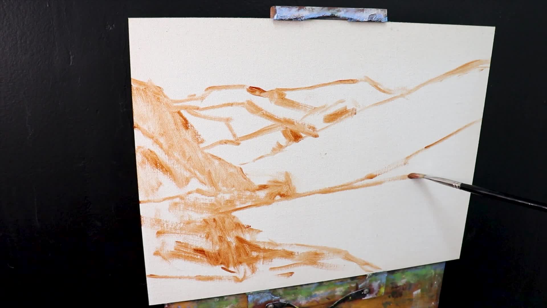
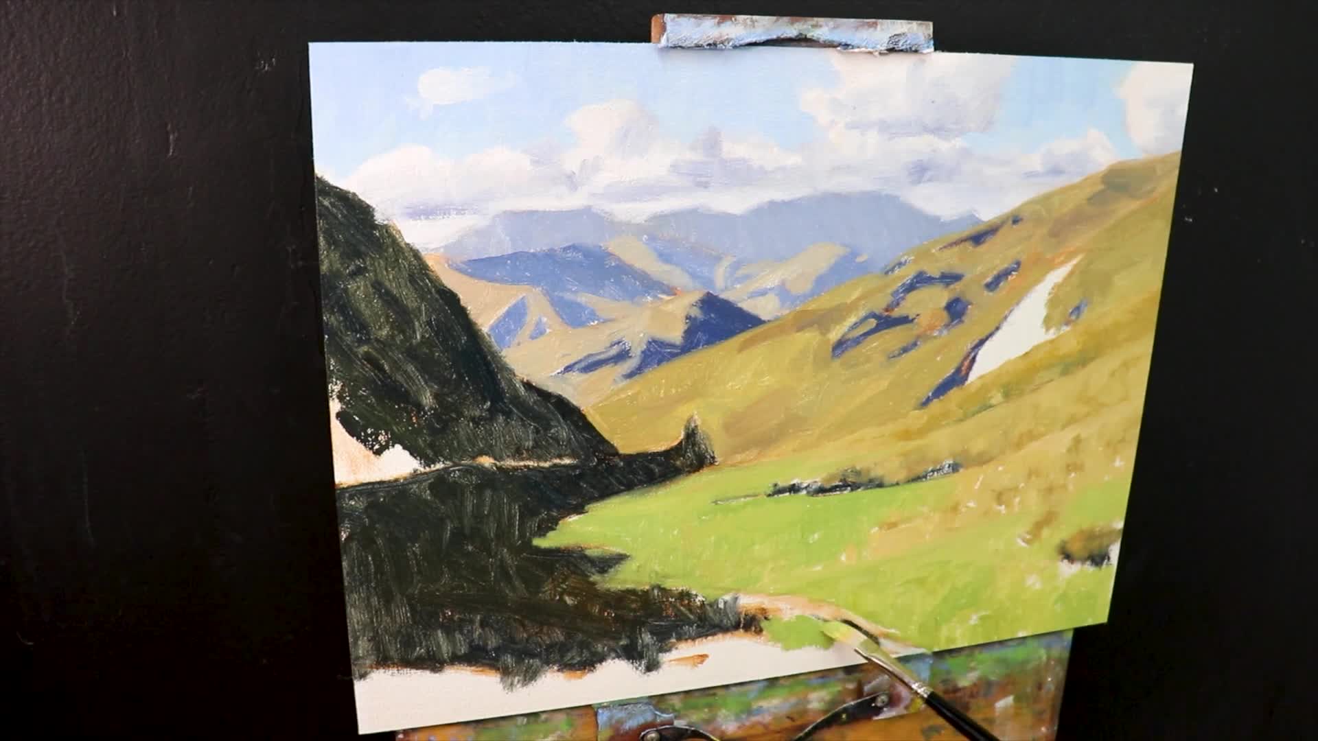
Step 1: Laying the Foundation with Dark Values and Shadows
Here’s where we begin to build the bones of our painting – and trust me, this step will make or break the sense of depth in your final piece. To create convincing depth, I always begin with my darkest values and shadows, working from dark to light rather than the other way around.
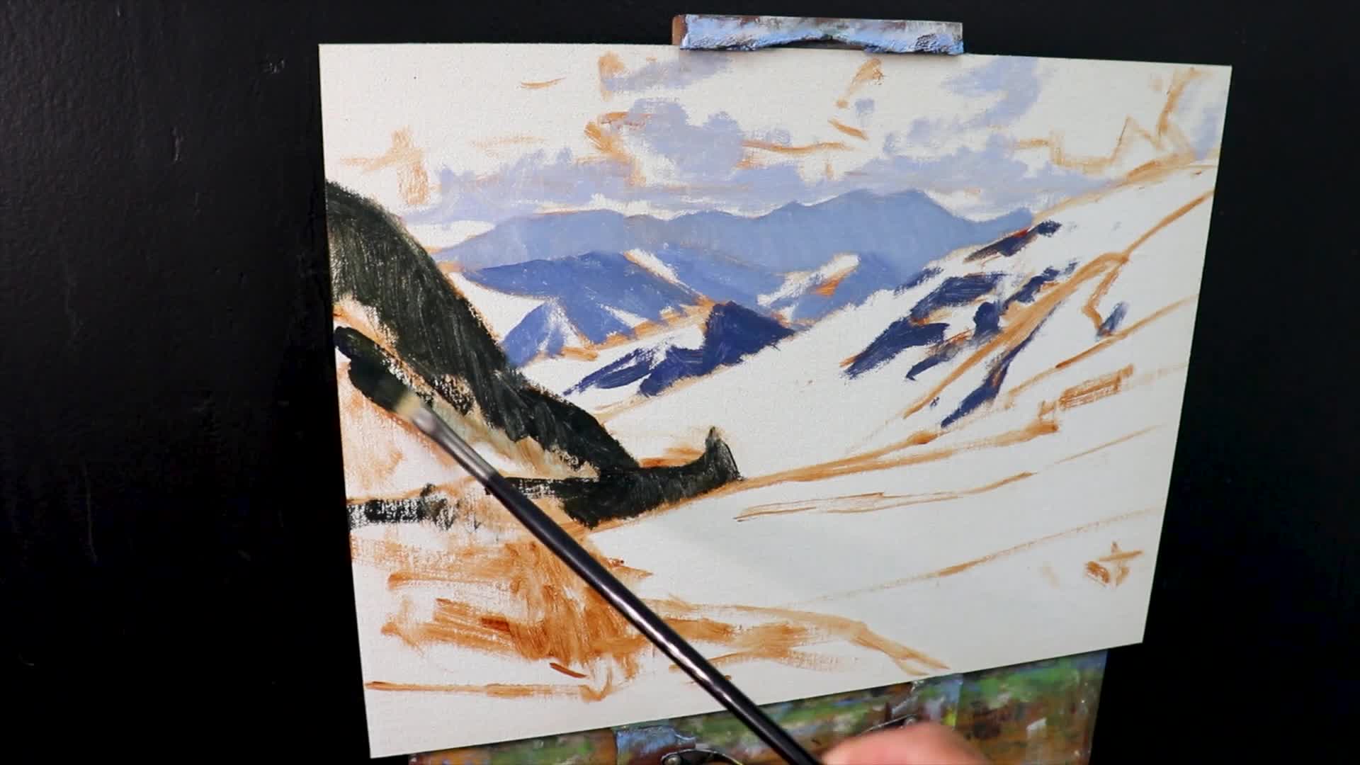
Those first bold strokes should define your cloud shadows – these aren’t just random dark shapes, but the actual framework that will hold your entire landscape together. Think of them as the skeleton that everything else will hang on.
As you’re laying in these foundational darks, keep these crucial principles in mind:
- Value Basics: The darkest darks and lightest lights appear in the foreground. This is your secret weapon for creating that punch of contrast that pulls the viewer’s eye forward.
- Receding Forms: As objects recede into the distance, they decrease in contrast and become more muted. Your distant mountains should never compete with the drama happening in your foreground.
This approach sets a strong tonal foundation that makes it infinitely easier to illuminate other areas later. When you establish your darkest darks first, every subsequent layer of paint has a reference point, and you’ll find yourself naturally creating the right relationships between your values. It’s like building a house – you need that solid foundation before you can add the beautiful details that make people stop and stare.
“A good painting always starts from a solid tonal framework.”
By focusing on dark values first, we’re building a strong base for atmospheric perspective and depth.
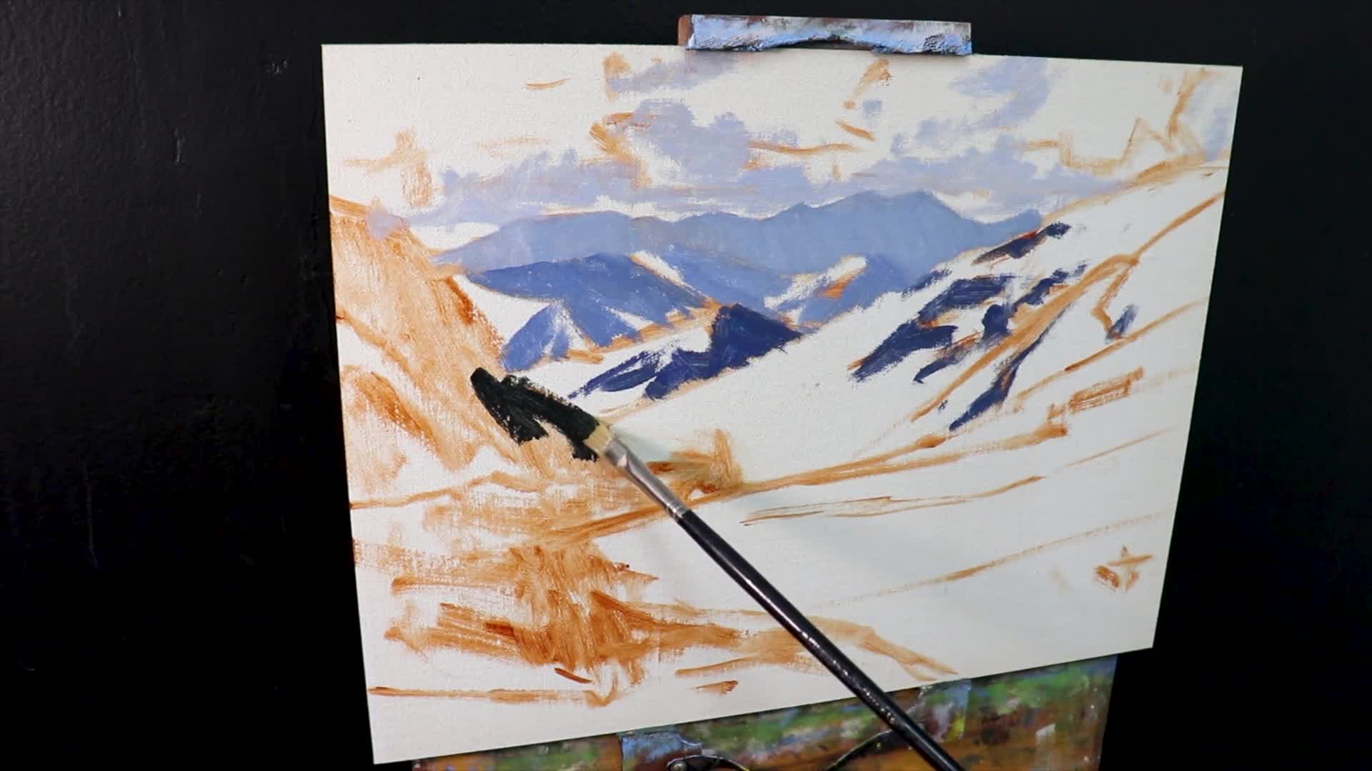
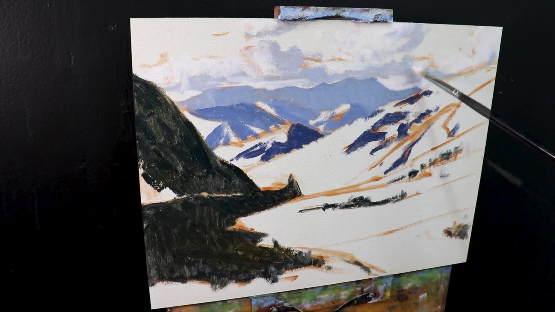
Painting the Clouds and Distant Mountains
Now we’re getting to one of my favorite parts – mixing those perfect atmospheric colors that make distant mountains feel like they’re actually miles away. The secret lies in understanding how the atmosphere affects color as it travels toward us, and I’ve found a specific color combination that captures this beautifully every time.
The colors used for these areas include:
- Ultramarine Blue – my go-to for that atmospheric quality
- Burnt Sienna – this is crucial for desaturating those colors and giving them that hazy, distant feel
- Titanium White – for lifting the values and creating that sense of air and light
- Alizarin Crimson – just a touch adds that subtle violet tint you see in distant mountains, especially during golden hour
This versatile mix is absolutely perfect for elements like clouds and those far-off mountain shadows that seem to dissolve into the sky. The magic happens when you get the proportions just right – too much blue and they’ll feel too intense, too much burnt sienna and they’ll look muddy. Here’s a pro tip I’ve learned: for foreground shadows where you want more richness and warmth, try enriching this same basic mix with a touch of yellow ochre. This keeps your color harmony intact while giving your closer elements that extra punch they need to feel present and substantial.
Step 2: Illuminating the Scene with Light Areas and Loose Brushwork
The key here is embracing loose, confident brushwork that captures the energy and movement of the landscape. I can’t stress this enough: being expressive at this stage will save you from creating those overly detailed, rigid-looking landscapes that feel more like photographs than paintings.
After establishing those crucial shadows, it’s time to breathe life into your painting – and this is where I see so many artists get caught up in perfectionism too early.
Here’s what I focus on during this phase:
- Keeping brushwork broad and expressive – let your brush dance across the canvas
- Not stressing over intricate details during the blocking phase – resist that urge to tighten up too soon
- Building up layers once the initial layer is dry – patience here will reward you with richer, more luminous colors
Remember, we’re building a foundation of light and atmosphere first. The details will come later, but right now, it’s all about capturing that sense of light flooding across your mountain scene with bold, confident strokes.
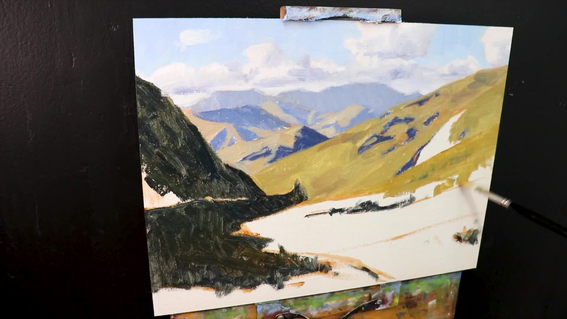
Crafting Rugged Mountain Grass Colors
Getting realistic greenery in your mountain landscape is all about understanding one crucial principle – controlling color saturation to maintain that sense of distance. I see so many artists reach for those tube greens and wonder why their distant mountains suddenly jump forward in the composition. The secret is mixing your own muted, atmospheric greens that respect the laws of aerial perspective.
For those distant mountain hues that need to feel properly receded, I rely on this simple but effective blend:
- Yellow Ochre – provides the earthy base
- Ultramarine Blue – creates that muted green without the intensity
- Titanium White – lightens and further desaturates the mix
The key insight here is that less saturation keeps distant forms from visually advancing in the scene. When you mix these three colors together, you get those perfect gray-greens that capture the way distant vegetation actually appears through miles of atmosphere – never bright, never demanding attention, but beautifully convincing in their restraint.
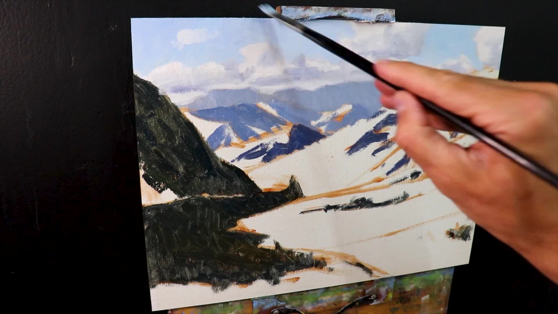
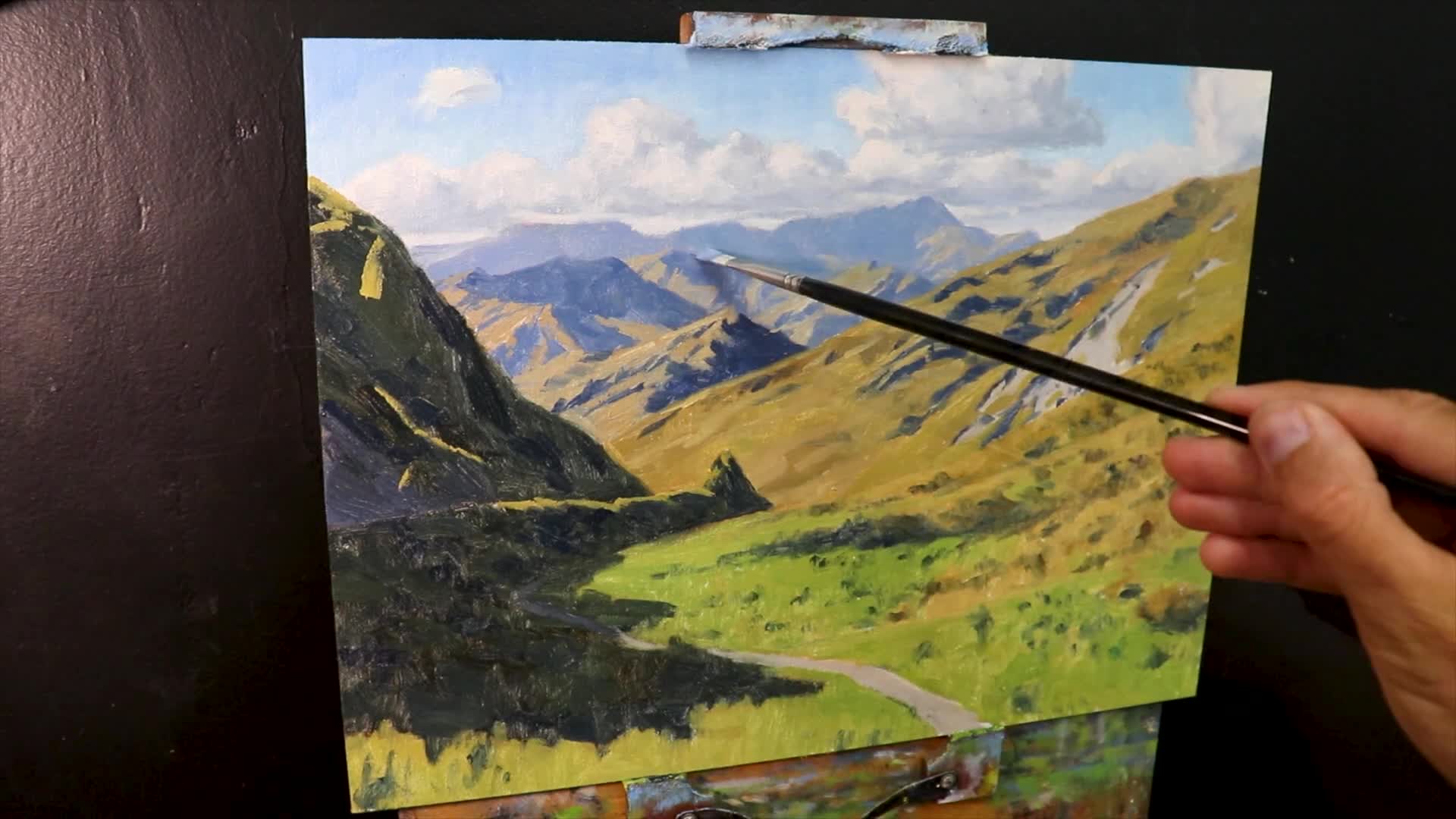
Step 3: Modeling—Adding Details and Refinements
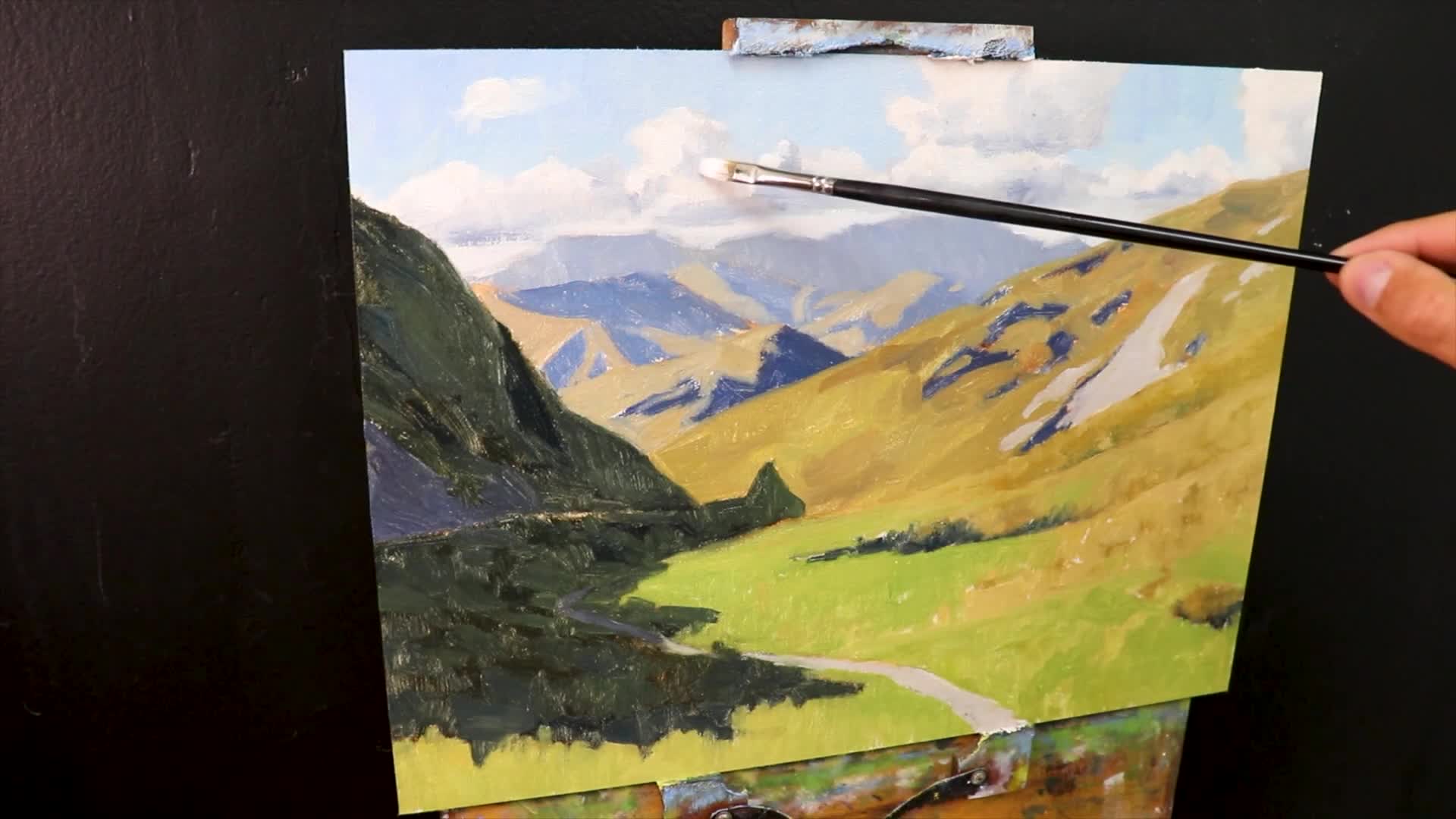
Now that our foundational blocking is in place, it’s time to start modeling individual zones – this is where your painting really begins to come alive. Think of this stage as sculpting with paint, where you’re defining the three-dimensional form of each element while maintaining that overall sense of depth we’ve been building.
Here’s my process for building these crucial layers:
- Adding detail to clouds – but here’s the trick: make sure they convincingly recede by keeping distant clouds softer and less defined than those overhead
- Emphasizing lighting contrasts with a laser focus on value relationships over color – remember, it’s the lights and darks that create form, not the colors themselves
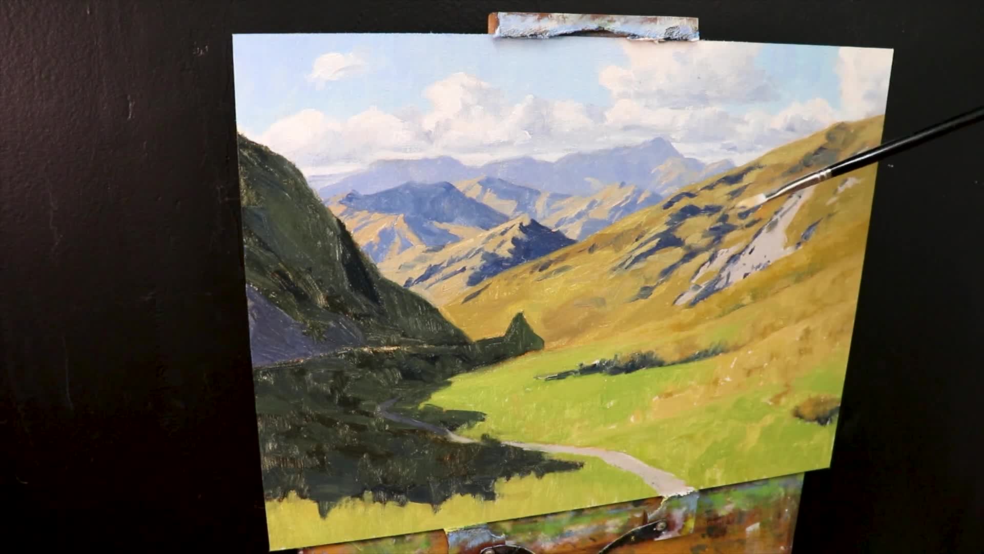
During this stage, I’m constantly asking myself: does this detail help or hurt the overall depth of my painting? Every stroke should either push something back or pull it forward, never leave it floating in that awkward middle ground.
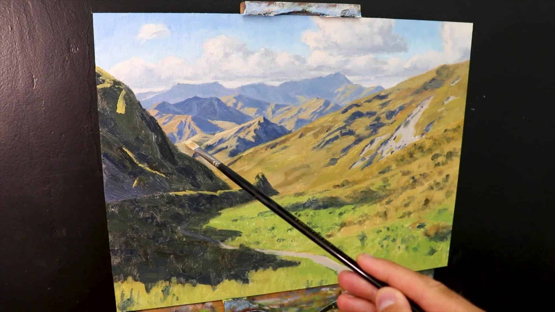
Building Layers and Crafting Composition
This is where your painting starts to develop that rich, luminous quality that makes viewers lean in closer. I approach this layering phase methodically, always working from my established darks toward the light. The beauty of this approach is how each new layer interacts with what’s underneath, creating depth that you simply can’t achieve in a single pass.
This modeling phase focuses on two critical areas:
- Painting lighter tones over darker ones – this creates natural color mixing right on the canvas and gives you those subtle gradations that make mountains feel real
- Reassessing and tweaking compositions for improved balance – step back frequently and trust your instincts about what needs adjustment
As I progress through these layers, I’m constantly switching between different brushes to match the job at hand. I’ll grab synthetic brushes when I need precision for detailed shadows and switch to bristle brushes for those broader, more expressive strokes that capture the sweep of distant ridgelines. Each tool serves a specific purpose in building up that convincing sense of form and atmosphere.
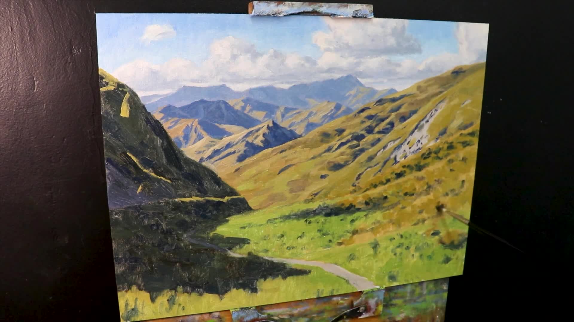
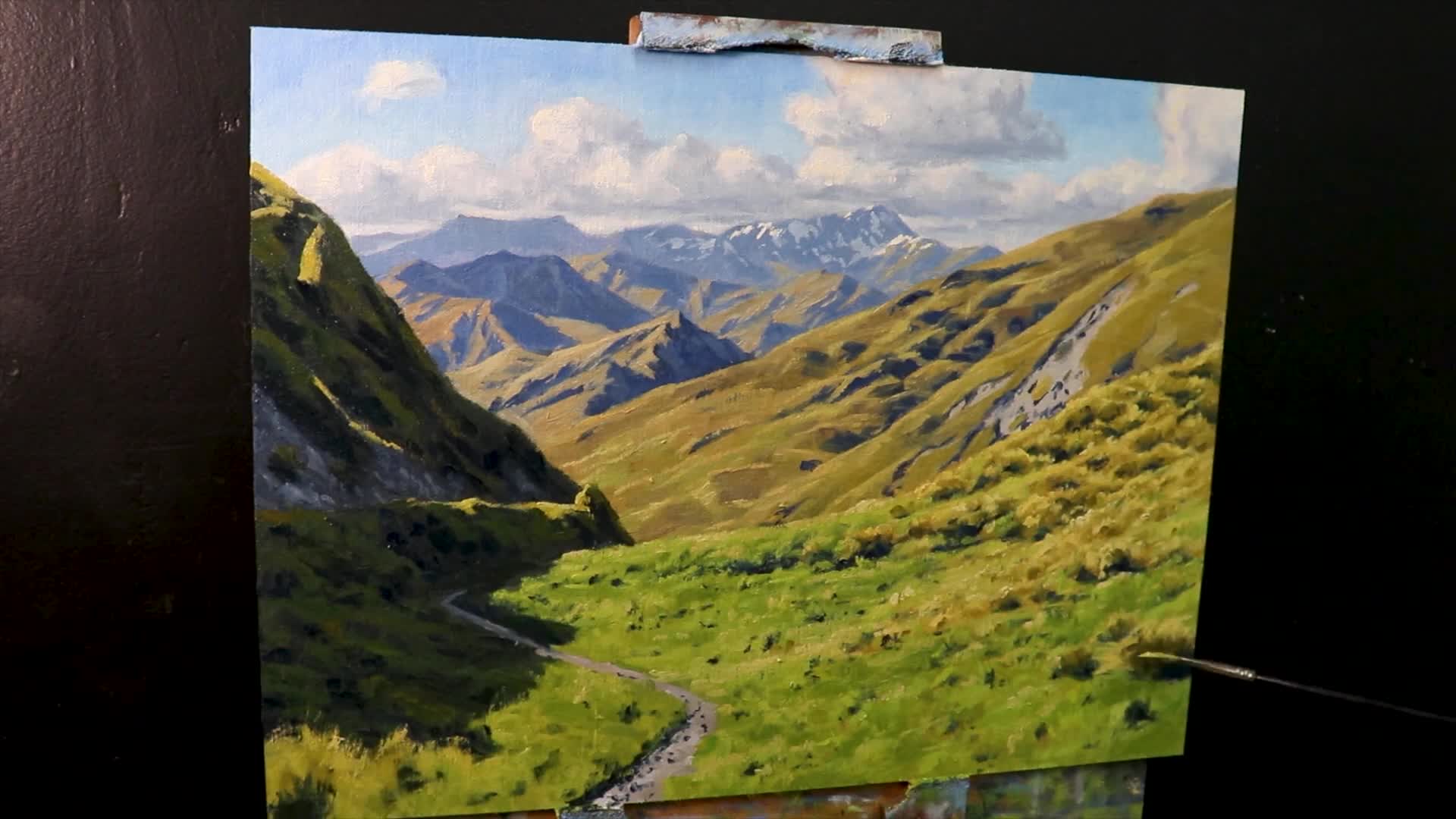
Step 4: Highlighting with Lightest Tones
We’re almost at the finish line now, and this is where you get to add that final punch that transforms a good painting into something truly captivating. Emphasizing your lightest tones is like turning on the sun in your painting – it brings those sunlit areas and snowy peaks to brilliant life, creating the brightness and contrast that makes viewers feel like they’re squinting against mountain light.
“Save your lightest values until last—that’s when the magic happens.”
For these crucial highlights, I use titanium white mixed with just a hint of yellow ochre – this combination ensures your highlights maintain their brightness without that harsh, chalky look that can overwhelm your painting. That touch of yellow ochre gives the white a subtle warmth that feels natural and convincing, like actual sunlight hitting those distant peaks.
Conclusion: Enhancing Your Landscapes
This six-step method I’ve shared with you today isn’t just theory – it’s a proven approach that guarantees depth and dimension in your landscapes when you follow the thoughtful sequence we’ve covered. From those crucial foundational dark values all the way through to those brilliant final highlights, each stage has brought us closer to creating a truly vibrant, three-dimensional landscape that feels alive and inviting.
Whether you’re just starting your artistic journey or you’ve been painting for years, I can’t emphasize enough how important it is to continually practice these techniques. Mastering the art of capturing nature’s depth doesn’t happen overnight, but with each painting, you’ll find yourself becoming more confident and intuitive with these principles. The mountains will start to recede naturally, your foregrounds will pop with convincing presence, and that elusive sense of atmosphere will become second nature.
I hope this process has given you some solid tools to take back to your own easel. And hey, if you’re hungry for more insights like these, don’t forget to join our weekly classes where we dive deep into techniques like this in real-time – there’s nothing quite like learning and painting together as a community!
If you’re striving to elevate your painting skills, consider visiting our art school for more comprehensive lessons and guidance. Watch the video attached for more hands-on insights. Happy painting!